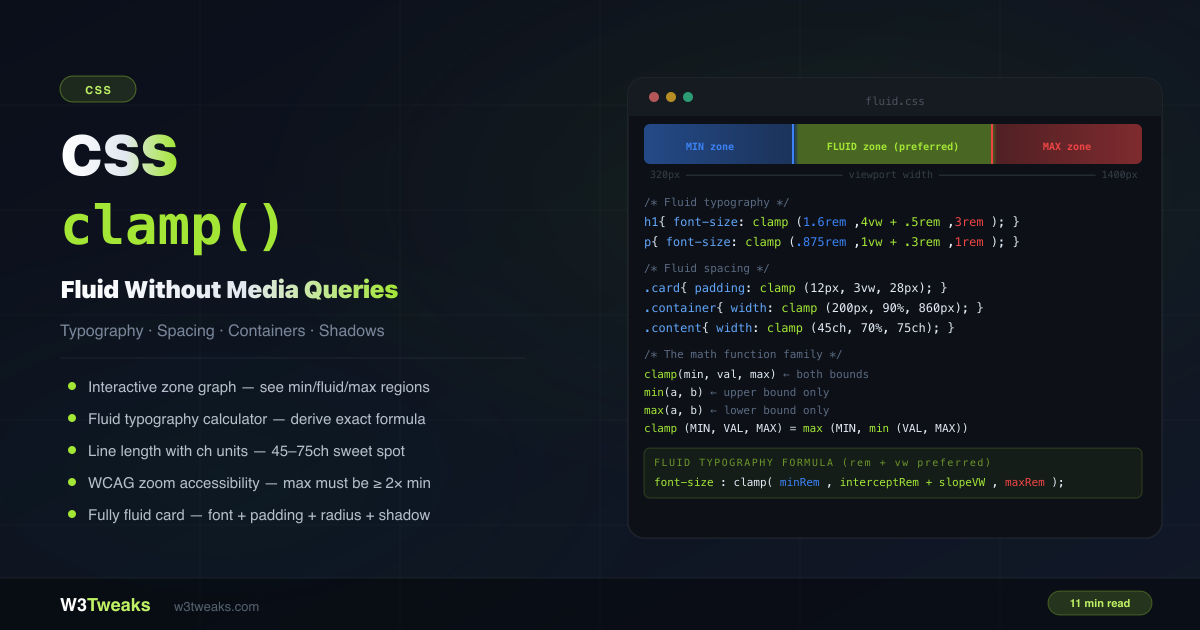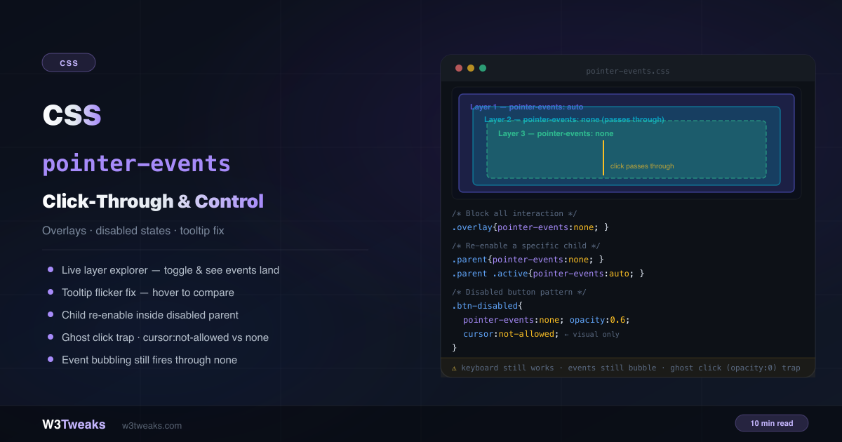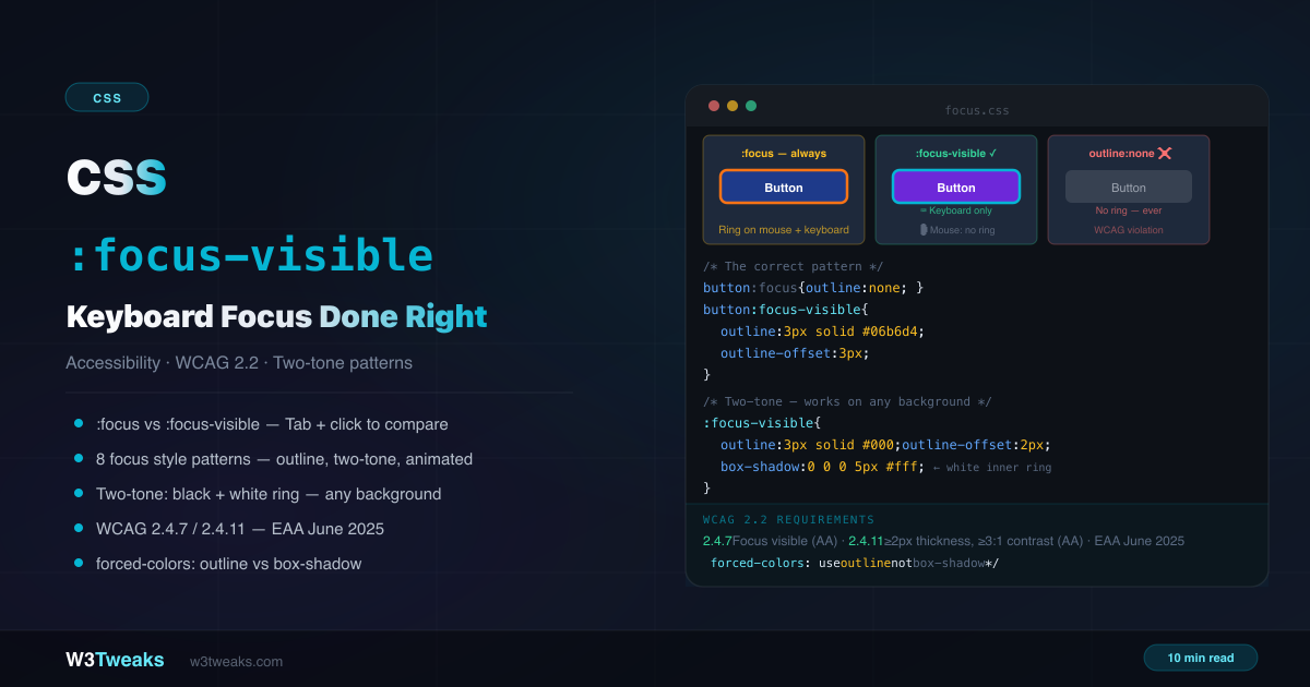
TL;DR
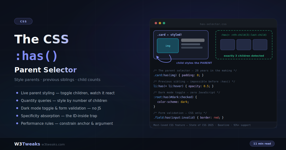
:has() matches the element outside the parentheses based on what’s inside it. It’s the long-awaited CSS parent selector — and much more:
.card:has(img)             { border: cyan; }   /* parent selector */
.item:has(+ .item:hover)   { opacity: 0.6; }   /* previous sibling */
.grid:has(> :nth-child(5)) { columns: 3; }     /* quantity query */
:root:has(#dark:checked)   { color-scheme: dark; }  /* CSS-only theme */
Watch out: an ID inside :has() promotes the whole rule to ID-specificity (neutralize with :where()); :has() cannot nest inside :has(); and :not(:has(x)) ≠ :has(:not(x)) — they ask completely different questions.
Support: Baseline Widely Available — Safari 15.4+, Chrome/Edge 105+, Firefox 121+ (93%+ global). Voted most-loved CSS feature in State of CSS 2025.
→ Try it in the live demo — toggle content into a card, hover a sibling, add/remove items to fire quantity queries, and flip a zero-JS dark-mode switch. Deep dive below for CSS-only tabs, <details> accordions, state-machine buttons, the two-negatives trap, shadow-DOM scope, and the Bloom-filter performance story.
For over twenty years, one feature topped every CSS wishlist: a parent selector — the ability to style an element based on what’s inside it. :has() finally delivered it, and then went further: it’s also a previous-sibling selector, a quantity query mechanism, and a state machine that replaces whole categories of JavaScript.
/* Style the card that CONTAINS an image */
.card:has(img) { padding: 0; }

/* Style the label BEFORE an invalid input */
label:has(+ input:invalid) { color: red; }

/* Style the grid differently when it has 5+ children */
.grid:has(> :nth-child(5)) { grid-template-columns: repeat(2, 1fr); }
It was voted the most-used and most-loved CSS feature in the State of CSS 2025 survey — and it earns that with real patterns: CSS-only form validation, dark mode toggles, modal scroll locks, spotlight hovers, three-state buttons, tabs, accordions. This guide covers all of them, plus the four rules that trip people up: specificity absorption, the no-nesting restriction, the forgiving-selector-list gotcha, and the performance constraints. :has() pairs naturally with container queries for context-aware components and custom properties for state-driven theming.
Live Demo
Three tabs: ① parent selector playground — toggle content into a card and watch the card itself restyle, plus CSS-only form validation with the polite show-error-after-interaction pattern, ② the previous-sibling hover demo and live quantity queries — add and remove items to fire count-based rules, ③ real patterns — a working zero-JS dark mode toggle, the all-but-me spotlight hover, modal scroll lock, negation patterns, the specificity absorption trap, and the three hard rules.
What :has() Actually Does
:has() is a relational pseudo-class: it matches an element if the selector inside its parentheses matches something relative to it. The styled element is always the one outside the parentheses:
/* Matches .card elements — the ones that contain an img */
.card:has(img) { border-color: cyan; }

/* Matches .card elements that contain a DIRECT CHILD img */
.card:has(> img) { padding: 0; }

/* Matches h2 elements immediately FOLLOWED BY a paragraph */
h2:has(+ p) { margin-bottom: 0.5rem; }

/* Matches .card elements that contain a checked checkbox */
.card:has(input:checked) { background: #eef; }
Read it as “that has”: “the card that has an image.” The argument accepts any relative selector — descendants by default, direct children with >, next siblings with +, later siblings with ~.
Combining conditions
/* AND — chain multiple :has() */
.card:has(img):has(.badge) { /* contains BOTH */ }

/* OR — comma inside one :has() */
.card:has(img, video) { /* contains EITHER */ }

/* NOT — two different meanings, order matters */
.card:not(:has(img)) { /* cards WITHOUT any image */ }
.card:has(img:not([alt])) { /* cards WITH an image that lacks alt */ }
The Two-Negatives Trap — :not(:has()) vs :has(:not())
This is the highest-value distinction in the whole selector, and where devs slip most. The two shapes ask completely different questions:
/* Cards that contain NO images at all */
.card:not(:has(img)) { background: var(--placeholder); }

/* Cards that contain AT LEAST ONE non-image child.
   Almost every card has a heading or paragraph, so this matches
   basically everything — rarely what you meant. */
.card:has(:not(img)) { background: red; }
Word it out to keep them straight:
| Selector | Reads as | Matches when |
|---|---|---|
.card:not(:has(img)) | ”cards that don’t have any image” | Zero <img> descendants |
.card:has(:not(img)) | ”cards that have any non-image child” | Any child that isn’t an image — nearly always true |
.card:has(img:not([alt])) | ”cards with an image that lacks alt” | Any image descendant is missing alt |
The last one is the useful cousin: an accessibility audit rule that flags posts containing images with missing alt text.
The Previous-Sibling Selector CSS Never Had
CSS always had + (next sibling) and ~ (later siblings) — but nothing that looked backwards. :has() closes the gap:
/* The element immediately BEFORE a hovered element */
.item:has(+ .item:hover) {
  transform: scale(0.9);
  opacity: 0.6;
}

/* ALL elements before the hovered one */
.item:has(~ .item:hover) {
  filter: blur(2px);
}

/* The label before a required input */
label:has(+ input:required)::after {
  content: " *";
  color: #e11d48;
}

/* The heading before a code block — tighten spacing */
h2:has(+ pre) { margin-bottom: 0.5rem; }
The logic: .item:has(+ .item:hover) selects an item whose next sibling is hovered — which makes the selected item the previous sibling of the hovered one. Backwards selection through forwards combinators.
Quantity Queries — Style by Child Count
:has() combined with :nth-child() styles a container based on how many children it contains — no JavaScript counting:
/* Exactly 3 children */
.grid:has(> :nth-child(3):last-child) { gap: 24px; }

/* At most 3 children (3 or fewer, excluding 0) */
.grid:has(> :nth-child(-n+3):last-child) { justify-content: center; }

/* 5 or more children */
.grid:has(> :nth-child(5)) { grid-template-columns: repeat(3, 1fr); }

/* Between 4 and 6 children (inclusive) */
.grid:has(> :nth-child(4)):has(> :nth-child(-n+6):last-child) {
  grid-template-columns: repeat(2, 1fr);
}
The decoding key: :nth-child(5) existing at all means “at least 5 children.” :nth-child(3):last-child means “the 3rd child is the last one” — exactly 3. Combine both directions for ranges.
Real-world uses: navigation bars that switch to a compact layout past 6 items, comment threads that add “show more” styling at 10+, image galleries that change grid density with count, and grids that adapt columns to content without media queries.
Empty States — :empty vs :not(:has(*))
Every dashboard, comments list, and search page needs an “empty state” style. Two selectors get used interchangeably here, and they behave differently in ways that show up in production:
/* :empty — strictest. Fails if there's even one whitespace character. */
.list:empty::before { content: 'No results.'; }

/* :not(:has(*)) — whitespace-tolerant. Matches when there are no
   ELEMENT children, regardless of stray text nodes or whitespace. */
.list:not(:has(*))::before { content: 'No results.'; }

/* :has(> :not(.skeleton)) — content-arrived signal. Fires when the
   list has at least one child that isn't a placeholder skeleton. */
.list:has(> :not(.skeleton)) .skeleton { display: none; }
:empty is stricter than most tutorials admit — a single newline inside the container breaks it. For anything rendered by a framework, JSX, or a CMS, use :not(:has(*)). The third pattern is the one every skeleton loader wants: swap placeholders for real content the instant the first non-skeleton item is inserted, in pure CSS.
CSS-Only Form Validation
The flagship :has() pattern — a form wrapper that reacts to its input’s state, including the polite “only show errors after the user has finished typing” UX that previously required JavaScript:
/* Highlight the wrapper while its input is focused */
.field:has(input:focus) {
  border-color: #6366f1;
  background: rgba(99, 102, 241, 0.05);
}

/* Success state — valid AND user has typed something */
.field:has(input:valid:not(:placeholder-shown)) {
  border-color: #10b981;
}

/* Error state — invalid + typed + NOT currently focused */
.field:has(input:invalid:not(:placeholder-shown):not(:focus)) {
  border-color: #ef4444;
}

/* Show the error message only in that state */
.field-error { display: none; }
.field:has(input:invalid:not(:placeholder-shown):not(:focus)) .field-error {
  display: block;
}
The three-part condition is the magic: :invalid alone would flag empty required fields the moment the page loads. Adding :not(:placeholder-shown) waits until the user typed; adding :not(:focus) waits until they’ve left the field. Errors appear exactly when a human reviewer would point them out.
One shortcut worth knowing: for focus specifically, you don’t need :has() — :focus-within already styles ancestors of focused elements. And form:invalid works directly, because validity pseudo-classes propagate to the form element. But form:has(:checked), hover states, and the placeholder-shown combination genuinely require :has().
Dark Mode Toggle — Zero JavaScript
A checkbox anywhere in the DOM can drive the entire page theme through :root:has():
<label>
  <input type="checkbox" id="dark-mode">
  Dark mode
</label>
/* The checkbox state sets the color scheme */
:root:has(#dark-mode:checked) {
color-scheme: dark;
}
/* light-dark() picks the right value automatically */
body {
background: light-dark(#ffffff, #0f172a);
color: light-dark(#1e293b, #e2e8f0);
}
.card {
background: light-dark(#f8fafc, #1e293b);
border-color: light-dark(#e2e8f0, rgba(255, 255, 255, 0.1));
}No event listeners, no class toggling, no theme state in JavaScript. The only JS needed is one line to pre-check the box from the user’s saved preference or prefers-color-scheme. The full theming architecture is covered in the CSS dark mode guide. Design tools like Figma and Framer let you prototype conditional variants (hover, has-icon, is-selected); :has() is how those variants become one selector in production.
CSS-Only Tabs — Radio + :has(input:checked)
Every “CSS-only tabs” solution before :has() had a caveat: :target breaks the browser back button; sibling-combinator patterns require the panels to sit next to the inputs. :has() decouples the two — a radio anywhere can drive a panel anywhere:
<div class="tabs">
  <input type="radio" name="tab" id="tab-1" checked>
  <input type="radio" name="tab" id="tab-2">
  <input type="radio" name="tab" id="tab-3">

  <nav>
    <label for="tab-1">Overview</label>
    <label for="tab-2">Pricing</label>
    <label for="tab-3">Reviews</label>
  </nav>

  <section class="panels">
    <article data-panel="1">Overview content</article>
    <article data-panel="2">Pricing content</article>
    <article data-panel="3">Reviews content</article>
  </section>
</div>
.panels [data-panel] { display: none; }
.tabs:has(#tab-1:checked) [data-panel="1"] { display: block; }
.tabs:has(#tab-2:checked) [data-panel="2"] { display: block; }
.tabs:has(#tab-3:checked) [data-panel="3"] { display: block; }
/* Style the active label too — no aria-current juggling required */
.tabs:has(#tab-1:checked) label[for="tab-1"],
.tabs:has(#tab-2:checked) label[for="tab-2"],
.tabs:has(#tab-3:checked) label[for="tab-3"] {
color: var(--accent);
border-bottom: 2px solid currentColor;
}The pattern generalizes to any state-driven UI: radio groups, checkboxes, <details> elements. Add role="tablist", role="tab", and aria-controls for accessibility — the interaction is CSS-driven but semantics still need HTML markup.
<details> Accordions — :has([open])
A <details> element already toggles on click. :has() lets its parent react to which item is currently open, so the whole accordion behaves like a single component:
.accordion details {
  border-bottom: 1px solid var(--border);
  padding: 12px 0;
}

/* Fade closed items when any item is open — spotlight focus mode */
.accordion:has(details[open]) details:not([open]) summary {
  opacity: 0.5;
}

/* Elevate the currently open panel */
.accordion:has(details[open]) details[open] {
  background: var(--panel-open);
  border-radius: 10px;
  padding: 16px;
}

/* Rotate the summary chevron when open */
details[open] summary::after {
  transform: rotate(90deg);
}
Add name="faq" to every <details> (Baseline 2024) to get accordion-single-open behavior for free — only one panel is open at a time and the browser handles the exclusivity. :has() handles the reactive styling.
Buttons as State Machines — data-state + :has()
Real UI buttons live in states: idle → loading → success → back to idle. Instead of toggling classes on the button from JavaScript, drive the entire state cascade from a single data-state attribute and let :has() restyle everything:
<button data-state="loading" class="save-btn">
  <span class="label">Save</span>
  <span class="spinner" aria-hidden="true"></span>
  <span class="check" aria-hidden="true">✓</span>
</button>
.save-btn { position: relative; }
.save-btn .spinner,
.save-btn .check { display: none; }
/* Loading state: hide label, show spinner, disable */
.save-btn[data-state="loading"] {
cursor: wait;
pointer-events: none;
}
.save-btn[data-state="loading"]:has(.spinner) .label { visibility: hidden; }
.save-btn[data-state="loading"] .spinner { display: block; }
/* Success state — replaces both */
.save-btn[data-state="success"] {
background: var(--success);
}
.save-btn[data-state="success"] .label,
.save-btn[data-state="success"] .spinner { display: none; }
.save-btn[data-state="success"] .check { display: block; }Set data-state="loading" from JS on submit, "success" on the resolved promise. Everything else — spinner visibility, label hiding, check display, cursor change — is CSS. Radix and Shadcn UI components expose data-state attributes exactly for this reason; pair them with :has([data-state='open']) for popovers, dropdowns, and dialogs. Same three-state pattern powers add-to-cart buttons on Shopify and BigCommerce themes.
Attribute-Driven Context-Aware Theming
The compound :has() + attribute-selector pattern is where the selector earns its keep on real dashboards. A card can restyle itself based on both its own status attribute AND the attributes of what it contains:
/* Kanban card turns red when it's marked overdue AND holds a
   high-priority tag — one selector, no JS. */
[data-status="active"]:has([data-priority="high"]) {
  border-left: 4px solid var(--red);
  background: var(--red-tint);
}

/* Alerts panel elevates when it holds an unread critical alert */
.alerts:has([data-severity="critical"][data-read="false"]) {
  box-shadow: 0 0 0 2px var(--red);
}
When card content comes from Sanity, Contentful, or Storyblok, [data-category]:has([data-priority="urgent"]) styles the card straight from CMS attributes with zero mapping code — the CMS ships the attribute, CSS reacts.
More Production Patterns
Modal scroll lock
/* Lock page scroll while any dialog is open */
body:has(dialog[open]) { overflow: hidden; }

/* Blur the page behind the modal */
body:has(dialog[open]) main { filter: blur(4px); }
The “all but me” spotlight hover
/* When the row contains a hovered card, fade the others */
.row:has(.card:hover) .card:not(:hover) {
  opacity: 0.35;
  transform: scale(0.97);
}
One rule replaces the mouseenter/mouseleave listener pair on every card.
Accessibility audit outline
/* Flag posts containing images with missing alt text */
.post:has(img:not([alt])) {
  outline: 3px dashed red;
}
Drop this in a dev-only stylesheet and missing alt attributes become instantly visible.
Layout switching by content type
/* Gallery with any portrait image gets taller rows */
.gallery:has(img[data-orientation="portrait"]) {
  grid-auto-rows: 320px;
}

/* Article with a floated figure gets wider line length */
.article:has(figure.float) { max-width: 75ch; }
Radio-driven view switcher
/* A radio anywhere in <body> controls a distant component */
body:has(input[value="list"]:checked) .card-grid {
  grid-template-columns: 1fr;
}
body:has(input[value="grid"]:checked) .card-grid {
  grid-template-columns: repeat(3, 1fr);
}
The selector and target don’t need any DOM relationship — body:has() sees the whole page. This is the mechanism behind most “CSS-only tabs/accordions/toggles.”
Gotcha 1: Specificity Absorption
:has() contributes the specificity of its most specific argument — exactly like :is(). The pseudo-class itself adds nothing, but what’s inside counts fully:
.card:has(img)     /* (0,1,1) — class + element */
.card:has(.badge)  /* (0,2,0) — two classes */
.card:has(#hero)   /* (1,1,0) — the ID counts! */
That last one is the trap: an ID inside :has() silently promotes the entire rule to ID-level specificity, and later class-based overrides mysteriously stop working. When you don’t want the weight, wrap the argument in :where(), which zeroes it out:
.card:has(:where(#hero)) /* (0,1,0) — just the .card */For the underlying mechanics, see the CSS specificity deep-dive.
Gotcha 2: The Three Hard Rules
/* 1. :has() cannot nest inside :has() */
.a:has(.b:has(.c)) { }        /* ❌ invalid — entire rule dropped */
.a:has(.b):has(.c) { }        /* ✅ chain instead (AND logic) */
.a:has(.b .c) { }             /* ✅ or use a descendant argument */

/* 2. Pseudo-elements are invalid inside :has() */
.a:has(::before) { }          /* ❌ invalid */

/* 3. In unsupported browsers, the WHOLE selector block dies */
.new:has(img), .old { }       /* ❌ .old ALSO gets nothing! */
:is(.new:has(img)), .old { }  /* ✅ :is() is a forgiving list */
Rule 3 is the sneaky one: :has() isn’t in the “forgiving selector list” category on its own, so grouping it with ordinary selectors in one rule takes the ordinary selectors down with it in older browsers. Either give :has() rules their own block, wrap them in :is()/:where(), or gate with @supports selector(:has(*)) — the same pattern from the @supports feature detection guide. If you’re shipping to Vercel, Netlify, or Cloudflare Pages, an @supports selector(:has(*)) block bundles cleanly at the edge with no client JS.
Gotcha 3: :has() Does Not Pierce Shadow DOM
Every shadow root is its own selector scope. A :has() rule in the host document cannot match elements inside a web component’s shadow root, and vice versa — this is by design, part of the encapsulation guarantee:
<my-card>
  #shadow-root
    <div class="inner">
      <img src="hero.jpg">
    </div>
</my-card>
/* ❌ This selector never matches — img is inside shadow DOM */
my-card:has(img) { border: 2px solid cyan; }Two escape hatches when you need cross-boundary reactivity:
::part()— the component author exposes internal elements viapart="inner", and consumers can select and query them:my-card::part(inner)becomes selectable, though:has()on parts is still evolving.- Reflect state to a host attribute — the component sets
this.hasImage = trueas an attribute reflection, and the host document usesmy-card[has-image]:has(...)at the host level instead.
If your :has() rule “isn’t working” and the target is inside a <my-*> element, this is why.
Gotcha 4: Performance — Constrain Both Sides
The “:has() is slow” reputation dates from the 2022 flag-experiment era. Chrome 105+ ships a Bloom filter fast path plus ancestor-invalidation optimizations that put :has() roughly on par with ordinary descendant selectors. WebKit ships a parallel implementation with similar characteristics. Two rules keep it cheap:
/* ❌ Broad anchor — evaluated against every div on the page */
div:has(img) { }

/* ✅ Specific anchor — small candidate set */
.card:has(img) { }

/* ❌ Unconstrained argument — full subtree traversal per check */
.dashboard:has(.alert) { }

/* ✅ Constrained argument — checks direct children only */
.dashboard:has(> .alert) { }
.dashboard:has(> .panel > .alert) { }
Keep the anchor (A) narrow, keep the argument (B) shallow with > or + combinators, and avoid pairing :has() with the universal selector. For cross-browser visual regressions on :has() states — hover-triggered card lifts, radio-driven tab swaps — component-testing platforms like Chromatic, Percy, and Applitools capture per-state snapshots without hand-written selectors. Sentry and LogRocket surface CSS-driven layout shifts in production; pair them with Chrome DevTools’ “Force element state” toggle to reproduce :has()-triggered reflows locally.
Browser Support & Progressive Enhancement
:has() is Baseline Widely Available. Safari 15.4+ (notably, the first browser to ship it), Chrome and Edge 105+, Firefox 121+. Over 93% global support in 2026.
For the remaining slice, design fallback-first: base styles that work without :has(), enhancements inside @supports selector(:has(*)):
/* Base — works everywhere */
.card { border-radius: 16px; padding: 16px; }

/* Enhancement */
@supports selector(:has(*)) {
  .card:has(img) { padding: 0; overflow: hidden; }
}
If you use Tailwind CSS 3.4+, the built-in has-* variant compiles to the same rules — <div class="has-[img]:p-0">…</div> becomes .has-\[img\]\:p-0:has(img) { padding: 0 }. Frontend Masters and Scrimba both cover advanced selector work in depth if you want a paid deep dive; Kevin Powell’s YouTube covers :has() end-to-end for free.
Key Takeaways
:has()matches the element outside the parentheses — style a parent because of what it contains:.card:has(img)- Combinators inside the argument unlock relatives CSS never could select:
:has(+ .x:hover)is a previous-sibling selector,:has(> img)restricts to direct children - Quantity queries style containers by child count:
:has(> :nth-child(3):last-child)= exactly 3,:has(> :nth-child(5))= at least 5 - Chain for AND (
:has(a):has(b)), comma for OR (:has(a, b)), and remember:not(:has(x))≠:has(:not(x))— the first excludes containers, the second nearly always matches - Empty-state detection:
:emptyis strict about whitespace,:not(:has(*))matches “no element children” — prefer the latter for framework output - CSS-only form validation:
:has(input:invalid:not(:placeholder-shown):not(:focus))shows errors only after the user typed and left the field :root:has(#toggle:checked)+light-dark()= dark mode with zero JavaScript event handling- CSS-only tabs and
<details>accordions: a radio or[open]state anywhere in the DOM can drive panel visibility and active-tab styling through.tabs:has(#tab-1:checked) [data-panel="1"] - State machines: pair
data-state="loading|success|error"on a button with:has(.spinner)and:has(.check)to make the button its own state graph - Attribute selectors +
:has()deliver context-aware theming:[data-status]:has([data-priority="high"])restyles containers from CMS-driven attributes - Specificity absorption: an ID inside
:has()makes the whole rule ID-strength — neutralize with:where() :has()can’t nest inside:has(), can’t contain pseudo-elements, and takes non-forgiving selector groups down with it in old browsers — isolate or wrap in:is():has()does not pierce shadow DOM — reflect state to a host attribute or expose internals via::part()- Performance: modern browsers use Bloom filters + ancestor invalidation, so
:has()performs close to ordinary selectors; keep the anchor narrow, keep the argument shallow (>/+), avoiddiv:has()or universal-selector pairings - Baseline Widely Available: Safari 15.4+, Chrome/Edge 105+, Firefox 121+ — 93%+ support with
@supports selector(:has(*))gating for the rest
FAQ
What is the CSS :has() selector?
:has() is a relational pseudo-class that matches an element if the relative selector in its parentheses matches something anchored to that element. It’s best known as the CSS parent selector — .card:has(img) styles the card that contains an image — but it also selects previous siblings (li:has(+ li:hover)), enables quantity queries by child count, and reacts to descendant states like :checked, :invalid, and :hover.
Is CSS :has() a parent selector?
Yes — that’s its primary role. parent:has(child) selects the parent of any matching descendant, and parent:has(> child) restricts the match to direct children. Before :has(), styling a parent based on its contents required JavaScript. It goes beyond parents too: with sibling combinators inside the argument, it selects previous siblings, which no other CSS mechanism can do.
How do I select a previous sibling in CSS?
Use :has() with the next-sibling combinator inside the argument: .item:has(+ .item:hover) selects the item whose next sibling is hovered — making it the previous sibling of the hovered element. Use ~ instead of + to select all earlier siblings: .item:has(~ .item:hover).
What is the difference between :not(:has()) and :has(:not())?
They ask completely different questions. .card:not(:has(img)) matches cards that contain zero image descendants. .card:has(:not(img)) matches cards that contain at least one non-image child — which is almost every card, since most cards have a heading or paragraph, so this rarely does what you meant. If you want “cards without images,” use :not(:has(img)). If you want “cards containing an image with a missing attribute” like alt text, use .card:has(img:not([alt])).
Why is my :has() selector not working?
Common causes: (1) nesting :has() inside another :has() — invalid, chain them instead; (2) a pseudo-element inside the argument — also invalid; (3) grouping a :has() rule with normal selectors in one block — in browsers without support, the entire block is dropped, including the normal selectors; (4) a specificity surprise — an ID inside :has() gives the whole rule ID-level specificity, which may override or be unoverridable where you don’t expect; (5) the target is inside a web component’s shadow DOM — :has() cannot pierce shadow boundaries.
Is CSS :has() slow?
In modern browsers, no — engines use Bloom filters and ancestor-invalidation optimizations that make :has() perform close to regular descendant selectors. The practical rules: keep the anchor specific (.card:has(img), never div:has(img) or *:has()), and constrain the argument with child (>) or sibling (+) combinators so DOM mutations don’t trigger deep subtree traversals.
How do I build CSS-only tabs with :has()?
Use radio inputs and pair them with .tabs:has(#tab-1:checked) [data-panel="1"] { display: block }. The radios can sit anywhere in the same container; :has() bridges the distance. It solves the two problems earlier “CSS-only tabs” solutions had: :target breaks the browser back button, and sibling-combinator patterns force strict DOM ordering. :has() decouples the input from the panel entirely.
Can I build a state-machine button with :has()?
Yes — put data-state="idle|loading|success" on the button and let CSS drive the visual states. .btn[data-state="loading"]:has(.spinner) .label { visibility: hidden } hides the label while showing the spinner; .btn[data-state="success"] .check { display: block } swaps in a checkmark. JavaScript only updates the data-state attribute — every visible transition is CSS. This is the same pattern Radix and Shadcn UI use with their data-state attributes for popovers, dropdowns, and dialogs.
Does :has() work in Shadow DOM?
No — shadow roots are selector-scoped by design, so a :has() rule in the host document cannot match elements inside a web component’s shadow tree, and vice versa. Two workarounds: expose internals via ::part() and select against those, or reflect state to a host attribute (e.g., this.setAttribute('has-image', '')) so the host document can query my-card[has-image]:has(...) at the light-DOM level.
What is the browser support for CSS :has()?
:has() is Baseline Widely Available: Safari 15.4+ (the first browser to ship it), Chrome and Edge 105+, and Firefox 121+ — over 93% global support as of 2026. For older browsers, keep base styles functional without it and gate enhancements behind @supports selector(:has(*)).