Removing outline: none without a replacement is one of the most common accessibility failures on the web. For keyboard users — people with motor disabilities, blind users with screen readers, power users who prefer the keyboard — the focus indicator is their cursor. Without it, they’re navigating blind.
CSS :focus-visible solves the real problem: show a focus ring for keyboard navigation, hide it for mouse clicks that don’t need it. No JavaScript, no tabindex hacks.
/* ❌ Wrong — removes focus for everyone including keyboard users */
button:focus { outline: none; }

/* ✅ Right — removes for mouse, keeps for keyboard */
button:focus         { outline: none; }
button:focus-visible {
  outline: 3px solid #06b6d4;
  outline-offset: 3px;
}
This 2026 guide covers the complete difference between :focus, :focus-visible, and :focus-within, the 8 visual patterns ranked by accessibility, WCAG 2.4.7 + 2.4.11, the sticky-header focus trap (the most-shipped a11y bug of 2026), inert and <dialog> for modern focus trapping, :has(:focus-visible) as the modern keyboard-only parent highlight, accent-color for native form focus, why mobile tap intentionally doesn’t trigger :focus-visible, and the WICG polyfill for legacy browsers. For scoping focus styles to containers, see CSS Selectors Guide.
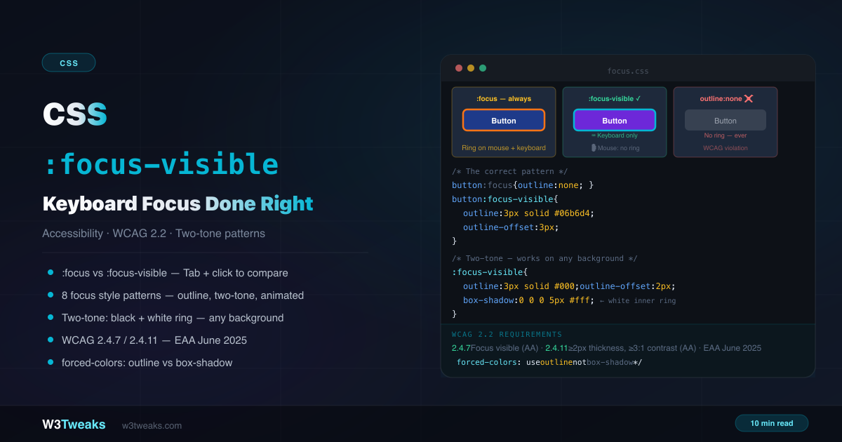
Live Demo
Three tabs: ① compare :focus (always shows), :focus-visible (keyboard only), and outline:none (broken) — Tab then click to feel the difference, ② eight visual focus patterns including the two-tone indicator demonstrated on varied backgrounds, ③ real patterns — skip link, CSS reset gotcha, progressive enhancement fallback, WCAG reference table, and forced-colors High Contrast Mode.
CSS :focus vs :focus-visible vs :focus-within
Three pseudo-classes, three different behaviors:
/* :focus — fires whenever element gains focus */
/* from keyboard Tab, mouse click, or programmatic .focus() */
button:focus { outline: 3px solid blue; }

/* :focus-visible — fires only when browser decides indicator is needed */
/* keyboard Tab → shows; mouse click → hidden (on non-inputs) */
button:focus-visible { outline: 3px solid blue; }

/* :focus-within — fires on the PARENT when any descendant is focused */
.form-group:focus-within { border-color: blue; }
When :focus-visible shows vs hides
The browser uses a built-in heuristic:
Shows focus ring when:
- User pressed Tab, arrow keys, or any keyboard shortcut to reach the element
- The element is a text input (
<input>,<textarea>) — text inputs always show the cursor, so focus is always visible - The element was focused programmatically (
.focus()) AND the user was recently using keyboard navigation
Hides focus ring when:
- User clicked with a mouse or tapped on a touch screen (on non-input elements)
- A script called
.focus()after a mouse interaction (in most browsers)
/* Inputs: :focus-visible always fires (you need to know where you're typing) */
input:focus-visible { outline: 3px solid blue; } /* always shows on inputs */

/* Buttons: :focus-visible only fires on keyboard */
button:focus-visible { outline: 3px solid blue; } /* Tab = shows, click = hidden */
Cross-browser heuristic differences
The “browser decides” rule isn’t identical across vendors. Real differences worth knowing:
| Interaction | Chrome | Firefox | Safari |
|---|---|---|---|
<button> clicked with mouse | hidden | hidden | hidden |
<a> clicked with mouse | hidden | hidden | hidden |
<input type="text"> clicked | shown | shown | shown (always shows on inputs) |
Programmatic .focus() after click | hidden | hidden | hidden |
Programmatic .focus() after Tab | shown | shown | shown |
<button> activated with Enter/Space | shown | shown | shown |
The takeaway: design assuming the ring may appear, never rely on it not appearing for styling. If a clean, ring-free look on click is critical, only use outline: none on :focus:not(:focus-visible) (the safe fallback pattern below).
css :focus vs :focus-visible — The Three Patterns Ranked
Pattern 1 — Correct: Use :focus-visible
/* Remove :focus ring, add it back on :focus-visible */
:focus         { outline: none; }
:focus-visible {
  outline: 3px solid #06b6d4;
  outline-offset: 3px;
}
Mouse users see no ring on click. Keyboard users see a clear ring on Tab.
Pattern 2 — Safe Fallback: :focus:not(:focus-visible)
For older browsers that don’t support :focus-visible, this progressive enhancement pattern ensures keyboard users always get a ring:
/* Step 1: Apply focus style broadly (works in every browser) */
:focus {
  outline: 3px solid #06b6d4;
  outline-offset: 3px;
}

/* Step 2: Remove for mouse — only in browsers that understand :focus-visible */
:focus:not(:focus-visible) {
  outline: none;
}
Old browsers that don’t know :focus-visible ignore the second rule — they still show the ring for all focus. Modern browsers apply both, showing it for keyboard, hiding it for mouse.
Pattern 3 — Wrong: outline:none with no replacement
/* ❌ NEVER — breaks keyboard navigation completely */
*:focus { outline: none; }
button:focus { outline: 0; }
.nav a:focus { outline: none; }
Removing the focus indicator without a replacement violates WCAG 2.4.7 Focus Visible — a Level AA requirement. In the European Union, the European Accessibility Act (effective June 28, 2025) mandates this as a legal requirement for commercial products and services.
css outline-offset — The Underused Property
outline-offset adds space between the element’s border and the focus ring. It dramatically improves the visual quality of focus indicators:
/* Without offset — ring hugs the element edge */
:focus-visible { outline: 3px solid blue; }

/* With offset — ring has breathing room */
:focus-visible {
  outline: 3px solid blue;
  outline-offset: 3px;
}

/* Negative offset — ring appears inside the element */
:focus-visible {
  outline: 3px solid blue;
  outline-offset: -4px;
}
A 2–4px positive offset generally looks best for most UI elements. For elements with border-radius, the outline follows the same curve automatically. Push the ring off rounded corners without breaking contrast.
8 Visual Focus Patterns
1. Standard outline (recommended baseline)
:focus-visible {
  outline: 3px solid #06b6d4;
  outline-offset: 3px;
}
A minimal :focus-visible example before the rest. Clean, widely supported, respects High Contrast Mode. The safe default for every project.
2. Outline with glow
:focus-visible {
  outline: 2px solid #7c3aed;
  outline-offset: 4px;
  box-shadow: 0 0 0 8px rgba(124, 58, 237, 0.55);
}
The outline handles accessibility compliance; the box-shadow adds a soft ambient glow.
3. Box-shadow ring (use with caution)
:focus-visible {
  outline: none;
  box-shadow: 0 0 0 3px #06b6d4, 0 0 0 5px rgba(6, 182, 212, 0.2);
}
Visually smooth but box-shadow is invisible in Windows High Contrast Mode. Always add a transparent outline alongside:
:focus-visible {
  outline: 3px solid transparent; /* invisible but respected by forced-colors */
  outline-offset: 3px;
  box-shadow: 0 0 0 3px #06b6d4;
}
4. css two-tone focus — works on any background
The most robust focus indicator: a dark ring with a light inner buffer (or vice versa). At least one of the two colors always contrasts with any background:
:focus-visible {
  outline: 3px solid #000000;    /* dark outer ring */
  outline-offset: 2px;
  box-shadow: 0 0 0 5px #ffffff; /* white inner buffer */
}
This is the pattern recommended by WCAG guidance for elements that appear on unpredictable backgrounds (images, gradients, user-generated content). The black ring contrasts with light backgrounds; the white buffer contrasts with dark backgrounds.
For dark UIs, invert the colors:
:focus-visible {
  outline: 3px solid #ffffff;
  outline-offset: 2px;
  box-shadow: 0 0 0 5px #000000;
}
5. Inset shadow
:focus-visible {
  outline: none;
  box-shadow: inset 0 0 0 3px #06b6d4;
}
Focus ring drawn inside the element — good for input fields and card surfaces where an external ring would overlap adjacent elements.
6. Styled underline (links)
a:focus-visible {
  outline: none;
  text-decoration-color: #06b6d4;
  text-decoration-thickness: 3px;
  text-underline-offset: 3px;
}
Natural for inline links. More visible than the default underline without adding a geometric ring around the text.
7. Background change
.nav-item:focus-visible {
  outline: none;
  background: rgba(6, 182, 212, 0.15);
  color: #06b6d4;
}
Suitable for navigation items and menus where an outline would look out of place. Must be clearly distinct from the hover state.
8. Animated offset
:focus-visible {
  outline: 3px solid #06b6d4;
  outline-offset: 0;
  transition: outline-offset 0.15s ease;
}

:focus-visible:focus {
  outline-offset: 3px;
}

@media (prefers-reduced-motion: reduce) {
  :focus-visible { transition: none; }
}
The ring appears to “lift” from the element. Always wrap in prefers-reduced-motion.
WCAG 2.4.7 Focus Visible and 2.4.11 Focus Appearance
A keyboard focus indicator that passes WCAG 2.4.11 must meet specific size and contrast requirements.
WCAG 2.4.7 Focus Visible — Level AA (mandatory since WCAG 2.0)
Keyboard focus must be visible. Any custom focus indicator (or lack of one) that makes focus invisible is a violation.
WCAG 2.4.11 Focus Appearance — Level AA, NEW in WCAG 2.2
When a focus indicator is visible, it must:
- Have a minimum area of at least the perimeter of a 2px thick ring around the component
- Have a contrast ratio of at least 3:1 between the focused and unfocused states
- Not be hidden by author-created content
/* Meets WCAG 2.4.11 */
:focus-visible {
  outline: 3px solid #005fcc; /* 3px ≥ 2px minimum */
  outline-offset: 2px;
  /* #005fcc on white = 4.7:1 ≥ 3:1 required */
}
WCAG 2.4.13 Focus Appearance — Level AAA
Enhanced requirements: even larger minimum area and higher contrast. The two-tone pattern (black + white) exceeds AAA requirements on any background.
WCAG 1.4.11 Non-text Contrast — Level AA
All user interface component states (including focused) must have at least 3:1 contrast between the component boundary and adjacent colors.
WCAG 2.2 was published October 5, 2023, and 2.4.11 is the first time the spec sets concrete thickness/contrast numbers for focus appearance. The EU European Accessibility Act enforces WCAG 2.1 Level AA as the minimum from June 28, 2025; many member-state implementations are upgrading toward 2.2’s stricter 2.4.11.
css forced-colors active — Windows High Contrast Mode
Windows High Contrast Mode replaces all custom colors with a limited system color palette. Inside @media (forced-colors: active), swap custom colors for CanvasText and Highlight. Most CSS colors are overridden — box-shadow is invisible. outline is respected.
/* Standard focus */
:focus-visible {
  outline: 3px solid #06b6d4;
  outline-offset: 3px;
}

/* High Contrast Mode override — explicit for clarity */
@media (forced-colors: active) {
  :focus-visible {
    outline: 3px solid CanvasText; /* system-defined text color */
    outline-offset: 3px;
    /* box-shadow is invisible here — never rely on it alone */
  }
}
CSS system color keywords for forced-colors:
| Keyword | Meaning |
|---|---|
CanvasText | Default text color |
Canvas | Background color |
ButtonFace | Button background |
ButtonText | Button text |
Highlight | Selected/active background |
HighlightText | Selected/active text |
LinkText | Link color |
Use these in forced-colors contexts to respect the user’s accessibility settings. Test in Chromium DevTools: Rendering panel → Emulate CSS media feature forced-colors → active.
Focus + Scroll: The Sticky Header Trap
The most-shipped a11y bug of 2026. A user Tabs to a link, the browser scrolls it into view — and the sticky header sits directly on top of it. The focus ring is technically there, but invisible. One line of CSS fixes it for the entire site:
html {
  scroll-padding-top: 5rem; /* matches your sticky header height */
}
scroll-padding-top tells the browser to reserve that space when scrolling any element into view — including Tab navigation, anchor jumps, and skip-link targets. Pair with scroll-margin-top on individual elements that need extra clearance:
:target,
.has-anchor {
  scroll-margin-top: 5rem;
}

/* For full-bleed cards under a sticky header */
.card { scroll-margin-block: 1rem; }
Browser-driven focus scrolling respects both properties, so this single rule cleans up Tab navigation, #anchor jumps, route changes, and any element.scrollIntoView() calls — without JavaScript.
:focus-within — Style the Parent
:focus-within fires on a parent element when any descendant has focus. A practical :focus-within example: highlight the whole form group as the user tabs through it.
.form-group {
  border: 2px solid #e2e8f0;
  border-radius: 8px;
  padding: 12px;
  transition: border-color 0.2s, background 0.2s;
}

.form-group:focus-within {
  border-color: #06b6d4;
  background: rgba(6, 182, 212, 0.03);
}

.form-group:focus-within label {
  color: #06b6d4;
}
The individual input still needs its own :focus-visible style — :focus-within only styles the parent.
css :has focus-visible — The Modern Keyboard-Only Parent Highlight
:focus-within fires for both mouse and keyboard focus on descendants. If you only want the parent highlighted for keyboard-style focus, use :has(:focus-visible) — Baseline since late 2023:
/* :focus-within fires for mouse + keyboard */
.card:focus-within {
  box-shadow: 0 0 0 3px var(--focus);
}

/* :has(:focus-visible) fires only for keyboard */
.card:has(:focus-visible) {
  box-shadow: 0 0 0 3px var(--focus);
}
This is the correct pattern for cards or rows where you want a hover-vs-focus disambiguation: mouse clicks don’t highlight the card, but Tab navigation does.
Modern Focus Trapping: inert and <dialog>
The 2026 answer to “how do I trap focus inside my modal.” Forget manual keydown listeners — the native primitives are Baseline now.
<dialog> with showModal() — automatic focus trap
<dialog id="confirm-delete">
  <h2>Delete this item?</h2>
  <form method="dialog">
    <button>Cancel</button>
    <button value="confirm">Delete</button>
  </form>
</dialog>
const dlg = document.getElementById('confirm-delete');
dlg.showModal(); // auto-traps focus inside the dialog<dialog> with showModal() automatically traps Tab navigation inside the dialog, makes everything outside inert, gives ESC-to-close, and lets Enter on a form button close with that button’s value. It’s the spec answer for modals. Plain dlg.show() (non-modal) does NOT trap focus.
The inert attribute — for custom modal layers
When <dialog> isn’t an option, use the inert attribute on the background:
<div id="page-content" inert>
  <!-- All focusable elements here are removed from Tab order -->
  <!-- Screen readers skip the entire subtree -->
</div>

<div class="modal" role="dialog" aria-modal="true">
  <button>Focusable</button>
</div>
inert is one attribute that does what custom focus traps did in 20 lines: removes the subtree from the tab order, the accessibility tree, and pointer events. No JavaScript focus loop required. For legacy support, focus-trap (vanilla) and react-focus-lock (React) remain the fallback libraries.
tabindex Focus Management and Programmatic Focus
<!-- Naturally focusable — Tab navigates to it automatically -->
<button>Click me</button>
<a href="/page">Navigate</a>
<input type="text">

<!-- tabindex="0" — added to Tab order at natural position -->
<div tabindex="0" role="button">Custom button</div>

<!-- tabindex="-1" — focusable by JavaScript .focus() but not Tab -->
<div tabindex="-1" id="modal-dialog" role="dialog">Modal</div>
The Programmatic Focus Pattern (SPA Route Changes)
The load-bearing pattern for SPA route changes, skip-link targets, error summaries, and modal openers:
<main id="main" tabindex="-1">
  <!-- Page content -->
</main>
// After route change in React Router / Vue Router / Astro view transition
document.getElementById('main').focus({ preventScroll: true });tabindex="-1" makes <main> programmatically focusable without inserting it into the Tab sequence. Because focus arrives via script (not keyboard), :focus-visible does NOT fire — which is usually what you want for a route change (no flashing ring on every navigation). The preventScroll: true option keeps the existing scroll position; without it the browser scrolls to the focused element.
/* Style custom elements with tabindex="0" */
[tabindex="0"]:focus-visible {
  outline: 3px solid #06b6d4;
  outline-offset: 3px;
}

/* tabindex="-1" focused programmatically — hide the ring */
[tabindex="-1"]:focus { outline: none; }
Theming Native Form Focus with accent-color
accent-color (Baseline 2023) tints native form control fills and their matching focus indicators without overriding the whole control:
:root {
  accent-color: #6c63ff;
}
This affects <input type="checkbox">, <input type="radio">, <input type="range">, and <progress>. Chromium and Firefox ship a matching focus ring color too. Safari support is partial (control tint yes, focus ring color no by mid-2026), so accent-color complements, not replaces, an explicit :focus-visible ring on the control’s wrapper:
/* Tint the native control */
input[type="checkbox"] { accent-color: #6c63ff; }

/* Plus explicit focus ring for cross-browser consistency */
input[type="checkbox"]:focus-visible {
  outline: 2px solid #6c63ff;
  outline-offset: 2px;
}
Why Tap on Mobile Doesn’t Show a Focus Ring
Touch taps and mouse clicks do NOT trigger :focus-visible — by design. Touch users don’t expect a persistent focus ring after a tap; they’re not navigating with a keyboard, they don’t need an indicator that says “this is where you’ll Enter next.” The heuristic correctly suppresses it.
What DOES trigger :focus-visible on mobile:
- Bluetooth keyboard connected to a phone/tablet — Tab navigation fires
:focus-visiblenormally - Screen reader virtual focus (TalkBack on Android, VoiceOver on iOS) — fires
:focus-visiblebecause the user is keyboard-style navigating - Programmatic focus on text inputs — always shows (you need to see where you’ll type)
If you genuinely want to show a ring after tap, use :focus (always fires) instead of :focus-visible. But that’s rarely the right answer — it adds visual noise for mobile users who don’t need it.
The CSS Reset Gotcha
Some Bootstrap versions historically included outline: 0 declarations on focused states, and various legacy reset files inherited similar patterns. Always audit your reset file. Any rule that targets :focus with outline: none or outline: 0 needs a replacement.
/* ❌ Found in some Bootstrap versions + various legacy resets */
* { outline: none; }
*:focus { outline: none; }
How to find it: Search your CSS for outline: none and outline: 0. Any rule that targets :focus needs a replacement.
How to fix it: Add :focus-visible styles after the reset, or restore browser defaults:
/* Restore browser default outlines on :focus */
:focus { outline: revert; }

/* Then customize with :focus-visible */
:focus-visible {
  outline: 3px solid #06b6d4;
  outline-offset: 3px;
}
:focus:not(:focus-visible) { outline: none; }
Skip Links
Skip links allow keyboard users to jump past repetitive navigation directly to main content. They’re visually hidden until focused:
<body>
  <a href="#main-content" class="skip-link">Skip to main content</a>
  <nav><!-- navigation --></nav>
  <main id="main-content" tabindex="-1"><!-- content --></main>
</body>
.skip-link {
position: absolute;
top: -100%;
left: 8px;
background: #06b6d4;
color: #0b0f1a;
font-size: 14px;
font-weight: 700;
padding: 8px 16px;
border-radius: 0 0 8px 8px;
text-decoration: none;
z-index: 9999;
transition: top 0.15s ease;
}
/* Use :focus, not :focus-visible — skip links must work for ALL keyboard users */
.skip-link:focus {
top: 0;
}
/* Still add a visible focus ring */
.skip-link:focus-visible {
outline: 3px solid #000;
outline-offset: 2px;
}
@media (prefers-reduced-motion: reduce) {
.skip-link { transition: none; }
}Use
:focus(not:focus-visible) for the skip link position — it needs to become visible for any keyboard user, including those using screen readers that navigate differently from Tab.
Complete Production Focus System
/* ─────────────────────────────────────────────
   Production focus style system
   Meets WCAG 2.4.7 and 2.4.11 (Level AA)
────────────────────────────────────────────── */

/* 1. Smooth Tab navigation under sticky headers */
html { scroll-padding-top: 5rem; }

/* 2. Remove default :focus ring (we'll replace with :focus-visible) */
:focus { outline: none; }

/* 3. Safe fallback for browsers without :focus-visible */
:focus:not(:focus-visible) { outline: none; }

/* 4. Main focus style — outline respects forced-colors */
:focus-visible {
  outline: 3px solid var(--color-focus, #06b6d4);
  outline-offset: 3px;
}

/* 5. High Contrast Mode — explicit system colors */
@media (forced-colors: active) {
  :focus-visible {
    outline: 3px solid CanvasText;
  }
}

/* 6. Reduced motion respected */
@media (prefers-reduced-motion: no-preference) {
  :focus-visible {
    transition: outline-offset 0.1s ease;
  }
}

/* 7. Native form controls — accent-color + explicit ring */
:root { accent-color: var(--color-focus, #06b6d4); }
input:focus-visible,
textarea:focus-visible,
select:focus-visible {
  outline: 2px solid var(--color-focus, #06b6d4);
  outline-offset: 0;
}

/* 8. Links — underline-based focus */
a:focus-visible {
  outline: none;
  text-decoration-color: var(--color-focus, #06b6d4);
  text-decoration-thickness: 3px;
  text-underline-offset: 3px;
}

/* 9. Card / row keyboard highlight */
.card:has(:focus-visible) {
  box-shadow: 0 0 0 3px var(--color-focus, #06b6d4);
}
Browser Support
:focus-visible — Baseline since March 2022. Chrome 86+, Firefox 85+, Safari 15.4+, Edge 86+. 97%+ global coverage in mid-2026.
:focus-within — Chrome 60+, Firefox 52+, Safari 10.1+, Edge 79+.
:has(:focus-visible) — Baseline since December 2023. Chrome 105+, Firefox 121+, Safari 15.4+.
forced-colors media query — Chrome 89+, Firefox 89+, Edge 79+, Safari 16+.
inert attribute — Baseline since March 2023. Chrome 102+, Firefox 112+, Safari 15.5+.
<dialog> element — Baseline since March 2022. All evergreens.
accent-color — Baseline 2023. Chrome 93+, Firefox 92+, Safari 15.4+ (partial focus-ring support).
scroll-padding-top / scroll-margin-top — Universal modern support.
outline-offset — Universal support.
css focus-visible polyfill for Legacy Browsers
Need IE 11 or Safari < 15.4 support? The WICG focus-visible polyfill adds a .js-focus-visible class to the body when active, plus a .focus-visible class on the focused element:
npm install focus-visibleimport 'focus-visible';/* Use the polyfilled class alongside the native pseudo */
.js-focus-visible :focus:not(.focus-visible) { outline: none; }
.js-focus-visible :focus.focus-visible { outline: 3px solid #06b6d4; }
/* Modern browsers use the native pseudo */
:focus-visible { outline: 3px solid #06b6d4; }By mid-2026 the polyfill is rarely needed — 97%+ coverage. Worth installing only if your audience analytics show notable legacy traffic.
Key Takeaways
:focus-visibleshows a ring for keyboard navigation (Tab), hides it for mouse click and touch tap — the correct balance between aesthetics and accessibility:focusfires for all focus;:focus-visibleonly when the browser decides an indicator is needed;:focus-withinfires on the parent for any descendant focus;:has(:focus-visible)is the modern keyboard-only parent highlight- The two-tone indicator (black outline + white inner buffer) is the most universally accessible — visible on any background color, gradient, or image
outlinerespects Windows High Contrast Mode;box-shadowdoes not — never rely onbox-shadowaloneoutline-offsetadds breathing room between the element and the ring — use 2–4px for most elements- The
:focus:not(:focus-visible)pattern provides safe progressive enhancement for older browsers html { scroll-padding-top: 5rem }fixes the sticky-header focus trap in one line — applies to Tab navigation, anchor jumps, skip links, andscrollIntoView()<dialog>.showModal()is the spec answer to focus traps — automatic Tab trap,inertbackground, ESC-to-close. For custom modals, theinertattribute removes a subtree from tab order + a11y tree in one attribute- Programmatic focus pattern:
<main tabindex="-1">+.focus({ preventScroll: true })for SPA route changes. Script focus ontabindex="-1"does NOT trigger:focus-visible(usually desired) accent-color(Baseline 2023) tints native checkbox/radio/range and their focus ring on Chromium/Firefox — Safari support is partial, so always add an explicit:focus-visiblering too- Mobile tap intentionally does NOT trigger
:focus-visible— touch users don’t expect a persistent ring. Bluetooth keyboard and screen-reader virtual focus DO trigger it - WCAG 2.4.11 Focus Appearance (Level AA in WCAG 2.2, October 2023): minimum 2px thick, 3:1 contrast ratio. EU European Accessibility Act enforces WCAG 2.1 AA from June 28, 2025
- CSS resets: audit for
outline: none/outline: 0on:focus— some Bootstrap versions and various legacy reset files have it - Skip links use
:focus(not:focus-visible) so they work for all keyboard and screen reader users - Always wrap focus animations in
@media (prefers-reduced-motion: reduce)to disable for motion-sensitive users
FAQ
What is :focus-visible in CSS?
:focus-visible is a CSS pseudo-class that applies styles when an element gains focus AND the browser determines that a visible focus indicator should be shown — typically for keyboard navigation (Tab key) but not for mouse clicks or touch taps. It’s the recommended way to show focus rings for accessibility while keeping the UI clean for mouse and touch users.
What is the difference between :focus and :focus-visible?
:focus fires whenever any element receives focus — from keyboard Tab, mouse click, touch tap, or programmatic .focus(). :focus-visible only fires when the browser’s heuristic determines that a visible indicator is needed — mainly for keyboard navigation, text inputs, and screen-reader virtual focus. Mouse clicking a button shows :focus but typically not :focus-visible.
Why should I never use outline:none on :focus?
Removing the focus outline without a replacement breaks keyboard navigation. For users who can’t use a mouse — people with motor disabilities, screen reader users, power users — the focus indicator is their cursor. Without it they can’t tell where they are on the page. This violates WCAG 2.4.7 (Level AA) and is a legal requirement under the EU’s European Accessibility Act (effective June 28, 2025).
What is the two-tone focus indicator?
The two-tone focus indicator uses a dark outline and a white inner buffer (or vice versa): outline: 3px solid #000; outline-offset: 2px; box-shadow: 0 0 0 5px #fff. At least one of the two colors always contrasts with any background color, image, or gradient behind the element — making it universally accessible without needing to know the background.
Why does box-shadow not work for focus in High Contrast Mode?
Windows High Contrast Mode (activated via Windows accessibility settings) replaces all custom CSS colors with a limited system color palette. box-shadow properties are completely removed in this mode. CSS outline is respected and stays visible. Always use outline as your primary focus indicator, and add an explicit @media (forced-colors: active) rule using system color keywords like CanvasText.
What is :focus-within?
:focus-within applies to a parent element when any descendant has focus. It’s used for form group highlighting — styling the entire group container when one of its inputs is focused. It differs from :focus-visible: :focus-visible styles the focused element itself; :focus-within styles an ancestor of the focused element.
Why doesn’t tap show a focus ring on mobile?
By design. Touch taps and mouse clicks intentionally do NOT trigger :focus-visible — touch users don’t expect a persistent focus ring after a tap, since they’re not keyboard-navigating. The heuristic correctly suppresses it. What DOES trigger :focus-visible on mobile: a Bluetooth keyboard connected to the phone, screen-reader virtual focus (TalkBack, VoiceOver), and programmatic focus on text inputs. If you genuinely want a ring after tap, use :focus (always fires) — but that’s rarely the right answer for mobile.
Should I use :focus-within or :has(:focus-visible)?
Use :focus-within when you want the parent highlighted on any descendant focus (mouse, keyboard, touch). Use :has(:focus-visible) when you only want the parent highlighted on keyboard-style focus — perfect for cards and rows where you want a hover-vs-focus disambiguation. :has(:focus-visible) is Baseline since late 2023, so it’s safe to use in production.
How do I move focus after a route change in React or Vue?
Use the tabindex="-1" + .focus() programmatic pattern: add tabindex="-1" to <main> (or your main content container), then call document.getElementById('main').focus({ preventScroll: true }) after the route change completes. tabindex="-1" makes the element programmatically focusable without adding it to the Tab order. Because focus arrives via script, :focus-visible does NOT fire — no flashing ring on every navigation. preventScroll: true keeps the existing scroll position.