TL;DR
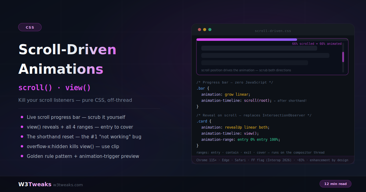
Swap a keyframe animation’s clock for a scroll position — no listeners, no observers, no library, runs on the compositor thread:
/* Reveal on scroll — six lines replacing IntersectionObserver */
.card {
  opacity: 1;                          /* GOLDEN RULE: default = finished state */
}
@supports (animation-timeline: view()) {
  @media (prefers-reduced-motion: no-preference) {
    .card {
      animation: revealUp linear both;
      animation-timeline: view();
      animation-range: entry 0% entry 100%;
    }
  }
}
@keyframes revealUp {
  from { opacity: 0; transform: translateY(28px); }
  to   { opacity: 1; transform: translateY(0); }
}
Two timeline types: scroll() tracks a container’s scroll progress (progress bars, parallax); view() tracks an element’s own visibility (reveals — the IntersectionObserver replacement). animation-range picks a segment of the view timeline (entry / contain / exit / cover).
Watch out — five sharp edges:
- The shorthand reset —
animation:always resetsanimation-timelinetoauto. Declare the shorthand first, timeline after. overflow-x: hiddenkillsview()— it silently establishes a scroll container. Useoverflow-x: clipinstead.- The invisible-forever bug — never default to
opacity: 0. Author the finished state; layer the animation inside@supports. - Only
transformandopacitystay on the compositor — animatingwidth/top/marginon a scroll timeline recreates jank in pure CSS. prefers-reduced-motionisn’t optional — parallax and multi-speed movement trigger vestibular disorders.
Direct SEO win: unlike scroll-listener JS, SDA doesn’t degrade Google’s INP Core Web Vital — it’s a compositor-thread animation, so busy JavaScript can’t make it jank.
Support: Chrome/Edge 115+, Safari shipped, Firefox stable behind flag (Interop 2026 priority) — ~83% global. Ship as progressive enhancement with @supports (animation-timeline: view()).
→ Try it in the live demo — scroll a real container and watch the progress bar + spinning badge scrub, see four cards reveal via view() in a scrollable box, and read through the five gotchas + animation-trigger preview. Deep dive below for @property-driven scroll animations, horizontal carousels via scroll(self inline), view-timeline-inset, and the INP ranking benefit.
Be honest: how many times have you wired up a scroll listener, an IntersectionObserver, or a whole animation library just to fade in a card as it scrolls into view? That entire category of JavaScript is now one CSS declaration:
.card {
  animation: revealUp linear both;
  animation-timeline: view();
  animation-range: entry 0% entry 100%;
}

@keyframes revealUp {
  from { opacity: 0; transform: translateY(28px); }
  to   { opacity: 1; transform: translateY(0); }
}
No listeners, no thresholds, no cleanup — and it runs on the compositor thread, so busy JavaScript can’t make it jank and it never touches your INP score.
This guide covers the full API: scroll progress timelines (scroll()), view progress timelines (view()), all four animation-range values, named timelines, staggering — and, crucially, the five gotchas behind virtually every “scroll animation not working” bug report, from the shorthand reset to the overflow-x: hidden trap. Scroll-driven animations combine beautifully with scroll-snap for section-based experiences and with custom properties via @property for animating values.
Live Demo
Three tabs with real scrollable containers: ① a scroll progress bar and spinning badge scrubbed by the container's scroll position — zero JavaScript, ② view() reveal cards animating through their entry range plus a cover-range color-shift card and the four-ranges diagram, ③ the five gotchas — shorthand reset, overflow-x:hidden trap, the invisible-forever bug with the golden-rule fix, compositor property rules, reduced-motion guards, and the animation-trigger preview. In browsers without support (Firefox stable), everything degrades to visible static content — demonstrating the progressive-enhancement pattern itself.
The Mental Shift: @keyframes Never Meant “Time”
The insight that unlocks this API: keyframe percentages don’t inherently refer to time. 0% to 100% just means progress — and animation-timeline swaps the progress source:
/* Default: progress = elapsed time */
.el { animation: spin 2s linear; }

/* Scroll-driven: progress = scroll position */
.el {
  animation: spin linear;
  animation-timeline: scroll();
}
With a scroll timeline, animation-duration is ignored — scroll position entirely determines where in the animation the browser renders. Scroll halfway, the animation is at 50%. Scroll back, it scrubs backwards. Easing, delays, and fill modes all still apply.
Two timeline types exist:
- Scroll progress timelines —
scroll()— track how far a scroll container has scrolled (0% = top, 100% = bottom) - View progress timelines —
view()— track an element’s visibility as it enters, crosses, and exits a scrollport
Scroll Progress Timelines — scroll()
The classic use case: a reading progress bar.
/* Anonymous form — nearest ancestor scroller */
.progress-bar {
  position: fixed;
  top: 0; left: 0; right: 0;
  height: 4px;
  background: linear-gradient(90deg, #d946ef, #8b5cf6);
  transform-origin: left;

  animation: growBar linear;
  animation-timeline: scroll(root); /* the page's scroll */
}

@keyframes growBar {
  from { transform: scaleX(0); }
  to   { transform: scaleX(1); }
}
scroll() takes two optional arguments — which scroller, and which axis:
animation-timeline: scroll();              /* nearest scroller, block axis */
animation-timeline: scroll(root);          /* the document viewport */
animation-timeline: scroll(self);          /* the element's own scroll */
animation-timeline: scroll(nearest inline);/* nearest scroller, x-axis */
Horizontal Carousels — scroll(self inline)
Explicit axis selection unlocks horizontal-scroll patterns without a single scroll listener — image galleries, timeline scrollers, kanban-style boards, story carousels. The pattern Shopify and BigCommerce product-page carousels are moving toward:
.carousel {
  overflow-x: auto;
  display: flex;
  gap: 16px;
  scroll-snap-type: x mandatory;
  scroll-timeline: --carousel inline;   /* name the timeline, x-axis */
}

.carousel-progress {
  position: sticky;
  top: 8px;
  height: 3px;
  background: color-mix(in oklch, currentColor 20%, transparent);

  animation: fill linear;
  animation-timeline: --carousel;
}
@keyframes fill { from { transform: scaleX(0) } to { transform: scaleX(1) } }
The progress bar scrubs left-to-right as the user swipes horizontally through the carousel. Combined with scroll-snap-type: x mandatory, you get “n of 8” style progress indicators for free — no scroll event listener, no scrollLeft math, no cleanup on unmount.
Named timelines
When the animated element isn’t a descendant of the scroller — or you want explicitness — name the timeline:
/* On the scroll container */
.scroller { scroll-timeline: --gallery-timeline; }

/* On any element that should follow it */
.indicator {
  animation: slideAlong linear;
  animation-timeline: --gallery-timeline;
}
For elements in different DOM branches, hoist the name with timeline-scope on a shared ancestor:
body { timeline-scope: --gallery-timeline; }
/* Now a sidebar element can follow the main column's scroll */
View Progress Timelines — view()
The IntersectionObserver killer. A view timeline tracks one element’s journey through the scrollport:
.card {
  animation: revealUp linear both;
  animation-timeline: view();
}
By default the animation spans the element’s entire visible journey — 0% as its first pixel enters, 100% as its last pixel leaves. That full journey is rarely what you want for a reveal, which is where ranges come in.
animation-range — The Four Named Ranges
animation-range maps the animation onto a segment of the view timeline:
| Range | Covers |
|---|---|
entry | The element crossing the start edge (entering) |
contain | The element fully visible inside the scrollport |
exit | The element crossing the end edge (leaving) |
cover | The entire visible journey (default) |
/* Reveal: animate ONLY while entering */
.card {
  animation: revealUp linear both;
  animation-timeline: view();
  animation-range: entry 0% entry 100%;
}

/* Rotate only while fully visible */
.spinner {
  animation: rotate linear both;
  animation-timeline: view();
  animation-range: contain 0% contain 100%;
}

/* Color-shift across the whole journey */
.hue-card {
  animation: hueShift linear both;
  animation-timeline: view();
  animation-range: cover 0% cover 100%;
}

/* Mix ranges for precise control */
.hero-text {
  animation: fadeSlide linear both;
  animation-timeline: view();
  animation-range-start: contain 0%;
  animation-range-end: exit 50%;
}
The longhand animation-range-start / animation-range-end pair reads more clearly than the shorthand once you’re mixing range names — use whichever your team parses faster.
view-timeline-inset — Trigger Earlier or Later
The named ranges are calibrated against the scrollport edges by default. view-timeline-inset shrinks or grows the effective scrollport for the purposes of view() — positive values fire the animation earlier (before the element hits the real edge), negative values fire it later:
.card {
  animation-timeline: view();
  view-timeline-inset: 20% 0;   /* start range 20% before top edge, end at bottom edge normal */
  animation-range: entry 0% entry 100%;
}
The two values are <top> <bottom> (or <start> <end> in logical properties). Perfect for above-the-fold hero animations that should play “as if the element were already scrolled slightly into view” — a common design brief that used to require IntersectionObserver rootMargin tuning. Design tools like Figma and Framer expose this concept as a “trigger offset” slider in their scroll-effect panels; view-timeline-inset is the CSS primitive underneath.
Staggering without JavaScript
Two techniques cascade a group of cards:
/* Technique 1: negative delay shifts each start point */
.card:nth-child(2) { animation-delay: -0.1s; }
.card:nth-child(3) { animation-delay: -0.2s; }

/* Technique 2: offset the range per child */
.card:nth-child(2) { animation-range: entry 10% entry 110%; }
.card:nth-child(3) { animation-range: entry 20% entry 120%; }
Animating Custom Properties on Scroll — @property
Regular CSS custom properties (--x: 10deg) can’t be interpolated by animations — the browser doesn’t know what type they are. Register them with @property and they become animatable, unlocking scroll-driven color-mix, gradient stops, calc chains, and hue shifts:
/* 1. Register the property so the browser knows its type */
@property --hue {
  syntax: '<angle>';
  initial-value: 0deg;
  inherits: false;
}

/* 2. Animate it via scroll */
@supports (animation-timeline: scroll()) {
  .hero {
    animation: rainbowShift linear;
    animation-timeline: scroll(root);
    background: linear-gradient(45deg,
      oklch(70% 0.2 var(--hue)),
      oklch(70% 0.2 calc(var(--hue) + 120deg))
    );
  }
}
@keyframes rainbowShift {
  from { --hue: 0deg; }
  to   { --hue: 360deg; }
}
Without @property, --hue would jump between keyframes instead of interpolating. With registration, the browser knows it’s a <angle> and smoothly scrubs from 0° through 360° driven by scroll position. The pattern generalizes to any value type — <length> for parallax distances, <percentage> for gradient stops, <color> for hero backgrounds, <number> for opacity ramps that feed multiple properties via calc().
This is the primitive behind the fancy scroll-driven color shifts you see on landing pages from Vercel, Netlify, Linear, and Framer — no JS scroll observer, no requestAnimationFrame loop, just a registered custom property and a keyframe.
Gotcha 1: The Shorthand Reset (The #1 Bug)
animation-timeline is a reset-only member of the animation shorthand: the shorthand always resets it to auto (the time-based timeline) and can never set it. Declaration order is therefore load-bearing:
/* ❌ Shorthand AFTER timeline — timeline silently reset to auto */
.el {
  animation-timeline: view();
  animation: reveal linear; /* ← killed it */
}

/* ✅ Shorthand FIRST, timeline after */
.el {
  animation: reveal linear;
  animation-timeline: view();
}
This is the classic “works in my minimal test, breaks in the real codebase” bug — a later rule (or a mixin, or a framework reset) declaring the animation shorthand wipes the timeline. When a scroll animation mysteriously plays as a normal instant animation or not at all, check for a shorthand declared after the timeline first.
Gotcha 2: overflow-x: hidden Kills view()
The decades-old trick for hiding horizontal overflow breaks view timelines:
/* ❌ Turns body into a scroll container — view() now measures the wrong thing */
html, body { overflow-x: hidden; }

/* ✅ clip cuts overflow WITHOUT creating a scroll container */
html, body { overflow-x: clip; }
overflow: hidden establishes a scroll container (scrollable by script, just without scrollbars); overflow: clip genuinely clips with no scrolling machinery. If view() animations fire at bizarre positions or never at all, audit your page for this legacy line.
Gotcha 3: The Invisible-Forever Bug + The Golden Rule
The most-shipped scroll-animation bug on the web: authoring the hidden state as the default.
/* ❌ In Firefox (no support), cards are opacity: 0 forever */
.card { opacity: 0; }
.card {
  animation: fadeIn linear both;
  animation-timeline: view();
}
The golden rule: author the finished state as your default, then layer the animation on where supported:
/* Default: fully visible. No support = it just shows. */
.card { opacity: 1; }

@supports (animation-timeline: view()) {
  @media (prefers-reduced-motion: no-preference) {
    .card {
      animation: fadeIn linear both;
      animation-timeline: view();
      animation-range: entry 0% entry 100%;
    }
  }
}
Nested this way, the worst case in any browser or preference combination is graceful — visible content with no motion — never a blank page. Note animation-fill-mode: both in the mix: without it, elements snap back to their un-animated state outside the range.
Gotcha 4: Only transform and opacity Are Free
The off-main-thread superpower has a condition: it applies to compositor properties only.
/* ✅ Compositor thread — smooth under any main-thread load */
transform, opacity

/* ⚠️ Main thread — layout/paint per scroll frame = self-inflicted jank */
width, height, top, left, margin, padding, box-shadow, border-radius
Animate width on a scroll timeline and you’ve rebuilt scroll-listener jank in pure CSS. The fixes are the standard ones: fake size changes with transform: scale(), movement with translate(), and reveals with opacity + clip-path where supported.
Gotcha 5: prefers-reduced-motion Is Not Optional
Parallax and multi-speed movement are documented triggers for vestibular disorders. Gate motion:
@media (prefers-reduced-motion: no-preference) {
  .parallax-layer {
    animation: parallaxShift linear;
    animation-timeline: scroll(root);
  }
}
The nuance worth knowing: reduced motion ≠ no animation. A scroll-driven color transition or a plain opacity fade is generally fine to keep for reduced-motion users — it’s translation, scaling, rotation, and parallax depth that trigger symptoms. Offer a calmer version rather than nothing.
Parallax in Six Lines
@media (prefers-reduced-motion: no-preference) {
  .hero-bg {
    animation: parallax linear;
    animation-timeline: scroll(root);
  }
}

@keyframes parallax {
  from { transform: translateY(0); }
  to   { transform: translateY(-30%); }
}
The background moves slower than the scroll — classic parallax, no library, compositor-smooth. Layer several elements with different translation distances for depth. This is the six-line replacement for what Rive, LottieFiles, and Theatre.js used to be the go-to for on marketing sites — for pure parallax and reveal work, native CSS now wins on bundle size, INP, and hydration.
The Direct SEO Benefit — INP and Core Web Vitals
Google’s Interaction to Next Paint (INP) is a Core Web Vital as of March 2024 and a confirmed ranking signal. Scroll-listener JavaScript is one of the most common ways to degrade it: every scroll event handler runs on the main thread, delaying the paint that follows the user’s next interaction. GSAP’s ScrollTrigger, Framer Motion’s useScroll, and the classic IntersectionObserver-with-callback pattern all pay this cost.
Scroll-driven animations pay zero. They run on the compositor thread — the same thread that handles scrolling — so no main-thread work happens per frame, and INP is completely unaffected. On a landing page that previously used a scroll library for reveals + parallax + a progress bar, migrating to SDA can drop INP by 30–80ms in the field, directly measurable in Google Search Console’s Core Web Vitals report and in synthetic monitoring from SpeedCurve, DebugBear, Calibre, and Vercel Speed Insights.
Production observability tools — Datadog RUM, Sentry Performance, LogRocket, and FullStory — surface INP regressions attributable to scroll handlers in their per-interaction attribution views. Migrating those handlers to SDA shows up as a green improvement in the same dashboards. This is one of the rare CSS features with a direct measurable search-ranking benefit.
What’s Next: animation-trigger (Scroll-Triggered, Not Scrubbed)
Scrubbing is wrong for one common case: “play this entrance once, on its own clock, when the element shows up.” That’s a triggered animation, not a scrubbed one — and it’s exactly what animation-trigger (Chrome 145+) delivers:
.card {
  animation: pop 0.5s ease-out;
  animation-trigger: view() play-forwards;
}
A real timed animation, fired by visibility — the final IntersectionObserver use case, falling. It’s Chrome/Edge-only as of mid-2026; treat it as enhancement with your existing observer fallback, and watch this space.
Where Scroll-Driven Animations Fit in Your Stack
The library ecosystem isn’t going away — but the split is clarifying. Where native SDA wins: reveals (view() replaces IntersectionObserver-based patterns from Framer Motion, Motion One, and GSAP ScrollTrigger on the “fade in on scroll” case), progress bars, parallax up to depth-of-3, color and gradient scrubbing, horizontal carousel indicators, hue shifts on landing pages.
Where GSAP ScrollTrigger and Motion still win: complex pinning (element stays fixed while scroll drives siblings), timeline sequencing across multiple triggers, DOM mutations tied to scroll milestones, physics-based scroll interactions, and reverse-timeline logic that CSS can’t yet express. The GSAP Business license is still the right call for those cases — CSS SDA is not a wholesale replacement, it’s a huge coverage win on the 80% of scroll work that used to force a JS library dependency.
Component libraries like Aceternity UI, Radix Themes, shadcn/ui, and Chakra are shifting scroll-reveal primitives to native SDA where possible. Landing-page builders — Webflow, Framer, Wix Studio, Squarespace, Elementor — increasingly compile their scroll-effect UI down to native animation-timeline output rather than injecting scroll-listener runtime bundles. Design tools Figma, Framer, Rive, and Jitter all preview scroll effects visually; when the design becomes code, native CSS is now often the correct target.
For CMS-driven landing pages — Sanity, Contentful, Storyblok, Prismic, Ghost — SDA is a hydration-free enhancement: pure CSS in the shipped stylesheet, no client JS bundle to hydrate, no flicker between server-render and interactive. Vercel, Netlify, and Cloudflare Pages deploy the same CSS on every request; there’s no runtime dependency to invalidate or split. And in Chromatic or Percy visual regression, each scroll state captures deterministically because the animation progress is a function of scroll position, not wall-clock time.
Browser Support
As of mid-2026: Chrome/Edge 115+ and Safari have shipped scroll-driven animations. Firefox stable still keeps them behind the layout.css.scroll-driven-animations.enabled flag (enabled by default in Nightly, and a named Interop 2026 priority — Mozilla clearly intends to ship). Global support sits around 83% — close to Baseline, not quite there.
And that’s fine, because this feature is progressive enhancement by design: browsers without support ignore animation-timeline entirely and render your (correct, visible) default state. With the golden-rule pattern, there is no failure mode — only browsers with polish and browsers without. Ship it today.
@supports (animation-timeline: view()) {
  /* all scroll-driven styles */
}
You can inspect a running scroll-driven animation in Chrome DevTools → Elements → the Animations panel shows the active animation-timeline and lets you scrub it manually to test end states. StackBlitz and CodeSandbox both preview SDA correctly in their Chromium runners if you want to prototype in a scratch project.
Key Takeaways
animation-timelineswaps an animation’s progress source from the clock to a scroll position — keyframes, easing, and fill modes all work unchanged; duration is ignoredscroll()tracks a container’s scroll progress (progress bars, page-wide effects);view()tracks an element’s own visibility (reveals, per-element effects — the IntersectionObserver replacement)animation-rangemaps the animation onto a timeline segment:entry(entering),contain(fully visible),exit(leaving),cover(whole journey)view-timeline-insetshrinks or grows the effective scrollport forview()— positive fires earlier, negative fires later; the CSS primitive under Figma/Framer’s “trigger offset” slider- Horizontal carousels use
scroll-timeline: --name inlineon the scroller — the pattern replacing scroll-listener progress indicators on product-page carousels - Named timelines (
scroll-timeline: --name) plustimeline-scopeconnect scrollers to elements in different DOM branches @property+ SDA unlocks animating custom properties on scroll — the primitive behind scroll-driven color-mix, gradient stops, and hue shifts on modern landing pages- The shorthand reset:
animationalways resetsanimation-timelinetoauto— declare the shorthand first, the timeline after, every time overflow-x: hiddenon html/body breaksview()— useoverflow-x: clipinstead- The golden rule: default = finished visible state; animations layered inside
@supports+prefers-reduced-motion: no-preference— the worst case is graceful, never broken - Only
transformandopacitystay on the compositor — animating layout properties on a scroll timeline recreates jank in pure CSS - Stagger with negative
animation-delayor per-child range offsets — no JavaScript - Direct SEO benefit: SDA runs on the compositor and doesn’t degrade Google’s INP Core Web Vital — migrating scroll-listener JS to SDA can drop field INP by 30–80ms, measurable in Search Console
- Support: Chrome/Edge 115+, Safari shipped, Firefox behind a flag (Interop 2026) — ~83%, ship as enhancement today;
animation-trigger(Chrome 145+) brings play-once scroll-triggered animations next
FAQ
What are CSS scroll-driven animations?
Scroll-driven animations let CSS keyframe animations progress based on scroll position instead of elapsed time. Setting animation-timeline: scroll() ties an animation to how far a container has scrolled; animation-timeline: view() ties it to an element’s own visibility in the scrollport. They replace scroll event listeners, IntersectionObserver reveal patterns, and parallax libraries — with zero JavaScript, running off the main thread on the compositor.
How do I make an element animate when it scrolls into view with CSS?
Give it a keyframe animation, a view timeline, and an entry range: animation: revealUp linear both; animation-timeline: view(); animation-range: entry 0% entry 100%;. The element animates exactly while entering the scrollport. Critically, author the visible finished state as the default and wrap the animation in @supports (animation-timeline: view()) so unsupported browsers show content instead of a permanently hidden element.
Why is my animation-timeline not working?
The top cause is the shorthand reset: animation-timeline is a reset-only member of the animation shorthand, so any animation: declaration after the timeline resets it to auto. Declare the shorthand first, then the timeline. Other causes: the browser doesn’t support it (Firefox stable requires a flag as of mid-2026), nothing is actually scrolling, or overflow-x: hidden on html/body has hijacked the scroll container that view() measures — replace it with overflow-x: clip.
What is animation-range in CSS?
animation-range maps a scroll-driven animation onto a segment of its timeline. For view timelines, four named ranges exist: entry (element crossing into the scrollport), contain (fully visible), exit (crossing out), and cover (the entire visible journey — the default). Ranges accept percentages and can be mixed: animation-range: entry 25% cover 50%, or via the animation-range-start/animation-range-end longhands.
How do I animate a custom property on scroll?
Register the property with @property { syntax: '<angle>'; initial-value: 0deg; inherits: false; }, then include it in your keyframes and attach a scroll timeline. The @property registration tells the browser the value’s type, which unlocks interpolation — without it, custom properties jump between keyframes instead of scrubbing smoothly. This is the primitive behind scroll-driven color-mix, gradient-stop animation, and hue shifts on landing pages, all without a scroll listener.
Do scroll-driven animations improve Core Web Vitals?
Yes — directly. Scroll-listener JavaScript degrades Google’s Interaction to Next Paint (INP) because every scroll handler runs on the main thread. Scroll-driven animations run on the compositor thread (the same thread as scrolling), so they add zero main-thread work per frame and never degrade INP. Migrating scroll-based reveals, parallax, or progress bars from JavaScript to native SDA typically drops field INP by 30–80ms — a directly measurable improvement in Google Search Console’s Core Web Vitals report.
Are CSS scroll animations better for performance than JavaScript?
Significantly — when animating transform and opacity, scroll-driven animations run on the compositor thread, the same thread that handles scrolling, so they stay smooth even when the main thread is busy and never degrade INP the way scroll listeners do. The caveat: animating layout properties (width, top, margin) forces main-thread work per scroll frame, recreating jank in pure CSS — stick to compositor properties.
Can I build a horizontal carousel with scroll-driven animations?
Yes — use scroll-timeline: --name inline on the horizontally-scrolling container to name a timeline for its x-axis, then attach a progress indicator elsewhere with animation-timeline: --name. Combined with scroll-snap-type: x mandatory, you get “n of 8” style progress indicators for free — no scroll event listener, no scrollLeft math, no cleanup on unmount. This is the pattern replacing scroll-listener carousel indicators on modern product-page templates.
Should I use scroll-driven animations or GSAP ScrollTrigger?
Depends on the case. Native SDA wins on: reveals, progress bars, parallax up to depth-of-3, color/gradient scrubbing, horizontal carousel indicators — anything that maps cleanly to a @keyframes animation scrubbed by scroll. GSAP ScrollTrigger still wins on: complex pinning (element stays fixed while scroll drives siblings), timeline sequencing across multiple triggers, DOM mutations tied to scroll milestones, physics-based scroll interactions, and reverse-timeline logic CSS can’t express. Use both — SDA for the 80% of cases that used to force GSAP as a dependency, GSAP for the specialised remainder.
What browsers support CSS scroll-driven animations?
As of mid-2026: Chrome and Edge 115+, and Safari have shipped support. Firefox stable keeps the feature behind the layout.css.scroll-driven-animations.enabled flag (on by default in Nightly; a named Interop 2026 priority), putting global support around 83%. Because unsupported browsers simply ignore animation-timeline and show the default state, the feature is safe to ship today as progressive enhancement gated by @supports (animation-timeline: view()).