TL;DR
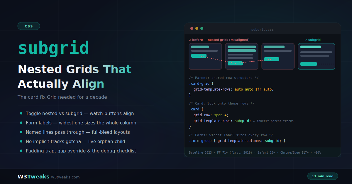
Subgrid is a value for grid-template-columns and grid-template-rows — the nested grid adopts its parent’s track sizing instead of defining its own. That fixes the card-alignment problem CSS never had a real answer to: the tallest title anywhere in the row sizes the shared title track for every card, buttons snap to one baseline, no fixed heights or JavaScript.
.card-grid  { display: grid; grid-template-rows: auto auto 1fr auto; }
.card       { display: grid; grid-row: span 4; grid-template-rows: subgrid; }
Watch out for four sharp edges: a subgridded axis has no implicit tracks (an extra child piles into the last one), padding/border on the subgrid is subtracted from its edge tracks and misaligns them, gap inherits but browsers disagreed early on (set it explicitly), and “subgrid does nothing” almost always means span 1 — a subgrid only has as many tracks as it spans.
→ Try it in the live demo — toggle the card fix, watch the widest label size the entire form column, add an orphan child and see it get crammed, and slide the gap without breaking alignment.
You know this bug. Three cards in a row — title, description, button. One title wraps to two lines, one description runs long, and now your buttons sit at three different heights like a badly stacked shelf. For a decade the fixes were all bad: hardcode a min-height and pray, or ship a JavaScript library that measures every card and forces them equal.
The root cause: a nested grid inside one card doesn’t know about the nested grid inside another. Each computes its own rows independently. Subgrid ends this — a grid item can adopt its parent’s track sizing:
.card-grid {
  display: grid;
  grid-template-columns: repeat(3, 1fr);
  grid-template-rows: auto auto 1fr auto; /* title · meta · body · button */
  gap: 14px;
}

.card {
  display: grid;
  grid-row: span 4;              /* span the four parent rows */
  grid-template-rows: subgrid;   /* inherit their sizing */
}
Now the tallest title in the row sizes the shared title track for every card; every button lands in the same row. No measurements, no JavaScript, no fixed heights. This is why every serious design-system team — the Figma library curators, the Storybook maintainers, Chromatic reviewers, Radix UI and shadcn/ui component authors — treats subgrid as the default primitive for card grids today.
This guide covers the card fix in depth, form label alignment, the pricing-table pattern SaaS teams actually ship, pairing subgrid with container queries, named-line pass-through for full-bleed layouts, Tailwind and CSS Modules integration, DevTools debugging across Chrome/Firefox/Safari, the CSS Grid Level 3 masonry follow-on, and the gotchas that generate the “subgrid does nothing” questions — no implicit tracks, the padding trap, and gap inheritance. It builds directly on CSS Grid fundamentals and pairs with container queries for components that both align and adapt.
Live Demo
Three tabs: ① the card fix — toggle between nested grids (jagged buttons) and subgrid (perfect shared rows) with three variable-length cards, ② a live form where the widest label sizes the entire label column via column subgrid, plus a full-bleed article layout with named lines passing through, ③ the gotchas — a live no-implicit-tracks demo (add an orphan child and watch it get crammed), the padding trap, a gap-override slider proving track lines stay put, the 'subgrid does nothing' checklist, and the flexbox fallback pattern.
What Subgrid Actually Is
subgrid is a value for grid-template-columns and/or grid-template-rows — not a display type. Instead of defining its own track listing, the nested grid uses the parent’s tracks for that axis:
.parent {
  display: grid;
  grid-template-columns: repeat(9, 1fr);
  grid-template-rows: repeat(4, minmax(100px, auto));
}

.item {
  display: grid;             /* still needs to BE a grid */
  grid-column: 2 / 7;        /* spans 5 parent columns */
  grid-row: 2 / 4;           /* spans 2 parent rows */
  grid-template-columns: subgrid;  /* → 5 columns, parent-sized */
  grid-template-rows: subgrid;     /* → 2 rows, parent-sized */
}
The subgrid has exactly as many tracks as it spans — five columns here because it spans five. Its children can now be placed on those tracks, aligning perfectly with the outer grid even though they’re not direct children of it.
The crucial difference from a nested grid: it’s a two-way relationship. Subgrid items participate in sizing the parent’s tracks — the widest content anywhere in the shared track sizes it for everyone. A nested grid is a sealed box; a subgrid is a window.
Per-axis freedom
Subgrid applies per axis — lock one, keep the other independent:
/* Columns locked to parent, rows free (implicit) */
.widget {
  display: grid;
  grid-template-columns: subgrid;
  grid-auto-rows: min-content;  /* invent rows as needed */
}
The Card Fix — Step by Step
The pattern that sells the feature:
Step 1 — the parent defines rows for the cards’ internals:
.card-grid {
  display: grid;
  grid-template-columns: repeat(3, 1fr);
  grid-template-rows: auto auto 1fr auto;
  gap: 14px;
}
Four row tracks per card row: title (auto), meta (auto), body (1fr — stretches), button (auto).
Step 2 — each card spans those rows and subgrids onto them:
.card {
  display: grid;
  grid-row: span 4;
  grid-template-rows: subgrid;
}
Step 3 — there is no step 3. The card’s four children fall into the four inherited tracks. The tallest title sizes the title row for all cards; 1fr bodies absorb the leftover; buttons share one baseline. Content of any length, alignment guaranteed. This is the pattern behind virtually every polished card grid on Shopify storefronts, headless-commerce sites built with Next.js Commerce or Hydrogen, and the product-listing components shipping in Bootstrap 5.3+ and shadcn/ui.
With more cards than one row, each row of cards gets its own set of four tracks — repeat the row pattern in the parent (grid-template-rows: repeat(auto-fill, auto auto 1fr auto) won’t work directly; in practice you either know the row count or let modern grid-template-rows: masonry-adjacent patterns handle it — for typical listing pages, defining rows per visible row or using a fixed row group per media query is the working approach).
The Pricing Table Pattern
The card fix’s most valuable real-world application is the SaaS pricing table — the layout every Stripe billing page, Chargebee/Paddle/Recurly checkout, and product marketing site needs to get right. Three or four tiers, each with a variable-length feature list, and every row must align across tiers or the comparison reads as broken.
.pricing {
  display: grid;
  grid-template-columns: repeat(4, 1fr);
  /* One row per pricing-table element, in order: */
  grid-template-rows:
    auto      /* plan name */
    auto      /* price */
    auto      /* billing period */
    auto      /* CTA button */
    repeat(12, auto); /* up to 12 feature rows */
  gap: 0;
}

.tier {
  display: grid;
  grid-row: 1 / -1;            /* span every row */
  grid-template-rows: subgrid;
  border-left: 1px solid #e5e7eb;
}

.tier .feature { padding: 12px 16px; }
.tier .feature.missing { color: #9ca3af; }
Every feature row lines up horizontally across all four tiers — “Priority support” in Free lines up with “Priority support” in Enterprise, even when the Free tier shows a strikethrough and the Enterprise tier shows a checkmark plus sub-text. Before subgrid this required either a giant table element (bad for responsive) or a JavaScript row-equalizer running on every resize. The CTA row lands at the same baseline across tiers regardless of price-string length (“$0” vs “$149/month billed annually”).
For dynamic feature counts driven by a CMS — Sanity, Contentful, Storyblok, Prismic — cap the maximum in the template (repeat(12, auto)) and pad shorter tiers with an empty div per missing row; the alignment holds automatically and marketing can add features without a code deploy.
Forms — The Widest Label Wins
Each field group is its own component with its own markup, yet every label shares one column:
.form {
  display: grid;
  grid-template-columns: max-content 1fr;
  gap: 0.75rem 1rem;
}

.form-group {
  display: grid;
  grid-column: 1 / -1;
  grid-template-columns: subgrid;
}

.form-group label { grid-column: 1; text-align: right; }
.form-group input,
.form-group select { grid-column: 2; }
Without subgrid, each .form-group computes max-content for its own label independently — labels of different widths, ragged alignment. With subgrid, the first column is sized by the widest label in the entire form. Add a field with a longer label and every row re-aligns automatically. No fixed widths to babysit, and it survives localization into German — the reason it’s now the default form layout in most enterprise design systems catalogued on Zeroheight and Supernova.
Subgrid + Container Queries — The Layout Combo Nobody Documents
Subgrid solves cross-sibling alignment. Container queries solve component-level responsiveness. Combine them and you get the modern component: a card that both aligns perfectly with its siblings and rearranges its own internals based on its rendered width — not the viewport’s.
.card-grid {
  display: grid;
  grid-template-columns: repeat(auto-fit, minmax(240px, 1fr));
  grid-template-rows: auto auto 1fr auto;
  gap: 16px;
}

.card {
  display: grid;
  grid-row: span 4;
  grid-template-rows: subgrid;
  container-type: inline-size;   /* each card is its own container */
}

/* When a card renders wider than 400px, promote to a two-column internal layout */
@container (min-width: 400px) {
  .card {
    grid-template-columns: 120px 1fr;
    grid-template-rows: subgrid; /* still subgridded on rows */
  }
  .card .fc-title { grid-column: 2; }
  .card .fc-body  { grid-column: 2; }
  .card .fc-thumb { grid-row: 1 / -1; grid-column: 1; }
}
The card stays row-aligned with siblings via subgrid, and independently switches to a wide-format thumbnail layout when its container gives it room. This is the pattern real design systems have converged on: it works identically inside a narrow sidebar, a wide main column, or a two-column dashboard — no viewport breakpoints required. Storybook stories written against this pattern render correctly at every resize because the container query fires off the card’s actual width, not the viewport.
Named Lines Pass Through — Full-Bleed Layouts
Parent line names are available inside every subgrid — which unlocks the classic full-bleed article pattern with zero width math:
.article {
  display: grid;
  grid-template-columns:
    [full-start] 1fr
    [content-start] minmax(0, 3fr) [content-end]
    1fr [full-end];
}

.section {
  display: grid;
  grid-column: full;
  grid-template-columns: subgrid;
}

.section p      { grid-column: content; } /* names inherited! */
.section figure { grid-column: full; }    /* breaks out */
Body text sits in the content column; the occasional figure spans full width — every element in every section snapped to the same shared lines. Sections stay semantic components; the parent owns the geometry. (Subgrids can also declare their own additional line names without a track listing: grid-template-columns: subgrid [a] [b] [c];.)
Subgrid in Real Frameworks
Nobody hand-writes CSS Grid in a big codebase anymore — the utilities, CSS-in-JS libraries, and framework abstractions all have first-class subgrid support today.
Tailwind CSS (3.4+): grid-cols-subgrid and grid-rows-subgrid utilities map directly to the CSS values, with col-span-*/row-span-* for the spans. The Tailwind card fix is a two-class change:
<div class="grid grid-cols-3 grid-rows-[auto_auto_1fr_auto] gap-4">
  <article class="grid row-span-4 grid-rows-subgrid">
    <h3>...</h3><p>...</p><p>...</p><button>...</button>
  </article>
</div>
CSS Modules compose the pattern with composes, so a .card class that composes from a shared .subgrid-card inherits the subgrid rules — one authoritative definition per design token.
styled-components / Emotion / Vanilla Extract / PandaCSS: all pass grid-template-rows: subgrid through as a regular declaration; the only footgun is when a runtime library serializes the value and lowercases it (rare, but check your CSS-in-JS version if subgrid mysteriously stops working — some very old runtimes stripped it as unrecognized).
Astro, Next.js, SvelteKit, Remix: the frameworks themselves are irrelevant — subgrid is regular CSS. What matters is that server-rendered HTML matches client HTML, and static hosts like Vercel, Netlify, and Cloudflare Pages all serve modern CSS unchanged, so Baseline 2023 support means production-safe today.
Debugging Subgrid in DevTools — All Three Browsers
Every browser’s DevTools now visualizes subgrid, but their strengths differ.
Firefox — still the best-in-class grid inspector. Elements panel → Layout tab → check the grid overlay for the parent, and Firefox draws every explicit and implicit track line, labels every line number, shows track sizes in the tooltip, and specifically visualizes subgrids with a nested indicator. If subgrid alignment is broken, open it here first — 30 seconds versus 10 minutes of guessing.
Chrome DevTools — Elements panel → Layout tab (bottom half of Elements) → toggle “Show grid overlay” for the parent and each subgrid; each gets a colored badge next to its selector in the DOM tree. Chrome’s overlay is cleaner-looking than Firefox’s but its named-line labels are smaller and it doesn’t explicitly badge subgrids as “subgrid” — you have to notice they’re inheriting.
Safari Web Inspector — Elements → Layout panel → grid overlay works but track-size annotations were added later than the other two; use it to spot-check, but reach for Firefox for tricky diagnosis. Safari Technology Preview usually has the freshest inspector features.
Cross-browser test tooling: for the “does this render identically” pass across Firefox/Chrome/Safari + WebKit-on-Windows, BrowserStack, LambdaTest, and Sauce Labs all run the ~90% supported subgrid path against their real-device grids without flags. Percy and Chromatic (part of Storybook) do visual-regression snapshots so a subgrid change that shifts a single card baseline gets caught in the PR, not in production.
Gotcha 1: No Implicit Tracks
The one that costs everyone a confused half hour. A normal grid invents implicit tracks when children overflow the explicit ones. A subgridded axis doesn’t — it has exactly the spanned tracks, full stop:
.card {
  grid-row: span 3;
  grid-template-rows: subgrid; /* exactly 3 tracks */
}
/* Add a 4th child → it has nowhere to go.
   It gets crammed into the LAST track. Quiet breakage. */
Your content count must match your spanned track count. If a component needs a free-growing axis, don’t subgrid that axis — subgrid the columns and use grid-auto-rows for the rows (or update the span when the content model changes).
Gotcha 2: Padding Eats Your Tracks
Margins, borders, and padding on the subgrid container are subtracted from its edge tracks — shifting them out of alignment with the parent’s tracks, which defeats the entire point:
/* ❌ Edge tracks shrink by 16px — misaligned with siblings */
.card {
  grid-template-rows: subgrid;
  padding: 16px;
}

/* ✅ Keep the subgrid spacing-free; pad the items */
.card > * { padding-inline: 16px; }
.card > *:first-child { padding-top: 16px; }
.card > *:last-child { padding-bottom: 16px; }
If cards need borders (they usually do), remember the border width also comes out of the edge tracks — consistent borders across all cards keep the relative alignment intact, which is why the card pattern still works; just don’t mix bordered and borderless subgrids in one row and expect pixel alignment.
Gotcha 3 (Sort Of): Gap Is Inherited, Overridable
Subgrids inherit the parent’s gap by default, and you can override it:
.parent { gap: 2rem; }

.sub {
  grid-template-columns: subgrid;
  gap: 0.5rem; /* spacing INSIDE the subgrid */
}
The subtle part: overriding gap doesn’t move the inherited track lines — the smaller gap is carved out of the tracks themselves, so cross-grid alignment is preserved. Practical tip from cross-browser testing: set gap on subgrids explicitly rather than relying on inheritance — legacy inconsistencies existed in how browsers resolved inherited gaps.
The “Subgrid Does Nothing” Checklist
When subgrid appears to have zero effect, it’s almost always one of five things:
- Is the parent
display: grid? Subgrid only works when the element is a grid item of an actual grid. - Is the subgrid element itself
display: grid?subgridis a value, not a display type — withoutdisplay: grid,grid-template-rows: subgridis ignored. - Does it span enough tracks? A subgrid has only the tracks it spans —
span 1inherits one track and looks like nothing happened. Setgrid-row: span 4orgrid-column: 1 / -1. This is the most common miss. - Is subgrid on the right axis? Card internal alignment needs rows subgridded; form label columns need columns.
- Debug in Firefox DevTools first (see the DevTools section above) — its subgrid visualization is the fastest diagnosis path.
Fallback Pattern
At ~90% support you may not need one, but the graceful version costs three lines:
/* Base: flex column — works everywhere */
.card { display: flex; flex-direction: column; }
.card .btn { margin-top: auto; } /* button to the bottom */

@supports (grid-template-rows: subgrid) {
  .card {
    display: grid;
    grid-row: span 4;
    grid-template-rows: subgrid;
  }
}Flex-with-margin-top: auto pins buttons to card bottoms everywhere (just not cross-card row-aligned); subgrid perfects it where supported. Keep subgrid nesting to two levels or fewer — deeper chains hit cross-browser edge cases and are genuinely hard to reason about.
Subgrid vs the Alternatives
| Approach | Cross-sibling alignment | Verdict |
|---|---|---|
| Nested grid | ❌ Independent tracks | Use when the child needs its own structure |
display: contents | ⚠️ Children join parent grid, but the wrapper’s box (border, background, padding) disappears | Use for pure structural flattening only |
| Fixed heights / min-height | ⚠️ Breaks with real content, font scaling, localization | Legacy — retire it |
| JavaScript equalizers | ⚠️ Layout thrash, resize listeners | Legacy — retire it |
| Subgrid | ✅ Shared tracks, two-way sizing | The purpose-built tool |
display: contents deserves the comparison because it also gets grandchildren onto the outer grid — but it erases the wrapper’s visual box entirely. Cards need their border and background; subgrid keeps the box and shares the tracks.
Looking Ahead — CSS Grid Level 3 (Masonry)
Subgrid is CSS Grid Level 2. Level 3 introduces masonry — the Pinterest-style layout where items pack tightly with variable heights and no gaps, which the current auto-fill/auto-fit machinery can’t produce. The spec is actively contested: Chrome has proposed a decoupled item-flow: masonry property that’s independent of the grid display value, while Firefox and Safari have implemented a grid-template-rows: masonry value that lives inside Grid. As of this writing, Firefox ships the Grid-integrated syntax behind a flag, Safari 17.4+ ships it unflagged, and Chrome supports the newer item-flow behind flags.
The good news for this article: masonry and subgrid compose cleanly. A subgridded card inside a masonry container inherits alignment on the row axis while the container packs tightly. Whichever syntax wins, subgrid’s contract doesn’t change — you’re safe to ship subgrid patterns today knowing the masonry future adds capability rather than replacing anything.
Browser Support
Subgrid is Baseline 2023: Firefox 71+ (shipped first, December 2019), Safari 16+ (September 2022), Chrome and Edge 117+ (September 2023) — roughly 90% global support today. The @supports (grid-template-rows: subgrid) fallback above covers the remainder, and Firefox’s DevTools remain the best place to debug any grid, subgrids included.
Key Takeaways
- Subgrid lets a grid item adopt its parent’s track sizing —
grid-template-rows: subgridand/orgrid-template-columns: subgrid— creating shared tracks across nesting levels - It’s a two-way relationship: subgrid children participate in sizing the parent’s tracks, so the tallest content anywhere in a shared track sizes it for all siblings — the mechanism behind the card fix
- The card pattern: parent declares
grid-template-rows: auto auto 1fr auto; each card setsgrid-row: span 4; grid-template-rows: subgrid— titles, bodies, and buttons align across all cards regardless of content length - Pricing tables: one parent grid with a row per element (name, price, CTA, up to N features), each tier spans
1 / -1and subgrids rows — every feature aligns horizontally across all tiers without JavaScript, safe for CMS-driven feature counts - Forms:
grid-template-columns: max-content 1fron the parent + column subgrid per field group — the widest label in the entire form sizes every label column - Subgrid + container queries is the modern component: subgrid keeps siblings aligned while
container-type: inline-sizeon each card lets it rearrange its own internals based on rendered width — no viewport breakpoints - Named lines pass through to subgrids, enabling full-bleed article layouts where every section places children by the parent’s
content/fullline names - Frameworks are covered: Tailwind ships
grid-cols-subgrid/grid-rows-subgridsince 3.4; CSS Modules compose it viacomposes; styled-components, Emotion, Vanilla Extract, and PandaCSS pass the value through unchanged - DevTools rank: Firefox’s grid inspector is best-in-class for subgrid diagnosis; Chrome DevTools works but doesn’t badge subgrids explicitly; Safari has the overlay but reach for Firefox for tricky cases. BrowserStack/LambdaTest/Sauce Labs cover the ~10% no-support tail
- No implicit tracks on a subgridded axis — extra children get crammed into the last track; content count must match spanned tracks
- Padding, margins, and borders on the subgrid are subtracted from its edge tracks — pad the items, not the subgrid container
- Gap inherits and can be overridden without moving track lines — but set it explicitly for cross-browser consistency
- The debug checklist: parent is a grid, subgrid element has
display: grid, it spans enough tracks, it’s the right axis, and Firefox DevTools for diagnosis - Baseline 2023 — Firefox 71+, Safari 16+, Chrome/Edge 117+, ~90% global; a three-line flex fallback covers the rest; CSS Grid Level 3 masonry composes cleanly with subgrid whichever syntax wins
FAQ
What is CSS subgrid?
Subgrid is a value for grid-template-columns and grid-template-rows that makes a nested grid adopt its parent grid’s track sizing instead of defining its own. The subgrid’s children then align to the parent’s grid lines, and they participate in sizing the parent’s tracks — solving the long-standing problem of aligning content across sibling components like cards, which independent nested grids cannot do.
How do I align card content with CSS subgrid?
Define the internal row structure on the parent grid — grid-template-rows: auto auto 1fr auto for title, meta, body, and button — then make each card span those rows and inherit them: grid-row: span 4; grid-template-rows: subgrid. The tallest title in the row sizes the shared title track, 1fr bodies stretch to fill, and every button lands in the same final row regardless of content length.
Why is my CSS subgrid not working?
Check five things: the parent must be display: grid; the subgrid element itself needs display: grid (subgrid is a value, not a display type); it must span enough tracks (grid-row: span 4 or grid-column: 1 / -1 — a one-track span looks like nothing happened); subgrid must be on the correct axis (rows for card alignment, columns for forms); and remember a subgridded axis creates no implicit tracks, so extra children pile into the last track.
What is the difference between subgrid and nested grid?
A nested grid defines completely independent tracks — its layout has no relationship to the parent’s, so content in sibling nested grids can’t align. A subgrid shares the parent’s tracks for the chosen axis: items align to the parent’s lines, named lines pass through, and the subgrid’s content participates in sizing the shared tracks. Use a nested grid when the child needs independent structure; use subgrid when alignment with the outer grid matters.
Does subgrid inherit gap from the parent grid?
Yes — gap is inherited by default, and it can be overridden on the subgrid with its own gap value. Overriding changes the spacing inside the subgrid without moving the inherited track lines, so alignment with the parent grid is preserved. For maximum cross-browser consistency, set gap on subgrids explicitly rather than relying on inheritance.
What browsers support CSS subgrid?
Subgrid is Baseline 2023: Firefox 71+ (first to ship, December 2019), Safari 16+, and Chrome/Edge 117+ (September 2023) — around 90% global support today. For the remainder, a flexbox fallback (display: flex; flex-direction: column with margin-top: auto on the button) wrapped under @supports (grid-template-rows: subgrid) degrades gracefully.
How do I build a pricing table with subgrid?
Define one parent grid with a column per tier and a row per element in order — plan name, price, billing period, CTA button, then a row per feature (or repeat(N, auto) capped at the maximum you’ll allow). Each tier is a subgridded child spanning every row: grid-row: 1 / -1; grid-template-rows: subgrid. Every element lines up horizontally across all tiers, price-string length can’t shift the CTA baseline, and CMS-driven feature lists stay aligned as long as you pad shorter tiers with empty divs up to the row cap.
Can I use subgrid with container queries?
Yes, and it’s the modern component pattern. Give each card container-type: inline-size so it becomes its own containment context, keep grid-row: span 4; grid-template-rows: subgrid for cross-card alignment, and add @container (min-width: 400px) rules that switch the card’s internal layout when it renders wider. The card stays row-aligned with siblings via subgrid while independently switching internal layout based on its actual width — no viewport breakpoints, works identically in narrow sidebars and wide main columns.
Does Tailwind CSS support subgrid?
Yes since Tailwind CSS 3.4 — grid-cols-subgrid and grid-rows-subgrid utilities map directly to grid-template-columns: subgrid and grid-template-rows: subgrid, and you compose them with col-span-*/row-span-* for the span the subgrid needs. The card fix in Tailwind is a two-class change: the parent uses grid grid-cols-3 grid-rows-[auto_auto_1fr_auto] and each card uses grid row-span-4 grid-rows-subgrid.