TL;DR
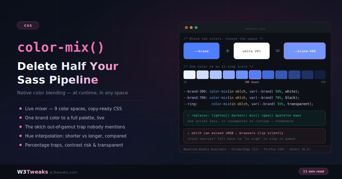
color-mix() blends two colors natively at runtime — one function, any two <color> values, any of nine color spaces. It replaces the Sass functions half your projects still ship for: lighten(), darken(), mix(), rgba(), and the whole $palette map plus @each loop. And unlike Sass, it recomputes in the browser — change one --brand custom property and eleven derived tokens regenerate, which is why Tailwind CSS 4.0, Radix Colors, Open Props, and Material Design 3 all lean on it under the hood.
:root { --brand: #4f7fff; }

.btn         { background: var(--brand); }
.btn:hover   { background: color-mix(in oklch, var(--brand), black 14%); }
.btn:focus   { outline: 3px solid color-mix(in oklch, var(--brand) 55%, transparent); }
.btn-ghost   { background: color-mix(in oklch, var(--brand) 12%, var(--surface)); }
Watch out for four things that quietly ruin real deployments: the silent oklch gamut clip (vivid sources mix to colors your display can’t render, browser maps them inward with no warning), hue interpolation with rectangular spaces is a syntax error that drops the whole declaration, percentages summing under 100% turn the shortfall into transparency (not more color), and runtime palettes carry runtime contrast risk — a user-picked brand color can push derived text below WCAG 4.5:1 with nothing to flag it in review.
→ Try it in the live demo — a five-space comparison strip, an 11-step palette that regenerates from one color picker, and side-by-side gamut/hue gotchas.
Ok so here’s a thing I finally admitted to myself last month: probably half of what my projects still had Sass for was color math. lighten() for hover. darken() for the pressed state. rgba() because you needed a translucent border, and God forbid you tried to feed it a var() — that never worked, ever, and we all wrote workarounds for it for like six years.
Every project had a $palette map somewhere. And an @each loop that emitted 11 scale variables from it. All of it — every single tint, every hover, every focus ring — computed once at build time and then frozen into the CSS file. If someone downstream wanted to change the brand color at runtime? Tough. Recompile. Ship a new build.
color-mix() fixes that whole story in one line:
:root {
  --brand: #4f7fff;
  --brand-hover: color-mix(in oklch, var(--brand), black 14%);
  --brand-soft:  color-mix(in oklch, var(--brand) 12%, var(--surface));
  --brand-ring:  color-mix(in oklch, var(--brand) 55%, transparent);
}
Change --brand and everything downstream regenerates in the browser. Doesn’t matter where the change comes from — a theme switcher, a user setting, per-tenant white-label config coming from a database. Sass freezes. color-mix stays alive.
And this isn’t a “cool but nobody uses it” thing either. Tailwind 4 uses color-mix() internally now — that’s why bg-blue-500/50 doesn’t need a pre-computed alpha color anymore, they yanked out the whole alpha-map generation from v3. Radix Colors ships their 12-step scales assuming you’ll blend on top of them. Open Props does the same, Adam Argyle basically won’t shut up about it (correctly, he’s right). Material Design 3’s HCT color system integrates directly. If you’re still writing lighten($c, 20%) in 2026, honestly, you’re behind.
Anyway. This guide covers the syntax (which is short) and picking a color space (which matters a lot more than most tutorials will tell you), generating a whole palette from one token, dark mode with light-dark(), the design-system integration story, and — this is the part I wish somebody had written for me two years ago — all the sharp edges. The silent oklch gamut clip almost nobody mentions. Polar-only hue interpolation and how it silently drops your declarations. Percentages that turn into transparency when you weren’t expecting them to. The runtime contrast risk that only bites you when a user picks yellow as their brand color.
Pairs naturally with dark mode & prefers-color-scheme and cascade layers for organizing the whole system.
Live Demo
Three tabs: ① a live mixer — pick two colors, drag the ratio, switch between nine color spaces and four hue interpolation methods, with copy-ready CSS output and a five-space comparison strip showing how differently the same mix resolves, ② a palette engine — change one brand color and watch an 11-step scale, hover and active states, focus rings, soft surfaces and currentcolor fades all regenerate live, plus the Sass replacement table, ③ the gotchas — the oklch out-of-gamut trap shown side by side against srgb, shorter vs longer hue gradients, percentage rules, contrast risk, transparent handling, and the fallback pattern.
The Syntax
color-mix( in <color-space>, <color> <percentage?>, <color> <percentage?> )/* 80% brand, 20% white */
color-mix(in oklch, #4f7fff 80%, white)
/* Omit both percentages → 50/50 */
color-mix(in oklch, red, blue)
/* Give one → the other takes the remainder */
color-mix(in oklch, var(--brand) 30%, var(--surface))
/* Works with currentcolor and transparent */
color-mix(in oklch, currentcolor, transparent 45%)Any valid <color> works on either side. Hex, named colors, rgb(), oklch(), var() refs, currentcolor, transparent — all of it.
That last point is the big one. rgba(var(--brand), 0.5) has literally never worked in any browser, ever. It was one of those things everyone hit in year one of learning CSS custom properties and then you just wrote a helper for it and moved on. color-mix(in oklch, var(--brand) 50%, transparent) is the actual answer to that problem, only about eight years late. For most teams that reason alone is enough to make the migration worth it.
Choosing a Color Space (This Matters More Than You Think)
The in <space> part is not decoration and I ignored it for way too long when I started using this. Mix the same blue and white in five different color spaces and you get five visibly different results. Not “kinda different” — like, obviously different, you’d never confuse them. This is the single biggest lever on how your output looks.
| Space | Behavior | Use when |
|---|---|---|
oklch | Perceptually uniform, polar hue | Default for almost everything |
oklab | Perceptually uniform, rectangular | Uniformity without hue-wheel behavior (the gradient default) |
srgb | Legacy web blending | Sources are already vivid, or matching old blends |
hsl | Hue-wheel interpolation | You specifically want hue rotation |
lab / lch | CIELAB-based, perceptual | Print-adjacent or legacy color pipelines |
srgb-linear | Physically linear | Avoid for UI — midpoints come out unexpectedly dark |
display-p3 | Wide gamut | Targeting wide-gamut displays deliberately |
Reason oklch wins by default is its lightness channel actually maps to what your eye perceives as lightness. Sounds obvious. It’s not, and sRGB/HSL famously fail at it. Try it — a 50% blue in sRGB looks darker than a 50% green, so any scale built by stepping the lightness values comes out uneven-looking. In OKLCH they come out even because the math genuinely matches human vision.
This is why an oklch palette looks designed and an HSL palette looks computed. Sounds like the same thing but it isn’t.
Radix Colors is built entirely on this principle btw. Their 12-step scales are hand-tuned in OKLCH because even OKLCH’s own math doesn’t quite land where a human eye would pick — but it gets so much closer than anything else that starting there saves you 80% of the work.
Two traps to call out. srgb-linear — never use it for UI. Midpoints come out way darker than you’d expect, like the interpolation is happening in some physics simulator instead of a design tool. And the default space when you omit in ... from a gradient is oklab, but color-mix() doesn’t have a default — the space is required. So no accidental inheritance to worry about, at least.
Generating a Palette From One Token
The pattern that replaces a Sass $palette map plus its @each loop:
:root {
  --brand: #4f7fff;

  /* Tints — mix toward white */
  --brand-50:  color-mix(in oklch, var(--brand)  5%, white);
  --brand-100: color-mix(in oklch, var(--brand) 15%, white);
  --brand-200: color-mix(in oklch, var(--brand) 30%, white);
  --brand-300: color-mix(in oklch, var(--brand) 50%, white);
  --brand-400: color-mix(in oklch, var(--brand) 75%, white);

  --brand-500: var(--brand);

  /* Shades — mix toward black */
  --brand-600: color-mix(in oklch, var(--brand) 85%, black);
  --brand-700: color-mix(in oklch, var(--brand) 70%, black);
  --brand-800: color-mix(in oklch, var(--brand) 55%, black);
  --brand-900: color-mix(in oklch, var(--brand) 40%, black);
  --brand-950: color-mix(in oklch, var(--brand) 25%, black);
}
Eleven tokens. One source of truth. Zero build step. And it re-derives the second you change --brand.
For white-label products, per-user theming, CMS-configurable brand colors — this is a genuine architectural difference, not just “convenient”. Shopify Polaris merchants brand their storefront on the fly. Auth0 login pages pull the tenant’s brand color from an admin setting. Intercom and Zendesk widgets recolor per customer. HubSpot too I think. The whole SaaS white-label story is genuinely just easier to ship with color-mix than without it, and if you’ve ever tried to do the Sass version of this you know exactly the pain I’m talking about (running a per-tenant Sass build pipeline at deploy time and shipping N different CSS files — I did that once, would recommend nobody ever do it).
Layering pattern that’s aged best in production: keep the reference layer flat — raw values you control. Then let the semantic layer derive variants with color-mix(). Small token count, infinite state coverage.
Component state tokens
.btn {
  background: var(--brand);
}
.btn:hover  { background: color-mix(in oklch, var(--brand), black 14%); }
.btn:active { background: color-mix(in oklch, var(--brand), black 26%); }
.btn:focus-visible {
  outline: 3px solid color-mix(in oklch, var(--brand) 55%, transparent);
  outline-offset: 2px;
}

/* Soft tinted surface — brand at low opacity over the real surface */
.callout {
  background: color-mix(in oklch, var(--brand) 12%, var(--surface));
  border: 1px solid color-mix(in oklch, var(--brand) 35%, transparent);
}

/* Fade an icon to a lighter version of its inherited color */
.icon-muted {
  color: color-mix(in oklch, currentcolor, transparent 45%);
}
That currentcolor trick is one of those things you learn once and then use forever. One rule, and any icon fades relative to whatever color it inherited — doesn’t matter what context, no token plumbing needed. Wish I’d known about it years ago tbh.
Integration With The Design System Ecosystem
Basically every serious design system has picked a stance on this now. Here’s what actually shipped:
Tailwind CSS 4.0 — uses color-mix() internally for opacity utilities. So bg-blue-500/50 doesn’t compile to a pre-computed alpha color anymore, it compiles to color-mix(in oklch, var(--color-blue-500), transparent 50%). Runtime. That’s the whole reason they were able to yank the alpha-map generation out of v3 and stop bloating CSS files with every possible opacity variant of every color. Bootstrap 5.3+ moved its theming API to CSS custom properties for basically the same reason. UnoCSS and Bulma followed.
Radix Colors — 12-step scales per hue, light + dark, hand-tuned for consistent perceptual contrast at each step. Intentionally shipped as reference tokens — the assumption is you layer your semantic tokens on top with color-mix() for hover/pressed/soft/subtle states, not pick a step directly for each state.
Open Props — flat custom properties (--red-5, --blue-9, all of that), docs literally show the color-mix() derivation pattern. Adam Argyle who authors it has been one of the loudest voices for years on why this should be the default approach.
Material Design 3 — uses HCT (Google’s OKLCH variant) for dynamic color scheme generation. The web implementation leans on color-mix() for the tonal palettes that adapt to user wallpaper on Android.
CSS-in-JS — styled-components, Emotion, Vanilla Extract, PandaCSS, StyleX. They all just pass color-mix() through unchanged as regular CSS. One thing to actually watch though: I’ve seen older CSS-in-JS versions parse template literals a bit too aggressively and mangle color-mix(in oklch, ...) when they don’t recognize the function. If it silently breaks, wrap the value in whatever raw-CSS escape hatch your library ships. All of them have one. Just test once with your actual runtime version and move on.
Adobe Spectrum, Salesforce Lightning, IBM Carbon — all their theming guides now recommend color-mix for state derivation too. The consensus is basically unanimous at this point.
Dark Mode with light-dark() + color-mix()
Modern pairing that most tutorials still show as two totally separate techniques for some reason. light-dark() returns one of two colors depending on color scheme. color-mix() blends colors. If you combine them your dark-mode-aware derived states become one line each — no more @media (prefers-color-scheme: dark) blocks duplicating every derived token, which honestly was the part of dark mode I always hated most:
:root {
  color-scheme: light dark;
  --brand: light-dark(#4f7fff, #7fa5ff);          /* lighter blue in dark mode */
  --surface: light-dark(white, #0f172a);
  --text: light-dark(#0f172a, #e2eaf5);
}

.btn {
  background: var(--brand);
}
/* Hover works in both modes — mix picks the right --brand automatically */
.btn:hover {
  background: color-mix(in oklch, var(--brand), black 14%);
}

/* Soft surface adapts too — no @media block, no duplicated rule */
.callout {
  background: color-mix(in oklch, var(--brand) 12%, var(--surface));
}
light-dark() needs color-scheme set on some ancestor (usually :root, easiest). Browser support is basically identical to color-mix() — Chrome/Edge 123+, Firefox 120+, Safari 17.5+ — so if you can use one, you can use the other. No fallback debate.
Edge case: sometimes you want different hover treatment in dark vs light mode. E.g. mix toward white in dark mode instead of toward black. Which sounds like it’d need a media query. It doesn’t, you just nest one function in the other:
.btn:hover {
  background: color-mix(in oklch, var(--brand), light-dark(black, white) 14%);
}
Still one line. Still survives every future --brand swap.
Figma → CSS Handoff (The Design Token Pipeline)
This is where color-mix drops the design-to-code cost by like 5-10x. Rough numbers but not exaggerating. Typical modern pipeline looks like:
- Designer defines a base palette in Figma using Figma Variables (or Tokens Studio, if the team’s on that instead). Usually just the reference tokens —
brand,surface,text. Small handful. - Exports via the Figma Variables plugin. Or Tokens Studio, or Zero Height’s sync, or Supernova’s automated pipeline. Lands as
tokens.jsonor straight into CSS custom properties. - In CSS, all the semantic and state tokens are derived with
color-mix(). Not exported from Figma. This is the important part.
Before color-mix(), every hover, active, focus, soft-surface variant had to be its own Figma variable. Exported separately. Kept in sync manually. Token explosion — I once inherited a system with 8 brand colors × 5 interactive states × 12 tints, so 480 tokens to keep in sync between Figma and CSS. That’s a full-time job for somebody and it’s a miserable job.
With color-mix() you only export the 8 brand colors. States get derived once in CSS. Designer tweaks the brand color in Figma? Only that one variable re-syncs, every derived state updates in the browser on its own. Shopify, Airbnb, Stripe, Uber design teams have all published post-mortems on this exact migration and they all report roughly the same 5-10x drop in token count.
Automation side — Locofy, Anima, Builder.io all now emit color-mix() in their exported CSS when they detect state-derivation patterns in a design. So even the AI-generated code path is on board.
The Sass Functions You Can Delete
| Sass | Native color-mix() | Bonus |
|---|---|---|
lighten($c, 20%) | color-mix(in oklch, $c 80%, white) | Perceptually even steps |
darken($c, 20%) | color-mix(in oklch, $c 80%, black) | Perceptually even steps |
mix($a, $b, 40%) | color-mix(in oklch, $a 40%, $b) | You choose the space |
rgba($c, 0.5) | color-mix(in oklch, $c 50%, transparent) | Works on var() values |
$palette map + @each | 11 color-mix() custom properties | Runtime, themeable |
color-mix() vs relative color syntax
They solve adjacent problems and it’s worth being deliberate:
color-mix()— you have a base and a target: blend brand toward white, toward the surface, toward transparent.- Relative color syntax —
oklch(from var(--brand) calc(l - 0.08) c h)— you want to nudge one channel of a single color and leave the others untouched.
Reach for color-mix() for tints, shades, and translucency; reach for relative color syntax for “same hue and chroma, slightly darker” adjustments where blending toward black would also desaturate.
Gotcha 1: The Silent oklch Gamut Clip
Ok so this is the one I wish someone had told me about the first time I picked up color-mix. Every tutorial you’ll read recommends oklch. Almost none of them mention this next part: OKLCH can express colors that don’t exist inside the sRGB gamut your monitor can actually render. When your mix lands outside that gamut the browser silently maps it inward. No console warning, nothing in DevTools that jumps out at you. It just… happens.
/* Vivid red toward white — the math produces a chroma no sRGB display can show */
color-mix(in oklch, #ff0000 70%, white)
/* You designed vivid. You got a flatter pink. */
Catch it: open DevTools, hover the color swatch in the Styles panel, compare the computed value against what you actually wrote. If chroma is capped your hover states and gradients come out paler than the source colors implied. That’s the tell.
Fix it: when your source colors are already highly saturated, mix in srgb instead of oklch. You trade perceptual uniformity for staying inside the renderable gamut. Which is a good trade when the alternative is silently getting a different color than the one you designed.
Small caveat about tooling — Deque axe, Stark, WAVE, Lighthouse all catch contrast failures. None of them flag this gamut issue at all. It’s a visual regression you’ll only catch via manual review or visual-diff snapshots (Chromatic, Percy). If your product has brand-color fidelity requirements, worth setting one of those up.
Gotcha 2: Hue Interpolation Is Polar-Only
Polar color spaces (hsl, hwb, lch, oklch) place hue on a wheel, so mixing two hues means picking a direction around it. Four methods exist:
shorter hue— the shorter arc (default)longer hue— the longer arc, passing through more intermediate huesincreasing hue— always clockwisedecreasing hue— always counter-clockwise
/* red (0deg) → blue (240deg): shorter takes the 120deg arc */
color-mix(in oklch, red, blue)

/* longer takes the 240deg arc — through green and yellow */
color-mix(in oklch longer hue, red, blue)
The trap: specifying a hue interpolation method with a rectangular space (srgb, oklab, lab, srgb-linear, display-p3) is a syntax error — the whole declaration is thrown out and your color silently falls back to whatever it inherited.
color-mix(in srgb longer hue, red, blue) /* ❌ invalid — declaration dropped */Also worth knowing: in polar spaces, mixing is order-dependent when chained, because which direction counts as “shorter” can change depending on what mixes came before.
Gotcha 3: Percentage Rules That Bite
/* Both 0% → INVALID. Nothing to mix, nothing renders. */
color-mix(in oklch, red 0%, blue 0%)  /* ❌ */

/* Sum under 100% → the remainder becomes TRANSPARENCY */
color-mix(in oklch, red 30%, blue 30%)
/* → a 50/50 red-blue mix at 60% alpha, not a "more transparent" version of either */

/* Avoid calc() percentages — results often land outside 0–100% */
color-mix(in oklch, red calc(var(--x) * 1%), blue)  /* ⚠️ unpredictable */
Omit both and you get 50/50. Give one and the other absorbs the remainder. Give both and they normalize to 100% — but if they sum to less than 100%, the shortfall becomes alpha, which is a genuine surprise if you weren’t expecting a translucent result.
Gotcha 4: Runtime Palettes Mean Runtime Contrast Risk
This is the accessibility cost of dynamic theming and honestly the one I’ve seen ship to production the most times. It’s real easy to miss in code review because in review your own brand color always works fine:
/* Perfectly readable when --brand is navy. Fails WCAG when --brand is yellow. */
color: color-mix(in oklch, var(--brand) 70%, white);
If your system accepts a user- or tenant-supplied brand color, a derived text color can drop below 4.5:1 with nothing to warn you. The mix is mathematically correct and visually illegible. This is the failure mode nobody catches until you get a support ticket from a customer who set their brand to #FFD700 and now can’t read anything on their own site.
Actual mitigations that work:
- Use fixed dark/light text tokens for body copy. Not mixed ones. Body copy is the highest-risk place and honestly it doesn’t need to be branded, ever.
- Derive text color from lightness —
oklch’slchannel makes this tractable. Blending toward white/black also desaturates which is a separate problem. - Actually test the extremes of the brand-color range your product accepts. Not just your own brand. This is the step everyone skips because it takes 20 min to set up a fixture with 10 wild brand colors.
contrast-color()is the thing. It’s Baseline-eligible now and it literally does the WCAG contrast picking for you. Same forlight-dark(). Both were designed for this exact problem.- Deque axe or Stark in PR checks catches it on your own brand tokens. Not on user-supplied ones though — that needs runtime testing, no way around it.
Gotcha 5: transparent Is Black With Zero Alpha
transparent computes to rgb(0 0 0 / 0) — black at zero opacity. In older interpolation models that leaked through as a muddy fade toward grey. Modern color-mix() uses premultiplied alpha, so it behaves the way you actually want:
color-mix(in oklch, red 50%, transparent)
/* → red at 50% alpha ✓  (not a dark, desaturated red) */
This makes it the clean modern replacement for rgba($c, 0.5) — and unlike rgba(), it works on var() values.
Browser Support and Fallbacks
color-mix() is Baseline Widely Available: Chrome and Edge 111+, Firefox 113+, Safari 16.2+. Almost every audience needs no fallback at all — the WebKit share on iOS 16.2+ crossed the 95% threshold in most tier-1 markets ages ago, and Vercel/Netlify/Cloudflare Pages/AWS Amplify/GitHub Pages all serve modern CSS unchanged so there’s no build-step interference.
When you do want a fallback, the two-declaration pattern is enough, since browsers discard declarations they can’t parse:
.btn {
  background: #3f6ae0;                                        /* static fallback */
  background: color-mix(in oklch, var(--brand), black 14%);   /* enhancement */
}
For larger structural differences, feature-detect:
@supports (color: color-mix(in srgb, red, blue)) {
  /* palette-driven layout or theming */
}
Key Takeaways
color-mix(in <space>, <color> <pct?>, <color> <pct?>)blends two colors natively at runtime — works with hex, named colors,var(),currentcolor, andtransparent- It replaces Sass
lighten(),darken(),mix(),rgba(), and$palettemaps — and unlike Sass it recomputes in the browser when the source token changes, enabling per-user and white-label theming from one stylesheet (the story behind Shopify Polaris, Auth0, Intercom, and Zendesk tenant-branding pipelines) - The color space is the biggest quality lever: default to
oklchfor perceptually even steps; usesrgbwhen sources are already vivid; avoidsrgb-linearfor UI (dark midpoints) - An 11-step palette needs one token plus eleven one-line mixes toward white and black — keep the reference layer flat and derive in the semantic layer; this is the Radix Colors and Open Props recommendation, and the Tailwind 4.0 opacity-utility implementation strategy
color-mix(in oklch, var(--brand) 55%, transparent)gives translucency without baking alpha into tokens;currentcolormixes fade elements relative to inherited color- Pair with
light-dark()for dark mode —--brand: light-dark(#4f7fff, #7fa5ff)plus regular color-mix hover states means one line per token, no@mediablock - Figma-to-CSS handoff (via Figma Variables, Tokens Studio, Zero Height, Supernova, Locofy, Anima) drops 5-10x in token count when state derivation moves from Figma to
color-mix()in CSS - CSS-in-JS integration is unchanged pass-through in styled-components, Emotion, Vanilla Extract, PandaCSS, StyleX — verify once with your runtime version
- The oklch gamut trap: vivid sources can mix to out-of-gamut colors that browsers clip silently — verify computed values in DevTools, fall back to
in srgbwhen it happens; Chromatic/Percy visual diffs catch it - Hue interpolation (
shorter/longer/increasing/decreasing hue) works only in polar spaces — using it withsrgboroklabis a syntax error that drops the declaration - Percentage rules: omit both for 50/50; both at 0% is invalid; a sum under 100% turns the shortfall into alpha; avoid
calc()percentages - Runtime palettes carry runtime contrast risk — use fixed text tokens for body copy, watch the new
contrast-color()function, wire Deque axe or Stark into PR checks - Baseline Widely Available (Chrome/Edge 111+, Firefox 113+, Safari 16.2+) — the two-declaration fallback covers the rest; most audiences skip it entirely today
FAQ
What is CSS color-mix()?
color-mix() is a native CSS function that blends two colors in a specified color space, with optional percentage weighting — for example color-mix(in oklch, var(--brand) 80%, white). It accepts any valid color value including custom properties, currentcolor, and transparent, and it computes at runtime in the browser, which lets an entire derived palette regenerate when a single base token changes. This is why Tailwind CSS 4.0 uses it internally for opacity utilities and why Radix Colors, Open Props, and Material Design 3 all recommend it for state derivation.
Which color space should I use with color-mix()?
Default to oklch: it’s perceptually uniform, so equal steps look equal to the human eye, and it handles hue predictably. Use oklab when you want that uniformity without polar hue behavior, srgb when your source colors are already highly saturated (to avoid out-of-gamut clipping) or when matching legacy blends, and hsl when you specifically want hue-wheel interpolation. Avoid srgb-linear for interface work — its midpoints render unexpectedly dark. Design systems like Radix Colors are entirely tuned in OKLCH for exactly this reason.
Can color-mix() replace Sass color functions?
Yes for the common ones: lighten() becomes a mix toward white, darken() a mix toward black, mix() maps directly, and rgba() becomes a mix toward transparent. A $palette map plus @each loop becomes a handful of custom properties. The advantage beyond removing the build step is that color-mix() works on var() values and recomputes at runtime, so one stylesheet can serve a brand color that changes per user or tenant — something Sass cannot do at all. This is the mechanism under most modern white-label SaaS theming (Shopify Polaris, Auth0, Intercom, Zendesk).
Why does my color-mix() result look wrong or washed out?
The most common cause is silent gamut clipping: OKLCH can express colors outside the sRGB range, and when a mix of vivid source colors lands outside it, the browser maps the result inward with no warning, producing a flatter color than the math implies. Check by hovering the swatch in DevTools and comparing the computed value to what you wrote; if chroma is capped, mix in srgb instead. Other causes: percentages summing under 100% (which adds transparency) or a hue interpolation method used with a rectangular color space, which is a syntax error that drops the declaration.
What is the difference between color-mix() and relative color syntax?
color-mix() blends two colors — use it when you have a base and a target, like brand toward white or toward transparent. Relative color syntax, such as oklch(from var(--brand) calc(l - 0.08) c h), modifies individual channels of a single color — use it when you want “same hue and chroma, slightly darker” without the desaturation that blending toward black introduces. They complement each other rather than competing.
How do I use color-mix() with dark mode?
Pair it with light-dark(). Declare your reference tokens as --brand: light-dark(#4f7fff, #7fa5ff) — that swaps automatically when the color scheme changes. Then your derived states with color-mix(in oklch, var(--brand), black 14%) work in both modes without a @media (prefers-color-scheme: dark) block, because --brand resolves to the right color for the current mode before the mix happens. Both functions have essentially the same browser support (Chrome/Edge 123+, Firefox 120+, Safari 17.5+ for light-dark(); Chrome/Edge 111+, Firefox 113+, Safari 16.2+ for color-mix()) so if you can use one, you can use both.
Does Tailwind CSS support color-mix()?
Yes — Tailwind CSS 4.0 uses color-mix() internally for its opacity utilities, so bg-blue-500/50 compiles to color-mix(in oklch, var(--color-blue-500), transparent 50%) rather than a pre-computed alpha color. That’s why v4 dropped the alpha-map generation from v3 and no longer bloats output with every opacity variant. You can also use color-mix() directly in Tailwind arbitrary values: [background:color-mix(in_oklch,var(--brand)_60%,white)]. Bootstrap 5.3+, UnoCSS, and Bulma have all made similar moves toward runtime color computation.
Do browsers support CSS color-mix()?
Yes — color-mix() is Baseline Widely Available, supported in Chrome and Edge 111+, Firefox 113+, and Safari 16.2+. Every major frontend host (Vercel, Netlify, Cloudflare Pages, AWS Amplify, GitHub Pages) serves modern CSS unchanged so there’s no build interference. For the small remainder, declare a static color first and the color-mix() value second: browsers that can’t parse the second declaration keep the first. Larger differences can be gated with @supports (color: color-mix(in srgb, red, blue)).