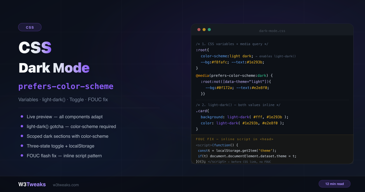
Dark mode needs three ingredients: CSS variables for your color tokens, a media query to flip them based on system preference, and — optionally — a toggle so users can override the system setting with their own choice.
/* 1. Define tokens */
:root {
  color-scheme: light dark; /* required for light-dark() and native UI */
  --bg: #f8fafc;
  --text: #1e293b;
}

/* 2. Override in dark mode */
@media (prefers-color-scheme: dark) {
  :root:not([data-theme="light"]) {
    --bg: #0f172a;
    --text: #e2e8f0;
  }
}

/* 3. Manual override (user toggle) */
[data-theme="dark"]  { --bg: #0f172a; --text: #e2e8f0; }
[data-theme="light"] { --bg: #f8fafc; --text: #1e293b; }
This guide covers the complete implementation, OKLCH tokens with color-mix() (the 2026 default), the new light-dark() function (and the critical color-scheme gotcha that breaks it), Material 3 surface elevation for professional-looking dark mode, the View Transitions API for the circular-bloom theme toggle animation, the CSS dark mode toggle with three states (System/Light/Dark), the dark mode flash fix for SSG/SSR/SPA, Windows High Contrast Mode survival with forced-colors, meta theme-color for mobile browser chrome, and the Tailwind v4 @custom-variant dark pattern. Related: CSS aspect-ratio · CSS object-fit and object-position · CSS mask property.
Live Demo
Three tabs: live preview with System/Light/Dark toggle showing how every component adapts, the light-dark() function vs media query comparison plus the color-scheme native UI demo and scoped dark sections, and the complete copy-paste implementation walkthrough.
Step 1 — CSS Custom Properties as Color Tokens
The foundation. CSS custom properties dark mode is the backbone of any system that scales past two colors. Define all your colors as custom properties on :root (semantic names, not values) — components use token names, and the tokens get overridden in dark mode:
:root {
  /* Color tokens — semantic names, not values */
  --color-bg:        #f8fafc;
  --color-surface:   #ffffff;
  --color-surface-2: #f1f5f9;
  --color-text:      #1e293b;
  --color-text-muted:#64748b;
  --color-border:    rgba(0, 0, 0, 0.08);
  --color-accent:    #8b5cf6;
}

/* Components reference tokens, never raw colors */
.card {
  background: var(--color-surface);
  border: 1px solid var(--color-border);
  color: var(--color-text);
}
OKLCH Dark Mode Tokens — The 2026 Default
Every major 2026 dark-mode write-up (Stripe, Vercel, Tailwind v4, Builderius, Adam Argyle’s Open Props) has migrated from hex/RGB to OKLCH. The reason: OKLCH is perceptually uniform. Bumping lightness by 15% produces a 15% perceived lightness change at every hue — hex doesn’t. Your brand color stays vibrant when you go dark instead of muddying.
:root {
  color-scheme: light dark;

  /* OKLCH tokens — perceptually uniform */
  --bg:      oklch(98% 0.005 240);  /* near-white with slight blue tint */
  --surface: oklch(100% 0 0);       /* pure white */
  --text:    oklch(20% 0.02 240);
  --accent:  oklch(60% 0.25 285);   /* vibrant purple */
}

@media (prefers-color-scheme: dark) {
  :root:not([data-theme="light"]) {
    --bg:      oklch(15% 0.02 240);
    --surface: oklch(22% 0.025 240);
    --text:    oklch(95% 0.005 240);
    --accent:  oklch(75% 0.18 285);  /* lighter, less saturated for dark */
  }
}
Deriving variants with color-mix(in oklch, ...)
Define a single token, derive its hover/border/subtle variants:
:root {
  --accent: oklch(60% 0.25 285);
}

.btn {
  background: var(--accent);
}

.btn:hover {
  /* Mix 15% white into the accent — perceptually 15% lighter */
  background: color-mix(in oklch, var(--accent) 85%, white);
}

.btn-subtle {
  /* 12% of accent on transparent — translucent brand tint */
  background: color-mix(in oklch, var(--accent) 12%, transparent);
}

.border-accent {
  /* Border that's perceptually consistent with the accent at any hue */
  border-color: color-mix(in oklch, var(--accent) 40%, var(--color-border));
}
color-mix() in OKLCH space means hue and saturation don’t drift when you scale lightness. This is the single biggest “looks pro” upgrade for any dark mode system.
Browser support: OKLCH and color-mix() are Baseline since 2023 — Chrome 111+, Firefox 113+, Safari 16.4+. Safe for production.
prefers-color-scheme Media Query — Detecting System Preference
The prefers-color-scheme media query is the browser’s signal that the OS is set to dark.
@media (prefers-color-scheme: dark) {
  :root {
    --color-bg:        #0f172a;
    --color-surface:   #1e293b;
    --color-surface-2: #0f172a;
    --color-text:      #e2e8f0;
    --color-text-muted:#94a3b8;
    --color-border:    rgba(255, 255, 255, 0.08);
  }
}
This alone is a complete, zero-JavaScript dark mode. The browser checks the OS setting and applies the overrides automatically.
Note: The
:root:not([data-theme="light"])selector shown in the demo code prevents the dark media query from applying when the user has manually selected light mode via the toggle. Use this form whenever you also ship a manual toggle. Without it, the media query would override the manual preference.
The full three-value list is light, dark, and no-preference. Default to light when no-preference is reported — it’s the safer baseline.
color-scheme CSS Property — The Native UI Fix
The color-scheme CSS property does two things:
- Enables
light-dark()function — without it,light-dark()always returns the light value regardless of the user’s OS setting - Themes native browser UI — scrollbars, form controls (
<input>,<select>,<textarea>), and checkboxes switch to their dark variants automatically when the user is in dark mode
:root {
  color-scheme: light dark;
  /* your tokens... */
}
Without color-scheme: light dark, native scrollbars and form inputs stay light even when the rest of your page is dark — visibly broken UX.
CSS light-dark() Function — The Modern Way
The CSS light-dark() function replaces the old media-query duplication with a single declaration. It accepts two values and returns one based on the active color scheme — no separate @media block needed:
:root {
  color-scheme: light dark; /* required */
}

.card {
  background: light-dark(#ffffff, #1e293b);
  color:      light-dark(#1e293b, #e2e8f0);
  border:     1px solid light-dark(rgba(0,0,0,.08), rgba(255,255,255,.08));
}
The Critical Gotcha
light-dark() reads color-scheme, not prefers-color-scheme directly.
Without the color-scheme CSS property set to light dark, light-dark() silently resolves to the light value:
/* ❌ Missing color-scheme — light-dark() always returns the first value */
.card {
  background: light-dark(#ffffff, #1e293b);
  /* Even in dark mode, this returns #ffffff — broken */
}

/* ✅ color-scheme: light dark set on :root — works correctly */
:root { color-scheme: light dark; }
.card {
  background: light-dark(#ffffff, #1e293b);
  /* Now correctly returns #1e293b in dark mode */
}
light-dark() vs prefers-color-scheme
They are NOT equivalent. light-dark() responds to the color-scheme CSS property value, which can be scoped to individual elements. prefers-color-scheme is a media query that reads the OS setting globally.
/* Scoped: this section always renders dark values in light-dark() */
.dark-sidebar {
  color-scheme: dark; /* forces dark regardless of OS or page setting */
  background: light-dark(#f8fafc, #0f172a); /* always returns #0f172a */
}
light-dark() with Images — New in 2026
The spec was extended in March 2026 to support <image> values, not just colors:
:root { color-scheme: light dark; }

.logo {
  background-image: light-dark(url('/logo-dark.png'), url('/logo-light.png'));
}

.hero {
  background-image: light-dark(
    linear-gradient(135deg, #f1f5f9, #e2e8f0),
    linear-gradient(135deg, #0f172a, #1e293b)
  );
}
Chrome 128+ shipped first; Safari and Firefox are rolling out. Check MDN for current status.
Material 3 Surface Elevation — The Pro Move
Here’s the single biggest “looks pro vs looks amateur” difference in dark mode design: elevated surfaces get LIGHTER in dark mode, not darker. This inverts the light-mode convention where shadows push surfaces down. Material 3, Atlassian Design, Stripe, and Linear all follow this rule.
:root {
  color-scheme: light dark;

  /* Light mode: surfaces step DOWN (lower = lighter) */
  --surface-0: oklch(100% 0 0);          /* deepest white */
  --surface-1: oklch(98% 0.005 240);     /* page background */
  --surface-2: oklch(95% 0.01 240);      /* sidebar / chrome */
  --surface-3: oklch(92% 0.015 240);     /* dropdown / popover */

  --text: oklch(20% 0.02 240);
}

@media (prefers-color-scheme: dark) {
  :root:not([data-theme="light"]) {
    /* Dark mode: surfaces step UP (higher = lighter) */
    --surface-0: oklch(12% 0.02 240);    /* page background */
    --surface-1: oklch(18% 0.025 240);   /* card */
    --surface-2: oklch(24% 0.03 240);    /* modal */
    --surface-3: oklch(30% 0.035 240);   /* dropdown / popover */

    --text: oklch(95% 0.005 240);
  }
}

.page    { background: var(--surface-0); }
.card    { background: var(--surface-1); }
.modal   { background: var(--surface-2); }
.popover { background: var(--surface-3); }
Each step up is ~6% perceptual lightness (oklch makes that easy). Modals “float” over cards, popovers “float” over modals. In light mode the visual hierarchy is shadows; in dark mode it’s tonal lift.
Image Handling in Dark Mode
Photos designed for bright backgrounds can feel harsh in dark mode. Dim them slightly:
@media (prefers-color-scheme: dark) {
  :root:not([data-theme="light"]) img:not([src*=".svg"]) {
    filter: brightness(0.9) contrast(1.05);
  }
}

[data-theme="dark"] img:not([src*=".svg"]) {
  filter: brightness(0.9) contrast(1.05);
}
Swap Images Entirely with <picture>
For cases where a completely different image is needed (logo on dark vs light background):
<picture>
  <source srcset="/logo-white.png" media="(prefers-color-scheme: dark)">
  <img src="/logo-dark.png" alt="Company logo">
</picture>
Form Inputs — The Forgotten Component
Browsers apply their own dark mode styles to form inputs inconsistently. Always define explicit colors:
input, select, textarea {
  background: var(--color-surface);
  color: var(--color-text);
  border: 1px solid var(--color-border);
}

input::placeholder { color: var(--color-text-muted); }

input:focus {
  outline: 2px solid var(--color-accent);
  border-color: transparent;
}
The CSS Dark Mode Toggle — Three-State System/Light/Dark
Building a CSS dark mode toggle that respects system preference takes three states, not two. A two-state toggle (just light/dark) loses the user’s system preference once they switch. A three-state toggle adds a “System” option that removes any manual override and follows the OS again.
<div role="group" aria-label="Color theme">
  <button data-theme-btn="system" aria-pressed="true">System</button>
  <button data-theme-btn="light"  aria-pressed="false">Light</button>
  <button data-theme-btn="dark"   aria-pressed="false">Dark</button>
</div>
function setTheme(theme) {
const root = document.documentElement;
if (theme === 'system') {
delete root.dataset.theme;
localStorage.removeItem('theme');
} else {
root.dataset.theme = theme;
localStorage.setItem('theme', theme);
}
// Update aria-pressed on buttons
document.querySelectorAll('[data-theme-btn]').forEach(btn => {
btn.setAttribute('aria-pressed', btn.dataset.themeBtn === theme);
});
// Update <meta name="theme-color"> for mobile chrome (see section below)
updateMetaThemeColor();
}
// Bind buttons
document.querySelectorAll('[data-theme-btn]').forEach(btn => {
btn.addEventListener('click', () => setTheme(btn.dataset.themeBtn));
});matchMedia Dark Mode JavaScript — Listen for OS Changes
Use matchMedia('(prefers-color-scheme: dark)') in JavaScript to read the system preference and listen for changes — useful when the user is on “System” mode and the OS flips automatically (e.g. at sunset):
const mq = window.matchMedia('(prefers-color-scheme: dark)');

mq.addEventListener('change', (e) => {
  if (!localStorage.getItem('theme')) {
    // User is on "System" mode — UI follows automatically
    const activeMode = e.matches ? 'dark' : 'light';
    console.log(`System switched to ${activeMode}`);
    updateMetaThemeColor();
  }
});
Dark Mode localStorage Persistence + Cross-Tab Sync
Persist the choice with localStorage.setItem('theme', value) so dark mode survives reloads. To sync across open tabs (user switches theme in tab A, tab B updates immediately), listen for the storage event:
window.addEventListener('storage', (e) => {
  if (e.key === 'theme') {
    setTheme(e.newValue || 'system');
  }
});
The storage event fires in all tabs except the one that wrote the value — perfect for cross-tab sync.
CSS Dark Mode Flash Fix (FOUC) — SSG vs SSR vs SPA
The dark mode flash fix is a synchronous inline script that runs before the first paint. But the right approach depends on your rendering model. Three patterns:
| Rendering | Where state lives | The fix |
|---|---|---|
| SSG (static HTML, Astro/Eleventy/Hugo) | localStorage only | Inline <script> in <head> before CSS — reads localStorage, sets data-theme synchronously |
| SSR with RSC (Next.js App Router, Remix) | Cookie (server-readable) | Write theme to a cookie on toggle; server reads cookie and adds class to <html> during SSR — zero flash |
| SPA (CSR React/Vue/Svelte) | localStorage + hydration | Same inline script as SSG, runs before hydration |
Pattern 1: SSG / SPA inline script
<!DOCTYPE html>
<html lang="en">
<head>
  <meta charset="UTF-8">

  <!-- FOUC fix — runs before CSS loads, prevents flash -->
  <script>
    (function() {
      const saved = localStorage.getItem('theme');
      if (saved === 'dark' || saved === 'light') {
        document.documentElement.dataset.theme = saved;
      }
    })();
  </script>

  <link rel="stylesheet" href="/styles.css">
</head>
Why it works: <script> without defer or async is synchronous — the browser pauses rendering and executes it immediately. By the time CSS loads and the page paints, the correct data-theme is already set. Zero flash.
Pattern 2: SSR Next.js App Router (cookie pattern)
React Server Components cannot read localStorage (it’s a browser API). Use a cookie instead:
// app/layout.tsx
import { cookies } from 'next/headers';

export default async function RootLayout({ children }) {
  const theme = (await cookies()).get('theme')?.value ?? 'system';

  return (
    <html lang="en" data-theme={theme !== 'system' ? theme : undefined}>
      <body>{children}</body>
    </html>
  );
}
// On the toggle button click
async function setTheme(theme) {
await fetch('/api/theme', { method: 'POST', body: JSON.stringify({ theme }) });
document.documentElement.dataset.theme = theme === 'system' ? '' : theme;
}The server writes the cookie, reads it on the next render, and applies the class during SSR — so the very first paint is already correct.
Pattern 3: Astro with View Transitions
Astro’s view transitions wipe document state between page navigations. Re-apply theme in the astro:after-swap event:
document.addEventListener('astro:after-swap', () => {
  const saved = localStorage.getItem('theme');
  if (saved) document.documentElement.dataset.theme = saved;
});
View Transition Theme Toggle — The Animated Switch
A view transition theme toggle wraps the class swap in document.startViewTransition(). The result: a smooth circular bloom from the toggle button as the page recolors. Baseline-eligible as of 2025.
async function toggleTheme(event) {
  // Capture click coordinates for the bloom origin
  const x = event.clientX;
  const y = event.clientY;
  const endRadius = Math.hypot(
    Math.max(x, window.innerWidth - x),
    Math.max(y, window.innerHeight - y)
  );

  // Progressive enhancement — fallback for browsers without the API
  if (!document.startViewTransition) {
    setTheme('dark');
    return;
  }

  const transition = document.startViewTransition(() => setTheme('dark'));

  await transition.ready;

  document.documentElement.animate(
    { clipPath: [
        `circle(0px at ${x}px ${y}px)`,
        `circle(${endRadius}px at ${x}px ${y}px)`,
    ]},
    { duration: 500, easing: 'ease-in', pseudoElement: '::view-transition-new(root)' }
  );
}
/* Disable the default cross-fade so only our circular clip animates */
::view-transition-old(root),
::view-transition-new(root) {
animation: none;
mix-blend-mode: normal;
}
/* Respect motion preferences */
@media (prefers-reduced-motion: reduce) {
::view-transition-old(root),
::view-transition-new(root) { animation: none; }
}Browser support: Chrome 111+, Safari 18+, Firefox 138+ (2025). Falls back to instant theme swap on unsupported browsers via the if (!document.startViewTransition) guard.
meta theme-color for Mobile Browser Chrome
Two <meta> tags make the iOS Safari address bar (and Android Chrome chrome) match your page theme:
<meta name="theme-color" content="#f8fafc" media="(prefers-color-scheme: light)">
<meta name="theme-color" content="#0f172a" media="(prefers-color-scheme: dark)">
For the manual-toggle case, update the meta tag content via JavaScript when the user clicks:
function updateMetaThemeColor() {
  const isDark = document.documentElement.dataset.theme === 'dark' ||
    (!document.documentElement.dataset.theme &&
     window.matchMedia('(prefers-color-scheme: dark)').matches);

  document.querySelector('meta[name="theme-color"]')
    .setAttribute('content', isDark ? '#0f172a' : '#f8fafc');
}
Cheap win — two lines of HTML and iOS Safari’s address bar matches your theme.
Forced-Colors Mode CSS — Windows High Contrast Survival
@media (forced-colors: active) targets Windows High Contrast Mode (WHCM), where the OS strips your palette entirely and replaces colors with user-defined system colors. prefers-contrast: more doesn’t cover this — WHCM is its own world.
The fix: use CSS system color keywords (Canvas, CanvasText, LinkText, ButtonText, Highlight) that map to the user’s chosen colors:
@media (forced-colors: active) {
  .card {
    background: Canvas;
    color: CanvasText;
    border: 1px solid CanvasText;
  }

  .btn {
    background: ButtonFace;
    color: ButtonText;
    border: 1px solid ButtonText;
  }

  a {
    color: LinkText;
  }

  ::selection {
    background: Highlight;
    color: HighlightText;
  }
}
forced-color-adjust: none Opt-Out
For brand logos, data viz, and color-meaningful UI (charts, maps), opt out so colors aren’t overridden:
.brand-logo,
.data-viz {
  forced-color-adjust: none;
}
Use this sparingly — every opt-out hurts a WHCM user. Only when colors carry semantic meaning that words can’t replace.
prefers-contrast Companion
@media (prefers-contrast: more) {
  :root {
    --color-text:   #000000;
    --color-bg:     #ffffff;
    --color-border: #000000;
    --color-accent: #0000cc;
  }
}

@media (prefers-color-scheme: dark) and (prefers-contrast: more) {
  :root:not([data-theme="light"]) {
    --color-text:   #ffffff;
    --color-bg:     #000000;
    --color-border: #ffffff;
  }
}
Transitions — Don’t Animate on Initial Load
Color transitions should only animate when the user explicitly switches themes, not on page load or when the system preference changes without user interaction:
/* ❌ Animates on page load — jarring */
body { transition: background 0.3s, color 0.3s; }

/* ✅ Only animate after first render */
.theme-loaded body { transition: background 0.3s, color 0.3s; }document.addEventListener('DOMContentLoaded', () => {
requestAnimationFrame(() => {
document.documentElement.classList.add('theme-loaded');
});
});Scoped Dark Mode — “Theme Within a Theme”
Force a specific element (and all its children) to always render in dark mode regardless of the page theme, using color-scheme:
.dark-sidebar {
  color-scheme: dark;
  background: #0f172a;
  color: #e2e8f0;
}

.dark-sidebar .card {
  background: light-dark(#ffffff, #1e293b); /* always #1e293b */
}

/* Force light in a section */
.always-light {
  color-scheme: light;
  background: #ffffff;
  color: #1e293b;
}
Complete Production Token System
:root {
  color-scheme: light dark;

  /* Surface elevation — light mode steps DOWN, dark steps UP */
  --surface-0: light-dark(oklch(100% 0 0),      oklch(12% 0.02 240));
  --surface-1: light-dark(oklch(98% 0.005 240), oklch(18% 0.025 240));
  --surface-2: light-dark(oklch(95% 0.01 240),  oklch(24% 0.03 240));
  --surface-3: light-dark(oklch(92% 0.015 240), oklch(30% 0.035 240));

  /* Typography */
  --text:       light-dark(oklch(20% 0.02 240),  oklch(95% 0.005 240));
  --text-muted: light-dark(oklch(45% 0.02 240),  oklch(70% 0.01 240));

  /* Borders — semitransparent so they read on any surface */
  --border:       light-dark(oklch(0% 0 0 / 0.08), oklch(100% 0 0 / 0.08));
  --border-strong:light-dark(oklch(0% 0 0 / 0.16), oklch(100% 0 0 / 0.16));

  /* Brand / accent — derive hover via color-mix */
  --accent:        light-dark(oklch(60% 0.25 285), oklch(75% 0.18 285));
  --accent-hover:  color-mix(in oklch, var(--accent) 85%, white);
  --accent-subtle: color-mix(in oklch, var(--accent) 12%, transparent);

  /* Semantic */
  --success: light-dark(oklch(55% 0.18 145), oklch(75% 0.18 145));
  --warning: light-dark(oklch(70% 0.20 75),  oklch(80% 0.18 75));
  --error:   light-dark(oklch(55% 0.22 25),  oklch(70% 0.20 25));
}
Browser Support
| Feature | Chrome | Firefox | Safari | Baseline |
|---|---|---|---|---|
prefers-color-scheme | 76+ | 67+ | 12.1+ | ✅ since 2019 |
color-scheme | 81+ | 96+ | 13+ | ✅ |
light-dark() | 123+ | 120+ | 17.5+ | ✅ since 2024 |
light-dark() with images | 128+ | rolling | rolling | March 2026 spec |
OKLCH + color-mix() | 111+ | 113+ | 16.4+ | ✅ since 2023 |
forced-colors media query | 79+ | 89+ | 14+ | ✅ |
| View Transitions API | 111+ | 138+ | 18+ | ✅ since 2025 |
Key Takeaways
- Light-first: define light mode in
:root, override in aprefers-color-scheme: darkmedia query - OKLCH tokens with
color-mix(in oklch, ...)are the 2026 default — perceptual lightness scaling without hue drift color-scheme: light darkmust be on:root— it enableslight-dark()AND auto-themes scrollbars and form controlslight-dark()readscolor-scheme, notprefers-color-schemedirectly — withoutcolor-scheme: light dark, it always returns the light value- Material 3 surface elevation — in dark mode, elevated surfaces get LIGHTER, not darker. The single biggest “pro” upgrade.
- Three-state toggle (System/Light/Dark) is better than two-state — “System” removes the override and follows the OS
- FOUC fix matrix: SSG → inline script in
<head>; SSR (Next.js App Router/Remix) → cookie + server-read class; SPA → inline script before hydration storageevent keeps multiple tabs in sync when the user switches theme- View Transitions API wraps the class swap in
document.startViewTransition()for a circular bloom animation <meta name="theme-color">withmedia="(prefers-color-scheme: dark)"matches the iOS Safari address bar to your themeforced-colors: activeis its own media query — use CSS system colors (Canvas,CanvasText,LinkText) for Windows High Contrast Modeforced-color-adjust: noneopts out for brand logos and data viz where color carries meaning- Always add
transitiononly after page load — not on initial paint — to avoid jarring color flashes - Form inputs need explicit
background,color, andborder— never trust browser defaults - Tailwind v4:
@custom-variant dark (&:where(.dark, .dark *))in CSS replaces the olddarkMode: 'class'config
FAQ
What is prefers-color-scheme in CSS?
prefers-color-scheme is a CSS media feature that detects whether the user has selected a light or dark color theme in their OS settings. Use it inside a @media (prefers-color-scheme: dark) block to override your color tokens automatically when the user’s system is in dark mode. Values are light, dark, and no-preference.
How does CSS dark mode work with custom properties?
Define all colors as CSS custom properties on :root (the light values), then override them inside @media (prefers-color-scheme: dark). Every component uses var(--color-text), var(--color-bg) etc. — when the tokens change, every component updates automatically without any component-level media queries. Combine with OKLCH for perceptual lightness scaling.
What is the CSS light-dark() function?
light-dark() accepts two values and returns one based on the active color scheme. background: light-dark(white, darkblue) returns white in light mode and dark blue in dark mode. It requires color-scheme: light dark on an ancestor element — without it, it always returns the first (light) value even in dark mode. Baseline since 2024.
Should I use OKLCH for dark mode in 2026?
Yes — it’s the modern default. OKLCH is perceptually uniform, so bumping lightness by 15% gives a 15% perceived lightness change at every hue. Hex doesn’t. Brand colors stay vibrant when you go dark instead of muddying. Pair with color-mix(in oklch, ...) to derive hover/border/subtle variants from a single base token. Baseline since 2023.
How do I fix the flash of white before dark mode loads?
The fix depends on your rendering model. For SSG/SPA, add a synchronous inline <script> in <head> before your CSS link that reads localStorage and sets document.documentElement.dataset.theme immediately — runs before paint. For SSR with Next.js App Router or Remix, use a cookie instead (React Server Components can’t read localStorage) — the server reads the cookie and adds the class to <html> during SSR. For Astro with view transitions, re-apply theme in the astro:after-swap event.
What is color-scheme in CSS?
The color-scheme CSS property tells the browser which color schemes an element supports. Setting color-scheme: light dark on :root enables two things: (1) it makes light-dark() work correctly, and (2) it tells the browser to also apply dark mode to native UI elements like scrollbars, form inputs, and checkboxes — which don’t respond to your custom CSS variables.
Should I use a view transition for the theme toggle?
If you want the polished circular-bloom animation, yes — wrap the class swap in document.startViewTransition() and animate ::view-transition-new(root) with a clip-path from the click coordinates. Baseline since 2025 (Chrome 111+, Safari 18+, Firefox 138+). Add a prefers-reduced-motion guard so users with motion sensitivity get an instant swap instead.
How do I do dark mode in Tailwind?
Tailwind v4 killed the darkMode: 'class' config key. The new pattern is in CSS: @custom-variant dark (&:where(.dark, .dark *)); lets you write dark:bg-slate-900 class utilities. v4 also defaults to prefers-color-scheme with zero config — just write dark:bg-slate-900 and it works for system-dark users. The class-strategy is opt-in via the variant. For v3 codebases, the old darkMode: 'class' still works but tailwind.config.js is itself deprecated for v4.