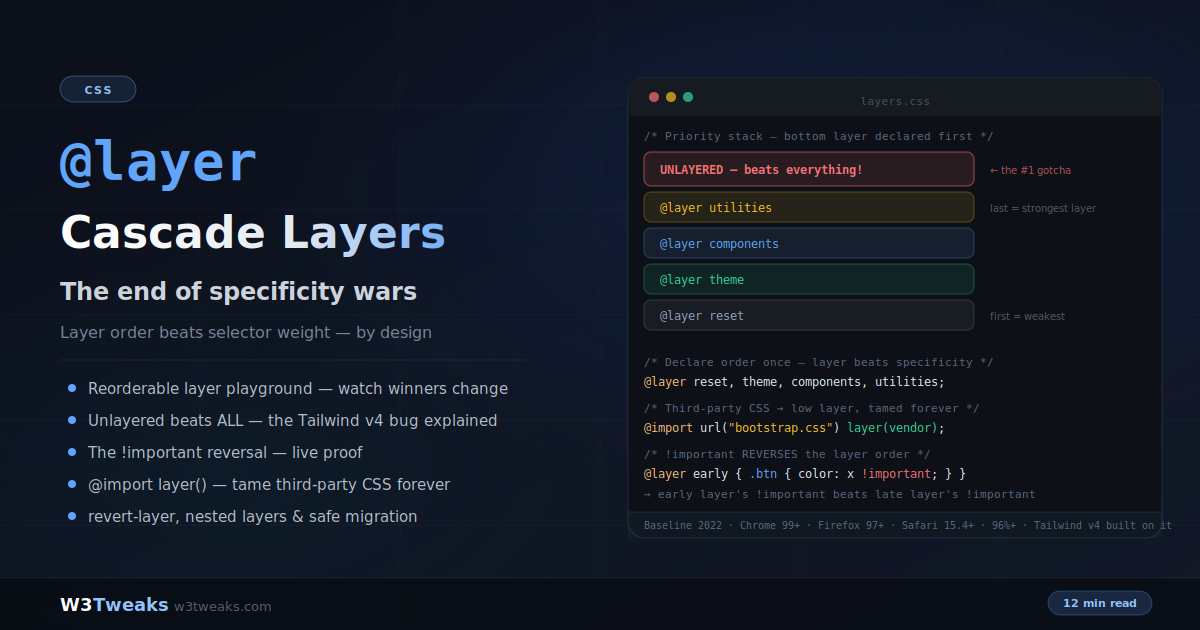
The css aspect-ratio property lets you reserve a box’s proportions with one line. Set a width-to-height ratio on any element and the browser maintains it automatically — across responsive breakpoints, inside grid and flex containers, and before images have finished loading.
/* Responsive 16:9 video — no wrapper div needed */
iframe {
  width: 100%;
  height: auto;
  aspect-ratio: 16 / 9;
}

/* Always-square avatars */
.avatar {
  width: 48px;
  aspect-ratio: 1; /* same as 1 / 1 */
  border-radius: 50%;
}

/* Image that reserves space before it loads — prevents CLS */
img {
  width: 100%;
  height: auto;
  aspect-ratio: auto 16 / 9; /* auto uses intrinsic ratio; 16/9 is fallback */
}
This guide covers the complete property, the auto fallback pattern for images, the content-overflow gotcha and its fix, CSS aspect-ratio flexbox and grid interactions, CSS variable and calc() patterns for design tokens, Tailwind aspect ratio utility equivalents, the aspect-ratio media query disambiguation, view-transition interpolation, social-card cropping with object-fit + object-position, the common ratios cheat sheet, and how to replace the padding-bottom hack cleanly. For pairing aspect-ratio with image cropping, see CSS object-fit and object-position.
Live Demo
Three tabs: ① ratio explorer with preset and custom ratios (now with decimal support for 1.91:1 OG and 1.618 golden ratio) plus a common-ratios reference table, ② six real patterns including CLS simulation, padding-hack comparison, and the auto 16/9 image fix, ③ four edge cases — both-dimensions explicit, content overflow, and flexbox stretch interaction.
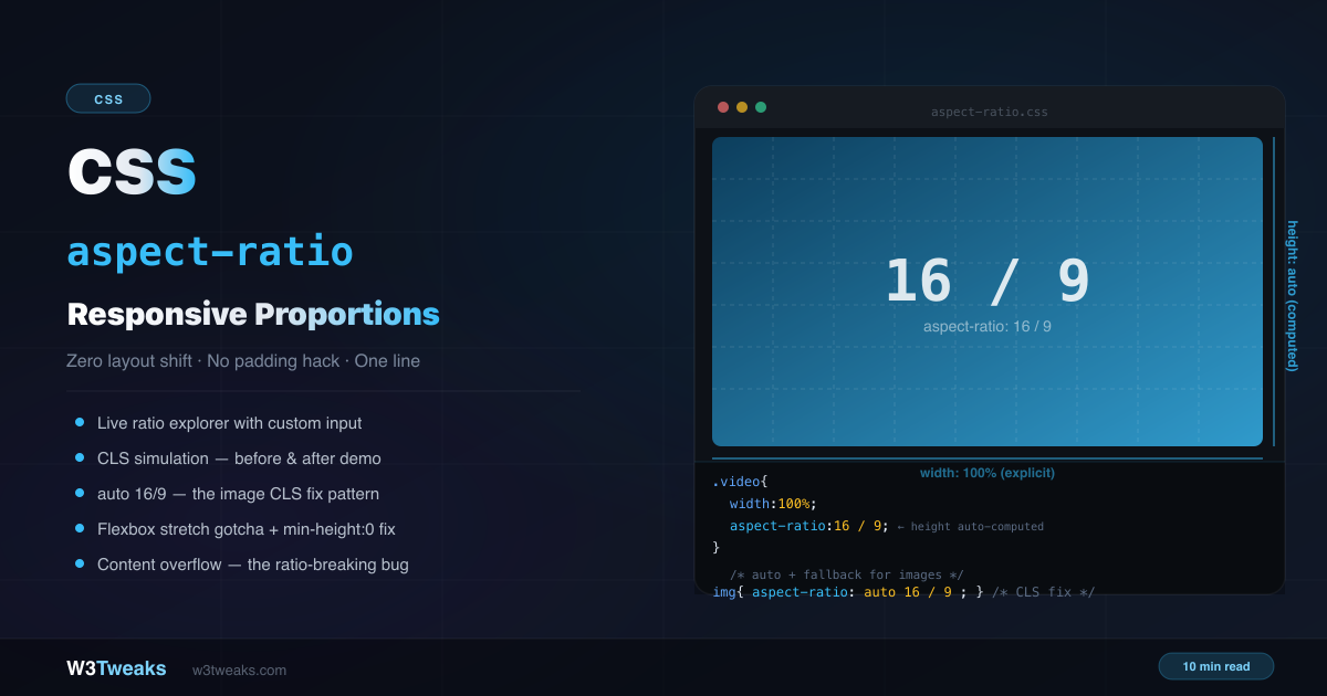
The Key Rule: Only One Auto Dimension
aspect-ratio only works when at least one dimension is automatic (not explicitly set). The browser calculates the auto dimension from the ratio.
/* ✅ Width is explicit, height auto → ratio applies */
.box { width: 100%; aspect-ratio: 16 / 9; }

/* ✅ Height is explicit, width auto → ratio applies */
.box { height: 200px; aspect-ratio: 16 / 9; }

/* ❌ Both explicit → aspect-ratio is silently ignored */
.box { width: 400px; height: 100px; aspect-ratio: 16 / 9; } /* ignored */
The most common pattern: set width: 100% (or width: 200px) and let aspect-ratio compute the height automatically.
Syntax — All Valid Values
/* Two numbers separated by / */
aspect-ratio: 16 / 9;     /* widescreen video */
aspect-ratio: 4 / 3;      /* traditional monitor */
aspect-ratio: 1 / 1;      /* perfect square */
aspect-ratio: 9 / 16;     /* portrait/vertical video */
aspect-ratio: 1.91 / 1;   /* Open Graph image (1.91:1) */
aspect-ratio: 1.618 / 1;  /* CSS golden ratio for typography panels */

/* Single number — height is 1 */
aspect-ratio: 1;          /* same as 1 / 1 */
aspect-ratio: 2;          /* same as 2 / 1 */
aspect-ratio: 0.5;        /* same as 1 / 2 */

/* auto — use element's intrinsic ratio */
aspect-ratio: auto;       /* for replaced elements (img, video) */

/* auto with fallback — the image CLS pattern */
aspect-ratio: auto 16 / 9; /* use intrinsic when loaded, 16/9 before */

/* calc() works — useful inside design systems */
aspect-ratio: calc(16 / 9);
Driving aspect-ratio with CSS Custom Properties
Treating ratio as a design token is the cleanest pattern:
:root {
  --ratio-video: 16 / 9;
  --ratio-card:  3 / 2;
  --ratio-square: 1;
}

.hero       { aspect-ratio: var(--ratio-video); }
.card-image { aspect-ratio: var(--ratio-card); }
.avatar     { aspect-ratio: var(--ratio-square); }
This mirrors how Bootstrap 5 ships the .ratio helper — every utility class wraps --bs-aspect-ratio: 56.25%. Defining your own CSS variable means a single line in a theme file controls the proportions site-wide.
For runtime adaptive UIs, set the CSS variable from JavaScript:
document.querySelector('.player')
  .style.setProperty('--ratio', videoIsPortrait ? '9 / 16' : '16 / 9');
Replacing the Old CSS aspect-ratio Padding Hack
The css aspect-ratio padding hack is what every tutorial taught before September 2021. The old way to create a responsive 16:9 video container required a wrapper element and 5 CSS rules:
/* ❌ Old padding-bottom hack — fragile, verbose */
.video-wrapper {
  position: relative;
  padding-bottom: 56.25%; /* 9/16 × 100% */
  height: 0;
}

.video-wrapper iframe {
  position: absolute;
  top: 0;
  left: 0;
  width: 100%;
  height: 100%;
}
The modern way — one CSS rule, no wrapper needed:
/* ✅ Modern — clean, semantic, works natively */
iframe {
  width: 100%;
  height: auto;
  aspect-ratio: 16 / 9;
  border: none;
}
Browser support:
aspect-ratiois Baseline — supported since September 2021: Chrome 88+, Firefox 89+, Safari 15+, Edge 88+. 97%+ global coverage. Safe to use without a fallback for all modern targets. No JavaScript aspect-ratio polyfill is needed — use the@supportsfallback at the end of this guide if you must support pre-2021 browsers.
CSS aspect-ratio Auto — The Image CLS Fix
The auto keyword tells the browser to use the element’s natural (intrinsic) aspect ratio when it has one. For <img> and <video> elements, this means the browser uses the media file’s actual dimensions.
/* auto alone — uses intrinsic ratio when loaded, no fallback */
img { aspect-ratio: auto; }

/* auto + fallback — the production pattern */
img {
  width: 100%;
  height: auto;
  aspect-ratio: auto 16 / 9;
  /*             ↑         ↑
                 Uses actual image ratio when loaded
                           Reserves space at 16:9 while loading */
}
Why this matters for CLS: Before aspect-ratio: auto 16/9, an image loading into a width: 100%; height: auto container had zero height until the image loaded. When it loaded, the image took up space and pushed all following content down — a layout shift (CLS).
With aspect-ratio: auto 16/9, the browser reserves 16/9 of the element’s width as height while the image loads. When the image loads, it switches to the image’s actual intrinsic ratio. The content doesn’t jump.
The Image Width/Height Attribute Precedence Rule
Jake Archibald’s canonical write-up captures it best. The browser computes the displayed aspect ratio in this order:
- CSS
aspect-ratioproperty (highest priority) - HTML
widthandheightattributes on the<img>(browser auto-computesaspect-ratio: auto W/H) - Intrinsic dimensions of the loaded image file (used by
autokeyword)
<!-- Best practice: HTML attributes + minimal CSS for zero CLS -->
<img
  src="hero.jpg"
  alt="Hero"
  width="1200"
  height="675"
  loading="lazy"
>
img {
width: 100%;
height: auto; /* ← magic ingredient — preserves the computed ratio */
}The trap: if your CSS sets a fixed height (anything other than auto), it overrides the HTML height attribute and breaks the CLS guarantee. Always pair width: 100% with height: auto on responsive images.
This is the best practice for all content images — the browser handles CLS with zero CSS aspect-ratio needed.
Common Ratios Reference
| CSS value | Decimal | Use case |
|---|---|---|
16 / 9 | 1.78 | HD video, YouTube, hero images |
4 / 3 | 1.33 | Traditional monitor, slide decks, product images |
1 / 1 | 1.00 | Instagram square, avatars, icon containers |
3 / 2 | 1.50 | 35mm photography standard, blog cards |
2 / 1 | 2.00 | Twitter/X cards, banner ads |
1.91 / 1 | 1.91 | css 1.91 1 og image — Open Graph (og:image), Facebook link preview, LinkedIn 1200×627 |
9 / 16 | 0.56 | TikTok, Instagram Reels, vertical video |
4 / 5 | 0.80 | Instagram portrait, tall product photo |
21 / 9 | 2.33 | Ultrawide cinematic, panoramic hero |
1.618 / 1 | 1.618 | Golden ratio for typography panels, sidebar widths |
1 / 1.414 | 0.707 | A4 paper (1:√2) |
2.39 / 1 | 2.39 | Cinema scope |
Native CSS vs Tailwind vs Bootstrap
If you reach for a utility framework, here’s how the same ratios translate:
| Ratio | Native CSS | Tailwind | Bootstrap |
|---|---|---|---|
| 16:9 | aspect-ratio: 16/9 | aspect-video | .ratio.ratio-16x9 |
| 4:3 | aspect-ratio: 4/3 | aspect-[4/3] | .ratio.ratio-4x3 |
| 1:1 | aspect-ratio: 1 | aspect-square | .ratio.ratio-1x1 |
| 21:9 | aspect-ratio: 21/9 | aspect-[21/9] | .ratio + custom --bs-aspect-ratio |
| Custom (e.g. 3:2) | aspect-ratio: 3/2 | aspect-[3/2] | .ratio + --bs-aspect-ratio: 66.66% |
Bootstrap’s .ratio helper actually uses the old padding-bottom hack under --bs-aspect-ratio: 56.25%. Tailwind compiles aspect-video directly to aspect-ratio: 16 / 9 — modern native CSS.
Property vs Media Feature — Don’t Confuse Them
aspect-ratio exists in two distinct places in CSS, and confusing them is its own bug category.
The aspect-ratio CSS property — targets the ELEMENT
.card { aspect-ratio: 16 / 9; } /* sizes the card */The aspect-ratio media query — targets the VIEWPORT
/* Apply only when the VIEWPORT itself has a wide aspect ratio */
@media (min-aspect-ratio: 16/9) {
  .hero { padding: 4rem; }
}

/* Or exactly square viewport (rare but valid) */
@media (aspect-ratio: 1/1) { ... }
The media query targets the browser window dimensions. The property targets an element. They are unrelated despite the shared name.
The modern third sibling — @container (aspect-ratio)
Currently, container queries support aspect-ratio comparisons too:
.card-container {
  container-type: inline-size;
}

@container (aspect-ratio > 16/9) {
  .card-image { aspect-ratio: 21 / 9; } /* wider container → wider image */
}
CSS aspect-ratio vs object-fit — Which One for What
This is the most-confused pairing in responsive image styling. The one-line rule:
aspect-ratioreserves the box.object-fitdecides how the image fills it.
/* Use BOTH together for production responsive images */
.hero-image {
  width: 100%;
  aspect-ratio: 16 / 9;    /* the box is 16:9, regardless of image */
  object-fit: cover;        /* image fills the box, cropping if needed */
  object-position: center;  /* default — controls WHERE the crop happens */
}| Property | Sets | Affects | When to use |
|---|---|---|---|
aspect-ratio | Element proportions | The box itself | Always for responsive media containers |
object-fit | How content fits the box | Replaced elements (img, video, iframe, embed, object, canvas) | When aspect-ratio of box ≠ media’s natural ratio |
object-position | Where the crop happens | Replaced elements with object-fit: cover/contain | When center isn’t the right focal point |
Pattern: Social Card Thumbnails
The OG image standard is 1.91:1 (1200×630). Twitter Card is 2:1 (1200×600). Pinterest is 2:3 (1000×1500). Using object-position keeps the focal point in frame across all three crops:
/* Single source image, three card sizes, focal point preserved */
.card-image-og { aspect-ratio: 1.91 / 1; }
.card-image-twitter { aspect-ratio: 2 / 1; }
.card-image-pinterest { aspect-ratio: 2 / 3; }

.card-image-og,
.card-image-twitter,
.card-image-pinterest {
  width: 100%;
  overflow: hidden;
}

.card-image-og img,
.card-image-twitter img,
.card-image-pinterest img {
  width: 100%;
  height: 100%;
  object-fit: cover;
  object-position: 50% 40%; /* keep focal point in safe-zone center 80% */
}
For social cards: keep the important content in the center 80% so all three platforms crop sensibly.
Real Pattern: Responsive 16:9 Video CSS
Drop-in responsive 16:9 video css — the iframe holds its own ratio:
<iframe
  src="https://www.youtube.com/embed/VIDEO_ID"
  title="Video title"
  allowfullscreen
></iframe>
iframe {
width: 100%;
height: auto;
aspect-ratio: 16 / 9;
border: none;
border-radius: 8px;
}This works for YouTube, Vimeo, Google Maps, Loom, and any other iframe embed. The iframe gets its width from its container and the height is calculated from the ratio. No wrapper div, no padding hack.
Real Pattern: Uniform Image Grid
.gallery {
  display: grid;
  grid-template-columns: repeat(auto-fill, minmax(200px, 1fr));
  gap: 1rem;
}

.gallery-item {
  aspect-ratio: 1 / 1;
  overflow: hidden;
  border-radius: 8px;
}

.gallery-item img {
  width: 100%;
  height: 100%;
  object-fit: cover;
  object-position: center;
}
Every grid cell stays in ratio regardless of the image’s natural proportions or the grid track width.
Real Pattern: Always-Square Avatars
.avatar {
  width: 48px;        /* any width — height computed automatically */
  aspect-ratio: 1;    /* shorthand for 1 / 1 */
  border-radius: 50%; /* perfect circle from a perfect square */
  overflow: hidden;
}

.avatar img {
  width: 100%;
  height: 100%;
  object-fit: cover;
}
aspect-ratio: 1 (single number) is equivalent to aspect-ratio: 1 / 1. It’s the shortest way to guarantee a square element.
Real Pattern: Card Layouts With Consistent Image Area
.card {
  background: white;
  border-radius: 12px;
  overflow: hidden;
}

.card-image {
  aspect-ratio: 16 / 9;
  overflow: hidden;
}

.card-image img {
  width: 100%;
  height: 100%;
  object-fit: cover;
}

.card-body { padding: 16px; }
Animating Between Aspect Ratios
Browsers interpolate aspect-ratio on a logarithmic curve so the change feels visually linear:
.expandable-card {
  aspect-ratio: 1 / 1;
  transition: aspect-ratio 400ms cubic-bezier(0.4, 0, 0.2, 1);
}

.expandable-card.expanded {
  aspect-ratio: 16 / 9;
}

@media (prefers-reduced-motion: reduce) {
  .expandable-card { transition: none; }
}
This is also what makes view transitions look smooth when an element’s aspect ratio changes between page states — the browser handles the interpolation natively. Chrome shipped the logarithmic interpolation in 2024-25; Firefox and Safari follow the same curve.
CSS aspect-ratio Not Working? Common Causes
Cause 1: Both Dimensions Explicit → Ratio Ignored
/* ❌ aspect-ratio is completely ignored here */
.box {
  width: 200px;
  height: 100px;      /* explicit — overrides ratio */
  aspect-ratio: 1;    /* silently ignored */
}

/* ✅ One dimension auto → ratio applies */
.box {
  width: 200px;
  /* height: unset — auto by default */
  aspect-ratio: 1; /* height computed as 200px */
}
Cause 2: Content Overflow Breaks the Ratio
If content inside an aspect-ratio box is larger than the computed height, the box expands with it — breaking the ratio:
/* ✅ Content is clipped — ratio maintained */
.box {
  width: 100%;
  aspect-ratio: 2 / 1;
  min-height: 0;      /* prevent content from expanding height */
  overflow: hidden;   /* clip content that would overflow */
}
This is especially important in grid and flex contexts where content-heavy items can blow out the ratio.
Cause 3: CSS aspect-ratio Flexbox Stretch Override
CSS aspect-ratio flexbox issues almost always trace to align-items: stretch (the default) forcing items to a specific height, overriding the computed ratio:
/* ✅ Option 1: flex-start lets items size naturally */
.flex-container {
  display: flex;
  align-items: flex-start;
}

/* ✅ Option 2: per-item fix */
.flex-item {
  aspect-ratio: 1;
  align-self: flex-start;
  min-height: 0;
}
Cause 4: CSS Grid Track Stretch
In a CSS Grid, items with aspect-ratio inside tracks that have align-items: stretch may also expand:
.grid-item {
  aspect-ratio: 16 / 9;
  overflow: hidden; /* clips content, maintains ratio */
}
Cause 5: Image Without height: auto
A CSS height (anything other than auto) on an <img> overrides the HTML height attribute and breaks the CLS guarantee. Always:
img {
  width: 100%;
  height: auto;  /* ← critical */
}
CSS aspect-ratio Container Query Patterns
Combine css aspect-ratio container query patterns for adaptive layouts:
.card-container {
  container-type: inline-size;
}

.card-image {
  aspect-ratio: 16 / 9;
}

/* Switch to square when container is narrow */
@container (max-width: 300px) {
  .card-image {
    aspect-ratio: 1 / 1;
  }
}

/* Or query the container's own ratio */
@container (aspect-ratio > 16/9) {
  .card-image { aspect-ratio: 21 / 9; }
}
@supports Fallback for Pre-2021 Browsers
For projects that must support browsers before September 2021:
/* Fallback — old padding hack */
.video-wrap {
  position: relative;
  padding-bottom: 56.25%;
  height: 0;
}

.video-wrap > * {
  position: absolute;
  inset: 0;
  width: 100%;
  height: 100%;
}

/* Enhancement — modern browsers */
@supports (aspect-ratio: 16 / 9) {
  .video-wrap {
    padding-bottom: unset;
    height: unset;
    position: static;
  }

  .video-wrap > * {
    position: static;
    width: 100%;
    height: auto;
    aspect-ratio: 16 / 9;
  }
}
In practice, targeting Chrome 88+/Firefox 89+/Safari 15+ covers 97%+ of global users — the fallback is rarely needed.
Performance and Core Web Vitals
aspect-ratio is one of the most impactful CSS properties for Core Web Vitals:
- Prevents CLS — by reserving space before content loads, the layout doesn’t shift when images, videos, or ads appear
- No JS required — pure CSS space reservation, no
getBoundingClientRect()hacks - Works with lazy loading —
<img loading="lazy">combined with HTMLwidth/heightattributes (oraspect-ratio: auto ...) ensures zero CLS even on lazily-loaded images - LCP-friendly — combine with
fetchpriority="high"on the LCP image so the largest contentful paint loads first into its reserved box
<!-- The complete LCP + CLS-free image pattern -->
<img
  src="hero.jpg"
  alt="Hero"
  width="1200"
  height="675"
  fetchpriority="high"
  loading="eager"
>
img {
width: 100%;
height: auto;
}Key Takeaways
aspect-ratioonly works when at least one dimension is auto — setwidthand letheightbe computed- Both
16 / 9and the single number1.78are valid;1is the shorthand for a perfect square aspect-ratio: auto 16/9reserves 16:9 space while an image loads, then uses the image’s actual ratio — the primary CLS fix- Adding HTML
widthandheightattributes on<img>is the best CLS prevention — the browser appliesautoaspect-ratio automatically. CSSheight: autois required to preserve the computation aspect-ratiovsobject-fit— aspect-ratio reserves the box; object-fit decides how the image fills it. Use both together- CSS custom properties (
aspect-ratio: var(--ratio)) +calc()make aspect-ratio a design-token primitive - Tailwind ships
aspect-video/aspect-square/aspect-[3/2]; Bootstrap ships.ratio.ratio-16x9(still using the padding-bottom hack under--bs-aspect-ratio) aspect-ratioproperty (sizes an element) is distinct from@media (aspect-ratio)(matches viewport). Don’t confuse them.@container (aspect-ratio)is the modern third sibling- Replaces the
padding-bottom: 56.25%hack with one clean CSS rule — no wrapper div needed - Content overflow breaks the ratio — fix with
min-height: 0; overflow: hidden - Flexbox
align-items: stretchoverrides ratio — usealign-items: flex-startoralign-self: flex-start - Browsers interpolate
aspect-ratioon a logarithmic curve for smooth animations —transition: aspect-ratio 300msjust works - Social card thumbnails: 1.91:1 OG, 2:1 Twitter, 2:3 Pinterest — use
object-position: 50% 40%to keep the focal point in the safe-zone @supports (aspect-ratio: 1)for graceful degradation — but you almost never need it- No JavaScript polyfill is needed — Baseline since September 2021
FAQ
What is the CSS aspect-ratio property?
The CSS aspect-ratio property defines a preferred width-to-height ratio for an element. When one dimension is automatic (not explicitly set), the browser computes it from the ratio. A video container with width: 100% and aspect-ratio: 16/9 will always have a height exactly 9/16ths of its width, regardless of the viewport size. It’s Baseline supported since September 2021 (Chrome 88+, Firefox 89+, Safari 15+).
How do I make a responsive 16:9 video container in CSS?
Set width: 100%; height: auto; aspect-ratio: 16 / 9 directly on the <iframe> element. No wrapper div is needed. This replaces the old padding-bottom: 56.25% hack that required a wrapper element and an absolutely positioned inner element. The same one-line approach works for YouTube, Vimeo, Google Maps, Loom, and any other iframe embed.
What does aspect-ratio: auto do?
The auto keyword tells the browser to use the element’s natural intrinsic aspect ratio when one exists (for images and videos). Used alone on an <img>, it has no effect until the image loads. Combined as aspect-ratio: auto 16/9, the 16/9 serves as a fallback while the image loads, then the actual image ratio takes over — preventing Cumulative Layout Shift (CLS).
Why is my CSS aspect-ratio not working?
Most common reason: both width and height are set to explicit values. When both are explicit, aspect-ratio is silently ignored — the explicit values take priority. Set only one dimension explicitly and leave the other as auto. Other common causes: content inside the box is overflowing and pushing the height beyond the ratio (fix with min-height: 0; overflow: hidden), or flexbox align-items: stretch is overriding the computed height (fix with align-items: flex-start). For images, a CSS height other than auto overrides the HTML height attribute and breaks the CLS guarantee.
How does aspect-ratio work with flexbox?
Flexbox’s default align-items: stretch can override the computed height from aspect-ratio, forcing all items to the height of the tallest item. Fix by setting align-items: flex-start on the container, or align-self: flex-start on the individual item. Also add min-height: 0 to prevent content from expanding beyond the ratio.
CSS aspect-ratio vs object-fit — which one for what?
aspect-ratio reserves the box’s proportions; object-fit decides how the content inside the box fills it. Use both together for production responsive images: aspect-ratio makes the container 16:9 regardless of the image’s natural ratio, then object-fit: cover crops the image to fill the container without distortion. Add object-position: center (or a specific focal point like 50% 40%) to control where the crop happens.
How do I use a CSS variable with aspect-ratio?
aspect-ratio: var(--my-ratio) works directly — set --my-ratio: 16 / 9 as a custom property. The value can be a single number (var(--my-ratio: 1.618)), a width / height pair, or wrapped in calc(). This is the cleanest pattern for design tokens: define --ratio-video: 16 / 9 and --ratio-card: 3 / 2 once at :root, then reference them in component styles. Bootstrap 5’s .ratio helper does this with --bs-aspect-ratio (though it falls back to the padding-bottom hack underneath).
Can I change aspect-ratio at different breakpoints?
Yes — aspect-ratio responds to media queries, container queries, and CSS animations like any other CSS property. Switch from aspect-ratio: 16/9 on desktop to aspect-ratio: 1/1 on mobile with a media query, or use container queries (@container (max-width: 300px)) to adapt based on the component’s container width. Browsers interpolate the change on a logarithmic curve for smooth transition: aspect-ratio 300ms animations.