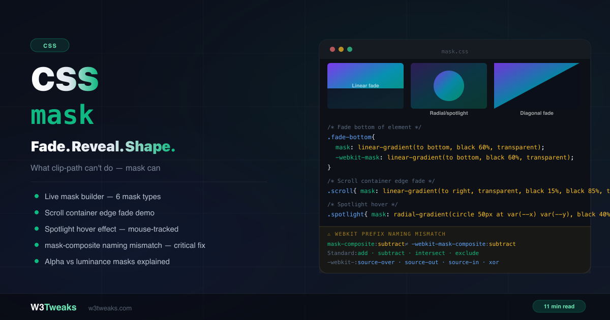
CSS mask controls element visibility using another image or gradient as the “stencil”. Unlike CSS clip-path which creates hard binary edges — fully visible or fully hidden — mask creates soft fades, partial transparency, and graduated visibility.
/* Fade the bottom of an image */
.hero-img {
  mask-image: linear-gradient(to bottom, black 60%, transparent 100%);
  -webkit-mask-image: linear-gradient(to bottom, black 60%, transparent 100%);
}

/* Recolor an SVG icon with currentColor */
.icon {
  background-color: currentColor;
  mask-image: url('icons/arrow.svg');
  -webkit-mask-image: url('icons/arrow.svg');
}
This guide covers the complete CSS mask image property set, the alpha vs luminance reality that fixes the misleading “black = visible” rule, CSS mask gradient patterns (linear, radial, conic), SVG icon recoloring with currentColor + mask-image, CSS scroll fade gradient containers, CSS spotlight effect with mask + mousemove, CSS wipe reveal animation via @keyframes, the new scroll-driven mask reveal using animation-timeline: view(), mask-composite with the four-edge feathering pattern, the parallel mask-border property family, and the critical -webkit-mask-composite naming mismatch that silently breaks Safari. For hard-edged shape clipping without fades, use CSS clip-path instead.
Live Demo
Three tabs: ① live mask builder with 6 mask types and real-time code generation, side-by-side mask vs clip-path comparison, ② six real patterns — scrollable container edge fade, spotlight hover, wipe reveal animation, diagonal fade, vignette, text edge fade, ③ mask-composite values with before/after demos and the critical -webkit prefix naming mismatch table.
How CSS mask Actually Works — The Two Rules Most Tutorials Get Wrong
Most CSS mask tutorials open with “black = visible, transparent = hidden” as if it’s a universal rule. It isn’t. That framing breaks the moment a reader swaps black for any other color and the mask still works. There are actually two distinct modes with two different rules.
Rule 1 — Alpha mode (the default for CSS gradients)
The alpha channel of each mask pixel controls visibility. Color is irrelevant.
rgba(0, 0, 0, 1)(opaque black) → fully visiblergba(255, 0, 0, 1)(opaque red) → fully visible (same as black!)rgba(255, 255, 255, 1)(opaque white) → fully visible (same as black!)rgba(*, *, *, 0)(any color, zero alpha) → fully hiddenrgba(*, *, *, 0.5)(any color, 50% alpha) → 50% visible
We use black in gradient examples because the CSS keyword transparent is internally rgba(0, 0, 0, 0) — so black ↔ transparent creates a smooth alpha transition that visually mirrors the effect. But red ↔ transparent produces identical output.
/* These three produce IDENTICAL output in alpha mode */
mask-image: linear-gradient(to bottom, black, transparent);
mask-image: linear-gradient(to bottom, red, transparent);
mask-image: linear-gradient(to bottom, hotpink, transparent);
Rule 2 — Luminance mode (default for SVG <mask> elements)
The brightness of each mask pixel controls visibility. Color matters now.
- Black → fully hidden
- White → fully visible
- Grey → partial visibility (proportional to brightness)
.svg-masked {
  mask-image: url('#svg-mask');
  mask-mode: luminance;
  -webkit-mask-mode: luminance;
}
Why two modes exist: Alpha mode matches how background-image thinks (transparency = nothing there). Luminance mode matches how Photoshop / SVG <mask> think (brightness = how much shows through). CSS gradients default to alpha because that’s the friendlier model for typical web use cases. SVG <mask> defaults to luminance because that’s the SVG specification’s original behavior.
The TL;DR table:
| Mode | Default for | What controls visibility |
|---|---|---|
| Alpha | CSS gradients, PNGs | Alpha channel of each pixel (color ignored) |
| Luminance | SVG <mask> elements | Brightness of each pixel |
CSS mask vs clip-path: which one do you need?
This is the most-searched question about CSS masking:
clip-path | mask | |
|---|---|---|
| Edge type | Hard, sharp, binary | Soft, graduated, partial |
| Transparency levels | None — in or out | Full range 0–100% |
| Performance | Faster | Slightly heavier |
| SVG shapes | ✅ clip-path: url(#svg) | ✅ mask-image: url(#svg) |
| Gradient shapes | ❌ No | ✅ Yes |
| Animate reveals | Harder (vertex count rule) | ✅ Animate gradient stops |
| Browser support | Better | Good (needs prefix) |
| Use for | Sharp geometric shapes | Fades, spotlights, gradient reveals |
Decision rule: If you need a sharp geometric shape (octagon, star, polygon cut), use clip-path. If you need any kind of soft edge, gradient fade, partial transparency, or scroll-based reveal, use mask.
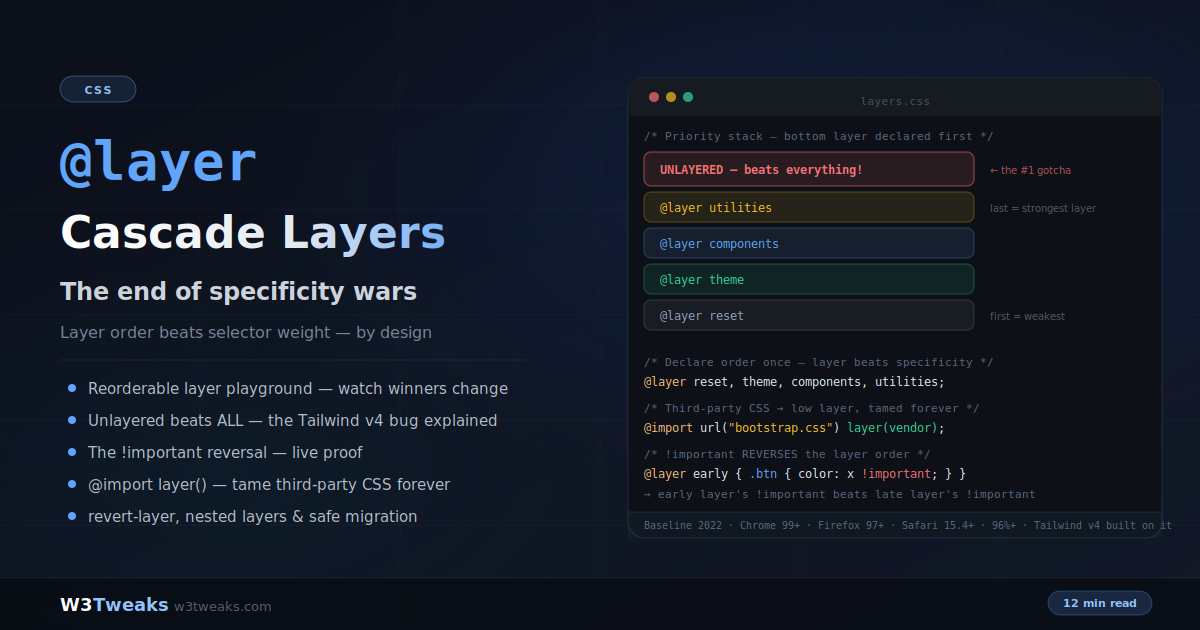
The CSS mask image Properties
mask is shorthand covering 8 individual properties:
/* Shorthand */
.el {
  mask: <mask-image> <position> / <size> <repeat> <clip> <origin> <composite> <mode>;
}

/* Individual properties */
.el {
  mask-image: linear-gradient(to bottom, black, transparent);
  mask-position: 0% 0%;
  mask-size: auto;
  mask-repeat: no-repeat;
  mask-clip: border-box;
  mask-origin: border-box;
  mask-composite: add;
  mask-mode: match-source;
}
In practice you’ll set mask-image (and the webkit prefix) for almost everything. The others matter for advanced compositions.
CSS mask gradient — linear, radial, conic
Any CSS gradient works as a mask image.
Linear gradient — fade an edge
.fade-bottom {
  mask-image: linear-gradient(to bottom, black 60%, transparent 100%);
  -webkit-mask-image: linear-gradient(to bottom, black 60%, transparent 100%);
}

/* Fade both horizontal edges — for scroll containers */
.scroll-fade {
  mask-image: linear-gradient(to right, transparent, black 15%, black 85%, transparent);
  -webkit-mask-image: linear-gradient(to right, transparent, black 15%, black 85%, transparent);
}
Radial gradient — spotlight or vignette
.vignette {
  mask-image: radial-gradient(ellipse at center, black 40%, transparent 80%);
  -webkit-mask-image: radial-gradient(ellipse at center, black 40%, transparent 80%);
}

.spotlight {
  mask-image: radial-gradient(circle 80px at 50% 50%, black 60%, transparent 100%);
  -webkit-mask-image: radial-gradient(circle 80px at 50% 50%, black 60%, transparent 100%);
}
Conic gradient — pie wedge masks
.pie-wedge {
  mask-image: conic-gradient(from 0deg, black 0deg 90deg, transparent 90deg 360deg);
  -webkit-mask-image: conic-gradient(from 0deg, black 0deg 90deg, transparent 90deg 360deg);
}
Recolor SVG Icons with mask-image and currentColor
The #1 practical reason to use mask: theming single-color SVG icons that follow currentColor (and therefore your dark mode, hover state, link color, anything).
<button class="icon-btn">
  <span class="icon icon-arrow"></span>
  Click me
</button>
.icon {
display: inline-block;
width: 1em;
height: 1em;
background-color: currentColor;
-webkit-mask-position: center;
mask-position: center;
-webkit-mask-repeat: no-repeat;
mask-repeat: no-repeat;
-webkit-mask-size: contain;
mask-size: contain;
}
.icon-arrow {
-webkit-mask-image: url('/icons/arrow.svg');
mask-image: url('/icons/arrow.svg');
}
.icon-btn { color: blue; } /* icon is blue */
.icon-btn:hover { color: red; } /* icon is red */
.dark .icon-btn { color: white; } /* icon is white */Why this beats <img src="arrow.svg">: the SVG file is loaded once and recolored infinitely via CSS — no per-color SVG copies, no inline SVG bloat in your HTML, no JavaScript. The icon’s color is whatever the surrounding text color is.
Limitation: the source SVG must be single-color (any color in the file is replaced by the background-color you set). Multi-color icons need a different approach (inline SVG with fill: currentColor on specific paths, or CSS filter chains).
Pattern 1: CSS scroll fade gradient — fade scroll container edges
The #1 practical use case for mask-image. Horizontal or vertical scrollable containers that hint at more content by fading the edges:
/* Horizontal scroll with faded edges */
.chips-scroll {
  display: flex;
  overflow-x: auto;
  gap: 8px;
  padding: 8px 16px;
  scrollbar-width: none;

  mask-image: linear-gradient(to right, transparent, black 15%, black 85%, transparent);
  -webkit-mask-image: linear-gradient(to right, transparent, black 15%, black 85%, transparent);
}

.chips-scroll::-webkit-scrollbar { display: none; }
Feathering all 4 edges with mask-composite: intersect
To fade all four edges of a container (top + bottom + left + right), stack two linear gradients and combine them with mask-composite: intersect:
.four-edge-fade {
  /* Two gradients: horizontal fade + vertical fade */
  mask-image:
    linear-gradient(to right, transparent, black 10%, black 90%, transparent),
    linear-gradient(to bottom, transparent, black 10%, black 90%, transparent);
  mask-composite: intersect;

  -webkit-mask-image:
    linear-gradient(to right, transparent, black 10%, black 90%, transparent),
    linear-gradient(to bottom, transparent, black 10%, black 90%, transparent);
  -webkit-mask-composite: source-in;
}
The intersect composite means a pixel is only visible where BOTH gradients allow it — which is the center area of the box, with all four edges fading out simultaneously.
Pattern 2: CSS spotlight effect with mask + mousemove
A dark overlay with a radial gradient mask centered at the cursor position — the element “lights up” where the mouse is:
<div class="card-wrap" id="card">
  <div class="card-content"><!-- content --></div>
  <div class="spotlight-overlay" id="overlay"></div>
</div>
.card-wrap { position: relative; overflow: hidden; }
.spotlight-overlay {
position: absolute;
inset: 0;
background: rgba(0, 0, 0, 0.85);
opacity: 0;
transition: opacity 0.2s;
mask-image: radial-gradient(circle 80px at var(--x, 50%) var(--y, 50%), black 60%, transparent 100%);
-webkit-mask-image: radial-gradient(circle 80px at var(--x, 50%) var(--y, 50%), black 60%, transparent 100%);
}
.card-wrap:hover .spotlight-overlay { opacity: 1; }const card = document.getElementById('card');
const overlay = document.getElementById('overlay');
card.addEventListener('mousemove', (e) => {
const rect = card.getBoundingClientRect();
overlay.style.setProperty('--x', `${e.clientX - rect.left}px`);
overlay.style.setProperty('--y', `${e.clientY - rect.top}px`);
});Using CSS custom properties (--x, --y) means the mask gradient string is only declared once in CSS — JS just updates two custom properties, which is far cheaper than rewriting the entire mask-image value on every mousemove event.
Touch device fallback: hover doesn’t exist on touch devices. For mobile, either skip the spotlight entirely with @media (hover: hover) or tie the position to a tap point:
@media (hover: none) {
  .spotlight-overlay { opacity: 0 !important; }
}
Pattern 3: CSS wipe reveal animation with @keyframes
Animating a mask gradient’s stop position creates a smooth wipe reveal — no clip-path vertex counting needed:
@keyframes wipe-in {
  from { mask-image: linear-gradient(to right, black 0%, transparent 0%);
         -webkit-mask-image: linear-gradient(to right, black 0%, transparent 0%); }
  to   { mask-image: linear-gradient(to right, black 100%, transparent 100%);
         -webkit-mask-image: linear-gradient(to right, black 100%, transparent 100%); }
}

.reveal { animation: wipe-in 1s cubic-bezier(0.4, 0, 0.2, 1) forwards; }

@media (prefers-reduced-motion: reduce) {
  .reveal { mask-image: none; -webkit-mask-image: none; animation: none; }
}
Pattern 4: Scroll-driven mask reveal (animation-timeline)
A modern flagship technique. Tie a mask reveal to scroll position with zero JavaScript using CSS Scroll-Driven Animations (Chrome 115+, Firefox behind flag):
@keyframes scroll-reveal {
  from { mask-image: linear-gradient(to right, black 0%, transparent 0%);
         -webkit-mask-image: linear-gradient(to right, black 0%, transparent 0%); }
  to   { mask-image: linear-gradient(to right, black 100%, transparent 100%);
         -webkit-mask-image: linear-gradient(to right, black 100%, transparent 100%); }
}

.scroll-revealed {
  animation: scroll-reveal linear both;
  animation-timeline: view();           /* tied to viewport entry */
  animation-range: entry 0% cover 40%;  /* fully revealed by 40% of cover */
}

/* Fallback for browsers without scroll-driven animations */
@supports not (animation-timeline: view()) {
  .scroll-revealed {
    mask-image: linear-gradient(to right, black 100%, transparent 100%);
    -webkit-mask-image: linear-gradient(to right, black 100%, transparent 100%);
    animation: none;
  }
}
The mask animates as the element enters the viewport — wiping in from left to right as it scrolls into view. No IntersectionObserver, no scroll event listeners. animation-range controls precisely when the animation starts and ends relative to the element’s position in the scroll container.
For background scroll progress (mask tied to overall page scroll instead of element entry), use animation-timeline: scroll(root block).
Pattern 5: CSS text mask gradient
Animating a shimmer mask across headlines for hero text effects:
.shimmer-text {
  background: linear-gradient(90deg, #7c3aed, #0891b2, #059669);
  -webkit-background-clip: text;
  background-clip: text;
  -webkit-text-fill-color: transparent;

  /* Animated shimmer mask sweeping left-to-right */
  -webkit-mask-image: linear-gradient(90deg, black 30%, white 50%, black 70%);
  mask-image: linear-gradient(90deg, black 30%, white 50%, black 70%);
  -webkit-mask-mode: luminance;
  mask-mode: luminance;
  -webkit-mask-size: 200% 100%;
  mask-size: 200% 100%;
  animation: shimmer 3s linear infinite;
}

@keyframes shimmer {
  from { -webkit-mask-position: 100% 0; mask-position: 100% 0; }
  to   { -webkit-mask-position: -100% 0; mask-position: -100% 0; }
}

@media (prefers-reduced-motion: reduce) {
  .shimmer-text { animation: none; }
}
Note mask-mode: luminance — the gradient uses black ↔ white (a brightness ramp), so we need the luminance interpretation, not alpha.
mask-mode — Alpha vs Luminance Made Concrete
/* alpha mode — alpha controls visibility */
.alpha {
  mask-image: linear-gradient(to right, rgba(0,0,0,0), rgba(0,0,0,1));
  mask-mode: alpha; /* default for gradients */
}

/* luminance mode — brightness controls visibility */
.lum {
  mask-image: linear-gradient(to right, black, white);
  mask-mode: luminance;
  -webkit-mask-mode: luminance;
}
mask-type on the SVG <mask> element
There’s also mask-type — set on the SVG <mask> element itself (not the masked element) — that controls the default mode the SVG mask reports:
<svg width="0" height="0">
  <mask id="luminance-mask" mask-type="luminance"> <!-- explicit on the SVG side -->
    <rect width="100" height="100" fill="white"/>
  </mask>
</svg>
Precedence rule: the CSS mask-mode on the masked element wins over the SVG <mask>’s mask-type. If you set mask-mode: match-source, the SVG’s mask-type is honored. If you set mask-mode: alpha or mask-mode: luminance, the explicit CSS value wins.
Multiple Mask Layers and mask-composite
Like background-image, mask-image accepts multiple comma-separated layers:
.multi-masked {
  mask-image:
    radial-gradient(circle at 30% 50%, black 30%, transparent 50%),
    radial-gradient(circle at 70% 50%, black 30%, transparent 50%);
  mask-composite: add;

  -webkit-mask-image:
    radial-gradient(circle at 30% 50%, black 30%, transparent 50%),
    radial-gradient(circle at 70% 50%, black 30%, transparent 50%);
  -webkit-mask-composite: source-over;
}
mask-composite Values
| Value | Effect |
|---|---|
add | Both layers combined — visible wherever either allows |
subtract | Top layer removes from bottom — punch-out effect |
intersect | Only where both layers overlap is visible |
exclude | XOR — overlap is hidden, non-overlap is visible |
mask-composite Gotchas
Real bugs developers hit:
- mask-composite does nothing with a single mask layer. It only operates between 2+ layers. A single
mask-imageignoresmask-compositeentirely. - Layer order is right-to-left like
background-image. The first mask listed is the TOP layer; subsequent masks are below it.mask-compositedescribes how layer N composites against the result of layers below it. - The webkit composite is also order-sensitive but the semantics of each value name don’t fully map 1:1 —
source-outdescribes “the top-source painted outside the destination,” which corresponds to standardsubtractbut is a different mental model.
⚠️ The webkit mask composite Naming Trap Explained
This is the most critical gotcha in CSS masking and is almost never documented well. The standard mask-composite values and the -webkit-mask-composite values use completely different names:
| Effect | Standard mask-composite | Prefixed -webkit-mask-composite |
|---|---|---|
| Combine both | add | source-over |
| Punch through | subtract | source-out |
| Overlap only | intersect | source-in |
| XOR ring | exclude | xor |
/* ❌ Wrong — using standard names for both breaks Safari */
.el {
  mask-composite: subtract;
  -webkit-mask-composite: subtract; /* Safari ignores this */
}

/* ✅ Correct — different names for standard and prefixed */
.el {
  mask-composite: subtract;
  -webkit-mask-composite: source-out;
}
The webkit value source-over maps to the standard add — they are identical in effect. Same for source-out/subtract, source-in/intersect, xor/exclude. The names come from different specification ancestries — webkit kept Apple’s Quartz 2D blend operator names; the standard adopted Compositing and Blending Level 1 names.
mask-border vs mask-image — The Parallel Property Family
Just as border-image is a separate property family from background-image, mask-border is a separate family from mask-image. It applies a mask only to the border-box edges (9-slice style):
.fancy-border {
  border: 20px solid transparent;
  mask-border-source: url('border-mask.svg');
  mask-border-slice: 33%;
  mask-border-width: 20px;
  mask-border-repeat: round;
  -webkit-mask-box-image-source: url('border-mask.svg');
  -webkit-mask-box-image-slice: 33%;
  -webkit-mask-box-image-width: 20px;
  -webkit-mask-box-image-repeat: round;
}
mask-border-* property | Equivalent mask-* property | Purpose |
|---|---|---|
mask-border-source | mask-image | URL or gradient |
mask-border-slice | (no parallel) | How to cut the 9-slice |
mask-border-width | (no parallel) | Width of each slice edge |
mask-border-outset | (no parallel) | Offset from border box |
mask-border-repeat | mask-repeat | round / repeat / stretch |
mask-border-mode | mask-mode | alpha or luminance |
Browser support: mask-border family is partial — Safari (with -webkit-mask-box-image-* prefix) has had it since 2009; Chrome shipped support in 120; Firefox is partial. Use @supports to detect.
The Complete -webkit- Prefix Checklist
For maximum browser support, include both prefixed and unprefixed versions:
.masked {
  -webkit-mask-image: linear-gradient(to bottom, black 60%, transparent);
  mask-image: linear-gradient(to bottom, black 60%, transparent);

  -webkit-mask-size: cover;
  mask-size: cover;

  -webkit-mask-repeat: no-repeat;
  mask-repeat: no-repeat;

  -webkit-mask-position: center;
  mask-position: center;

  -webkit-mask-mode: alpha;
  mask-mode: alpha;

  /* DIFFERENT VALUE NAMES! */
  -webkit-mask-composite: source-over;
  mask-composite: add;
}
Browser Support
| Property | Chrome | Firefox | Safari | Edge |
|---|---|---|---|---|
mask (with gradients) | 120+ | 53+ | 15.4+ (unprefixed) / 4+ (prefixed) | 120+ |
mask-composite | 120+ | 53+ | 15.4+ | 120+ |
mask-border-* | 120+ | partial | 4+ (prefixed) | 120+ |
animation-timeline: view() for scroll-driven mask | 115+ | behind flag | not yet | 115+ |
The -webkit- prefix covers Safari from version 4 (2009). Always include the prefix alongside the unprefixed version.
/* Fallback with @supports — no mask */
.el { /* default styles */ }

/* Enhanced with mask */
@supports (mask-image: linear-gradient(black, transparent)) or
          (-webkit-mask-image: linear-gradient(black, transparent)) {
  .el {
    -webkit-mask-image: linear-gradient(to bottom, black 60%, transparent);
    mask-image: linear-gradient(to bottom, black 60%, transparent);
  }
}
CSS mask not working safari? Debug Checklist
Nine times out of ten it’s a missing -webkit- prefix. The remaining bugs:
No visible mask effect:
- Did you include
-webkit-mask-imagealongsidemask-image? Safari requires the prefix - Is
mask-imageset tononesomewhere in the cascade? - Check the gradient direction —
to bottomfades from visible-at-top to transparent-at-bottom (in alpha mode)
mask-composite not working in Safari:
- Are you using standard value names (
add,subtract,intersect,exclude) for-webkit-mask-composite? Safari needs the different names:source-over,source-out,source-in,xor
mask-composite: intersect “does nothing”:
- It only operates with 2+ mask layers. A single mask-image ignores composite
- Layer order is right-to-left — the FIRST mask listed is the TOP layer
SVG mask looks wrong:
- SVG
<mask>uses luminance mode by default — black = hidden, white = visible - The SVG element must be in the DOM (not just an external file URL) for Firefox compatibility
- If
mask-typeon the SVG andmask-modeon the CSS disagree, the CSS wins (unless mask-mode ismatch-source)
Mask disappears in print:
- Print stylesheets generally strip blend modes and masks. Override with
@media print { * { mask-image: none !important; } }or provide a clean fallback
Mask disappears in High Contrast Mode:
forced-colors: active(Windows High Contrast) strips mask effects. Provide a fallback with@media (forced-colors: active)that doesn’t rely on masking for accessibility-critical content
Key Takeaways
- Forget “black = visible” as a universal rule — in alpha mode (default for gradients), only the alpha channel matters; color is ignored. In luminance mode (SVG
<mask>default), brightness controls visibility - Use
maskfor soft fades and gradient reveals; use clip-path for sharp geometric shapes - SVG icon recoloring with
mask-image: url(icon.svg)+background-color: currentColoris the #1 practical use of CSS mask - Fade scroll container edges with
linear-gradient(to right, transparent, black 15%, black 85%, transparent)— the most popular pattern - Feather all 4 edges by stacking two linear gradients with
mask-composite: intersect(-webkit-mask-composite: source-in) - Spotlight effects use a
radial-gradient()mask with the cursor position updated via CSS custom properties — far cheaper than rewriting the fullmask-imagevalue - Animated wipe reveals work by animating gradient stop percentages — simpler than
clip-pathanimation - Scroll-driven mask reveals using
animation-timeline: view()are a modern flagship pattern — zero JavaScript, ties mask animation to viewport entry mask-mode: alpha(gradients default) uses transparency;mask-mode: luminance(SVG default) uses brightnessmask-typeon the SVG<mask>element sets the default mode; CSSmask-modeoverrides (unlessmask-mode: match-source)- The parallel
mask-borderfamily applies masks only to the border-box edges (9-slice) - Critical:
-webkit-mask-compositeuses completely different value names thanmask-composite—source-over≠addin name only mask-compositedoes nothing with a single mask layer — it only operates between 2+ layers- Always include both prefixed (
-webkit-mask-*) and unprefixed versions of all mask properties
FAQ
What is the CSS mask property?
The CSS mask property (shorthand for mask-image and related properties) controls element visibility by using another image or gradient as a stencil. In alpha mode (default for gradients), the alpha channel of each mask pixel controls visibility — opaque = visible, transparent = hidden. In luminance mode (default for SVG <mask>), brightness controls visibility — white = visible, black = hidden. Unlike clip-path which creates hard binary edges, mask enables soft fades and partial transparency.
What is the difference between CSS mask and clip-path?
clip-path clips an element to a geometric shape — everything inside is fully visible, everything outside is completely hidden, with a hard sharp edge. mask uses an image or gradient to control visibility with soft fades and partial transparency. Use clip-path for sharp geometric shapes and mask for fades, spotlights, gradient reveals, or any effect requiring soft or graduated edges.
Why is my CSS mask not working in Safari?
Nine times out of ten it’s a missing -webkit- prefix. Always include -webkit-mask-image alongside mask-image. Also check mask-composite — Safari’s -webkit-mask-composite uses different value names: source-over (not add), source-out (not subtract), source-in (not intersect), xor (not exclude). If you wrote -webkit-mask-composite: subtract, Safari ignores it because that value doesn’t exist in the webkit vocabulary.
What is alpha vs luminance mask mode in CSS?
Alpha mode (default for CSS gradients) uses the transparency channel — opaque areas visible, transparent areas hidden, with color completely ignored. Luminance mode (default for SVG <mask> elements) uses pixel brightness — black = hidden, white = visible, grey = partial. Set mask-mode: luminance explicitly when working with SVG masks or greyscale images where brightness should control visibility instead of alpha.
Can I make masked icons follow my theme or dark mode?
Yes — that’s the most popular use of mask-image . Set mask-image: url(icon.svg) and background-color: currentColor on a div or <span>. The icon’s color is then whatever the surrounding text color is — change theme, hover, link color, and the icon follows. No SVG file duplication, no inline SVG bloat, no JavaScript. The limitation is that the source SVG must be single-color (any color in the file is replaced by the background-color).
How do I fade the edges of a scrollable container with CSS?
Apply a mask gradient to the scrollable container: mask-image: linear-gradient(to right, transparent, black 15%, black 85%, transparent). This fades the left and right 15% of the container to transparent while keeping the middle fully visible. Adjust the stop percentages to control fade distance. To fade all four edges (top + bottom + left + right), stack two gradients with mask-composite: intersect. Include -webkit-mask-image with the same value for Safari.
How do I animate a CSS mask reveal?
Use @keyframes to animate the gradient stop position. Start with mask-image: linear-gradient(to right, black 0%, transparent 0%) (hidden) and end with mask-image: linear-gradient(to right, black 100%, transparent 100%) (revealed). The browser interpolates the stop percentage for a smooth wipe. For scroll-tied reveals currently, use animation-timeline: view() instead of IntersectionObserver — the animation runs based on the element’s position in the viewport with zero JavaScript. Always add @media (prefers-reduced-motion: reduce) to disable for users with motion sensitivity.
Why does mask-composite: intersect look like nothing happened?
Two likely causes. First: mask-composite only operates between 2+ mask layers — a single mask-image ignores composite entirely. Make sure your mask-image value has at least two comma-separated layers. Second: in Safari, -webkit-mask-composite: intersect is wrong; the webkit value is source-in. If both standard and prefixed values are set to intersect, Safari silently does nothing. Use -webkit-mask-composite: source-in alongside mask-composite: intersect.