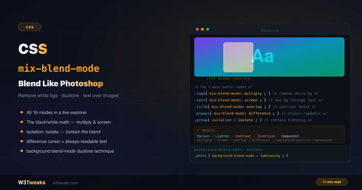
mix-blend-mode lets an element’s pixels react to whatever is behind them — using the same compositing algorithms Photoshop has offered since the 1990s, now available in a single CSS property.
/* Remove white background from a logo — no Photoshop needed */
.logo { mix-blend-mode: multiply; }

/* Text that's always readable on any background */
.label { color: white; mix-blend-mode: difference; }

/* Overlay that boosts contrast of whatever's behind it */
.tint { mix-blend-mode: overlay; }
This guide covers all 16 blend modes organized into 5 learnable groups, the mathematical reason multiply removes white and screen removes black, isolation: isolate for containing blending, background-blend-mode for duotone effects, the canonical Spotify-style SVG feColorMatrix duotone when CSS isn’t accurate enough, the WCAG accessibility caveat for “always readable” difference text, the interaction matrix when blend modes silently stop working with opacity/filter/transform, plus-lighter/plus-darker from CSS Blending Level 2, animation/transition behavior, the glitch / chromatic-aberration RGB-split pattern, and forced-colors mode fallbacks. For how blend modes interact with CSS filters and stacking contexts, see CSS filter & backdrop-filter.
Live Demo
Three tabs: ① all 16 blend modes in a live explorer — click any mode to apply it to the shape, text, or both, ② six practical patterns including white background removal, always-readable text, isolation containment, and the cursor inversion effect, ③ background-blend-mode patterns — duotone photos, color tinting, and animated blend mode cycling.
How mix-blend-mode Works
When an element has mix-blend-mode set to anything other than normal, its pixels are mathematically combined with the pixels of the layers behind it. The formula used depends on the blend mode value.
The element doing the blending is called the source. What’s behind it is called the backdrop. The result is a new composite color computed pixel by pixel.
.element {
  mix-blend-mode: multiply; /* element blends with backdrop */
}
Blend modes work between elements that share the same stacking context — typically siblings or parent/child. Elements in completely separate branches of the DOM that happen to visually overlap will not blend with each other unless they share a stacking context.
Complete CSS Blend Modes List — 16 Values
All 16 blend modes fall into 5 groups based on their mathematical behavior. Memorizing the groups makes the modes intuitive.
Group 1 — Darken (multiply, darken, color-burn)
These modes always produce a result darker than either input color. White pixels disappear. Dark colors get darker.
/* multiply — white becomes transparent, everything darkens */
.logo-with-white-bg { mix-blend-mode: multiply; }

/* darken — keeps whichever pixel is darker */
.overlay { mix-blend-mode: darken; }

/* color-burn — darkens background using element color */
.dramatic { mix-blend-mode: color-burn; }
Mental model: Darken group = “things that make light disappear.”
Group 2 — Lighten (screen, lighten, color-dodge)
These modes always produce a result lighter than either input color. Black pixels disappear. Light colors get lighter.
/* screen — black becomes transparent, everything lightens */
.text-on-image { mix-blend-mode: screen; }

/* lighten — keeps whichever pixel is lighter */
.highlight { mix-blend-mode: lighten; }

/* color-dodge — brightens background using element */
.blown-out { mix-blend-mode: color-dodge; }
Mental model: Lighten group = “things that make dark disappear.”
Group 3 — Contrast (overlay, hard-light, soft-light)
These modes boost contrast — darks get darker, lights get lighter.
.colorize { mix-blend-mode: overlay; }
.subtle { mix-blend-mode: soft-light; }
.graphic { mix-blend-mode: hard-light; }
Mental model: Contrast group = “Photoshop’s photo enhancement modes.”
Group 4 — Inversion (difference, exclusion)
These modes subtract one color from another, often producing inverted or unusual results.
.always-contrast { mix-blend-mode: difference; }
.psychedelic { mix-blend-mode: exclusion; }
Mental model: Inversion group = “things that create unexpected, contrasting results.”
Group 5 — Component (hue, saturation, color, luminosity)
These modes take specific color properties from the source and combine with others from the backdrop.
.colorize-photo { mix-blend-mode: color; }       /* hue+sat from source, luminosity from backdrop */
.duotone { mix-blend-mode: luminosity; }         /* luminosity from source, hue+sat from backdrop */
.hue-shift { mix-blend-mode: hue; }              /* hue only */
.desaturate { mix-blend-mode: saturation; }      /* saturation only */
Mental model: Component group = “Photoshop’s advanced layer blending options.”
Beyond the 16: Premultiplied-Alpha Modes (plus-lighter, plus-darker)
CSS Blending Level 2 added two newer modes that operate on premultiplied alpha — used by Apple’s Liquid Glass-style UIs and modern cross-fade animations:
| Mode | Behavior | Use case |
|---|---|---|
plus-lighter | Adds alpha-weighted colors (sum without saturating) | Cross-fade animations without the mid-fade flicker. Used in iOS view transitions. |
plus-darker | Multiplies alpha-weighted colors | Subtractive layering on partially transparent stacks. Rare. |
/* The "no flicker" cross-fade — both images fully visible at the midpoint */
.fade-out { mix-blend-mode: plus-lighter; }
.fade-in  { mix-blend-mode: plus-lighter; }
Browser support: Safari 15.4+, Chrome 121+, Firefox 130+. Use as progressive enhancement.
The Black/White Math — Why multiply and screen Are So Powerful
multiply and screen are the most practically useful blend modes, and their behavior with pure black and white is mathematically exact.
multiply: white disappears, black stays
The multiply formula: result = source × backdrop
In terms of color values (0 = black, 1 = white):
- Source pixel is white (1):
1 × backdrop = backdrop— backdrop shows through unchanged - Source pixel is black (0):
0 × backdrop = 0— always black
Practical result: White pixels on the source become transparent (showing whatever’s behind). Dark pixels remain dark. Perfect for logos on white backgrounds.
screen: black disappears, white stays
The screen formula: result = 1 - (1 - source) × (1 - backdrop)
- Source pixel is black (0):
1 - (1-0) × (1-backdrop) = backdrop— backdrop shows through - Source pixel is white (1):
1 - (0) × anything = 1— always white
Practical result: Black pixels become transparent. White pixels remain white. This is the opposite of multiply.
Pattern 1: Remove White Background CSS
The most-searched mix-blend-mode use case. You have a logo JPEG or PNG with a white background and no transparent version available. Remove white background from a logo in CSS with mix-blend-mode: multiply — no Photoshop needed.
<div class="brand-container">
  <img class="logo" src="logo-with-white-bg.jpg" alt="Logo">
</div>
.brand-container {
background: linear-gradient(135deg, #7c3aed, #0891b2);
padding: 20px;
}
.logo {
mix-blend-mode: multiply;
/* White areas of the logo disappear, showing the gradient through */
}Works best when: The logo has a clean white background and dark logo colors. If the logo has colors other than black on white, multiply will tint them. For logos with colored shapes on a white background, you may prefer an SVG with transparent fill — but multiply is the quick CSS fix.
Pattern 2: Text That Always Contrasts (with the WCAG Caveat)
mix-blend-mode: difference on white text creates a text color that is the complement of whatever is behind it:
.always-readable {
  color: white;
  mix-blend-mode: difference;
}
⚠️ The “Always Readable” Myth
The most-shared misconception about
differencetext. The formula is|source - backdrop|per channel — so against a mid-luminance backdrop (e.g. RGB ~127, 127, 127), white text becomes mid-grey (~128, 128, 128) and fails WCAG 1.4.3 (4.5:1 contrast). The text is not “always readable” — it’s only reliably readable against backgrounds with extreme luminance values (very dark or very light).WCAG SC 1.4.3 applies to the composited color, not the source color. If you ship
mix-blend-mode: differencetext, Lighthouse will fail the audit on any mid-tone background.Safer alternative: use
differencefor decorative cursor effects (Pattern 5 below) where readability isn’t the goal. For accessibility-critical text on unpredictable backgrounds, use a semi-transparent scrim or atext-shadowwith a contrasting color — both produce predictable, measurable contrast.
For unpredictable backgrounds where the design genuinely calls for difference, add a contrast-safe fallback:
.label {
  color: white;
  mix-blend-mode: difference;
  /* Fallback: drop-shadow ensures the text edge has contrast in worst-case backdrop luminance */
  filter: drop-shadow(0 0 2px rgba(0,0,0,0.8));
}
Pattern 3: CSS Text on Image Readable with overlay
Making CSS text on image readable without a dark scrim, using overlay blend mode. overlay multiplies against dark backgrounds and screens against light ones — text with mix-blend-mode: overlay maintains visibility across both dark and light areas of an image:
<div class="hero">
  <img class="hero-img" src="photo.jpg" alt="">
  <h1 class="hero-title">Article Title</h1>
</div>
.hero { position: relative; }
.hero-img {
width: 100%;
height: 400px;
object-fit: cover;
}
.hero-title {
position: absolute;
inset: 0;
display: flex;
align-items: center;
justify-content: center;
color: white;
mix-blend-mode: overlay;
font-size: clamp(2rem, 5vw, 4rem);
font-weight: 900;
}Same WCAG caveat applies — overlay text isn’t reliably 4.5:1 on every backdrop. For body copy that must meet WCAG AA, a dark scrim (background: linear-gradient(transparent, rgba(0,0,0,.7))) is the safer, measurable choice.
Pattern 4: isolation isolate CSS — Containing the Blending
What isolation: isolate in CSS actually does — and why it’s the fix for half your blend-mode bugs. By default, blend modes blend the element against everything in the stacking context behind it — including the page background, grandparent backgrounds, and other unrelated elements.
isolation: isolate creates a new stacking context, so blend modes inside only blend with elements within that context:
/* ❌ Problem — circles blend with the page background too */
.rgb-circles .circle {
  mix-blend-mode: screen;
}

/* ✅ Fix — circles only blend with each other */
.rgb-circles {
  isolation: isolate; /* creates a new stacking context */
  background: black;  /* black is neutral for screen blend mode */
}

.rgb-circles .circle {
  mix-blend-mode: screen;
}<div class="rgb-circles">
<div class="circle red"></div>
<div class="circle green"></div>
<div class="circle blue"></div>
</div>.rgb-circles {
isolation: isolate;
background: black;
position: relative;
width: 200px;
height: 200px;
}
.circle {
position: absolute;
width: 80px;
height: 80px;
border-radius: 50%;
mix-blend-mode: screen;
}
.red { background: red; top: 10px; left: 10px; }
.green { background: lime; top: 10px; right: 10px; }
.blue { background: blue; bottom: 10px; left: 50%; transform: translateX(-50%); }Pattern 5: The Difference Cursor Effect
A popular design pattern — a circle that inverts colors under the cursor as it moves. Pure mix-blend-mode: difference on the cursor element, no complex color calculation needed:
<div class="container" id="container">
  <div class="cursor-dot" id="cursor"></div>
</div>
.cursor-dot {
position: fixed;
width: 40px;
height: 40px;
border-radius: 50%;
background: white;
mix-blend-mode: difference;
pointer-events: none;
transform: translate(-50%, -50%);
transition: width 0.2s, height 0.2s;
z-index: 9999;
}document.addEventListener('mousemove', (e) => {
cursor.style.left = e.clientX + 'px';
cursor.style.top = e.clientY + 'px';
});Pattern 6: CSS Glitch Effect (Chromatic Aberration)
Build a pure-CSS glitch effect by stacking RGB-channel layers with mix-blend-mode: screen + animated offsets. The result mimics CRT chromatic aberration / VHS distortion:
<div class="glitch" data-text="GLITCH">
  <span aria-hidden="true">GLITCH</span>
  <span aria-hidden="true">GLITCH</span>
  GLITCH
</div>
.glitch {
position: relative;
display: inline-block;
font-size: clamp(3rem, 8vw, 6rem);
font-weight: 900;
color: white;
background: black;
isolation: isolate; /* contain the blend to this stack */
}
.glitch span {
position: absolute;
inset: 0;
mix-blend-mode: screen;
}
.glitch span:nth-child(1) {
color: #ff0040; /* red channel */
animation: glitch-rgb 2.5s infinite;
}
.glitch span:nth-child(2) {
color: #00ffea; /* cyan channel */
animation: glitch-rgb 2.5s infinite reverse;
}
@keyframes glitch-rgb {
0%, 100% { transform: translate(0, 0); }
20% { transform: translate(-3px, 2px); }
40% { transform: translate(3px, -2px); }
60% { transform: translate(-2px, -1px); }
80% { transform: translate(2px, 1px); }
}
@media (prefers-reduced-motion: reduce) {
.glitch span { animation: none; transform: none; }
}The two <span> channels use screen to add red and cyan light to the base text. As they offset slightly, the eye sees an RGB-split “broken signal” effect. Always include the prefers-reduced-motion opt-out.
When mix-blend-mode Silently Stops Working: The Interaction Matrix
Mix-blend-mode not working? 90% of the time it’s a missing isolation: isolate on the parent — but the other 10% is a sibling property that creates a stacking context and flattens the blend. The complete matrix:
| Property | Creates stacking context? | Flattens nested blend? |
|---|---|---|
opacity < 1 | ✅ Yes | ✅ Often — blend mode renders on the opacity layer, not the page |
filter: * (anything not none) | ✅ Yes | ✅ Yes — same mechanism |
transform: * (anything not none) | ✅ Yes | ⚠️ Sometimes — depends on which property triggers compositing first |
will-change: transform | ✅ Yes (in most browsers) | ⚠️ Sometimes |
backdrop-filter: * | ✅ Yes | ✅ Yes |
isolation: isolate | ✅ Yes (by design) | ✅ Intentional containment |
position: fixed | ✅ Yes | ⚠️ Sometimes |
mix-blend-mode itself | ✅ Yes | (this is the source) |
The rule: if you set mix-blend-mode on an element AND its parent has any of opacity < 1, filter, transform, or backdrop-filter, the blend will composite against the PARENT’S rendered output, not the grandparent / page. Often that’s fine — sometimes it silently breaks the effect.
Debug pattern: systematically remove opacity, filter, transform from each ancestor in DevTools until the blend works. The first ancestor where removal fixes it is the culprit.
background-blend-mode — Blend Inside an Element
background-blend-mode blends multiple CSS background layers on the same element — the background image blends with the background color (or other background images). Unlike mix-blend-mode, it doesn’t interact with surrounding elements.
.element {
  background-image: url(photo.jpg);
  background-color: #7c3aed;
  background-blend-mode: multiply;
}
CSS Duotone Image — The Pure-CSS Approach
Create a CSS duotone image effect with two background layers and luminosity + color. The most powerful background-blend-mode technique — converting a photo to a two-color (duotone) image using only CSS:
.duotone-photo {
  background-image: url(photo.jpg),
    linear-gradient(to right, #7c3aed, #0891b2);
  background-blend-mode: luminosity;
}
How it works: luminosity takes the luminance (brightness) from the top layer (the photo) and the hue and saturation from the bottom (the gradient). The photo’s shapes and contrast remain; its colors are replaced by the gradient.
For a punchier result, add filter: contrast(1.2) to the element.
CSS Duotone Photo Effect — The Spotify-Style SVG feColorMatrix Approach
When you need exact tonal remapping (Spotify’s canonical duotone covers), reach for SVG feColorMatrix instead of background-blend-mode. It’s more accurate because you control the exact tonal curve:
<svg width="0" height="0" style="position:absolute">
  <defs>
    <filter id="duotone-purple-cyan">
      <!-- Step 1: desaturate to greyscale -->
      <feColorMatrix type="matrix" values="
        0.333 0.333 0.333 0 0
        0.333 0.333 0.333 0 0
        0.333 0.333 0.333 0 0
        0     0     0     1 0" />
      <!-- Step 2: remap greyscale to a two-color gradient -->
      <feComponentTransfer color-interpolation-filters="sRGB">
        <feFuncR tableValues="0.486 0.035" />  <!-- #7c3aed → #08… -->
        <feFuncG tableValues="0.227 0.569" />
        <feFuncB tableValues="0.929 0.698" />
        <feFuncA tableValues="1 1" />
      </feComponentTransfer>
    </filter>
  </defs>
</svg>
.duotone-spotify {
filter: url(#duotone-purple-cyan);
}When to use which:
| Approach | Use when |
|---|---|
background-blend-mode: luminosity (pure CSS) | Fast prototyping, decorative thumbnails, no exact color brand match required |
SVG feColorMatrix + feComponentTransfer | Brand-accurate two-tone covers (Spotify), pixel-exact tonal remap |
The CSS approach is one line; the SVG approach is 15 lines but ranges across exact RGB values. For high-traffic brand pages, ship the SVG version; for everywhere else, CSS is enough.
Background Blend Mode Multiply for Color Tinting
Use background-blend-mode: multiply to tint hero images with a brand color:
.tinted-purple {
  background-image: url(photo.jpg), linear-gradient(#7c3aed, #7c3aed);
  background-blend-mode: multiply;
}

.tinted-amber {
  background-image: url(photo.jpg), linear-gradient(#d97706, #d97706);
  background-blend-mode: multiply;
}
Animating mix-blend-mode — The “Not Animatable” Myth
The CSS spec describes mix-blend-mode as discrete (not interpolated). In practice, browsers do support @keyframes with blend modes — they snap between values without interpolation:
@keyframes blend-cycle {
  0%   { mix-blend-mode: normal; }
  33%  { mix-blend-mode: screen; }
  66%  { mix-blend-mode: multiply; }
  100% { mix-blend-mode: overlay; }
}

.cycling { animation: blend-cycle 6s ease-in-out infinite; }
For genuine interpolation of a numeric “blend amount”, use @property to type a custom property and animate it instead of the blend mode itself:
@property --blend-mix {
  syntax: '<percentage>';
  inherits: false;
  initial-value: 0%;
}

.fade {
  background:
    linear-gradient(180deg, rgba(124, 58, 237, var(--blend-mix)), transparent) /* fades in */ ,
    url(photo.jpg);
  background-blend-mode: multiply;
  transition: --blend-mix 0.5s;
}

.fade:hover { --blend-mix: 100%; }
@property makes --blend-mix typed-and-animatable — the browser can now interpolate between 0% and 100% smoothly. Combined with background-blend-mode, you get the visual effect of “blend amount” transitioning.
mix-blend-mode vs backdrop-filter
These are frequently confused. They are fundamentally different tools:
mix-blend-mode | backdrop-filter | |
|---|---|---|
| What it does | Blends element with backdrop using Photoshop-like algorithms | Applies filter effects (blur, brightness) to the backdrop |
| Uses Photoshop math | ✅ multiply, screen, overlay, etc. | ❌ uses CSS filter functions |
| Needs transparency | Works on any element | Element must be semi-transparent |
| Creates stacking context | ✅ Yes | ✅ Yes |
| Good for | Logo white removal, text effects, duotone, glitch | Frosted glass nav, modal blurs |
Performance Considerations
Blend modes require the browser to composite layers, which has a rendering cost:
/* Contain blending to a single composited layer */
.list-wrapper {
  isolation: isolate;
  will-change: transform;
}
.item { mix-blend-mode: multiply; }
Test on mobile — blend modes on large areas (hero images, full-page backgrounds) can drop below 60fps on older mobile hardware. Bugzilla #1008128 documents the historical Firefox compositor cost; modern browsers are much better but mobile GPUs still struggle with full-screen blends.
Mix Blend Mode Not Working? Debug Checklist
Transparent body background breaks blend modes:
/* ❌ Blend modes don't render — body is transparent */
body { }

/* ✅ Fix — give body any background */
body { background: #ffffff; }
Elements from different DOM branches don’t blend: mix-blend-mode only blends elements within the same stacking context. Use isolation: isolate on a shared parent to force a new stacking context.
Stacking context from a parent property flattens the blend: any of opacity < 1, filter, transform, backdrop-filter on an ancestor creates a new stacking context that the blend renders inside. See the interaction matrix above.
Forced-colors mode (Windows High Contrast) strips blend modes: all blend modes flatten to normal in forced-colors: active — the system color theme takes over. Provide a fallback that doesn’t depend on blending for accessibility-critical content:
.glitch-text {
  mix-blend-mode: screen;
  color: cyan;
}

@media (forced-colors: active) {
  .glitch-text {
    mix-blend-mode: normal;
    color: CanvasText;
  }
}
Print stylesheets generally strip blend modes: browsers don’t support mix-blend-mode reliably in print. Override with @media print:
@media print {
  * {
    mix-blend-mode: normal !important;
    background-blend-mode: normal !important;
  }
}
blend mode creates unintended stacking context for children: Setting mix-blend-mode to anything other than normal creates a stacking context — exactly like opacity or filter. This can break z-index layering on child elements. Use isolation: isolate on a wrapper to control where the boundary sits.
Browser Support
mix-blend-mode — Baseline since January 2020. Chrome 41+, Firefox 32+, Safari 8+, Edge 79+. 98%+ global coverage.
background-blend-mode — same support. Chrome 35+, Firefox 30+, Safari 8+, Edge 79+.
isolation: isolate — Chrome 41+, Firefox 36+, Safari 8+, Edge 79+.
plus-lighter / plus-darker — Safari 15.4+, Chrome 121+, Firefox 130+. Progressive enhancement.
Key Takeaways
- Blend modes are organized into 5 groups: Darken, Lighten, Contrast, Inversion, Component
multiplyerases white because white × anything = anything — perfect for logo white-background removalscreenerases black because screen of black = the other color — for text that reveals the backgrounddifferencecreates complementary colors — but it is NOT “always readable”; mid-luminance backdrops produce ~#808080 and fail WCAG 1.4.3- For accessibility-critical text on unpredictable backgrounds, use a dark scrim or
text-shadowinstead — measurable contrast, not pixel math isolation: isolatecreates a stacking context boundary — blend modes inside only blend with siblings, not the whole pagebackground-blend-modeblends background layers on the same element — useluminosityfor fast duotone- For brand-accurate two-tone covers (Spotify-style), use SVG
feColorMatrix+feComponentTransferinstead — more accurate at the cost of 15 lines plus-lighter/plus-darker(CSS Blending Level 2) are the premultiplied-alpha modes Apple uses for view transitionsmix-blend-modesilently flattens when an ancestor hasopacity < 1,filter,transform, orbackdrop-filter— they all create stacking contexts- Blend modes can be cycled with
@keyframes(snap, no interpolation); for smooth interpolation, animate an@propertytyped variable - Transparent
bodybackground breaks blend modes — always set a background onbody forced-colors: activestrips all blend modes — provide a fallback- Print stylesheets generally strip blend modes — override with
@media print - Performance: blend modes create compositing layers — test on mobile, use
isolationto contain the scope
FAQ
What is CSS mix-blend-mode?
mix-blend-mode is a CSS property that controls how an element’s pixels blend with the pixels of whatever is behind it, using the same Photoshop-like compositing algorithms (multiply, screen, overlay, etc.). The element blends against its backdrop — everything visible behind it in the same stacking context.
How do I remove a white background from a logo with CSS?
Apply mix-blend-mode: multiply to the logo image. The multiply formula multiplies source pixels by backdrop pixels — white (value 1) times anything equals that same value, so white pixels become transparent. Place the logo on a colored background and white areas disappear completely. Works best with logos that have a clean white background and dark colors — colored shapes on white will get tinted by the backdrop.
Mix-blend-mode vs opacity — which one when?
Both create stacking contexts, but they do completely different things. opacity uniformly reduces the transparency of the entire element (and its children). mix-blend-mode changes the pixel math used to composite the element against its backdrop without changing transparency. Use opacity to fade an element in/out. Use mix-blend-mode to color-interact with the backdrop (remove white, invert colors, create duotone). They can be combined, but the opacity layer applies first — so blending happens on the already-faded element.
What is the difference between mix-blend-mode and backdrop-filter?
mix-blend-mode blends an element’s pixels with the backdrop using Photoshop-like mathematical formulas (multiply, screen, overlay). backdrop-filter applies CSS filter effects (blur, brightness, contrast) to the pixels behind an element. They serve completely different purposes — mix-blend-mode for artistic compositing effects, backdrop-filter for frosted glass and UI blur effects.
What does isolation: isolate do with mix-blend-mode?
isolation: isolate creates a new stacking context boundary. Without it, blend modes inside an element blend with everything behind them on the page, including grandparent backgrounds and unrelated elements. With isolation: isolate on the parent, blend modes inside only blend with elements within that same parent — contained, predictable blending.
Why is my mix-blend-mode not working?
Most common cause: the body element has no background color set. Blend modes fail to composite on a transparent root. Fix: add any background to body. Other causes: an ancestor has opacity < 1, filter, transform, or backdrop-filter — all of which create stacking contexts that flatten the blend. Or elements are in different DOM branches that only visually overlap but don’t share a stacking context — use isolation: isolate on a shared parent.
Why does my mix-blend-mode disappear in dark mode or forced-colors mode?
In forced-colors: active (Windows High Contrast Mode), all blend modes are flattened to normal — the system color theme takes over. This is by design for accessibility. Provide a fallback with @media (forced-colors: active) that uses system colors (CanvasText, Canvas) instead of relying on the blend. Print media also generally strips blend modes — override with @media print { * { mix-blend-mode: normal !important; } }.
What is background-blend-mode used for?
background-blend-mode blends multiple CSS background layers on the same element — typically a background-image with a background-color or second background image. Its most popular use is the duotone photo technique: background-image: url(photo.jpg), linear-gradient(...) with background-blend-mode: luminosity maps the photo’s tones to the gradient’s colors, creating a two-color image effect without image editing software. For brand-accurate two-tone covers, use SVG feColorMatrix instead.