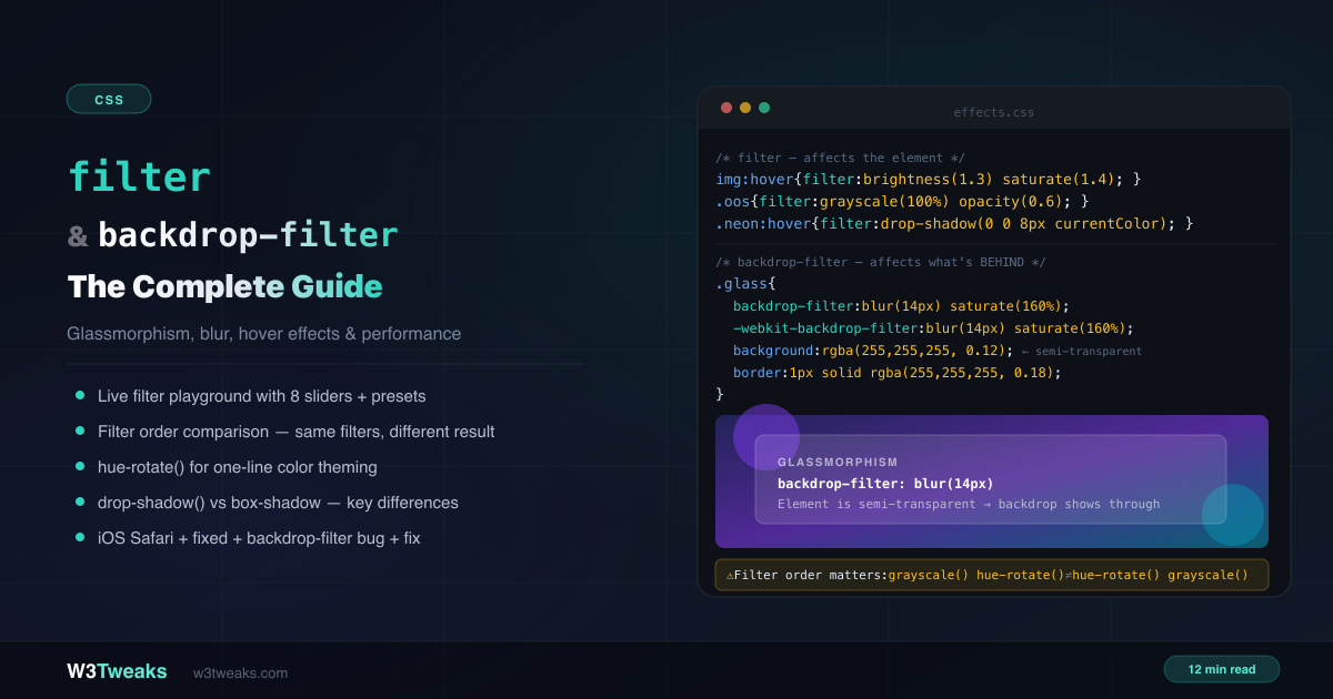
filter and backdrop-filter are two of the most visually impactful CSS properties — and the least understood. They share the same set of functions but apply effects to completely different targets.
/* filter — affects the element itself */
img { filter: grayscale(100%); }
img:hover { filter: grayscale(0) brightness(1.1); }

/* backdrop-filter — affects what's BEHIND the element */
.nav {
  background: rgba(255, 255, 255, 0.1); /* must be semi-transparent */
  backdrop-filter: blur(12px) saturate(160%);
}
This complete guide covers all 10 filter functions, why filter order changes the result, drop-shadow() vs box-shadow, the hue-rotate() theming trick, glassmorphism patterns including Apple’s Liquid Glass aesthetic and the native dialog::backdrop modal pattern, filter: url() for SVG-referenced effects (duotone, gooey blobs, displacement), the prefers-reduced-transparency accessibility query, @supports fallback patterns, forced-colors mode behavior, the iOS Safari performance bug, and which filters are expensive on mobile. For how filter creates a stacking context and affects z-index, see CSS z-index & stacking contexts.
Live Demo
Three tabs: ① live filter playground with 8 sliders and 8 presets — stack any combination and see the CSS, ② backdrop-filter glassmorphism patterns with hue-rotate() instant theming demo, ③ real-world patterns — hover effects, grayscale out-of-stock, neon glow, drop-shadow on icons, blurred background trick.
10 CSS Filter Examples You’ll Actually Use
All filter functions work with both filter and backdrop-filter. They’re applied left-to-right in declaration order.
blur()
filter: blur(0);    /* no blur — sharp */
filter: blur(4px);  /* moderate blur */
filter: blur(20px); /* heavy blur */
Applies a Gaussian blur. The value is a standard deviation — not a radius. The only unit is px (no percentages).
brightness()
filter: brightness(0);    /* completely black */
filter: brightness(0.5);  /* 50% brightness */
filter: brightness(1);    /* unchanged (default) */
filter: brightness(1.5);  /* 50% brighter */
filter: brightness(200%); /* percentage also valid */
Scales luminance linearly. Use 1.1–1.3 for subtle hover feedback on images and cards.
contrast()
filter: contrast(0);    /* flat grey */
filter: contrast(1);    /* unchanged */
filter: contrast(2);    /* high contrast */
Adjusts the difference between light and dark areas. Above 1 increases punch and vibrancy.
grayscale()
filter: grayscale(1);    /* fully grey */
filter: grayscale(0.5);  /* partial desaturation */
filter: grayscale(0);    /* full color */
A classic CSS filter grayscale on hover pattern: apply grayscale(1) to logo walls or team grids, remove on hover to reveal color.
hue-rotate() — CSS Color Change
filter: hue-rotate(0deg);    /* no change */
filter: hue-rotate(90deg);   /* 90° shift — greens become blues */
filter: hue-rotate(180deg);  /* complementary color */
A single filter: hue-rotate(120deg) shifts your entire brand palette — instant theming without touching a CSS variable. The most creative filter, covered in depth below.
invert()
filter: invert(1);    /* fully inverted — photographic negative */
filter: invert(0.5);  /* 50% — grey midtones */
Used for dark-mode image handling or creative visual effects.
opacity()
filter: opacity(0.5); /* 50% transparent */Same visual result as the opacity CSS property, but can be combined with other filter functions in a single chain.
saturate()
filter: saturate(0);    /* desaturated */
filter: saturate(1);    /* unchanged */
filter: saturate(180%); /* vivid */
Combine with brightness(1.1) for a “vibrant photo” hover effect.
sepia()
filter: sepia(1); /* full warm brown tone */Combine with brightness(0.9) and contrast(0.85) for an authentic aged-photo look.
drop-shadow() — drop-shadow CSS for Shape-Aware Shadows
filter: drop-shadow(x y blur color);

filter: drop-shadow(4px 4px 8px rgba(0,0,0,0.5));
filter: drop-shadow(0 0 12px #6366f1);
Use the drop-shadow CSS filter when you need a shadow that follows transparency — PNGs, SVGs, and text glyphs. This is the critical difference from box-shadow.
CSS Filter Order Matters: Left-to-Right Application
This is the most overlooked fact about CSS filters. Filters are applied left to right, each one operating on the output of the previous filter. The same filters in a different order produce a different result.
/* These two are NOT equivalent */
filter: grayscale(100%) hue-rotate(90deg);
filter: hue-rotate(90deg) grayscale(100%);
Why: In the first declaration, grayscale(100%) removes all color information first, leaving a grey image. Then hue-rotate(90deg) runs on an already-grey image — no color to rotate, so the output is grey.
/* More visible order impact */
filter: sepia(100%) hue-rotate(180deg);  /* sepia, then shift to blue-grey */
filter: hue-rotate(180deg) sepia(100%); /* blue-grey, then sepia over it */

/* Practical effect */
filter: blur(4px) drop-shadow(0 4px 8px black);
/* shadow applied to blurred output — soft shadow */

filter: drop-shadow(0 4px 8px black) blur(4px);
/* shadow is sharpened first, then everything blurs — less visible shadow */
Rule of thumb: Put blur() last if you want other effects to remain sharp. Put drop-shadow() after other filters if you want the shadow color unaffected.
drop-shadow() vs box-shadow — The Real Differences
These two look similar but work fundamentally differently:
box-shadow | filter: drop-shadow() | |
|---|---|---|
| Follows | Bounding box (rectangle) | Alpha channel (actual shape) |
| Spread radius | ✅ Supported | ❌ Not supported |
| Multiple shadows | ✅ Comma-separated | ✅ Space-separated in filter |
| Inset shadow | ✅ inset keyword | ❌ Not supported |
| Blur radius math | Standard | Half value = same visual result |
Applies after clip-path | ❌ Gets clipped | ✅ Applies after clipping |
| Works on transparent PNGs | ❌ Rectangular only | ✅ Follows shape |
Survives forced-colors | ❌ Stripped | ❌ Stripped |
The blur radius difference
drop-shadow() blur is calculated differently from box-shadow:
/* These look approximately the same */
box-shadow: 0 0 20px rgba(0,0,0,0.5);     /* box-shadow blur: 20px */
filter: drop-shadow(0 0 10px rgba(0,0,0,0.5)); /* drop-shadow blur: 10px (half) */
drop-shadow() uses a standard deviation value (from SVG filter math). To match a box-shadow blur of 20px, use drop-shadow blur of 10px.
When to use each
Use box-shadow for:
- Regular rectangular elements (cards, buttons, modals)
- When you need
insetshadow - When you need a spread radius to create a solid border-like glow
Use filter: drop-shadow() for:
- PNG images with transparent backgrounds
- SVG icons and illustrations
- Elements with
clip-pathapplied - Text glyphs (follows letterforms, unlike
text-shadowwhich can blur weirdly) - Neon glow effects (stack multiple)
Combining Multiple Filters
Chain multiple filter functions in a single declaration, separated by spaces:
/* Vintage photo effect */
.vintage {
  filter: sepia(0.6) contrast(0.85) brightness(0.9) saturate(0.8);
}

/* Out-of-stock grayout */
.unavailable {
  filter: grayscale(100%) opacity(0.6);
  cursor: not-allowed;
}

/* CSS filter hover effect — a subtle hover like this makes
   product cards pop without changing layout */
.card:hover {
  filter: brightness(1.1) contrast(1.05) saturate(1.3);
  transition: filter 0.3s ease;
}

/* Neon glow — stack drop-shadows */
.neon-btn:hover {
  filter:
    drop-shadow(0 0 6px currentColor)
    drop-shadow(0 0 20px currentColor)
    drop-shadow(0 0 40px currentColor);
}
The Gooey Blob Trick — blur() + contrast()
A pure-CSS metaball effect using nothing but two chained filters on a parent + colored circles inside:
.gooey-container {
  /* Heavy blur softens edges; high contrast clips alpha
     above ~50% to opaque, below ~50% to transparent.
     Result: blobs that merge as they overlap. */
  filter: blur(20px) contrast(30);
}

.gooey-container > .blob {
  width: 60px;
  height: 60px;
  background: #7c3aed;
  border-radius: 50%;
  position: absolute;
}
This is the perfect demonstration of “filter order matters” in action: swap blur() and contrast() and the effect vanishes. blur() MUST run first so contrast() has a soft edge to threshold.
backdrop-filter — How It Works
backdrop-filter applies filter functions to the content behind an element — not the element itself. For the effect to be visible, the element (or its background) must be semi-transparent or fully transparent.
/* ❌ Backdrop is hidden — element is opaque */
.panel {
  background: #fff;
  backdrop-filter: blur(12px); /* you can't see through white */
}

/* ✅ Backdrop is visible — element is semi-transparent */
.panel {
  background: rgba(255, 255, 255, 0.15); /* semi-transparent */
  backdrop-filter: blur(12px) saturate(160%);
  -webkit-backdrop-filter: blur(12px) saturate(160%); /* Safari */
}
Frosted Glass CSS — The Glassmorphism Pattern
The frosted glass CSS pattern is just backdrop-filter: blur(12px) plus a translucent background and a 1px inner border. Copy-paste glassmorphism CSS code below — works in every evergreen browser since 2023:
.glass-card {
  /* Semi-transparent fill */
  background: rgba(255, 255, 255, 0.12);

  /* The frosted glass effect */
  backdrop-filter: blur(14px) saturate(160%);
  -webkit-backdrop-filter: blur(14px) saturate(160%); /* Safari */

  /* Subtle highlight border */
  border: 1px solid rgba(255, 255, 255, 0.18);
  border-radius: 16px;

  /* Depth */
  box-shadow: 0 8px 32px rgba(0, 0, 0, 0.1);
}
Glassmorphism nav bar
.nav {
  position: sticky;
  top: 0;
  z-index: 50;
  background: rgba(11, 15, 26, 0.6);
  backdrop-filter: blur(12px) brightness(110%);
  -webkit-backdrop-filter: blur(12px) brightness(110%);
  border-bottom: 1px solid rgba(255, 255, 255, 0.07);
}
Apple Liquid Glass — iOS 26 / macOS Tahoe Aesthetic
Apple’s Liquid Glass design language (shipped in iOS 26 and macOS Tahoe) layers backdrop-filter: blur() with an SVG feDisplacementMap for refraction — the “glass” warps the content behind it as if light is bending through curved glass. A starter pattern:
<svg width="0" height="0" style="position:absolute">
  <defs>
    <filter id="liquid-glass">
      <feTurbulence type="fractalNoise" baseFrequency="0.02" numOctaves="2" seed="3" />
      <feDisplacementMap in="SourceGraphic" scale="20" />
    </filter>
  </defs>
</svg>
.liquid-card {
background: rgba(255, 255, 255, 0.06);
backdrop-filter: blur(20px) saturate(180%);
-webkit-backdrop-filter: blur(20px) saturate(180%);
/* The refraction layer — applied to a pseudo-element so it
refracts the backdrop without distorting the card's content. */
position: relative;
isolation: isolate;
}
.liquid-card::before {
content: '';
position: absolute;
inset: 0;
filter: url(#liquid-glass);
z-index: -1;
}For production, build the SVG filter to your design (turbulence frequency and displacement scale control “how glassy” the warp looks).
Blurred Modal Overlay + dialog::backdrop
The modern modal pattern uses the native <dialog> element and styles its ::backdrop pseudo-element directly:
<dialog id="my-modal">
  <h2>Are you sure?</h2>
  <button onclick="this.closest('dialog').close()">Cancel</button>
</dialog>dialog::backdrop {
background: rgba(0, 0, 0, 0.4);
backdrop-filter: blur(8px);
-webkit-backdrop-filter: blur(8px);
}
dialog {
background: rgba(17, 24, 39, 0.9);
backdrop-filter: blur(20px);
-webkit-backdrop-filter: blur(20px);
border: 1px solid rgba(255, 255, 255, 0.1);
border-radius: 12px;
padding: 24px;
}
/* Open the dialog from JS */
/* document.getElementById('my-modal').showModal(); */Native <dialog> + ::backdrop is universally supported in modern browsers (Chrome 117+, Firefox 129+, Safari 17.5+). Handles focus trap, ESC-to-close, and the click-outside semantics for free.
prefers-reduced-transparency — The Accessibility Override
WCAG expects you to respect users who can’t process glass effects. Chrome 118+ ships prefers-reduced-transparency alongside prefers-reduced-motion:
.glass-card {
  background: rgba(255, 255, 255, 0.12);
  backdrop-filter: blur(14px) saturate(160%);
  -webkit-backdrop-filter: blur(14px) saturate(160%);
}

@media (prefers-reduced-transparency: reduce) {
  .glass-card {
    /* Solid fallback — readable, no glass */
    background: rgb(28, 32, 48);
    backdrop-filter: none;
    -webkit-backdrop-filter: none;
  }
}
Always pair glassmorphism with this query — particularly important for nav bars and modals where users with vestibular or visual processing differences would otherwise be unable to read the foreground text.
@supports Fallback for Older Browsers
For graceful degradation when the user’s browser doesn’t support backdrop-filter at all (rare but still worth shipping):
.glass-card {
  /* Fallback — opaque background readable in any browser */
  background: rgb(28, 32, 48);
}

@supports ((backdrop-filter: blur(1px)) or (-webkit-backdrop-filter: blur(1px))) {
  .glass-card {
    /* Enhanced — semi-transparent + glass */
    background: rgba(255, 255, 255, 0.12);
    backdrop-filter: blur(14px) saturate(160%);
    -webkit-backdrop-filter: blur(14px) saturate(160%);
  }
}
Check both backdrop-filter and -webkit-backdrop-filter in the @supports query — older Safari needs the prefix and won’t match the unprefixed query.
hue-rotate() for Instant Color Theming
This is one of the most underused filter tricks. Applying hue-rotate() to <body> or :root shifts every color on the page simultaneously — creating instant theme variants from a single design:
/* Default — no rotation */
:root { filter: none; }

/* Theme variants */
[data-theme="blue"]   :root { filter: hue-rotate(200deg); }
[data-theme="green"]  :root { filter: hue-rotate(120deg); }
[data-theme="red"]    :root { filter: hue-rotate(0deg); }
[data-theme="yellow"] :root { filter: hue-rotate(60deg); }
// Toggle with JavaScript
document.documentElement.style.filter = `hue-rotate(${degrees}deg)`;Important:
filteron:rootorbodyalso shifts image colors, gradients, and anything else on the page. Use it for pure CSS themes, or scope it to specific UI containers if images should stay unaffected.
Beyond the 10 Functions: filter: url()
The 10 functions cover most cases, but filter also accepts url(#svg-filter-id) referencing an SVG <filter> element. This unlocks effects impossible with the built-in functions — duotone images, threshold cutouts, displacement, color matrix transforms, and more.
CSS Duotone Image — Spotify-Style
For a CSS duotone image effect like Spotify’s, reference an SVG <filter> with feColorMatrix via filter: url(#duotone). The matrix remaps RGB so dark pixels become one color and light pixels become another:
<svg width="0" height="0" style="position:absolute">
  <defs>
    <filter id="duotone-purple-pink">
      <feColorMatrix type="matrix" values="
        0.3  0.3  0.3  0  0.05
        0.1  0.1  0.1  0  0.1
        0.5  0.5  0.5  0  0.3
        0    0    0    1  0" />
    </filter>
  </defs>
</svg>img.duotone {
filter: url(#duotone-purple-pink);
}Build duotone matrices visually at duotone.shapefactory.co or hand-tune the matrix values: row 1 = red output, row 2 = green output, row 3 = blue output, column = R/G/B/A inputs + constant.
Threshold / Cutout Effect
A “1-bit” black-and-white threshold:
<svg width="0" height="0" style="position:absolute">
  <defs>
    <filter id="threshold">
      <feColorMatrix type="matrix" values="
        0  0  0  0  0
        0  0  0  0  0
        0  0  0  0  0
        0  0  0  127 -64" />
    </filter>
  </defs>
</svg>
.threshold { filter: url(#threshold); }The trick: the alpha row multiplies the alpha by 127 and subtracts 64 — pushing midtones above 50% to fully opaque and below 50% to fully transparent. Gives a hand-stamped / sticker look.
filter Creates a Stacking Context
Any filter value other than none creates a new stacking context — exactly like opacity. This is a common source of z-index bugs:
/* ❌ z-index stops working — filter creates a stacking context */
.parent {
  filter: blur(0px); /* even blur(0) creates a context! */
}

.child {
  position: absolute;
  z-index: 999; /* trapped inside .parent's stacking context */
}
If you’re fighting a z-index battle and nothing works, check every ancestor for filter values — including filter: blur(0), filter: brightness(1), and any animation that transitions filter. All of them create a stacking context.
Filters in forced-colors Mode
Windows High Contrast (and other forced-colors environments) strips ALL filter and box-shadow values — both box-shadow AND filter: drop-shadow() disappear. If you rely on a shadow to indicate elevation/hover/affordance, that signal is gone for these users.
.card {
  box-shadow: 0 4px 12px rgba(0,0,0,0.1);
}

/* Provide a border fallback when shadows are stripped */
@media (forced-colors: active) {
  .card {
    border: 2px solid CanvasText;
  }
}
The fix: when an affordance depends on a shadow, add a forced-colors: active rule that swaps in a border using CanvasText (the system high-contrast text color).
Performance Tiers — Not All Filters Are Equal
| Filter | Performance | Notes |
|---|---|---|
brightness() | 🟢 Fast | Simple multiply operation |
contrast() | 🟢 Fast | Simple math |
grayscale() | 🟢 Fast | Matrix operation |
sepia() | 🟢 Fast | Matrix operation |
invert() | 🟢 Fast | Simple invert |
hue-rotate() | 🟡 Moderate | Color space conversion |
saturate() | 🟡 Moderate | Color space conversion |
opacity() | 🟡 Moderate | GPU layer but simple |
blur() | 🔴 Expensive | Per-pixel gaussian blur |
drop-shadow() | 🔴 Expensive | Contains blur internally |
filter: url(#svg) | 🔴 Expensive | Composited on CPU in some browsers |
backdrop-filter: blur() | 🔴 Very expensive | Reads pixels from below every frame |
Performance tips
/* Promote to GPU layer BEFORE animation starts */
.card {
  will-change: filter;
  transition: filter 0.3s ease;
}

.card:hover {
  filter: brightness(1.2) saturate(1.3);
}

/* Remove will-change when not needed */
.card.animation-done {
  will-change: auto;
}
Keep blur() radius as small as possible while achieving the desired effect. On mobile, blur values above 10px can cause dropped frames.
⚠️ iOS Safari + position:fixed + backdrop-filter
There is a well-known performance bug in iOS Safari: applying backdrop-filter to a position: fixed element causes severe scroll jank — the browser repaints the blurred area on every scroll frame.
/* ❌ Causes scroll jank on iOS Safari */
.nav {
  position: fixed;
  top: 0;
  backdrop-filter: blur(12px);
}

/* ✅ Option 1: Use position:sticky instead */
.nav {
  position: sticky;
  top: 0;
  backdrop-filter: blur(12px);
}

/* ✅ Option 2: Modern media query for iOS */
@media (hover: none) and (pointer: coarse) {
  .nav {
    backdrop-filter: none;
    background: rgba(11, 15, 26, 0.95);
  }
}
On iPhone, backdrop-filter blur sometimes fails on elements inside position: fixed containers — promote to a stacking context with transform: translateZ(0) if you must keep fixed positioning.
CSS backdrop-filter Not Working? Debug Checklist
If backdrop-filter is not working, check three things first: a -webkit- prefix for Safari, a semi-transparent background, and no overflow: hidden on the parent.
No visible effect:
- Is the element (or its background) semi-transparent?
background: rgba(...)— notbackground: #fff - Is the
-webkit-backdrop-filterprefix included for Safari? - Is there content behind the element to blur?
backdrop-filteron an element with nothing behind it has no visible effect - Parent has
overflow: hiddenortransform? This creates a containing block that clips the backdrop sample —backdrop-filterhas nothing to read. Move the element outside the clipping ancestor, or use a positioned wrapper. backdrop-filteronbodyorhtml? No effect by design — there’s nothing behind the root element to filter.
Effect visible in Chrome but not Safari:
- Missing
-webkit-backdrop-filter: blur(...)— backdrop-filter in Safari still ships behind the-webkit-backdrop-filterprefix — declare both for full coverage - Safari 14 and below required the prefix; Safari 18+ supports without prefix but keep both for compatibility
Scroll jank on mobile:
position: fixed+backdrop-filter— switch toposition: stickyor provide an opaque fallback on touch devices
Shadows gone in High Contrast?
forced-colors: activestrips allbox-shadowandfilter: drop-shadow()values — add a border fallback inside aforced-colors: activemedia query
z-index issues after adding filter:
filtercreates a stacking context — children cannotz-indexabove elements outside the filtered parent. See CSS z-index & stacking contexts.
Browser Support
filter — Chrome 18+, Firefox 35+, Safari 9.1+. Baseline, 99%+ global support.
backdrop-filter — Baseline as of September 2024 (Chrome 76+, Firefox 103+, Safari 9+). Always include -webkit-backdrop-filter for Safari compatibility. Global support is now 96%+.
filter: url(#id) — Universal support since IE10.
prefers-reduced-transparency — Chrome 118+, Safari 18+, Firefox in progress. Use as progressive enhancement.
dialog::backdrop — Chrome 117+, Firefox 129+, Safari 17.5+.
Key Takeaways
filterapplies effects to the element itself;backdrop-filterapplies to what’s behind it- Filters are applied left to right — order changes the result, especially when color filters interact
drop-shadow()follows the alpha channel (shape-aware);box-shadowfollows the bounding boxdrop-shadow()blur radius ≈ half ofbox-shadowblur radius for equivalent visual blur- Stack multiple
drop-shadow()for neon glow effects usingcurrentColor - Any
filtervalue other thannonecreates a new stacking context — common source ofz-indexbugs blur()anddrop-shadow()are expensive — keep radii small and usewill-change: filterfor transitionsbackdrop-filterrequires a semi-transparent background to be visiblebackdrop-filter+position: fixedcauses scroll jank on iOS Safari — useposition: sticky- Always include
-webkit-backdrop-filteralongsidebackdrop-filterfor Safari support hue-rotate()on:rootor a wrapper is the fastest way to create color theme variantsprefers-reduced-transparencyis the modern a11y query that disables glass for users who need it@supports (backdrop-filter: blur(1px))with BOTH prefixed + unprefixed checks for graceful degradationfilter: url(#id)unlocks SVG filter effects: duotone, threshold, displacement, gooey blobs- Apple Liquid Glass (iOS 26) =
backdrop-filter: blur()+ SVGfeDisplacementMapfor refraction dialog::backdrop+backdrop-filteris the modern native modal pattern — no JS focus trap neededblur(20px) contrast(30)is the gooey blob trick — order matters, blur MUST run firstforced-colors: activestrips all shadows — provide aborderfallback when shadows carry meaning
FAQ
What is the difference between filter and backdrop-filter?
filter applies graphical effects — blur, grayscale, brightness — to the element itself and all its content. backdrop-filter applies the same effects only to the content visible through the element from behind. The element must be semi-transparent for backdrop-filter to be visible. Think of filter as a photo filter on a picture, and backdrop-filter as frosted glass in front of a window.
Why is my backdrop-filter not working?
Most common reasons: (1) the element has an opaque background — change to rgba(...) with an alpha value below 1; (2) missing -webkit-backdrop-filter for Safari — always include both properties; (3) a parent has overflow: hidden or a transform value, creating a containing block that clips the backdrop sample; (4) there is no content behind the element for it to blur; (5) it’s applied to html or body — by design there’s nothing behind the root.
Why does backdrop-filter not work on iPhone?
Two common iPhone-specific issues: (1) position: fixed + backdrop-filter causes severe scroll jank on iOS Safari — switch to position: sticky or provide an opaque fallback on touch devices via @media (hover: none) and (pointer: coarse); (2) on some iOS versions backdrop-filter sometimes fails on elements inside position: fixed containers — promoting to a stacking context with transform: translateZ(0) can help if you must keep fixed positioning.
How do I make a frosted glass effect in CSS?
Three ingredients: (1) a semi-transparent background with rgba() (alpha 0.1–0.2), (2) backdrop-filter: blur(10px-20px) plus -webkit-backdrop-filter for Safari, (3) a subtle border: 1px solid rgba(255,255,255,0.15) for the glass edge highlight. Wrap the whole thing in an @supports query for graceful degradation, and add a @media (prefers-reduced-transparency: reduce) block that swaps to an opaque background for users who can’t process glass effects.
What is the difference between drop-shadow() and box-shadow?
box-shadow follows the element’s rectangular bounding box. filter: drop-shadow() follows the element’s alpha channel — hugging the actual visible shape, making it perfect for icons, PNGs with transparent areas, SVGs, and elements with clip-path applied. Also, drop-shadow() has no spread parameter and its blur is calculated differently (roughly half the visual blur of the same box-shadow value). Both are stripped in forced-colors mode.
How do I create a CSS duotone image effect?
For a CSS duotone image effect like Spotify’s, reference an SVG <filter> with feColorMatrix via filter: url(#duotone). The color matrix remaps RGB so dark pixels become one brand color and light pixels become another. Build matrices visually at duotone.shapefactory.co or hand-tune: each row maps to red/green/blue output, each column to an input channel plus a constant. Apply the SVG filter to an <img> and the duotone is instant — no Canvas, no preprocessing, just CSS.
Does CSS filter affect performance?
Filters have different performance costs. brightness(), contrast(), grayscale(), sepia(), and invert() are fast GPU operations. blur() and drop-shadow() are expensive because they read surrounding pixels. backdrop-filter: blur() is the most expensive — it reads pixels from the layer below every frame. filter: url(#svg) is composited on the CPU in some browsers and can be expensive too. Use will-change: filter to promote the element before animated transitions, keep blur radii small on mobile, and avoid backdrop-filter on position: fixed elements on iOS.
Why does adding filter break my z-index?
Any filter value other than none creates a new stacking context — the same behavior as opacity. Elements inside a filtered parent cannot z-index above elements outside it, regardless of z-index value. The fix is to remove the filter from the ancestor, move it to an inner element, or use isolation: isolate to create a deliberate stacking context boundary elsewhere.