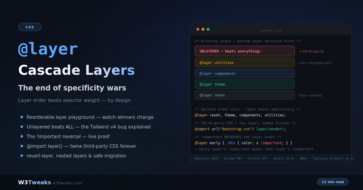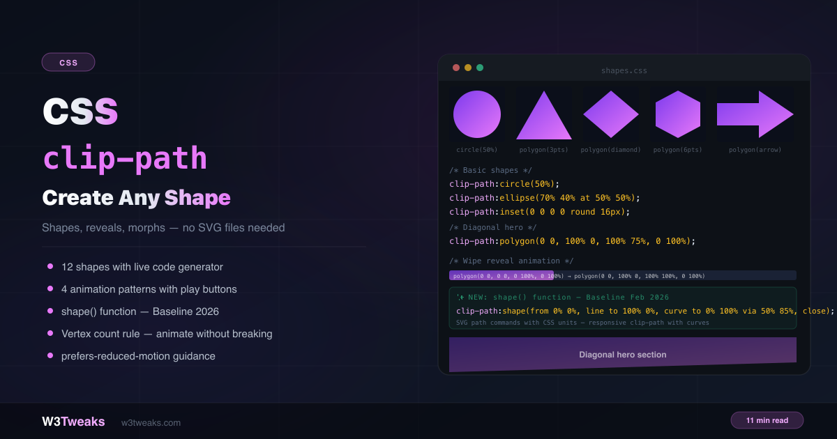
clip-path lets you cut any element into any shape — circles, hexagons, arrows, diagonals, chevrons — with pure CSS. No SVG files. No image masks. No extra HTML elements.
img { clip-path: circle(50%); }                              /* circular avatar */
.hero { clip-path: polygon(0 0, 100% 0, 100% 75%, 0 100%); } /* diagonal hero */
.badge { clip-path: polygon(0 0, 100% 0, calc(100% - 10px) 50%, 100% 100%, 0 100%); } /* notch */
This complete guide covers every clip-path value, how animation works and why it breaks, responsive diagonals, clip-path on pseudo-elements, the new shape() / rect() / xywh() functions, scroll-driven CSS animations with animation-timeline: view(), clipping to arbitrary SVG paths with clip-path: url(#id), when to use the Clippy generator, the hover/click area gotcha most tutorials get wrong, @keyframes loops, and how to fix it when clipping stops working. For creating decorative shapes without affecting layout, combine with CSS ::before and ::after.
Live Demo
Three tabs: ① 12-shape gallery with live code generation and coordinate system explainer, ② four animation patterns with play buttons — wipe, circle expand, polygon morph, and scroll reveal, ③ real use cases including diagonal hero, avatar shapes, notched badges, and the new shape() function.
How clip-path Works
clip-path defines a visible region for an element. Everything inside the path is visible; everything outside is hidden. The element’s layout box stays the same — clip-path is purely visual and doesn’t affect flow, spacing, or document layout.
/* The element still occupies its full box — only the visual is clipped */
.card {
  width: 200px;
  height: 200px;
  clip-path: circle(50%); /* only a circle is visible */
}
Unlike overflow: hidden, clip-path can create non-rectangular shapes and can be animated between compatible shapes.
Pointer events follow the visible clipped region, not the rectangular box. Per the CSS Masking spec, hover/click targeting respects the clip. If you find clicks registering outside the visible shape, it’s usually because a wrapper element overlaps — add
pointer-events: noneto the wrapper, or match its clip-path to the child.
The Four clip-path Functions
circle()
clip-path: circle(radius);
clip-path: circle(radius at cx cy); /* explicit center */

clip-path: circle(50%);           /* perfect circle, centered */
clip-path: circle(40% at 50% 50%); /* same — explicit center */
clip-path: circle(80px at 0 0);   /* pixel radius, top-left origin */
The radius can be a percentage (of the smaller dimension) or a length. The center defaults to 50% 50% if omitted.
ellipse()
clip-path: ellipse(rx ry at cx cy);

clip-path: ellipse(60% 40% at 50% 50%); /* wide ellipse */
clip-path: ellipse(40% 60% at 50% 50%); /* tall ellipse */
Two radii — horizontal and vertical. Independent control over width and height of the oval.
inset(), rect(), and xywh() — Three Ways to Clip a Rectangle
CSS gives you three shape functions for rectangular clips. They produce the same result but with different syntax:
/* inset(top right bottom left round border-radius) */
clip-path: inset(10px 20px 30px 40px round 16px);
clip-path: inset(0 0 0 0 round 16px); /* full element with rounded corners */
clip-path: inset(10% 5% round 24px);  /* shrunk + rounded */

/* rect(top right bottom left) — explicit edge coordinates */
clip-path: rect(10px 100px 90px 0); /* clip to 100x80 box at top-left */

/* xywh(x y width height) — most readable for "crop this region" */
clip-path: xywh(20px 10px 100px 80px); /* clip to 100x80 box at (20,10) */
clip-path: xywh(0 0 100% 50% round 12px); /* top half with rounded corners */| Function | Best for | Syntax style |
|---|---|---|
inset() | Shrinking from edges + rounded corners | ”Margin-like” — distance from each edge |
rect() | Defining explicit clip edges | ”Border-like” — top/right/bottom/left coordinates |
xywh() | ”Crop this region” mental model | ”Position + size” — x, y, width, height |
Browser support: inset() has universal support since 2017. rect() and xywh() shipped in Chrome 118, Safari 17.4, Firefox 128 — Baseline-eligible.
polygon()
clip-path: polygon(x1 y1, x2 y2, x3 y3, ...);The most versatile function. Accepts a list of coordinate pairs that define vertices, connected clockwise to form a closed shape. Percentage coordinates are relative to the element’s dimensions:
clip-path: polygon(50% 0%, 0% 100%, 100% 100%);       /* triangle */
clip-path: polygon(50% 0%, 100% 50%, 50% 100%, 0% 50%); /* diamond */
clip-path: polygon(50% 0%, 100% 25%, 100% 75%, 50% 100%, 0% 75%, 0% 25%); /* hexagon */
Need a custom polygon? Generate it visually with Clippy by Bennett Feely — drag vertices on a canvas and copy the generated CSS. It’s the de facto CSS clip-path generator and saves significant time for irregular shapes you’d otherwise hand-code.
The Coordinate System
The origin 0% 0% is the top-left corner of the element. X increases to the right; Y increases downward:
(0% 0%)  ————————————  (100% 0%)
   |                        |
   |       ELEMENT          |
   |                        |
(0% 100%) ————————————  (100% 100%)
You can also use pixel values, rem, vh, or calc() — they’re relative to the coordinate system defined by clip-path: inset() origin (the element’s border box by default).
/* Mix units freely */
clip-path: polygon(0 0, calc(100% - 40px) 0, 100% 40px, 100% 100%, 0 100%);
/* Creates a chamfered top-right corner — 45° cut at 40px */
Clip-path Polygon Examples You Can Copy
CSS clip-path triangle
clip-path: polygon(50% 0, 100% 100%, 0 100%) gives you a perfect triangle in three vertices — top apex, bottom-right, bottom-left.
/* Triangle — pointing up */
clip-path: polygon(50% 0%, 0% 100%, 100% 100%);

/* Triangle — pointing right */
clip-path: polygon(0% 0%, 100% 50%, 0% 100%);

/* Diamond */
clip-path: polygon(50% 0%, 100% 50%, 50% 100%, 0% 50%);

/* Hexagon */
clip-path: polygon(50% 0%, 100% 25%, 100% 75%, 50% 100%, 0% 75%, 0% 25%);

/* Pentagon */
clip-path: polygon(50% 0%, 100% 38%, 82% 100%, 18% 100%, 0% 38%);

/* Arrow pointing right */
clip-path: polygon(0% 20%, 60% 20%, 60% 0%, 100% 50%, 60% 100%, 60% 80%, 0% 80%);

/* Diagonal — bottom-right cut */
clip-path: polygon(0 0, 100% 0, 100% 75%, 0 100%);

/* Diagonal — bottom-left cut */
clip-path: polygon(0 0, 100% 0, 100% 100%, 0 75%);

/* Chevron tag (notched right edge) */
clip-path: polygon(0 0, calc(100% - 10px) 0, 100% 50%, calc(100% - 10px) 100%, 0 100%);

/* Chamfered corner (top-right) */
clip-path: polygon(0 0, calc(100% - 20px) 0, 100% 20px, 100% 100%, 0 100%);

/* Shield */
clip-path: polygon(50% 0%, 100% 20%, 100% 70%, 50% 100%, 0% 70%, 0% 20%);
Clipping with SVG Paths: clip-path: url(#id)
When polygon() and shape() can’t express the curve you need — arbitrary Bézier paths from Illustrator, text clipping, hand-drawn shapes — reference an SVG <clipPath> element by ID:
<!-- 1. Define the path in inline SVG (hidden) -->
<svg width="0" height="0" style="position:absolute">
  <defs>
    <clipPath id="wave-clip" clipPathUnits="objectBoundingBox">
      <path d="M0,0 L1,0 L1,0.8 C0.75,1 0.25,0.6 0,0.8 Z" />
    </clipPath>
  </defs>
</svg>
/* 2. Reference it from CSS */
.hero {
clip-path: url(#wave-clip);
}The clipPathUnits="objectBoundingBox" is critical — it makes the path coordinates relative (0 to 1) so the clip scales with the element. Without it, the path uses absolute SVG units and won’t resize.
When to use url() vs polygon()/shape():
- polygon() — straight-line shapes you can hand-code in under 10 vertices
- shape() (Baseline Feb 2026) — curves, arcs with CSS units (recommended new choice for curved shapes)
- url(#id) — complex Bézier paths exported from a design tool, text clipping, paths you can’t easily hand-author
- Clippy generator — when you want to drag vertices visually instead of editing coordinates
Clip-path Animation Examples
clip-path is GPU-accelerated and supports smooth CSS transitions — but only between compatible shapes.
The Vertex Count Rule
The most critical rule for animation: you can only smoothly transition between two polygon() shapes with the same number of vertices. The browser interpolates each corresponding point pair.
/* ✅ Works — both have 4 vertices */
.el { clip-path: polygon(0 0, 100% 0, 100% 100%, 0 100%); } /* rectangle */
.el:hover { clip-path: polygon(20% 0%, 80% 0%, 100% 100%, 0% 100%); } /* trapezoid */

/* ❌ Breaks — different vertex counts, no smooth interpolation */
.el { clip-path: polygon(0 0, 100% 0, 100% 100%, 0 100%); } /* 4 points */
.el:hover { clip-path: polygon(50% 0%, 100% 38%, 82% 100%, 18% 100%, 0% 38%); } /* 5 points */
Fixing vertex count mismatches
Pad the simpler shape with duplicate vertices to match the count:
/* Pentagon hover on a square — pad to 5 vertices */
.el {
  clip-path: polygon(0% 0%, 100% 0%, 100% 100%, 0% 100%, 0% 100%); /* 5 vertices */
  transition: clip-path 0.5s ease;
}

.el:hover {
  clip-path: polygon(50% 0%, 100% 38%, 82% 100%, 18% 100%, 0% 38%); /* 5 vertices */
}
Pattern 1 — Wipe Reveal (left to right)
.reveal {
  clip-path: polygon(0 0, 0 0, 0 100%, 0 100%); /* start: zero width */
  transition: clip-path 0.8s cubic-bezier(0.4, 0, 0.2, 1);
}

.reveal.visible {
  clip-path: polygon(0 0, 100% 0, 100% 100%, 0 100%); /* end: full width */
}
Points 1 and 2 share the same x position (0) at the start. Points 2 and 3 expand rightward as x moves from 0 to 100%. Same 4 vertices — smooth interpolation.
Pattern 2 — Circle Expand Reveal
.page-transition {
  clip-path: circle(0% at 50% 50%); /* invisible */
  transition: clip-path 0.8s ease;
}

.page-transition.open {
  clip-path: circle(150% at 50% 50%); /* 150% ensures full coverage in all corners */
}

/* Expand from a specific click point */
.page-transition {
  clip-path: circle(0% at var(--cx, 50%) var(--cy, 50%));
}
The 150% matters — at 100% the circle only just reaches the closer edge; in a non-square box the corners stay clipped. 150% guarantees full coverage no matter the aspect ratio.
Pattern 3 — Polygon Morph (Clip-path Hover Effect)
.shape {
  clip-path: polygon(50% 0%, 100% 38%, 82% 100%, 18% 100%, 0% 38%); /* pentagon */
  transition: clip-path 0.6s cubic-bezier(0.68, -0.55, 0.265, 1.55);
}

.shape:hover {
  clip-path: polygon(50% 0%, 100% 50%, 50% 100%, 0% 50%, 0% 50%); /* diamond — 5 vertices */
}
The simplest clip-path hover effect — animate clip-path on :hover for reveal-on-hover cards (works because vertex count matches at 5 each).
Pattern 4 — Loop Animation with @keyframes
transition handles state-change animations. For loops, multi-stop morphs, and infinite reveals you need @keyframes:
@keyframes morph-loop {
  0%   { clip-path: polygon(50% 0%, 100% 50%, 50% 100%, 0% 50%); } /* diamond */
  33%  { clip-path: polygon(50% 0%, 100% 38%, 82% 100%, 18% 100%, 0% 38%); } /* WARNING: 5 vs 4 vertices */
  66%  { clip-path: polygon(0% 0%, 100% 0%, 100% 100%, 0% 100%); }
  100% { clip-path: polygon(50% 0%, 100% 50%, 50% 100%, 0% 50%); }
}

.loop-shape {
  animation: morph-loop 4s ease-in-out infinite;
}
The vertex-count rule still applies between each keyframe pair. The pentagon at 33% above will snap because it has 5 vertices while the diamond has 4 — pad to match before going to production.
Pattern 5 — Scroll-Driven CSS Animation with animation-timeline
The flagship pattern: pure-CSS scroll reveal with no JavaScript at all. The animation-timeline: view() API ties an animation’s progress to an element’s position in the viewport:
.scroll-reveal {
  animation: reveal linear both;
  animation-timeline: view();
  animation-range: entry 25% cover 50%;
}

@keyframes reveal {
  from { clip-path: inset(45% 20%); }   /* zoomed-in / narrow visible region */
  to   { clip-path: inset(0); }          /* full element visible */
}

/* Always respect reduced motion */
@media (prefers-reduced-motion: reduce) {
  .scroll-reveal {
    animation: none;
    clip-path: none;
  }
}
No IntersectionObserver, no scroll listener, no JS at all. The browser handles everything natively at compositor speed.
Browser support: animation-timeline: view() — Chrome 115+, Safari 26+. Firefox in progress. Use as progressive enhancement with IntersectionObserver fallback.
Pattern 6 — IntersectionObserver Fallback
For browsers without animation-timeline, the classic scroll-trigger pattern still works:
.section-reveal {
  clip-path: inset(0 100% 0 0); /* fully hidden (right inset = 100%) */
  transition: clip-path 0.9s cubic-bezier(0.4, 0, 0.2, 1);
}

.section-reveal.in-view {
  clip-path: inset(0 0% 0 0); /* fully visible */
}

@media (prefers-reduced-motion: reduce) {
  .section-reveal { clip-path: none; transition: none; }
}
const observer = new IntersectionObserver((entries) => {
entries.forEach(entry => {
if (entry.isIntersecting) {
entry.target.classList.add('in-view');
observer.unobserve(entry.target); // animate once
}
});
}, { threshold: 0.1 });
document.querySelectorAll('.section-reveal').forEach(el => observer.observe(el));Responsive clip-path with calc() and vw
The most common clip-path use case — a diagonal bottom edge — can look dramatically different across viewport sizes. At 1440px, a subtle angle; at 320px, an almost-horizontal slash. Fix it with calc() and viewport units:
/* ❌ Fixed percentage — dramatic at narrow widths */
.hero {
  clip-path: polygon(0 0, 100% 0, 100% 80%, 0 100%);
}

/* ✅ Viewport-relative angle — consistent across widths */
.hero {
  clip-path: polygon(0 0, 100% 0, 100% calc(100% - 5vw), 0 100%);
}
The trick: calc(100% - 5vw) on the bottom-right point means the diagonal’s vertical drop scales with the viewport width — maintaining the same perceived angle across all screen sizes.
clip-path on ::before and ::after
clip-path works on pseudo-elements — allowing complex decorative shapes without touching the HTML:
/* Decorative geometric glow behind a card */
.card {
  position: relative;
  background: #1a2235;
  border-radius: 16px;
  padding: 24px;
}

.card::before {
  content: "";
  position: absolute;
  inset: -8px;
  background: linear-gradient(135deg, #7c3aed44, #e879f944);
  clip-path: polygon(
    0 20px, 20px 0, 100% 0,
    100% calc(100% - 20px),
    calc(100% - 20px) 100%,
    0 100%
  );
  z-index: -1;
  border-radius: inherit;
}
This creates a chamfered (cut-corner) decorative border behind the card — using clip-path on ::before with position: absolute and negative inset. See CSS ::before and ::after explained for the full pseudo-element pattern.
Clip-path Image Circle for Avatars
The most common single-use pattern — turning a rectangular image into a circular avatar without a wrapper div:
img.avatar {
  width: 80px;
  height: 80px;
  object-fit: cover;        /* crop to square first */
  clip-path: circle(50%);   /* then clip to circle */
}
object-fit: cover handles the rectangular-to-square crop, then clip-path: circle(50%) clips to a perfect circle. Works directly on <img> elements — no wrapper, no extra HTML.
For hexagon, diamond, or shield avatars, swap circle(50%) for any polygon shape from the gallery above.
clip-path with CSS Variables
Make shapes configurable and themeable with custom properties:
:root {
  --diagonal-cut: 8vw;
  --corner-cut: 20px;
}

.hero {
  clip-path: polygon(0 0, 100% 0, 100% calc(100% - var(--diagonal-cut)), 0 100%);
}

@media (max-width: 768px) {
  :root { --diagonal-cut: 4vw; }
}

.hero--shallow { --diagonal-cut: 3vw; }
.hero--steep   { --diagonal-cut: 12vw; }
The shape() Function — Baseline February 2026
shape() is the new CSS function that brings SVG path commands directly into CSS — with CSS units. Unlike path() which requires fixed pixel coordinates, shape() supports responsive %, px, rem, and calc() values.
clip-path: shape(
  from 0% 0%,
  line to 100% 0%,
  line to 100% 70%,
  curve to 0% 100% via 50% 85%,  /* cubic bezier curve */
  close
);
shape() command reference
| Command | Syntax | Description |
|---|---|---|
from | from X Y | Starting point |
line | line to X Y | Straight line |
hline | hline to X | Horizontal line |
vline | vline to Y | Vertical line |
curve | curve to X Y via X1 Y1 | Quadratic bezier |
curve | curve to X Y via X1 Y1, X2 Y2 | Cubic bezier |
arc | arc to X Y of R R | Elliptical arc |
close | close | Close path |
/* Wave bottom edge — impossible cleanly with polygon() */
.section {
  clip-path: shape(
    from 0% 0%,
    line to 100% 0%,
    line to 100% 85%,
    curve to 0% 85% via 25% 100%, 75% 70%,
    close
  );
}
Browser support: Chrome 119+, Firefox 136+ (Baseline as of February 2026), Safari 18.2+. Safe for production .
Clip-path Not Working? Run This Checklist
Shape not visible:
- Is
clip-pathsupported? Add@supports (clip-path: circle(50%)) {}to test - Check DevTools — Firefox has a built-in clip-path editor (click the polygon icon next to
clip-pathin Styles) - Did you use a comma between values inside the function?
polygon(50% 0%, 0% 100%, 100% 100%)— missing commas silently fail
Animation not smooth:
- Both shapes have different vertex counts — pad the simpler shape with duplicate vertices
- Animating
circle()→polygon()doesn’t interpolate — convert circle to a many-sided polygon approximation - Cross-function transitions (
circle()toinset()) don’t interpolate either
Shape clips off-screen on mobile:
- Using fixed pixel values in
polygon()— switch to percentages orcalc() - Diagonal section is too steep on narrow viewports — use
calc(100% - Xvw)for responsive angle
clip-path on img element not working in Safari older than 14:
- Wrap the
<img>in a<div>and applyclip-pathto the wrapper —clip-pathon replaced elements had inconsistent Safari support before v14
Shape hides box-shadow:
clip-pathclipsbox-shadow— the shadow is outside the clipped region. Usefilter: drop-shadow()instead, which applies after clipping:
/* ❌ box-shadow gets clipped */
.shape { clip-path: polygon(...); box-shadow: 0 10px 30px rgba(0,0,0,0.3); }

/* ✅ filter: drop-shadow() applies after clipping */
.shape { clip-path: polygon(...); filter: drop-shadow(0 10px 30px rgba(0,0,0,0.3)); }
Click area doesn’t match the visible shape:
- The CSS Masking spec says pointer events DO follow the clipped shape — clicks register on the visible region, not the rectangular box
- If clicks still hit outside the shape, a wrapper element is intercepting — apply
pointer-events: noneto the wrapper
clip-path: url(#id) not working:
- The SVG must be in the DOM (inline
<svg>, not external file via<img>reference) - Use
clipPathUnits="objectBoundingBox"and 0-1 path coordinates if you want the clip to scale with the element
clip-path vs overflow:hidden vs border-radius
| Need | Best approach |
|---|---|
| Rectangular crop | overflow: hidden |
| Rounded rectangle | border-radius |
| Non-rectangular shape | clip-path |
| Animated shape reveal | clip-path with transition or @keyframes |
| Complex curved shape | clip-path: shape() |
| Arbitrary SVG path | clip-path: url(#id) |
| Partial transparency / soft edge | mask (not clip-path) |
| Shadow on clipped shape | filter: drop-shadow() |
clip-path is GPU-accelerated and creates a new stacking context. It’s the right tool for visual shaping — not for layout control. Always pair with overflow: hidden on the parent if you need to prevent layout overflow from the element’s box.
Accessibility and prefers-reduced-motion
clip-path animations — especially reveals and morphs — can be visually intense and trigger motion sickness in users with vestibular disorders. Always wrap clip-path animations in a motion preference query:
.reveal {
  clip-path: inset(0 100% 0 0);
  transition: clip-path 0.8s ease;
}

.reveal.visible {
  clip-path: inset(0 0% 0 0);
}

@media (prefers-reduced-motion: reduce) {
  .reveal {
    clip-path: none;
    transition: none;
  }
}
Clip-path Browser Support
clip-path with circle(), ellipse(), polygon(), inset() — Chrome 55+, Firefox 54+, Safari 9.1+. Baseline — 98%+ global coverage. Safe everywhere.
clip-path: rect() and xywh() — Chrome 118+, Safari 17.4+, Firefox 128+. Baseline-eligible.
clip-path: path() — Chrome 88+, Firefox 71+, Safari 13.1+.
clip-path: shape() — Chrome 119+, Firefox 136+, Safari 18.2+. Baseline as of February 2026 — safe for production now.
clip-path: url(#id) — universal support since IE9.
animation-timeline: view() (for scroll-driven reveals) — Chrome 115+, Safari 26+. Firefox in progress. Use as progressive enhancement.
Key Takeaways
clip-pathcreates a visible region — everything outside is hidden, layout is unaffected- Four functions:
circle(),ellipse(),inset(),polygon()— plus modern siblingsrect()andxywh()for rectangles,shape()for curves - Pointer events follow the clipped region per spec — clicks register on the visible shape, not the box
- Coordinate origin is top-left (
0% 0%), bottom-right is100% 100% - Animation only works between same-type shapes with the same vertex count — pad with duplicate vertices to match
- Use
calc(100% - Xvw)for responsive diagonals that maintain consistent angle across viewports clip-pathclipsbox-shadow— usefilter: drop-shadow()insteadclip-pathworks on::before/::afterfor decorative shapes without extra HTMLclip-path: url(#id)references an SVG<clipPath>for arbitrary Bézier curves polygon can’t express- Use Clippy to generate complex polygon values visually
- The new
shape()function allows SVG path commands with CSS units — curves, arcs — Baseline Feb 2026 - Scroll-driven CSS reveals with
animation-timeline: view()work without IntersectionObserver — Chrome 115+, progressive enhancement @keyframesfor loops/multi-stop morphs;transitionfor state changes- Always wrap clip-path animations in
@media (prefers-reduced-motion: reduce)
FAQ
What is CSS clip-path?
clip-path is a CSS property that defines a clipping region for an element. Everything inside the region is visible; everything outside is hidden. It can create circles, ellipses, polygons, and arbitrary shapes — without SVG files, image masks, or extra HTML elements. The element’s layout box remains unchanged, and pointer events follow the visible clipped region per the CSS Masking spec.
How do I make a circle with clip-path?
Use clip-path: circle(50%) — this clips the element to a circle at 50% of its smaller dimension, centered by default. For images or avatars, apply it directly to the <img> element: img { clip-path: circle(50%); width: 80px; height: 80px; object-fit: cover; }. The object-fit: cover handles the rectangular-to-square crop first.
Why won’t my clip-path animate smoothly?
Almost always a vertex count mismatch. CSS can only interpolate between two polygon() shapes with the same number of vertices. If you’re going from a 4-point shape to a 5-point shape, the browser snaps rather than animates. Fix it by adding a duplicate vertex to the simpler shape to match the count. circle() to polygon() also cannot interpolate — convert the circle to a high-vertex polygon approximation. Cross-function transitions (circle() to inset()) don’t interpolate either.
How do I make a diagonal section with clip-path?
Use clip-path: polygon(0 0, 100% 0, 100% 80%, 0 100%) on the section element. The bottom-right point at 80% height creates the diagonal. For responsive angles that stay consistent across screen widths, use calc(): polygon(0 0, 100% 0, 100% calc(100% - 5vw), 0 100%).
Can I clip-path a background-image?
No — clip-path clips the entire element, not individual background layers. You have two options: (1) use mask-image instead, which clips the background-image layer specifically with soft alpha edges, or (2) move the image to a real <img> element or ::before pseudo-element and clip that. The mask-image route is better for partial transparency; the element route is better for crisp geometric shapes.
Clip-path vs mask — when do I use each?
Use clip-path for crisp geometric edges — circles, polygons, hexagons, diagonals. Every pixel is either fully visible or fully hidden, no anti-aliasing on the edge. Use mask-image when you need soft/feathered alpha edges (gradient fades, blurred edges), or when you need to clip a background layer (which clip-path can’t do), or when you need to clip with a raster image rather than a vector shape. Both are GPU-accelerated and both support animation.
Why does clip-path hide my box-shadow?
clip-path clips everything outside its region — including box-shadow which renders outside the element’s box. Use filter: drop-shadow(0 10px 30px rgba(0,0,0,0.3)) instead. filter: drop-shadow() is applied after the clipping, so the shadow follows the shape correctly.
What is the CSS shape() function?
shape() is a new CSS function for clip-path that allows SVG-like path commands — move, line, curve, arc — using CSS units like px, %, and calc(). Unlike the older path() function which requires fixed pixel coordinates, shape() is fully responsive. It became Baseline across all major browsers in February 2026 and is safe for production use. For complex arbitrary paths you can’t easily hand-author, clip-path: url(#id) referencing an SVG <clipPath> is still the right escape hatch.