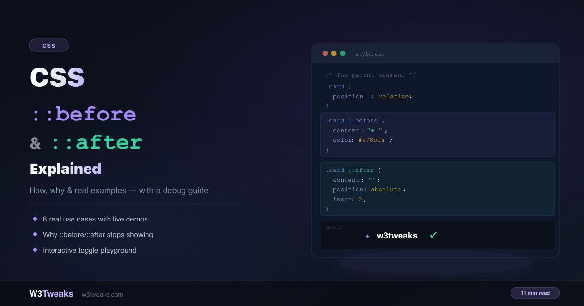
You can add decorative arrows, tooltips, notification badges, quote marks, and animated underlines to elements — without adding a single extra <span> or <div> to your HTML. That’s exactly what ::before and ::after are for.
Most developers learn the syntax quickly but stay confused about why their pseudo-elements randomly stop showing, or why width and height seem to be ignored. This guide covers both: what they are, how to use them with real examples, and a complete debug checklist for when they silently refuse to appear.
Live Demo
Three tabs: toggle pseudo-element properties live and see the DOM tree, 8 real use cases, and the 5 reasons ::before/::after stops working with fixes.
What Are ::before and ::after?
::before and ::after are pseudo-elements — they insert virtual elements into the DOM that exist in the rendered page but are never written in your HTML. The browser creates them for you based on your CSS.
::beforeinserts a virtual element as the first child of the selected element::afterinserts a virtual element as the last child of the selected element
<!-- Your HTML -->
<div class="card">Hello</div>

<!-- What the browser renders -->
<div class="card">
  ::before  ← virtual, CSS-only
  Hello
  ::after   ← virtual, CSS-only
</div>
They behave like real elements — you can position them, give them dimensions, animate them, and apply any CSS property. The only difference is they’re created and controlled entirely in CSS.
Why Use ::before and ::after?
The core reason: keep your HTML clean. Instead of adding empty <span> elements for decorative arrows, label overlays, or decorative lines, pseudo-elements do the same job in CSS with zero extra markup.
/* Without pseudo-elements — cluttered HTML */
<button class="btn">
  Read more
  <span class="arrow"></span>  ← extra markup
</button>

/* With pseudo-elements — clean HTML */
<button class="btn">Read more</button>

.btn::after {
  content: " →";
}
This matters for accessibility too — screen readers don’t read ::before/::after content as meaningful text (depending on the content value), so they’re appropriate for purely decorative additions.
The content Property — The One Rule You Cannot Skip
Every ::before and ::after must have a content property. This is what tells the browser to render the pseudo-element at all. Without it, nothing shows — no error, no warning, just silence.
/* Invisible — content is missing */
.card::before {
  width: 8px;
  height: 8px;
  background: #a78bfa;
  border-radius: 50%;
}

/* Visible — content: "" is enough for a decorative shape */
.card::before {
  content: ""; /* required, even if empty */
  display: block;
  width: 8px;
  height: 8px;
  background: #a78bfa;
  border-radius: 50%;
}
The content property accepts several values:
/* Plain text */
.label::after  { content: " NEW"; }

/* Unicode characters */
.list li::before { content: "→ "; }

/* Empty string — for purely decorative shapes */
.shape::before { content: ""; }

/* HTML attribute value */
.tooltip::after { content: attr(data-tip); }

/* Counter value */
.step::before { content: counter(step-counter); }

/* URL (image) */
.icon::before { content: url("/icons/check.svg"); }
::before vs ::after — What’s the Difference?
The difference is purely about insertion position:
::before | ::after | |
|---|---|---|
| Inserted as | First child of element | Last child of element |
| Visual position | Before the element’s content | After the element’s content |
| Common uses | Opening quotes, lead icons, step numbers | Closing quotes, arrows, tooltips, badges |
| z-index stacking | Sits below ::after when both are used | Sits above ::before by default |
In practice, the choice between the two is usually about which position makes more semantic and visual sense for your use case. For a tooltip that appears above the element, ::after is conventional. For a decorative opening quote, ::before makes more sense.
The Positioning Pattern
The most powerful use of pseudo-elements comes from combining them with position: absolute. This pattern unlocks overlays, badges, decorations, and effects without touching the HTML:
/* Step 1: position the parent */
.card {
  position: relative; /* required */
}

/* Step 2: position the pseudo-element inside it */
.card::after {
  content: "NEW";
  position: absolute;
  top: 12px;
  right: 12px;

  background: #a78bfa;
  color: #fff;
  font-size: 10px;
  font-weight: 700;
  padding: 2px 8px;
  border-radius: 4px;
  letter-spacing: 1px;
}
Without position: relative on the parent, the ::after element positions itself against the nearest positioned ancestor — which is almost never what you want. The CSS positioning guide covers exactly how absolute positioning resolves against ancestors.
8 Real Use Cases
1. Decorative Lines Around a Heading
Lines on either side of a section title — no extra <hr> elements needed:
.section-title {
  display: flex;
  align-items: center;
  gap: 16px;
  text-align: center;
}

.section-title::before,
.section-title::after {
  content: "";
  flex: 1;
  height: 1px;
  background: linear-gradient(90deg, transparent, rgba(167,139,250,0.5));
}

.section-title::after {
  background: linear-gradient(90deg, rgba(167,139,250,0.5), transparent);
}
2. Button with Animated Arrow
An arrow that slides on hover — no icon library required:
.btn {
  display: inline-flex;
  align-items: center;
  gap: 8px;
  padding: 10px 20px;
}

.btn::after {
  content: "";
  display: inline-block;
  width: 8px;
  height: 8px;
  border-top: 2px solid currentColor;
  border-right: 2px solid currentColor;
  transform: rotate(45deg);
  transition: transform 0.25s ease;
}

.btn:hover::after {
  transform: rotate(45deg) translate(3px, -3px);
}
3. Tooltip Using attr()
A CSS-only tooltip that reads from an HTML data attribute:
<span class="tooltip" data-tip="Built with ::after and attr()">Hover me</span>.tooltip {
position: relative;
cursor: default;
}
.tooltip::after {
content: attr(data-tip); /* reads the data-tip attribute */
position: absolute;
bottom: calc(100% + 10px);
left: 50%;
transform: translateX(-50%);
background: #1a2235;
border: 1px solid rgba(167,139,250,0.3);
color: #e2eaf5;
font-size: 12px;
padding: 6px 10px;
border-radius: 6px;
white-space: nowrap;
opacity: 0;
pointer-events: none;
transition: opacity 0.2s;
}
.tooltip:hover::after {
opacity: 1;
}4. Notification Badge
A notification count badge using attr() — no JavaScript needed for the visual:
<button class="icon-btn" data-count="3">🔔</button>.icon-btn {
position: relative;
}
.icon-btn::after {
content: attr(data-count);
position: absolute;
top: -6px;
right: -6px;
width: 20px;
height: 20px;
background: #f87171;
border-radius: 50%;
font-size: 10px;
font-weight: 800;
color: #fff;
display: flex;
align-items: center;
justify-content: center;
border: 2px solid var(--page-bg);
}5. Content Label Overlay
A “NEW” or “SALE” label on a card without adding HTML:
.article-card {
  position: relative;
}

.article-card.is-new::after {
  content: "NEW";
  position: absolute;
  top: 12px;
  left: 12px;
  background: #a78bfa;
  color: #fff;
  font-size: 10px;
  font-weight: 800;
  padding: 3px 8px;
  border-radius: 4px;
  letter-spacing: 1.5px;
}
6. OR Divider Between Sections
The horizontal lines in login forms that say “or continue with”:
.divider {
  display: flex;
  align-items: center;
  gap: 12px;
  color: #5a6a82;
  font-size: 13px;
}

.divider::before,
.divider::after {
  content: "";
  flex: 1;
  height: 1px;
  background: rgba(255,255,255,0.07);
}
7. Animated Hover Underline
A smooth underline that grows from left to right on hover:
.nav-link {
  position: relative;
  text-decoration: none;
}

.nav-link::after {
  content: "";
  position: absolute;
  bottom: -2px;
  left: 0;
  width: 0;
  height: 2px;
  background: #a78bfa;
  transition: width 0.3s ease;
}

.nav-link:hover::after {
  width: 100%;
}
8. Decorative Opening Quote
A large quotation mark behind a blockquote — no image, no extra element:
blockquote {
  position: relative;
  padding: 16px 16px 16px 48px;
}

blockquote::before {
  content: "\201C"; /* Unicode left double quote */
  position: absolute;
  left: 8px;
  top: 0;
  font-size: 60px;
  line-height: 1;
  color: rgba(167,139,250,0.3);
  font-family: Georgia, serif;
}
Not Working? The 5 Reasons and Their Fixes
These are the only reasons ::before or ::after ever silently fails to show.
Reason 1 — Missing content property
/* Broken — pseudo-element doesn't render at all */
.icon::before {
  width: 12px;
  height: 12px;
  background: red;
}

/* Fixed */
.icon::before {
  content: ""; /* add this */
  display: block;
  width: 12px;
  height: 12px;
  background: red;
}
Reason 2 — Applied to a void/replaced element
::before and ::after insert content inside an element. Void elements (<img>, <input>, <br>, <hr>) cannot have children — pseudo-elements on them are ignored.
/* Broken — img cannot have children */
img::before { content: "NEW"; }

/* Fixed — wrap in a div */
.img-wrapper { position: relative; }
.img-wrapper::after {
  content: "NEW";
  position: absolute;
  top: 8px; left: 8px;
}
Reason 3 — Shape has no display set
Pseudo-elements default to display: inline. Inline elements ignore width, height, and vertical padding.
/* Broken — width/height ignored on inline */
.dot::before {
  content: "";
  width: 12px;
  height: 12px;
  background: #a78bfa;
}

/* Fixed */
.dot::before {
  content: "";
  display: block; /* or inline-block */
  width: 12px;
  height: 12px;
  background: #a78bfa;
}
Reason 4 — Parent missing position: relative
/* Broken — ::after escapes to nearest positioned ancestor */
.card { /* no position */ }
.card::after {
  content: "Label";
  position: absolute;
  top: 8px; right: 8px;
}

/* Fixed */
.card { position: relative; }
.card::after {
  content: "Label";
  position: absolute;
  top: 8px; right: 8px;
}
Reason 5 — Clipped by overflow: hidden
/* Broken — ::before extends outside and gets clipped */
.card {
  overflow: hidden;
  position: relative;
}
.card::before {
  content: "";
  position: absolute;
  inset: -4px; /* outside bounds — clipped */
}

/* Fixed — move pseudo-element to outer wrapper */
.card-wrapper { position: relative; }
.card-wrapper::before {
  content: "";
  position: absolute;
  inset: -4px;
}
.card { overflow: hidden; }
If overflow: hidden is breaking other things too — like sticky positioning — the position: sticky guide covers that whole trap and the overflow: clip workaround.
::before / ::after vs Pseudo-Classes
This is a common mix-up. Pseudo-elements (::before, ::after, ::placeholder, ::selection) target a part of an element or insert virtual elements. Pseudo-classes (:hover, :focus, :nth-child()) target elements based on their state or position in the DOM.
/* Pseudo-class — selects an element in a certain state */
.btn:hover { background: #6366f1; }

/* Pseudo-element — inserts a virtual element */
.btn::after { content: " →"; }

/* Combined — change the pseudo-element on state change */
.btn:hover::after { content: " ✓"; color: #34d399; }
The double colon (::) syntax for pseudo-elements is CSS3+. The single colon (:before, :after) was the CSS2 syntax — still supported in all browsers but not recommended. Use double colons.
Common Gotchas
1. You can only have one ::before and one ::after per element
/* The second ::before overwrites the first */
.card::before { content: "A"; }
.card::before { content: "B"; } /* replaces above */

/* Use both for two decorations */
.card::before { content: "A"; }
.card::after  { content: "B"; }
2. content: none and content: normal remove the pseudo-element
/* Useful for resetting in responsive layouts */
@media (max-width: 600px) {
  .section-title::before,
  .section-title::after {
    content: none; /* removes decorative lines on mobile */
  }
}
3. content values with attr() only work for string attributes
/* Works — data attributes are strings */
.tooltip::after { content: attr(data-tip); }

/* No unit support — can't do attr(data-width)px in stable CSS */
4. Pseudo-elements are ignored by querySelector in JavaScript
// This always returns null
document.querySelector('.card::before');

// Read computed styles instead
const styles = getComputedStyle(document.querySelector('.card'), '::before');
console.log(styles.getPropertyValue('content'));
5. Pseudo-elements create their own stacking interactions
When you start animating ::before overlays on hovered cards, layering surprises follow. The z-index and stacking contexts guide explains why pseudo-elements sometimes paint above content you expect them to sit behind.
Browser Support
::before and ::after are supported in every browser that handles CSS — Chrome, Firefox, Safari, Edge, and every mobile browser. There are no polyfills needed, no feature flags, and no caveats for modern browsers.
The double colon syntax (::before) is supported in all modern browsers. IE8 only supports the single-colon syntax (:before) — only relevant if you’re maintaining very legacy codebases. For exact compatibility data see MDN’s ::before reference and caniuse.com/css-gencontent.
Key Takeaways
::beforeinserts a virtual first child,::afterinserts a virtual last child — both exist in the render, not in the HTML- The
contentproperty is required — evencontent: ""for purely decorative shapes - Pseudo-elements default to
display: inline— setdisplay: blockordisplay: inline-blockto usewidthandheight - For positioned overlays, the parent must have
position: relative - They cannot be used on void elements —
<img>,<input>,<br>,<hr>— wrap these instead overflow: hiddenon the parent clips absolutely-positioned pseudo-elements — move to an outer wrapper- Use
::before/::afterfor decorative content; avoid putting meaningful content in them for accessibility - The double colon
::syntax is correct — single colon is legacy CSS2
FAQ
What is ::before and ::after in CSS?
They are pseudo-elements that insert virtual child elements at the beginning (::before) and end (::after) of a selected element’s content. They exist in the rendered page but are created entirely in CSS — no HTML required. You control their content with the content property and style them like any other element.
Why use ::before and ::after?
The main benefit is keeping HTML clean and semantic. Decorative elements like arrows, lines, badges, quote marks, and overlay labels are pure presentation — they belong in CSS, not HTML. Pseudo-elements let you add them without empty <span> elements cluttering your markup.
How do I use ::before and ::after in CSS?
Select an element, append ::before or ::after, and always include a content property. For decorative shapes, set content: "". For positioned overlays, add position: absolute and make sure the parent has position: relative:
.parent { position: relative; }
.parent::after {
  content: "";
  position: absolute;
  top: 0; right: 0;
  width: 20px; height: 20px;
  background: #a78bfa;
}
Why is my ::before or ::after not showing?
Five reasons in order of likelihood: (1) content property is missing — add content: "" at minimum, (2) the element is a void element like <img> or <input> — wrap it in a <div> instead, (3) display is inline by default — add display: block if using width/height, (4) the parent is missing position: relative — required for absolute positioning, (5) an ancestor has overflow: hidden that is clipping it — move to an outer wrapper.
What is the difference between ::before and ::after?
::before inserts its virtual element as the first child — before the element’s content. ::after inserts it as the last child — after the content. For position: absolute use cases, visual position is controlled by top, right, bottom, and left, so the before/after distinction is less important than it is for inline use.
Can I use ::before and ::after on an img tag?
No. <img> is a void element — it cannot have child elements, and pseudo-elements are children. The fix is to wrap the image in a <div> or <figure> and apply ::before/::after to the wrapper instead.
What is the difference between pseudo-elements and pseudo-classes?
Pseudo-classes (:hover, :focus, :nth-child) target elements based on their state or position in the DOM — nothing is created. Pseudo-elements (::before, ::after, ::placeholder) target a specific part of an element, or in the case of ::before/::after, create new virtual elements. You can combine them: .btn:hover::after changes the ::after pseudo-element when the button is hovered.