clamp() sets a value that scales fluidly between a minimum and maximum — in a single line, with no media queries.
/* Font scales from 1rem → 2rem as viewport grows */
h1 { font-size: clamp(1rem, 4vw, 2rem); }

/* Width: never under 200px, never over 800px */
.container { width: clamp(200px, 90%, 800px); }

/* Padding: 12px on mobile, 28px on wide screens */
.card { padding: clamp(12px, 3vw, 28px); }
This guide covers clamp() completely: the three-zone behavior, the min()/max()/clamp() family, the correct rem + vw preferred-value formula, a worked fluid typography calculator, ch units for optimal line length, WCAG accessibility, the component-fluid pattern with container query units (cqi/cqb), dynamic viewport units (dvw/svw/lvw) for iOS Safari, fluid line-height, the “var() inside clamp() doesn’t work” myth, clamp + aspect-ratio for fluid hero boxes, Tailwind v4 / Open Props built-ins, the Utopia.fyi generator, and the “min > max” gotcha. For related responsive techniques, see CSS Container Queries, CSS aspect-ratio, and CSS @font-face.
Live Demo
Three tabs: ① live clamp() explorer — sliders for min/preferred/max with a zone graph showing where each region is active, apply to font-size/width/padding/gap/border-radius, and a viewport width simulator, ② fluid typography calculator — enter target sizes and viewports to derive the exact clamp() formula with intercept and slope math, ③ six real patterns — type scale, ch line length, fully fluid card, container width, border-radius + shadow, and fluid spacing tokens.
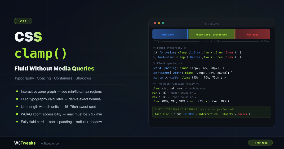
How CSS clamp() Works — The Three Zones
clamp(MIN, PREFERRED, MAX) picks the preferred value if it falls between min and max. If the preferred is smaller than the minimum, min is used. If it’s larger than the maximum, max is used.
clamp(14px, 4vw, 36px)

At 200px viewport:  4vw = 8px  → below 14px min → uses 14px
At 600px viewport:  4vw = 24px → between 14–36px → uses 24px
At 1000px viewport: 4vw = 40px → above 36px max  → uses 36px
The three regions:
- Min zone — viewport is too small for the preferred value to reach the minimum
- Fluid zone — viewport is in the range where the preferred value is active and scaling
- Max zone — viewport is large enough that the preferred value would exceed the maximum
clamp() is mathematically equivalent to: max(MIN, min(PREFERRED, MAX))
CSS clamp min max Difference — The Math Function Family
The css clamp min max difference is simple: min() picks the smallest, max() picks the largest, clamp() bounds a preferred value between both.
/* min(a, b) — uses the SMALLER of the two values */
width: min(50%, 400px);
/* 50% is used on narrow screens; 400px caps it on wide screens */
/* Same as: clamp(none, 50%, 400px) */

/* max(a, b) — uses the LARGER of the two values */
font-size: max(1rem, 2.5vw);
/* 1rem is the floor; 2.5vw grows above it on wide screens */
/* Same as: clamp(1rem, 2.5vw, none) */

/* clamp(min, val, max) — bounded on both sides */
font-size: clamp(1rem, 2.5vw, 2rem);
/* 1rem floor, 2rem ceiling, scales with viewport between them */
You can compose all three:
/* min() inside clamp() for a complex lower bound */
width: clamp(min(90vw, 320px), 50%, max(800px, 60vw));

/* max() inside the preferred value */
padding: clamp(16px, max(2vw, 12px), 40px);
Syntax and Values
/* Units: px, rem, em, %, vw, vh, ch, svw, dvh — all valid */
font-size: clamp(1rem, 4vw, 2rem);
width:     clamp(200px, 50%, 800px);
gap:       clamp(8px, 2vw, 24px);
padding:   clamp(1rem, 5%, 3rem);

/* calc() inside each argument */
font-size: clamp(1rem, calc(0.5rem + 2vw), 2rem);

/* Nesting */
border-radius: clamp(4px, min(1.5vw, 2vh), 20px);

/* none — removes a bound (new in CSS Values Level 4) */
font-size: clamp(none, 4vw, 2rem); /* no minimum — same as min(4vw, 2rem) */
font-size: clamp(1rem, 4vw, none); /* no maximum — same as max(1rem, 4vw) */
rem vs vw clamp — Why the rem + vw Preferred Value Wins
The rem vs vw clamp debate is settled: combine both inside clamp() so zoom still works. Every tutorial uses clamp(1rem, 4vw, 2rem) — but bare vw creates a problem. On a 320px phone, 4vw is only 12.8px. On a 1600px monitor, 4vw is 64px. The scaling is extreme at both edges.
The better approach: calc(interceptRem + slopeVW) as the preferred value.
/* ❌ Bare vw — extreme scaling at edge viewports */
font-size: clamp(1rem, 4vw, 2rem);

/* ✅ rem + vw — controlled slope */
font-size: clamp(1rem, 0.5rem + 2.5vw, 2rem);
The rem component sets the base; the vw component controls the rate of growth. This gives you much more precise control over when the min and max zones activate.
Going further: svw, lvw, dvw inside clamp()
vw measures the viewport width, but on iOS Safari the address bar shrinks the visible area when you scroll — and vh/vw recalculates with it, causing layout jumps. Dynamic viewport units (dvw) fix the iOS Safari address-bar jump that plain vw causes inside clamp().
| Unit | Behavior | When to use |
|---|---|---|
vw | Initial viewport width (changes only on resize) | Most cases — predictable |
svw | Small viewport (smallest possible, address bar visible) | Stable, no layout shift |
lvw | Large viewport (largest possible, address bar hidden) | Maximum potential space |
dvw | Dynamic — updates as address bar shows/hides | True fluidity, but causes layout shift |
/* Use dvw inside clamp for true viewport-responsive sizing on iOS */
font-size: clamp(1rem, 0.5rem + 2dvw, 2rem);

/* Use svw if you need stability — no shift when address bar appears */
.hero { height: clamp(300px, 60svh, 600px); }
Rule of thumb: dvw for sizing that should follow address-bar changes (background images, hero text). svw for layout that must stay stable (modals, sticky headers).
CSS Fluid Typography Formula — Slope + Intercept Math
The css fluid typography formula boils down to slope * 100vw + intercept, clamped at both ends.
To calculate the exact preferred value that interpolates between two specific sizes at two specific viewports:
slope = (maxSize - minSize) / (maxVW - minVW)
intercept = minSize - (slope × minVW)

preferred = intercept + (slope × 100)vw
Example: 1rem (16px) at 320px viewport → 2rem (32px) at 1280px viewport:
slope = (32 - 16) / (1280 - 320) = 16 / 960 = 0.01667 px/px
intercept = 16 - (0.01667 × 320) = 16 - 5.33 = 10.67px = 0.667rem
slopeVW = 0.01667 × 100 = 1.667vw

font-size: clamp(1rem, 0.667rem + 1.667vw, 2rem);
At 320px: 0.667rem + 1.667 × 3.2px = 10.67px + 5.33px = 16px ✓
At 1280px: 0.667rem + 1.667 × 12.8px = 10.67px + 21.33px = 32px ✓
Skip the math: Utopia.fyi generator
If you’d rather not derive the formula by hand, utopia.fyi/type-scale generates the clamp() output for you — paste min size, max size, min viewport, max viewport and copy the result. Its space generator does the same for spacing scales. It’s the de-facto reference tool for fluid type — every major CSS resource links to it.
Ready-to-use fluid type scale (320px→1280px, base 16px)
A fluid type scale defines --text-xs through --text-3xl once, then every heading inherits the scale.
:root {
  --text-xs:  clamp(0.75rem, 0.7rem + 0.25vw, 0.875rem); /* 12px → 14px */
  --text-sm:  clamp(0.875rem, 0.8rem + 0.375vw, 1rem);   /* 14px → 16px */
  --text-base:clamp(1rem, 0.95rem + 0.25vw, 1.125rem);   /* 16px → 18px */
  --text-lg:  clamp(1.125rem, 1rem + 0.625vw, 1.5rem);   /* 18px → 24px */
  --text-xl:  clamp(1.25rem, 1rem + 1.25vw, 2rem);       /* 20px → 32px */
  --text-2xl: clamp(1.5rem, 1rem + 2.5vw, 3rem);         /* 24px → 48px */
  --text-3xl: clamp(2rem, 1rem + 5vw, 5rem);             /* 32px → 80px */
}

h1 { font-size: var(--text-3xl); }
h2 { font-size: var(--text-2xl); }
h3 { font-size: var(--text-xl); }
h4 { font-size: var(--text-lg); }
p  { font-size: var(--text-base); }
Fluid line-height (and why it must be unitless)
Most tutorials show font-size: clamp() and stop — leaving headings with cramped line-height at large sizes. Fluid line-height fixes this:
h1 {
  font-size: clamp(2rem, 1rem + 4vw, 4rem);
  line-height: clamp(1.1, 1.05 + 0.2vw, 1.4);
}
Why unitless: line-height: 1.2 means “1.2× the element’s font-size.” A unitless value inherits as a multiplier, recalculating per child element. line-height: 1.2em inherits as a fixed pixel value, which breaks when children have different font sizes. Always use unitless line-height inside clamp().
WCAG Accessibility — The 200% Zoom Requirement
WCAG Success Criterion 1.4.4 Resize Text (Level AA) requires that text can be resized up to 200% without loss of content or functionality.
When you use clamp() for font-size, this requires the maximum value to be at least 2× the minimum value:
/* ✅ max (2rem) is 2× min (1rem) — 200% zoom works */
font-size: clamp(1rem, 2.5vw, 2rem);

/* ❌ max (1.5rem) is only 1.5× min (1rem) — zoom may be blocked */
font-size: clamp(1rem, 2.5vw, 1.5rem);
The minimum value in clamp() sets the floor that the browser uses regardless of zoom. If that floor is already 16px and the max is 20px, the element can only grow to 20px even at 200% zoom — falling short of the required 200%.
Using rem units (not px) for both min and max also helps, since rem values scale with the user’s browser font size preference.
ch unit CSS — Optimal Line Length with clamp()
The ch unit css ties width to your font’s 0 glyph, making 65ch the gold-standard line length. Typography research consistently shows 45–75 characters per line is the optimal range for reading comfort.
/* The typographic sweet spot — 45–75 characters per line */
.prose {
  width: clamp(45ch, 70%, 75ch);
  margin-inline: auto;
}

/* For narrower content columns */
.article-body {
  width: clamp(45ch, 65%, 68ch);
  margin-inline: auto;
  line-height: 1.7;
}
This ensures the column is never too narrow on small screens (min 45 chars) and never uncomfortably wide on large monitors (max 75 chars).
Component-Fluid clamp() with Container Query Units
The biggest conceptual unlock most tutorials miss. clamp() + cqi makes a component fluid to its parent container, not the viewport. The same card component can sit in a sidebar OR fill a hero — and adapt correctly.
.card {
  container-type: inline-size;  /* opt the card into container queries */
}

.card h2 {
  /* cqi = 1% of the container's inline (horizontal) size */
  font-size: clamp(1.25rem, 0.5rem + 4cqi, 2rem);
}

.card p {
  font-size: clamp(0.875rem, 0.5rem + 1.5cqi, 1rem);
  padding: clamp(0.5rem, 0.5cqi + 0.25rem, 1.5rem);
}| Unit | What it measures |
|---|---|
cqw | 1% of container width |
cqh | 1% of container height |
cqi | 1% of container inline-size (width in LTR) |
cqb | 1% of container block-size (height in horizontal) |
cqmin | smaller of cqi and cqb |
cqmax | larger of cqi and cqb |
This is what page-level fluid type pretended to be. A cqi-based card in a 300px sidebar renders at the small end of its clamp; the same card filling a 1200px hero renders at the large end — automatically, with no wrapper class or media query. See CSS Container Queries for the full container queries story.
Pattern: Fluid Spacing Token System
css fluid spacing tokens like --space-md: clamp(1rem, 0.5rem + 1vw, 1.5rem) let every component reuse the same scale:
:root {
  --space-3xs: clamp(4px, 1vw, 6px);
  --space-2xs: clamp(6px, 1.5vw, 10px);
  --space-xs:  clamp(8px, 2vw, 14px);
  --space-sm:  clamp(12px, 2.5vw, 20px);
  --space-md:  clamp(16px, 4vw, 28px);
  --space-lg:  clamp(24px, 5vw, 40px);
  --space-xl:  clamp(32px, 6vw, 56px);
  --space-2xl: clamp(48px, 8vw, 80px);
  --space-3xl: clamp(64px, 10vw, 120px);
}

/* All components use the tokens — all scale automatically */
.section    { padding-block: var(--space-2xl); }
.card       { padding: var(--space-md); border-radius: var(--space-xs); }
.card + .card { margin-top: var(--space-sm); }
.grid       { gap: var(--space-md); }
If you use Tailwind, Open Props, or shadcn
You may already have fluid utilities built in:
- Tailwind v4 ships native fluid spacing utilities —
text-fluid-base,p-fluid-mdetc. — built onclamp()internally. Check the v4 migration docs. - Open Props (by Adam Argyle) exposes
--size-fluid-1through--size-fluid-10as ready-to-use fluid spacing tokens. Import fromopen-props/sizesand you skip the math entirely. - shadcn/ui doesn’t ship fluid utilities — bring your own. The token system above drops in cleanly alongside shadcn components.
Pattern: Fully Fluid Card Component
A card where every spatial property uses clamp() — zero media queries:
.card {
  /* Spacing */
  padding: clamp(12px, 3vw, 28px);
  gap: clamp(8px, 2vw, 16px);

  /* Shape */
  border-radius: clamp(6px, 1.5vw, 16px);

  /* Shadow — scales the blur and offset */
  box-shadow:
    0 clamp(2px, 0.5vw, 6px)
    clamp(8px, 2vw, 24px)
    rgba(0, 0, 0, 0.15);

  /* Typography */
  font-size: clamp(0.875rem, 1.2vw + 0.3rem, 1rem);
}

.card-title {
  font-size: clamp(1rem, 2vw + 0.3rem, 1.5rem);
  font-weight: 800;
}

.card-btn {
  padding: clamp(6px, 1vw, 12px) clamp(12px, 2vw, 24px);
  border-radius: clamp(4px, 0.5vw, 8px);
  font-size: clamp(0.8rem, 1vw + 0.2rem, 0.95rem);
}
Every property scales proportionally across the full viewport range.
Fluid Boxes with Locked Aspect Ratio
Pair clamp() with aspect-ratio for fluid hero images that prevent layout shift:
.hero {
  width: clamp(20rem, 90vw, 60rem);
  aspect-ratio: 16 / 9;
  background: url('/hero.jpg') center / cover;
}

.video-thumb {
  width: clamp(200px, 30vw, 400px);
  aspect-ratio: 16 / 9;
}
The width scales fluidly; the height auto-derives from the aspect ratio. The browser reserves the correct space before the image loads — preventing CLS during fluid scaling.
Pattern: Container Width With Fluid Gutters
Two equivalent approaches:
/* Approach 1: width with clamp */
.container {
  width: clamp(320px, 90%, 1200px);
  margin-inline: auto;
}

/* Approach 2: max-width + fluid horizontal padding */
.container {
  max-width: 1200px;
  margin-inline: auto;
  padding-inline: clamp(16px, 5vw, 80px);
}
Approach 2 ensures the content never touches the viewport edges (minimum 16px gutter) while growing to comfortable 80px gutters on wide displays.
clamp() vs Media Queries
clamp() | Media queries | |
|---|---|---|
| Scaling | Continuous fluid scaling | Step changes at breakpoints |
| Code size | 1 line | 3+ lines per breakpoint |
| Visual transitions | Smooth across all widths | Jumps at breakpoints |
| Logical | Easy to reason about | Requires testing each breakpoint |
| Limitations | Can’t express non-linear curves | Full control per breakpoint |
| Best for | Typography, spacing, sizing | Layout changes, hiding elements |
The recommendation: Use clamp() for sizes and spacing. Use media queries for layout changes (switching from column to row, showing/hiding elements). They complement each other.
/* ✅ clamp() for sizing — no media queries needed */
.card {
  font-size: clamp(0.875rem, 1.2vw + 0.3rem, 1rem);
  padding: clamp(12px, 3vw, 24px);
}

/* ✅ Media query for layout — still useful */
@media (min-width: 768px) {
  .grid { display: grid; grid-template-columns: repeat(3, 1fr); }
}
Gotchas
min > max — browser silently uses min
If the minimum value is larger than the maximum, the browser uses the minimum and silently ignores the maximum. No error is thrown:
/* ❌ min (400px) > max (200px) — 200px is silently ignored */
width: clamp(400px, 50%, 200px); /* always 400px */

/* ✅ Always ensure min < max */
width: clamp(200px, 50%, 400px);
Mixing incompatible units
All three arguments must be resolvable to the same type (length, time, percentage, etc.). Mixing types that can’t be compared causes the whole declaration to be invalid:
/* ❌ Invalid — can't compare angle and length */
font-size: clamp(1rem, 5deg, 2rem);

/* ✅ Valid — all lengths */
font-size: clamp(1rem, 4vw, 2rem);
Myth: “var() inside clamp() doesn’t work”
This is widespread misinformation from older Stack Overflow answers. It’s been false for years — CSS variables work perfectly inside clamp():
:root {
  --fluid-min: 1rem;
  --fluid-max: 2rem;
  --fluid-pref: calc(0.5rem + 2.5vw);
}

h2 {
  font-size: clamp(var(--fluid-min), var(--fluid-pref), var(--fluid-max));
}
The variables resolve before clamp() evaluates. For values that need to animate or transition, register them as typed custom properties with @property:
@property --hero-size {
  syntax: '<length>';
  initial-value: 16px;
  inherits: true;
}

.hero {
  --hero-size: clamp(1rem, 4vw, 3rem);
  font-size: var(--hero-size);
  transition: --hero-size 0.3s;
}
User font size preferences
Using px for min and max makes the bounds insensitive to the user’s browser font size setting. Use rem to respect their preference:
/* ❌ Ignores user's font size setting */
font-size: clamp(14px, 4vw, 24px);

/* ✅ Scales with user's browser font preference */
font-size: clamp(0.875rem, 4vw, 1.5rem);
clamp css Browser Support
clamp css browser support reached Baseline in 2020 and now covers 98%+ of users.
clamp()— Chrome 79+, Firefox 75+, Safari 13.1+, Edge 79+. Baseline since 2020.min()andmax()— Same support asclamp().- Container query units (
cqi/cqb/cqw) — Chrome 105+, Safari 16+, Firefox 110+. Baseline 2023. - Dynamic viewport units (
dvw/svw/lvw) — Chrome 108+, Safari 15.4+, Firefox 101+. Baseline 2022.
Polyfill / fallback for legacy contexts
For very old browsers (or restricted environments like email rendering or embedded WebKit), use the comma-fallback trick — a static value followed by the clamp() declaration:
.heading {
  font-size: 1.5rem;        /* legacy browsers use this */
  font-size: clamp(1rem, 4vw, 2rem); /* modern browsers override */
}
Browsers that can’t parse clamp() ignore the second declaration; modern browsers use it. PostCSS plugins like postcss-preset-env can auto-generate static fallbacks if you target ancient browsers — but for 98%+ of modern audiences you don’t need them.
Key Takeaways
clamp(MIN, PREFERRED, MAX)picks the preferred value when it’s between min and max, otherwise uses the nearest bound- It’s equivalent to
max(MIN, min(PREFERRED, MAX))— composingmin()andmax() - Use
clamp(0.5rem + 2vw, ...)preferred pattern instead of barevwfor better slope control - The fluid typography formula:
slope = (maxSize - minSize) / (maxVW - minVW), thenpreferred = interceptRem + slopeVW - Utopia.fyi generates the clamp() formula for you — paste sizes and viewports, copy the output
- WCAG 1.4.4: max font size must be ≥ 2× the min to allow 200% browser zoom
- Use
chunits for line length:width: clamp(45ch, 70%, 75ch)targets the typographic sweet spot - Container query units (cqi/cqb) + clamp() = component-fluid sizing. Cards adapt to their slot, not the viewport
- Dynamic viewport units (dvw) inside clamp() fix iOS Safari’s address-bar layout jumps
- Fluid line-height with unitless values (
line-height: clamp(1.1, ..., 1.4)) prevents cramped headings at large sizes - Apply
clamp()to padding, gap, border-radius, and shadow to build fully fluid components with zero breakpoints - Pair
clamp()withaspect-ratiofor fluid hero boxes that prevent layout shift during scaling - Combine with CSS custom properties for a fluid spacing token system (Tailwind v4, Open Props ship these built-in)
var()works perfectly insideclamp()— the “doesn’t work” claim is a myth. Use@propertyfor animatable typed values- Gotcha: if min > max, the browser silently uses min — always check min < max
clamp()complements media queries — use clamp for sizing/spacing, media queries for layout changes- Baseline since 2020 — safe to ship without a polyfill in modern browsers
FAQ
What does CSS clamp() do?
clamp(MIN, PREFERRED, MAX) returns the preferred value if it falls between min and max. If the preferred is smaller than the minimum, it returns the minimum. If it’s larger than the maximum, it returns the maximum. It’s used to create values that scale fluidly with the viewport while staying within defined bounds — without media queries.
How do I use clamp() for fluid typography?
Set the minimum to your smallest acceptable font size (in rem), the preferred value to calc(interceptRem + slopeVW) for a controlled scaling curve, and the maximum to the largest size. Example: font-size: clamp(1rem, 0.5rem + 2.5vw, 2rem). The rem + vw pattern gives better slope control than bare vw. The WCAG requirement is that the maximum must be at least 2× the minimum.
What is the difference between clamp(), min(), and max()?
min(a, b) returns the smaller value — useful for upper-bounding (element never exceeds a size). max(a, b) returns the larger value — useful for lower-bounding (element never goes below a size). clamp(min, val, max) bounds both sides simultaneously. They’re mathematically related: clamp(MIN, VAL, MAX) is equivalent to max(MIN, min(VAL, MAX)).
Why use rem + vw in the preferred value instead of just vw?
Bare vw values can be extreme at edge viewports — 4vw is 12.8px on a 320px phone and 64px on a 1600px monitor. Adding a rem offset (0.5rem + 2.5vw) gives a gentler slope with better control. The rem sets the base size, and the vw multiplier controls how fast it scales. The fluid typography formula calculates the exact rem + vw combination to hit precise sizes at specific viewport widths.
What are ch units and why use them with clamp()?
ch is a CSS unit equal to the width of the “0” character in the current font. It’s ideal for constraining line lengths to readable widths. Typography research shows 45–75 characters per line is optimal for readability. width: clamp(45ch, 70%, 75ch) ensures text columns are never uncomfortably narrow or wide.
Does clamp() work with any CSS property?
Yes — clamp() works with any CSS property that accepts numeric length, percentage, or other comparable values: font-size, width, height, padding, margin, gap, border-radius, line-height, box-shadow values, and more. It does not work with properties that take non-numeric values like display or color.
Should I use Utopia.fyi or write the clamp() formula myself?
Use Utopia.fyi for production work. It generates the exact clamp(intercept rem + slope vw, ...) output, handles your type-scale ratio (Major Third, Perfect Fourth, etc.) and outputs ready-to-paste CSS custom properties. Write the formula by hand only when you need a specific intercept that doesn’t fit Utopia’s settings, or when learning how it works. Every major fluid-typography reference (Smashing Magazine, Adam Argyle, web.dev) recommends Utopia.
What’s the difference between vw and dvw inside clamp()?
vw is the initial viewport width — it only changes on resize. dvw is the dynamic viewport width — it updates as the iOS Safari address bar shrinks/grows. Inside clamp(), dvw gives true viewport-responsive sizing but can cause layout shift as the address bar animates. svw (small viewport) is stable — always the smallest possible size. Use dvw for sizing that should follow address-bar changes (hero text); use svw for layout that must stay stable (modals, sticky headers).
Can I use clamp() with container query units like cqi?
Yes — and it’s the most powerful pattern most tutorials skip. font-size: clamp(1rem, 0.5rem + 4cqi, 2rem) makes the font fluid to the parent container’s inline size, not the viewport. Set container-type: inline-size on the parent, then the child’s clamp values scale with the container — so the same card component looks right in a 300px sidebar and a 1200px hero, with zero wrapper class or media query.