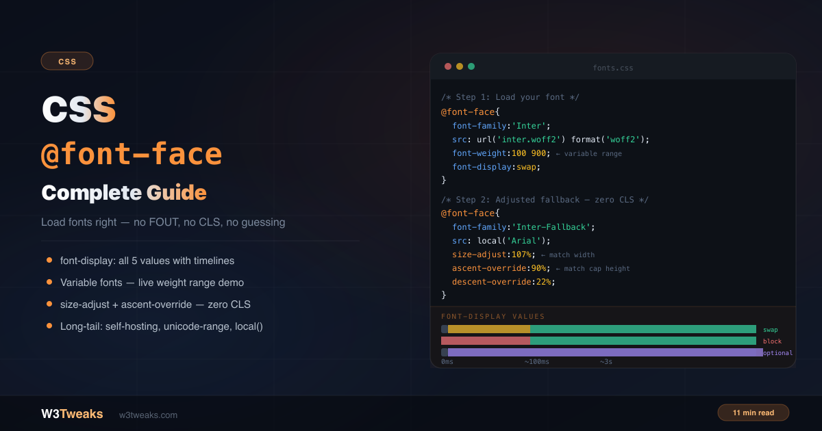
Most @font-face tutorials show you the basic syntax and say “add font-display: swap”. That’s not wrong — but it’s about 20% of what you need to know. This guide covers the complete picture: why the 5 font-display values make fundamentally different trade-offs, the most common variable font bug that makes all weights look identical, why font-synthesis: none is the partner to fix you’ve never heard of, the Font Loading API that lets you choreograph font swaps in JavaScript, font-variant-numeric for tabular numerals (and why MDN says to prefer it over font-feature-settings), the modern system-font stacks that ship in zero kilobytes, the adjusted fallback pattern that eliminates layout shift, unicode-range for subsetting, preload’s hidden LCP trade-off, and whether the local() trick is still worth using .
For how cascading and specificity affect font property overrides, see CSS specificity explained. For the modern selector toolkit that pairs naturally with font targeting, see CSS selectors you’re not using.
Live Demo
Three tabs: ① all 5 font-display values with click-to-focus loading timelines and a decision guide, ② variable fonts with live wght/wdth/opsz axis sliders, ③ the adjusted fallback pattern with three real font-pair recipes (Inter/Arial, Roboto/Helvetica, Playfair/Georgia).
The Basic @font-face Syntax
@font-face {
  font-family: 'Inter'; /* the name you'll use in font-family declarations */
  src: url('/fonts/inter-variable.woff2') format('woff2');
  font-weight: 400;
  font-style: normal;
  font-display: swap;
}

/* Use it anywhere */
body {
  font-family: 'Inter', system-ui, sans-serif;
}
The font-family value is a custom name you define — it doesn’t have to match the actual font name. The src tells the browser where to fetch the file.
Font Formats — Just Use WOFF2
Older tutorials show a src stack with 5 formats:
/* ❌ 2016 approach — unnecessary */
@font-face {
  src: url('font.eot'),
       url('font.eot?#iefix') format('embedded-opentype'),
       url('font.woff2') format('woff2'),
       url('font.woff') format('woff'),
       url('font.ttf') format('truetype');
}
/* ✅ Modern approach — woff2 only */
@font-face {
src: url('font.woff2') format('woff2');
}WOFF2 is supported in every browser since 2016. Chrome 36+, Firefox 39+, Safari 12+, Edge 14+. Unless you’re actively supporting IE11 (you shouldn’t be), drop everything else. The format() hint is still recommended — it prevents the browser downloading a file it can’t use.
Declaring Multiple Weights Correctly
Each weight/style combination needs its own @font-face block with the same font-family name:
@font-face {
  font-family: 'Inter';
  src: url('/fonts/inter-regular.woff2') format('woff2');
  font-weight: 400;
  font-style: normal;
  font-display: swap;
}

@font-face {
  font-family: 'Inter';
  src: url('/fonts/inter-bold.woff2') format('woff2');
  font-weight: 700;
  font-style: normal;
  font-display: swap;
}

@font-face {
  font-family: 'Inter';
  src: url('/fonts/inter-italic.woff2') format('woff2');
  font-weight: 400;
  font-style: italic;
  font-display: swap;
}
The browser matches the font-weight and font-style descriptors to select the correct file when you write font-weight: bold or font-style: italic in your CSS.
FOIT, FOUT, FOFT — The Three Words Every Font Tutorial Uses
Before the font-display section, the three acronyms you’ll see across every font-loading discussion:
- FOIT (Flash Of Invisible Text) — text is hidden while the custom font loads. Caused by
font-display: blockandauto. Bad for users on slow connections. - FOUT (Flash Of Unstyled Text) — fallback text shows first, then the custom font swaps in. Caused by
font-display: swap. Readable but causes layout shift. - FOFT (Flash Of Faux Text) — fallback text shows, then the browser fakes bold/italic by skewing the regular weight before the real bold weight arrives. Caused by missing weight declarations + the browser’s default
font-synthesis. The fix isfont-synthesis: none(covered below).
Each font-display value trades off between these three behaviors. The next section maps which value causes which.
font-display — All 5 Values Explained
font-display controls what the user sees while a custom font loads. Most tutorials say “use swap” — but each value makes a different trade-off between readability, visual stability, and performance.
How font loading works
Every @font-face font goes through three periods:
- Block period — text is invisible while the browser waits for the font (FOIT)
- Swap period — if the font hasn’t loaded, shows a fallback font (FOUT)
- Failure period — if the font still hasn’t loaded, it’s abandoned and the fallback is used permanently
font-display controls the length of each period.
font-display: swap
@font-face {
  font-display: swap;
}
Tiny block period (~100ms). Infinite swap period. The browser shows fallback text almost immediately, then swaps to your custom font when it loads.
Result: Text is always readable. The swap causes a layout shift (CLS) because the fallback and custom font have different metrics.
Use for: Body text, headings — anything users need to read immediately.
font-display: block
@font-face {
  font-display: block;
}
Short block period (~3 seconds). Infinite swap period. Text is invisible while the font loads. If the font loads within 3 seconds, it appears. Otherwise fallback kicks in and the font swaps in when ready.
Result: FOIT — invisible text for up to 3 seconds on slow connections. Terrible UX for body text.
Use for: Icon fonts only — where a fallback character would be meaningless or confusing.
font-display: fallback
@font-face {
  font-display: fallback;
}
Tiny block period. Short swap period (~3 seconds). If the font doesn’t load within the swap window, the browser permanently switches to the fallback font — no late swap.
Result: No FOIT, minimal FOUT. If the font loads fast, it swaps in cleanly. If it’s slow, the fallback is used and the page is stable.
Use for: Fonts that should enhance but not block — where you’d rather show a good fallback than a late swap.
font-display: optional
@font-face {
  font-display: optional;
}
Tiny block period. No swap period. The browser may skip loading the font entirely on slow connections. The font is cached after first load and used on all subsequent visits.
Result: Zero layout shift. Zero FOIT. The custom font silently improves visual quality over time as it caches.
Use for: The best choice for Core Web Vitals (CLS). Perfect for decorative fonts where the fallback is acceptable. The font will be invisible to users on slow connections on first visit.
font-display: auto
The browser picks the strategy. Usually behaves like block. Avoid — you lose control over the loading experience.
The Decision Table
| Use case | font-display value | Causes |
|---|---|---|
| Body text, headings — must be readable immediately | swap | FOUT (managed with adjusted fallback) |
| Icon fonts | block | FOIT (acceptable for icons) |
| Fonts that should enhance but not block | fallback | brief FOUT or permanent fallback |
| Best Core Web Vitals (CLS) score | optional | possible no-swap on first visit |
| Never | auto | usually FOIT |
Variable Fonts — One File, Every Weight
A variable font is a single .woff2 file containing an entire typeface family — all weights from 100 to 900, and sometimes italic, width, and optical-size axes too. One file replaces 8+ separate font files.
@font-face {
  font-family: 'Inter';
  src: url('/fonts/inter-variable.woff2') format('woff2');
  font-weight: 100 900; /* range — not a single value */
  font-style: normal;
  font-display: swap;
}
The critical difference from a static font declaration is the weight range (100 900 instead of 400). Once declared this way, every weight from 100 to 900 is available:
h1 { font-family: 'Inter'; font-weight: 800; }
h2 { font-family: 'Inter'; font-weight: 600; }
p  { font-family: 'Inter'; font-weight: 400; }
.light { font-family: 'Inter'; font-weight: 300; }
The #1 variable font bug
If your variable font renders identically at every weight, you forgot the range:
/* ❌ Single value — browser ignores non-400 requests */
@font-face {
  font-family: 'Inter';
  src: url('inter-variable.woff2') format('woff2');
  font-weight: 400; /* wrong — single value */
}

/* ✅ Range — all weights work */
@font-face {
  font-family: 'Inter';
  src: url('inter-variable.woff2') format('woff2');
  font-weight: 100 900; /* correct — range */
}
Fine-tuning with font-variation-settings
For OpenType axes beyond weight (width, slant, optical size), use font-variation-settings:
.condensed-bold {
  font-family: 'RobotoFlex';
  font-variation-settings:
    'wght' 700,    /* weight axis */
    'wdth' 75,     /* width — condensed */
    'opsz' 32;     /* optical size */
}
The opsz (optical size) axis is the one most developers never touch. It adjusts the design weight, contrast, and spacing for the rendered point size — display copy at 32pt looks subtly different from body copy at 14pt in a properly-designed optical-size font. Set it to match the rendered font-size for production-quality typography.
font-synthesis: none — The Faux Bold Gotcha
When a weight you ask for doesn’t actually exist in your @font-face declarations, browsers don’t surface an error. They fake it — skewing the regular weight to simulate italic, thickening it to simulate bold. The result is the third flash acronym from earlier: FOFT (Flash Of Faux Text). You wrote font-weight: 700 expecting a real bold weight; the browser invented one.
The catch is that synthesized weights look wrong. Real bold has different letter shapes, different stroke contrast, different counters. A fake bold is just the regular cut painted thicker — letters lose their internal shapes, stems become muddy at small sizes, and the rendering shifts when the real weight finally loads (if it does).
The fix is font-synthesis. It tells the browser “if a weight or style isn’t really declared, render the fallback as-is — do not synthesize”:
/* Forbid all synthesis */
html { font-synthesis: none; }

/* Or longhand — block only bold synthesis, allow italic synthesis */
html { font-synthesis: weight; } /* blocks weight synthesis */

/* Allow specific axes */
html {
  font-synthesis-weight: none;       /* no faux bold */
  font-synthesis-style: none;        /* no faux italic */
  font-synthesis-small-caps: none;   /* no faux small-caps */
}
The trade-off: with
font-synthesis: none, you MUST declare every weight and style you use in@font-face. Otherwise the text silently won’t render bold at all — it’ll stay in the regular weight. This is exactly what you want: it surfaces missing font files as obvious visual bugs in dev instead of as muddy production rendering.
Browser support: Chrome 97+, Firefox 111+, Safari 16.4+. Safe for production .
The Font Loading API — Choreograph Swaps in JavaScript
@font-face and font-display cover most cases declaratively. But sometimes you need to know exactly when a font has loaded — to trigger an animation, swap layout classes, or load a font conditionally based on user input. The Font Loading API gives you that control.
document.fonts.ready — wait for all fonts
The simplest pattern: a Promise that resolves when every @font-face declared in your CSS has finished loading (or failed):
// Wait for all CSS-declared fonts to load
document.fonts.ready.then(() => {
  document.documentElement.classList.remove('fonts-loading');
  document.documentElement.classList.add('fonts-loaded');
});
Pair with CSS to mask the FOUT entirely on critical above-the-fold copy:
.fonts-loading h1 { opacity: 0; }
.fonts-loaded h1  { opacity: 1; transition: opacity 0.15s; }
FontFace constructor — programmatic loading
For conditional loading — a route-based code-split font, a user-preference-driven font swap, or a prefers-reduced-data-aware lighter weight — construct and load a FontFace directly:
const inter = new FontFace(
  'Inter',
  'url(/fonts/inter-variable.woff2) format("woff2")',
  { weight: '100 900', display: 'swap' }
);

inter.load()
  .then(face => {
    document.fonts.add(face);
    console.log('Inter loaded — safe to use');
  })
  .catch(err => {
    console.error('Inter failed to load:', err);
    // fall back to a system stack gracefully
  });
document.fonts.add() makes the font available the same way an @font-face rule would. The .load() Promise lets you detect failures explicitly — something @font-face alone can’t do.
Why this pairs with font-display: optional
font-display: optional is the best CWV choice but has a downside: the custom font may not appear on a user’s first visit. With the Font Loading API, you can preload it programmatically once the page is idle so it’s cached for the second visit:
// After the main page loads, warm the cache for next time
window.addEventListener('load', () => {
  requestIdleCallback(() => {
    new FontFace('Inter', 'url(/fonts/inter-variable.woff2)').load();
  });
});
font-variant-numeric — Tabular Numbers and Other Modern Properties
If you’ve ever wanted lining figures, oldstyle numerals, small caps, or tabular numbers (every digit the same width — critical for tables, dashboards, prices, timers), the property to reach for is font-variant-numeric (or its siblings font-variant-ligatures, font-variant-caps). Most tutorials show font-feature-settings for this, which is the legacy low-level API. MDN explicitly recommends the high-level font-variant-* properties over font-feature-settings because they cascade properly, respect the user’s locale, and don’t override each other accidentally.
The mapping
| Need | Modern (recommended) | Legacy font-feature-settings |
|---|---|---|
| Tabular numbers (table-aligned digits) | font-variant-numeric: tabular-nums; | font-feature-settings: "tnum"; |
| Oldstyle figures (mixed-height numerals) | font-variant-numeric: oldstyle-nums; | font-feature-settings: "onum"; |
| Slashed zero | font-variant-numeric: slashed-zero; | font-feature-settings: "zero"; |
| Fractions (½, ¾) | font-variant-numeric: diagonal-fractions; | font-feature-settings: "frac"; |
| Common ligatures (ff, fi, fl) | font-variant-ligatures: common-ligatures; | font-feature-settings: "liga"; |
| Discretionary ligatures (st, ct) | font-variant-ligatures: discretionary-ligatures; | font-feature-settings: "dlig"; |
| Small caps | font-variant-caps: small-caps; | font-feature-settings: "smcp"; |
| All small caps (caps too) | font-variant-caps: all-small-caps; | font-feature-settings: "c2sc", "smcp"; |
The bug tabular-nums fixes
In a dashboard where numbers update in place (a price ticker, a timer, a count), proportional digits cause the column width to jiggle every time a 1 becomes a 4. The fix is one line:
.price, .timer, table td.numeric {
  font-variant-numeric: tabular-nums;
}
The digits now occupy fixed cells, the column doesn’t shift, and the micro-layout-shift inside the table cell disappears. This is a CLS-adjacent bug that almost no @font-face guide mentions but that ships in production dashboards constantly.
One gotcha: the font itself has to ship a tabular-nums feature. Most modern fonts do (Inter, Roboto, Source Sans, Plus Jakarta) — but not all. If
tabular-numsdoes nothing visible, your font probably doesn’t include the OpenTypetnumtable.
Modern Font Stacks — The Zero-@font-face Option
Before you ship a single @font-face declaration, consider whether you need one. The modern system font stacks at modern-font-stacks.com give you typographically distinct, well-designed font families using only fonts already installed on the user’s device. Zero downloaded bytes. Zero FOIT, FOUT, or FOFT. Zero layout shift. Zero CWV regression risk.
Real measurements from the modern-font-stacks project: replacing a 4-weight web font (~410KB total) with the system sans stack drops to 0KB of font payload and matches the visual character of fonts like Inter or Roboto across all modern OSes.
:root {
  /* "Modern System Sans" — looks like Inter on Mac, Segoe UI on Windows */
  --font-sans: ui-sans-serif, system-ui, -apple-system, BlinkMacSystemFont,
               "Segoe UI", Roboto, "Helvetica Neue", Arial, "Noto Sans",
               sans-serif, "Apple Color Emoji", "Segoe UI Emoji",
               "Segoe UI Symbol", "Noto Color Emoji";

  /* "Old Style Serif" — looks like Garamond / Sabon on most OSes */
  --font-serif: ui-serif, Charter, "Bitstream Charter", Cambria, Georgia, serif;

  /* "Industrial Mono" — what code editors use */
  --font-mono: ui-monospace, "Cascadia Code", "Source Code Pro", Menlo,
               Consolas, "DejaVu Sans Mono", monospace;
}

body { font-family: var(--font-sans); }
code { font-family: var(--font-mono); }
When to use it: brand sites where the existing system fonts are acceptable, content-heavy pages where CWV trumps brand typography, dashboards and admin UIs that prioritize speed. Use a real web font only when the brand identity genuinely requires it — and then use the adjusted fallback pattern below to neutralize the CLS cost.
Should You Still Use local()?
The local() function in src checks if the font is already installed on the user’s device before downloading it:
@font-face {
  font-family: 'Inter';
  src: local('Inter'),
       url('/fonts/inter.woff2') format('woff2');
}
The case against local():
- Metric mismatch — the locally installed Inter may be a different version with slightly different metrics than your web font. This causes unexpected layout differences between users.
- Privacy fingerprinting — browsers can detect which fonts are installed.
local()can be used as a privacy fingerprinting vector. For this reason, Firefox and some Chromium builds restrictlocal()in private/incognito mode. - Version inconsistency — a user on Inter 3.x gets different rendering than a user on Inter 4.x.
The verdict: Skip local() for most fonts . The download savings are minimal (WOFF2 files are small after compression), and the consistency tradeoff isn’t worth it. The exception is system fonts (Arial, Georgia, Times New Roman) where you’re deliberately using the device font as a fallback — which is exactly the adjusted fallback pattern below.
The Adjusted Fallback Pattern — Zero Layout Shift
This is the most important technique in this guide and the one almost no tutorial covers.
font-display: swap always causes some layout shift because your fallback font (Arial, Helvetica, etc.) has different metrics than your custom font — different character width, different ascender/descender height. When the swap happens, everything reflows.
The fix: Create a modified version of the fallback font using @font-face with metric overrides that match your custom font’s measurements:
/* Step 1: your custom font */
@font-face {
  font-family: 'Inter';
  src: url('/fonts/inter-variable.woff2') format('woff2');
  font-weight: 100 900;
  font-display: swap;
}

/* Step 2: adjusted fallback that matches Inter's metrics */
@font-face {
  font-family: 'Inter-Fallback';
  src: local('Arial'); /* start with system Arial */
  size-adjust: 107%;      /* scale width to match Inter */
  ascent-override: 90%;   /* match Inter's cap height */
  descent-override: 22%;  /* match Inter's descenders */
  line-gap-override: 0%;  /* match Inter's line gap */
}

/* Step 3: stack with adjusted fallback in second position */
body {
  font-family: 'Inter', 'Inter-Fallback', Arial, system-ui, sans-serif;
}
What happens:
- Page loads —
Inter-Fallback(adjusted Arial) renders with Inter’s exact metrics - Inter loads — swaps in seamlessly with no layout change
- CLS score stays near zero
Finding the correct override values
The exact values depend on your specific font pair. Three ways to get them:
1. The Fontaine package (recommended for production):
npm install fontaineFontaine automatically generates and injects adjusted fallback @font-face declarations for any font.
2. The Perfect Font Fallback calculator: Visit industrialempathy.com/perfect-ish-font-fallback — paste your Google Fonts URL and get the exact override values.
3. Manual calculation: Use font-size-adjust values from font metrics tools like fonttools or wakamaifondue.com.
What size-adjust, ascent-override, and descent-override do
@font-face {
  font-family: 'Inter-Fallback';
  src: local('Arial');

  size-adjust: 107%;
  /* Scales ALL glyphs in the font by this percentage.
     Inter characters are ~7% wider than Arial — scale Arial up 7% to match. */

  ascent-override: 90%;
  /* Controls height above the text baseline.
     Affects how much space is above capital letters and ascenders. */

  descent-override: 22%;
  /* Controls depth below the text baseline.
     Affects how much space is below descenders (g, p, y, etc.) */

  line-gap-override: 0%;
  /* Controls the external leading — gap between text lines in addition to
     ascent and descent. Inter has 0 line gap, so set this to 0. */
}
unicode-range — Load Only the Characters You Need
unicode-range tells the browser to only download and use this @font-face declaration when the specified Unicode characters appear in the page content:
/* Load the font only for Latin characters */
@font-face {
  font-family: 'Inter';
  src: url('/fonts/inter-latin.woff2') format('woff2');
  font-display: swap;
  unicode-range: U+0000-00FF, U+0131, U+0152-0153, U+02BB-02BC, U+02C6, U+02DA,
                 U+02DC, U+0304, U+0308, U+0329, U+2000-206F, U+20AC, U+2122,
                 U+2191, U+2193, U+2212, U+2215, U+FEFF, U+FFFD;
}
Why this matters: A full Inter woff2 with all glyphs is ~300KB. The Latin subset is ~30KB. If your page only uses Latin characters, you’re downloading 270KB you don’t need.
Common unicode-range values
unicode-range: U+0000-00FF;      /* Basic Latin + Latin Supplement */
unicode-range: U+0400-045F;      /* Cyrillic */
unicode-range: U+0370-03FF;      /* Greek */
unicode-range: U+0600-06FF;      /* Arabic */
unicode-range: U+0030-0039;      /* Numbers only (0–9) */
unicode-range: U+0041-005A;      /* Uppercase letters only (A–Z) */
This is exactly how Google Fonts splits its font files — each language subset is a separate woff2 downloaded only when that character set is needed.
Self-Hosting Google Fonts Correctly
Self-hosting gives you GDPR compliance, faster load times (no DNS lookup to fonts.googleapis.com), and full control over caching headers. Here’s the correct process:
Step 1 — Download the font files:
Use google-webfonts-helper.herokuapp.com or gwfh.mranftl.com — paste your Google Fonts URL and get the correct woff2 files with proper @font-face declarations ready to copy.
Step 2 — Set correct HTTP headers:
Cache-Control: public, max-age=31536000, immutableFont files never change (you’ll version them differently if you update). Long cache = zero repeat downloads.
Step 3 — Preload critical fonts (carefully):
<link rel="preload" href="/fonts/inter-variable.woff2"
      as="font" type="font/woff2" crossorigin>
Preload moves a font to the front of the browser’s resource queue. It can take ~30% off LCP-and-LCP-adjacent metrics when applied correctly — but it can also delay LCP if you preload the wrong things:
- Only preload above-the-fold fonts. If a font is used in the footer or below the fold, preload steals bandwidth from your actual LCP element.
- Maximum 2 preloaded fonts. Each preload competes with HTML, CSS, and the LCP image for the connection.
- Skip preload entirely if your LCP element is an image. The font is not your LCP — don’t make it race the thing that is.
- Always add
crossorigin. Fonts are CORS-fetched even from the same origin; withoutcrossoriginthe browser fetches twice (once for the preload, once for the real CSS-driven request).
Step 4 — Use the adjusted fallback pattern (covered above) to eliminate CLS.
If you can’t self-host: Bunny Fonts
For sites that genuinely need a CDN, Bunny Fonts is a GDPR-safe, API-compatible drop-in replacement for Google Fonts. The URL structure mirrors Google’s exactly — change fonts.googleapis.com to fonts.bunny.net and your existing <link> tags continue to work, but no user data goes to Google. Same fonts, same subsetting, no compliance headache.
@font-face Not Working? Debug Checklist
Font not loading at all:
- Is the file path correct? Check browser DevTools → Network tab for 404 errors
- Is the
font-familyname in yourfont-familydeclaration spelled exactly the same as in@font-face? - Is the file actually a woff2? Rename a .ttf to .woff2 and it won’t work — the format matters
Font loads but wrong weight appears:
- For variable fonts: is
font-weightset as a range (100 900) not a single value (400)? - For static fonts: do you have separate
@font-faceblocks for each weight? - Is the browser synthesising bold/italic from a regular weight? Set
font-synthesis: noneso missing weights become obvious bugs instead of muddy rendering
Font loading causes layout shift:
- Use the adjusted fallback pattern with
size-adjust,ascent-override,descent-override - Switch to
font-display: optionalif the font is decorative and the fallback is acceptable - Consider whether you need a custom font at all — the modern system font stacks ship in 0 bytes
Flash of invisible text (FOIT):
- Check
font-display— if it’sblockorauto, that’s your cause - Switch to
font-display: swaporfallback
Numbers in tables/dashboards jiggle when they update:
- The font is using proportional digits — add
font-variant-numeric: tabular-numsto the relevant cells
Font renders blurry:
- Your font file is likely not woff2 format — convert from .ttf using a tool like
woff2(Google’s npm package) - Try
-webkit-font-smoothing: antialiasedon macOS/iOS for sharper rendering
The Complete Production @font-face Setup
/* ━━━━━━━━━━━━━━━━━━━━━━━━━━━━━━━━━━━━━━━━━━━━━━━━━
   Complete @font-face setup — copy and adapt
   ━━━━━━━━━━━━━━━━━━━━━━━━━━━━━━━━━━━━━━━━━━━━━━━━━ */

/* 1. Custom font — variable, Latin subset */
@font-face {
  font-family: 'Inter';
  src: url('/fonts/inter-variable.woff2') format('woff2');
  font-weight: 100 900;
  font-style: normal;
  font-display: swap;
  unicode-range: U+0000-00FF, U+0131, U+0152-0153;
}

/* 2. Adjusted fallback — eliminates CLS on swap */
@font-face {
  font-family: 'Inter-Fallback';
  src: local('Arial');
  size-adjust: 107%;
  ascent-override: 90%;
  descent-override: 22%;
  line-gap-override: 0%;
}

/* 3. Font stack — custom first, adjusted fallback second */
:root {
  --font-sans: 'Inter', 'Inter-Fallback', system-ui, -apple-system,
               BlinkMacSystemFont, 'Segoe UI', Roboto, sans-serif;
}

/* 4. Use it + neutralize the faux-bold gotcha + tabular nums for data */
body {
  font-family: var(--font-sans);
  font-synthesis: none; /* no faux bold/italic — declare every weight you use */
  -webkit-font-smoothing: antialiased;
  -moz-osx-font-smoothing: grayscale;
}

.numeric, table td, .price, .timer {
  font-variant-numeric: tabular-nums;
}
<!-- 5. Preload in <head> — above-the-fold fonts only, always crossorigin -->
<link rel="preload" href="/fonts/inter-variable.woff2"
as="font" type="font/woff2" crossorigin>// 6. Optional: choreograph the font-loaded state with the Font Loading API
document.fonts.ready.then(() => {
document.documentElement.classList.add('fonts-loaded');
});Common Gotchas
Forgetting crossorigin on preload links:
<!-- ❌ Without crossorigin — browser downloads the font twice -->
<link rel="preload" href="/fonts/inter.woff2" as="font" type="font/woff2">

<!-- ✅ With crossorigin — single download -->
<link rel="preload" href="/fonts/inter.woff2" as="font" type="font/woff2" crossorigin>
Font files are always fetched with CORS even from the same origin. Without crossorigin on the preload tag, the browser fetches twice — once for the preload hint and once when CSS requests the font.
font-display: optional on first visit:
optional may not render the custom font at all on a user’s first visit if the connection is slow. This is intentional — it prevents layout shift. The font loads in the background and is available immediately on all subsequent visits from cache. Tell your design team so they don’t report it as a bug. If you want to mitigate this, use requestIdleCallback + FontFace.load() (covered in the Font Loading API section) to warm the cache.
System font names in local() vary by OS:
/* Different operating systems use different names */
src: local('Helvetica Neue Bold'),   /* macOS */
     local('HelveticaNeue-Bold'),     /* older macOS */
     local('Helvetica Neue'),          /* fallback */
     url('font.woff2') format('woff2');
Browser Support
@font-face — supported in all browsers since IE6. font-display — Chrome 60+, Firefox 58+, Safari 11.1+. unicode-range — all modern browsers. Variable fonts (font-weight range) — Chrome 62+, Firefox 62+, Safari 11+. size-adjust — Chrome 92+, Firefox 89+, Safari 17+. ascent-override, descent-override — Chrome 87+, Firefox 89+, Safari 17+. font-synthesis — Chrome 97+, Firefox 111+, Safari 16.4+. font-variant-numeric — Chrome 52+, Firefox 34+, Safari 9.1+. Font Loading API (document.fonts.ready, FontFace) — Chrome 35+, Firefox 41+, Safari 10+.
Key Takeaways
- Currently, woff2-only
srcis correct — drop the old 5-format stack - The three flash acronyms: FOIT (block — invisible text), FOUT (swap — fallback then swap), FOFT (faux text — synthesized bold/italic)
font-display: swapshows fallback immediately and swaps — best for readable text, causes some CLSfont-display: optionalis the best for Core Web Vitals — zero CLS, zero FOIT, font improves silently with caching- For variable fonts,
font-weightin@font-facemust be a range (100 900) not a single value. Usefont-variation-settingsfor thewdth,opsz, and other axes font-synthesis: noneprevents the browser from faking bold/italic when you forgot to declare a weight — turns silent FOFT into an obvious bug- The Font Loading API (
document.fonts.ready,FontFaceconstructor) lets you choreograph swaps, detect failures, and warm the cache forfont-display: optionalsecond visits - Prefer
font-variant-numeric: tabular-nums(andfont-variant-ligatures,font-variant-caps) over the legacyfont-feature-settings— MDN recommends it and it cascades properly - Modern system font stacks (modern-font-stacks.com) ship in zero bytes — consider whether you need a web font at all before adding
@font-face - The adjusted fallback pattern (
size-adjust+ascent-override+descent-override) eliminates layout shift from font swaps — the most impactful CWV technique in this guide unicode-rangelets you load only the character subsets your page uses — reduces font file sizes significantly- Skip
local()for most fonts — metric inconsistency and privacy fingerprinting outweigh the performance benefit - Preload above-the-fold fonts only, max 2, always with
crossorigin— preloading too much delays LCP - Bunny Fonts is a GDPR-safe drop-in for Google Fonts when you can’t self-host
FAQ
What is CSS @font-face?
@font-face is a CSS at-rule that defines a custom font for use on a web page. It tells the browser the font’s name, where to download the file, which weights and styles are available, and how to handle loading behaviour. Once defined, the font is available to use anywhere via the font-family property.
What is the difference between font-display swap and font-display optional?
font-display: swap always shows fallback text immediately and swaps to the custom font when it loads — guaranteeing readable text but potentially causing layout shift. font-display: optional gives the browser the option to skip loading the font on slow connections — zero layout shift, zero FOIT, but the custom font may not appear on a user’s first visit. The font is cached after first download and used on all subsequent visits. Use optional when your Core Web Vitals score matters most.
What are FOIT, FOUT, and FOFT?
FOIT (Flash Of Invisible Text) is when text is hidden while the custom font loads — caused by font-display: block or auto. FOUT (Flash Of Unstyled Text) is when fallback text shows first and swaps to the custom font when ready — caused by font-display: swap. FOFT (Flash Of Faux Text) is when the browser fakes bold or italic by skewing or thickening the regular weight while the real weight loads — caused by missing weight declarations plus the browser’s default font synthesis. The fix for FOFT is font-synthesis: none.
Why is my variable font showing the same weight for bold, regular, and light?
The font-weight descriptor in your @font-face is set to a single value (400) instead of a range (100 900). With a single value, the browser only maps that one weight to the font file and uses font synthesis (fake bold, fake light) for everything else. Fix it by setting font-weight: 100 900 in the @font-face rule.
What does font-synthesis: none do?
font-synthesis: none tells the browser to never fake bold, italic, or small-caps when the requested weight or style isn’t actually loaded. Without it, browsers silently synthesize missing styles by skewing or thickening the regular cut — which looks muddy and rerenders when the real font arrives (FOFT). With font-synthesis: none set, missing fonts become an obvious visual bug in development instead of a subtle production-quality regression. The trade-off: you must declare every weight and style you actually use in your @font-face rules.
When should I use the Font Loading API?
Use the Font Loading API when you need to know exactly when a font has finished loading. Common cases: triggering an animation after the font is ready, swapping a .fonts-loading class for .fonts-loaded to hide above-the-fold text until the real font arrives, conditional loading based on user preferences or route, detecting load failures so you can fall back gracefully, and warming the cache for font-display: optional second visits using requestIdleCallback plus FontFace.load().
What is the difference between font-variant-numeric tabular-nums and font-feature-settings tnum?
Both enable tabular numerals (fixed-width digits) but font-variant-numeric: tabular-nums is the modern high-level property and font-feature-settings: "tnum" is the legacy low-level escape hatch. MDN recommends font-variant-* properties because they cascade properly, respect user locale, and don’t override each other accidentally. Use font-feature-settings only for OpenType features that don’t have a font-variant-* equivalent.
What is size-adjust in @font-face?
size-adjust scales all glyphs in the font by a percentage. Its primary use is in the adjusted fallback pattern — creating a modified version of a system font (like Arial) that matches the metrics of your custom font (like Inter). When the custom font loads and swaps in, the layout stays identical because the fallback was pre-scaled to match. This eliminates the CLS caused by font-display: swap.
Should I self-host Google Fonts?
Yes, for three reasons: GDPR compliance (no user data sent to Google servers), faster loading (no separate DNS lookup), and control over cache headers. Use google-webfonts-helper to download the correct woff2 files and generate the @font-face declarations. Set long cache headers (max-age: 31536000, immutable) and add <link rel="preload"> for critical fonts. If you can’t self-host, Bunny Fonts is a GDPR-safe drop-in replacement with the same URL structure.
What does unicode-range do in @font-face?
unicode-range limits when a @font-face declaration is used to pages containing characters in the specified Unicode range. The browser only downloads the font file if those characters actually appear in the content. This is how Google Fonts splits fonts into language subsets — the full Latin+Cyrillic+Greek file is ~500KB, but the Latin-only subset is ~30KB. If your site is English-only, you only download the Latin subset.
Should I preload all my web fonts?
No. Preload only above-the-fold fonts, a maximum of two files, and always with crossorigin to avoid double-download. Preloading too much delays LCP because the preloads compete for bandwidth with your HTML, CSS, and LCP image. If your LCP element is an image, skip font preload entirely — the font is not your LCP, and racing it against the actual LCP element only slows the page down. For below-the-fold fonts, let font-display handle the loading order naturally.