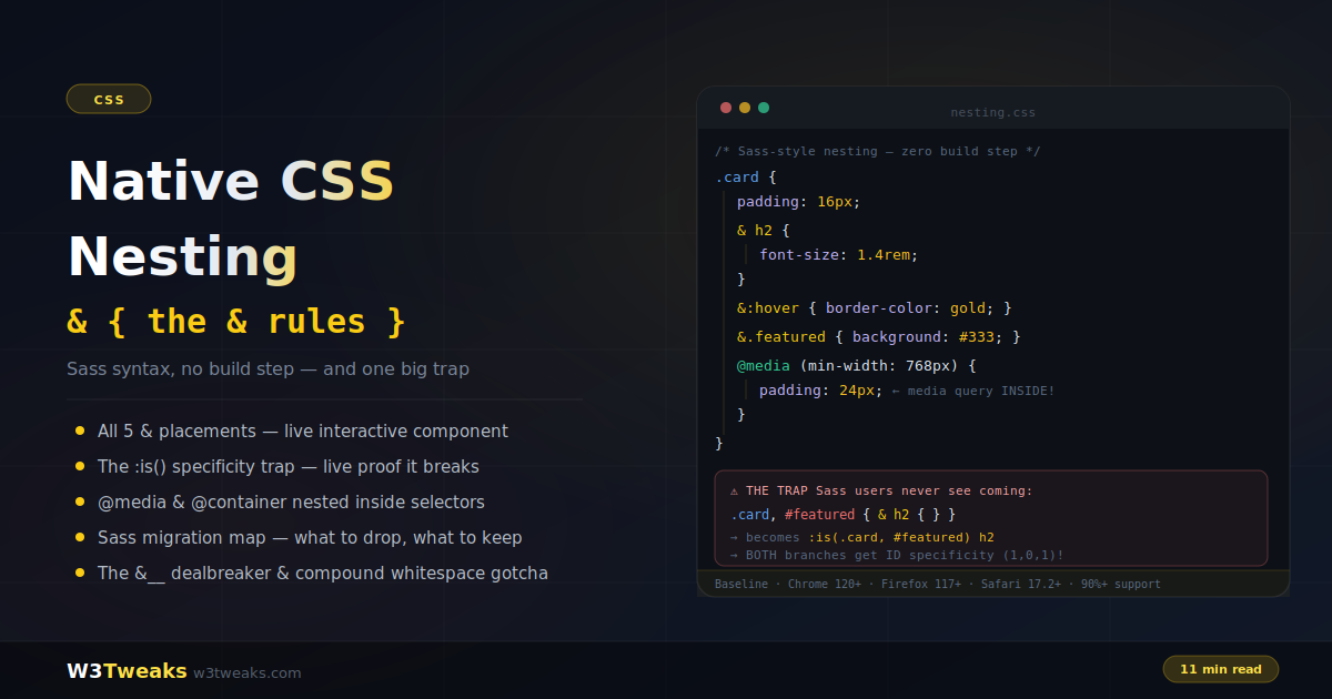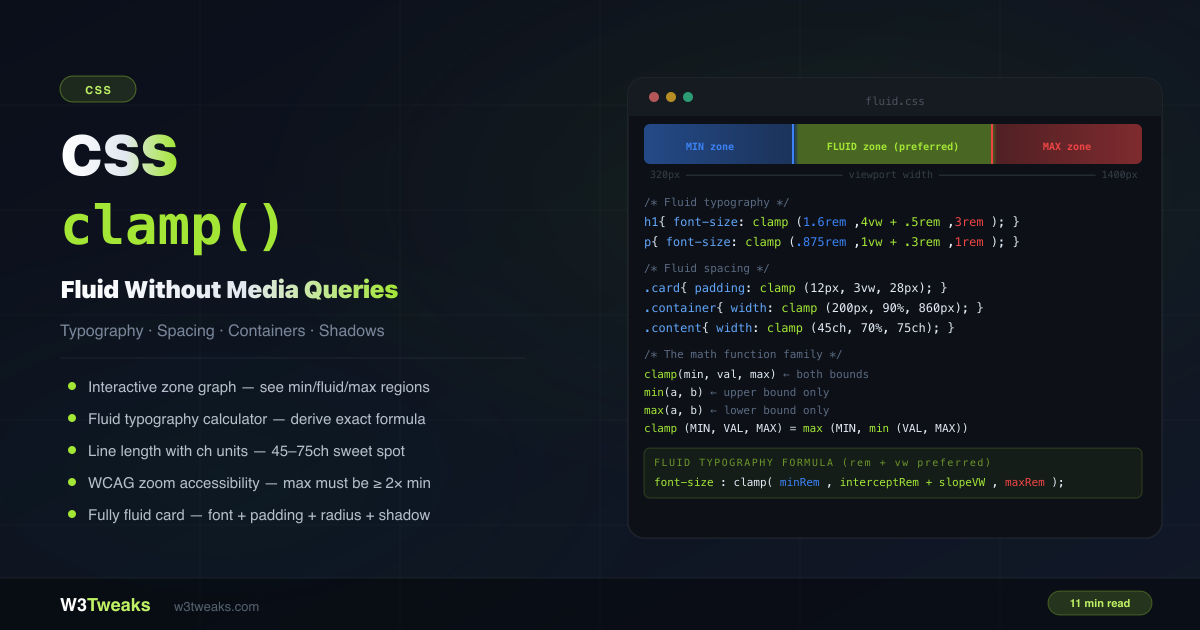
You know div, .class, and #id. You use :hover and :focus. But CSS has dozens of selectors that most developers never reach for — selectors that replace JavaScript event listeners, eliminate helper classes, and handle complex UI state in pure CSS. This isn’t a cheat sheet. It’s the selectors that are genuinely underused, with real-world patterns you can apply today. For how these selectors affect specificity scoring, see CSS specificity explained, and for the related pseudo-elements you’ll often pair them with, see ::before and ::after explained.
Live Demo
Three tabs: ① click any selector to highlight what it matches in a live HTML tree, ② six :has() patterns that replace JavaScript, ③ hidden gems including :focus-within, :placeholder-shown, :user-valid/:user-invalid, :nth-child(of), attribute tricks, and ::marker.
Combinators — The Ones Developers Forget
Most developers know the descendant combinator (space) but reach for it exclusively. The others are just as useful.
/* Descendant — any level deep */
.card p { color: grey; }

/* Direct child only (>) — does not match nested p */
.card > p { font-size: 1.1rem; }

/* Adjacent sibling (+) — immediately follows */
p + p { margin-top: 0; } /* removes top margin on second+ paragraphs */

/* General sibling (~) — all following siblings */
h2 ~ p { color: #6b7280; } /* all paragraphs after an h2 */
The adjacent sibling combinator (+) is particularly useful for “lobotomised owl” spacing:
/* Add spacing between ANY adjacent elements — no margin on the first */
.stack > * + * {
  margin-top: 1.5rem;
}
:nth-child() — Beyond even and odd
Most developers use :nth-child(odd) and :nth-child(even). The an+b formula is far more powerful:
li:nth-child(3)      /* exactly the 3rd item */
li:nth-child(3n)     /* every 3rd item: 3, 6, 9... */
li:nth-child(3n+1)   /* every 3rd starting from 1st: 1, 4, 7... */
li:nth-child(-n+3)   /* first 3 items only */
li:nth-child(n+4)    /* all items from 4th onward */
Combined:
/* Items 4 through 8 — from 4th, stop at 8th */
li:nth-child(n+4):nth-child(-n+8) { background: yellow; }
The new of selector syntax
The new :nth-child(An+B of selector) lets you count only elements that match a selector — not all siblings:
/* OLD way — selects 2nd child that happens to have .featured */
.item:nth-child(2) { }

/* NEW way — selects the 2nd .featured item, regardless of position */
.item:nth-child(2 of .featured) { outline: 2px solid cyan; }
This is a massive difference. In a list where .featured items are scattered among regular items, the old approach counts all children. The new of syntax counts only matching children.
/* Highlight every other featured item */
.card:nth-child(even of .featured) { background: rgba(0,200,180,0.1); }

/* Style the last 3 visible items */
.item:nth-child(-n+3 of :not(.hidden)) { border: 1px solid cyan; }
Browser support: Chrome 111+, Firefox 113+, Safari 15.4+ — safe for production.
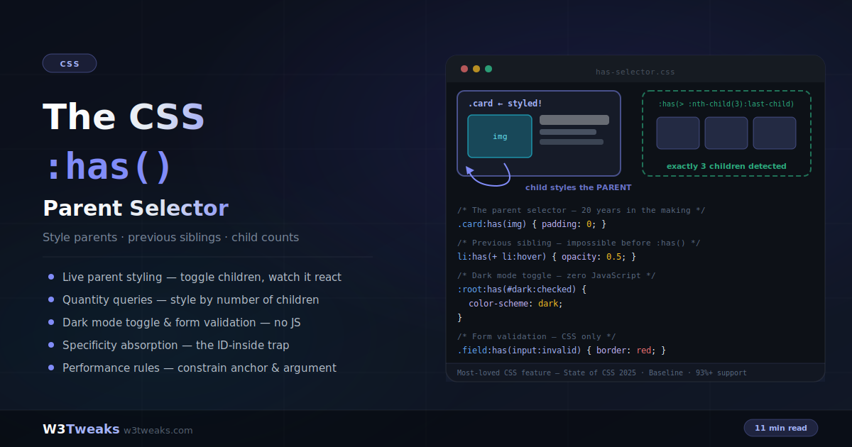
:has() — The Parent Selector
:has() was the most-requested CSS feature for over a decade. It selects an element based on what it contains.
Style a card that has an image
/* Default card */
.card { border: 1px solid #e5e7eb; }

/* Card WITH an image — no JavaScript class toggling */
.card:has(img) {
  border-color: #06b6d4;
  box-shadow: 0 4px 20px rgba(6,182,212,0.1);
}

/* Card WITHOUT an image — add extra padding */
.card:not(:has(img)) {
  padding-block: 2rem;
}
Toggle row style with a checkbox
/* Style the label when its checkbox is checked — no JavaScript */
label:has(input:checked) {
  background: rgba(52,211,153,0.1);
  border-color: rgba(52,211,153,0.4);
  color: #34d399;
}
Form group focus
/* Highlight the whole group when any input inside is focused */
.form-group:has(input:focus, textarea:focus) {
  border-color: #06b6d4;
  background: rgba(6,182,212,0.03);
}

.form-group:has(input:focus) label {
  color: #06b6d4;
  font-size: 0.75rem;
}
Auto-arrow on nav items with dropdowns
/* Automatically add dropdown arrow to nav items that contain a .dropdown */
.nav-item:has(.dropdown)::after {
  content: " ▾";
  color: #6b7280;
}

/* Rotate arrow when dropdown is open */
.nav-item:has(.dropdown.open)::after {
  transform: rotate(180deg);
}
Quantity query — change layout based on item count
/* Switch grid columns based on number of items */
.grid:has(:nth-child(1):last-child)  { grid-template-columns: 1fr; }
.grid:has(:nth-child(2):last-child)  { grid-template-columns: 1fr 1fr; }
.grid:has(:nth-child(3):last-child)  { grid-template-columns: 1fr 1fr 1fr; }

/* When 4 or more items exist — go to auto-fill */
.grid:has(:nth-child(4)) {
  grid-template-columns: repeat(auto-fill, minmax(200px, 1fr));
}
Style siblings based on another element’s state
/* When a sidebar is open, shrink the main content */
body:has(#sidebar.open) .main-content {
  margin-left: 280px;
  transition: margin 0.3s ease;
}

/* Dim everything except the focused modal */
body:has(.modal.active) .page-content {
  filter: blur(2px);
  pointer-events: none;
}
:checked + ~ — The Original CSS State Machine
Before :has() shipped to all browsers, the way to wire up CSS-only accordions, tabs, mobile menus, and modals was the :checked + sibling combinator pattern. It still has its place: it works back to IE9, ships in fewer bytes, and is often a cleaner mental model when the “state” lives on a single input.
The pattern: a hidden checkbox or radio holds the state. A sibling selector targets whatever the state controls.
<!-- Hidden checkbox holds the open/closed state -->
<input type="checkbox" id="menu-toggle" class="menu-toggle">
<label for="menu-toggle" class="menu-button">☰ Menu</label>

<nav class="menu">
  <a href="/">Home</a>
  <a href="/about">About</a>
</nav>
.menu-toggle { position: absolute; opacity: 0; }
.menu { max-height: 0; overflow: hidden; transition: max-height 0.3s; }
/* When the checkbox is checked, the sibling nav opens */
.menu-toggle:checked ~ .menu {
max-height: 400px;
}The same pattern with radios gives you CSS-only tabs:
<input type="radio" name="t" id="t1" checked>
<input type="radio" name="t" id="t2">
<input type="radio" name="t" id="t3">

<div class="tabs">
  <label for="t1">Tab 1</label>
  <label for="t2">Tab 2</label>
  <label for="t3">Tab 3</label>
</div>

<div class="panels">
  <section class="p1">Panel 1 content</section>
  <section class="p2">Panel 2 content</section>
  <section class="p3">Panel 3 content</section>
</div>
.panels section { display: none; }
#t1:checked ~ .panels .p1,
#t2:checked ~ .panels .p2,
#t3:checked ~ .panels .p3 { display: block; }When to prefer this over :has(): the state is owned by one input, you need wider browser support than :has() (which is fully Baseline as of 2024 but still useful in legacy contexts), or you want bookmarkable URLs — in which case look at :target next.
Accessibility: for menus and modals, wire
aria-expandedon the label using<label aria-expanded="false">plus a tiny JS toggle, OR move to the<details>element which gives you all this state management with proper semantics built in.
:target — URL-Driven UI Without JavaScript
:target matches an element whose id equals the current URL hash. It’s the only pseudo-class that gives you bookmarkable, deep-linkable UI with zero JavaScript. Tabs that can be linked to. FAQ entries that auto-scroll and highlight when shared. Lightbox galleries with a back-button history.
<nav>
  <a href="#tab-1">Overview</a>
  <a href="#tab-2">Specs</a>
  <a href="#tab-3">Reviews</a>
</nav>

<section id="tab-1">Overview content</section>
<section id="tab-2">Specs content</section>
<section id="tab-3">Reviews content</section>
/* Hide all sections by default */
section { display: none; }
/* Show the one whose id matches the URL hash */
section:target { display: block; }
/* Show first tab by default when nothing is targeted */
section:first-of-type:not(:target ~ section, body:has(:target) *) {
display: block;
}A user-friendlier default-tab pattern uses :has():
body:not(:has(section:target)) #tab-1 { display: block; }Why :target is genuinely underused:
- The URL becomes shareable —
/product/#reviewslands users on the reviews tab directly - The browser back/forward buttons navigate between tab states for free
- Search engines can index each tabbed state (with proper markup) since each has a distinct URL fragment
- Screen readers and keyboard users get native anchor-link semantics
Caveat: clicking a
:targetlink scrolls to the element. For tabs that shouldn’t scroll, either give the target ascroll-margin-top: 100vhworkaround (hacky), or useevent.preventDefault()plushistory.pushState()in a tiny JS shim — at which point:has(.active)might be simpler.
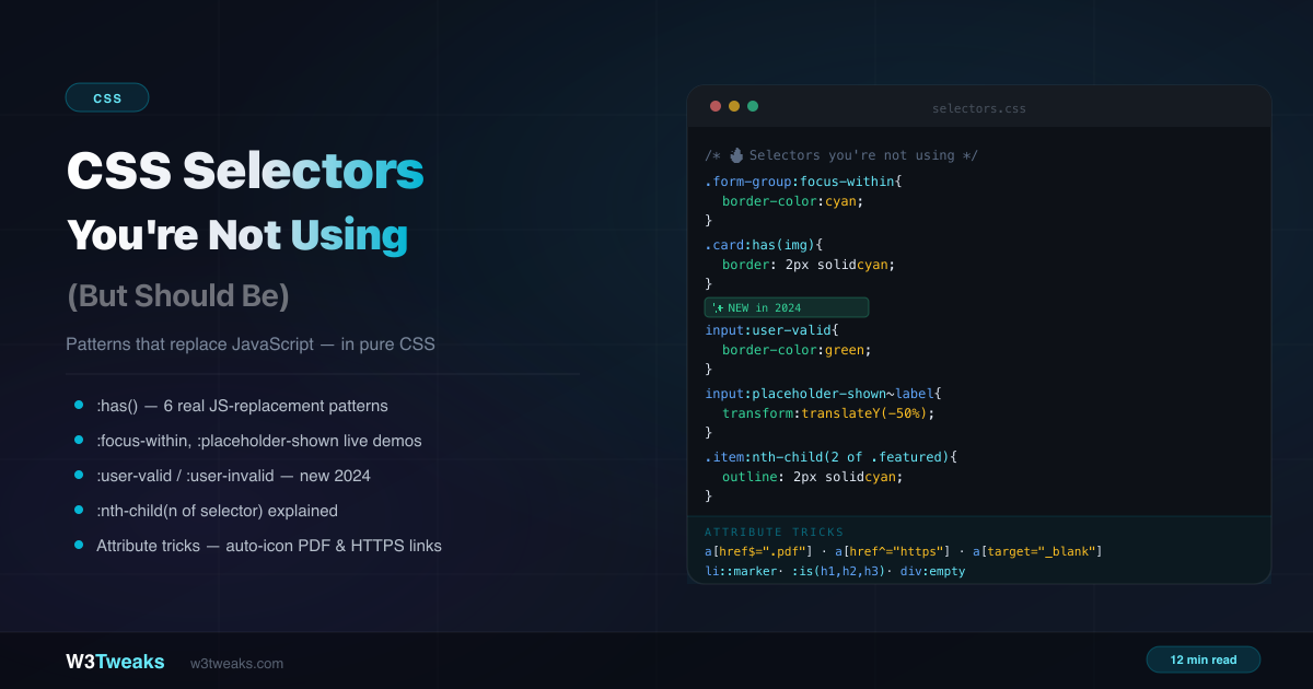
:focus-within — Style the Parent on Child Focus
:focus-within matches a parent element when any of its descendants has focus. It’s one of the most useful selectors for form UI — replacing an entire JavaScript pattern.
/* Highlight the whole field group when its input has focus */
.field-group {
  border: 2px solid #e5e7eb;
  border-radius: 8px;
  padding: 12px;
  transition: border-color 0.2s, background 0.2s;
}

.field-group:focus-within {
  border-color: #06b6d4;
  background: rgba(6,182,212,0.03);
}

.field-group:focus-within label {
  color: #06b6d4;
}
Without this selector you’d need JavaScript to add/remove a class on the group when the input fires focus and blur events.
:placeholder-shown — The Floating Label Pattern
:placeholder-shown is true when the input’s placeholder is visible — meaning the field is empty. Combined with :not(:placeholder-shown), it powers the floating label pattern with zero JavaScript:
<div class="field">
  <input type="email" id="email" placeholder=" " required>
  <label for="email">Email address</label>
</div>
.field { position: relative; }
.field input {
width: 100%;
padding: 20px 12px 6px;
border: 1px solid #e5e7eb;
border-radius: 8px;
font-size: 16px;
}
.field label {
position: absolute;
left: 12px;
top: 50%;
transform: translateY(-50%);
font-size: 16px;
color: #9ca3af;
pointer-events: none;
transition: all 0.15s ease;
}
/* Label floats up when field has a value OR is focused */
.field input:not(:placeholder-shown) ~ label,
.field input:focus ~ label {
top: 8px;
transform: none;
font-size: 11px;
color: #06b6d4;
font-weight: 600;
}The trick: Set
placeholder=" "(a single space) on the input. This ensures the placeholder is technically always “present” but invisible, so:placeholder-shownbehaves correctly as a proxy for the empty/filled state.
:user-valid and :user-invalid — New in 2024
:valid and :invalid fire immediately when the page loads — showing red errors on untouched, empty required fields before the user has done anything. This is terrible UX.
:user-valid and :user-invalid solve this. They only activate after the user has interacted with the field (typed something and moved on, or submitted the form):
/* ❌ Bad UX — fires immediately on page load */
input:invalid { border-color: red; }

/* ✅ Good UX — only fires after user interaction */
input:user-invalid {
  border-color: #f87171;
  background: rgba(248,113,113,0.05);
}

input:user-valid {
  border-color: #34d399;
  background: rgba(52,211,153,0.05);
}

/* Show error message only after user has interacted */
input:user-invalid ~ .error-msg {
  display: block;
}

input:user-valid ~ .error-msg {
  display: none;
}
:in-range and :out-of-range for numeric inputs
Paired with <input type="number">, <input type="range">, and <input type="date">, the :in-range and :out-of-range pseudo-classes style based on whether the current value falls within the input’s min/max bounds — without any change event listener:
<input type="number" min="1" max="10" value="12">input:in-range { border-color: #34d399; }
input:out-of-range {
border-color: #f87171;
background: rgba(248,113,113,0.05);
}
input:out-of-range + .hint::after { content: " — value is out of range"; }:required and :optional round out the form-pseudo set if you want to style based on the required attribute itself:
input:required + label::after  { content: " *"; color: #f87171; }
input:optional  + label::after  { content: " (optional)"; color: #9ca3af; font-weight: 400; }
Browser support for
:user-valid/:user-invalid: Chrome 119+, Firefox 88+, Safari 16.5+. For older browsers,:invalidfalls back gracefully (it just fires earlier).:in-range,:out-of-range,:required, and:optionalwork in all browsers.
Attribute Selectors — The Underused Toolkit
Attribute selectors target elements based on their HTML attributes. They’re incredibly powerful for auto-decorating elements without adding classes.
The six operators
[attr]          /* has the attribute (any value) */
[attr="val"]    /* exact match */
[attr~="val"]   /* value is in space-separated list */
[attr|="val"]   /* starts with "val" or "val-" */
[attr^="val"]   /* starts with "val" */
[attr$="val"]   /* ends with "val" */
[attr*="val"]   /* contains "val" anywhere */
Auto-decorate links by type
/* No extra classes — purely from the href attribute */
a[href^="https"]::before { content: "🔒 "; }
a[href$=".pdf"]::after   { content: " 📄 PDF"; font-size: 0.75em; color: #6b7280; }
a[href$=".zip"]::after   { content: " 📦 ZIP"; font-size: 0.75em; color: #6b7280; }
a[target="_blank"]::after { content: " ↗"; }
a[href^="mailto:"]::before { content: "✉ "; }
a[href^="tel:"]::before    { content: "📞 "; }
Data attributes as component state
/* Use data attributes for state instead of JS-toggled classes */
.button[data-state="loading"] {
  opacity: 0.7;
  pointer-events: none;
  cursor: wait;
}

.button[data-state="loading"]::after {
  content: " ⟳";
  animation: spin 1s linear infinite;
}

.card[data-featured="true"] {
  border-color: gold;
  order: -1; /* move to front in flex/grid */
}

/* Theme switching via data attribute on root */
[data-theme="dark"] {
  --bg: #0b0f1a;
  --text: #e2eaf5;
}
Case-insensitive matching
/* [i] flag — matches regardless of case */
a[href$=".PDF" i]  { } /* matches .pdf, .PDF, .Pdf */
a[href*="github" i] { } /* matches GitHub, github, GITHUB */
:dir() — the modern RTL-aware selector
The classic way to handle right-to-left layouts is [dir="rtl"]. But that attribute selector doesn’t inherit — it only matches elements where dir="rtl" is set directly. If the dir is on <html> and you target a deep .icon, the attribute selector misses.
:dir(rtl) is the inheriting alternative. It matches any element whose computed direction is right-to-left, regardless of where dir is set in the ancestor chain:
/* ❌ Only matches if dir="rtl" is on .icon itself */
[dir="rtl"] .icon { transform: scaleX(-1); }

/* ✅ Matches if ANY ancestor (including html) has dir="rtl" */
.icon:dir(rtl) { transform: scaleX(-1); }

/* Flip a chevron, swap quote glyphs, mirror an arrow */
.chevron:dir(rtl) { transform: rotate(180deg); }
blockquote:dir(rtl)::before { content: "❞"; }
blockquote:dir(ltr)::before { content: "❝"; }
Browser support: Chrome 120+, Firefox 49+, Safari 16.4+ — Baseline since December 2023.
:empty — Hide Empty Containers Without JavaScript
:empty matches elements with no children — not even whitespace:
/* Hide a container when it has nothing in it */
.notification-badge:empty { display: none; }

/* Show empty state inside a list */
.results-list:empty::after {
  content: "No results found.";
  display: block;
  text-align: center;
  padding: 2rem;
  color: #9ca3af;
  font-style: italic;
}

/* Remove margin from empty paragraphs in CMS content */
p:empty { margin: 0; }
::marker — Custom List Bullets
::marker targets the bullet or number of a list item — without removing list-style and rebuilding with ::before:
/* Custom bullet character and color */
li::marker {
  content: "▸ ";
  color: #06b6d4;
  font-size: 1.1em;
}

/* Ordered list — custom number color */
ol li::marker {
  color: #a78bfa;
  font-weight: 700;
}

/* Different markers per level */
ul ul li::marker { content: "– "; }
ul ul ul li::marker { content: "• "; }
:is(), :where(), and :not() — Write DRY Selectors
:is() and :where() both take a selector list and match any element that matches any selector in the list. They look identical — but they behave very differently in the cascade.
:is() — DRY with the highest specificity inside
/* ❌ Repetitive */
h1 a, h2 a, h3 a, h4 a, h5 a, h6 a {
  color: inherit;
  text-decoration: none;
}

/* ✅ DRY with :is() */
:is(h1, h2, h3, h4, h5, h6) a {
  color: inherit;
  text-decoration: none;
}

/* Multiple contexts */
:is(article, section, aside) > p:first-child {
  font-size: 1.15rem;
  color: #374151;
}
The specificity of :is() is the highest specificity of any selector inside it. So :is(#side, .nav) has the specificity of an ID — even when it’s matching a class.
:where() — zero specificity, perfect for resets and defaults
:where() is :is()’s underused sibling. It works identically — same selector matching — but contributes zero specificity. Anything inside :where() has the specificity of a wildcard.
/* Both rules match the same elements... */
:is(h1, h2, h3) { line-height: 1.2; }     /* specificity: 0,0,1 */
:where(h1, h2, h3) { line-height: 1.2; }  /* specificity: 0,0,0 */
That zero-specificity is why every modern CSS reset — Josh Comeau’s reset, Andy Bell’s modern reset, Open Props, Pico CSS — wraps its base rules in :where():
/* Reset rule with :where() — every user override wins automatically */
:where(button, input, select, textarea) {
  font: inherit;
  color: inherit;
}

/* Even the simplest user rule beats it — no !important needed */
.cta { font-family: 'Inter', sans-serif; } /* wins, specificity 0,1,0 */
Practical guideline: use :is() when you’re writing application styles and want the specificity to “count.” Use :where() for design-system defaults, resets, and any rule you want users to override without specificity wars. For deeper coverage of how this fits the cascade, see CSS specificity explained.
:not() with complex selectors
:not() now accepts complex selectors (CSS Selectors Level 4), not just simple ones:
/* ❌ CSS3 :not() — simple selectors only */
a:not(.btn) { text-decoration: underline; }

/* ✅ CSS4 :not() — complex selectors */
a:not(.btn):not([href^="#"]) { text-decoration: underline; }

/* Useful pattern: all interactive elements that aren't disabled */
:is(a, button, input):not(:disabled):not([aria-disabled="true"]):hover {
  cursor: pointer;
}

/* Style everything except the first AND last */
li:not(:first-child):not(:last-child) { color: #6b7280; }

/* Error states across multiple components */
:is(.input-group, .select-group, .textarea-group):has(:user-invalid) {
  border-color: #f87171;
}
Selectors That Replace JavaScript
Here’s a quick reference of common JavaScript patterns and their CSS-only replacements:
| JavaScript pattern | CSS replacement |
|---|---|
Add .focused class on focusin | :focus-within |
Add .has-value class on input | :not(:placeholder-shown) |
Add .checked class on change | label:has(input:checked) or :checked ~ .target |
Add .has-image class in JS | .card:has(img) |
Add .invalid class on blur | :user-invalid |
Add .out-of-range class on input | :out-of-range |
Add .empty class when list is cleared | :empty |
| Count items and add layout class | :has(:nth-child(n)) |
Add .external class to links | a[target="_blank"] |
Add .active-tab class on route change | :target (URL-driven) |
| Detect RTL via JS and add class | :dir(rtl) |
| Override design-system defaults | :where() (zero specificity) |
Bonus: Selectors for the Component Era
Two selectors that don’t get taught much but are quietly essential if you build with web components or design systems.
:defined — hide custom elements during upgrade
When a custom element loads its JavaScript and registers itself, the browser fires a “definition” event. Before that, the element renders as an unstyled, unknown tag — the classic FOUCE (Flash Of Unstyled Custom Element).
:defined matches a custom element only after it has been registered. The pattern:
/* Hide the custom element until it's defined, then fade in */
my-card:not(:defined) { visibility: hidden; }
my-card:defined { animation: fade-in 0.15s ease both; }

@keyframes fade-in {
  from { opacity: 0; } to { opacity: 1; }
}
:state() — style web-component states without attribute hacks
Authoring a web component? The old pattern was to expose state through attributes (<my-button loading>) so external CSS could target them. The modern pattern uses custom states registered via ElementInternals.states, then targeted with :state():
// Inside the component class
class MyButton extends HTMLElement {
  #internals;
  constructor() {
    super();
    this.#internals = this.attachInternals();
  }
  setLoading(on) {
    if (on) this.#internals.states.add('loading');
    else    this.#internals.states.delete('loading');
  }
}my-button:state(loading) {
opacity: 0.7;
pointer-events: none;
}
my-button:state(loading)::after {
content: " ⟳"; animation: spin 1s linear infinite;
}States stay encapsulated to the component — no attribute pollution on the public API.
Browser support:
:definedis universal.:state()is Chrome 90+, Firefox 126+, Safari 17.4+ — Baseline 2024.
Bonus: @scope — The Scoping Selector You Can Finally Use
@scope isn’t a selector — it’s an at-rule — but it solves the “how do I scope these styles without a CSS-in-JS build step” question that drove half the JavaScript ecosystem. As of Firefox 146 (early 2026), @scope is Baseline Newly Available.
The basics: @scope declares a root (where the styles begin to apply) and an optional limit (where they stop), and any selectors inside only match within that range.
/* Styles only apply inside .card, and don't leak out */
@scope (.card) {
  /* Inside the scope, you can use bare selectors */
  :scope { padding: 1rem; border-radius: 8px; }
  h2 { font-size: 1.25rem; }
  p { color: #6b7280; }
}
Donut scope — start inside one root, stop at another
The killer feature is @scope (root) to (limit). The styles apply between the root and the limit but skip everything deeper:
/* Style everything inside .article EXCEPT inside nested .embed */
@scope (.article) to (.embed) {
  a { color: var(--brand); text-decoration: underline; }
  img { max-width: 100%; }
}
Now an embedded widget’s links won’t get rewritten by the article’s link styling — the cascade boundary is enforced by the scope.
How it compares
| Need | Tool |
|---|---|
| Scope styles to a component | @scope (.component) |
| Stop styles bleeding into embeds | @scope (root) to (limit) |
| Override design-system defaults | :where() (zero specificity) |
| Manage layering across many sources | @layer |
@scope and :where() and @layer are complementary, not competing. Most production setups will use all three.
Browser support: Chrome 118+, Safari 17.4+, Firefox 146+ — Baseline Newly Available. Older Firefox versions just ignore the at-rule.
Common Gotchas
:empty is strict — whitespace counts as content:
/* ❌ This div is NOT :empty because of the newline */
<div>
</div>

/* ✅ This div IS :empty */
<div></div>
:placeholder-shown requires a non-empty placeholder:
/* The placeholder must exist — use a space if you don't want visible text */
<input placeholder=" " type="text">
:nth-child(of selector) counts differently than you might expect:
/* li:nth-child(2 of .featured) selects the 2nd .featured item,
   NOT the 2nd child that also happens to be .featured */
:has() cannot contain pseudo-elements:
/* ❌ Invalid */
.card:has(::before) { }

/* ✅ Valid */
.card:has(> p) { }
.card:has(img:first-child) { }
:where() vs :is() — same match, different specificity:
/* These match the SAME elements but have DIFFERENT specificity */
:is(#side, .nav) a   { color: red; }    /* specificity: 1,0,1 (ID counts!) */
:where(#side, .nav) a { color: red; }    /* specificity: 0,0,1 (zero from :where) */
[dir="rtl"] doesn’t inherit — :dir(rtl) does:
/* Document is <html dir="rtl">, .icon is nested deep */
.icon[dir="rtl"]  { } /* ❌ Doesn't match — .icon has no dir attribute */
.icon:dir(rtl)    { } /* ✅ Matches — :dir() reads the inherited direction */
Browser Support Summary
| Selector | Chrome | Firefox | Safari |
|---|---|---|---|
:has() | 105+ | 121+ | 15.4+ |
:where() | 88+ | 78+ | 14+ |
:focus-within | 60+ | 52+ | 10.1+ |
:placeholder-shown | 47+ | 51+ | 9+ |
:user-valid / :user-invalid | 119+ | 88+ | 16.5+ |
:in-range / :out-of-range | All | All | All |
:nth-child(of selector) | 111+ | 113+ | 15.4+ |
:target | All | All | All |
:checked | All | All | All |
:dir() | 120+ | 49+ | 16.4+ |
:defined | 54+ | 63+ | 10+ |
:state() | 90+ | 126+ | 17.4+ |
@scope | 118+ | 146+ | 17.4+ |
::marker | 86+ | 68+ | 11.1+ |
:is() / :where() | 88+ | 78+ | 14+ |
[attr$="val"] | All | All | All |
All selectors in this tutorial are safe for production except where noted.
Key Takeaways
- The adjacent sibling combinator (
+) and general sibling (~) eliminate many helper classes :nth-child(An+B of selector)counts only matching elements — entirely different from regular:nth-child():has()is the parent selector — it replaces JavaScript class toggling for focus, checked state, and child-based layout changes:checked + ~is the original CSS state machine — wider browser support and fewer bytes than:has()when state lives on one input:targetgives you URL-driven, bookmarkable, deep-linkable UI with zero JavaScript:focus-withinstyles a parent when any child has focus — eliminates thefocusin/focusoutJavaScript pattern:placeholder-shownpowers floating labels in pure CSS — useplaceholder=" "(space) as the trigger:user-valid/:user-invalidonly fire after user interaction — always prefer these over:valid/:invalidfor forms; pair with:in-range/:out-of-rangefor numeric inputs- Attribute selectors (
[href$=".pdf"],[target="_blank"]) auto-decorate elements without extra classes :dir(rtl)inherits where[dir="rtl"]doesn’t — always prefer it for RTL-aware styling:where()is:is()with zero specificity — use it for resets and design-system defaults that users can always override:definedand:state()are the modern selectors for web components — no attribute hacks needed@scope(Baseline) gives you native style scoping with donut-shaped boundaries — no CSS-in-JS build step required::markerstyles list bullets withoutlist-style: nonehacks:emptyhides empty containers and shows empty states without JavaScript
FAQ
What CSS selectors should I learn first?
After the basics (type, class, ID), focus on :nth-child(), attribute selectors, and the combinator operators (>, +, ~). Then move to :is(), :where(), :not(), :has(), and :focus-within — these five unlock the most powerful patterns and replace the most JavaScript.
What is the difference between :nth-child() and :nth-of-type()?
:nth-child(n) counts ALL siblings regardless of type. :nth-of-type(n) counts only siblings of the same element type. If you have a div mixed in with p elements, :nth-child(2) might match the div, while p:nth-of-type(2) matches the second p regardless of where div elements appear. Use :nth-child() for most cases — it’s more predictable and the new of selector syntax makes it even more powerful.
How does :has() work and what can I select with it?
:has() selects an element based on whether it contains a matching descendant. .card:has(img) matches cards that contain an image. .form:has(:user-invalid) matches a form that contains an invalid field. :has() cannot contain pseudo-elements and has some selector restrictions, but works with most selectors including :nth-child(), state pseudo-classes, and attribute selectors.
When should I use :where() instead of :is()?
:is() and :where() match the same elements but have different specificity. :is() takes the highest specificity of any selector inside it (so :is(#side, .nav) has ID-level specificity). :where() always contributes zero specificity. Use :where() for design-system defaults, CSS resets, and base styles — anything you want users to override without specificity wars. Use :is() for application styles where you want the specificity to matter.
What is :focus-within used for?
:focus-within matches a parent element when any of its descendants has keyboard or mouse focus. It’s primarily used for form group highlighting — styling the whole field container when its input is focused — replacing focusin/focusout JavaScript event listeners entirely.
What is the difference between :valid/:invalid and :user-valid/:user-invalid?
:valid and :invalid fire as soon as the page loads — meaning empty required fields show as red immediately before the user has interacted. :user-valid and :user-invalid only activate after the user has typed in the field and moved on, or tried to submit the form. Always prefer the :user-* variants for form validation feedback.
Can I build a tabbed interface without JavaScript?
Yes — three ways. :checked + ~ with radio inputs is the classic, widely-supported pattern. :target ties tab state to the URL hash so each tab is bookmarkable and shareable. :has(.active) (with a tiny JS click handler that adds .active) is the cleanest modern option when you don’t need URL state. The :checked and :target approaches require zero JavaScript.
Can I use data attributes for CSS state management?
Yes — and it’s a clean pattern. Instead of JavaScript toggling classes like .is-loading, set data-state="loading" on the element and target it with [data-state="loading"]. This makes state explicit in the HTML, readable in DevTools, and avoids polluting the class attribute with JavaScript-managed state.
Is @scope ready for production ?
Yes. As of Firefox 146 (early 2026), @scope is Baseline Newly Available — meaning it works in the latest version of every major browser. Older browser versions will simply ignore the @scope block, so the styles inside won’t apply but nothing breaks. For sites that need to support older Firefox, treat @scope as a progressive enhancement and provide a class-based fallback. For new projects targeting modern browsers, ship it.