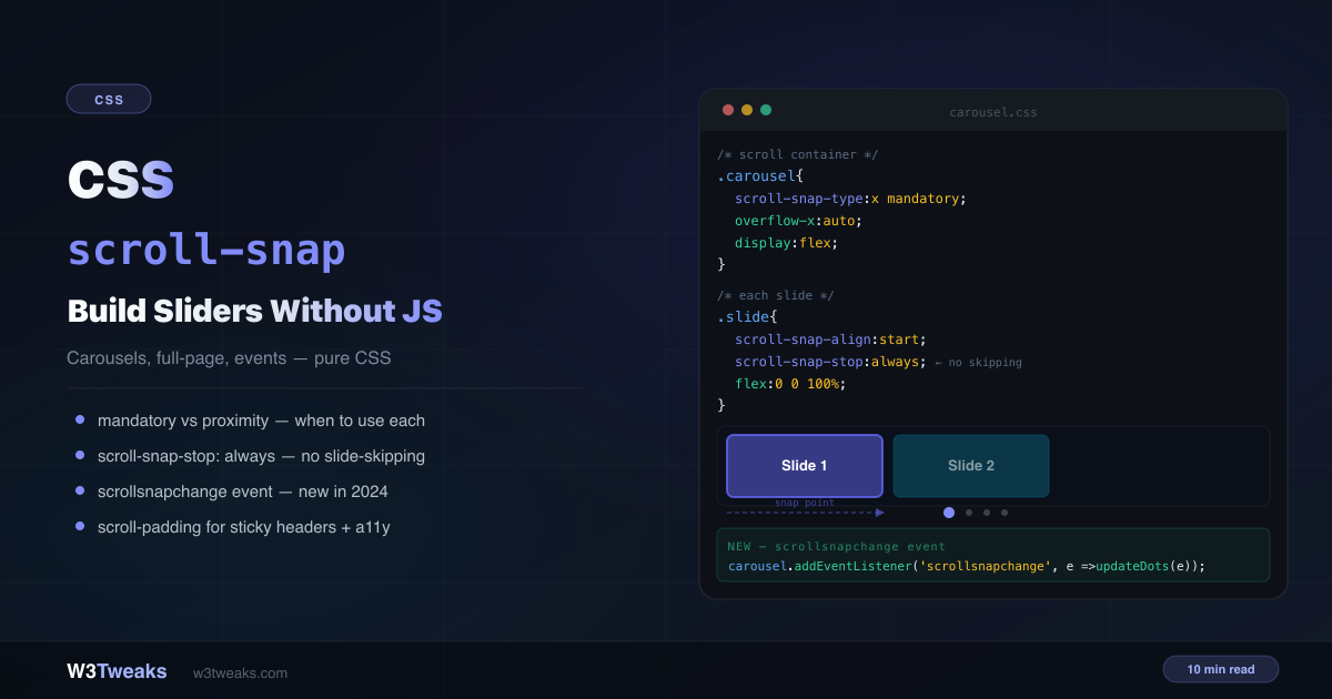
Two lines of CSS and you have a working carousel. No Swiper. No Slick. No JavaScript.
.carousel      { scroll-snap-type: x mandatory; overflow-x: auto; display: flex; }
.carousel-item { scroll-snap-align: start; flex: 0 0 100%; }
CSS scroll-snap controls how scrolling lands — making it stop at specific positions rather than wherever momentum runs out. This guide covers every property, the mandatory vs proximity decision, scroll-snap-stop for preventing slide-skipping, the new scrollsnapchange event that replaces IntersectionObserver hacks, the CSS Carousel API (::scroll-marker() and ::scroll-button() shipped in Chrome 135+ March 2025 and Safari 18.2+ December 2024), scroll-driven animations paired with snap, the 100dvh trick that fixes mobile, drag-to-scroll for desktop mouse users, keyboard accessibility, and a debug checklist for when CSS scroll snap is not working.
For the layout patterns this pairs with, see CSS position: sticky explained. For how cascade affects snap property overrides, see CSS specificity explained.
Live Demo
Three tabs: ① interactive builder — toggle axis, mandatory/proximity, all 4 alignment values, ② five real-world patterns including a CSS carousel with synced dots, full-page sections, 2D grid snap, and chat auto-scroll, ③ scroll-snap-stop, the scrollsnapchange event with proper feature detection, and scroll-padding for sticky headers.
How CSS scroll-snap Works
Every scroll-snap setup needs two things: a scroll container with scroll-snap-type and child elements with scroll-snap-align. The container defines the direction and strictness; the children define where the snap points are.
/* Container */
.scroll-container {
  overflow-x: auto;
  scroll-snap-type: x mandatory;
}

/* Children */
.scroll-item {
  scroll-snap-align: start;
}
When scrolling stops, the browser moves the scroll position to the nearest declared snap point. The container handles the axis and strictness; the children handle their own alignment.
scroll-snap-type — Axis and Strictness
scroll-snap-type takes two values: the axis and the strictness.
Axis values
scroll-snap-type: x mandatory;      /* horizontal scrolling */
scroll-snap-type: y mandatory;      /* vertical scrolling */
scroll-snap-type: both mandatory;   /* both axes simultaneously — 2D snap */
scroll-snap-type: block mandatory;  /* logical — usually vertical (en) */
scroll-snap-type: inline mandatory; /* logical — usually horizontal (en) */
The logical block and inline values respect writing mode — in writing-mode: vertical-rl (Japanese, Mongolian), inline becomes vertical and block becomes horizontal. Use logical values when supporting RTL or vertical scripts.
Mandatory vs proximity — Which Strictness to Choose
This is the most important decision in scroll-snap and the one most tutorials fail to explain properly.
scroll-snap-type: x mandatory;  /* always snaps to a snap point */
scroll-snap-type: x proximity;  /* snaps only if close to a snap point */
mandatory — The scroll position always ends on a snap point. The browser may scroll slightly after you lift your finger to reach the nearest snap point. If snapped content doesn’t fully fill the container, it’s possible for content between snap points to become inaccessible (the accessibility trap — more on this later).
proximity — The browser only snaps if the final scroll position would naturally land close to a snap point. Users can scroll freely and rest between items. The exact “close enough” threshold is browser-determined.
Mandatory vs proximity — Decision Table
| Use case | Value |
|---|---|
| Carousel where every slide should be fully visible | mandatory |
| Full-page hero sections on a landing page | mandatory |
| Long article with section anchors | proximity |
| Image gallery where users browse freely | proximity |
| Onboarding screens | mandatory |
| Content-heavy blog post | proximity |
The rule: use mandatory when every item is the same size and should be fully visible. Use proximity when content may be taller than the viewport or when users need to read freely.
scroll-snap-align — Where Each Child Snaps
scroll-snap-align is set on the children and defines the snap point’s position within each child:
.item { scroll-snap-align: start; }   /* leading edge aligns with container edge */
.item { scroll-snap-align: center; }  /* center aligns with container center */
.item { scroll-snap-align: end; }     /* trailing edge aligns with container edge */
.item { scroll-snap-align: none; }    /* no snap point — item can be scrolled past */
start is correct for full-width carousels — the left edge of the slide aligns with the left edge of the container.
center is correct for peeking carousels — adjacent slides are partially visible on both sides and the active slide is centered.
end is correct for chat interfaces — the last message’s bottom edge aligns with the bottom of the container.
none explicitly opts a child out of being a snap target — useful when you want some items in the scroll container to be snap-able but others to be skipped.
/* Peeking carousel — show partial next/prev slides */
.peeking-carousel {
  scroll-snap-type: x mandatory;
  overflow-x: auto;
  padding-inline: 40px;          /* space for peeking slides */
  scroll-padding-inline: 40px;   /* offset the snap point to match */
}

.peeking-item {
  scroll-snap-align: center;
  flex: 0 0 80%;                 /* less than 100% — neighbouring slides visible */
}
scroll-snap-stop: always — Prevent Slide Skipping
By default, a fast swipe or trackpad gesture can skip multiple snap points in one motion. scroll-snap-stop: always forces the browser to stop at each snap point, even during a fast gesture:
/* ❌ Default — fast swipe can skip multiple slides */
.slide {
  scroll-snap-align: start;
  /* scroll-snap-stop defaults to normal */
}

/* ✅ scroll-snap-stop: always — forces stop at every slide */
.slide {
  scroll-snap-align: start;
  scroll-snap-stop: always;
}
Use scroll-snap-stop: always for:
- Onboarding flows where each step must be seen
- Image galleries where nothing should be skipped
- Step-by-step tutorials
Use the default normal for:
- Carousels where speed navigation is fine
- Long lists where users want to skim quickly
Building a CSS Carousel Without JavaScript
Here’s a production-ready CSS carousel without JavaScript — full-width slides with a dot indicator:
<div class="carousel" id="carousel">
  <div class="slide">Slide 1</div>
  <div class="slide">Slide 2</div>
  <div class="slide">Slide 3</div>
  <div class="slide">Slide 4</div>
</div>

<!-- Dots are <button> for keyboard + screen-reader accessibility -->
<div class="carousel-dots" role="tablist" aria-label="Carousel pagination">
  <button class="dot active" type="button" aria-label="Go to slide 1"></button>
  <button class="dot" type="button" aria-label="Go to slide 2"></button>
  <button class="dot" type="button" aria-label="Go to slide 3"></button>
  <button class="dot" type="button" aria-label="Go to slide 4"></button>
</div>
.carousel {
display: flex;
overflow-x: auto;
scroll-snap-type: x mandatory;
scrollbar-width: none; /* Firefox + modern Chrome/Safari */
-webkit-overflow-scrolling: touch; /* iOS momentum scrolling */
}
.carousel::-webkit-scrollbar { display: none; } /* legacy WebKit */
.slide {
flex: 0 0 100%;
scroll-snap-align: start;
scroll-snap-stop: always;
}
.dot {
width: 8px; height: 8px;
padding: 0;
border-radius: 50%;
background: rgba(255,255,255,0.3);
border: none; cursor: pointer;
transition: all 0.2s;
}
.dot:focus-visible { outline: 2px solid currentColor; outline-offset: 2px; }
.dot.active {
width: 24px;
border-radius: 4px;
background: white;
}The Modern Way: ::scroll-marker() and ::scroll-button() (CSS Carousel API)
The spec-driven way to build dot indicators and prev/next buttons is the CSS Carousel API — two new pseudo-elements that generate the navigation UI without any markup at all. Chrome 135+ shipped both in March 2025; Safari 18.2 in December 2024. Current global coverage is ~75% and growing.
Dot indicators with zero markup
The browser generates one ::scroll-marker per snap child. Define the style and it renders into a ::scroll-marker-group you place anywhere on the page:
.carousel {
  scroll-snap-type: x mandatory;
  overflow-x: auto;
  display: flex;
  /* Tell the browser where to render the marker group */
  scroll-marker-group: after;
}

.slide {
  flex: 0 0 100%;
  scroll-snap-align: start;
}

/* Style the auto-generated markers */
.slide::scroll-marker {
  content: '';
  display: inline-block;
  width: 8px;
  height: 8px;
  border-radius: 50%;
  background: rgba(0,0,0,0.3);
  margin: 0 4px;
  cursor: pointer;
}

/* The marker matching the currently snapped slide */
.slide::scroll-marker:target-current {
  background: currentColor;
  width: 24px;
  border-radius: 4px;
}
The browser handles click-to-scroll, keyboard arrow navigation, focus management, and ARIA — all of which you’d write JavaScript for previously. No scrollIntoView() call, no scrollsnapchange listener, nothing.
Prev / next buttons
::scroll-button() generates four pseudo-button positions on the scroll container itself:
.carousel::scroll-button(left),
.carousel::scroll-button(right) {
  content: '';
  position: absolute;
  width: 40px;
  height: 40px;
  border-radius: 50%;
  background: rgba(0,0,0,0.5);
  cursor: pointer;
}

.carousel::scroll-button(left)  { content: '‹'; left: 8px;  top: 50%; }
.carousel::scroll-button(right) { content: '›'; right: 8px; top: 50%; }

/* Disabled state when at the start/end */
.carousel::scroll-button(*):disabled {
  opacity: 0.3;
  pointer-events: none;
}
Progressive enhancement pattern
Wrap the new API in @supports so older browsers keep the manual carousel:
/* Base: manual <button class="dot"> carousel — works everywhere */
.dots-fallback { display: flex; gap: 6px; }

/* Enhanced: use ::scroll-marker where supported */
@supports selector(::scroll-marker) {
  .dots-fallback { display: none; } /* hide manual dots */
  .carousel { scroll-marker-group: after; }
  .slide::scroll-marker { /* …auto dots */ }
}
This is the future of CSS carousels. For now, ship both — the manual implementation for Firefox (no support yet) and the spec implementation as an enhancement for Chrome/Safari users.
scrollsnapchange — Sync Indicators Without IntersectionObserver
For the manual carousel pattern (without ::scroll-marker), the scrollsnapchange event fires when the snapped element changes — no IntersectionObserver, no scroll event throttling, no guessing:
const carousel = document.getElementById('carousel');

// Feature-detect first
if ('onscrollsnapchange' in carousel) {
  carousel.addEventListener('scrollsnapchange', (e) => {
    // e.snapTargetInline = the newly snapped element (horizontal)
    // e.snapTargetBlock  = the newly snapped element (vertical)
    const newIndex = [...carousel.children].indexOf(e.snapTargetInline);
    updateDots(newIndex);
  });
} else {
  // Firefox + older browsers — IntersectionObserver fallback
  const observer = new IntersectionObserver((entries) => {
    entries.forEach(entry => {
      if (entry.isIntersecting && entry.intersectionRatio >= 0.5) {
        updateDots([...carousel.children].indexOf(entry.target));
      }
    });
  }, { root: carousel, threshold: 0.5 });

  [...carousel.children].forEach(slide => observer.observe(slide));
}

function updateDots(activeIndex) {
  document.querySelectorAll('.dot').forEach((dot, i) => {
    dot.classList.toggle('active', i === activeIndex);
  });
}
Browser support: Chrome 129+ (October 2024), Safari 18.2+ (December 2024). Firefox does not yet support it.
scrollsnapchanging — fires during dragging
scrollsnapchanging fires during the drag — before the scroll settles — allowing you to preview which slide is pending:
carousel.addEventListener('scrollsnapchanging', (e) => {
  // fires while user is still dragging
  const pendingIndex = [...carousel.children].indexOf(e.snapTargetInline);
  previewDot(pendingIndex); // lighter visual indication
});
Use scrollsnapchanging for “ghost” indicator states; use scrollsnapchange for the committed state.
Scroll to a Snap Point Programmatically
For programmatic navigation (a “next slide” button outside the carousel, a deep link to a specific slide), use scrollIntoView() with explicit alignment options:
function goToSlide(carousel, index) {
  const target = carousel.children[index];
  if (!target) return;
  target.scrollIntoView({
    behavior: 'smooth',   // animate
    inline: 'start',      // horizontal carousel — align to inline start
    block: 'nearest',     // don't scroll the page vertically
  });
}

// Wire up the nav button
document.getElementById('next-btn').addEventListener('click', () => {
  const carousel = document.getElementById('carousel');
  const current = [...carousel.children].findIndex(
    el => el === document.elementFromPoint(/* …*/)
  );
  goToSlide(carousel, current + 1);
});
The snap engine takes over from there. Once scrollIntoView lands at the target, scroll-snap-type keeps it pinned.
scroll-padding — Fix the Sticky Header Problem
When you have a sticky navigation bar, snap targets snap to the top of the viewport — hiding behind the nav. scroll-padding-top creates an offset that accounts for the header height:
:root {
  --nav-height: 60px;
}

.page {
  overflow-y: auto;
  scroll-snap-type: y mandatory;
  scroll-padding-top: var(--nav-height); /* snap points start below the header */
}

/* Or on html/body for full-page snapping */
html {
  scroll-padding-top: var(--nav-height);
}

.section {
  scroll-snap-align: start; /* aligns with the padded snap port, not the raw top */
  min-height: 100dvh;       /* see 100dvh section below */
}
This is the same pattern as scroll-margin-top for anchor links — both solve the “hiding behind sticky header” problem, from different sides.
scroll-margin vs scroll-padding — The Confused Pair
These two properties are constantly mixed up. They solve related but different problems:
| Property | Where it goes | What it does |
|---|---|---|
scroll-padding | On the container | Shrinks the snap port from the inside |
scroll-margin | On the child | Pushes the snap point outward from the child |
/* scroll-padding — shrinks the container's snap viewport */
.container {
  scroll-snap-type: y mandatory;
  scroll-padding-top: 60px; /* header height */
}

/* scroll-margin — adds space around a specific child's snap point */
.featured-section {
  scroll-snap-align: start;
  scroll-margin-top: 20px; /* extra offset for this section only */
}
Use scroll-padding when the offset applies to the whole container (fixed/sticky header). Use scroll-margin when the offset applies to a specific child only.
CSS Full-Page Scroll Without fullPage.js
<main class="page">
  <section class="section">Hero</section>
  <section class="section">Features</section>
  <section class="section">Pricing</section>
  <section class="section">Contact</section>
</main>
.page {
height: 100dvh; /* see 100dvh note below */
overflow-y: auto;
scroll-snap-type: y mandatory;
scroll-padding-top: 60px; /* sticky nav height */
}
.section {
min-height: 100dvh; /* fill the dynamic viewport */
scroll-snap-align: start;
}Important: Use
proximitynotmandatoryfor content-heavy sections. If a section’s content is taller than the viewport,mandatorywill prevent users from reading the bottom of it. Switch toproximitywhen section heights vary.
Use 100dvh not 100vh — The Mobile Fix
The single biggest production bug in full-page scroll setups is using 100vh on mobile. iOS Safari’s collapsing toolbar means 100vh is taller than the visible viewport — your first snap section overflows the screen by 60-100 pixels, and the snap engine fights the toolbar collapse animation.
Use dynamic viewport units instead — Baseline since 2023, supported in all modern browsers:
.section {
  min-height: 100dvh;  /* dynamic — recalculates when toolbar shows/hides */
  /* min-height: 100svh;  shortest viewport (toolbar visible) */
  /* min-height: 100lvh;  largest viewport (toolbar hidden) */
}dvh— adjusts as the browser UI shows/hides (recommended for full-page snap)svh— always the smallest possible viewport (no resize)lvh— always the largest possible viewport (overflow when toolbar shows)
For sticky scroll-padding-top, you usually want dvh so the snap port resizes with the visible viewport.
Animate Items as They Snap into View
Pair scroll-snap with scroll-driven animations (animation-timeline: view()) for free parallax-style effects — items scale up as they snap into the viewport center, fade in, or shift. Zero JavaScript. Chrome 115+ shipped this in 2023; Safari 26 ships it shortly.
.carousel-item {
  flex: 0 0 100%;
  scroll-snap-align: start;
  /* Drive an animation from the item's position in the viewport */
  animation: snap-zoom linear;
  animation-timeline: view();
  animation-range: entry 0% cover 50%;
}

@keyframes snap-zoom {
  from { transform: scale(0.85); opacity: 0.6; }
  to   { transform: scale(1);    opacity: 1; }
}
When the item enters the viewport, the animation runs from from → to driven by the scroll position itself. When the item leaves, it reverses. No IntersectionObserver, no GSAP, no requestAnimationFrame loop — the animation timeline IS the scroll position.
Reduced-motion gate: wrap in
@media (prefers-reduced-motion: no-preference)to respect users who’ve disabled animations.
Smooth Scrolling with Reduced-Motion Respect
scroll-behavior: smooth makes anchor links and scrollIntoView() animate to their target. Combined with scroll-snap, it makes click-to-slide feel polished. Always gate it behind prefers-reduced-motion — animated scrolling can trigger vestibular discomfort for some users.
/* Default: respect the user's reduced-motion preference */
@media (prefers-reduced-motion: no-preference) {
  html {
    scroll-behavior: smooth;
  }
  .carousel {
    scroll-behavior: smooth;
  }
}
With this in place, your “next slide” button animates the scroll for users who want motion and jumps instantly for users who don’t.
Drag-to-Scroll for Desktop Mouse Users
Horizontal carousels have one persistent UX problem on desktop: mouse wheels scroll vertically, not horizontally, so users without trackpads can’t navigate. Modern macOS/Windows trackpads handle horizontal swipes natively, but mouse-only users are stuck.
A short JS enhancement converts vertical wheel motion into horizontal scroll:
const carousel = document.querySelector('.carousel');

// Map wheel.deltaY to scrollLeft so mouse-wheel scrolls horizontally
carousel.addEventListener('wheel', (e) => {
  if (Math.abs(e.deltaY) > Math.abs(e.deltaX)) {
    e.preventDefault();
    carousel.scrollLeft += e.deltaY;
  }
}, { passive: false });

// Optional: click-and-drag for desktop mouse-drag scrolling
let isDown = false, startX, scrollLeft;
carousel.addEventListener('mousedown', (e) => {
  isDown = true;
  startX = e.pageX - carousel.offsetLeft;
  scrollLeft = carousel.scrollLeft;
  carousel.style.scrollSnapType = 'none'; // disable snap during drag
});
carousel.addEventListener('mouseup',    () => {
  isDown = false;
  carousel.style.scrollSnapType = '';    // re-enable snap (re-snaps on release)
});
carousel.addEventListener('mouseleave', () => { isDown = false; });
carousel.addEventListener('mousemove', (e) => {
  if (!isDown) return;
  e.preventDefault();
  const x = e.pageX - carousel.offsetLeft;
  carousel.scrollLeft = scrollLeft - (x - startX);
});
The scroll-snap-type: none during drag prevents the “slideshow effect” where every pixel of drag tries to snap to a new slide. Re-enabling on mouseup triggers a final snap to the nearest item.
Nested Scroll Containers with overscroll-behavior
When you have a horizontal carousel inside a vertically scrolling page, scrolling past the end of the carousel chains to the page scroll — which is usually jarring. overscroll-behavior prevents this:
.carousel {
  scroll-snap-type: x mandatory;
  overflow-x: auto;
  overscroll-behavior-x: contain; /* prevent scroll chaining to the page */
}
Without overscroll-behavior-x: contain, reaching the end of the carousel triggers the page to scroll vertically. With it, the scroll stops at the carousel’s edge.
Real Use Case: Chat — Keep Scrolled to Bottom
A clever use of scroll-snap-align: end on the last message keeps the chat scrolled to the most recent message:
<div class="chat-thread" id="thread">
  <div class="message">Hey, did you see this?</div>
  <div class="message">Not yet!</div>
  <div class="message last">Check the new CSS tutorial.</div>
</div>
.chat-thread {
height: 400px;
overflow-y: auto;
scroll-snap-type: y proximity;
}
.message.last {
scroll-snap-align: end; /* last message's bottom edge stays at container bottom */
}When a new message is added, the JS also needs to scroll to it — browsers don’t re-snap on DOM mutation alone. After that initial scroll, scroll-snap-align: end keeps the latest message pinned as the user scrolls back up and releases:
function addMessage(text) {
  const thread = document.getElementById('thread');
  const old = thread.querySelector('.last');
  if (old) old.classList.remove('last');

  const msg = document.createElement('div');
  msg.className = 'message last';
  msg.textContent = text;
  thread.appendChild(msg);

  // Required — snap doesn't auto-fire on append
  msg.scrollIntoView({ behavior: 'smooth', block: 'end' });
}
Keyboard Accessibility and Tab Navigation
When a snap child receives Tab focus, the browser auto-scrolls it into view. scroll-padding governs where focus-scrolling lands — the same padding that protects against sticky headers also keeps focused elements out from behind them.
For full keyboard accessibility:
<!-- Each snap child should be focusable -->
<div class="carousel" tabindex="0" aria-label="Image gallery">
  <article class="slide" tabindex="0">…</article>
  <article class="slide" tabindex="0">…</article>
  <article class="slide" tabindex="0">…</article>
</div>
// Arrow-key navigation (optional polish — Tab already works)
carousel.addEventListener('keydown', (e) => {
if (e.key === 'ArrowRight') {
e.preventDefault();
document.activeElement.nextElementSibling?.focus();
} else if (e.key === 'ArrowLeft') {
e.preventDefault();
document.activeElement.previousElementSibling?.focus();
}
});With tabindex="0" on each slide and scroll-padding on the container, keyboard users can Tab through slides naturally — focus follows the snap.
CSS scroll-snap Not Working? Debug Checklist
Container isn’t snapping (the #1 cause of “scroll snap not working”):
- Does the container have
overflow: autooroverflow: scroll? Without overflow, there’s nothing to snap - Does the container have a defined
height(for vertical) orwidth(for horizontal)? Without a fixed dimension, there’s no scroll - Is
scroll-snap-typeon the element that actually scrolls — not a wrapper?
Children don’t snap to the right position:
- Is
scroll-snap-alignset on the direct children of the scroll container? - Try
start,center, andendto see which aligns correctly with your design - Does the container need
scroll-paddingto account for a sticky header?
Scroll snap on mobile / iOS isn’t working:
- Add
-webkit-overflow-scrolling: touchto the container (legacy WebKit) - Ensure
overflow-x: scroll(notauto) on the container for iOS Safari older than 15 - Use
100dvhinstead of100vhfor full-page sections — iOS toolbar collapse breaks100vh - Percentage widths on snap children silently fail on iOS Safari — use explicit pixel widths or
flex: 0 0 100%
Fast swipe skips multiple items:
- Add
scroll-snap-stop: alwaysto each child
Dots indicator doesn’t update:
- Is the browser Chrome 129+/Safari 18.2+ for
scrollsnapchange? - On Firefox, use the IntersectionObserver fallback pattern (feature-detect with
'onscrollsnapchange' in element)
Mouse wheel doesn’t scroll the horizontal carousel:
- Add the wheel-to-scrollLeft JS handler shown in the drag-to-scroll section
Accessibility — The mandatory Trap
scroll-snap-type: mandatory can cause serious accessibility issues. If any content exists between snap points (like a section that’s taller than the viewport), or if any element isn’t designated as a snap target, that content may become unreachable by keyboard and assistive technology.
/* ❌ Dangerous — content between sections may be inaccessible */
.page {
  scroll-snap-type: y mandatory;
}

.long-section  { min-height: 200vh; } /* content overflows viewport */
.short-section { min-height: 100vh; }
Fixes:
- Use
proximityfor variable-height content - Ensure every snap point is a snap target with
scroll-snap-align - Test with keyboard-only navigation (Tab key)
- Use
@supportsto apply snap as a progressive enhancement:
/* Base experience — free scrolling */
.page { overflow-y: auto; }

/* Enhanced experience — snap only where supported and predictable */
@supports (scroll-snap-align: start) {
  .page { scroll-snap-type: y proximity; }
  .section { scroll-snap-align: start; }
}
CSS scroll-snap vs JavaScript Slider Libraries
| Feature | CSS scroll-snap | Swiper / Slick |
|---|---|---|
| Bundle size | 0KB | 30–100KB |
| GPU acceleration | ✅ Native | Varies |
| Touch support | ✅ Built-in | ✅ Built-in |
| Dot indicators (modern) | ✅ ::scroll-marker() | ✅ Built-in |
| Dot indicators (legacy) | Needs scrollsnapchange | ✅ Built-in |
| Mouse wheel horizontal | Needs 8-line JS | ✅ Built-in |
| Autoplay | ❌ Needs JS | ✅ Built-in |
| Complex transitions | Pair with scroll-driven animations | ✅ Full control |
| Keyboard navigation | ✅ Native (with tabindex) | ✅ |
| Lazy loading | Combine with native loading="lazy" | Often built-in |
Use CSS scroll-snap when: You need a carousel, full-page scroll, or 2D grid snap. No autoplay-by-default, no complex slide transitions — though scroll-driven animations close most of that gap today.
Use a JS library when: You need autoplay, thumbnail navigation with cross-fading, fade or 3D-perspective slide transitions, or deep customization that doesn’t fit the snap model.
Browser Support
CSS scroll-snap core — Baseline, fully supported in all modern browsers: Chrome 69+, Firefox 68+, Safari 11+, Edge 79+. Covers 97%+ of global users.
scroll-snap-stop — Chrome 75+, Firefox 103+, Safari 15+.
scrollsnapchange / scrollsnapchanging events — Chrome 129+ (October 2024), Safari 18.2+ (December 2024). Firefox support is not yet shipped. Use the IntersectionObserver polyfill for Firefox.
::scroll-marker() / ::scroll-button() (CSS Carousel API) — Chrome 135+ (March 2025), Safari 18.2+ (December 2025). Firefox in development. Use @supports selector(::scroll-marker) to gate.
100dvh / 100svh / 100lvh — All modern browsers since 2023. Baseline.
overscroll-behavior — Chrome 63+, Firefox 59+, Safari 16+.
Scroll-driven animations (animation-timeline: view()) — Chrome 115+, Safari 26+, Firefox in development.
Key Takeaways
scroll-snap-typeon the container +scroll-snap-alignon children = working carousel- Mandatory vs proximity:
mandatoryalways snaps — use for carousels and full-page layouts.proximitysnaps when nearby — use for content-heavy pages scroll-snap-stop: alwaysprevents fast swipes from skipping multiple slides- The CSS Carousel API (
::scroll-marker()/::scroll-button()) generates dot indicators and prev/next buttons without markup — Chrome 135+/Safari 18.2+ scrollsnapchangereplaces IntersectionObserver for syncing indicators — Chrome 129+/Safari 18.2+, with IntersectionObserver as Firefox fallback. Always feature-detect with'onscrollsnapchange' in element- Pair scroll-snap with scroll-driven animations (
animation-timeline: view()) for free parallax effects — gate withprefers-reduced-motion scroll-padding-topfixes the snap-behind-sticky-header problemscroll-paddingis on the container;scroll-marginis on the child — different use cases- Use
100dvhnot100vhfor full-page snap — iOS toolbar collapse breaks100vh - Add
scroll-behavior: smoothfor animated scrolling, gated byprefers-reduced-motion - For desktop mouse users, add a short wheel-to-scrollLeft JS handler
overscroll-behavior-x: containprevents scroll chaining from nested carousels to the pagemandatorycan trap keyboard users if content overflows the viewport — useproximityor test carefully
FAQ
How do I build a CSS carousel without JavaScript?
Set scroll-snap-type: x mandatory and overflow-x: auto on the container, then scroll-snap-align: start and flex: 0 0 100% on each slide. Add scrollbar-width: none to hide the scrollbar. That’s a working full-width CSS carousel without JavaScript in 5 lines of CSS. For dot indicators, use ::scroll-marker() natively (Chrome 135+/Safari 18.2+) or the scrollsnapchange event with IntersectionObserver fallback for older browsers.
What is the difference between mandatory and proximity in scroll-snap?
mandatory always moves the scroll to a snap point — the scroll never rests between items. proximity only snaps if the scroll would naturally end close to a snap point. Use mandatory for carousels and step-by-step layouts where every item should be fully visible. Use proximity for content-heavy pages where users need to freely read within a section.
Why is my CSS scroll-snap not working?
Check in this order: (1) Does the container have overflow: auto or overflow: scroll? Without overflow there is nothing to snap. (2) Does the container have an explicit height (vertical) or width (horizontal)? (3) Is scroll-snap-type on the element that actually scrolls, not a non-scrolling wrapper? (4) Is scroll-snap-align set on the direct children of the scroll container? On mobile/iOS: use 100dvh not 100vh, and use explicit pixel widths on snap children rather than percentages.
What is scroll-snap-stop: always?
scroll-snap-stop: always on a child forces the browser to stop at that element’s snap point during any scroll, even a fast swipe. Without it, a fast gesture can skip multiple snap points. Use it for carousels where no slide should ever be skipped — like onboarding flows or galleries.
What is the scrollsnapchange event?
scrollsnapchange is a JavaScript event that fires when the scroll container settles on a new snap target. It’s available in Chrome 129+ and Safari 18.2+. It’s the clean alternative to IntersectionObserver for syncing carousel dots, labels, or counters with the currently visible slide. Use the 'onscrollsnapchange' in element feature-detect and fall back to IntersectionObserver for Firefox.
How do I fix snap targets hiding behind a sticky header?
Add scroll-padding-top to the scroll container equal to the sticky header’s height. For full-page HTML scrolling: html { scroll-padding-top: 60px; }. For a custom scroll container: .container { scroll-padding-top: 60px; }. The snap points will now land below the header instead of behind it.
How do I scroll to a specific snap point with JavaScript?
Use scrollIntoView with explicit alignment options: target.scrollIntoView({ behavior: 'smooth', inline: 'start', block: 'nearest' }). For horizontal carousels, inline: 'start' aligns the target to the inline-start edge of the scroll container. The snap engine then takes over and keeps the target pinned. Wrap in requestAnimationFrame if you call it immediately after appendChild so the new element is laid out first.
What is the CSS Carousel API (::scroll-marker and ::scroll-button)?
The CSS Carousel API is a set of pseudo-elements added to CSS Overflow Level 5. ::scroll-marker() generates a dot indicator per snap child without any markup — the browser handles click-to-scroll, keyboard navigation, and ARIA automatically. ::scroll-button() generates prev/next buttons on the scroll container itself. Chrome 135+ shipped both in March 2025; Safari 18.2 in December 2025. Wrap in @supports selector(::scroll-marker) for progressive enhancement.
Can I scroll snap on mobile and iOS?
Yes — scroll-snap-type works in iOS Safari 11+ and all mobile browsers. Two iOS-specific gotchas: (1) use 100dvh not 100vh for full-page sections because iOS Safari’s collapsing toolbar makes 100vh taller than the visible viewport; (2) use explicit pixel widths on snap children rather than percentages — percentage widths silently fail in older iOS Safari versions.
How do I snap to a CSS grid?
Set scroll-snap-type: both mandatory (or both proximity) on the grid container and scroll-snap-align: start on each grid item. Both X and Y axes snap simultaneously. The container needs overflow: auto on both axes for snapping to work. This is the foundation pattern for map-like interfaces and 2D paginated content.
How do I get the mouse wheel to scroll a horizontal carousel?
Mouse wheels only scroll vertically by default. Add a small JS handler that maps wheel.deltaY to scrollLeft: carousel.addEventListener('wheel', e => { e.preventDefault(); carousel.scrollLeft += e.deltaY; }, { passive: false }). Combine with scroll-behavior: smooth and scroll-snap-type for a polished result. Modern macOS/Windows trackpads handle horizontal swipes natively, so this is mostly for desktop mouse users.