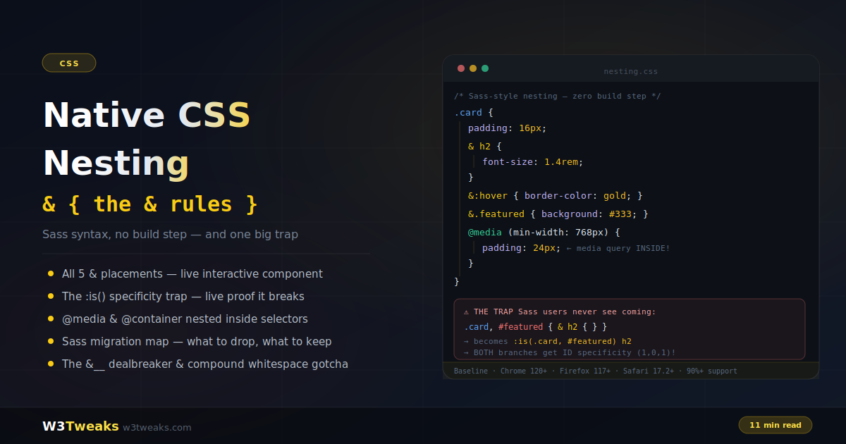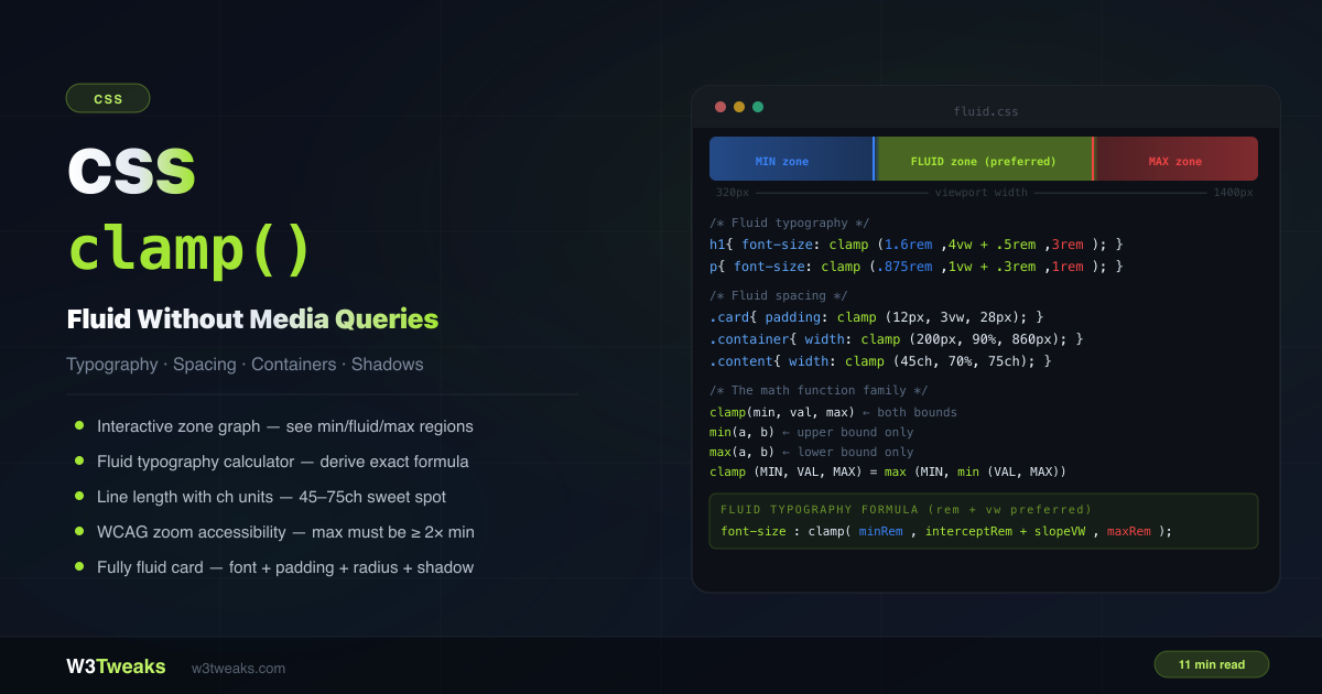
TL;DR
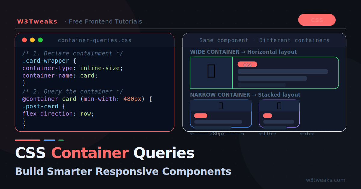
Container queries let a component style itself based on its parent container’s size instead of the viewport. Declare the container, then query it:
.card-wrapper { container-type: inline-size; }

@container (min-width: 400px) {
  .card { grid-template-columns: 130px 1fr; }
}
Watch out: a container cannot style itself (always wrap the component), and default container-type: size collapses to zero height without an explicit height — use inline-size.
Support: Size queries are Baseline 2023 (Chrome, Firefox, Safari, Edge). Style queries are Chrome/Edge/Safari 18+ (Firefox in dev).
→ Try it in the live demo — drag to resize and watch one card switch through three layouts. Deep dive below for named containers, container units, style queries, the debug checklist, and the migration playbook.
For fifteen years, responsive design meant one question: “how wide is the viewport?” Container queries change the question to “how wide is this component’s container?” — and that changes everything about how reusable components are built.
Drop a card into a narrow sidebar and it stacks. Drop the same card into a wide main column and it goes horizontal. Same CSS class, no context-specific overrides, no JavaScript resize observers. This is the API behind modern component libraries like Radix Themes, Shadcn UI, and Material UI’s newer primitives, and it’s the pattern CMS-driven layouts (Sanity, Contentful, Storyblok) have been waiting for — a card rendered from a headless CMS never knows where an editor will drop it.
This guide covers the full system: container-type and the @container rule, the six container query units, named containers for nesting, style queries, the four gotchas that generate most “not working” questions, and the migration strategy from media queries. Container queries pair naturally with CSS clamp() for fluid values and CSS custom properties for style queries.
Live Demo
Three tabs: ① a drag-to-resize playground — grab the corner and watch one product card switch between three layouts based on container width, plus the same card rendered in a sidebar and main column simultaneously, ② container units — a fully fluid card where typography and spacing scale with cqi as you drag, plus the complete six-unit reference, ③ advanced — named containers, live style queries, the can't-style-itself gotcha, the size-collapse trap, and the 5-point debug checklist.
The Problem Container Queries Solve
Media queries respond to the viewport. But a component doesn’t live in the viewport — it lives in a grid cell, a sidebar, a modal, a dashboard widget. The same viewport width can put your card in a 900px main column or a 260px sidebar:
/* ❌ The old workaround — context-specific overrides everywhere */
.card { /* base styles */ }
.sidebar .card { /* narrow overrides */ }
.modal .card { /* different overrides */ }
.dashboard-widget .card { /* yet more overrides */ }

@media (min-width: 768px) {
  .main .card { /* horizontal — but only in main! */ }
}
Every new placement means new override rules. The component isn’t portable — it’s welded to its contexts.
/* ✅ Container queries — the component adapts itself */
.card-wrapper { container-type: inline-size; }

@container (min-width: 400px) {
  .card { grid-template-columns: 130px 1fr; }
}
Now the card asks its own question — “how much space do I have?” — and answers it the same way everywhere. Design tools like Figma, Webflow, and Framer already let you preview component variants at arbitrary widths; container queries are the code-side equivalent.
Step 1 — Declare a Container
An element must explicitly opt in to being a query container with container-type:
/* Most common — query the width (inline axis) */
.wrapper { container-type: inline-size; }

/* Query both width AND height (careful — see gotchas) */
.wrapper { container-type: size; }

/* Default — not a size container (style queries still work) */
.wrapper { container-type: normal; }
Use inline-size as your default. It applies inline-size containment — the container’s width is locked from being influenced by its contents, but the height still grows naturally with content. That asymmetry is exactly what you want for typical components.
Naming containers
/* Longhand */
.sidebar {
  container-type: inline-size;
  container-name: sidebar;
}

/* Shorthand: name / type */
.sidebar { container: sidebar / inline-size; }
Names matter as soon as containers nest — covered below.
Step 2 — Query with @container
@container (min-width: 400px) {
  .card { flex-direction: row; }
}

/* Range syntax works too */
@container (width > 400px) {
  .card { flex-direction: row; }
}

@container (400px <= width <= 700px) {
  .card { /* only in the middle range */ }
}

/* Target a specific named container */
@container sidebar (min-width: 300px) {
  .nav-item { padding: 12px 16px; }
}
An unnamed @container rule queries the nearest ancestor with containment. A named rule walks up the tree until it finds a container with that name.
Combining Conditions — and, or, not
@container supports the same boolean logic as @media — and the range syntax cuts breakpoint sprawl in half:
/* Chain with `and` — narrow window inside a range */
@container (min-width: 400px) and (max-width: 700px) {
  .card { /* medium only */ }
}

/* Range form does the same thing more readably */
@container (400px <= width < 700px) {
  .card { /* medium only */ }
}

/* Negation — everything BELOW the threshold */
@container not (min-width: 400px) {
  .card { /* compact only */ }
}

/* `or` — orientation or aspect variants */
@container (aspect-ratio > 16/9) or (min-width: 900px) {
  .hero { /* wide OR landscape treatment */ }
}
Range form (width < 700px, width >= 400px) is the modern replacement for min-width/max-width chaining — same computed behavior, half the tokens.
The Complete Card Pattern
The canonical example — one card, three layouts, zero context classes:
<div class="card-wrapper">
  <article class="product-card">
    <img class="pc-img" src="product.jpg" alt="Product">
    <div class="pc-body">
      <h3>Wireless Headphones Pro</h3>
      <p class="pc-meta">★★★★★ 4.8 · 2,340 reviews</p>
      <p>Adaptive noise cancellation with 40-hour battery.</p>
      <span class="pc-price">$249</span>
    </div>
    <button class="pc-btn">Add to cart</button>
  </article>
</div>
.card-wrapper {
container: card / inline-size;
}
/* Base: compact stacked layout (narrowest containers) */
.product-card {
display: grid;
grid-template-columns: 1fr;
gap: 12px;
}
.pc-meta { display: none; } /* hide secondary info when tight */
/* Medium: image beside content */
@container card (min-width: 400px) {
.product-card { grid-template-columns: 130px 1fr; }
.pc-meta { display: block; }
}
/* Wide: three columns with a dedicated action area */
@container card (min-width: 620px) {
.product-card {
grid-template-columns: 180px 1fr auto;
align-items: center;
}
}Place .card-wrapper in a 3-column grid, a sidebar, a modal, or full-width — the card handles itself in all of them. Ecommerce theme systems like Shopify Polaris and BigCommerce Stencil are prime migration targets: product cards get reused inside carousels, grids, and drawers at wildly different widths.
Swapping grid-template-areas by Container
For anything more complex than a two-column split, name your grid areas and swap the whole map at each threshold:
.card-wrapper { container: card / inline-size; }

.product-card {
  display: grid;
  grid-template-areas: "img" "body" "actions";
  grid-template-columns: 1fr;
  gap: 12px;
}
.pc-img     { grid-area: img; }
.pc-body    { grid-area: body; }
.pc-actions { grid-area: actions; }

@container card (min-width: 400px) {
  .product-card {
    grid-template-areas: "img body";
    grid-template-columns: 130px 1fr;
  }
}

@container card (min-width: 620px) {
  .product-card {
    grid-template-areas: "img body actions";
    grid-template-columns: 180px 1fr auto;
    align-items: center;
  }
}
Same HTML, same class, three completely different topologies. This is the pattern real-world cards adopt once they outgrow flex-direction swaps.
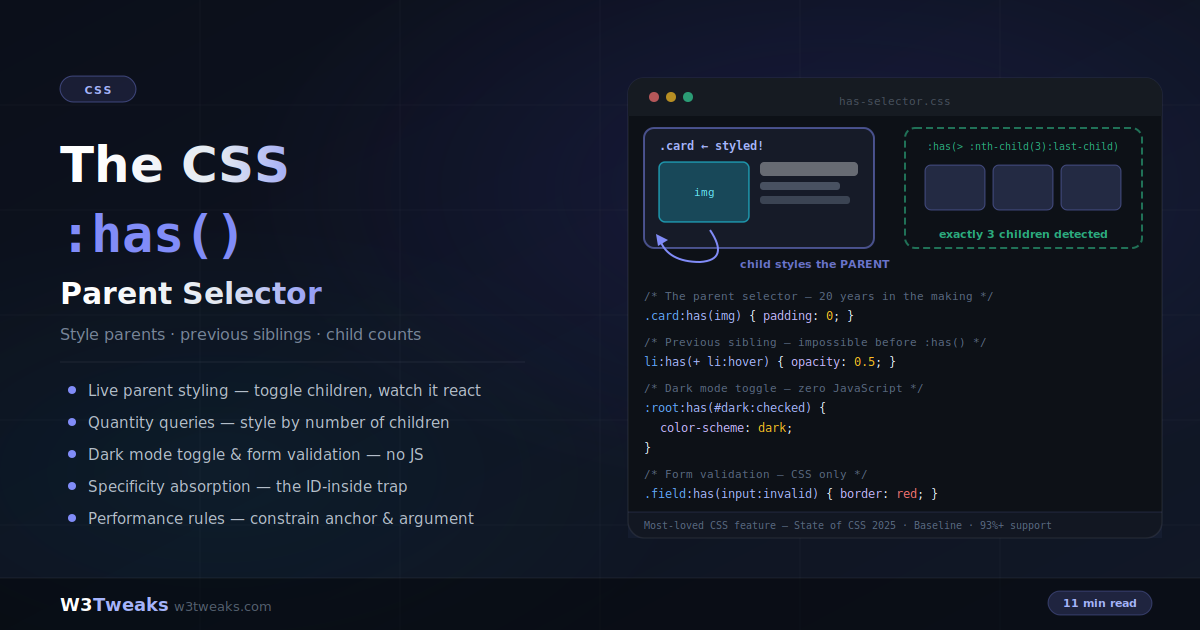
Combining with :has()
@container describes the space; :has() describes the contents. Combining them lets a card style itself only when both are true:
/* Horizontal layout, but only if the card actually has an image */
.card-wrapper:has(.pc-img) {
  container: card / inline-size;
}

@container card (min-width: 400px) {
  .product-card { grid-template-columns: 130px 1fr; }
}

/* If a promo badge is present AND we have room, pin it top-right */
@container card (min-width: 400px) {
  .product-card:has(.pc-badge) .pc-badge {
    position: absolute; top: 8px; right: 8px;
  }
}
Before :has(), you needed a wrapper class from the author. Now the component branches on its own contents — one CSS file, no JS, no class contract.
Container Query Units — Fluid Values Inside Components
Declaring a container unlocks six length units that work like vw/vh but are relative to the container:
| Unit | Means | Use for |
|---|---|---|
cqi | 1% of container inline size | ✅ Recommended default — logical, RTL-safe |
cqb | 1% of container block size | Vertical scaling (needs container-type: size) |
cqw | 1% of container width | Physical — prefer cqi |
cqh | 1% of container height | Physical — prefer cqb |
cqmin | 1% of the smaller axis | Squares that must never overflow |
cqmax | 1% of the larger axis | Backgrounds that must always cover |
Fluid typography inside a component
Combine cqi with clamp() for typography that scales with the component’s own space:
.card { padding: clamp(12px, 5cqi, 32px); }

.card h3 {
  font-size: clamp(1rem, 6cqi, 2.125rem);
  /* 6% of the CONTAINER width — not the viewport */
}

.card .btn {
  padding: clamp(5px, 1.5cqi, 10px) clamp(10px, 3cqi, 22px);
  border-radius: clamp(5px, 1.2cqi, 10px);
}
A heading in a wide dashboard panel reads large; the same heading in a sidebar shrinks proportionally. This is fluid typography at the component level — the piece viewport-based vw could never deliver.
Why cqi over cqw?
cqi follows the logical inline direction: it stays correct in RTL layouts and flips automatically for vertical writing modes. cqw is physically locked to horizontal width. They compute identically in typical Western horizontal layouts, but cqi is the future-proof habit.
The silent fallback
If you use cqi and no ancestor is a container, the unit falls back to the small viewport unit (svi) — the value silently scales with the viewport instead. Nothing errors, nothing warns. If container units “aren’t working,” the missing container-type up the tree is almost always why.
Named Containers — Nesting Without Chaos
Real layouts nest containers: a dashboard is a container, the widgets inside are containers, the cards inside widgets may be too. Unnamed queries always match the nearest ancestor — which usually isn’t what an inner component wants:
.dashboard { container: main / inline-size; }
.widget    { container: widget / inline-size; }

/* Grid layout responds to the DASHBOARD's width */
@container main (min-width: 900px) {
  .widget-grid { grid-template-columns: repeat(3, 1fr); }
}

/* Widget internals respond to the WIDGET's own width */
@container widget (min-width: 350px) {
  .widget-title { font-size: 1.3rem; }
  .widget-chart { height: 220px; }
}
Without names, the .widget-title query would match the widget container (nearest) — fine. But the .widget-grid query would also match the widget instead of the dashboard — broken. Name containers as soon as you nest them.
Style Queries — Query Custom Property Values
The second kind of container query: instead of size, query a CSS custom property value on the container:
/* Set a property on any ancestor */
.hero-section { --theme: dark; }

/* Descendants respond automatically */
@container style(--theme: dark) {
  .chip {
    background: #0f172a;
    color: #e2e8f0;
  }
  .card { border-color: rgba(255, 255, 255, 0.15); }
}
No class on every child, no descendant selector chains — set one property, the whole subtree restyles. This is a natural companion to the design token architecture pattern.
Two important differences from size queries:
- No
container-typeneeded — every element is a style container by default - Support is narrower — Chrome, Edge, and Safari 18+ ship style queries for custom properties; Firefox support is still in development as of 2026. Treat style queries as progressive enhancement.
Only Custom Properties Work Today
The spec allows style queries against any property — @container style(background-color: red), @container style(display: flex) — but no browser ships that yet. Only custom properties (--anything) actually match:
/* ✅ Works everywhere style queries ship (2026) */
.theme { --mode: dark; }
@container style(--mode: dark) {
  .chip { background: #0f172a; }
}

/* ❌ Parses but never matches (in 2026) */
.card { background: red; }
@container style(background-color: red) {
  .chip { color: white; } /* never applies */
}
Model the intent as a custom property (--theme, --density, --tone) instead of trying to read a computed style. This is how design token architectures already work, so the pattern maps cleanly.
/* Fallback-first: base styling works everywhere */
.chip { background: #f1f5f9; color: #0f172a; }

/* Enhancement where supported */
@container style(--theme: dark) {
  .chip { background: #0f172a; color: #e2e8f0; }
}
Gotcha 1: A Container Can’t Style Itself
The most common beginner trap. @container rules apply only to a container’s descendants — never to the container element itself:
/* ❌ Never applies — .card is the container being queried */
.card { container-type: inline-size; }

@container (min-width: 400px) {
  .card { background: red; } /* silently ignored */
}
Why: if the container could restyle itself based on its own size, changing its size would change its styles, which could change its size — an infinite loop. The spec forbids it.
The fix — a dedicated wrapper:
/* ✅ Wrapper is the container; .card is a descendant */
.card-wrapper { container-type: inline-size; }

@container (min-width: 400px) {
  .card { background: red; } /* works */
}
One extra div per component. Annoying, universal, non-negotiable.
Gotcha 2: container-type: size Collapses to Zero
size containment locks both axes — meaning children can no longer define the container’s height:
/* ❌ No explicit height → collapses to 0px tall */
.box { container-type: size; }

/* ✅ Give it a height... */
.box { container-type: size; height: 400px; }

/* ✅ ...or just use inline-size (the usual answer) */
.box { container-type: inline-size; }
If declaring a container makes your element vanish, this is why. inline-size avoids the problem entirely because height still flows from content.
Gotcha 3: Don’t Copy Media Query Breakpoints
Containers are narrower than viewports. A card that changed layout at a 768px viewport probably sat in a ~450px column at that moment. Copying 768px into @container means the query never fires in most placements:
/* ❌ Copied from the old media query — container never reaches 768px */
@container (min-width: 768px) { ... }

/* ✅ Rethought for the container's actual size range */
@container (min-width: 400px) { ... }
During migration, measure real container widths in DevTools rather than porting breakpoint values.
Gotcha 4: Nearest-Container Surprise
Unnamed queries match the nearest ancestor container — including containers you forgot you declared. A stray container-type on a layout wrapper can hijack every unnamed query inside it. The fix is the habit from earlier: name every container in any codebase with more than one.
Gotcha 5: Container Queries Do Not Pierce Shadow DOM
Every shadow root is its own containment context. A @container rule written in the light DOM cannot target a shadow-encapsulated element inside a web component, and a query written inside a shadow root cannot see a container declared in the host document:
<!-- Light DOM -->
<div class="card-wrapper">          <!-- container-type: inline-size -->
  <my-card></my-card>                <!-- shadow root inside -->
</div>
/* ❌ This query cannot reach elements inside my-card's shadow root */
@container (min-width: 400px) {
my-card .inner { flex-direction: row; }
}The fix: declare a container inside each shadow root, on the host or an internal wrapper, and write the @container rule in the same stylesheet the shadow root loads:
// Inside the web component
this.shadowRoot.innerHTML = `
  <style>
    :host { container-type: inline-size; }
    @container (min-width: 400px) {
      .inner { flex-direction: row; }
    }
  </style>
  <div class="inner">…</div>
`;
Every component ships its own containment context. This is why component libraries built on Lit, Stencil, or Ionic that adopt container queries do so at the host level — the containment story only works if it lives inside the encapsulation boundary.
The “Not Working” Debug Checklist
Five checks resolve nearly every container query bug:
- Is
container-typeset on an ancestor? Not on the element being styled — on a parent above it. - Are you styling the container itself? Wrap it; queries only style descendants.
- Nested containers? Add
container-name— unnamed queries hit the nearest container, which may not be the one you mean. - Breakpoints copied from media queries? Container widths are smaller — remeasure.
- Inside a web component? Every shadow root is a separate containment context — the container must be declared inside the same root.
Chrome DevTools: the Elements panel shows a container badge next to container elements — click it to inspect which queries evaluate and at what sizes. In Storybook, pair a resizable wrapper story with the viewport addon to sweep every container threshold the same way Chromatic catches visual diffs on media queries.
Container Queries vs Media Queries — The Decision Rule
They’re complements, not competitors:
@container — micro | @media — macro | |
|---|---|---|
| Scope | Component’s parent size | Viewport / device |
| Use for | Cards, widgets, nav items, anything reused across contexts | Page skeleton, sidebar show/hide, column counts |
| User preferences | ❌ Not available | ✅ prefers-color-scheme, prefers-reduced-motion |
| Print styles | ❌ | ✅ @media print |
The one-line rule: if it styles the page skeleton, use @media; if it styles a component that could live anywhere, use @container. User-preference and print queries stay with @media permanently — they have no container equivalent.
Fallback for legacy browsers
/* Base: works everywhere (flex fallback) */
.card { display: flex; flex-direction: column; }

/* Enhancement: container-aware layout */
@supports (container-type: inline-size) {
  .card-wrapper { container-type: inline-size; }

  @container (min-width: 400px) {
    .card { flex-direction: row; }
  }
}
Since container queries are Baseline in every evergreen browser served by Vercel, Netlify, or Cloudflare Pages edge, most sites can drop this @supports fallback entirely in 2026. Keep it only if analytics show real traffic from browsers older than Safari 16 / Chrome 105 / Firefox 110. The @supports feature query gates the enhancement cleanly if you do need it.
Migration Playbook — From @media to @container
The fastest path from a media-query card to a container-query card is a three-step diff. Start with a typical existing card:
/* Before — welded to viewport width */
.card { display: flex; flex-direction: column; gap: 12px; }

@media (min-width: 768px) {
  .card { flex-direction: row; }
}
Step 1 — Add a wrapper and declare the container. A container can’t style itself, so introduce one extra div and put container-type on it. If a suitable wrapper already exists (a grid item, a <li>, a section), use that:
.card-wrapper { container-type: inline-size; }Step 2 — Rewrite @media as @container, and rethink the number. A 768px viewport usually put the card in a ~400–500px column. Measure the actual container width in DevTools (open the container badge overlay) before porting:
@container (min-width: 400px) {
  .card { flex-direction: row; }
}
Step 3 — Swap fixed spacing/type for cqi. Anything that felt “just right” at one viewport width can now scale smoothly across every container the card lands in:
.card { padding: clamp(12px, 4cqi, 24px); }
.card h3 { font-size: clamp(1rem, 5cqi, 1.5rem); }
That’s the entire migration. If you use Tailwind, the first-party @container plugin exposes @[400px]: variants that compile to the same @container rules — the mental model is identical, only the source syntax differs.
What’s Next: Scroll-State Queries
The newest container query type queries a container’s scroll state instead of its size — whether a position: sticky element is currently stuck, whether a scroll-snap target is snapped, or whether an element is scrollable:
.site-header {
  container-type: scroll-state;
  position: sticky;
  top: 0;
}

/* Shrink the header only while it's actually stuck */
@container scroll-state(stuck: top) {
  .header-inner {
    padding-block: 6px;
    box-shadow: 0 4px 16px rgba(0, 0, 0, 0.3);
  }
}
This replaces the classic IntersectionObserver “shrink header on scroll” JavaScript with pure CSS. Shipped in Chrome and Edge (late 2025); guard with @supports (container-type: scroll-state) until Firefox and Safari land support.
Performance Notes
inline-sizecontainment is cheap — browsers optimize for it heavily. It’s also faster than the JavaScript alternative (ResizeObserver + class toggling) because layout logic stays off the main thread.- Don’t blanket-declare every element a container “just in case” — each containment context adds bookkeeping. Declare containers deliberately, on component wrappers.
- Container units recalculate on container resize, not viewport resize — usually less frequent, usually cheaper.
- If you push container queries into a very large tree, watch layout-shift and rendering metrics in a monitor like Sentry, LogRocket, or Vercel Analytics — full
sizecontainment on a deep node is easy to overcorrect on.
Browser Support
Size queries (container-type, @container, all six units) — Baseline 2023: Chrome 105+, Firefox 110+, Safari 16+, Edge 105+. Roughly 96% global support in 2026. Production-ready without polyfills.
Style queries (@container style() on custom properties) — Chrome 111+, Edge 111+, Safari 18+. Firefox in development. Progressive enhancement only.
Scroll-state queries — Chrome and Edge (late 2025). Progressive enhancement only.
Key Takeaways
- Container queries make components respond to their parent container’s size instead of the viewport — the same component adapts to a sidebar, grid cell, or modal with one set of CSS
- Declare containment first:
container-type: inline-sizeis the recommended default (width queries, natural height) @container (min-width: 400px)queries the nearest ancestor container; addcontainer-nameas soon as containers nest@containersupportsand,or,not, and range syntax (400px <= width < 700px) — same boolean logic as@media, half the tokens- Container units (
cqi,cqb,cqmin,cqmax) work like viewport units but relative to the container — combine withclamp()for fluid typography inside components - Prefer
cqiovercqw— logical units stay correct in RTL and vertical writing modes - Swap
grid-template-areasat container thresholds for topology changes, not just column counts - Combine
@containerwith:has()— one describes the space, the other describes the contents, together they replace class contracts - A container cannot style itself — wrap components in a dedicated container element
container-type: sizecollapses to zero height without an explicit height — another reasoninline-sizeis the default- Container breakpoints are smaller than viewport breakpoints — remeasure during migration, don’t copy values
- Container queries do not pierce shadow DOM — declare a container inside each shadow root (on
:hostor an internal wrapper) and write the@containerrule in the same stylesheet - Style queries (
style(--theme: dark)) work with custom properties only in 2026 — other properties parse but never match; model intent as a--custom-property - Keep
@mediafor page skeleton, user preferences, and print — container queries handle everything component-level - Migration is three steps: add a wrapper with
container-type, rewrite@mediaas@containerwith rethought (smaller) breakpoints, swap fixed spacing forcqi
FAQ
What are CSS container queries?
CSS container queries let you style elements based on the size of a parent container rather than the browser viewport. You declare an element a container with container-type: inline-size, then use @container (min-width: 400px) rules to change descendant styles when the container crosses that width. This makes components truly reusable — the same card adapts whether it’s in a narrow sidebar or a wide content area.
What is the difference between container queries and media queries?
Media queries respond to the viewport (browser window) size and user preferences like color scheme. Container queries respond to the size of a parent container element. Use media queries for page-level layout decisions and user preferences; use container queries for component-level responsiveness where an element needs to adapt to whatever space it’s placed in.
Why are my container queries not working?
The most common causes: (1) container-type isn’t set on any ancestor of the element you’re styling, (2) you’re trying to style the container itself — queries only apply to descendants, so wrap the component, (3) nested containers without container-name — unnamed queries match the nearest container which may be the wrong one, (4) breakpoint values copied from media queries — containers are narrower than viewports, so a 768px container breakpoint may never fire, and (5) you’re inside a web component — every shadow root is a separate containment context, so the container must be declared inside the same root.
What are cqi and cqw units in CSS?
They’re container query length units — like vw but relative to the container instead of the viewport. cqi is 1% of the container’s inline size (width in horizontal writing modes) and cqw is 1% of the physical width. Prefer cqi because it follows logical direction and stays correct in RTL and vertical writing modes. If no ancestor container exists, these units silently fall back to small viewport units.
Can a container query style the container itself?
No. @container rules apply only to a container’s descendants, never the container element itself — allowing self-styling would create infinite sizing loops. The standard fix is to wrap the component in a dedicated wrapper element, declare the wrapper as the container, and style the component inside it.
What are CSS style queries?
Style queries are a type of container query that tests a custom property value instead of a size: @container style(--theme: dark) { ... } applies its rules to descendants of any element where --theme: dark is set. Unlike size queries, no container-type declaration is needed. Only custom properties work today — the spec allows other properties but no browser ships that yet. Support as of 2026: Chrome, Edge, and Safari 18+, with Firefox still in development — use them as progressive enhancement.
Do container queries work in web components with shadow DOM?
Yes, but each shadow root is its own containment context. A @container rule written in the host document cannot reach elements inside a shadow root, and vice versa. Declare the container inside the shadow root (typically on :host or an internal wrapper), and write the @container rule in the same stylesheet the shadow root loads. Component libraries built on Lit, Stencil, or Ionic handle this at the host level so the containment story stays inside the encapsulation boundary.
How do I migrate from media queries to container queries?
Three steps. First, add a wrapper element around the component and set container-type: inline-size on it — a container cannot style itself. Second, rewrite each @media (min-width: X) as @container (min-width: Y) and rethink the number — a value that made sense for the viewport is almost always wrong for the container, which is usually much smaller. Measure real container widths in DevTools. Third, swap fixed spacing and font sizes for cqi-based clamp() expressions so the component scales smoothly across every container width, not just at threshold jumps.
Can I combine @container with the :has() selector?
Yes, and it is one of the strongest patterns in modern CSS. @container describes the available space; :has() describes the component’s own contents. For example, .card-wrapper:has(.pc-img) applies container-type only to cards that actually contain an image, and @container card (min-width: 400px) { .product-card:has(.pc-badge) .pc-badge { … } } positions a promo badge absolutely only when the badge exists AND the container is wide enough. Before :has(), this needed a class contract from the author; now the component branches on its own contents with no JS.