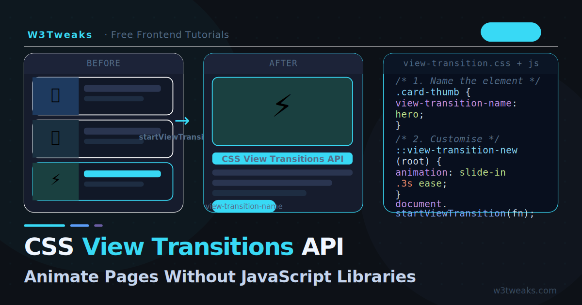
For years, smooth page transitions required a JavaScript animation library — GSAP, Framer Motion, Barba.js, or a full SPA framework. The browser had no native way to animate between two different DOM states.
The View Transitions API changes this completely. With one JavaScript call and a few lines of CSS, you get buttery smooth transitions between pages, between list states, between UI modes — anything. The browser captures a screenshot of the current state, updates the DOM, then animates between the two automatically. See the web.dev guide to View Transitions for the official deep-dive.
It is now supported across all major browsers and is one of the most exciting additions to the web platform in years. It pairs naturally with CSS container queries — container queries let a single component adapt its layout, and view transitions animate between those layouts smoothly. For loading states between transitions, the CSS skeleton loading screens guide shows the canonical placeholder pattern.
Live Demo
Click the tabs and cards to see View Transitions in action. Best in Chrome, Edge, Safari 18+, and Firefox 129+.
How It Works in 30 Seconds
// Without View Transitions — instant, jarring
document.querySelector('#content').innerHTML = newHTML;

// With View Transitions — smooth, animated
document.startViewTransition(() => {
  document.querySelector('#content').innerHTML = newHTML;
});
That single change gives you a smooth cross-fade between the old and new content. The browser:
- Captures a screenshot of the current page
- Runs your DOM update inside the callback
- Animates from the old screenshot to the new live DOM
No GSAP. No Framer Motion. No CSS @keyframes required for the default fade — though you can customise everything.
The Default Transition
By default, startViewTransition produces a smooth cross-fade across the entire page. The browser creates two pseudo-elements you can target with CSS:
/* The outgoing (old) content */
::view-transition-old(root) {
  animation: fade-out 0.25s ease forwards;
}

/* The incoming (new) content */
::view-transition-new(root) {
  animation: fade-in 0.25s ease forwards;
}
You do not need to write these — the browser provides the fade by default. But you can override them to create any animation you want.
Customising the Root Transition
Replace the default fade with a slide, zoom, or any CSS animation:
/* Slide in from the right */
@keyframes slide-from-right {
  from { transform: translateX(100%); }
}
@keyframes slide-to-left {
  to { transform: translateX(-100%); }
}

::view-transition-old(root) {
  animation: slide-to-left 0.3s ease both;
}
::view-transition-new(root) {
  animation: slide-from-right 0.3s ease both;
}
/* Zoom out / in */
::view-transition-old(root) {
animation: scale-out 0.3s ease both;
}
::view-transition-new(root) {
animation: scale-in 0.3s ease both;
}
@keyframes scale-out { to { transform: scale(0.9); opacity: 0; } }
@keyframes scale-in { from { transform: scale(1.1); opacity: 0; } }/* Reduce motion — always respect this */
@media (prefers-reduced-motion: reduce) {
::view-transition-old(root),
::view-transition-new(root) {
animation: none;
}
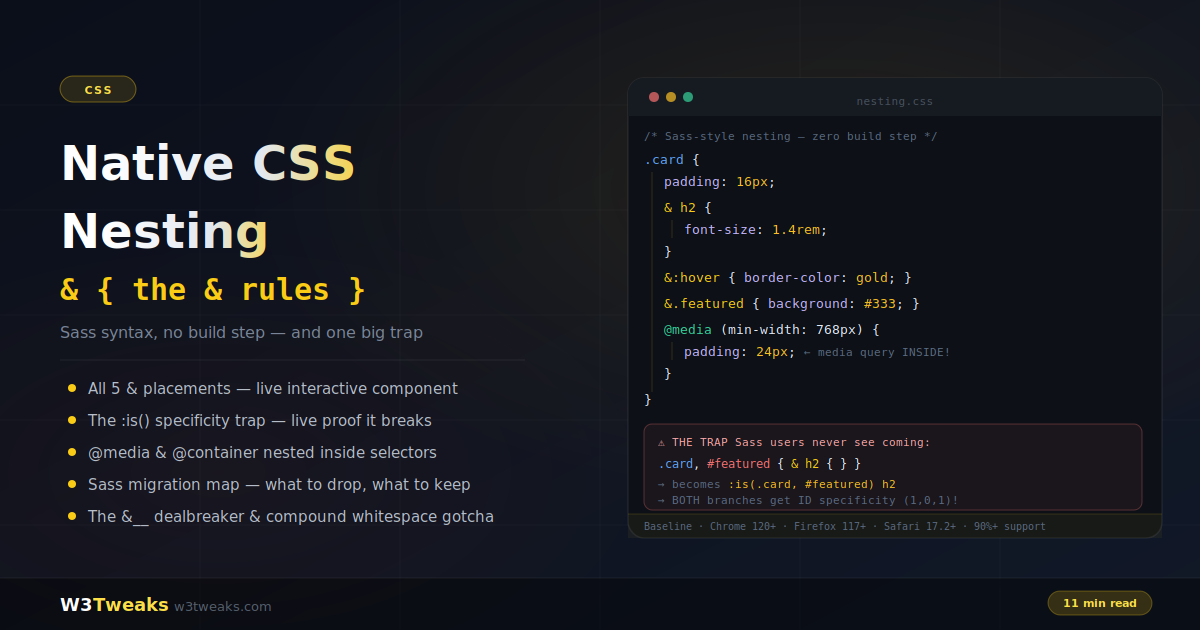
}Named Transitions — The Powerful Part
Named transitions let specific elements morph independently of the rest of the page. This is what makes the API truly impressive: a card thumbnail in a list can smoothly expand into a full-width hero image on the detail page.
Step 1 — Assign the name in CSS
/* Give the element a view-transition-name */
.hero-image {
  view-transition-name: hero;
}

.card-title {
  view-transition-name: post-title;
}
Step 2 — Target it with pseudo-elements
/* The hero image morphs between its two positions */
::view-transition-old(hero),
::view-transition-new(hero) {
  /* Browser handles the position/size morphing automatically */
  animation-duration: 0.4s;
  animation-timing-function: ease-in-out;
}

/* Title slides up while hero morphs */
::view-transition-old(post-title) {
  animation: fade-out 0.2s ease;
}
::view-transition-new(post-title) {
  animation: slide-up 0.3s ease 0.1s both;
}
@keyframes slide-up {
  from { transform: translateY(20px); opacity: 0; }
}
Step 3 — Update the DOM
async function navigateToPost(postId) {
  // Transition automatically connects same-named elements
  await document.startViewTransition(async () => {
    // Fetch and render new content
    const html = await fetchPost(postId);
    document.querySelector('#app').innerHTML = html;
  });
}
One name per page: Each
view-transition-namevalue must be unique in the DOM at any given moment. If two elements share the same name, the transition will skip that element.
Real Example: Card → Detail Transition
A blog card list where clicking a card smoothly expands it into the full article:
<!-- Card list -->
<div class="post-card" data-id="1" onclick="openPost(1)">
  <img class="card-thumb" src="thumb.jpg" alt="CSS tricks">
  <h2 class="card-title">CSS Grid Complete Guide</h2>
</div>

<!-- Detail view (hidden initially) -->
<article class="post-detail" id="detail" style="display:none">
  <img class="detail-hero" src="hero.jpg" alt="CSS tricks">
  <h1 class="detail-title">CSS Grid Complete Guide</h1>
  <div class="detail-content">...</div>
</article>
/* Card thumbnail gets a unique name per post */
.post-card[data-id="1"] .card-thumb { view-transition-name: thumb-1; }
.post-card[data-id="1"] .card-title { view-transition-name: title-1; }
/* Detail elements share the same names */
.detail-hero { view-transition-name: thumb-1; }
.detail-title { view-transition-name: title-1; }async function openPost(id) {
const card = document.querySelector(`.post-card[data-id="${id}"]`);
const detail = document.getElementById('detail');
await document.startViewTransition(() => {
// Hide the list, show the detail
document.querySelector('.post-list').style.display = 'none';
detail.style.display = 'block';
// Update content to match
detail.querySelector('.detail-hero').src = card.querySelector('.card-thumb').src;
detail.querySelector('.detail-title').textContent = card.querySelector('.card-title').textContent;
});
}
async function closePost() {
await document.startViewTransition(() => {
document.getElementById('detail').style.display = 'none';
document.querySelector('.post-list').style.display = 'block';
});
}The browser automatically detects that thumb-1 and title-1 exist in both the old and new DOM states, and morphs them between their positions and sizes. Zero animation code required for the morph itself.
Practical Example: Animated Tabs
Tabs where the active panel transitions smoothly:
function switchTab(newTabId) {
  const panels = document.querySelectorAll('.tab-panel');
  const tabs   = document.querySelectorAll('.tab-btn');

  document.startViewTransition(() => {
    // Deactivate current
    document.querySelector('.tab-btn.active')?.classList.remove('active');
    document.querySelector('.tab-panel.active')?.classList.remove('active');

    // Activate new
    document.querySelector(`[data-tab="${newTabId}"]`).classList.add('active');
    document.querySelector(`#panel-${newTabId}`).classList.add('active');
  });
}
/* Each panel gets its own transition name */
#panel-css { view-transition-name: tab-panel }
#panel-javascript{ view-transition-name: tab-panel }
#panel-html { view-transition-name: tab-panel }
/* Animate panel content */
::view-transition-old(tab-panel) {
animation: tab-out 0.2s ease both;
}
::view-transition-new(tab-panel) {
animation: tab-in 0.25s ease 0.05s both;
}
@keyframes tab-out { to { opacity: 0; transform: translateY(-8px); } }
@keyframes tab-in { from { opacity: 0; transform: translateY(8px); } }Dark Mode Toggle with View Transitions
Animate the dark/light mode switch across the whole page:
const toggle = document.getElementById('themeToggle');

toggle.addEventListener('click', async () => {
  // If browser doesn't support View Transitions, just toggle
  if (!document.startViewTransition) {
    document.documentElement.classList.toggle('dark');
    return;
  }

  const transition = document.startViewTransition(() => {
    document.documentElement.classList.toggle('dark');
  });

  // Wait for transition to be ready before customising
  await transition.ready;
});
/* Radial reveal from the toggle button position */
::view-transition-new(root) {
clip-path: circle(0% at calc(100% - 40px) 40px);
animation: reveal 0.5s ease-in-out forwards;
}
::view-transition-old(root) {
animation: none;
}
@keyframes reveal {
to { clip-path: circle(150% at calc(100% - 40px) 40px); }
}This creates a circular ripple reveal that expands from the toggle button position — the same effect used by many premium design tools.
Cross-Document Transitions (MPA)
Since Chrome 126+, you can add View Transitions between full page navigations — no JavaScript required at all, just CSS:
/* Add this to every page's CSS */
@view-transition {
  navigation: auto;
}
That single CSS rule enables cross-fade transitions between any two pages on the same origin when users click links. No JavaScript, no SPA router, no framework.
Customise per-route with named transitions:
/* On the blog index page */
.post-card img {
  view-transition-name: hero-image;
}

/* On the article page */
.article-hero img {
  view-transition-name: hero-image;
}
Now navigating from a blog card to the article page produces a hero image morph — across a full page navigation.
Browser support for cross-document transitions: Chrome 126+, Edge 126+. Firefox and Safari support is in development. Always include the
@media (prefers-reduced-motion)fallback.
Handling the Transition Object
startViewTransition returns an object with three promises you can use for fine-grained control:
const transition = document.startViewTransition(updateDOM);

// Fires when the old screenshot is captured and
// the new DOM is rendered — but before animation starts
await transition.ready;
// → Good place to start WAAPI animations synced with the transition

// Fires when the transition animation completes
await transition.finished;
// → Good place to clean up or start a follow-up animation

// Skip the animation entirely (useful for reduced motion)
transition.skipTransition();
Fallback for Unsupported Browsers
Always check for support before calling startViewTransition:
function safeTransition(updateFn) {
  if (!document.startViewTransition) {
    // Instant update for browsers without support
    updateFn();
    return Promise.resolve();
  }
  return document.startViewTransition(updateFn).finished;
}

// Usage — same call works everywhere
await safeTransition(() => {
  document.querySelector('#content').innerHTML = newHTML;
});
Current browser support for startViewTransition (SPA transitions):
- Chrome 111+ ✅
- Edge 111+ ✅
- Safari 18+ ✅
- Firefox 130+ ✅
This covers 90%+ of global users.
Performance Tips
Keep view-transition-name scoped — every named element creates a layer the browser has to composite. Keep named transitions to the 2–3 elements that actually need to morph.
Use contain: layout on containers with named children to prevent unexpected compositing of surrounding elements.
Avoid transitions on large images without explicit dimensions — the browser needs to know the size before and after to calculate the morph correctly.
Use animation-fill-mode: both on your custom keyframes to prevent flashes at the start and end of the animation.
Key Takeaways
document.startViewTransition(fn)is the entire API — one line enables smooth animations- The default is a cross-fade; override with
::view-transition-old(root)and::view-transition-new(root) - Named transitions with
view-transition-namelet individual elements morph independently between states - Each
view-transition-namemust be unique in the DOM at any given time - Cross-document transitions with
@view-transition { navigation: auto }require zero JavaScript - Always wrap in a support check and always include
prefers-reduced-motionoverrides - The transition object has
.ready,.finished, and.skipTransition()for advanced control
FAQ
What is the CSS View Transitions API?
It’s a browser API that lets you animate between two different DOM states with a single JavaScript call: document.startViewTransition(() => { /* mutate DOM here */ }). The browser captures a screenshot of the current page, runs your DOM update, then animates from the old state to the new state. The default is a cross-fade; you can override it with pure CSS to slide, zoom, morph, or anything else.
Do I still need GSAP or Framer Motion?
For simple page-to-page and state-to-state transitions: no. View Transitions handle 80% of common animation needs natively, with better performance and zero bundle cost. For complex sequenced animations, scroll-triggered effects, SVG morphing, and physics-based motion, GSAP and Framer Motion remain stronger. Use the right tool for the job — View Transitions are the new default for transitions, libraries are for everything else.
What browsers support the View Transitions API?
Chrome 111+ and Edge 111+ have supported same-document transitions since 2023. Safari 18 (Sept 2024) added support. Firefox 129 (Aug 2024) added support. Cross-document MPA transitions (the @view-transition at-rule) are newer — Chrome 126+ and Safari 18+. For unsupported browsers, the DOM update happens instantly without animation — graceful degradation built in.
Does the View Transitions API work with React or Vue?
Yes — wrap your state-update function in document.startViewTransition(). In React, that means wrapping the setState call (or flushSync in concurrent mode): document.startViewTransition(() => { flushSync(() => setState(...)); }). In Vue, wrap the reactive mutation. The animation happens after the framework finishes rendering the new DOM.
How do I make different elements morph independently?
Give each element a unique view-transition-name in CSS: .hero-image { view-transition-name: hero; }. When the DOM updates, the browser matches elements with the same name across the old and new states and morphs them in place. The image in your card list becomes the hero image on the detail page with smooth position/size animation. Each name must be unique in the DOM at any given moment, or that element’s transition is skipped.
Will View Transitions slow down my site?
No — the API is GPU-accelerated and the browser optimizes the screenshot capture. The animations run on the compositor thread, so they don’t block layout or JavaScript. The only cost is during the brief animation window itself; once the transition finishes, performance is identical to a non-animated DOM update. Always wrap in a prefers-reduced-motion check so users who’ve opted out of motion don’t see animation at all.