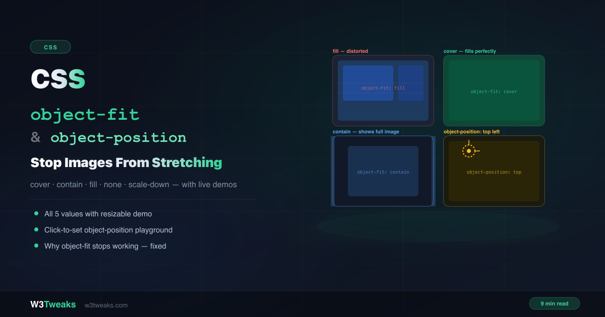
You have a card grid where every thumbnail should be the same height. You set width: 100% and height: 200px on the images — and they all stretch and distort to fill the space. The fix is two words: object-fit: cover.
object-fit controls how an image (or video) fills its container when the container’s proportions don’t match the image’s natural dimensions. object-position controls which part of that image stays visible when it’s cropped. Together they replace every padding-hack, background-image workaround, and wrapper-div trick you’ve been using for image sizing.
Live Demo
Three tabs: all 5 object-fit values with a resizable container, click-to-set object-position playground, and real use cases — including why object-fit sometimes stops working.
What object-fit Does
By default, when you constrain an <img> with explicit width and height, the browser uses object-fit: fill — it stretches the image to fill the space completely, distorting the aspect ratio.
object-fit overrides this behaviour and tells the browser how to fit the image content inside its container box:
img {
  width: 100%;
  height: 200px;
  object-fit: cover; /* no more stretching */
}
It works on any replaced element — elements whose content comes from an external source: <img>, <video>, <iframe>, and <canvas>.
The 5 object-fit Values
cover
Scales the image up or down to fill the container completely. The aspect ratio is preserved. Any parts of the image that don’t fit are cropped. This is the value you’ll use most.
img {
  width: 100%;
  height: 250px;
  object-fit: cover; /* fills box, crops edges, no distortion */
}
Use cover for: card thumbnails, hero images, avatar circles, background-style images.
contain
Scales the image to fit entirely inside the container. The aspect ratio is preserved and the full image is always visible — but if the container proportions don’t match, letterbox space (empty areas) appears on the sides or top/bottom.
img {
  width: 100%;
  height: 200px;
  object-fit: contain; /* full image visible, may show empty space */
}
Use contain for: logos, product images, icons, diagrams — anything where cropping is not acceptable.
fill
The default value. Stretches the image to fill the container on both axes. The aspect ratio is not preserved — images distort. Almost never what you want.
img {
  object-fit: fill; /* default — distorts the image */
}
none
Renders the image at its natural (intrinsic) size, centered in the container. If the image is larger than the container it gets cropped; if smaller, empty space appears. The image is never scaled.
img {
  width: 300px;
  height: 200px;
  object-fit: none; /* uses natural dimensions, centered */
}
scale-down
Picks the smaller result of none or contain. The image will never be upscaled beyond its natural size — but it will shrink if the container is smaller.
img {
  width: 100%;
  height: 200px;
  object-fit: scale-down; /* contain, but never upscale */
}
Use scale-down for small icons inside large containers — they show at natural size rather than being blown up and blurry.
cover vs contain — Choosing the Right One
| Scenario | Use |
|---|---|
| Card thumbnail in a grid | cover |
| User profile avatar | cover |
| Hero / banner image | cover |
| Logo in a header | contain |
| Product image in an e-commerce card | contain |
| Icon inside a button | scale-down |
| Full image must always be visible | contain |
The deciding question: is it acceptable to crop parts of the image? Yes → cover. No → contain.
object-position — Controlling the Focal Point
When object-fit: cover crops an image, it centers by default. That works for many images, but for portraits or images with an off-center subject, important parts get cropped out.
object-position solves this — it lets you specify which part of the image should remain visible after cropping:
img {
  width: 100%;
  height: 200px;
  object-fit: cover;
  object-position: top; /* keep the top of the image — faces stay in frame */
}
Keyword values
/* Horizontal: left | center | right */
/* Vertical:   top  | center | bottom */

object-position: center;        /* default */
object-position: top;           /* keep top edge — good for portraits */
object-position: bottom;        /* keep bottom edge */
object-position: top left;      /* keep top-left corner */
object-position: bottom right;  /* keep bottom-right corner */
Percentage and pixel values
/* Percentage: 0% = left/top edge, 100% = right/bottom edge, 50% = center */
object-position: 50% 20%;   /* centered horizontally, 20% from top */
object-position: 30% 60%;   /* custom focal point */

/* Pixel values */
object-position: 0px 40px;  /* 0px from left, 40px from top */
object-position: -20px 0;   /* shift left by 20px */
Real example — keeping faces in frame
/* Portrait photos in a landscape card */
.team-card img {
  width: 100%;
  height: 180px;
  object-fit: cover;
  object-position: top; /* face stays visible, body crops out */
}
Real-World Use Cases
User avatars
.avatar {
  width: 48px;
  height: 48px;
  border-radius: 50%;
  overflow: hidden; /* clips the img to the circle */
}

.avatar img {
  width: 100%;
  height: 100%;
  object-fit: cover;
  object-position: center top; /* keeps faces centered */
}
Card thumbnail grid
.card-image {
  width: 100%;
  height: 200px;
  overflow: hidden;
  border-radius: 8px 8px 0 0;
}

.card-image img {
  width: 100%;
  height: 100%;
  object-fit: cover;
  transition: transform 0.3s ease;
}

.card:hover .card-image img {
  transform: scale(1.05); /* subtle zoom on hover */
}
The same pattern pairs well with skeleton loading screens — show a shimmer placeholder while the image loads, then swap it in with object-fit: cover for a flicker-free transition.
Fullscreen background video
.video-hero {
  position: fixed;
  inset: 0;
  width: 100%;
  height: 100%;
  z-index: -1;
}

.video-hero video {
  width: 100%;
  height: 100%;
  object-fit: cover; /* works on video too */
  object-position: center;
}
Logo container
.logo-wrap {
  width: 160px;
  height: 60px;
  display: flex;
  align-items: center;
  justify-content: center;
}

.logo-wrap img {
  width: 100%;
  height: 100%;
  object-fit: contain; /* full logo always visible */
}
object-fit vs background-size: cover
Both do similar things — but for different contexts:
object-fit: cover | background-size: cover | |
|---|---|---|
| Applied to | <img>, <video> elements | CSS background images |
| HTML | <img src="..."> | No <img> in HTML |
| SEO / alt text | Yes — image is in DOM | No |
| Accessibility | Screen readers see it | Decorative only |
| JavaScript access | Can be queried | CSS-only |
| Focal point control | object-position | background-position |
Rule of thumb: use <img> + object-fit for content images (photos, products, avatars) — they need alt text and SEO. Use background-image + background-size for purely decorative backgrounds.
object-fit Not Working? Here’s Why
Reason 1 — No explicit width and height on the image
object-fit only activates when the <img> has a constrained box to fit into. Without width and height, the image renders at its natural size and there’s nothing to fit.
/* Broken — no container box defined */
img { object-fit: cover; }

/* Fixed — explicit dimensions create the box */
img {
  width: 100%;
  height: 200px; /* or any fixed/min height */
  object-fit: cover;
}
Reason 2 — Applied to a non-replaced element
object-fit only works on replaced elements: <img>, <video>, <iframe>, <canvas>. It does nothing on <div>, <span>, or any regular HTML element.
/* Broken — div is not a replaced element */
.card { object-fit: cover; } /* ignored */

/* Fixed — target the img inside */
.card img {
  width: 100%;
  height: 200px;
  object-fit: cover;
}
Reason 3 — Confused with background-size
If you’re setting a CSS background image and wondering why object-fit isn’t working — you want background-size: cover instead.
/* Wrong property for background images */
.hero { background-image: url(hero.jpg); object-fit: cover; }

/* Correct */
.hero { background-image: url(hero.jpg); background-size: cover; }
Common Gotchas
1. Parent overflow must be hidden for cover to visually crop
object-fit: cover applies the cropping within the image element itself — but if you also have a border-radius on the container, you may need overflow: hidden to visually clip the image corners:
.avatar {
  width: 48px;
  height: 48px;
  border-radius: 50%;
  overflow: hidden; /* needed to clip img to circle shape */
}
2. object-position without object-fit does nothing useful
object-position only has a visual effect when object-fit is set to something other than fill. With fill (the default), the image is stretched to the full box regardless of position.
/* object-position has no effect with fill */
img { object-fit: fill; object-position: top; }

/* object-position works with cover, contain, none, scale-down */
img { object-fit: cover; object-position: top; }
3. object-fit: cover on a video doesn’t pause or mute it
object-fit is purely visual — it only affects how the video frame fills its container. Autoplay, mute, and loop are separate HTML attributes:
<video autoplay muted loop playsinline style="object-fit: cover;">
  <source src="hero.mp4" type="video/mp4">
</video>
Browser Support
Both object-fit and object-position are Baseline — supported in all modern browsers:
- Chrome 31+
- Firefox 36+
- Safari 10+
- Edge 16+
Global coverage is 98%+ today. No polyfill needed. The only legacy concern is IE11, which does not support object-fit — if you need IE11 support, use a background-image approach instead. For exact compatibility data see MDN’s object-fit reference and caniuse.com/object-fit.
Key Takeaways
object-fitcontrols how an image fills its container — it only works on replaced elements with explicit dimensionscoverfills the container and crops;containshows the full image with possible letterbox;fillstretches (default — avoid it)object-positionsets the focal point whencovercrops — usetopfor portraits to keep faces in frame- Always set both
widthandheighton<img>forobject-fitto have any effect - Use
<img>+object-fitfor content images (SEO, alt text); usebackground-sizefor decorative backgrounds object-fit: coverworks on<video>elements too — perfect for fullscreen background videos- Browser support is 98%+ — safe for all modern production use
FAQ
What is CSS object-fit?
object-fit is a CSS property that controls how an <img> or <video> element fills its container when the container’s dimensions don’t match the media’s natural aspect ratio. Instead of stretching (the default), you can tell it to crop (cover), letterbox (contain), or keep its natural size (none).
What is the difference between object-fit cover and contain?
cover scales the image to fill the entire container — the aspect ratio is preserved but the edges may be cropped. contain scales the image to fit completely inside the container — nothing is cropped but letterbox space may appear. Use cover when filling the space matters more than showing the full image. Use contain when the complete image must always be visible.
Why is object-fit not working?
Two most common causes: (1) the <img> has no explicit width and height set — without a constrained box, there’s nothing to fit into; (2) you applied it to a <div> or other non-replaced element — object-fit only works on <img>, <video>, <iframe>, and <canvas>.
Can I use object-fit on a video?
Yes. object-fit works on <video> elements exactly like it does on <img>. object-fit: cover is the standard approach for fullscreen background videos — it fills the viewport without black bars and without distortion, regardless of the viewport’s aspect ratio.
What does object-position do?
object-position controls which part of the image stays visible after object-fit crops it. By default it’s center — the middle of the image stays visible. Set it to top to keep the top of the image (useful for portraits where the face is at the top), or use percentage values like 50% 20% to pin a specific focal point.
What is the difference between object-fit and background-size?
Both achieve similar visual results but for different contexts. object-fit applies to <img> and <video> HTML elements — the image is in the DOM, has alt text, and is accessible to search engines. background-size applies to CSS background images — decorative only, no alt text, not indexed by search engines. For content images that need SEO or accessibility, always use <img> + object-fit.