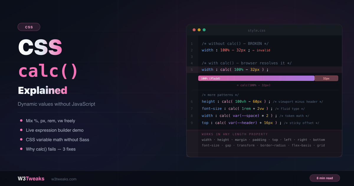
You can’t write width: 100% - 32px in plain CSS. The browser handles percentages and pixels at different stages of layout — it doesn’t know what 100% equals until it knows the parent’s size. calc() solves this by deferring the calculation to the browser, which resolves it at render time when all values are known.
No JavaScript. No CSS preprocessor. Just the browser doing layout math you can’t do yourself. This guide covers every pattern you’ll use regularly, the unit mixing rules, and the three silent reasons calc() stops working. The same dynamic-value thinking shows up in CSS container queries, which lets components respond to their own size rather than the viewport.
Live Demo
Three tabs: a live expression builder (pick values, units, and operators to see calc() update in real time), unit mixing rules with what's valid and what isn't, and four real-world patterns plus the three reasons calc() silently fails.
What calc() Does
calc() is a CSS function that lets you perform math directly in property values. Its superpower is mixing units that can’t normally be combined — percentages with pixels, viewport units with rems, CSS variables with numbers.
/* Not valid CSS — browser can't resolve this */
width: 100% - 32px;

/* Valid — browser resolves at render time */
width: calc(100% - 32px);
The browser evaluates the expression during layout — after it knows the parent’s computed size — and uses the result as the final property value.
The Syntax
property: calc(expression);calc() accepts any CSS length, percentage, angle, time, or frequency value, combined with four operators:
width:  calc(100% - 32px);     /* subtraction */
height: calc(50vh + 20px);     /* addition    */
gap:    calc(var(--base) * 2); /* multiply    */
width:  calc(100% / 3);        /* division    */
Spaces around + and − are required. Writing calc(100%-32px) is invalid. Always write calc(100% - 32px) with spaces on both sides of the operator. The * and / operators don’t strictly require spaces but include them for readability.
Mixing Units — The Rules
The whole point of calc() is combining units the browser can’t add any other way. Here’s what’s allowed:
Addition and subtraction
Both sides must be compatible unit types — you can’t add a length and a ratio:
/* Valid — different but compatible length types */
width: calc(100% - 24px);      /* percentage + pixels */
height: calc(100vh - 60px);    /* viewport unit + pixels */
font-size: calc(1rem + 0.5vw); /* relative + viewport */
padding: calc(2% + 8px);       /* percentage + pixels */

/* Invalid — unitless with unit in addition */
width: calc(100% + 2); /* what is 2? 2px? 2%? */
Multiplication and division
One side must be unitless:
/* Valid — one unitless operand */
width: calc(100% / 3);          /* divide by unitless number */
margin: calc(var(--base) * 2);  /* multiply by unitless number */
gap: calc(8px * 1.5);           /* result is 12px */

/* Invalid — both sides have units */
width: calc(20px * 5px); /* would give px² — not a valid CSS unit */

/* Invalid — dividing by zero */
width: calc(100px / 0);
Nested calc()
You can nest calc() inside calc() — though modern CSS just uses parentheses instead:
/* Both are valid — parentheses preferred */
width: calc(calc(100% - 20px) / 2);
width: calc((100% - 20px) / 2);  /* cleaner */
Using calc() with CSS Variables
calc() and CSS custom properties are one of the most powerful combinations in modern CSS. You can derive values mathematically from design tokens — change one variable and the whole system updates.
:root {
  --spacing: 8px;
  --header-height: 60px;
  --sidebar-width: 240px;
  --columns: 3;
}

/* Derive spacing from a base token */
.card { padding: calc(var(--spacing) * 2); }         /* 16px */
.section { margin-top: calc(var(--spacing) * 4); }   /* 32px */

/* Layout math */
.main-content {
  width: calc(100% - var(--sidebar-width) - 24px);
}

.content-area {
  height: calc(100vh - var(--header-height));
}

/* Equal columns from a variable */
.grid-item {
  width: calc(100% / var(--columns) - 16px);
}
If your CSS variable stores a unitless number, you cannot append a unit inside calc() by writing calc(var(--size)px) — that’s invalid syntax. Either store the unit in the variable (--size: 16px) or multiply by 1px: calc(var(--size) * 1px).
5 Patterns You’ll Use Every Week
1. Full width minus fixed padding
The most common calc() use case — an element that fills its container but respects a fixed offset:
.inner-content {
  width: calc(100% - 48px); /* full width minus 24px padding on each side */
  margin: 0 auto;
}
2. Full viewport height minus header
Content that exactly fills the remaining screen after a fixed or sticky header:
:root { --header-height: 60px; }

.page-content {
  min-height: calc(100vh - var(--header-height));
}

/* Works for sticky sidebar too */
.toc {
  position: sticky;
  top: calc(var(--header-height) + 16px); /* clears header + breathing room */
  max-height: calc(100vh - var(--header-height) - 32px);
  overflow-y: auto;
}
This is the same calc() pattern that powers most sticky sidebars — the position: sticky guide covers the full setup, including the overflow traps that silently break sticky.
3. Equal columns with explicit gap
Before CSS Grid’s gap, this pattern was essential. Still useful in flex layouts:
/* Three equal columns with 16px gaps between them */
.col {
  width: calc(100% / 3 - 11px); /* (2 gaps / 3 columns) ≈ 10.67px, rounded */
  /* or use CSS Grid gap instead */
}

/* Two columns */
.half {
  width: calc(50% - 8px); /* 16px total gap / 2 */
}
4. Fluid font size that scales with viewport
Before clamp(), this was the fluid typography approach:
/* Font grows from 1rem at narrow viewports, adding 2vw as viewport grows */
h1 { font-size: calc(1rem + 2vw); }
p  { font-size: calc(0.875rem + 0.5vw); }
For bounded scaling (a minimum and maximum cap), wrap the expression in clamp(): font-size: clamp(1rem, calc(1rem + 2vw), 2rem). We cover clamp() patterns in the Common Gotchas section below.
5. Full-bleed element inside a constrained container
Breaking an element out of a max-width container to span the full viewport:
.container {
  max-width: 800px;
  margin: 0 auto;
}

/* This child breaks out to full viewport width */
.full-bleed {
  width: 100vw;
  margin-left: calc(50% - 50vw);
}
calc() vs Sass/Less Math
Before calc() became powerful, developers used CSS preprocessors for layout math. Here’s when to use each:
| Situation | Use |
|---|---|
| Mixing different unit types | calc() — preprocessors can’t do this |
| Math with CSS variables | calc() — variables aren’t resolved at compile time |
| Responsive values based on viewport | calc() |
| Static values known at write time | Either — Sass is fine |
| Complex design token systems | CSS variables + calc() |
The modern answer for most cases: native CSS calc() with CSS custom properties. Preprocessors are less necessary for layout math .
calc() in Media Queries — A Common Mistake
calc() works inside property values within media query blocks — but not inside the media query condition itself:
/* Invalid — calc() not allowed in media condition */
@media (min-width: calc(768px + 1px)) { }

/* Valid — static value in condition, calc() inside the block */
@media (min-width: 769px) {
  .sidebar {
    width: calc(100% - 240px); /* calc() works here */
  }
}
calc() Not Working? The 3 Reasons
Reason 1 — Missing spaces around + and −
/* All broken — browser ignores the expression */
width: calc(100%-32px);   /* no spaces */
width: calc(100% -32px);  /* -32px reads as negative number, not subtraction */
width: calc(100%- 32px);  /* space only after minus */

/* Correct — space before AND after the operator */
width: calc(100% - 32px);
Reason 2 — Unitless CSS variable used as a length
/* Broken — can't append unit outside the variable */
:root { --size: 16; }
width: calc(var(--size)px); /* invalid syntax */

/* Fix option 1: include unit in the variable */
:root { --size: 16px; }
width: calc(var(--size) * 2);

/* Fix option 2: multiply by 1 with the unit */
:root { --size: 16; }
width: calc(var(--size) * 1px); /* 16 * 1px = 16px */
Reason 3 — Both operands have units in multiplication
/* Broken — produces px² which is not a valid CSS unit */
width: calc(20px * 5px);

/* Fixed — right side is unitless */
width: calc(20px * 5);  /* = 100px */
Debug calc() with DevTools — The 60-Second Workflow
Most calc() bugs become obvious the moment you see what the browser actually resolved to. The trick: stop reading your source CSS, start reading the computed value the browser produced. Chrome, Firefox, and Safari all show this — they just hide it slightly differently.
Step 1 — Open the right tab (not the one you think)
Right-click the broken element, choose Inspect. In the DevTools sidebar, there are two CSS tabs:
- Styles tab — shows your source CSS, including the literal
calc(100% - 32px)text you wrote - Computed tab — shows the resolved final value the browser used (e.g.
width: 928px)
For calc() debugging, always go to the Computed tab first. The Styles tab will never tell you whether your expression resolved correctly — it just echoes your source.
Element selected → Sidebar → Computed → Filter: "width"If you see your expected value (e.g. 928px for a calc(100% - 32px) on a 960px parent), calc() worked. If you see 0px, auto, or the unmodified 100%, the expression failed — and the browser fell back to a default.
Step 2 — Hover the expression in the Styles tab
In Chrome and Edge, hover over the calc(...) value in the Styles tab. A tooltip pops up showing the resolved value in pixels:
width: calc(100% - 32px)  ← your source
                ↓ (hover)
[ tooltip: 928px ]        ← what the browser actually computed
Firefox has the same feature in its inspector. Safari shows the resolved value inline next to the source.
If the tooltip doesn’t appear at all → your CSS is invalid syntax (Reason 1 from above — usually a missing space around -). The browser parsed the rule but threw away the property value entirely.
Step 3 — When calc() is invalid, the Styles tab shows you
Invalid calc() expressions are crossed out with a strikethrough and have a small warning triangle in the Styles tab:
width: calc(100%-32px); ⚠ (struck through, warning)That’s the browser saying “I don’t know how to parse this.” Click the triangle for the parser error — usually “Invalid property value.”
Common parser errors and what they mean:
| DevTools warning | Likely cause | Fix |
|---|---|---|
| Property value invalid | Missing space around + or − | Add spaces: calc(100% - 32px) |
| Couldn’t resolve units | Two unit operands in * or / | Make one side unitless |
var(--x) resolves to unset | Variable not defined in this scope | Check --x is set on an ancestor |
Step 4 — Inspect the CSS variable chain
When calc(var(--something) * 2) produces an unexpected result, the variable is usually the culprit. In Chrome DevTools, hover over the var(--something) token in the Styles tab — a popover shows:
- The current resolved value
- Where it was defined (with a click-through to the source rule)
- Whether it’s the fallback value
This is the fastest way to spot the “I changed --spacing on .theme-dark but the calc still uses 8px” class of bug — the variable resolved from the wrong cascade level.
Step 5 — Live-edit calc() to test your fix
Click directly on the calc(...) value in the Styles tab to edit it in place. The page re-renders immediately. Use this to:
- Sanity-check what value you actually need (start with hardcoded
928px, then work backwards to the expression) - Test unit combinations without saving to your stylesheet
- Verify CSS variable changes propagate as expected
Once you’ve confirmed the right expression in DevTools, paste it back into your stylesheet.
The diagnostic order I use, every time
When a calc() doesn’t work:
- Computed tab first. If the value is
0px/auto/ the source100%, calc failed. Continue. - Hover the expression in Styles. No tooltip = invalid syntax. Look for the warning triangle.
- Check each
var()token. Hover to see resolved value + source. The bug is usually here when the syntax is fine but the math is wrong. - Live-edit in DevTools. Replace the calc with a hardcoded value first to confirm the calc is the culprit (not a different CSS rule overriding it).
This takes 60 seconds and beats every “let me add console.log(getComputedStyle(...)) everywhere” approach.
Common Gotchas
calc() updates on every layout — it’s not computed once. A calc(100% - 32px) value recalculates every time the parent resizes. This is a feature, not a bug — it’s what makes responsive layouts work.
calc() is supported in shorthand properties:
/* Works in shorthand */
background: url(img.png) calc(50% - 10px) center / cover no-repeat;
transform: translateX(calc(100% - 20px));
animation: slide calc(var(--duration) * 1000ms) ease;
Nesting min(), max(), clamp() inside calc() — and vice versa:
/* calc inside clamp */
font-size: clamp(1rem, calc(1rem + 2vw), 2rem);

/* min inside calc */
width: calc(min(100%, 800px) - 48px);
calc() has no effect on display, position, color, or non-numeric properties — it only works where a numeric length, time, angle, or percentage value is expected.
Browser Support
calc() has been supported since 2013 — Chrome 26+, Firefox 16+, Safari 7+, Edge (all versions). Global coverage is essentially 100% for all meaningful browsers. Nested calc(), calc() with var(), and calc() in transition and animation are all supported in all modern browsers. For up-to-date data see MDN’s calc() reference and caniuse.com/calc.
Key Takeaways
calc()defers math to the browser — it resolves at layout time when all unit values are known- Its superpower is mixing unit types that can’t be combined in plain CSS:
%,px,rem,vw +and−operators require spaces on both sides —calc(100%-32px)is always invalid*and/require one unitless operand — you can’t multiply two lengths- Combining
calc()with CSS custom properties creates dynamic design token systems calc()works inside property values — not inside@mediaquery conditions- Unitless CSS variable +
calc(): include the unit in the variable or multiply by1px - Debug failing
calc()by reading the Computed tab in DevTools, not the Styles tab — the source text won’t tell you whether the browser actually resolved it - Browser support is 100% — use it everywhere without hesitation
FAQ
What does CSS calc() do?
calc() is a CSS function that lets you perform math — addition, subtraction, multiplication, and division — directly inside property values. Its main purpose is mixing different unit types that can’t be combined in plain CSS, such as 100% - 32px or 100vh - 60px.
Why is my CSS calc() not working?
Three most common reasons: (1) missing spaces around + or − — always write calc(100% - 32px) with spaces; (2) a unitless CSS variable being used as a length — include the unit in the variable itself, or multiply by 1px; (3) attempting to use calc() in a @media condition — it only works inside property values within the block.
Can I use calc() with CSS variables?
Yes — this is one of the most useful combinations in modern CSS. calc(var(--spacing) * 2) multiplies a CSS custom property by a unitless number. calc(100% - var(--sidebar-width)) subtracts a variable from a percentage. The variable must include its unit if you’re using it in addition or subtraction.
What is the difference between calc() and clamp()?
calc() performs a single mathematical expression — calc(1rem + 2vw) gives a value that scales linearly with the viewport. clamp() adds a minimum and maximum cap — clamp(1rem, calc(1rem + 2vw), 2rem) scales like calc() but never goes below 1rem or above 2rem. Use calc() for layout math; use clamp() for fluid typography and bounded scaling.
Does calc() work in media queries?
Partially. calc() works inside property values within a media query block, but not inside the media query condition itself. @media (min-width: calc(768px + 1px)) is invalid. Use a static value in the condition: @media (min-width: 769px).
Can I use calc() for font sizes?
Yes. font-size: calc(1rem + 2vw) creates a font that scales with the viewport — larger on wide screens, smaller on narrow ones. For a more controlled version with explicit minimum and maximum sizes, use clamp() instead: font-size: clamp(1rem, calc(1rem + 2vw), 2rem).
How do I debug a calc() that isn’t working?
Open DevTools, select the element, and go to the Computed tab — that shows the resolved final value the browser used, not the source calc(...) text. If the computed value is 0px, auto, or your unmodified 100%, the expression failed. Then in the Styles tab, hover over the calc(...) value: Chrome and Edge show a tooltip with the resolved value, and Firefox/Safari show it inline. If no tooltip appears or the rule has a warning triangle, your syntax is invalid (usually a missing space around + or −). Hover any var() tokens to see what the variable actually resolved to — that’s where most “the math is wrong” bugs live.