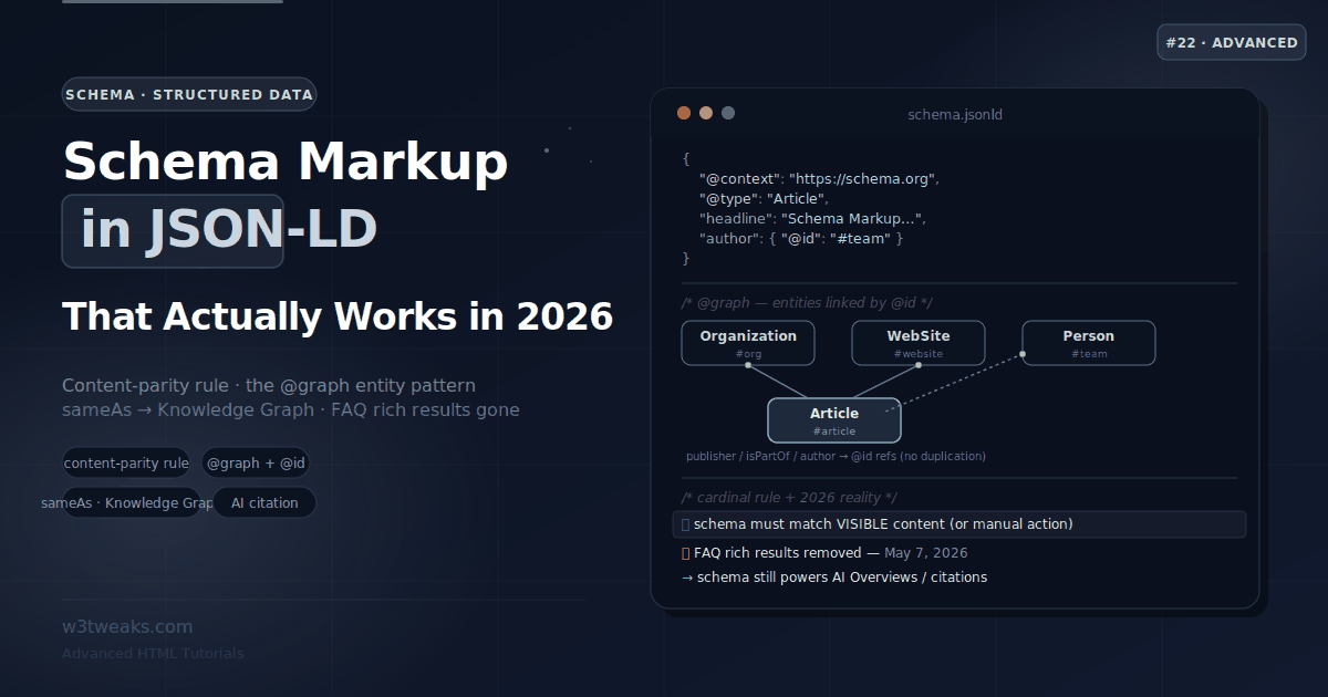
Here is a statistic from WebAIM’s 2025 analysis of the top one million home pages that should make every developer pause: 79.4% of sites use ARIA, and those sites have more than twice as many accessibility errors as sites without ARIA.
ARIA was built to solve accessibility problems. The data says it’s creating them. Why?
Because most ARIA tutorials teach you what each role does but not what goes catastrophically wrong when you use it incorrectly. A badly implemented role="menu" is worse for a screen reader user than no menu at all. An aria-live region added after content is already injected announces nothing. A role="button" on a <div> without keyboard handling gives sighted users a button and keyboard users a dead zone. An aria-hidden="true" on a focusable element produces a completely silent screen reader experience — focus lands there, screen readers say nothing, the user is lost.
35% of ARIA menus on the web introduce accessibility barriers due to incorrect markup and missing keyboard interactions. These aren’t obscure edge cases — they’re the patterns copied from tutorials and Stack Overflow every day.
This tutorial is organized differently from others. Every section leads with what goes wrong, then shows the correct pattern. It also covers three things almost no other tutorial does: the aria-hidden + focusable element silent-SR trap (with the modern inert fix), the role="presentation" cascading footgun that strips semantics from nested elements, and the mobile screen reader divergence between iOS VoiceOver, Android TalkBack, NVDA, and JAWS. You’ll also learn the accessibility tree debugger in DevTools — the tool that lets you verify ARIA before you ever open a screen reader.
Related tutorials: HTML5 Form Validation · HTML dialog Element · HTML details Accordions
Live Demo
Five interactive examples: landmark roles page map, widget roles with correct keyboard patterns, aria-live regions (timing trap demo), the 5 Rules of ARIA with violations, and the most common ARIA mistakes with fixes.
The #1 Rule: No ARIA Is Better Than Bad ARIA
Before any role, property, or state — understand the First Rule of ARIA from the WAI-ARIA Authoring Practices Guide:
“If you can use a native HTML element or attribute with the semantics and behavior you require already built in, instead of re-purposing an element and adding an ARIA role, state, or property to make it accessible, then do so.”
<!-- Don't do this — rebuilding what HTML already provides -->
<div role="button" tabindex="0"
     onclick="handleClick()"
     onkeydown="if(e.key==='Enter'||e.key===' ')handleClick()">
  Submit
</div>

<!-- Do this — free keyboard, ARIA, and click handling -->
<button type="button" onclick="handleClick()">Submit</button>
The <button> element gives you: role="button" in the accessibility tree, keyboard activation (Enter + Space), focus management, and :disabled state — all without a single ARIA attribute.
The semantic HTML equivalence table — these native elements already have the ARIA roles built in:
| Native HTML | Implicit ARIA role | Don’t add |
|---|---|---|
<button> | role="button" | role="button" |
<a href=""> | role="link" | role="link" |
<input type="checkbox"> | role="checkbox" | role="checkbox" |
<input type="radio"> | role="radio" | role="radio" |
<select> | role="listbox" | role="listbox" |
<nav> | role="navigation" | role="navigation" |
<main> | role="main" | role="main" |
<header> | role="banner" (when top-level) | role="banner" |
<footer> | role="contentinfo" (when top-level) | role="contentinfo" |
<form> | role="form" | role="form" |
Adding role="navigation" to a <nav> is redundant. It adds noise to the accessibility tree without helping anything.
Step 1 — The 5 Rules of ARIA (With Violation Examples)
The WAI-ARIA spec defines five rules. Every other rule in ARIA flows from these.
Rule 1: Use native HTML first (above)
Already covered. Use <button>, <a>, <input>, <select>, <details>, <dialog> before reaching for role=.
Rule 2: Do not change native semantics unless absolutely necessary
<!-- Violation: overriding a heading's semantics -->
<h2 role="tab">Dashboard</h2>

<!-- Correct: wrapper takes the role, heading retains its semantics -->
<div role="tab" id="tab-dashboard">
  <h2>Dashboard</h2>
</div>
Changing a heading’s role strips it from the document outline and confuses screen readers expecting headings to be headings.
Rule 3: All interactive ARIA controls must be keyboard accessible
<!-- Violation: custom control unreachable by keyboard -->
<div role="button" onclick="doSomething()">Click me</div>

<!-- Correct: tabindex + keyboard handler -->
<div role="button" tabindex="0"
     onclick="doSomething()"
     onkeydown="if(event.key==='Enter'||event.key===' '){event.preventDefault();doSomething()}">
  Click me
</div>
If a mouse user can interact with something, a keyboard user must be able to as well. Every role="button", role="slider", role="tab", and role="menuitem" needs keyboard support. But remember Rule 1: use <button> and you get this free.
Rule 4: Do not use role="presentation" or role="none" on focusable elements
<!-- Violation: making a focusable link invisible to screen readers -->
<a href="/home" role="presentation">Home</a>

<!-- Correct: only use none/presentation on decorative, non-interactive elements -->
<table role="presentation"><!-- layout table, not data --></table>
<img src="decorative-squiggle.svg" role="presentation" alt="">
role="none" (preferred modern form) and role="presentation" remove an element’s semantics. Using them on something with href, tabindex, or that’s naturally focusable is contradictory — focus will still land there and screen readers will be confused.
Rule 5: All interactive elements must have an accessible name
<!-- Violation: icon button with no accessible name -->
<button onclick="search()">
  <svg><!-- search icon --></svg>
</button>

<!-- Violation: icon button with tooltip but no SR label -->
<button onclick="search()" data-tooltip="Search">
  <svg><!-- search icon --></svg>
</button>

<!-- Correct: aria-label for icon buttons -->
<button onclick="search()" aria-label="Search">
  <svg aria-hidden="true"><!-- search icon --></svg>
</button>

<!-- Correct: visually hidden text -->
<button onclick="search()">
  <svg aria-hidden="true"><!-- search icon --></svg>
  <span class="sr-only">Search</span>
</button>
The accessible name is what a screen reader announces when focusing the element. Without it, a screen reader announces “button” — no context, no meaning.
Step 2 — Landmark Roles: One Rule to Remember
Landmark roles divide the page into named regions that screen reader users can jump to directly (using keys like D in NVDA or rotor in VoiceOver).
The single rule: HTML5 semantic elements carry their landmark role automatically — no role attribute needed. Non-semantic elements (<div>, <span>, <section>) need an explicit role.
<!-- These already have landmark roles — no role attribute needed -->
<header>…</header>       <!-- role="banner" (when top-level) -->
<nav>…</nav>             <!-- role="navigation" -->
<main>…</main>           <!-- role="main" -->
<aside>…</aside>         <!-- role="complementary" -->
<footer>…</footer>       <!-- role="contentinfo" (when top-level) -->
<form>…</form>           <!-- role="form" (only when has accessible name) -->

<!-- Redundant — don't add role to semantic elements -->
<nav role="navigation">…</nav>     <!-- redundant -->
<main role="main">…</main>         <!-- redundant -->
<header role="banner">…</header>   <!-- redundant -->

<!-- These DO need explicit role because they're not semantic -->
<div role="navigation">…</div>     <!-- necessary -->
<div role="main">…</div>           <!-- necessary -->
<div role="search">…</div>         <!-- search has no HTML equivalent -->
Labeling multiple landmarks of the same type
When a page has more than one <nav>, screen readers announce “navigation” for both. Users can’t tell them apart. Label them:
<!-- aria-label distinguishes landmarks of the same type -->
<nav aria-label="Primary">…</nav>
<nav aria-label="Breadcrumb">…</nav>
<nav aria-label="Article contents">…</nav>

<!-- Or use aria-labelledby pointing to a visible heading -->
<aside aria-labelledby="related-heading">
  <h2 id="related-heading">Related articles</h2>
  …
</aside>
The role="search" landmark
role="search" has no native HTML equivalent. Use it on the form or container wrapping your site’s search feature:
<!-- Wrap your search form in role="search" -->
<div role="search">
  <label for="site-search">Search this site</label>
  <input type="search" id="site-search" name="q">
  <button type="submit">Search</button>
</div>

<!-- HTML5 <search> element — new in 2023, use for all browsers -->
<search>
  <label for="site-search">Search this site</label>
  <input type="search" id="site-search" name="q">
  <button type="submit">Search</button>
</search>
Step 3 — Widget Roles: The Ones Developers Misuse Most
Tab panels (role="tab", role="tablist", role="tabpanel")
Tabs are the most commonly implemented ARIA widget. The keyboard pattern is arrow keys to switch tabs — not Tab key. This surprises most developers.
<div role="tablist" aria-label="Account settings">
  <button role="tab"
          id="tab-profile"
          aria-selected="true"
          aria-controls="panel-profile">
    Profile
  </button>
  <button role="tab"
          id="tab-security"
          aria-selected="false"
          aria-controls="panel-security"
          tabindex="-1">
    Security
  </button>
  <button role="tab"
          id="tab-billing"
          aria-selected="false"
          aria-controls="panel-billing"
          tabindex="-1">
    Billing
  </button>
</div>

<div role="tabpanel"
     id="panel-profile"
     aria-labelledby="tab-profile">
  <h2>Profile settings</h2>
  …
</div>

<div role="tabpanel"
     id="panel-security"
     aria-labelledby="tab-security"
     hidden>
  <h2>Security settings</h2>
  …
</div>
const tablist = document.querySelector('[role="tablist"]');
const tabs = [...tablist.querySelectorAll('[role="tab"]')];
tabs.forEach((tab, i) => {
tab.addEventListener('keydown', (e) => {
let target;
if (e.key === 'ArrowRight') target = tabs[(i + 1) % tabs.length];
if (e.key === 'ArrowLeft') target = tabs[(i - 1 + tabs.length) % tabs.length];
if (e.key === 'Home') target = tabs[0];
if (e.key === 'End') target = tabs[tabs.length - 1];
if (!target) return;
e.preventDefault();
activateTab(target);
});
tab.addEventListener('click', () => activateTab(tab));
});
function activateTab(tab) {
// Deactivate all
tabs.forEach(t => {
t.setAttribute('aria-selected', 'false');
t.setAttribute('tabindex', '-1');
document.getElementById(t.getAttribute('aria-controls')).hidden = true;
});
// Activate selected
tab.setAttribute('aria-selected', 'true');
tab.removeAttribute('tabindex'); // or tabindex="0"
document.getElementById(tab.getAttribute('aria-controls')).hidden = false;
tab.focus();
}Key patterns for tabs:
- Only the active tab has
tabindex="0"— inactive tabs havetabindex="-1" - Arrow keys move between tabs; Tab key moves out of the tablist entirely
aria-selected="true/false"(notaria-expanded) is the state for tabsaria-controlslinks each tab to its panel;aria-labelledbylinks each panel back
If you can’t implement all of this, don’t use role="tab". Cosmetically applying role="tab" to a section switcher without the arrow-key contract is one of the most common ARIA failures. Sighted users see tabs and assume Tab moves between them; screen reader users hear “tab” and try arrow keys that go nowhere. Either implement the full contract or use a <nav> with regular buttons (the live demo above does the latter for its own section switcher — see the source for the reasoning).
The role="menu" trap (35% cause barriers)
role="menu" is for application menus — the File, Edit, View menus in a desktop application. It is not for navigation dropdowns. Using it for a nav dropdown creates broken keyboard expectations:
<!-- Wrong: role="menu" on a navigation dropdown -->
<nav>
  <button aria-expanded="false" aria-haspopup="menu">Products</button>
  <ul role="menu">
    <li role="menuitem"><a href="/product-a">Product A</a></li>
    <li role="menuitem"><a href="/product-b">Product B</a></li>
  </ul>
</nav>

<!-- Correct: navigation dropdown needs no menu role -->
<nav>
  <button aria-expanded="false" aria-controls="products-dropdown">
    Products
  </button>
  <ul id="products-dropdown">
    <li><a href="/product-a">Product A</a></li>
    <li><a href="/product-b">Product B</a></li>
  </ul>
</nav>
When would you actually use role="menu"? Only for text-editor-style application menus:
<!-- Correct use of role="menu": application action menu -->
<button aria-haspopup="menu" aria-controls="edit-menu">Edit</button>
<ul id="edit-menu" role="menu" aria-label="Edit">
  <li role="menuitem" tabindex="-1">Cut</li>
  <li role="menuitem" tabindex="-1">Copy</li>
  <li role="menuitem" tabindex="-1">Paste</li>
  <li role="separator"></li>
  <li role="menuitem" tabindex="-1" aria-disabled="true">Find and Replace</li>
</ul>
role="menu" requires: arrow key navigation between items, Home/End keys, type-ahead character navigation, Escape to close, and focus returning to the trigger on close. If you’re not implementing all of that, don’t use role="menu".
role="dialog" vs role="alertdialog"
<!-- role="dialog": modal requires the user to interact -->
<div role="dialog"
     aria-modal="true"
     aria-labelledby="dialog-title">
  <h2 id="dialog-title">Edit profile</h2>
  …
</div>

<!-- role="alertdialog": modal communicates urgent information -->
<!-- Screen readers interrupt immediately to announce it -->
<div role="alertdialog"
     aria-modal="true"
     aria-labelledby="alert-title"
     aria-describedby="alert-desc">
  <h2 id="alert-title">Confirm delete</h2>
  <p id="alert-desc">This will permanently delete your account.</p>
  <button>Cancel</button>
  <button>Delete</button>
</div>
Use role="alertdialog" only when the dialog requires an immediate response to critical information. Use role="dialog" for all other modals. Better yet, use the native <dialog> element — it applies role="dialog" automatically. See the HTML dialog tutorial.
Step 4 — The aria-hidden + Focusable Silent-Screen-Reader Footgun
This is the most catastrophic ARIA failure in production, and no other ARIA tutorial documents it as a dedicated section. Real failure mode:
<!-- ❌ Catastrophic: user can focus this button, but screen readers say nothing -->
<button aria-hidden="true" onclick="submit()">Submit</button>

<!-- ❌ Same disaster, less obvious: aria-hidden on a container that wraps focusable links -->
<aside aria-hidden="true">
  <a href="/help">Help</a>          <!-- focusable, but completely silent -->
  <a href="/contact">Contact</a>    <!-- focusable, but completely silent -->
</aside>
What goes wrong: the user Tabs into the element. Focus lands. Sighted users see a focused button. Screen reader users hear absolutely nothing — no name, no role, no state, no hint that focus moved. They have no way to know where they are. This is the worst possible accessibility outcome — silently broken, with zero user feedback.
It happens constantly in production when developers:
- Apply
aria-hidden="true"to a “decorative” sidebar that actually contains focusable links - Add
aria-hidden="true"to a closed off-screen menu but forget to also remove its links from the tab order - Wrap background content of a modal in
aria-hidden="true"thinking it’ll skip the background, but the background still has focusable elements that get focused if the modal’s focus trap leaks
The inert attribute is the modern fix
The HTML inert attribute (baseline-supported in all browsers since 2023) does what most developers reach for aria-hidden to do: it removes an element and all its descendants from focus order AND the accessibility tree, in a single attribute, with no silent-SR risk.
<!-- ✅ Correct: inert removes from tab order AND accessibility tree atomically -->
<aside inert>
  <a href="/help">Help</a>          <!-- not focusable, not in a11y tree, safe -->
  <a href="/contact">Contact</a>    <!-- not focusable, not in a11y tree, safe -->
</aside>

<!-- ✅ The modal pattern — inert the background, NOT aria-hidden -->
<main id="page-content">…</main>
<dialog id="my-modal">…</dialog>

<script>
function openModal() {
  document.getElementById('page-content').inert = true;  // safe — focus can't leak
  document.getElementById('my-modal').showModal();
}
function closeModal() {
  document.getElementById('my-modal').close();
  document.getElementById('page-content').inert = false;
}
</script>
When aria-hidden IS the right choice
aria-hidden="true" is correct on truly non-interactive decorative content that you want the screen reader to skip:
<!-- ✅ Decorative SVG inside a button with its own accessible name — safe -->
<button aria-label="Save">
  <svg aria-hidden="true">…</svg>   <!-- not focusable, fine -->
</button>

<!-- ✅ Visual decoration with no interactive children — safe -->
<div class="background-wave" aria-hidden="true">
  <svg>…</svg>   <!-- pure visual, no links or buttons -->
</div>
The test: before adding aria-hidden="true" to anything, run this query in DevTools:
const el = document.querySelector('YOUR_SELECTOR');
const focusables = el.querySelectorAll(
  'a, button, input, textarea, select, [tabindex]:not([tabindex="-1"])'
);
if (focusables.length > 0) {
  console.warn('🚨 aria-hidden contains focusable elements — use inert instead');
  console.warn('Affected:', [...focusables]);
}
If that query finds anything, use inert instead of aria-hidden.
Step 5 — The role=“presentation” / role=“none” Cascading Trap
Another rarely-documented footgun. role="presentation" (and its modern equivalent role="none") removes an element’s semantic role — but in specific cases, it also strips required semantic roles from its children, breaking nested semantics in ways that aren’t obvious.
The cascade: required-children roles get stripped
Per the WAI-ARIA spec, when you apply role="presentation" to an element whose semantics depend on a parent-child relationship, the children lose their required complementary roles too:
<!-- ❌ Broken: <th> and <td> lose their semantics inside a presentation table -->
<table role="presentation">
  <tr>
    <th>Name</th>           <!-- no longer announced as "column header" -->
    <td>Alice</td>          <!-- no longer announced as a table cell -->
  </tr>
</table>

<!-- ❌ Broken: <li> children lose their listitem role -->
<ul role="presentation">
  <li>Item 1</li>           <!-- no longer announced as "list item, 1 of 2" -->
  <li>Item 2</li>           <!-- no longer announced as "list item, 2 of 2" -->
</ul>
The intent of role="presentation" is “this isn’t really a table/list — it’s just visual layout.” That’s why the children’s roles get stripped too — a “fake” table with semantic cells is contradictory.
When you actually want the cascade
For layout-only structures, this is exactly what you want:
<!-- ✅ Correct: layout-only table (no real tabular data) -->
<table role="presentation">
  <tr>
    <td><img src="hero.jpg" alt="Article hero"></td>
    <td><h2>Headline</h2><p>Lead paragraph</p></td>
  </tr>
</table>
<!-- Screen readers ignore the table structure entirely — just read content top-to-bottom -->
When the cascade silently breaks you
For real data structures, accidentally applying role="presentation" breaks the screen reader’s understanding entirely:
<!-- ❌ Real product table accidentally marked as presentation -->
<table role="presentation"
       aria-label="Pricing comparison">  <!-- label is ignored — table isn't a table -->
  <thead>
    <tr><th>Plan</th><th>Price</th></tr>
  </thead>
  <tbody>
    <tr><td>Free</td><td>$0</td></tr>
    <tr><td>Pro</td><td>$29</td></tr>
  </tbody>
</table>
<!-- Screen reader output: "Free $0 Pro $29" — no header context, no row/column nav -->
Same problem with semantic lists used as nav menus — applying role="presentation" to clean up “extra” list-item announcements strips list semantics that screen reader users rely on for navigation:
<!-- ❌ Common mistake: stripping list semantics from real navigation -->
<nav>
  <ul role="presentation">     <!-- removes "list, 5 items" announcement -->
    <li><a href="/home">Home</a></li>
    <li><a href="/about">About</a></li>
    <li><a href="/contact">Contact</a></li>
  </ul>
</nav>
<!-- Users no longer know how many items are in the menu before navigating -->
The rule: only use role="presentation" / role="none" when the element is purely visual layout. If the structure carries any meaning (data table, real list, semantic group), don’t strip it.
Step 6 — Mobile Screen Reader Divergence
Every other ARIA tutorial implicitly assumes NVDA on Windows Chrome. The reality is that most accessibility audits include iOS VoiceOver and Android TalkBack — and they behave differently from NVDA/JAWS in ways that catch developers off guard. Here’s the matrix that nobody publishes:
| Behaviour | NVDA (Win) | JAWS (Win) | VoiceOver (iOS) | TalkBack (Android) | VoiceOver (macOS) |
|---|---|---|---|---|---|
aria-live="polite" on off-screen element | Announces | Announces | Often silent — needs to be on-screen | Announces | Announces |
aria-live="assertive" interrupts speech | Yes | Yes | Treated as polite in some apps | Yes | Yes |
role="alert" first announcement | Announces | Announces | Announces | Sometimes delayed 1–2 sec | Announces |
aria-haspopup="menu" announces “menu” | Yes | Yes | Says “pop-up” | Says “pop-up button” | Says “menu pop-up” |
Custom role="button" on <div> | Reads | Reads | Reads | Reads | Reads |
Arrow keys inside role="tablist" | Yes (focus mode) | Yes | N/A — swipe gestures replace arrows | N/A — swipe gestures | Yes |
aria-current="page" announcement | ”current page" | "current page" | "current page" | "selected" | "current page” |
<details> open/close announcement | ”expanded/collapsed" | "expanded/collapsed" | "expanded/collapsed" | "expanded/collapsed" | "expanded/collapsed” |
aria-expanded on a <button> | ”expanded/collapsed" | "expanded/collapsed" | "expanded/collapsed" | "open/closed" | "expanded/collapsed” |
aria-describedby text length cap | None | None | ~250 chars | ~150 chars | None |
The three things this means for production
-
aria-liveregions must be visible (not just in the DOM) for iOS VoiceOver. A common pattern of puttingaria-liveregions in a visually-hidden container off-screen — works on NVDA/JAWS, often silent on iOS. Make sure your live region is laid out within the viewport (useclip-path: inset(50%)for visual hiding rather thantop: -9999pxpositioning). -
Touch-screen ARIA navigation doesn’t use arrow keys. TalkBack and VoiceOver on touch devices replace arrow keys with swipe-left/swipe-right gestures to move between elements. Your
role="tablist"arrow-key handler is irrelevant on mobile — but thearia-selectedstate still announces correctly when the user swipes onto a tab. The keyboard contract still matters for desktop+keyboard mobile users (Bluetooth keyboard with iPad, for example). -
aria-describedbytext gets truncated on mobile. Long descriptions inaria-describedbyget cut off by mobile screen readers at ~150-250 characters. Keep descriptions short. If you need to convey a lot of context, structure it as part of the visible content rather than describedby.
Test plan: if your audience includes mobile users (always), do at least one pass with iOS VoiceOver and one with TalkBack before shipping. Each takes 10 minutes to learn the basics — the Apple Accessibility VoiceOver overview and Google Accessibility TalkBack docs cover the gestures.
Step 7 — States & Properties: The Full Picture
aria-expanded
Announces whether a collapsible section is open. Update it with JavaScript on every toggle:
<button aria-expanded="false" aria-controls="nav-dropdown" id="nav-trigger">
  Menu
</button>
<ul id="nav-dropdown" hidden>…</ul>
const trigger = document.getElementById('nav-trigger');
const dropdown = document.getElementById('nav-dropdown');
trigger.addEventListener('click', () => {
const isOpen = trigger.getAttribute('aria-expanded') === 'true';
trigger.setAttribute('aria-expanded', !isOpen);
dropdown.hidden = isOpen;
});aria-selected vs aria-checked vs aria-pressed
These three look similar but mean different things:
| Attribute | Use with | Meaning |
|---|---|---|
aria-selected | role="tab", role="option", role="treeitem" | Item is the active selection in a group |
aria-checked | role="checkbox", role="radio", role="menuitemcheckbox" | Item is toggled on/off |
aria-pressed | role="button" (toggle button) | Button is in a pressed/active state |
<!-- aria-selected: tabs, listbox options -->
<button role="tab" aria-selected="true">Profile</button>

<!-- aria-checked: custom checkboxes -->
<div role="checkbox" aria-checked="false" tabindex="0">Dark mode</div>

<!-- aria-pressed: toggle buttons (bold, italic, etc.) -->
<button aria-pressed="false" onclick="toggleBold(this)">Bold</button>
aria-disabled vs disabled
<!-- HTML disabled: removes from tab order, greys it out, blocks all events -->
<button disabled>Submit</button>

<!-- aria-disabled: keeps in tab order (user can discover it),
     but communicates "disabled" to screen readers.
     YOU must block click/keyboard events in JS. -->
<button aria-disabled="true"
        onclick="event.preventDefault()"
        aria-describedby="submit-hint">
  Submit
</button>
<p id="submit-hint" class="sr-only">Complete all required fields first.</p>
Use aria-disabled="true" (instead of disabled) when you want the element to remain keyboard-reachable — so screen reader users can discover it and read its associated hint. Use HTML disabled when it should be completely inert.
Step 8 — aria-live Regions: The Timing Trap Nobody Explains
aria-live tells screen readers to announce content that changes dynamically without a page load or focus change. It powers everything from toast notifications to form validation messages.
The timing trap (the bug most tutorials cause)
// WRONG: The live region doesn't exist when content is injected
function showError(message) {
  const container = document.createElement('div');
  container.setAttribute('aria-live', 'polite');
  container.textContent = message;   // injected at same time as creation
  document.body.appendChild(container);
  // Screen reader never sees this — the live region wasn't "registered"
}

// CORRECT: Live region exists in DOM on page load (even when empty)
// Then content is injected into it later
<!-- Put live regions in your HTML on page load — empty -->
<div id="status-msg" aria-live="polite" aria-atomic="true"></div>
<div id="error-msg" aria-live="assertive" aria-atomic="true"></div>
<div id="char-count" aria-live="polite" aria-atomic="true"></div>// Inject content into the pre-existing live region
function showStatus(message) {
const region = document.getElementById('status-msg');
// Clear first, then set — forces announcement even if same content
region.textContent = '';
requestAnimationFrame(() => { region.textContent = message; });
}
function showError(message) {
document.getElementById('error-msg').textContent = message;
}aria-live="polite" vs aria-live="assertive" — the decision
Use polite | Use assertive |
|---|---|
| Confirmation messages (“Saved!”) | Form validation errors on submit |
| Character count updates | Payment failure alert |
| Toast notifications | Session timeout warning |
| Search results count | Critical system error |
| Progress updates | Anything that needs instant attention |
Default to polite. Only use assertive for time-critical errors. Assertive interrupts whatever the screen reader is currently announcing — overusing it is deeply frustrating.
aria-atomic — announce the whole region or just the change
<!-- aria-atomic="false" (default): only the changed text is announced -->
<!-- Good for: chat messages, log entries, list additions -->
<ul aria-live="polite" aria-atomic="false" id="chat-log">
  <!-- Each new <li> is announced when appended -->
</ul>

<!-- aria-atomic="true": the entire region is announced every time -->
<!-- Good for: status messages, counters, composed sentences -->
<div aria-live="polite" aria-atomic="true" id="cart-status">
  <!-- "3 items in cart — $84.52" is announced as a whole -->
</div>
The character counter pattern — a classic aria-atomic use case:
<label for="tweet">Tweet</label>
<textarea id="tweet" maxlength="280"></textarea>

<!-- aria-atomic="true" ensures "140 characters remaining" is read in full -->
<!-- Not just "140" after the user stops typing -->
<div id="tweet-count" aria-live="polite" aria-atomic="true"></div>
const textarea = document.getElementById('tweet');
const counter = document.getElementById('tweet-count');
const MAX = 280;
textarea.addEventListener('input', () => {
const remaining = MAX - textarea.value.length;
counter.textContent = `${remaining} character${remaining !== 1 ? 's' : ''} remaining`;
});Specialized live region roles
These roles set aria-live implicitly — you don’t need the attribute:
<!-- role="alert": assertive + atomic = true. For urgent errors. -->
<div role="alert">Session expired. Please log in again.</div>

<!-- role="status": polite + atomic = true. For confirmations. -->
<div role="status">Profile saved successfully.</div>

<!-- role="log": polite, atomic = false. For chat, audit logs. -->
<ol role="log">…</ol>

<!-- role="timer": live timer — announce on interval -->
<div role="timer" aria-live="off" id="countdown">05:00</div>
role="alert" does NOT need to be pre-registered empty. It announces immediately when injected into the DOM. All other live regions must be in the DOM before content changes.
Step 9 — aria-busy: The Underdocumented Loading State
aria-busy="true" tells screen readers that a region is being updated. The screen reader announces the region as “busy” and waits before reading its content.
<!-- Mark a section as loading -->
<section id="search-results" aria-live="polite" aria-busy="false">
  <!-- Results will be injected here -->
</section>
async function search(query) {
const results = document.getElementById('search-results');
// Signal: loading in progress
results.setAttribute('aria-busy', 'true');
results.innerHTML = '<p class="loading-skeleton">Loading…</p>';
try {
const data = await fetchResults(query);
results.innerHTML = renderResults(data);
} catch (err) {
results.innerHTML = `<p role="alert">Search failed. Please try again.</p>`;
} finally {
// Signal: loading complete — screen reader now reads the new content
results.setAttribute('aria-busy', 'false');
}
}Step 10 — Naming & Labeling: aria-label vs aria-labelledby vs aria-describedby
The three labeling attributes are frequently confused. Here’s the precise difference:
| Attribute | Provides | Use when |
|---|---|---|
aria-label | An invisible label string | No visible text to reference |
aria-labelledby | References visible text by id | Visible heading/text already exists |
aria-describedby | Supplementary description | Adding context beyond the label |
<!-- aria-label: icon buttons, regions without visible headings -->
<button aria-label="Close dialog">×</button>
<nav aria-label="Secondary navigation">…</nav>

<!-- aria-labelledby: use the heading that's already there -->
<section aria-labelledby="billing-heading">
  <h2 id="billing-heading">Billing information</h2>
  …
</section>

<!-- aria-describedby: adds detail to the label -->
<input type="password" id="pw"
       aria-describedby="pw-requirements">
<p id="pw-requirements">
  Must be 8+ characters with one uppercase letter and one number.
</p>
The precedence order for accessible names
When multiple naming methods apply, the browser uses this priority order:
aria-labelledby(highest priority — always wins)aria-labeltitleattribute- Element content /
alttext (lowest priority)
<!-- aria-labelledby OVERRIDES the button's text content -->
<h2 id="dialog-heading">Delete Account</h2>
<button aria-labelledby="dialog-heading">OK</button>
<!-- Screen reader announces: "Delete Account, button" — not "OK, button" -->
Use this deliberately (linking a button to its section heading) but be aware it can produce surprising results.
Step 11 — Debug ARIA With the Accessibility Tree
This is the most practical debugging skill in all of ARIA — and essentially no tutorial covers it.
Every browser’s DevTools has an Accessibility pane that shows the accessibility tree for any selected element. This is what screen readers actually see, not your HTML.
Chrome/Edge: DevTools → Elements panel → click any element → select the Accessibility tab in the right sidebar. Or: DevTools → More tools → Accessibility tree (full-tree view).
Firefox: DevTools → Accessibility tab (top toolbar) → full tree view of the page.
Safari: Develop menu → Show Accessibility Inspector.
What to check in the tree
button "Search"
  role: button
  name: "Search"           ← this is what SR announces
  state: focusable
  ↑ Good: has a name

button ""
  role: button
  name: (empty)            ← SR announces "button" with no context
  state: focusable
  ↑ Bad: missing accessible name — add aria-label

div
  role: generic            ← not in the accessibility tree as interactive
  ↑ Add role="button" + tabindex if this is interactive
The four questions to answer in the tree
- Is the element in the tree? (
aria-hidden="true"removes it — and may have removed focusable children too, see Step 4) - Does it have the right role? (check against your intent)
- Does it have an accessible name? (check the “name” field)
- Are its children’s roles intact? (if you used
role="presentation"on a parent, check that child semantics aren’t stripped — see Step 5)
If all four are correct, the screen reader experience will be correct. Fix in the tree before opening a screen reader — it’s 10× faster to debug.
Complete Working Example — Accessible Tab Panel
A complete implementation combining landmark roles, role="tablist", keyboard navigation, and accessible naming:
<!DOCTYPE html>
<html lang="en">
<head>
  <meta charset="UTF-8">
  <title>Accessible Tab Panel</title>
  <style>
    .tab-container { max-width: 600px; font-family: system-ui, sans-serif; }
    [role="tablist"] { display: flex; border-bottom: 2px solid #e5e7eb; gap: 0; }
    [role="tab"] {
      padding: 10px 20px; background: none; border: none;
      border-bottom: 2px solid transparent; cursor: pointer;
      font-size: 14px; font-weight: 500; color: #6b7280;
      margin-bottom: -2px; transition: color .15s, border-color .15s;
    }
    [role="tab"]:hover { color: #111827; }
    [role="tab"][aria-selected="true"] { color: #2563eb; border-bottom-color: #2563eb; }
    [role="tab"]:focus-visible { outline: 2px solid #2563eb; outline-offset: 2px; border-radius: 4px; }
    [role="tabpanel"] { padding: 20px 0; }
    [role="tabpanel"]:focus-visible { outline: 2px solid #2563eb; outline-offset: 4px; border-radius: 6px; }
  </style>
</head>
<body>

<main>
  <div class="tab-container">
    <div role="tablist" aria-label="Account settings">
      <button role="tab" id="tab-profile"
              aria-selected="true"
              aria-controls="panel-profile">Profile</button>
      <button role="tab" id="tab-security"
              aria-selected="false"
              aria-controls="panel-security"
              tabindex="-1">Security</button>
      <button role="tab" id="tab-billing"
              aria-selected="false"
              aria-controls="panel-billing"
              tabindex="-1">Billing</button>
    </div>

    <div role="tabpanel" id="panel-profile" tabindex="0"
         aria-labelledby="tab-profile">
      <h2>Profile settings</h2>
      <p>Update your display name and avatar.</p>
    </div>

    <div role="tabpanel" id="panel-security" tabindex="0"
         aria-labelledby="tab-security" hidden>
      <h2>Security settings</h2>
      <p>Change your password and enable two-factor authentication.</p>
    </div>

    <div role="tabpanel" id="panel-billing" tabindex="0"
         aria-labelledby="tab-billing" hidden>
      <h2>Billing settings</h2>
      <p>Manage payment methods and view invoices.</p>
    </div>
  </div>
</main>

<script>
  const tablist = document.querySelector('[role="tablist"]');
  const tabs    = [...tablist.querySelectorAll('[role="tab"]')];

  tabs.forEach((tab, i) => {
    tab.addEventListener('keydown', e => {
      let target;
      if (e.key === 'ArrowRight') target = tabs[(i + 1) % tabs.length];
      if (e.key === 'ArrowLeft')  target = tabs[(i - 1 + tabs.length) % tabs.length];
      if (e.key === 'Home')       target = tabs[0];
      if (e.key === 'End')        target = tabs[tabs.length - 1];
      if (!target) return;
      e.preventDefault();
      activateTab(target);
    });
    tab.addEventListener('click', () => activateTab(tab));
  });

  function activateTab(tab) {
    tabs.forEach(t => {
      t.setAttribute('aria-selected', 'false');
      t.setAttribute('tabindex', '-1');
      document.getElementById(t.getAttribute('aria-controls')).hidden = true;
    });
    tab.setAttribute('aria-selected', 'true');
    tab.removeAttribute('tabindex');
    const panel = document.getElementById(tab.getAttribute('aria-controls'));
    panel.hidden = false;
    tab.focus();
  }
</script>
</body>
</html>
Key Takeaways
- ARIA sites have twice as many accessibility errors as non-ARIA sites — the answer is not less ARIA, but correct ARIA; always prefer semantic HTML first
- The First Rule of ARIA: use native HTML elements with built-in semantics before adding
role=to a generic element - HTML5 semantic elements carry their landmark role automatically —
<nav role="navigation">is redundant;<div role="navigation">is necessary - Never use
role="menu"for navigation dropdowns — it’s for application menus (File, Edit, View) and requires full arrow-key and type-ahead keyboard support - Never
aria-hidden="true"an element that contains focusable children — focus lands there, screen readers say nothing, the user is silently lost. Use theinertattribute instead (now baseline-supported) role="presentation"cascades — applied to a<table>,<ul>, or other element with required children roles, it strips the children’s semantics too. Only use for purely visual layout structures, never on real data- Mobile screen readers diverge from NVDA/JAWS — iOS VoiceOver often misses off-screen
aria-live, TalkBack uses different state vocabulary, swipe gestures replace arrow keys. Test on a mobile SR before shipping - Tab widgets use
aria-selected(notaria-expanded), arrow keys to move between tabs, and only onetabindex="0"— the active tab aria-liveregions MUST exist in the DOM empty on page load — injecting a live region and content simultaneously causes no announcement;role="alert"is the one exception- Default to
aria-live="polite"— only useassertivefor time-critical errors that need to interrupt; overusing assertive frustrates screen reader users aria-busy="true"on a container while loading signals “busy” to screen readers — set itfalsewhen loading completes- Use
aria-disabled="true"instead ofdisabledwhen you want a disabled element to remain keyboard-reachable and describable - Open DevTools → Accessibility pane to check role, name, and tree presence before testing with a real screen reader — it’s 10× faster to debug
FAQ
What is the difference between aria-label and aria-labelledby?
aria-label provides an invisible label string directly on the element. aria-labelledby points to the id of another element whose text becomes the label. Prefer aria-labelledby when visible text already describes the element — it avoids duplication, stays in sync when the visible text changes, and is the only labeling method translated automatically by Chrome’s auto-translate and i18n libraries (aria-label strings often skip translation).
When should I use ARIA roles vs native HTML?
Always try native HTML first. <button> over <div role="button">. <nav> over <div role="navigation">. <dialog> over <div role="dialog">. Native elements provide keyboard access, implicit ARIA roles, and focus management for free. Only add ARIA roles when you need to describe custom interactive components that have no native HTML equivalent — custom sliders, tab panels, tree views, or complex comboboxes.
Why does my aria-live region not announce anything?
The most common cause is the live region being added to the DOM at the same time as its content. The accessibility API must register the live region while it’s empty before content is injected. Place the live region in your HTML on page load and inject content into it later. If the live region is added dynamically, wait at least 2 seconds before injecting content. On iOS VoiceOver specifically, the live region must also be visible within the viewport — off-screen positioning can silently disable announcement.
What is the difference between polite and assertive aria-live?
aria-live="polite" queues the announcement and delivers it when the user pauses — they finish what they’re doing first. aria-live="assertive" interrupts whatever the screen reader is saying immediately. Use polite for everything: confirmations, counts, search results. Only use assertive for critical, time-sensitive errors like payment failures, session expirations, or form submit errors.
Is role=“menu” appropriate for dropdown navigation?
No. role="menu" is for application-style menus (like a text editor’s File or Edit menu). It implies a full keyboard contract: arrow keys to navigate items, Home/End keys, character type-ahead, Escape to close and return focus to trigger. Navigation dropdowns should use no menu role — just aria-expanded on the trigger and a plain list of links in the dropdown.
How do I hide decorative elements from screen readers without breaking keyboard users?
Two patterns depending on whether the hidden region contains focusable elements. For decorative content with no focusable children — icons, background SVGs, divider lines — aria-hidden="true" is safe. For any region containing focusable elements (links, buttons, inputs, anything with tabindex) — use the inert attribute instead. inert removes the element from BOTH the accessibility tree AND focus order atomically; aria-hidden only removes from the tree, leaving focus to silently land on invisible elements. Never aria-hidden an element you haven’t first verified contains zero focusable descendants.
Why did my screen reader stop announcing the items inside a table I marked as presentation?
role="presentation" (and role="none") strips the required child roles along with the element’s own role. On a <table role="presentation">, the <th> elements lose their “column header” role and <td> elements lose their “table cell” role — the screen reader treats it as plain content. This is correct for layout-only tables, catastrophic for real data tables. Only apply role="presentation" to elements whose structure is purely visual; never on tables, lists, or groups carrying meaning.
Does ARIA behave the same on iOS VoiceOver and Android TalkBack as on desktop NVDA/JAWS?
No. Mobile screen readers diverge in several ways: iOS VoiceOver often skips off-screen aria-live regions (the live region must be visible in the viewport), aria-expanded is announced as “open/closed” on TalkBack instead of “expanded/collapsed,” touch screens replace arrow keys with swipe gestures (your role="tablist" arrow-key handler is irrelevant on a phone), and aria-describedby text gets truncated around 150–250 characters on mobile. Always test with at least one mobile screen reader before shipping anything mission-critical.