Open any HTML form validation tutorial and you’ll find the same five attributes — required, pattern, min, max, type — and two CSS pseudo-classes — :valid and :invalid. But ship that code and your users will see angry red borders on every required field the moment the page loads, before they’ve typed a single character.
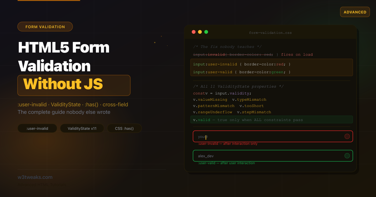
That’s the problem nobody writes about. The fix is :user-invalid, a newer CSS pseudo-class that’s been shipping in all major browsers since 2023 and is supported by over 90% of users right now. Most tutorials don’t mention it. W3Schools added a single sentence. Nobody has shown it side-by-side with the old approach so you can see exactly what changes.
This tutorial covers what the others miss: the full ValidityState object with all 11 properties (not just the 3 most tutorials show), CSS :has() for styling parent elements without JavaScript, cross-field validation with the Constraint Validation API, the invalid event, formnovalidate for save-draft patterns, the autofill quirks that silently break validation on Safari but not Chrome, the required edge cases on radio groups and <select> that produce “why doesn’t my form work?” Stack Overflow threads, and the production-ready form pattern that ties all of it together.
Related tutorials: HTML Popover API · HTML dialog Element · Details & Summary Accordions · Multi-step HTML Forms
Live Demo
Five live examples: :user-invalid vs :invalid comparison, all HTML validation attributes, all 11 ValidityState properties, CSS-only inline errors with :has(), and a complete production registration form.
The Problem Nobody Explains: :invalid Fires Immediately
Add required to an input and style it with :invalid — every tutorial does this:
/* What every tutorial shows you */
input:invalid {
  border-color: red;
  background: #fef2f2;
}
The result: every required field on your form turns red the instant the page loads, before the user has clicked anything. Required fields are invalid by definition when they’re empty — that’s what required means. So :invalid matches them immediately.
<!-- This input is :invalid on page load — it's empty and required -->
<input type="email" required placeholder="Enter your email">
This is a documented UX failure. Users see a form full of red error states before they’ve done anything wrong. It signals “you already made mistakes” before they start.
The fix: :user-invalid
The :user-invalid pseudo-class matches the same invalid state, but only after the user has interacted with the field. Specifically:
- It activates after the user has typed in a field and moved focus away
- It stays active if the user submits the form with invalid values
- It activates on re-interaction if the value was previously flagged invalid
- It never fires on page load, no matter what
/* What you should use instead */
input:user-invalid {
  border-color: #dc2626;
  background: #fef2f2;
}

input:user-valid {
  border-color: #16a34a;
  background: #f0fdf4;
}
<!-- Same input — now only turns red AFTER the user has interacted and left -->
<input type="email" required placeholder="Enter your email">The result: An empty form on load. A green or red border only after the user has touched that specific field. Exactly the UX users expect.
| Behavior | :invalid | :user-invalid |
|---|---|---|
| Fires on page load (before interaction) | Yes — immediately | No |
| Fires after user types wrong value and leaves | Yes | Yes |
| Fires after failed form submit | Yes | Yes |
| Clears when field becomes valid | Yes | Yes |
| Browser support | All browsers | Chrome 119+, Firefox 88+, Safari 16.5+ (90%+) |
For the ~10% that don’t support :user-invalid, the fallback is: :invalid styles simply apply immediately — which is the old behavior, not a broken one. No polyfill needed.
The :placeholder-shown workaround (older articles teach this — don’t)
Before :user-invalid shipped, the standard hack was combining :invalid with :not(:placeholder-shown):
/* Old workaround — works without :user-invalid but breaks several cases */
input:not(:placeholder-shown):invalid {
  border-color: red;
}
This worked because empty inputs show their placeholder, so they don’t match :not(:placeholder-shown) until the user types something. But it has three failure modes: (1) inputs without a placeholder attribute always match :not(:placeholder-shown), so they go red immediately — defeating the purpose, (2) <select> and <textarea> don’t have placeholders the same way, (3) it doesn’t activate after blurring an empty field, only after typing. Use :user-invalid and only fall back to :placeholder-shown if you genuinely need to support pre-2023 Safari.
Step 1 — HTML Validation Attributes: The Complete Reference
The browser validates automatically when you set these attributes. No JavaScript, no event listeners.
required
The field must have a non-empty value to submit.
<!-- Text, email, password, select, textarea — all support required -->
<input type="text"     required>
<input type="email"    required>
<input type="password" required>
<textarea              required></textarea>
<select required>
  <option value="">Choose…</option>
  <option value="a">Option A</option>
</select>

<!-- Checkboxes: must be checked -->
<input type="checkbox" required id="terms">
<label for="terms">I agree to the terms</label>

<!-- Radio groups: at least one in the group must be selected -->
<input type="radio" name="plan" value="free"    required> Free
<input type="radio" name="plan" value="pro"     required> Pro
<input type="radio" name="plan" value="enterprise"> Enterprise
pattern
Value must match a regular expression. The pattern is matched against the entire value (the browser implicitly wraps it in ^(?:...)$).
<!-- US phone: 3 digits, dash, 3 digits, dash, 4 digits -->
<input type="tel"  pattern="[0-9]{3}-[0-9]{3}-[0-9]{4}"
       placeholder="555-867-5309"
       title="Format: 555-867-5309">

<!-- Username: 3–20 chars, letters/numbers/underscore only -->
<input type="text" pattern="[a-zA-Z0-9_]{3,20}"
       title="3–20 characters: letters, numbers, underscore only">

<!-- Password: 8+ chars with at least one number -->
<input type="password" pattern="(?=.*\d).{8,}"
       title="At least 8 characters including at least one number">

<!-- UK postcode -->
<input type="text" pattern="[A-Z]{1,2}[0-9][0-9A-Z]?\s?[0-9][A-Z]{2}"
       title="UK postcode format (e.g. SW1A 1AA)">
The title attribute on a pattern-constrained input becomes the browser’s validation message. Always write it as a description of what’s required, not just the regex: title="Digits only, 10 characters" not title="[0-9]{10}".
min, max, step
For numeric and date inputs:
<!-- Number range -->
<input type="number" min="1" max="100" step="1">

<!-- Date range -->
<input type="date" min="2026-01-01" max="2026-12-31">

<!-- Time in 30-minute increments -->
<input type="time" min="09:00" max="17:00" step="1800">

<!-- Range slider: 0–100 in steps of 5 -->
<input type="range" min="0" max="100" step="5" value="50">

<!-- Floating point: 2 decimal places -->
<input type="number" min="0" max="9999.99" step="0.01">
minlength and maxlength
Character count constraints — only validated on user-provided input (not programmatic values):
<!-- Tweet: 1–280 characters -->
<textarea minlength="1" maxlength="280"></textarea>

<!-- Username: 3–20 characters -->
<input type="text" minlength="3" maxlength="20">
Critical browser quirk: minlength and maxlength are not checked if the value is set programmatically — even if you explicitly call checkValidity() afterward. They only validate user-provided input. This surprises most developers.
type as a validator
Input types enforce their own format constraints:
<input type="email">    <!-- must contain @ and a domain -->
<input type="url">      <!-- must start with a valid protocol -->
<input type="number">   <!-- only numeric characters -->
<input type="date">     <!-- must be a valid date -->
<input type="color">    <!-- must be a valid hex color -->
The required Edge Cases Everyone Gets Wrong
These are the four “I added required but it’s not working” Stack Overflow questions. None of them are bugs — they’re documented behaviors that surprise everyone.
1. <select required> needs an empty-value first option to trigger
A <select required> only counts as “missing” when the selected option has an empty string value. Without an empty first option, the first option in the list is auto-selected and counts as a valid choice.
<!-- Broken — first option ("Free") is selected by default, validates immediately -->
<select required>
  <option value="free">Free</option>
  <option value="pro">Pro</option>
  <option value="enterprise">Enterprise</option>
</select>

<!-- Fixed — empty-value option forces the user to pick -->
<select required>
  <option value="">Choose a plan…</option>
  <option value="free">Free</option>
  <option value="pro">Pro</option>
  <option value="enterprise">Enterprise</option>
</select>
The empty-value option is the de-facto placeholder for <select>. Add disabled selected if you want it shown initially but un-selectable on re-open: <option value="" disabled selected>Choose a plan…</option>.
2. required on radio groups applies to the whole group
You only need required on one radio in a group — the browser treats the whole name="..." group as a single field. But putting required on every radio works too and is more self-documenting.
<!-- Both work identically — at least one must be selected to submit -->
<input type="radio" name="plan" value="free" required>     Free
<input type="radio" name="plan" value="pro">               Pro
<input type="radio" name="plan" value="enterprise">        Enterprise

<!-- More self-documenting — required on every radio in the group -->
<input type="radio" name="plan" value="free"       required> Free
<input type="radio" name="plan" value="pro"        required> Pro
<input type="radio" name="plan" value="enterprise" required> Enterprise
The gotcha: the browser’s error tooltip appears on the first invalid radio, not the visually-relevant one — so place your label/error UI near the first radio in the group, or use setCustomValidity + a custom message anchored where users expect.
3. type="email" multiple validates each comma-separated value
Adding multiple to an email input lets users enter multiple addresses, comma-separated. The browser validates each one against the email format independently:
<!-- Invitee list — each comma-separated email must be valid -->
<input type="email" name="invitees" multiple
       placeholder="alice@example.com, bob@example.com, carol@example.com">
Whitespace around commas is fine — the browser trims. But a single malformed entry in the list invalidates the whole field. If you want to surface which specific address is bad, you need to split on , in JavaScript and check each.
4. pattern is implicitly anchored — but acts like it isn’t
The browser wraps your pattern in ^(?:...)$, so it must match the entire value. But the anchoring is invisible to you when debugging in a regex tester. If you copy-paste your pattern into regex101 and it matches, that doesn’t guarantee it’ll work in pattern= — regex101 matches anywhere by default.
<!-- This DOES NOT match "user-123" — the dash and digits aren't in the pattern -->
<input pattern="[a-z]+">

<!-- Test your pattern as if it had ^ and $ already -->
<!-- If you want a substring match, you need wildcards on both sides: -->
<input pattern=".*[a-z]+.*">
Don’t escape the anchors yourself (pattern="^[a-z]+$") — that double-anchors and works in most browsers but is technically wrong per spec.
Step 2 — CSS Validation Pseudo-classes: All Six
Most tutorials cover only :valid and :invalid. There are six validation-related pseudo-classes:
/* 1. :valid — value satisfies all constraints (fires immediately on load) */
input:valid { }

/* 2. :invalid — value fails any constraint (fires immediately on load) */
input:invalid { }

/* 3. :user-valid — valid AND the user has interacted with the field */
input:user-valid { }

/* 4. :user-invalid — invalid AND the user has interacted with the field */
input:user-invalid { }

/* 5. :required — has the required attribute */
input:required { }

/* 6. :optional — does NOT have the required attribute */
input:optional { }
The practical rule: always use :user-valid and :user-invalid for error/success styling. Use :valid and :invalid only for non-error visual cues like character count indicators.
Full field styling system
/* Base field */
.field input,
.field textarea,
.field select {
  border: 1px solid #d1d5db;
  border-radius: 8px;
  padding: 10px 12px;
  font-size: 14px;
  width: 100%;
  transition: border-color 0.15s, box-shadow 0.15s;
  outline: none;
}

/* Focus — always show a focus ring */
.field input:focus,
.field textarea:focus,
.field select:focus {
  border-color: #2563eb;
  box-shadow: 0 0 0 3px rgba(37, 99, 235, 0.15);
}

/* Valid state — only after user interaction */
.field input:user-valid,
.field textarea:user-valid,
.field select:user-valid {
  border-color: #16a34a;
  box-shadow: none;
}

/* Invalid state — only after user interaction */
.field input:user-invalid,
.field textarea:user-invalid,
.field select:user-invalid {
  border-color: #dc2626;
  box-shadow: 0 0 0 3px rgba(220, 38, 38, 0.1);
}

/* Required indicator on the label */
.field label:has(+ input:required)::after,
.field label:has(+ textarea:required)::after {
  content: ' *';
  color: #dc2626;
  font-weight: 500;
}
Step 3 — CSS :has() for Parent Element Styling (Zero JavaScript)
The :has() pseudo-class lets you style a parent based on its children’s state. Combined with :user-invalid, you can show and hide inline error messages with pure CSS — no JavaScript at all.
The pattern
<div class="field">
  <label for="email">Email address</label>
  <input type="email" id="email" name="email" required>
  <span class="error-msg" aria-live="polite">
    Please enter a valid email address.
  </span>
  <span class="success-msg" aria-live="polite">
    Looks good!
  </span>
</div>
/* Error message: hidden by default */
.error-msg { display: none; color: #dc2626; font-size: 12px; margin-top: 4px; }
.success-msg { display: none; color: #16a34a; font-size: 12px; margin-top: 4px; }
/* Show error message when field is user-invalid */
.field:has(input:user-invalid) .error-msg { display: block; }
/* Show success message when field is user-valid */
.field:has(input:user-valid) .success-msg { display: block; }
/* Style the wrapper too */
.field:has(input:user-invalid) {
/* Optionally highlight the entire field group */
}What this achieves: The error message appears and disappears based purely on field validity after interaction. Zero JavaScript event listeners. The aria-live="polite" ensures screen readers announce the message when it appears.
CSS alone can’t distinguish which validation constraint failed (required vs pattern vs minlength). For specific per-error messages, you need the Constraint Validation API (Step 5). CSS :has() + :user-invalid handles the “show/hide” layer; JS handles the “which message” layer.
Step 4 — All 11 ValidityState Properties
The validity property on any form element returns a ValidityState object. Most tutorials mention 3–4 properties. There are 11, and knowing which one is active lets you show the exact right error message.
const input = document.querySelector('input');
const v = input.validity; // ValidityState object

v.valid           // true if all constraints pass — the only "success" flag
v.valueMissing    // true if required and empty
v.typeMismatch    // true if value doesn't match the type (e.g., "notanemail" in type="email")
v.patternMismatch // true if value doesn't match the pattern attribute
v.tooShort        // true if value is shorter than minlength
v.tooLong         // true if value is longer than maxlength
v.rangeUnderflow  // true if value < min
v.rangeOverflow   // true if value > max
v.stepMismatch    // true if value doesn't align with the step attribute
v.badInput        // true if browser can't convert the input to a value (e.g., partial date)
v.customError     // true if setCustomValidity() was called with a non-empty string
Reading the right property for the right message:
function getErrorMessage(input) {
  const v = input.validity;

  if (v.valid)           return '';
  if (v.valueMissing)    return `${input.labels?.[0]?.textContent ?? 'This field'} is required.`;
  if (v.typeMismatch)    return getTypeMismatchMessage(input.type);
  if (v.tooShort)        return `Minimum ${input.minLength} characters. You have ${input.value.length}.`;
  if (v.tooLong)         return `Maximum ${input.maxLength} characters. You have ${input.value.length}.`;
  if (v.patternMismatch) return input.title || 'Please match the required format.';
  if (v.rangeUnderflow)  return `Value must be at least ${input.min}.`;
  if (v.rangeOverflow)   return `Value must be no more than ${input.max}.`;
  if (v.stepMismatch)    return `Value must be a multiple of ${input.step}.`;
  if (v.badInput)        return 'Please enter a valid value.';
  if (v.customError)     return input.validationMessage;

  return 'This value is not valid.';
}

function getTypeMismatchMessage(type) {
  const messages = {
    email: 'Please enter a valid email address (e.g., name@example.com).',
    url:   'Please enter a valid URL (e.g., https://example.com).',
    number: 'Please enter a number.',
  };
  return messages[type] ?? 'Please enter a valid value.';
}
Step 5 — setCustomValidity() and the invalid Event
setCustomValidity()
Call this method with a non-empty string to mark a field as invalid with a custom message. Call it with an empty string to clear the custom error.
const input = document.getElementById('username');

input.addEventListener('input', () => {
  // Async validation: check if username is taken
  const taken = ['admin', 'root', 'test'];

  if (taken.includes(input.value.toLowerCase())) {
    input.setCustomValidity('That username is already taken.');
  } else {
    input.setCustomValidity('');  // ← MUST clear when valid — or the field stays broken
  }
});
The most common setCustomValidity() mistake: Calling it with an error message but forgetting to clear it with setCustomValidity('') when the value becomes valid. Once set, the custom error persists until explicitly cleared — even if the user fixes the value.
Accessibility caveat: don’t rely on the native bubble for screen readers
setCustomValidity() causes the browser to show a tooltip “bubble” with your message. That bubble is not reliably announced by screen readers — it’s been an open Chromium issue for years, NVDA’s behavior on Firefox is inconsistent, and Safari + VoiceOver works only when focus is correctly placed. Don’t treat the bubble as your accessibility layer.
The accessible pattern: use setCustomValidity to block form submission, but render the error as visible text bound to the input via aria-describedby:
<div class="field">
  <label for="username">Username</label>
  <input type="text" id="username" name="username"
         required minlength="3"
         aria-describedby="username-error">
  <!-- aria-live=polite means screen readers announce the message when it appears -->
  <span id="username-error" class="error-msg" aria-live="polite"></span>
</div>
const input = document.getElementById('username');
const errEl = document.getElementById('username-error');
input.addEventListener('input', () => {
const taken = ['admin', 'root', 'test'];
if (taken.includes(input.value.toLowerCase())) {
input.setCustomValidity('That username is already taken.');
errEl.textContent = 'That username is already taken.';
input.setAttribute('aria-invalid', 'true');
} else {
input.setCustomValidity('');
errEl.textContent = '';
input.removeAttribute('aria-invalid');
}
});Now both sighted and screen-reader users get the same message at the same time, regardless of whether the native bubble shows or fires correctly. The setCustomValidity call still does its job (blocking submission); it’s just no longer the primary communication channel.
The invalid event
When a form is submitted with invalid fields, or when checkValidity()/reportValidity() is called, an invalid event fires on each invalid element. It does not bubble — you must attach listeners to individual elements or use capture:
const form = document.querySelector('form');

// Does NOT work — invalid doesn't bubble to the form
form.addEventListener('invalid', handleInvalid);

// Works — capture phase catches it at the form level
form.addEventListener('invalid', handleInvalid, true);

// Or attach to each input individually
form.querySelectorAll('input').forEach(input => {
  input.addEventListener('invalid', handleInvalid);
});

function handleInvalid(e) {
  const input = e.target;
  const msg   = getErrorMessage(input);   // from Step 4
  showInlineError(input, msg);
}
Using the invalid event for custom error display with novalidate:
const form = document.getElementById('myForm');
form.setAttribute('novalidate', ''); // Disable browser default bubble UI

form.addEventListener('submit', (e) => {
  // checkValidity() fires 'invalid' on each invalid field
  // Our invalid handlers render the custom inline errors
  if (!form.checkValidity()) {
    e.preventDefault();
    // Focus the first invalid field
    form.querySelector(':invalid')?.focus();
  }
});

form.addEventListener('invalid', (e) => {
  e.preventDefault(); // Stop browser from showing its own bubble tooltip
  showInlineError(e.target);
}, true); // capture = true because invalid doesn't bubble
novalidate is a feature, not a bug
Most tutorials describe novalidate as a way to “turn off” HTML5 validation. That’s the wrong framing. The best use of novalidate is: keep all the validation logic, just suppress the native bubble UI so you can render your own accessible errors.
<form novalidate>  <!-- ← Disables the native bubble, keeps validity tracking -->
  <input type="email" required>
  <!-- ↑ Still tracked by :user-invalid, validity.valid, etc. -->
  <!--   But no browser bubble appears on submit. -->
</form>
// You decide when to render errors. The browser still does the math.
form.addEventListener('submit', (e) => {
if (!form.checkValidity()) {
e.preventDefault();
// Render YOUR error UI here — aria-describedby, inline messages, summary list
}
});You get the best of both worlds: the browser’s parsing and tracking of all 11 ValidityState properties, but full control over how errors are presented (and to whom).
formnovalidate — skipping validation for specific buttons
Add formnovalidate to a submit button to bypass all validation for that submission. This is the correct pattern for “Save Draft” buttons:
<form id="articleForm" action="/article" method="post">
  <input type="text"  name="title"   required placeholder="Title">
  <textarea           name="content" required placeholder="Content"></textarea>

  <!-- Requires all fields valid before submitting -->
  <button type="submit">Publish</button>

  <!-- Skips ALL validation — saves incomplete drafts -->
  <button type="submit" formnovalidate name="action" value="draft">
    Save Draft
  </button>
</form>
Step 6 — Cross-Field Validation: Password Confirm
The Constraint Validation API doesn’t handle cross-field rules natively (like “password must match confirm password”). Use setCustomValidity() to bridge the gap:
<form id="signupForm">
  <div class="field">
    <label for="password">Password</label>
    <input type="password" id="password" name="password"
           required minlength="8"
           pattern="(?=.*[A-Z])(?=.*\d).{8,}"
           title="8+ characters, one uppercase letter, one number">
  </div>

  <div class="field">
    <label for="confirmPassword">Confirm password</label>
    <input type="password" id="confirmPassword" name="confirmPassword"
           required>
    <span class="error-msg" id="confirmError" aria-live="polite"></span>
  </div>

  <button type="submit">Create account</button>
</form>
const password = document.getElementById('password');
const confirmPassword = document.getElementById('confirmPassword');
const confirmError = document.getElementById('confirmError');
function validatePasswordMatch() {
if (password.value !== confirmPassword.value) {
confirmPassword.setCustomValidity("Passwords don't match.");
confirmError.textContent = "Passwords don't match.";
} else {
confirmPassword.setCustomValidity(''); // Clear when matching
confirmError.textContent = '';
}
}
// Revalidate on every keystroke in either field
password.addEventListener('input', validatePasswordMatch);
confirmPassword.addEventListener('input', validatePasswordMatch);
// Also run on blur to catch copy-paste
confirmPassword.addEventListener('blur', validatePasswordMatch);Conditional required (required-if pattern)
Require a field only when a condition is met:
<label>
  <input type="checkbox" id="hasBusiness" onchange="toggleBusinessField(this)">
  I am registering a business
</label>

<div id="businessField" class="field hidden">
  <label for="businessName">Business name</label>
  <input type="text" id="businessName" name="businessName">
</div>
const hasBusiness = document.getElementById('hasBusiness');
const businessField = document.getElementById('businessField');
const businessName = document.getElementById('businessName');
function toggleBusinessField(checkbox) {
if (checkbox.checked) {
businessField.classList.remove('hidden');
businessName.setAttribute('required', ''); // Add required dynamically
} else {
businessField.classList.add('hidden');
businessName.removeAttribute('required'); // Remove required when hidden
businessName.setCustomValidity(''); // Clear any pending validation
}
}Always remove required when you hide a field. A hidden required field will block form submission even if the user can’t see it. Use input.removeAttribute('required') when hiding, input.setAttribute('required', '') when showing.
Step 7 — File Input Validation
File inputs don’t support pattern or type constraints for content type — you need the Constraint Validation API with setCustomValidity():
<div class="field">
  <label for="avatar">Profile photo</label>
  <input type="file" id="avatar" name="avatar"
         accept="image/png,image/jpeg,image/webp"
         required>
  <span class="error-msg" id="fileError" aria-live="polite"></span>
  <span class="hint">PNG, JPG, or WebP · Max 2MB</span>
</div>
const fileInput = document.getElementById('avatar');
const fileError = document.getElementById('fileError');
const ALLOWED_TYPES = ['image/png', 'image/jpeg', 'image/webp'];
const MAX_SIZE_BYTES = 2 * 1024 * 1024; // 2MB
fileInput.addEventListener('change', validateFile);
function validateFile() {
fileError.textContent = '';
fileInput.setCustomValidity(''); // Clear previous
const file = fileInput.files[0];
if (!file) return;
// Check MIME type (the accept attribute is bypassed when users type paths)
if (!ALLOWED_TYPES.includes(file.type)) {
const msg = `File type not allowed. Please upload a PNG, JPG, or WebP image.`;
fileInput.setCustomValidity(msg);
fileError.textContent = msg;
return;
}
// Check file size
if (file.size > MAX_SIZE_BYTES) {
const sizeMB = (file.size / 1024 / 1024).toFixed(1);
const msg = `File too large (${sizeMB}MB). Maximum size is 2MB.`;
fileInput.setCustomValidity(msg);
fileError.textContent = msg;
return;
}
}The accept attribute is advisory, not secure. Users can bypass it by typing a file path directly. Always re-validate file type on the client and server. Never trust accept alone.
Autofill Breaks Validation Inconsistently — Test This
Browser autofill (the saved-passwords / saved-addresses dropdown) counts as a “user interaction” inconsistently across browsers. This is the single most-skipped gotcha in every other validation tutorial — and it produces real production bugs.
The behavior matrix
| Action | Chrome | Firefox | Safari |
|---|---|---|---|
| User types into a field | :user-invalid activates on blur | Same | Same |
| Browser autofills a valid value | :user-valid activates immediately | :user-valid activates | Often doesn’t trigger either |
| Browser autofills an invalid value (rare) | :user-invalid triggers | :user-invalid triggers | Often silent — no styling |
<input> value set programmatically | Neither triggers | Neither triggers | Neither triggers |
Why it bites: A user opens your signup form. Chrome autofills their email — :user-valid fires, the field turns green, all good. Same user on Safari — autofills the same email, but :user-valid doesn’t fire, the field stays in its base “not yet touched” state. The user thinks their email isn’t recognized and re-types it.
The workaround: listen for change and re-evaluate
Use a JavaScript change listener to force-trigger your validation UI when autofill happens:
// On every form field, re-run validation styling after autofill
form.querySelectorAll('input').forEach(input => {
  // 'change' fires when autofill completes on all major browsers
  input.addEventListener('change', () => {
    // Force re-evaluation of your error/success state
    if (input.validity.valid) {
      input.classList.add('was-validated-ok');
      input.classList.remove('was-validated-bad');
    } else {
      input.classList.add('was-validated-bad');
      input.classList.remove('was-validated-ok');
    }
  });
});
/* Use the class as a fallback styling hook for autofilled valid state */
input.was-validated-ok { border-color: #16a34a; }
input.was-validated-bad { border-color: #dc2626; }This gives you a consistent post-autofill state across browsers. The class-based approach also doubles as your styling target for “the user submitted with errors” — when you call form.checkValidity() in your submit handler, mark every field with these classes so all error states show simultaneously.
Testing autofill yourself
Browser DevTools can simulate autofill: open DevTools → Elements → select your input → in the console run $0.value = 'test@example.com'; $0.dispatchEvent(new Event('input')). That mimics autofill behavior. Programmatic value-setting does not fire change or input on its own, so you must dispatch it manually — which is precisely why autofill bugs slip through unit tests.
Complete Working Example — Production Registration Form
Combining every technique: novalidate, per-error messages via ValidityState, :user-invalid styling, :has() for inline errors, cross-field password validation, conditional required, autofill-aware class fallback, and the invalid event for submit-time error display.
<!DOCTYPE html>
<html lang="en">
<head>
  <meta charset="UTF-8">
  <title>Registration Form — HTML5 Native Validation</title>
  <style>
    /* ─── Reset + Base ───────────────────────────── */
    *, *::before, *::after { box-sizing: border-box; margin: 0; padding: 0; }
    body { font-family: 'Segoe UI', system-ui, sans-serif; background: #f8f9fa; color: #111827; padding: 2rem; }
    .form-card { background: #fff; border: 1px solid #e5e7eb; border-radius: 16px; padding: 2rem; max-width: 480px; margin: 0 auto; }
    h1 { font-size: 20px; font-weight: 600; margin-bottom: 6px; }
    .subtitle { font-size: 13px; color: #6b7280; margin-bottom: 24px; }

    /* ─── Field layout ───────────────────────────── */
    .field { display: flex; flex-direction: column; gap: 5px; margin-bottom: 16px; }
    .field label { font-size: 13px; font-weight: 500; color: #374151; }
    .field label.required::after { content: ' *'; color: #dc2626; }

    /* ─── Inputs ─────────────────────────────────── */
    .field input, .field select, .field textarea {
      border: 1px solid #d1d5db; border-radius: 8px;
      padding: 10px 12px; font-size: 14px; width: 100%;
      transition: border-color .15s, box-shadow .15s; outline: none;
      font-family: inherit; color: inherit;
    }
    .field input:focus, .field select:focus, .field textarea:focus {
      border-color: #2563eb;
      box-shadow: 0 0 0 3px rgba(37, 99, 235, .12);
    }

    /* ─── :user-invalid / :user-valid (with class fallbacks for autofill) */
    .field input:user-valid,
    .field input.was-validated-ok,
    .field select:user-valid,
    .field textarea:user-valid {
      border-color: #16a34a;
    }
    .field input:user-invalid,
    .field input.was-validated-bad,
    .field select:user-invalid,
    .field textarea:user-invalid {
      border-color: #dc2626;
      box-shadow: 0 0 0 3px rgba(220, 38, 38, .08);
    }

    /* ─── Error message (via :has() — zero JS to show/hide) */
    .error-msg { font-size: 12px; color: #dc2626; display: none; }
    .field:has(input:user-invalid)   .error-msg,
    .field:has(select:user-invalid)  .error-msg,
    .field:has(textarea:user-invalid) .error-msg { display: block; }

    /* JS also sets this class for submit-time errors */
    .field.show-error .error-msg { display: block; }

    /* ─── Hint text ──────────────────────────────── */
    .hint { font-size: 12px; color: #9ca3af; }

    /* ─── Password strength ──────────────────────── */
    .strength-bar { height: 4px; background: #e5e7eb; border-radius: 2px; overflow: hidden; }
    .strength-fill { height: 100%; width: 0; border-radius: 2px; transition: width .3s, background .3s; }

    /* ─── Buttons ────────────────────────────────── */
    .btn-row { display: flex; gap: 10px; margin-top: 8px; }
    .btn { padding: 10px 20px; border-radius: 8px; font-size: 14px; font-weight: 500; cursor: pointer; border: none; transition: opacity .15s; }
    .btn:hover { opacity: .88; }
    .btn-primary { background: #2563eb; color: #fff; flex: 1; }
    .btn-ghost   { background: #f3f4f6; color: #374151; border: 1px solid #e5e7eb; }
    .success-banner { display: none; background: #f0fdf4; border: 1px solid #bbf7d0; border-radius: 8px; padding: 12px 16px; font-size: 13px; color: #15803d; margin-top: 16px; }
  </style>
</head>
<body>
<div class="form-card">
  <h1>Create account</h1>
  <p class="subtitle">All fields marked * are required.</p>

  <form id="registerForm" novalidate>

    <div class="field">
      <label for="name" class="required">Full name</label>
      <input type="text" id="name" name="name"
             required minlength="2" maxlength="80"
             autocomplete="name"
             aria-describedby="err-name">
      <span class="error-msg" id="err-name" aria-live="polite"></span>
    </div>

    <div class="field">
      <label for="email" class="required">Email address</label>
      <input type="email" id="email" name="email"
             required autocomplete="email"
             aria-describedby="err-email">
      <span class="error-msg" id="err-email" aria-live="polite"></span>
    </div>

    <div class="field">
      <label for="username" class="required">Username</label>
      <input type="text" id="username" name="username"
             required minlength="3" maxlength="20"
             pattern="[a-zA-Z0-9_]+"
             title="Letters, numbers, and underscores only"
             aria-describedby="err-username">
      <span class="error-msg" id="err-username" aria-live="polite"></span>
      <span class="hint">3–20 characters. Letters, numbers, and _ only.</span>
    </div>

    <div class="field">
      <label for="password" class="required">Password</label>
      <input type="password" id="password" name="password"
             required minlength="8"
             pattern="(?=.*[A-Z])(?=.*\d).{8,}"
             autocomplete="new-password"
             aria-describedby="err-password">
      <div class="strength-bar"><div class="strength-fill" id="strengthFill"></div></div>
      <span class="error-msg" id="err-password" aria-live="polite"></span>
      <span class="hint">8+ characters, one uppercase letter, one number.</span>
    </div>

    <div class="field">
      <label for="confirm" class="required">Confirm password</label>
      <input type="password" id="confirm" name="confirm"
             required autocomplete="new-password"
             aria-describedby="err-confirm">
      <span class="error-msg" id="err-confirm" aria-live="polite"></span>
    </div>

    <div class="field">
      <label>
        <input type="checkbox" id="newsletter">
        Subscribe to weekly newsletter
      </label>
    </div>

    <div class="btn-row">
      <button type="submit" class="btn btn-primary">Create account</button>
      <button type="submit" class="btn btn-ghost" formnovalidate name="action" value="draft">
        Save draft
      </button>
    </div>

  </form>

  <div class="success-banner" id="successBanner">
    Account created! Check your email to verify your address.
  </div>
</div>

<script>
  const form      = document.getElementById('registerForm');
  const password  = document.getElementById('password');
  const confirm   = document.getElementById('confirm');
  const fillBar   = document.getElementById('strengthFill');

  /* ── Error messages via ValidityState ── */
  function getMsg(input) {
    const v = input.validity;
    if (v.valid) return '';
    if (v.valueMissing)    return `${input.labels[0].textContent.replace(' *','').trim()} is required.`;
    if (v.typeMismatch)    return input.type === 'email' ? 'Enter a valid email (name@example.com).' : 'Enter a valid value.';
    if (v.tooShort)        return `Minimum ${input.minLength} characters (currently ${input.value.length}).`;
    if (v.tooLong)         return `Maximum ${input.maxLength} characters.`;
    if (v.patternMismatch) return input.title || 'Value does not match the required format.';
    if (v.customError)     return input.validationMessage;
    return 'This value is not valid.';
  }

  function showErr(input) {
    const errEl = document.getElementById('err-' + input.id);
    if (!errEl) return;
    const msg = getMsg(input);
    errEl.textContent = msg;
    input.closest('.field')?.classList.toggle('show-error', !!msg);
    input.toggleAttribute('aria-invalid', !!msg);
  }

  function clearErr(input) {
    const errEl = document.getElementById('err-' + input.id);
    if (errEl) errEl.textContent = '';
    input.closest('.field')?.classList.remove('show-error');
    input.removeAttribute('aria-invalid');
  }

  /* ── Per-field validation on blur ── */
  form.querySelectorAll('input, select, textarea').forEach(el => {
    el.addEventListener('blur',  () => showErr(el));
    el.addEventListener('input', () => {
      if (el.closest('.field')?.classList.contains('show-error')) showErr(el);
      else clearErr(el);
    });
    // Autofill-aware: 'change' fires when the browser autofills
    el.addEventListener('change', () => {
      if (el.validity.valid) el.classList.add('was-validated-ok');
      else                   el.classList.add('was-validated-bad');
    });
  });

  /* ── Password strength indicator ── */
  password.addEventListener('input', () => {
    const v = password.value;
    let score = 0;
    if (v.length >= 8)          score++;
    if (/[A-Z]/.test(v))        score++;
    if (/[0-9]/.test(v))        score++;
    if (/[^a-zA-Z0-9]/.test(v)) score++;
    const pct   = (score / 4) * 100;
    const color = ['#e5e7eb', '#ef4444', '#f59e0b', '#22c55e', '#16a34a'][score];
    fillBar.style.width      = pct + '%';
    fillBar.style.background = color;
  });

  /* ── Password match ── */
  function checkMatch() {
    if (confirm.value && password.value !== confirm.value) {
      confirm.setCustomValidity("Passwords don't match.");
    } else {
      confirm.setCustomValidity('');
    }
  }
  password.addEventListener('input', checkMatch);
  confirm.addEventListener('input',  checkMatch);

  /* ── Submit: show errors on all invalid fields ── */
  form.addEventListener('submit', (e) => {
    if (e.submitter?.hasAttribute('formnovalidate')) {
      console.log('Saved as draft (validation skipped)');
      return; // Allow draft save without validation
    }
    if (!form.checkValidity()) {
      e.preventDefault();
      form.querySelectorAll('input, select, textarea').forEach(showErr);
      form.querySelector(':invalid')?.focus();
    } else {
      e.preventDefault(); // Demo only — would submit normally
      document.getElementById('successBanner').style.display = 'block';
    }
  });

  /* ── Suppress browser default bubble UI ── */
  form.addEventListener('invalid', e => e.preventDefault(), true);
</script>
</body>
</html>
Browser Support
| Feature | Chrome | Firefox | Safari | Edge |
|---|---|---|---|---|
| HTML5 validation attributes | 4+ | 4+ | 5+ | 12+ |
| Constraint Validation API | 10+ | 4+ | 5+ | 12+ |
:valid / :invalid | 10+ | 4+ | 5+ | 12+ |
:user-valid / :user-invalid | 119+ | 88+ | 16.5+ | 119+ |
CSS :has() | 105+ | 121+ | 15.4+ | 105+ |
formnovalidate | 10+ | 4+ | 5+ | 12+ |
:user-valid / :user-invalid degrade gracefully — if unsupported, the field simply has no validation styling, which is better than immediate red. For exact compatibility data see MDN’s :user-invalid reference and caniuse.com/css-user-invalid.
Key Takeaways
- Never use
:invalidalone for error styling — it fires on page load before the user touches anything; use:user-invalidinstead :user-invalidis supported by 90%+ of browser users and degrades gracefully to “no styling” in older browsers- CSS
:has()combined with:user-invalidenables zero-JavaScript inline error message show/hide - The
ValidityStateobject has 11 properties — read the specific one that’s true to show the most helpful error message - Always call
setCustomValidity('')to clear a custom error when the value becomes valid — forgetting this is the #1setCustomValiditybug - Don’t rely on the native validation bubble for accessibility — render visible error text bound to inputs via
aria-describedbyinstead - The
invalidevent does not bubble — attach listeners to individual elements or use capture (addEventListener('invalid', handler, true)) novalidateis a feature: use it to suppress the native bubble while keeping allValidityStatetracking — render your own accessible error UI<select required>only works when the default option hasvalue=""— otherwise the first real option is auto-selected and validates immediatelypatternis implicitly anchored — your regex must match the entire value, even though regex testers don’t show this- Autofill triggers validation styling inconsistently — add a
changelistener with class-based fallbacks to handle Safari’s silent behavior minlengthandmaxlengthare only validated on user-provided input — they don’t fire when you set values programmatically- Always validate file type and size client-side with
setCustomValidity()— theacceptattribute is advisory and easily bypassed - Cross-field validation requires
setCustomValidity()with dynamicrequiredattribute toggling; always removerequiredfrom hidden fields
FAQ
Why does my form show red borders before the user types anything?
You’re using :invalid for error styling. The :invalid pseudo-class matches any field that fails validation constraints, including required fields that are empty on page load. Replace :invalid with :user-invalid — it only applies after the user has interacted with and then left the field. This is supported in Chrome 119+, Firefox 88+, and Safari 16.5+ (90%+ of browsers globally).
What is the ValidityState object in HTML5?
ValidityState is an object returned by element.validity on any form element. It has 11 boolean properties that tell you exactly why a field is invalid: valueMissing, typeMismatch, patternMismatch, tooShort, tooLong, rangeUnderflow, rangeOverflow, stepMismatch, badInput, customError, and valid. Reading the specific property lets you show a precise error message instead of a generic “this field is invalid” message.
Why doesn’t my <select required> block submission?
The <select required> constraint is only triggered when the selected option has an empty string value. Without an empty first option (like <option value="">Choose…</option>), the first option in the list is auto-selected on load — and any non-empty value counts as valid. Add a blank-value first option as your placeholder.
How do I validate that two password fields match?
Use setCustomValidity() on the confirm field: compare password.value to confirmPassword.value on every input event in both fields. Call setCustomValidity("Passwords don't match") when they differ, and setCustomValidity('') (empty string) when they match. The empty string is required to clear the error — if you only ever set it with a message, the field stays invalid permanently even after fixing.
Why does my form work in Chrome but break in Safari after browser autofill?
Safari triggers :user-valid and :user-invalid inconsistently after autofill — sometimes silently, sometimes not at all. Chrome and Firefox usually do trigger them. Add a change event listener to every input and set a class like was-validated-ok / was-validated-bad as a fallback styling hook. The change event fires reliably across all browsers when autofill completes, even when the pseudo-classes don’t.
Can I style the parent label or field wrapper based on validation state?
Yes, using CSS :has(). The selector .field:has(input:user-invalid) targets the .field wrapper whenever its child input is in the :user-invalid state. Use this to change the label color, show/hide an error message span, or add a background tint to the entire field group — all without JavaScript.
What does formnovalidate do?
The formnovalidate attribute on a submit button bypasses all HTML5 constraint validation for that specific submission. Use it on “Save Draft”, “Back”, or “Cancel” buttons where you want the form to submit regardless of validity. The Publish or final Submit button should not have this attribute.
Is client-side HTML5 validation secure?
No. Client-side validation is a UX enhancement — it gives users immediate feedback without a round trip. It is not a security measure. Users can bypass it using browser developer tools, novalidate, or direct API calls. Always validate and sanitize all data server-side. HTML5 validation should be used in addition to, not instead of, server-side validation.