The <datalist> element has been in every major browser since 2014. It gives you a native combobox — a text input with autocomplete suggestions — with zero JavaScript and zero library imports. Yet most developers still reach for Select2, react-select, or Downshift for something this element handles natively.
The catch is that <datalist> has a few genuine quirks that no tutorial explains well: there is no native event that fires when the user picks from the list (versus types freely), browser inconsistencies in how value and label attributes are rendered, the dropdown cannot be styled with CSS, and iOS Safari has shipped at least one version with the feature completely broken. Understanding these limits — and knowing the workarounds — is what separates a rough datalist implementation from one you can actually ship.
This tutorial covers everything: the correct wiring, two ways to detect selection (the input value-compare pattern and the cleaner beforeinput + insertReplacementText trick), the display-label-submit-ID pattern, a production-grade async fetch pattern with AbortController and debounce, using <datalist> with non-text inputs, enforcing list-only selection with pattern, the current browser quirks matrix, the performance ceiling for large option lists, and a clear decision table for when to stop using datalist.
Related tutorials: HTML5 Form Validation · HTML details Accordions · Popover API
Live Demo
Five live examples: basic autocomplete, display label / submit ID pattern, async fetch with debounce + AbortController, datalist for range / color / time, and pattern enforcement for list-only selection.
Before / After — Select2 vs Native Datalist
Before — third-party autocomplete library
<!-- Select2: ~30kb JS + 10kb CSS, jQuery dependency -->
<link rel="stylesheet" href="select2.min.css">
<script src="jquery.min.js"></script>
<script src="select2.min.js"></script>

<select id="country" class="select2">
  <option value="us">United States</option>
  <option value="gb">United Kingdom</option>
  <!-- 190 more options... -->
</select>

<script>
  $('#country').select2({ placeholder: 'Search countries…' });
</script>
Cost: ~45kb of assets, jQuery dependency, custom ARIA, custom keyboard navigation, custom styling, custom mobile behavior — all to replicate what the browser can already do.
After — native datalist
<!-- No imports. No JavaScript. No styling required. -->
<label for="country">Country</label>
<input type="text" id="country" name="country"
       list="countries" placeholder="Search countries…"
       autocomplete="off">

<datalist id="countries">
  <option value="United States">
  <option value="United Kingdom">
  <option value="Canada">
  <option value="Australia">
  <!-- more options -->
</datalist>
Cost: 0kb. Browser handles filtering, keyboard navigation, ARIA, and mobile. Works everywhere Chrome 20+, Firefox 4+, Safari 12.1+.
Step 1 — Core Mechanics: Wiring and Options
The entire <datalist> API is two attributes:
<!-- 1. Give the datalist an id -->
<datalist id="fruits">
  <option value="Apple">
  <option value="Banana">
  <option value="Cherry">
  <option value="Dragonfruit">
  <option value="Elderberry">
</datalist>

<!-- 2. Point the input to it with list="" -->
<input type="text" list="fruits" id="fav" name="fav">
How the browser filters: as the user types, the browser shows only options where the value contains the typed string (case-insensitive, substring match in most browsers). The user can still type anything — <datalist> is a suggestion list, not a restriction.
autocomplete="off" matters: add this to the input to prevent the browser’s own autocomplete history from competing with your datalist suggestions:
<input type="text" list="fruits" autocomplete="off">Sharing one datalist across multiple inputs: any number of inputs can reference the same datalist:
<datalist id="colors">
  <option value="Red"><option value="Green"><option value="Blue">
</datalist>

<label>Primary color: <input type="text" list="colors" name="color1" autocomplete="off"></label>
<label>Accent color:  <input type="text" list="colors" name="color2" autocomplete="off"></label>
Step 2 — The value vs label Browser Inconsistency
The <option> element inside <datalist> has two ways to carry text:
<datalist id="langs">
  <!-- value only — all browsers show the value -->
  <option value="JavaScript">

  <!-- value + label — browsers disagree on what to show -->
  <option value="js" label="JavaScript">

  <!-- value + text content — Firefox uses the text content as the label -->
  <option value="js">JavaScript</option>
</datalist>
The browser rendering matrix:
| Syntax | Chrome | Firefox | Safari |
|---|---|---|---|
<option value="X"> | Shows X | Shows X | Shows X |
<option value="X" label="Y"> | Shows “X — Y” | Shows Y only | Shows X only |
<option value="X">Y</option> | Shows X | Shows “X Y” | Shows X |
The problem: if you want to show a human-readable label and submit a machine-readable ID, there is no single HTML syntax that works consistently across all browsers. The solution is in Step 3.
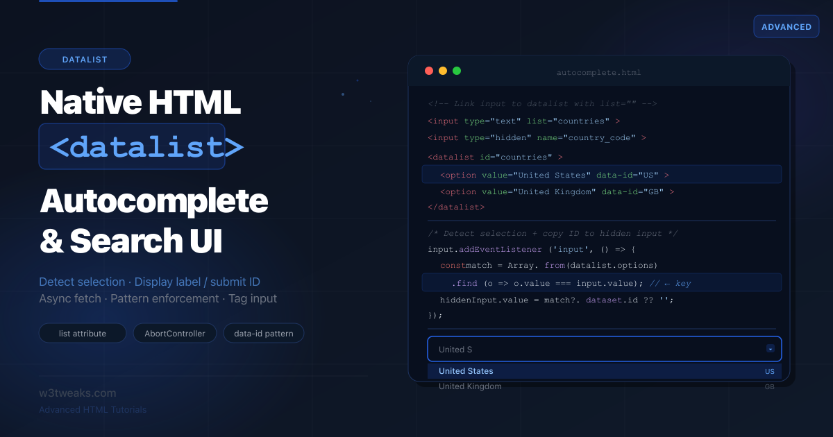
Step 3 — Display Label, Submit ID (The Pattern Nobody Documents)
This is the most-searched <datalist> question and the one with the worst answers. You want the user to see “United States” in the dropdown but submit "us" to the server.
The correct cross-browser pattern
Store the display label in value (what the user sees and types) and the actual ID in a data-id attribute. On selection, copy the data-id to a hidden input:
<div class="field">
  <label for="country">Country</label>
  <input type="text"   id="country"       list="countries"
         autocomplete="off" placeholder="Start typing a country…">
  <input type="hidden" id="country-code"  name="country_code">
</div>

<datalist id="countries">
  <option value="United States"  data-id="US">
  <option value="United Kingdom" data-id="GB">
  <option value="Canada"         data-id="CA">
  <option value="Australia"      data-id="AU">
  <option value="Germany"        data-id="DE">
  <option value="France"         data-id="FR">
  <option value="Japan"          data-id="JP">
</datalist>
const input = document.getElementById('country');
const hiddenCode = document.getElementById('country-code');
const datalist = document.getElementById('countries');
input.addEventListener('change', () => {
// Find the option whose value matches the current input text
const match = Array.from(datalist.options)
.find(opt => opt.value === input.value);
if (match) {
hiddenCode.value = match.dataset.id;
console.log(`Selected: ${input.value} → submits: ${hiddenCode.value}`);
} else {
hiddenCode.value = ''; // User typed a custom value — clear the code
}
});
// Clear the hidden code if user clears the input
input.addEventListener('input', () => {
if (!input.value) hiddenCode.value = '';
});On form submit: the visible country input submits the label text; the hidden country_code submits the machine-readable code. Only country_code needs the name attribute for form submission — the visible input’s name can be omitted.
Step 4 — Detecting Selection vs Free Typing
There is no select event on <datalist>. No native way to know if the user picked a suggestion or typed freely. This is the most common datalist frustration — and it has two clean solutions.
Approach 1 — Value comparison (universal, slightly imprecise)
const input    = document.getElementById('search');
const datalist = document.getElementById('suggestions');

// 'input' fires on every keystroke
input.addEventListener('input', () => {
  // Check if the current value exactly matches any option
  const isFromList = Array.from(datalist.options)
    .some(opt => opt.value === input.value);

  if (isFromList) {
    // User just picked from the list (or typed an exact match)
    input.dataset.selectedFromList = 'true';
    handleSelection(input.value);
  } else {
    input.dataset.selectedFromList = 'false';
  }
});

// 'change' fires when input loses focus or Enter is pressed
input.addEventListener('change', () => {
  const isExactMatch = Array.from(datalist.options)
    .some(opt => opt.value === input.value);

  if (isExactMatch) {
    console.log('Picked from list (or typed exact match):', input.value);
  } else {
    console.log('Custom value typed:', input.value);
  }
});

function handleSelection(value) {
  console.log('List option selected:', value);
  // Navigate, filter, fetch details, etc.
}
The limitation: you cannot distinguish “user typed exactly ‘Apple’” from “user clicked Apple in the dropdown.” Both produce identical browser events with this approach.
Approach 2 — beforeinput with inputType === 'insertReplacementText' (cleaner, modern)
The beforeinput event fires before the input value changes, and its inputType property tells you how the change is happening. When a user picks from a datalist, the browser fires beforeinput with inputType: 'insertReplacementText' — a signal you don’t get from keyboard typing.
input.addEventListener('beforeinput', (e) => {
  if (e.inputType === 'insertReplacementText') {
    // The user picked from the datalist — not keyboard input
    // e.data contains the option value being inserted
    console.log('Datalist pick detected:', e.data);
    handleSelection(e.data);
  }
});

// Still use 'input' for free-typing detection
input.addEventListener('input', (e) => {
  if (e.inputType !== 'insertReplacementText') {
    console.log('Keyboard typing:', input.value);
  }
});
Browser support: inputType: 'insertReplacementText' fires on datalist selection in Chrome, Edge, and Firefox. Safari’s behavior is less consistent — fall back to the value-compare approach in Approach 1 for cross-browser certainty, and use beforeinput as a fast-path when you need to distinguish click-vs-type.
Using selection to auto-advance focus
A common pattern — when a datalist option is selected, move focus to the next field:
input.addEventListener('input', () => {
  const isFromList = Array.from(datalist.options)
    .some(opt => opt.value === input.value);

  if (isFromList) {
    // Auto-advance to next field after brief delay (let browser close dropdown)
    setTimeout(() => {
      document.getElementById('nextField')?.focus();
    }, 50);
  }
});
Step 5 — Dynamic Options: Fetch with Debounce + AbortController
This is where most tutorials fall short. They show a simple fetch inside an input listener — which fires a network request on every single keystroke, can’t cancel stale requests, and has no loading state.
The production-grade pattern requires three things: a minimum character threshold, debouncing, and AbortController to cancel in-flight requests when new input arrives.
<div class="search-wrap">
  <input type="text" id="citySearch" list="cities"
         placeholder="Search cities…" autocomplete="off">
  <span class="loading-dot" id="cityLoader" hidden aria-live="polite">…</span>
</div>
<datalist id="cities"></datalist>
const input = document.getElementById('citySearch');
const datalist = document.getElementById('cities');
const loader = document.getElementById('cityLoader');
const MIN_CHARS = 2; // Don't fetch until 2+ characters
const DEBOUNCE = 300; // Wait 300ms after last keystroke
let debounceTimer = null;
let activeController = null; // Tracks the in-flight request
input.addEventListener('input', () => {
const query = input.value.trim();
// Clear datalist immediately when input is short
if (query.length < MIN_CHARS) {
datalist.innerHTML = '';
loader.hidden = true;
clearTimeout(debounceTimer);
// Cancel any in-flight request
activeController?.abort();
return;
}
// Debounce: reset the timer on every keystroke
clearTimeout(debounceTimer);
debounceTimer = setTimeout(() => fetchOptions(query), DEBOUNCE);
});
async function fetchOptions(query) {
// Cancel the previous in-flight request before starting a new one
activeController?.abort();
activeController = new AbortController();
loader.hidden = false;
try {
const url = `/api/cities?q=${encodeURIComponent(query)}&limit=8`;
const res = await fetch(url, { signal: activeController.signal });
if (!res.ok) throw new Error(`HTTP ${res.status}`);
const cities = await res.json(); // Expects: [{ name: "Paris", code: "FR" }, …]
// Rebuild the datalist options
datalist.innerHTML = cities
.map(c => `<option value="${escapeHtml(c.name)}" data-code="${c.code}">`)
.join('');
} catch (err) {
if (err.name === 'AbortError') return; // Cancelled — not an error
console.error('Fetch failed:', err);
datalist.innerHTML = ''; // Clear stale suggestions on error
} finally {
loader.hidden = true;
activeController = null;
}
}
function escapeHtml(str) {
return str.replace(/[&<>"']/g, c =>
({ '&':'&','<':'<','>':'>','"':'"',"'":''' }[c])
);
}Why AbortController matters: without it, a slow request for “P” could return after a fast request for “Pa” and overwrite the correct suggestions with stale data (a classic race condition). AbortController cancels the previous request the moment new input arrives.
Building a mock API for development
When your real API isn’t ready, mock it client-side using a local dataset:
// Local dataset as a mock API
const CITY_DATA = [
  'Paris', 'Portland', 'Prague', 'Perth', 'Pretoria',
  'Phoenix', 'Philadelphia', 'Pittsburgh', 'Palermo', 'Panama City',
  // … more cities
];

async function fetchOptions(query) {
  // Simulate network delay in development
  await new Promise(r => setTimeout(r, 80));

  const results = CITY_DATA
    .filter(c => c.toLowerCase().includes(query.toLowerCase()))
    .slice(0, 8);

  datalist.innerHTML = results
    .map(c => `<option value="${c}">`)
    .join('');
}
Step 6 — Datalist for Non-Text Inputs
This is almost completely undocumented outside of MDN. <datalist> works with several non-text input types, giving you native quick-pick UI in browser-native controls.
Range tick marks
Attach a <datalist> to type="range" to show tick marks at specific values:
<label for="rating">Satisfaction rating</label>
<input type="range" id="rating" name="rating"
       min="0" max="100" step="1" list="ticks">

<datalist id="ticks">
  <option value="0"   label="Terrible">
  <option value="25"  label="Poor">
  <option value="50"  label="Okay">
  <option value="75"  label="Good">
  <option value="100" label="Excellent">
</datalist>
The browser renders visible tick marks at 0, 25, 50, 75, and 100. In Chrome and Edge, the label attribute is displayed as a text caption below each tick.
Color presets
Attach a <datalist> to type="color" to show a palette of preset swatches:
<label for="brandColor">Brand color</label>
<input type="color" id="brandColor" name="brandColor"
       value="#2563eb" list="brandPalette">

<datalist id="brandPalette">
  <option value="#2563eb"> <!-- Blue -->
  <option value="#7c3aed"> <!-- Purple -->
  <option value="#0d9488"> <!-- Teal -->
  <option value="#d97706"> <!-- Amber -->
  <option value="#dc2626"> <!-- Red -->
  <option value="#111827"> <!-- Near-black -->
</datalist>
Chrome and Edge show swatches at the top of the color picker. Safari ignores the datalist on color inputs.
Time quick-picks
Attach a <datalist> to type="time" to show common time suggestions:
<label for="meetingTime">Meeting time</label>
<input type="time" id="meetingTime" name="meetingTime" list="times">

<datalist id="times">
  <option value="09:00">
  <option value="10:00">
  <option value="11:00">
  <option value="13:00">
  <option value="14:00">
  <option value="15:00">
  <option value="16:00">
</datalist>
Date suggestions
<label for="checkIn">Check-in date</label>
<input type="date" id="checkIn" name="checkIn" list="popularDates">

<datalist id="popularDates">
  <option value="2026-07-04">
  <option value="2026-07-05">
  <option value="2026-07-06">
</datalist>
Browser support for non-text datalist: range ticks — Chrome, Edge, Firefox. Color swatches — Chrome, Edge only. Time/date suggestions — Chrome, Edge, Firefox. Safari has the weakest non-text datalist support. Always test on your target browsers.
Step 7 — Pattern Enforcement: Restricting to List-Only Values
By default, <datalist> allows free-text entry — users can type anything regardless of the suggestions. If you need to restrict to only listed values, combine pattern attribute with a dynamically generated regex:
<label for="framework">JavaScript framework</label>
<input type="text" id="framework" name="framework"
       list="frameworks" autocomplete="off"
       required
       title="Please select a framework from the list">

<datalist id="frameworks">
  <option value="React">
  <option value="Vue">
  <option value="Angular">
  <option value="Svelte">
  <option value="Solid">
</datalist>
const input = document.getElementById('framework');
const datalist = document.getElementById('frameworks');
function buildPattern() {
// Escape any regex-special chars in option values
const values = Array.from(datalist.options)
.map(opt => opt.value.replace(/[.*+?^${}()|[\]\\]/g, '\\$&'));
// Case-insensitive exact match against any option value
const pattern = values.join('|');
input.pattern = pattern;
}
// Build pattern once on load
buildPattern();
// Rebuild if options change dynamically
const observer = new MutationObserver(buildPattern);
observer.observe(datalist, { childList: true });/* Show error state only after user interaction (using :user-invalid) */
#framework:user-invalid {
border-color: #dc2626;
}For the complete error-styling pattern (including the :user-invalid vs :invalid distinction that prevents red borders on page load), see the HTML5 form validation guide.
When to use this: use pattern + datalist when you want suggestions but also need to enforce that only suggested values are valid — for example, a country picker where free text shouldn’t be submitted, or a tag input where tags must come from a predefined taxonomy.
Step 8 — Multi-Value Tag Input with Datalist
Build a tags-style input where users pick multiple values from a datalist:
<div class="tag-wrap" id="tagWrap" aria-label="Selected tags">
  <!-- Tags injected here by JS -->
</div>

<input type="text" id="tagInput" list="tagList"
       placeholder="Add a tag…" autocomplete="off">

<datalist id="tagList">
  <option value="HTML"><option value="CSS"><option value="JavaScript">
  <option value="TypeScript"><option value="React"><option value="Node.js">
  <option value="Python"><option value="Rust"><option value="Go">
</datalist>

<input type="hidden" id="tagsValue" name="tags">
const tagInput = document.getElementById('tagInput');
const datalist = document.getElementById('tagList');
const tagWrap = document.getElementById('tagWrap');
const tagsValue = document.getElementById('tagsValue');
const selected = new Set();
tagInput.addEventListener('input', () => {
const val = tagInput.value.trim();
const isInList = Array.from(datalist.options).some(o => o.value === val);
if (isInList && !selected.has(val)) {
addTag(val);
tagInput.value = '';
}
});
tagInput.addEventListener('keydown', e => {
if (e.key === 'Backspace' && !tagInput.value) removeLastTag();
});
function addTag(value) {
selected.add(value);
const pill = document.createElement('span');
pill.className = 'tag-pill';
pill.innerHTML = `${value} <button type="button" aria-label="Remove ${value}">x</button>`;
pill.querySelector('button').onclick = () => removeTag(value, pill);
tagWrap.appendChild(pill);
syncHiddenInput();
}
function removeTag(value, pill) {
selected.delete(value);
pill.remove();
syncHiddenInput();
}
function removeLastTag() {
const pills = tagWrap.querySelectorAll('.tag-pill');
if (!pills.length) return;
const last = pills[pills.length - 1];
const val = last.textContent.replace('x', '').trim();
removeTag(val, last);
}
function syncHiddenInput() {
tagsValue.value = [...selected].join(',');
}The Browser Quirks Matrix (Read Before Shipping)
This is the section every other tutorial skips, and it’s the one that decides whether your form actually works for real users. The behaviours below are current currently — re-verify before launch, since browser teams ship fixes quietly.
| Quirk | Affected Versions | What Breaks | Workaround |
|---|---|---|---|
| Tap-to-select silently broken | iOS Safari 17.0–17.4 | User taps an option, dropdown closes, input stays empty | Detect iOS 17 via userAgent, swap in a custom dropdown |
| ”Double display” overlay bug | iOS Safari 18.0+ | Dropdown renders twice when more than ~3 options | Cap visible options to 3 on iOS, or use server-side filtering |
| Doesn’t fire on Android WebView | Android WebView ≤7 | Dropdown never appears | Show a fallback <select> element when datalist support is detected as broken |
| Prefix-match only (not substring) | Older Edge, some Firefox configurations | Typing “ork” doesn’t find “New York” | Server-side filter with String.includes() and replace <option> children |
| Display caps at ~20 matches | Firefox all versions | Long lists silently truncate | Filter server-side; don’t ship 1000+ static options |
| Renders black box past threshold | Chrome 100+ with large option lists | Dropdown becomes unreadable | Filter client-side and replace <option> children — see the 1000+ section below |
label attribute ignored on <option> | Safari all versions | The cross-browser pattern of using label for display fails | Use the data-id pattern from Step 3 instead |
autocomplete history overrides datalist | Chrome saved-data history | User’s saved entries appear above your suggestions | Always set autocomplete="off" on the input |
Feature-detecting datalist support
For the cases where the feature is genuinely missing or broken, detect rather than assume:
// Returns true if <datalist> + <input list> are wired together
function supportsDatalist() {
  const input = document.createElement('input');
  return 'list' in input && !!(window.HTMLDataListElement);
}

// iOS detection for the Safari 17.0–17.4 broken-tap window
function isBrokenIOSSafari() {
  const ua = navigator.userAgent;
  const m  = ua.match(/iPhone OS (\d+)_(\d+)/);
  if (!m) return false;
  const major = +m[1], minor = +m[2];
  return major === 17 && minor < 5;
}

if (!supportsDatalist() || isBrokenIOSSafari()) {
  // Fall back to a styled <select> or a custom combobox
  document.querySelector('input[list]')?.removeAttribute('list');
  // Show a hidden <select> with the same options
}
The pragmatic ladder: try datalist, detect the few known-broken environments, render a styled <select> as the fallback. <select> works everywhere and gives you 100% of the constrained-input UX for free — you just lose the free-typing capability.
Handling 1000+ Options: The Real Performance Ceiling
There is no documented “max options” limit in the spec, but every browser hits real walls. The numbers you can rely on currently:
- Firefox silently caps the visible dropdown at ~20 matches even if more options match. Lists below 500 options work fine; above that, users only ever see the first 20.
- Chrome renders the full filtered list up to roughly 1,000 options. Past that, the dropdown either becomes a black box or freezes the tab for a few hundred ms on every keystroke.
- Safari scrolls fine through hundreds of options but gets noticeably sluggish around 500.
Practical rule: if your dataset has more than ~500 options, don’t ship them all as static <option> elements. Filter server-side via the fetch-and-replace pattern from Step 5.
// Don't ship 5000 static <option>s — server-filter to 8–20 matches per query.
input.addEventListener('input', debounce(async () => {
  if (input.value.length < 2) return;
  const res = await fetch(`/api/search?q=${encodeURIComponent(input.value)}&limit=10`);
  const matches = await res.json();
  datalist.innerHTML = matches
    .map(m => `<option value="${escapeHtml(m.name)}" data-id="${m.id}">`)
    .join('');
}, 300));
The fetch-and-replace approach keeps the visible option count under 20 regardless of dataset size — the browser is happy, your bandwidth is small, and your search quality is whatever your server’s match algorithm provides. This is the same pattern Algolia and Typesense use internally, just without the library wrapper.
When to Stop Using <datalist>
<datalist> is the right choice for most autocomplete needs, but it has real limits. Use this decision table:
| Condition | Use datalist | Use custom component |
|---|---|---|
| Suggestions ≤ 500 options | Yes | — |
| Suggestions > 500 options | No, performance degrades | Yes, virtualized list |
| Need to style the dropdown | No, cannot be styled | Yes, full CSS control |
| Need rich option content (avatars, descriptions) | No, text only | Yes, custom render |
| Need to prevent free-text entry | Possible with pattern (Step 7) | Yes, native select or custom |
| Screen reader must announce suggestions reliably | Inconsistent across SR | Yes, full ARIA combobox pattern |
| Need multi-select | Workaround only (Step 8) | Yes, native select[multiple] or custom |
| Need to support iOS Safari 17.0–17.4 reliably | No, broken on those versions | Yes |
| Just need suggestions, free text allowed | Ideal fit | — |
| API-driven search (100s of results) | Yes, with fetch + debounce + replace | — |
The accessibility caveat: screen reader support for <datalist> is inconsistent. VoiceOver on iOS and NVDA on Windows have historically had issues announcing dropdown suggestions. If your form is in a critical path (checkout, signup, medical intake), test with actual screen readers or use the full ARIA combobox pattern instead.
Complete Working Example — Country Picker with ID Submission
A production-ready country autocomplete that displays the full name, submits the 2-letter code, and validates selection:
<!DOCTYPE html>
<html lang="en">
<head>
  <meta charset="UTF-8">
  <title>Country Picker — datalist</title>
  <style>
    body { font-family: system-ui, sans-serif; padding: 2rem; max-width: 480px; }
    .field { display: flex; flex-direction: column; gap: 6px; margin-bottom: 16px; }
    label  { font-size: 13px; font-weight: 500; color: #374151; }
    input[type="text"] {
      padding: 10px 12px; border: 1px solid #d1d5db;
      border-radius: 8px; font-size: 14px; width: 100%;
      transition: border-color .15s; outline: none;
    }
    input[type="text"]:focus { border-color: #2563eb; box-shadow: 0 0 0 3px rgba(37,99,235,.12); }
    input[type="text"]:user-valid   { border-color: #16a34a; }
    input[type="text"]:user-invalid { border-color: #dc2626; }
    .hint  { font-size: 12px; color: #9ca3af; }
    .code-badge { display: none; font-size: 11px; font-weight: 600;
                  background: #eff6ff; color: #2563eb; padding: 2px 8px;
                  border-radius: 10px; margin-left: 6px; }
    .code-badge.show { display: inline; }
    button { padding: 10px 20px; background: #2563eb; color: #fff;
             border: none; border-radius: 8px; font-size: 14px;
             font-weight: 500; cursor: pointer; }
    .result { margin-top: 16px; padding: 12px; background: #f0fdf4;
              border: 1px solid #bbf7d0; border-radius: 8px;
              font-size: 13px; color: #15803d; display: none; }
  </style>
</head>
<body>
  <form id="travelForm" novalidate>
    <div class="field">
      <label for="countryInput">
        Destination country
        <span class="code-badge" id="codeBadge"></span>
      </label>
      <input type="text" id="countryInput" list="countryList"
             name="country_name" autocomplete="off"
             required placeholder="Start typing a country…"
             title="Please select a country from the list">
      <input type="hidden" id="countryCode" name="country_code">
      <span class="hint">Choose from the list or type a country name</span>
    </div>
    <button type="submit">Continue</button>
  </form>

  <div class="result" id="result"></div>

  <datalist id="countryList">
    <option value="Afghanistan"              data-id="AF">
    <option value="Australia"               data-id="AU">
    <option value="Brazil"                  data-id="BR">
    <option value="Canada"                  data-id="CA">
    <option value="China"                   data-id="CN">
    <option value="France"                  data-id="FR">
    <option value="Germany"                 data-id="DE">
    <option value="India"                   data-id="IN">
    <option value="Italy"                   data-id="IT">
    <option value="Japan"                   data-id="JP">
    <option value="Mexico"                  data-id="MX">
    <option value="Netherlands"             data-id="NL">
    <option value="New Zealand"             data-id="NZ">
    <option value="Norway"                  data-id="NO">
    <option value="Portugal"               data-id="PT">
    <option value="South Korea"             data-id="KR">
    <option value="Spain"                   data-id="ES">
    <option value="Sweden"                  data-id="SE">
    <option value="Switzerland"             data-id="CH">
    <option value="United Kingdom"          data-id="GB">
    <option value="United States"           data-id="US">
  </datalist>

  <script>
    const countryInput = document.getElementById('countryInput');
    const countryCode  = document.getElementById('countryCode');
    const codeBadge    = document.getElementById('codeBadge');
    const countryList  = document.getElementById('countryList');
    const form         = document.getElementById('travelForm');
    const result       = document.getElementById('result');

    function getMatch(value) {
      return Array.from(countryList.options)
        .find(opt => opt.value.toLowerCase() === value.toLowerCase());
    }

    countryInput.addEventListener('input', () => {
      const match = getMatch(countryInput.value);
      if (match) {
        countryCode.value  = match.dataset.id;
        codeBadge.textContent = match.dataset.id;
        codeBadge.classList.add('show');
        countryInput.setCustomValidity('');  // Valid selection
      } else {
        countryCode.value  = '';
        codeBadge.classList.remove('show');
        // Only flag as invalid if non-empty
        countryInput.setCustomValidity(
          countryInput.value ? 'Please select a country from the list.' : ''
        );
      }
    });

    form.addEventListener('submit', e => {
      e.preventDefault();
      if (!getMatch(countryInput.value)) {
        countryInput.setCustomValidity('Please select a country from the list.');
        countryInput.reportValidity();
        return;
      }
      result.style.display = 'block';
      result.innerHTML = `
        Destination selected:<br>
        Display value: <strong>${countryInput.value}</strong><br>
        Submitted code: <strong>${countryCode.value}</strong>
      `;
    });
  </script>
</body>
</html>
Browser Support
| Feature | Chrome | Firefox | Safari | Edge |
|---|---|---|---|---|
Basic <datalist> | 20+ | 4+ | 12.1+ | 79+ |
option label attribute displayed | Partial | Yes | Partial | Partial |
| Range tick marks | Yes | Yes | No | Yes |
| Color picker swatches | Yes | No | No | Yes |
| Time/date suggestions | Yes | Yes | No | Yes |
datalist.options JS API | All | All | All | All |
beforeinput insertReplacementText | Yes | Yes | Inconsistent | Yes |
For exact compatibility, see MDN’s datalist reference and caniuse.com/datalist.
Key Takeaways
- Wire
<datalist>to an input with matchingidandlistattribute — that’s the minimum; the browser handles filtering, keyboard navigation, and ARIA - Add
autocomplete="off"to the input to prevent browser history suggestions from competing with your datalist - Multiple inputs can reference the same
<datalist>id — no duplication needed - The
option valueandlabelattributes render inconsistently across browsers — store the machine-readable ID indata-idand the display label invalue, then use a hidden input to capture the ID on selection - Two ways to detect selection: value-compare (works everywhere) and
beforeinputwithinputType === 'insertReplacementText'(cleaner but Safari is inconsistent) - The production async pattern requires three things together: minimum character threshold (don’t fetch on 1 char), debounce (wait 300ms after last keystroke), and
AbortController(cancel stale in-flight requests) - Cap static options at ~500 — Firefox displays only ~20 matches, Chrome degrades past 1000. Use fetch-and-replace for bigger datasets
- iOS Safari 17.0–17.4 has tap-to-select broken — feature-detect and fall back to
<select>on those versions - iOS Safari 18+ has the “double display” overlay bug with more than ~3 options — keep visible counts low on iOS or use a custom component
<datalist>works withtype="range"(tick marks),type="color"(swatches),type="time", andtype="date"— support varies by browser- Combine
pattern+setCustomValidity()to enforce list-only selection — datalist alone always allows free-text entry - Stop using datalist when you need styled dropdowns, rich option content, reliable screen reader announcements, or more than ~500 options
FAQ
What is the difference between datalist and select?
<select> forces the user to pick from the list — they cannot type freely. <datalist> is a suggestion list attached to a text input — the user can type anything, and the list narrows matching suggestions. Use <select> when you need to constrain input to a fixed set of values. Use <datalist> when suggestions help but free text is also acceptable (e.g., a country field where the user might type a territory not in your list).
How do I detect when the user selects from the datalist vs types freely?
Two approaches. The universal one: use the input event and compare input.value against datalist.options — Array.from(datalist.options).find(o => o.value === input.value). A match means the user picked from the list or typed an exact match. The cleaner modern approach: listen for beforeinput and check e.inputType === 'insertReplacementText' — datalist picks set this type, keyboard typing doesn’t. Chrome, Edge, and Firefox support it consistently; Safari is unreliable, so keep the value-compare as a fallback.
How do I show a label to the user but submit a different value (like an ID)?
Store the display label as the option’s value attribute (what the user sees and types) and put the machine-readable code in a data-id attribute. When the user picks an option, use JavaScript to read option.dataset.id and write it to a hidden input with the real form name. The visible input’s name can be omitted so only the hidden input is submitted. See Step 3 for the complete pattern.
Why is my datalist broken on iOS Safari?
iOS Safari shipped at least two known bugs that break datalist for real users. Versions 17.0 through 17.4 had tap-to-select silently fail — users tapped an option, the dropdown closed, but the input stayed empty. Versions 18.0+ introduced a “double display” overlay rendering bug when more than about 3 options are shown. The fix: feature-detect iOS 17 via user agent and fall back to <select> on those versions, and on iOS 18 cap your visible option count to 3 or use server-side filtering. See the Browser Quirks Matrix section for the full list.
How many options can a datalist handle?
Practically about 500 static options before performance degrades. Firefox silently caps the visible dropdown at ~20 matches no matter how many options exist. Chrome renders the full filtered list up to roughly 1,000 options, past which the dropdown becomes a black box or freezes the tab on every keystroke. For datasets over 500 entries, switch to the fetch-and-replace pattern: filter server-side, return 8–20 matches per query, and replace <option> children dynamically. This is the same pattern Algolia and Typesense use internally.
Can I style the datalist dropdown?
No. The dropdown rendered by <datalist> is a browser-native UI element and cannot be styled with CSS. You can style the <input> itself but not the suggestion list. If you need a styled dropdown, you need a custom autocomplete component (built with the Popover API or a third-party library like Downshift or Headless UI).
How do I populate datalist options from an API?
Listen for the input event on the text input. After a minimum character count (2+) and a debounce delay (300ms), fetch results from your API. Rebuild datalist.innerHTML with new <option> elements from the response. Use AbortController to cancel the previous request when new input arrives. See Step 5 for the complete production pattern.
Is datalist accessible?
Partially. <datalist> has built-in ARIA semantics, and most modern desktop screen readers (NVDA + Chrome, JAWS) handle it acceptably. However, VoiceOver on iOS and some combinations of screen reader + browser have historically been unreliable at announcing suggestions. For forms in critical paths, test with real screen readers or use the full ARIA combobox pattern (role="combobox", role="listbox", aria-expanded, aria-activedescendant). Don’t double-up by adding role="combobox" to an input that already has a list attribute — that produces double-announcements in NVDA and JAWS.