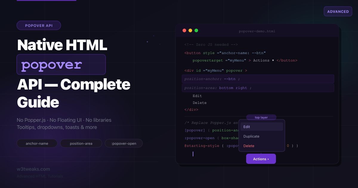
Every web app has tooltips. Dropdown menus. Context menus. Notification toasts. Each one is typically built with a combination of a positioning library (Popper.js, Floating UI), a component library (Headless UI, Radix), and dozens of lines of JavaScript for show/hide, keyboard handling, and outside-click detection.
The HTML Popover API, now baseline in all modern browsers, handles all of this with a single attribute. Pair it with CSS Anchor Positioning — which also just landed in all major browsers — and you can replace Popper.js entirely with pure HTML and CSS.
This tutorial covers the full Popover API surface: the declarative HTML wiring, both popover types, smooth animations, CSS anchor positioning for precise placement, JavaScript events, and five real-world patterns (tooltip, dropdown, toast stack, command palette, nested menus). If you’ve already read the HTML dialog tutorial, you’ll recognize some CSS patterns here — both <dialog> and popovers use top-layer rendering and the same @starting-style animation technique.
Live Demo
Five live examples: tooltip with anchor positioning, dropdown menu, toast stack, command palette, and auto vs manual comparison. All built with the native Popover API — zero libraries.
Before / After — Popper.js vs Native Popover
The tooltip is the most common UI pattern. Here’s what it used to take versus what it takes now.
Before — Tooltip with Popper.js
<!-- Markup: a button and a hidden tooltip div -->
<button id="trigger">Hover me</button>
<div id="tooltip" class="tooltip hidden" role="tooltip">
  This is a tooltip
</div>
import { createPopper } from '@popperjs/core'; // 11kb gzipped
const trigger = document.getElementById('trigger');
const tooltip = document.getElementById('tooltip');
let popperInstance;
function show() {
tooltip.classList.remove('hidden');
popperInstance = createPopper(trigger, tooltip, {
placement: 'top',
modifiers: [{ name: 'offset', options: { offset: [0, 8] } }]
});
}
function hide() {
tooltip.classList.add('hidden');
popperInstance?.destroy();
popperInstance = null;
}
trigger.addEventListener('mouseenter', show);
trigger.addEventListener('mouseleave', hide);
trigger.addEventListener('focus', show);
trigger.addEventListener('blur', hide);
// Also need: Escape key handler, ARIA attributes, z-index hacksProblems: external dependency (11kb+), manual event handling for every state, z-index wars, position: absolute breaking in overflow containers.
After — Tooltip with Native Popover + CSS Anchor Positioning
<!-- HTML-only wiring -->
<button popovertarget="myTooltip"
        popovertargetaction="toggle"
        style="anchor-name: --my-btn">
  Hover me
</button>

<div id="myTooltip" popover role="tooltip"
     style="position-anchor: --my-btn; position-area: top; margin: 8px;">
  This is a tooltip
</div>
/* Styling and animation — no JavaScript */
[popover] {
position-area: top;
margin-bottom: 8px;
background: #1f2937;
color: #fff;
padding: 6px 10px;
border-radius: 6px;
font-size: 13px;
border: none;
opacity: 1;
transition: opacity .15s, display .15s allow-discrete, overlay .15s allow-discrete;
}
[popover]:not(:popover-open) { opacity: 0; }
@starting-style {
[popover]:popover-open { opacity: 0; }
}Zero JavaScript. The browser handles positioning, top-layer rendering, light-dismiss (click outside), Escape key, and ARIA. You add three HTML attributes and some CSS.
Step 1 — Core Mechanics: The Three Attributes
The Popover API is built on three HTML attributes that wire a trigger to a target:
<!-- The target: any element with a popover attribute -->
<div id="myPopover" popover>
  I am the popover content.
</div>

<!-- The trigger: a button with popovertarget pointing to the target's id -->
<button popovertarget="myPopover">Open</button>
That’s it. This is a fully functional popover. No JavaScript. The browser:
- Shows the popover in the top layer (above everything, no z-index needed)
- Closes it when the user clicks outside (light-dismiss)
- Closes it when the user presses Escape
- Manages focus appropriately
If you’re not sure why the top layer eliminates z-index fights, the z-index and stacking contexts guide explains it.
The popovertargetaction attribute controls what the button does:
<!-- toggle (default): opens if closed, closes if open -->
<button popovertarget="p1" popovertargetaction="toggle">Toggle</button>

<!-- show: only opens, never closes -->
<button popovertarget="p1" popovertargetaction="show">Open</button>

<!-- hide: only closes, never opens -->
<button popovertarget="p1" popovertargetaction="hide">Close</button>
Checking the open state in CSS with :popover-open:
/* Styles applied when the popover is open */
[popover]:popover-open {
  background: #fff;
  box-shadow: 0 8px 32px rgba(0,0,0,0.15);
}

/* Style the trigger button when its popover is open */
button:has(+ [popover]:popover-open) {
  background: #eff6ff;
  color: #2563eb;
}
Step 2 — popover="auto" vs popover="manual"
The popover attribute accepts two values with very different behaviors:
<!-- auto (default when you write just "popover") -->
<div id="autoPopover" popover="auto">Auto popover</div>
<!-- Same as: -->
<div id="autoPopover" popover>Auto popover</div>

<!-- manual: you control open/close entirely -->
<div id="manualPopover" popover="manual">Manual popover</div>| Behavior | popover="auto" | popover="manual" |
|---|---|---|
| Light-dismiss (click outside) | Yes | No |
| Escape key closes | Yes | No |
| Opening one closes others | Yes | No |
| Multiple open at once | No | Yes |
| You control close | Optional | Required |
Use auto for: tooltips, dropdowns, context menus — anything where “click outside to close” is the expected behavior.
Use manual for: toast notifications (need to stack and auto-dismiss independently), tutorial walkthroughs (need multiple open simultaneously), loading indicators (should only close when loading is done).
Gotcha:
popovertargeton a button does not wire up to apopover="manual"element — clicks on the button do nothing. The browser only auto-togglesautopopovers. If you usemanual, you must call.showPopover()/.hidePopover()yourself from JavaScript (or from CSS state like:hoverfor the hover-tooltip pattern in Step 6).
<!-- Toast stack using manual — multiple can coexist -->
<div id="toast1" popover="manual" class="toast">File saved</div>
<div id="toast2" popover="manual" class="toast">Link copied</div>
<div id="toast3" popover="manual" class="toast">Upload complete</div>
// Show a toast and auto-dismiss after 3 seconds
function showToast(id) {
const toast = document.getElementById(id);
toast.showPopover();
setTimeout(() => toast.hidePopover(), 3000);
}
// All three can be visible simultaneously — 'manual' doesn't close others
showToast('toast1');
setTimeout(() => showToast('toast2'), 500);
setTimeout(() => showToast('toast3'), 1000);Step 3 — Styling Popovers & Smooth Animations
Browsers apply default styles to [popover] elements that you’ll want to override:
/* Browser defaults you need to reset */
[popover] {
  /* Browser sets: position: fixed, inset: 0, width: fit-content, height: fit-content */
  /* Browser sets: margin: auto (centers it without anchor positioning) */
  /* Browser sets: border: 2px solid black (ugly default) */

  /* Your reset: */
  border: none;
  padding: 0;
  margin: 0;
  border-radius: 10px;
  background: #fff;
  box-shadow: 0 8px 32px rgba(0, 0, 0, 0.12), 0 2px 8px rgba(0, 0, 0, 0.08);
  color: inherit;
}
Animating open and close uses the same @starting-style + allow-discrete technique as <dialog>. The challenge is the same: the exit animation needs to play as the element leaves the top layer:
[popover] {
  /* Fully visible, scaled to full size */
  opacity: 1;
  transform: scale(1) translateY(0);

  transition:
    opacity    .2s cubic-bezier(.16, 1, .3, 1),
    transform  .2s cubic-bezier(.16, 1, .3, 1),
    display    .2s allow-discrete,   /* required for exit animation */
    overlay    .2s allow-discrete;   /* required to delay top-layer removal */
}

/* EXIT state — where the animation ends when closing */
[popover]:not(:popover-open) {
  opacity: 0;
  transform: scale(.96) translateY(-4px);
}

/* ENTER state — where the animation starts when opening */
@starting-style {
  [popover]:popover-open {
    opacity: 0;
    transform: scale(.96) translateY(-4px);
  }
}
Direction-aware animations — animate from the right direction based on placement:
/* Popover appearing below the trigger: slide down from trigger */
[popover][data-placement="bottom"]:not(:popover-open) {
  transform: translateY(-6px);
}
@starting-style {
  [popover][data-placement="bottom"]:popover-open {
    transform: translateY(-6px);
  }
}

/* Popover appearing above the trigger: slide up from trigger */
[popover][data-placement="top"]:not(:popover-open) {
  transform: translateY(6px);
}
@starting-style {
  [popover][data-placement="top"]:popover-open {
    transform: translateY(6px);
  }
}
Step 4 — CSS Anchor Positioning: Replace Popper.js Entirely
This is the feature that makes the Popover API genuinely replace positioning libraries. CSS Anchor Positioning lets you attach a popover to a specific element so it follows it on the page — no JavaScript calculations needed.
The three properties
/* Step 1: Name the anchor element (the trigger button) */
#myButton {
  anchor-name: --my-button;  /* name with -- prefix (like CSS custom properties) */
}

/* Step 2: Reference the anchor on the popover */
#myPopover {
  position-anchor: --my-button;  /* popover is now anchored to --my-button */
}

/* Step 3: Choose where the popover appears relative to the anchor */
#myPopover {
  position-area: top;       /* above the anchor */
  /* or: bottom, left, right, top center, bottom span-all, etc. */
  margin-bottom: 8px;       /* gap between anchor and popover */
}
Or even shorter — set anchor name inline and skip the CSS class:
<button id="btn" style="anchor-name: --btn" popovertarget="pop">Open</button>
<div id="pop" popover style="position-anchor: --btn; position-area: bottom center;">
  I appear below the button
</div>
position-area values — the placement grid
Think of position-area as a 3×3 grid around the anchor. You describe where in the grid the popover should land:
/* Single values: the popover's center aligns with that edge */
position-area: top;           /* centered above */
position-area: bottom;        /* centered below */
position-area: left;          /* centered to the left */
position-area: right;         /* centered to the right */

/* Combined values: position in corner zones */
position-area: top left;      /* top-left corner */
position-area: bottom right;  /* bottom-right corner */

/* span-all: popover stretches the full width/height of the anchor row/col */
position-area: bottom span-all;  /* full-width below */

/* center: popover centered on the anchor itself */
position-area: center;        /* overlaps the anchor exactly */
Auto-flipping with position-try-fallbacks
The killer feature: when the popover would go off-screen, the browser automatically tries alternate positions:
#myPopover {
  position-anchor:       --my-button;
  position-area:         top;           /* preferred: above */
  margin-bottom:         8px;

  /* Fallback chain: try below, then left, then right */
  position-try-fallbacks: bottom, left, right;
}
/* More specific fallback using @position-try */
@position-try --fallback-bottom {
position-area: bottom;
margin-top: 8px;
margin-bottom: 0;
}
@position-try --fallback-left {
position-area: left;
margin-right: 8px;
margin-bottom: 0;
}
#myPopover {
position-anchor: --my-button;
position-area: top;
margin-bottom: 8px;
position-try-fallbacks: --fallback-bottom, --fallback-left;
}Inline anchoring (no CSS class needed)
For one-off anchored popovers, the style attribute handles it cleanly:
<button
  style="anchor-name: --profile-btn"
  popovertarget="profileMenu">
  Alex
</button>

<div id="profileMenu" popover
     style="position-anchor: --profile-btn; position-area: bottom right; margin-top: 6px;">
  <a href="/profile">View Profile</a>
  <a href="/settings">Settings</a>
  <a href="/logout">Log Out</a>
</div>
CSS Anchor Positioning requires Chrome 125+, Edge 125+, and Safari 18.2+ (released Dec 2024). Firefox support is in progress. Use the @supports fallback shown later for now.
Step 5 — JavaScript Control: Methods & Events
When you need more control than declarative HTML offers, the Popover API exposes a clean JavaScript interface.
The three methods
const popover = document.getElementById('myPopover');

popover.showPopover();    // open it
popover.hidePopover();    // close it
popover.togglePopover();  // open if closed, close if open

// togglePopover() accepts a force argument (like classList.toggle)
popover.togglePopover(true);   // always opens
popover.togglePopover(false);  // always closes
The toggle and beforetoggle events
const popover = document.getElementById('myPopover');

// 'beforetoggle' fires BEFORE the state changes
// Use this to: load async data, validate, or cancel the toggle
popover.addEventListener('beforetoggle', (e) => {
  console.log('Old state:', e.oldState);  // 'closed' or 'open'
  console.log('New state:', e.newState);  // 'open'  or 'closed'

  // Prevent the popover from opening — e.g. user isn't logged in
  if (e.newState === 'open' && !isLoggedIn()) {
    e.preventDefault();
    redirectToLogin();
  }
});

// 'toggle' fires AFTER the state has changed
popover.addEventListener('toggle', (e) => {
  if (e.newState === 'open') {
    loadMenuItems();           // fetch data now that it's visible
    trackAnalytics('menu_opened');
  } else {
    cleanupMenuState();
  }
});
Lazy loading content when a popover opens
const popover = document.getElementById('userCard');

popover.addEventListener('beforetoggle', async (e) => {
  if (e.newState !== 'open') return;

  // Show skeleton while loading
  popover.innerHTML = '<div class="skeleton">Loading...</div>';

  const userId = popover.dataset.userId;
  const data   = await fetchUser(userId);

  popover.innerHTML = `
    <div class="user-card">
      <img src="${data.avatar}" alt="${data.name}">
      <h3>${data.name}</h3>
      <p>${data.bio}</p>
    </div>
  `;
});
Programmatically syncing trigger button state
The browser doesn’t automatically set aria-expanded — you need to do that yourself:
const trigger = document.getElementById('menuBtn');
const popover  = document.getElementById('menu');

popover.addEventListener('toggle', (e) => {
  trigger.setAttribute('aria-expanded', e.newState === 'open');
});
Step 6 — Five Real-World Patterns
Pattern 1: Hover Tooltip with CSS-only
For hover-triggered tooltips, use :hover and :focus-visible on the trigger — no JavaScript at all:
<span class="tooltip-wrap">
  <button class="tooltip-trigger" aria-describedby="helpTip">
    What's this?
  </button>
  <div id="helpTip" popover="manual" role="tooltip" class="tooltip">
    This feature requires a Pro subscription.
  </div>
</span>
.tooltip-wrap { position: relative; display: inline-block; }
.tooltip-trigger { anchor-name: --tip-trigger; }
.tooltip {
position-anchor: --tip-trigger;
position-area: top;
margin-bottom: 8px;
background: #1f2937;
color: #f9fafb;
font-size: 12px;
padding: 6px 10px;
border-radius: 6px;
max-width: 200px;
line-height: 1.4;
border: none;
white-space: normal;
opacity: 0;
transition: opacity .15s, display .15s allow-discrete, overlay .15s allow-discrete;
}
/* Open on hover and keyboard focus — no JS */
.tooltip-wrap:hover .tooltip,
.tooltip-trigger:focus-visible + .tooltip {
opacity: 1;
}popover="manual" is used here because hover doesn’t use popovertarget — the CSS handles showing/hiding directly. Since it’s manual, no light-dismiss or Escape handling applies, which is correct for a hover tooltip.
Pattern 2: Dropdown Action Menu
<button id="actionBtn"
        style="anchor-name: --action-btn"
        popovertarget="actionMenu"
        aria-haspopup="menu"
        aria-expanded="false">
  Actions
</button>

<div id="actionMenu" popover role="menu"
     style="position-anchor: --action-btn; position-area: bottom right; margin-top: 6px;"
     class="dropdown-menu">
  <button role="menuitem">Edit</button>
  <button role="menuitem">Duplicate</button>
  <button role="menuitem">Export</button>
  <hr>
  <button role="menuitem" class="danger">Delete</button>
</div>
.dropdown-menu {
min-width: 160px;
padding: 6px;
border: 0.5px solid #e5e7eb;
border-radius: 10px;
background: #fff;
box-shadow: 0 8px 24px rgba(0,0,0,0.1), 0 2px 6px rgba(0,0,0,0.06);
/* Animate */
opacity: 1;
transform: scale(1) translateY(0);
transition:
opacity .18s ease,
transform .18s ease,
display .18s allow-discrete,
overlay .18s allow-discrete;
}
.dropdown-menu:not(:popover-open) {
opacity: 0;
transform: scale(.97) translateY(-4px);
}
@starting-style {
.dropdown-menu:popover-open {
opacity: 0;
transform: scale(.97) translateY(-4px);
}
}
.dropdown-menu button {
display: flex;
align-items: center;
gap: 8px;
width: 100%;
padding: 8px 10px;
border: none;
border-radius: 6px;
background: none;
font-size: 13px;
text-align: left;
cursor: pointer;
color: #374151;
}
.dropdown-menu button:hover { background: #f3f4f6; }
.dropdown-menu button.danger { color: #dc2626; }
.dropdown-menu button.danger:hover { background: #fef2f2; }
.dropdown-menu hr { border: none; border-top: 1px solid #f0f0f0; margin: 4px 0; }// Sync aria-expanded
const btn = document.getElementById('actionBtn');
const menu = document.getElementById('actionMenu');
menu.addEventListener('toggle', (e) => {
btn.setAttribute('aria-expanded', e.newState === 'open');
});
// Close menu after an action is clicked
menu.querySelectorAll('[role="menuitem"]').forEach(item => {
item.addEventListener('click', () => menu.hidePopover());
});Pattern 3: Toast Notification Stack
<!-- Toast container — positioned fixed, stacks from bottom-right -->
<div id="toastContainer" class="toast-container" aria-live="polite"></div>

<button onclick="addToast('File saved successfully', 'success')">Save file</button>
<button onclick="addToast('Link copied to clipboard', 'info')">Copy link</button>
<button onclick="addToast('Failed to upload — try again', 'error')">Upload</button>
.toast-container {
position: fixed;
bottom: 20px;
right: 20px;
z-index: 1; /* toasts are popover="manual" so they're in the top layer anyway */
display: flex;
flex-direction: column-reverse;
gap: 8px;
pointer-events: none;
}
.toast {
/* Override default popover positioning */
position: static !important;
margin: 0 !important;
inset: auto !important;
background: #fff;
border: 0.5px solid #e5e7eb;
border-radius: 10px;
padding: 12px 16px;
font-size: 14px;
box-shadow: 0 4px 16px rgba(0,0,0,0.1);
min-width: 240px;
max-width: 360px;
pointer-events: all;
opacity: 1;
transform: translateX(0);
transition: opacity .3s ease, transform .3s ease,
display .3s allow-discrete, overlay .3s allow-discrete;
}
.toast:not(:popover-open) {
opacity: 0;
transform: translateX(20px);
}
@starting-style {
.toast:popover-open {
opacity: 0;
transform: translateX(20px);
}
}
.toast.success { border-left: 3px solid #16a34a; }
.toast.error { border-left: 3px solid #dc2626; }
.toast.info { border-left: 3px solid #2563eb; }let toastCount = 0;
function addToast(message, type = 'info', duration = 3500) {
const toast = document.createElement('div');
toast.id = `toast-${++toastCount}`;
toast.setAttribute('popover', 'manual'); // manual so toasts stack
toast.className = `toast ${type}`;
toast.innerHTML = `
<span>${message}</span>
<button onclick="this.closest('[popover]').hidePopover()"
style="margin-left:12px;background:none;border:none;cursor:pointer;color:#9ca3af;font-size:16px;">x</button>
`;
document.getElementById('toastContainer').appendChild(toast);
toast.showPopover();
// Auto-dismiss
setTimeout(() => {
if (toast.matches(':popover-open')) {
toast.hidePopover();
}
}, duration);
// Remove from DOM after animation
toast.addEventListener('toggle', (e) => {
if (e.newState === 'closed') {
setTimeout(() => toast.remove(), 300);
}
});
}Pattern 4: Command Palette (⌘K)
<div id="commandPalette" popover class="command-palette" role="dialog" aria-label="Command palette">
  <div class="cmd-search">
    <input type="search" id="cmdInput" placeholder="Search commands…" autocomplete="off">
  </div>
  <div class="cmd-results" id="cmdResults" role="listbox"></div>
</div>
.command-palette {
width: min(600px, 90vw);
max-height: 400px;
border-radius: 12px;
padding: 0;
overflow: hidden;
border: 0.5px solid #e5e7eb;
box-shadow: 0 20px 60px rgba(0,0,0,0.15), 0 4px 16px rgba(0,0,0,0.08);
/* Center it — no anchor needed for command palettes */
inset: 20vh auto auto 50%;
transform: translateX(-50%);
opacity: 1;
transition:
opacity .2s ease,
transform .2s ease,
display .2s allow-discrete,
overlay .2s allow-discrete;
}
.command-palette:not(:popover-open) {
opacity: 0;
transform: translateX(-50%) scale(.96) translateY(-8px);
}
@starting-style {
.command-palette:popover-open {
opacity: 0;
transform: translateX(-50%) scale(.96) translateY(-8px);
}
}
.cmd-search input {
width: 100%;
padding: 16px 20px;
border: none;
border-bottom: 1px solid #f0f0f0;
font-size: 16px;
outline: none;
background: transparent;
}
.cmd-results { max-height: 340px; overflow-y: auto; padding: 6px; }
.cmd-item {
display: flex;
align-items: center;
gap: 10px;
padding: 10px 12px;
border-radius: 6px;
cursor: pointer;
font-size: 14px;
color: #374151;
}
.cmd-item:hover, .cmd-item.focused { background: #f3f4f6; }
.cmd-item-shortcut { margin-left: auto; font-size: 12px; color: #9ca3af; }const palette = document.getElementById('commandPalette');
const input = document.getElementById('cmdInput');
const results = document.getElementById('cmdResults');
const COMMANDS = [
{ label: 'New document', shortcut: 'Cmd+N', action: () => newDoc() },
{ label: 'Find in page', shortcut: 'Cmd+F', action: () => startFind() },
{ label: 'Open settings', shortcut: 'Cmd+,', action: () => openSettings() },
{ label: 'Toggle dark mode', shortcut: '', action: () => toggleDark() },
{ label: 'Export as PDF', shortcut: '', action: () => exportPDF() },
{ label: 'Copy share link', shortcut: '', action: () => copyLink() },
];
// Open with Cmd+K / Ctrl+K
document.addEventListener('keydown', (e) => {
if ((e.metaKey || e.ctrlKey) && e.key === 'k') {
e.preventDefault();
palette.showPopover();
input.focus();
renderCommands('');
}
});
// Filter commands
input.addEventListener('input', () => renderCommands(input.value));
function renderCommands(query) {
const q = query.toLowerCase();
const filtered = COMMANDS.filter(c => c.label.toLowerCase().includes(q));
results.innerHTML = filtered.map((c, i) => `
<div class="cmd-item" data-index="${i}" onclick="runCommand(${i})">
<span>${c.label}</span>
${c.shortcut ? `<kbd class="cmd-item-shortcut">${c.shortcut}</kbd>` : ''}
</div>
`).join('');
}
function runCommand(index) {
palette.hidePopover();
COMMANDS.filter(c => c.label.toLowerCase().includes(input.value.toLowerCase()))[index]?.action();
}
// Clear input on close
palette.addEventListener('toggle', (e) => {
if (e.newState === 'closed') input.value = '';
});Pattern 5: Nested Popovers (Submenu)
Nested auto popovers work correctly — the parent stays open when a child opens. This is built-in behavior with no extra JavaScript:
<!-- Parent menu -->
<button popovertarget="mainMenu"
        style="anchor-name: --main-btn"
        aria-haspopup="menu">File</button>

<div id="mainMenu" popover role="menu"
     style="position-anchor: --main-btn; position-area: bottom left; margin-top: 4px;"
     class="menu">
  <button role="menuitem">New</button>
  <button role="menuitem">Open</button>

  <!-- Nested submenu trigger — inline anchor for the submenu -->
  <button role="menuitem"
          style="anchor-name: --export-btn"
          popovertarget="exportMenu"
          popovertargetaction="toggle">
    Export
  </button>
</div>

<!-- Submenu — anchored to the "Export" item -->
<div id="exportMenu" popover role="menu"
     style="position-anchor: --export-btn; position-area: right span-all; margin-left: 4px;"
     class="menu submenu">
  <button role="menuitem">Export as PDF</button>
  <button role="menuitem">Export as CSV</button>
  <button role="menuitem">Export as PNG</button>
</div>
.menu {
min-width: 160px;
padding: 6px;
background: #fff;
border: 0.5px solid #e5e7eb;
border-radius: 10px;
box-shadow: 0 8px 24px rgba(0,0,0,0.1);
}
.menu, .submenu {
opacity: 1; transform: scale(1);
transition: opacity .15s, transform .15s,
display .15s allow-discrete, overlay .15s allow-discrete;
}
.menu:not(:popover-open) { opacity: 0; transform: scale(.97); }
@starting-style { .menu:popover-open { opacity: 0; transform: scale(.97); } }Step 7 — Accessibility Checklist
| Browser handles automatically | You still need to add |
|---|---|
| Top-layer rendering | aria-expanded on the trigger button |
Light-dismiss (click outside) for auto | aria-haspopup (menu, listbox, dialog, etc.) |
Escape key closes auto popovers | aria-controls pointing to the popover id |
| Focus stays interactive on page (non-modal) | role on the popover (menu, tooltip, dialog) |
:popover-open CSS state | aria-describedby for tooltips |
<!-- Correctly attributed dropdown menu -->
<button
  id="menuTrigger"
  popovertarget="myMenu"
  aria-haspopup="menu"
  aria-controls="myMenu"
  aria-expanded="false">
  Options
</button>

<div id="myMenu" popover role="menu" aria-labelledby="menuTrigger">
  <button role="menuitem">Edit</button>
  <button role="menuitem">Delete</button>
</div>

<!-- Correctly attributed tooltip -->
<button
  id="helpBtn"
  aria-describedby="helpTip"
  popovertarget="helpTip">
  Help
</button>

<div id="helpTip" popover role="tooltip">
  This field accepts comma-separated values.
</div>
// Always sync aria-expanded with the toggle event
const trigger = document.getElementById('menuTrigger');
const menu = document.getElementById('myMenu');
menu.addEventListener('toggle', (e) => {
trigger.setAttribute('aria-expanded', e.newState === 'open');
});Keyboard navigation inside a role="menu" popover — the browser does not handle arrow key navigation automatically. Add it yourself:
menu.addEventListener('keydown', (e) => {
  const items = [...menu.querySelectorAll('[role="menuitem"]')];
  const current = document.activeElement;
  const idx = items.indexOf(current);

  if (e.key === 'ArrowDown') {
    e.preventDefault();
    items[(idx + 1) % items.length].focus();
  } else if (e.key === 'ArrowUp') {
    e.preventDefault();
    items[(idx - 1 + items.length) % items.length].focus();
  } else if (e.key === 'Home') {
    e.preventDefault();
    items[0].focus();
  } else if (e.key === 'End') {
    e.preventDefault();
    items[items.length - 1].focus();
  }
});
Step 8 — Popover vs dialog vs details — Decision Table
| Question | popover | <dialog> | <details> |
|---|---|---|---|
| Should the rest of the page be blocked? | No | Yes | No |
| Is it anchored to a trigger element? | Usually yes | No | Always (inline) |
| Does it need a backdrop overlay? | No | Yes | No |
| Is it always in the document flow? | No (top layer) | No (top layer) | Yes (inline) |
| Can multiple be open simultaneously? | Yes (manual) | Yes (stacked) | Yes |
| Escape to close? | Yes (auto) | Yes | No |
| Click outside to close? | Yes (auto) | No (add manually) | No |
| Zero JavaScript possible? | Yes | Yes | Yes |
Simple rule: if it blocks the page, use <dialog>. If it’s always in-flow, use <details>. If it floats over the page anchored to a trigger, use popover. For the modal variant, the HTML dialog complete guide covers .showModal() and ::backdrop in depth. For the in-flow variant — accordions, FAQs, tree views — the HTML details & summary guide covers exclusive accordions, animations, and the FAQ rich-results trick.
Step 9 — Browser Support & Polyfill Strategy
Popover API:
- Chrome / Edge: 114+ (released May 2023)
- Firefox: 125+ (released April 2024)
- Safari: 17+ (released September 2023)
CSS Anchor Positioning:
- Chrome / Edge: 125+ (released May 2024)
- Safari: 18.2+ (released December 2024)
- Firefox: not yet shipped (in progress)
For up-to-date browser data, see caniuse.com/popover and caniuse.com/css-anchor-positioning.
Feature detection:
// Check Popover API support
const supportsPopover = HTMLElement.prototype.hasOwnProperty('popover');

if (!supportsPopover) {
  // Load polyfill dynamically
  import('https://unpkg.com/@oddbird/popover-polyfill')
    .then(() => console.log('Popover polyfill loaded'));
}

// Check CSS Anchor Positioning support
const supportsAnchor = CSS.supports('anchor-name: --x');

if (!supportsAnchor) {
  // Apply fallback class for manual JS positioning
  document.body.classList.add('no-anchor-positioning');
}
CSS @supports fallback for anchor positioning:
/* Default: use CSS anchor positioning */
[popover] {
  position-anchor: --my-trigger;
  position-area: bottom;
  margin-top: 8px;
}

/* Fallback: center the popover for browsers without anchor positioning */
@supports not (anchor-name: --x) {
  [popover] {
    position: fixed;
    inset: auto;
    top: 50%;
    left: 50%;
    transform: translate(-50%, -50%);
  }
}
WICG Polyfill — the official polyfill covers the Popover API (not CSS anchor positioning) and supports all major browsers back to Chrome 57, Firefox 98, and Safari 13:
<!-- Load polyfill only when needed -->
<script type="module">
  if (!HTMLElement.prototype.hasOwnProperty('popover')) {
    await import('https://unpkg.com/@oddbird/popover-polyfill/dist/popover.js');
  }
</script>
Key Takeaways
- Add
popoverto any element andpopovertargeton a button — that’s the minimum setup for a fully functional, accessible popover popover="auto"light-dismisses on outside click, closes on Escape, and closes otherautopopovers;popover="manual"does none of these — you control everything- Top-layer rendering means zero
z-indexconfiguration — the popover always renders above everything else - CSS Anchor Positioning (
anchor-name+position-anchor+position-area) replaces Popper.js and Floating UI entirely for positioning position-try-fallbacksauto-flips the popover to alternate positions when it would overflow the viewport@starting-style+allow-discreteenables smooth CSS-only open and close animations — the same technique used for<dialog>- The
beforetoggleevent fires before state changes; calle.preventDefault()to cancel the open/close - The
toggleevent fires after state changes — use it to syncaria-expandedand load async data - Arrow key navigation inside
role="menu"popovers is NOT handled automatically — add akeydownlistener yourself - The WICG polyfill covers the Popover API in older browsers; use
@supports not (anchor-name: --x)for CSS anchor positioning fallback
FAQ
What is the difference between popover=“auto” and popover=“manual”?
auto popovers close when the user clicks outside (light-dismiss), when Escape is pressed, or when another auto popover opens. Only one auto popover can be open at a time. manual popovers stay open until you explicitly call hidePopover() or the user clicks a button wired with popovertargetaction="hide". Multiple manual popovers can be open simultaneously. Use auto for menus and tooltips; use manual for toast stacks and multi-step walkthroughs.
Does the Popover API replace the dialog element?
No — they serve different purposes. Popovers are non-modal: the rest of the page remains interactive. They’re ideal for menus, tooltips, and toasts. The <dialog> element is modal when opened with .showModal(): it blocks page interaction, adds a backdrop, and traps keyboard focus. Use popovers when you don’t want to block the user; use <dialog> when you do.
Can I use the Popover API without JavaScript?
Yes, entirely. A button with popovertarget wired to an element’s id is all you need — the browser handles open, close, light-dismiss, and Escape with zero JavaScript. CSS handles styling and animations via :popover-open and @starting-style. The only things that require JavaScript are: async data loading, syncing aria-expanded, and arrow key navigation inside menus.
What is CSS Anchor Positioning and do I need it?
CSS Anchor Positioning is a new CSS spec that lets you position one element relative to another, even when they’re not parent-child in the DOM. Combined with the Popover API, it replaces positioning libraries like Popper.js and Floating UI. You don’t strictly need it — without it, auto popovers center themselves in the viewport by default. But for most real-world use cases (dropdowns, tooltips that appear next to their trigger), CSS Anchor Positioning is essential.
Why does my popover appear in the center of the page?
If you haven’t set position-anchor and position-area on the popover, the browser default centers it using position: fixed; inset: 0; margin: auto. Add anchor-name to the trigger and position-anchor + position-area to the popover to anchor it to the trigger element. See Step 4 for the full walkthrough.
Can I have nested popovers (a submenu inside a menu)?
Yes. When you open a child auto popover from inside a parent auto popover, the parent stays open. The browser treats nested popovers in the same “hiding tree” and only closes ancestors when you click outside all of them. Submenus work exactly this way — the Export example in Pattern 5 demonstrates this.