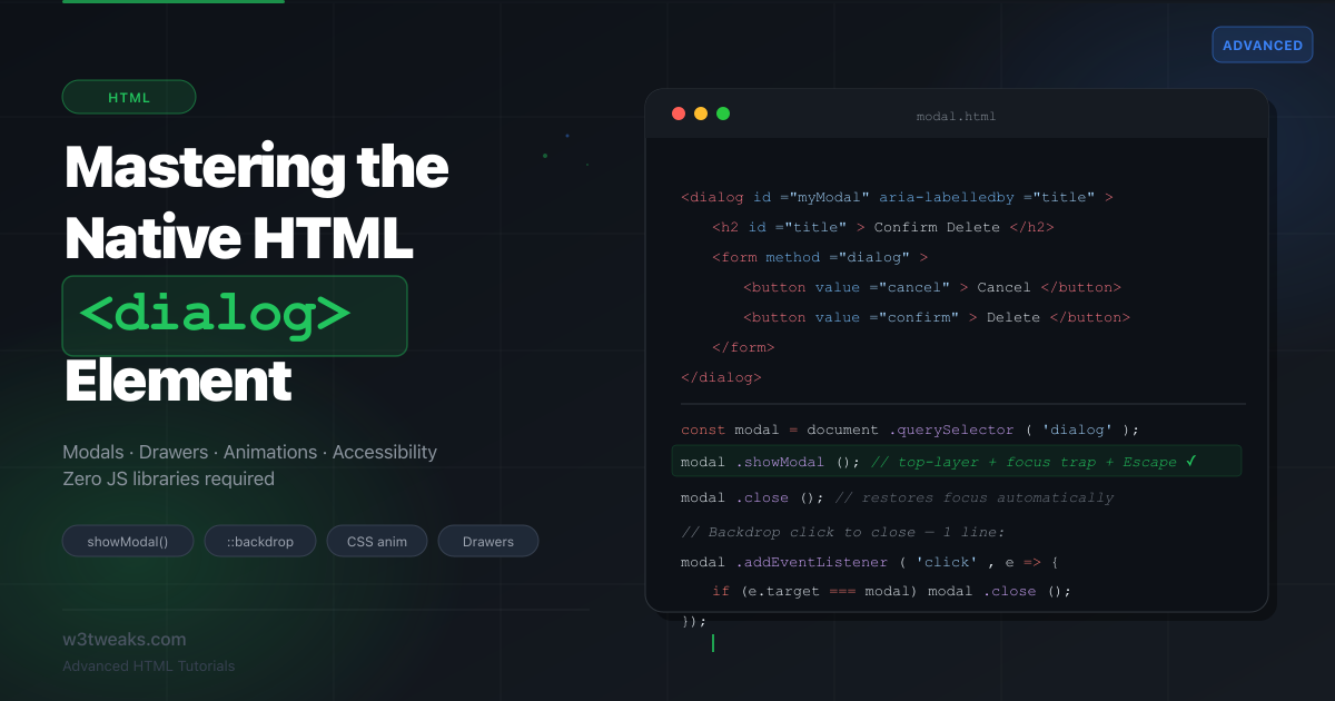
Every web app has modals. Most are built with <div class="modal">, a backdrop overlay <div>, manual aria-* attributes, custom keyboard traps, and hundreds of lines of JavaScript. The browser has had a native solution since 2022 — the <dialog> element — and almost nobody uses it correctly.
The <dialog> element renders in the top layer, which means it sits above everything else on the page — including fixed headers, sticky elements, and z-index stacking contexts — without any CSS z-index tricks. It automatically traps keyboard focus inside the dialog. It exposes a native ::backdrop pseudo-element for the overlay. And it fires a cancel event when the user presses Escape, so you don’t have to listen for keycodes manually.
This tutorial covers the full <dialog> surface: basic modals, styled backdrops, smooth entry/exit animations, drawer variants, form integration, and real-world accessibility patterns.
Live Demo
Four live examples: basic modal, animated modal, side drawer, and form dialog. All built with the native dialog element — zero external libraries.
Before / After — The Old Way vs The Dialog Way
The most common modal pattern before native <dialog> required a lot of manual work.
Before — The DIV modal hack
<!-- Old approach: manual everything -->
<div class="modal-backdrop hidden" id="backdrop"></div>
<div class="modal hidden" id="myModal" role="dialog" aria-modal="true" aria-labelledby="modalTitle">
  <div class="modal-content">
    <h2 id="modalTitle">Confirm Delete</h2>
    <p>This action cannot be undone.</p>
    <button id="cancelBtn">Cancel</button>
    <button id="confirmBtn">Delete</button>
  </div>
</div>
// Old approach: manual focus trap, Escape key, scroll lock, aria toggling
const modal = document.getElementById('myModal');
const backdrop = document.getElementById('backdrop');
const focusable = modal.querySelectorAll('button, input, a');
let lastFocused;
function openModal() {
lastFocused = document.activeElement;
modal.classList.remove('hidden');
backdrop.classList.remove('hidden');
document.body.style.overflow = 'hidden';
focusable[0].focus();
}
function closeModal() {
modal.classList.add('hidden');
backdrop.classList.add('hidden');
document.body.style.overflow = '';
lastFocused?.focus();
}
document.addEventListener('keydown', (e) => {
if (e.key === 'Escape') closeModal();
});
modal.addEventListener('keydown', (e) => {
if (e.key !== 'Tab') return;
const first = focusable[0];
const last = focusable[focusable.length - 1];
if (e.shiftKey && document.activeElement === first) {
e.preventDefault(); last.focus();
} else if (!e.shiftKey && document.activeElement === last) {
e.preventDefault(); first.focus();
}
});Problems: no top-layer rendering (z-index wars), manual focus trap, manual Escape listener, manual scroll lock, manual ARIA attributes, manual backdrop element. Every project reimplements this differently.
After — The Native Dialog
<!-- New approach: the browser handles everything -->
<dialog id="myModal" aria-labelledby="modalTitle">
  <h2 id="modalTitle">Confirm Delete</h2>
  <p>This action cannot be undone.</p>
  <button autofocus onclick="document.getElementById('myModal').close()">Cancel</button>
  <button onclick="handleDelete()">Delete</button>
</dialog>

<button onclick="document.getElementById('myModal').showModal()">Open</button>
// New approach: just open and close
const modal = document.getElementById('myModal');
// Open
modal.showModal(); // top-layer, focus trap, Escape key — all automatic
// Close
modal.close(); // restores focus to the trigger element automatically
// Close on backdrop click (only extra step you need)
modal.addEventListener('click', (e) => {
if (e.target === modal) modal.close();
});What the browser handles for free: top-layer rendering (no z-index needed), focus trap inside the dialog, Escape key closes it (cancel event), focus returns to the trigger on close, ::backdrop pseudo-element for the overlay, and aria-modal semantics. If you’ve ever fought a stubborn modal z-index, the z-index and stacking contexts guide explains why the top layer sidesteps that entire problem.
Step 1 — The Two Open Methods
<dialog> has two ways to open:
const dialog = document.querySelector('dialog');

// .show() — non-modal. Dialog opens, but the rest of the page is still interactive.
// No backdrop. User can click and interact outside.
dialog.show();

// .showModal() — modal. Traps focus, adds ::backdrop, blocks interaction outside.
// Escape key fires the 'cancel' event and closes it.
dialog.showModal();
In practice, you’ll use .showModal() for 95% of cases. Use .show() only for non-blocking notification panels where you still want the user to interact with the page.
Checking if the dialog is open:
if (dialog.open) {
  // dialog is currently visible (works for both .show() and .showModal())
}
Step 2 — Styling the Native Backdrop
The ::backdrop pseudo-element is the overlay behind the dialog when opened with .showModal(). It lives in the top layer, so no z-index needed:
/* Basic dark backdrop */
dialog::backdrop {
  background: rgba(0, 0, 0, 0.5);
}

/* Frosted glass backdrop */
dialog::backdrop {
  background: rgba(0, 0, 0, 0.35);
  backdrop-filter: blur(4px);
  -webkit-backdrop-filter: blur(4px);
}

/* Gradient backdrop */
dialog::backdrop {
  background: linear-gradient(
    135deg,
    rgba(99, 102, 241, 0.3),
    rgba(0, 0, 0, 0.6)
  );
}
Minimal dialog reset — browsers apply default styles you’ll want to override:
dialog {
  border: none;
  border-radius: 12px;
  padding: 0;                      /* control padding inside yourself */
  max-width: min(480px, 90vw);     /* responsive width */
  width: 100%;
  box-shadow: 0 20px 60px rgba(0, 0, 0, 0.2);
  color: inherit;
}

dialog[open] {
  display: flex;
  flex-direction: column;
}
The default display of an open <dialog> is block. Override it to flex or grid after you reset padding to zero.
Step 3 — Smooth Entry & Exit Animations
This is the trickiest part of <dialog>. The exit animation is the hard problem — the dialog is removed from the top layer as soon as .close() is called, before any CSS transition can play.
Modern approach: @starting-style + allow-discrete
Chrome 117+ and Safari 17.4+ support the new @starting-style rule and transition-behavior: allow-discrete, which makes dialog animations clean with pure CSS:
dialog {
  opacity: 1;
  transform: scale(1) translateY(0);
  transition:
    opacity 0.25s ease,
    transform 0.25s ease,
    display 0.25s allow-discrete,    /* required for enter/exit */
    overlay 0.25s allow-discrete;    /* required for top-layer exit */
}

/* Define the START state (entering animation) */
@starting-style {
  dialog[open] {
    opacity: 0;
    transform: scale(0.95) translateY(-8px);
  }
}

/* Define the EXIT state (closed = hidden) */
dialog:not([open]) {
  opacity: 0;
  transform: scale(0.95) translateY(-8px);
}

/* Backdrop animation */
dialog::backdrop {
  background: rgba(0, 0, 0, 0);
  transition:
    background 0.25s ease,
    display 0.25s allow-discrete,
    overlay 0.25s allow-discrete;
}

dialog[open]::backdrop {
  background: rgba(0, 0, 0, 0.5);
}

@starting-style {
  dialog[open]::backdrop {
    background: rgba(0, 0, 0, 0);
  }
}
Fallback: JavaScript class-toggle for older browsers
For broader browser support, use a CSS class + a small close wrapper:
dialog {
  opacity: 0;
  transform: scale(0.95) translateY(-8px);
  transition: opacity 0.25s ease, transform 0.25s ease;
}

dialog.is-open {
  opacity: 1;
  transform: scale(1) translateY(0);
}
function openDialog(dialog) {
dialog.showModal();
// Force reflow so transition plays from the initial state
dialog.offsetHeight;
dialog.classList.add('is-open');
}
function closeDialog(dialog) {
dialog.classList.remove('is-open');
// Wait for CSS transition to finish, THEN close
dialog.addEventListener('transitionend', () => dialog.close(), { once: true });
}Step 4 — Build a Side Drawer
The <dialog> element isn’t just for centered modals. With a few CSS overrides, it becomes a perfectly functional side drawer — with the same accessibility and focus trapping built in:
<dialog id="sideDrawer" class="drawer">
  <div class="drawer-header">
    <h2>Settings</h2>
    <button class="close-btn" aria-label="Close drawer">✕</button>
  </div>
  <nav class="drawer-nav">
    <a href="#">Profile</a>
    <a href="#">Notifications</a>
    <a href="#">Billing</a>
    <a href="#">Help</a>
  </nav>
</dialog>
/* Override default dialog centering to create a side drawer */
dialog.drawer {
position: fixed;
inset: 0 auto 0 0; /* stick to left edge */
margin: 0;
height: 100dvh; /* use dynamic viewport height for mobile */
max-height: 100dvh;
width: min(320px, 85vw);
max-width: none;
border-radius: 0;
border-right: 1px solid #e5e7eb;
transform: translateX(-100%);
transition: transform 0.3s cubic-bezier(0.4, 0, 0.2, 1);
}
dialog.drawer[open] {
transform: translateX(0);
}
@starting-style {
dialog.drawer[open] {
transform: translateX(-100%);
}
}
dialog.drawer::backdrop {
background: rgba(0, 0, 0, 0);
transition: background 0.3s ease, display 0.3s allow-discrete, overlay 0.3s allow-discrete;
}
dialog.drawer[open]::backdrop {
background: rgba(0, 0, 0, 0.4);
}
@starting-style {
dialog.drawer[open]::backdrop {
background: rgba(0, 0, 0, 0);
}
}
/* Right-side drawer — just change the inset */
dialog.drawer-right {
inset: 0 0 0 auto;
transform: translateX(100%);
}const drawer = document.getElementById('sideDrawer');
const closeBtn = drawer.querySelector('.close-btn');
document.getElementById('openDrawer').addEventListener('click', () => drawer.showModal());
closeBtn.addEventListener('click', () => drawer.close());
// Close on backdrop click
drawer.addEventListener('click', (e) => {
if (e.target === drawer) drawer.close();
});Step 5 — Closing Behaviors & the cancel Event
Closing on backdrop click
The dialog does NOT close when the user clicks the backdrop by default. Adding this behavior is one line:
dialog.addEventListener('click', (e) => {
  // e.target === dialog when clicking the backdrop
  // (the dialog element itself, not its children)
  if (e.target === dialog) dialog.close();
});
Handling the cancel event (Escape key)
When the user presses Escape, <dialog> fires a cancel event before closing. This is your hook for “are you sure you want to close?” prompts, or saving draft state:
dialog.addEventListener('cancel', (e) => {
  // Escape was pressed. e.preventDefault() stops the dialog from closing.
  const hasUnsavedChanges = checkForChanges();

  if (hasUnsavedChanges) {
    e.preventDefault();
    showUnsavedChangesWarning();
  }
  // If no changes, let it close naturally — don't call e.preventDefault()
});
Passing a return value on close
The .close() method accepts an optional return value string, accessible via dialog.returnValue:
// Pass a value when closing
confirmBtn.addEventListener('click', () => dialog.close('confirmed'));
cancelBtn.addEventListener('click',  () => dialog.close('cancelled'));

// Read the return value after the dialog closes
dialog.addEventListener('close', () => {
  if (dialog.returnValue === 'confirmed') {
    performDelete();
  }
});
This pairs especially well with <form method="dialog"> (next section).
Step 6 — Native Form Integration with method="dialog"
<form method="dialog"> is the cleanest way to handle dialog confirmation flows. When a form inside a dialog uses method="dialog", submitting it closes the dialog and sets dialog.returnValue to the value of the submit button that was clicked:
<dialog id="confirmDialog">
  <h2>Delete Project?</h2>
  <p>This will permanently delete all files and data.</p>

  <!-- method="dialog" prevents normal form submission -->
  <!-- It closes the dialog and sets returnValue to the clicked button's value -->
  <form method="dialog">
    <button type="submit" value="cancel">Cancel</button>
    <button type="submit" value="confirm" class="danger">Yes, Delete</button>
  </form>
</dialog>
const dialog = document.getElementById('confirmDialog');
document.getElementById('deleteBtn').addEventListener('click', () => {
dialog.showModal();
});
dialog.addEventListener('close', () => {
if (dialog.returnValue === 'confirm') {
console.log('User confirmed — running delete...');
} else {
console.log('User cancelled');
}
});No JavaScript needed to close the dialog — the form submit does it natively. For more complex form flows (validation, multi-step), the multi-step HTML forms guide walks through the patterns that pair well with <dialog>.
Bonus: pre-fill form fields before showing the dialog
function openEditDialog(user) {
  document.getElementById('nameInput').value  = user.name;
  document.getElementById('emailInput').value = user.email;
  dialog.showModal();
}
Complete Working Example
A production-ready modal covering animation, backdrop click, cancel event, form integration, focus management, and return value:
<!DOCTYPE html>
<html lang="en">
<head>
  <meta charset="UTF-8">
  <title>Native Dialog Modal</title>
  <style>
    dialog {
      border: none;
      border-radius: 16px;
      padding: 0;
      max-width: min(480px, 90vw);
      width: 100%;
      box-shadow: 0 25px 80px rgba(0, 0, 0, 0.25);
      color: #111;
      background: #fff;

      opacity: 1;
      transform: scale(1) translateY(0);
      transition:
        opacity    0.25s ease,
        transform  0.25s ease,
        display    0.25s allow-discrete,
        overlay    0.25s allow-discrete;
    }

    dialog:not([open]) {
      opacity: 0;
      transform: scale(0.95) translateY(-10px);
    }

    @starting-style {
      dialog[open] {
        opacity: 0;
        transform: scale(0.95) translateY(-10px);
      }
    }

    dialog::backdrop {
      background: rgba(0, 0, 0, 0);
      backdrop-filter: blur(0px);
      transition:
        background        0.25s ease,
        backdrop-filter   0.25s ease,
        display           0.25s allow-discrete,
        overlay           0.25s allow-discrete;
    }

    dialog[open]::backdrop {
      background: rgba(0, 0, 0, 0.5);
      backdrop-filter: blur(3px);
    }

    @starting-style {
      dialog[open]::backdrop {
        background: rgba(0, 0, 0, 0);
        backdrop-filter: blur(0px);
      }
    }

    .dialog-header {
      display: flex;
      align-items: center;
      justify-content: space-between;
      padding: 20px 24px 16px;
      border-bottom: 1px solid #f0f0f0;
    }

    .dialog-header h2 { margin: 0; font-size: 18px; font-weight: 600; }
    .dialog-body     { padding: 20px 24px; font-size: 15px; line-height: 1.6; color: #444; }

    .dialog-footer {
      display: flex;
      gap: 10px;
      justify-content: flex-end;
      padding: 16px 24px 20px;
      border-top: 1px solid #f0f0f0;
    }

    .btn {
      padding: 10px 20px;
      border-radius: 8px;
      font-size: 14px;
      font-weight: 500;
      cursor: pointer;
      border: 1px solid transparent;
    }
    .btn-ghost   { background: #f5f5f5; border-color: #e0e0e0; color: #333; }
    .btn-danger  { background: #ef4444; color: #fff; }
    .btn-primary { background: #3b82f6; color: #fff; }
  </style>
</head>
<body>

  <button class="btn btn-danger" id="openDelete">Delete Account</button>

  <dialog id="deleteDialog" aria-labelledby="deleteTitle">
    <div class="dialog-header">
      <h2 id="deleteTitle">Delete Account?</h2>
    </div>
    <div class="dialog-body">
      <p>This will permanently delete your account and all associated data.
      <strong>This action cannot be undone.</strong></p>
    </div>
    <div class="dialog-footer">
      <form method="dialog">
        <button class="btn btn-ghost"  type="submit" value="cancel">Cancel</button>
        <button class="btn btn-danger" type="submit" value="confirm" autofocus>Delete</button>
      </form>
    </div>
  </dialog>

  <script>
    const deleteDialog = document.getElementById('deleteDialog');

    document.getElementById('openDelete').addEventListener('click', () => {
      deleteDialog.showModal();
    });

    deleteDialog.addEventListener('click', (e) => {
      if (e.target === deleteDialog) deleteDialog.close('backdrop');
    });

    deleteDialog.addEventListener('close', () => {
      if (deleteDialog.returnValue === 'confirm') {
        alert('Account deleted! (demo only)');
      }
    });
  </script>
</body>
</html>
Accessibility Checklist
The native <dialog> handles most accessibility requirements automatically, but a few manual steps remain:
<!-- Label the dialog for screen readers -->
<dialog aria-labelledby="dialogTitle">
  <h2 id="dialogTitle">Confirm Action</h2>
</dialog>

<!-- Or use aria-label if there's no visible heading -->
<dialog aria-label="Image preview">
  <img src="photo.jpg" alt="User profile photo">
</dialog>

<!-- Set initial focus explicitly when the default isn't right -->
<dialog>
  <p>Are you sure?</p>
  <button autofocus>Cancel</button>
  <button>Confirm</button>
</dialog>

<!-- For destructive or urgent dialogs, use role="alertdialog" -->
<dialog role="alertdialog" aria-labelledby="alertTitle" aria-describedby="alertDesc">
  <h2 id="alertTitle">Unsaved Changes</h2>
  <p id="alertDesc">Your changes will be lost if you leave.</p>
</dialog>| Browser handles automatically | You still need to do |
|---|---|
| Focus trapped inside dialog | Add aria-labelledby or aria-label |
Escape key fires cancel event | Close button for mouse users |
| Focus returns to trigger on close | Backdrop click to close (1 line) |
aria-modal="true" semantics | autofocus on the right element |
::backdrop in top layer | Use role="alertdialog" for alerts |
Browser Support
<dialog> is fully supported in all modern browsers — Chrome 37+, Firefox 98+, and Safari 15.4+. The @starting-style animation feature requires Chrome 117+, Firefox 129+, and Safari 17.4+. For full compatibility details, see the MDN dialog reference or caniuse.com/dialog.
For the animation fallback, use the JavaScript class-toggle pattern from Step 3 — it works everywhere <dialog> itself works.
// Feature-detect @starting-style support
const supportsStartingStyle = CSS.supports('selector(@starting-style)') ||
  typeof CSSStartingStyleRule !== 'undefined';

if (!supportsStartingStyle) {
  // Use the JS class-toggle animation fallback
  document.querySelectorAll('dialog').forEach(applyJSAnimationFallback);
}
Key Takeaways
- Use
.showModal()not.show()— it’s the modal version with backdrop, focus trap, and Escape key handling built in - The
::backdroppseudo-element styles the overlay — no extra DOM element needed - Animate both dialog entry AND exit using
@starting-style+allow-discrete, or use a JS class-toggle +transitionendfor broad browser support - Change
position: fixed; inset: 0 auto 0 0to convert any dialog into a side drawer — all accessibility still works <form method="dialog">closes the dialog on submit and setsdialog.returnValueto the clicked button’svalue- The
cancelevent fires on Escape key — calle.preventDefault()to intercept it (e.g., for unsaved changes warnings) - Clicking the dialog’s
::backdropdoes NOT close it by default — adddialog.addEventListener('click', e => { if (e.target === dialog) dialog.close() }) - Add
aria-labelledbypointing to the dialog’s heading, andautofocuson the safest action button
FAQ
What is the difference between .show() and .showModal()?
.showModal() opens the dialog in the top layer with a ::backdrop, traps focus inside, and closes on Escape. .show() opens the dialog inline — no backdrop, no focus trap, no Escape key handling. Use .show() only for non-blocking panels or toasts where page interaction should remain available. For any modal UI, always use .showModal().
Does clicking outside the dialog close it automatically?
No. Clicking the backdrop (the ::backdrop area) does not close the dialog by default. This is intentional — accidental dismissal of a form or confirmation dialog would be a bad UX pattern. Add it yourself when you want it: dialog.addEventListener('click', e => { if (e.target === dialog) dialog.close() }). The condition e.target === dialog is true only when clicking the dialog element itself (the backdrop area), not its contents.
Can I have multiple dialogs open at the same time?
Yes. Each .showModal() call pushes the dialog onto the top-layer stack. The most recently opened dialog gets focus and Escape-to-close behavior. When it closes, focus returns to the dialog behind it. This stacking is handled automatically by the browser.
How do I prevent the dialog from closing on Escape?
Listen for the cancel event and call e.preventDefault():
dialog.addEventListener('cancel', (e) => e.preventDefault());Use this sparingly — only when there’s a genuine reason to block Escape, like unsaved form changes. Always give the user another way to close.
Is the dialog accessible without any extra ARIA?
The browser adds aria-modal="true" automatically when using .showModal(). You still need to label the dialog with aria-labelledby (pointing to a heading inside the dialog) or aria-label. For destructive/urgent dialogs, add role="alertdialog" — this tells screen readers to interrupt and announce the dialog immediately.
Can I use dialog for a full-screen lightbox or image viewer?
Yes. Override the default sizing:
dialog.lightbox {
  max-width: 95vw;
  max-height: 95dvh;
  width: auto;
  background: transparent;
  box-shadow: none;
  padding: 0;
}
The top-layer positioning ensures it covers everything, including fixed headers.