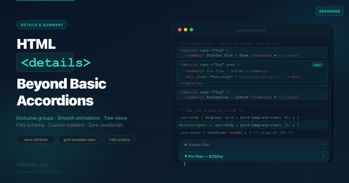
The <details> and <summary> elements are some of the most underestimated in HTML. Most tutorials show you a basic toggle and stop there. But recent browser updates — particularly the name attribute for exclusive accordions — have quietly made these elements far more powerful than most developers realize.
Before reaching for a JavaScript accordion library, consider what <details> gives you natively: keyboard accessibility, screen reader announcements, toggle events, and now exclusive group behavior. Pair it with the CSS grid-template-rows animation trick and you have a fully animated, accessible accordion with zero JavaScript and zero dependencies.
This tutorial picks up where every other tutorial stops. You’ll learn the name attribute for exclusive accordions, the correct way to animate open and close, how to build nested tree views, how to replace the default triangle with custom markers, and how to wire up FAQ structured data that generates rich results in Google Search. If you landed here from the Popover API tutorial or the dialog tutorial, you’ll recognize the same “native HTML replaces libraries” pattern.
Live Demo
Five live examples: exclusive accordion (name attribute), animated accordion (CSS grid trick), nested tree view, custom styled, and FAQ with schema markup. Zero JavaScript for the core behavior.
Before / After — The JavaScript Accordion vs Native HTML
Before — JavaScript accordion (the common approach)
<div class="accordion">
  <div class="accordion-item">
    <button class="accordion-header" aria-expanded="false" aria-controls="panel1">
      What is your refund policy?
      <span class="icon">+</span>
    </button>
    <div id="panel1" class="accordion-panel" hidden>
      <p>We offer a 30-day full refund on all plans.</p>
    </div>
  </div>
</div>
// Manual toggle, ARIA, keyboard handling, group logic
document.querySelectorAll('.accordion-header').forEach(btn => {
btn.addEventListener('click', () => {
const expanded = btn.getAttribute('aria-expanded') === 'true';
// Close all panels first (exclusive behavior)
document.querySelectorAll('.accordion-header').forEach(b => {
b.setAttribute('aria-expanded', 'false');
b.nextElementSibling.hidden = true;
});
// Open clicked (if it was closed)
if (!expanded) {
btn.setAttribute('aria-expanded', 'true');
btn.nextElementSibling.hidden = false;
}
});
});
// Also need: keyboard arrow navigation, focus management...Problems: manual ARIA management, manual keyboard handling, manual group logic, manual animation — every project reimplements this slightly differently.
After — Native HTML accordion
<!-- Exclusive accordion: only one open at a time — name attribute does it -->
<details name="faq">
  <summary>What is your refund policy?</summary>
  <p>We offer a 30-day full refund on all plans.</p>
</details>

<details name="faq">
  <summary>How do I cancel my subscription?</summary>
  <p>Cancel anytime from your account settings.</p>
</details>

<details name="faq">
  <summary>Do you offer student discounts?</summary>
  <p>Yes — 40% off with a valid .edu email address.</p>
</details>
Zero JavaScript. The browser handles toggle behavior, aria-expanded state, keyboard access (Enter/Space to toggle), and exclusive group behavior (opening one closes others). You write three attributes and you’re done.
Step 1 — Core Mechanics: How <details> Works
The <details> element is a disclosure widget — it shows a summary and hides additional content until the user expands it.
<!-- Minimal structure -->
<details>
  <summary>Click to expand</summary>
  <p>This content is hidden by default.</p>
</details>

<!-- Open by default with the 'open' attribute -->
<details open>
  <summary>This one starts expanded</summary>
  <p>Visible immediately on page load.</p>
</details>
What the browser gives you for free:
- The
<summary>is the only always-visible part — clicking it toggles the rest - If you omit
<summary>, the browser generates a default one (“Details”) - The
openattribute is added/removed by the browser on toggle — you can select it in CSS - A
toggleevent fires on the<details>element whenever it opens or closes - Full keyboard support: Tab to focus summary, Enter or Space to toggle
- Screen readers announce it as a disclosure widget with expanded/collapsed state
Reading and setting state in JavaScript:
const details = document.querySelector('details');

// Read state
console.log(details.open);  // true or false

// Open programmatically
details.open = true;

// Close programmatically
details.open = false;

// Listen for toggle
details.addEventListener('toggle', () => {
  console.log(details.open ? 'opened' : 'closed');
});
Styling with the [open] attribute selector:
/* Style the details element when open */
details[open] {
  background: #f0fdf4;
  border-color: #16a34a;
}

/* Style the summary arrow/icon when open */
details[open] > summary {
  font-weight: 600;
  color: #16a34a;
}

/* Everything inside details except the summary */
details > :not(summary) {
  padding: 12px 16px;
  color: #374151;
}
Step 2 — The name Attribute: Exclusive Accordions With Zero JavaScript
This is the most important update to <details> in years, and almost nobody is using it yet.
When multiple <details> elements share the same name attribute value, they form a mutually exclusive group — exactly like radio inputs. Opening one automatically closes all others in the group. No JavaScript. No event listeners. The browser manages the group natively.
<!-- All three share name="pricing" — only one can be open at a time -->
<details name="pricing">
  <summary>Starter Plan — $9/mo</summary>
  <p>Up to 3 projects, 5GB storage, email support.</p>
</details>

<details name="pricing">
  <summary>Pro Plan — $29/mo</summary>
  <p>Unlimited projects, 50GB storage, priority support, API access.</p>
</details>

<details name="pricing" open>
  <summary>Enterprise — Custom pricing</summary>
  <p>Dedicated infrastructure, SLA, custom integrations, onboarding.</p>
</details>
The rules:
namevalue is just a string — it doesn’t need to match anyid- Multiple groups can coexist on the same page with different
namevalues - A
<details>without anameis independent — it does not affect named groups - You can have one item
openby default in a group — opening another will close it - The
nameattribute doesn’t affect ARIA or accessibility — the browser still manages each item’s expanded state independently
<!-- Two independent accordion groups on the same page -->
<section>
  <h2>FAQ</h2>
  <details name="faq">...</details>
  <details name="faq">...</details>
</section>

<section>
  <h2>Pricing</h2>
  <details name="pricing">...</details>
  <details name="pricing">...</details>
</section>
Browser support: name on <details> requires Chrome 120+, Firefox 130+, Safari 17.2+. For older browsers, it degrades gracefully — items still toggle, they just don’t close each other (multiple can be open). No JavaScript polyfill needed unless exclusive behavior is critical. Confirm current coverage on caniuse.com/mdn-html_elements_details_name.
Step 3 — Smooth Animations: The CSS Grid Trick
Animating <details> is the trickiest part. The browser adds and removes the open attribute instantly — you can’t directly transition height: 0 to height: auto. The standard hack (transitioning max-height) produces uneven timing and requires a magic number guess for the max value.
The CSS grid-template-rows trick solves this cleanly with no JavaScript and no magic numbers:
The technique
<!-- Add a wrapper div inside the content -->
<details class="accordion-item">
  <summary class="accordion-summary">How does billing work?</summary>
  <div class="accordion-body">         <!-- the grid wrapper -->
    <div class="accordion-content">    <!-- the inner div that overflows -->
      <p>Billing happens on the first of each month.</p>
    </div>
  </div>
</details>
/* The grid wrapper animates row height from 0 to auto */
.accordion-body {
display: grid;
grid-template-rows: 0fr; /* collapsed: 0 height */
transition: grid-template-rows 0.3s cubic-bezier(0.4, 0, 0.2, 1);
}
/* When details is open, expand to full height */
details[open] > .accordion-body {
grid-template-rows: 1fr; /* expanded: full height */
}
/* Inner div must have overflow: hidden to clip at 0fr */
.accordion-content {
overflow: hidden;
padding: 0 16px; /* horizontal padding only */
}
/* Animate vertical padding separately to avoid jump */
.accordion-content-inner {
padding: 12px 0 16px;
}Why this works: grid-template-rows: 0fr collapses the row to its minimum content, which is 0 when overflow: hidden is set on the child. 1fr expands it to fill available space. CSS can transition between these two values, giving you a smooth expand and collapse without knowing the content height.
The exit animation problem
The same issue as <dialog> and [popover]: the open attribute is removed immediately when the user clicks to close, so the CSS transition plays correctly on open but not on close. The grid trick solves this differently — because we’re animating a CSS property (not display), the transition plays in both directions naturally.
However, the summary click still fires before the transition completes. To handle this correctly with a close animation:
// Optional: intercept close to let animation play first
document.querySelectorAll('details.accordion-item').forEach(details => {
  const summary = details.querySelector('summary');

  summary.addEventListener('click', (e) => {
    // Only intercept close (details is currently open)
    if (!details.open) return;

    e.preventDefault();  // Stop instant close

    const body = details.querySelector('.accordion-body');
    body.style.gridTemplateRows = '0fr';  // Trigger close animation

    body.addEventListener('transitionend', () => {
      details.open = false;            // Close after animation
      body.style.gridTemplateRows = '';// Reset inline style
    }, { once: true });
  });
});
If you don’t need the close animation (many designs don’t), skip the JavaScript entirely — the grid trick gives you a smooth open animation and an instant close, which is often fine.
Step 4 — Nested Tree Views
The <details> element nests naturally, making it ideal for file trees, navigation menus, and category hierarchies — with zero JavaScript:
<ul class="tree" role="tree">
  <li role="treeitem">
    <details name="tree-root">
      <summary>src</summary>
      <ul role="group">

        <li role="treeitem">
          <details name="tree-components">
            <summary>components</summary>
            <ul role="group">
              <li role="treeitem"><a href="#">Button.jsx</a></li>
              <li role="treeitem"><a href="#">Modal.jsx</a></li>
              <li role="treeitem"><a href="#">Input.jsx</a></li>
            </ul>
          </details>
        </li>

        <li role="treeitem">
          <details name="tree-hooks">
            <summary>hooks</summary>
            <ul role="group">
              <li role="treeitem"><a href="#">useAuth.js</a></li>
              <li role="treeitem"><a href="#">useFetch.js</a></li>
            </ul>
          </details>
        </li>

        <li role="treeitem"><a href="#">App.jsx</a></li>
        <li role="treeitem"><a href="#">main.jsx</a></li>
      </ul>
    </details>
  </li>
</ul>
/* Strip list styling */
.tree, .tree ul { list-style: none; padding: 0; margin: 0; }
/* Indent nested levels */
.tree ul { padding-left: 20px; border-left: 1px dashed #d1d5db; margin-left: 10px; }
/* Summary row */
.tree summary {
display: flex;
align-items: center;
gap: 6px;
padding: 5px 8px;
border-radius: 6px;
cursor: pointer;
font-size: 14px;
font-weight: 500;
list-style: none; /* removes default triangle */
user-select: none;
}
.tree summary::-webkit-details-marker { display: none; }
.tree summary::marker { display: none; }
.tree summary:hover { background: #f3f4f6; }
/* Rotate a custom icon on open */
.tree summary::before {
content: '▶';
font-size: 10px;
color: #9ca3af;
transition: transform 0.2s ease;
display: inline-block;
width: 12px;
}
.tree details[open] > summary::before { transform: rotate(90deg); }
/* File items */
.tree li > a {
display: block;
padding: 4px 8px;
font-size: 13px;
color: #374151;
text-decoration: none;
border-radius: 4px;
}
.tree li > a:hover { background: #f3f4f6; color: #111827; }Add role="tree", role="treeitem", and role="group" to the list elements for full ARIA tree widget semantics. The <details> provides keyboard toggle; the ARIA roles communicate hierarchy to screen readers.
Step 5 — Custom Markers and Styled Summaries
The default triangle marker is controlled by the ::marker pseudo-element and, in WebKit browsers, by ::-webkit-details-marker. Here’s how to replace it with anything you want. The same pseudo-element basics covered in the ::before and ::after guide apply here.
Remove the default marker
/* Cross-browser marker removal */
summary {
  list-style: none;           /* Standard */
}
summary::-webkit-details-marker {
  display: none;              /* Safari/Chrome legacy */
}
summary::marker {
  display: none;              /* Firefox + modern */
}
Custom icon with ::before / ::after
/* Plus/minus toggle icon */
summary {
  display: flex;
  align-items: center;
  justify-content: space-between;
  padding: 14px 16px;
  cursor: pointer;
  list-style: none;
}
summary::-webkit-details-marker { display: none; }

summary::after {
  content: '+';
  font-size: 20px;
  font-weight: 300;
  color: #9ca3af;
  transition: transform 0.2s ease, color 0.2s ease;
  flex-shrink: 0;
}

details[open] > summary::after {
  content: '−';             /* or keep '+' and just rotate: */
  color: #16a34a;
}

/* Alternative: rotate approach (keeps same character) */
summary::after {
  content: '›';
  transition: transform 0.25s ease;
  display: inline-block;
}
details[open] > summary::after {
  transform: rotate(90deg);
}
Chevron SVG icon via background-image
summary {
  padding-right: 36px;
  position: relative;
  list-style: none;
}
summary::-webkit-details-marker { display: none; }

summary::after {
  content: '';
  position: absolute;
  right: 14px;
  top: 50%;
  transform: translateY(-50%);
  width: 16px;
  height: 16px;
  background-image: url("data:image/svg+xml,%3Csvg xmlns='http://www.w3.org/2000/svg' fill='none' viewBox='0 0 24 24' stroke='%239ca3af' stroke-width='2'%3E%3Cpath stroke-linecap='round' stroke-linejoin='round' d='M19 9l-7 7-7-7'/%3E%3C/svg%3E");
  background-size: contain;
  background-repeat: no-repeat;
  transition: transform 0.25s ease;
}

details[open] > summary::after {
  transform: translateY(-50%) rotate(180deg);
}
The upcoming ::details-content pseudo-element
A new ::details-content pseudo-element is in the CSS specification (Chrome 131+ behind a flag, not yet widely available) that will let you style and animate the revealed content without the wrapper div trick:
/* Future CSS — not widely supported yet (check caniuse before using) */
details::details-content {
  display: grid;
  grid-template-rows: 0fr;
  transition: grid-template-rows 0.3s ease, content-visibility 0.3s allow-discrete;
}

details[open]::details-content {
  grid-template-rows: 1fr;
}
When ::details-content ships fully, you’ll be able to drop the wrapper <div> from the animation pattern entirely. For now, use the two-div grid trick from Step 3.
Step 6 — SEO Impact: FAQ Rich Results with <details>
Google’s FAQ rich results can display expandable Q&A directly in search results, significantly improving click-through rates. You can implement this with <details> for the UI and JSON-LD for the machine-readable schema.
The UI markup is just regular <details> elements — no microdata attributes needed. Google reads structured data from the JSON-LD block, not from the visible HTML:
<section class="faq" aria-label="Frequently asked questions">
  <h2>Frequently Asked Questions</h2>

  <details name="faq">
    <summary>What is your refund policy?</summary>
    <p>We offer a full 30-day money-back guarantee on all plans, no questions asked. Contact support and we'll process your refund within 2 business days.</p>
  </details>

  <details name="faq">
    <summary>Do you offer a free trial?</summary>
    <p>Yes — every plan includes a 14-day free trial. No credit card required to start.</p>
  </details>
</section>
Then add the JSON-LD block describing the same Q&A list. Shape it like this — fill in your own questions and answers in place of the placeholders:
<script type="application/ld+json">
{
  "[at]context": "https://schema.org",
  "[at]type":    "FAQPage",
  "mainEntity": [
    {
      "[at]type": "Question",
      "name":     "YOUR QUESTION 1",
      "acceptedAnswer": {
        "[at]type": "Answer",
        "text":     "YOUR ANSWER 1"
      }
    },
    {
      "[at]type": "Question",
      "name":     "YOUR QUESTION 2",
      "acceptedAnswer": {
        "[at]type": "Answer",
        "text":     "YOUR ANSWER 2"
      }
    }
  ]
}
</script>
Replace every [at] with a real @ symbol — "@context", "@type", etc. The shape is shown with a placeholder to keep Google’s structured-data crawler from accidentally parsing this code example as a second FAQPage on this very article. In your own page, you write "@context" literally.
Use Google’s Rich Results Test to verify your schema before publishing. Invalid schema is silently ignored — the test tells you why.
Step 7 — Accessibility: What’s Free vs What You Add
<details> and <summary> are natively accessible elements with built-in ARIA semantics. Here’s what you get for free versus what needs manual attention:
| Browser handles | You still need to do |
|---|---|
role="button" on <summary> | Visible focus styles (outline on summary:focus-visible) |
aria-expanded state (auto) | Sufficient color contrast on summary text |
| Enter / Space to toggle | Don’t hide the summary visually (always visible) |
| Focus management on toggle | Logical heading hierarchy before each <details> |
| Screen reader expanded/collapsed | aria-label if summary text isn’t self-explanatory |
<!-- Correct: summary text is descriptive -->
<details>
  <summary>Shipping & delivery times</summary>
  <p>Standard shipping: 5–7 days. Express: 1–2 days.</p>
</details>

<!-- Correct: aria-label when summary is ambiguous -->
<details>
  <summary aria-label="Toggle section: Advanced configuration options">
    Advanced
  </summary>
  ...
</details>

<!-- Correct: visible focus ring -->
<style>
summary:focus-visible {
  outline: 2px solid #2563eb;
  outline-offset: 2px;
  border-radius: 4px;
}
/* Never do: summary:focus { outline: none } */
</style>
For tree views: add the full ARIA tree widget pattern — role="tree" on the root <ul>, role="treeitem" on each <li>, role="group" on nested <ul>. Arrow key navigation is NOT provided by the browser for tree widgets — implement it with a keydown listener if your tree is interactive (not just a navigation structure).
Step 8 — Advanced Patterns
Pattern 1: Filter Panel (sidebar accordion)
<aside class="filter-panel" aria-label="Filter products">
  <details name="filters" open class="filter-group">
    <summary class="filter-heading">Category</summary>
    <div class="filter-body">
      <div class="filter-options">
        <label><input type="checkbox" value="electronics"> Electronics</label>
        <label><input type="checkbox" value="clothing">   Clothing</label>
        <label><input type="checkbox" value="books">      Books</label>
      </div>
    </div>
  </details>

  <details name="filters" class="filter-group">
    <summary class="filter-heading">Price range</summary>
    <div class="filter-body">
      <div class="filter-options">
        <label><input type="radio" name="price" value="0-50">  Under $50</label>
        <label><input type="radio" name="price" value="50-100"> $50–$100</label>
        <label><input type="radio" name="price" value="100+">  Over $100</label>
      </div>
    </div>
  </details>
</aside>
Pattern 2: Persisting open state across page loads
// Save and restore which items are open using localStorage
const STORAGE_KEY = 'accordion-state';

function saveState() {
  const state = {};
  document.querySelectorAll('details[id]').forEach(d => {
    state[d.id] = d.open;
  });
  localStorage.setItem(STORAGE_KEY, JSON.stringify(state));
}

function restoreState() {
  const state = JSON.parse(localStorage.getItem(STORAGE_KEY) || '{}');
  document.querySelectorAll('details[id]').forEach(d => {
    if (d.id in state) d.open = state[d.id];
  });
}

document.addEventListener('DOMContentLoaded', restoreState);
document.querySelectorAll('details').forEach(d => {
  d.addEventListener('toggle', saveState);
});
Pattern 3: Scroll to open item
// Automatically scroll opened items into view
document.querySelectorAll('details').forEach(details => {
  details.addEventListener('toggle', () => {
    if (!details.open) return;
    setTimeout(() => {
      details.scrollIntoView({ behavior: 'smooth', block: 'nearest' });
    }, 50); // Small delay to let animation start first
  });
});
Pattern 4: Open all / Close all controls
const detailsGroup = document.querySelectorAll('details[name="faq"]');

document.getElementById('openAll').addEventListener('click', () => {
  // name attribute prevents multiple open — temporarily remove it
  detailsGroup.forEach(d => {
    d.removeAttribute('name');
    d.open = true;
  });
  // Re-add name after opening all (optional — depends on UX intent)
});

document.getElementById('closeAll').addEventListener('click', () => {
  detailsGroup.forEach(d => { d.open = false; });
});
Browser Support
| Feature | Chrome | Firefox | Safari | Edge |
|---|---|---|---|---|
<details> / <summary> | 12+ | 49+ | 6+ | 79+ |
name attribute (exclusive) | 120+ | 130+ | 17.2+ | 120+ |
CSS grid-template-rows animation | 66+ | 61+ | 10.1+ | 79+ |
::details-content pseudo-element | 131+ (flag) | — | — | 131+ (flag) |
toggle event | 36+ | 49+ | 6+ | 79+ |
The name attribute degrades gracefully in older browsers — <details> items still work as individual toggles, they just don’t close each other automatically. No polyfill or JavaScript fallback is needed for the basic exclusive behavior. For full reference, see MDN’s details element docs.
Key Takeaways
<details>and<summary>work as accessible disclosure widgets with zero JavaScript — keyboard, ARIA, and screen reader support are built in- Add
name="group-name"to multiple<details>elements to create an exclusive accordion — the browser closes others when one opens, no JavaScript needed - The
openattribute is added/removed by the browser on toggle — select it withdetails[open]in CSS for state-based styling - The CSS
grid-template-rows: 0fr → 1frtrick animates height smoothly without knowing content height — nomax-heightguessing - Remove the default triangle with
summary { list-style: none }andsummary::-webkit-details-marker { display: none }then add your own with::beforeor::after - The
toggleevent fires on<details>after every open/close — use it to save state, load data lazily, or trigger other UI changes - FAQ
<details>elements combined with JSON-LDFAQPageschema give Google the data it needs for FAQ rich results in search - Never remove
outlineonsummary:focus— addsummary:focus-visiblestyles instead to keep keyboard users visible ::details-contentis coming in CSS but not widely supported yet — stick with the two-div grid wrapper for now- The
nameattribute degrades gracefully in older browsers — items still toggle individually, they just don’t auto-close each other
FAQ
What is the difference between details name attribute and JavaScript accordion?
The name attribute on <details> creates a mutually exclusive group natively in the browser — when one item opens, others with the same name close automatically. A JavaScript accordion reimplements this same behavior manually. The native approach requires zero JavaScript, is accessible by default, and degrades gracefully in older browsers where items simply don’t close each other.
Can I animate the details element opening and closing?
Yes, using the CSS grid-template-rows trick. Wrap the content (everything after <summary>) in two divs: an outer with display: grid; grid-template-rows: 0fr transitioning to 1fr when details[open], and an inner with overflow: hidden. This smoothly animates height without knowing the content size. The close direction requires a small JavaScript intercept to let the transition play before the open attribute is removed.
Does details summary work for SEO?
Yes — search engines index the content inside <details> regardless of whether it is expanded or collapsed. For FAQ pages specifically, pairing <details> with JSON-LD FAQPage schema gives Google the structured data it needs to generate FAQ rich results (expandable Q&As in search results), which can significantly improve click-through rates.
How do I remove the default triangle arrow from summary?
Use three CSS rules together for full cross-browser coverage: summary { list-style: none } (standard), summary::-webkit-details-marker { display: none } (Safari/Chrome legacy), and summary::marker { display: none } (Firefox and modern browsers). Then add your own icon using ::before or ::after pseudo-elements.
Is the details element accessible without extra ARIA?
Yes — <summary> is natively announced as a button with expanded/collapsed state by screen readers. You do not need to add role="button" or aria-expanded manually. What you do need to add: visible focus styles on summary:focus-visible, sufficient color contrast on summary text, and descriptive summary text that makes sense out of context. For tree view patterns, add the full ARIA tree widget roles manually.
When should I use details vs dialog vs popover?
Use <details> when the content is always in the document flow and toggles inline — FAQs, filter panels, code examples, reading more text. Use <dialog> when you need a modal that blocks the page — confirmations, forms, alerts. Use the Popover API when you need a floating overlay anchored to a trigger — tooltips, dropdowns, toasts. If it lives in the page flow and toggles: <details>. If it floats above the page: popover or dialog.