Images are responsible for over 60% of total page weight on most websites. The single highest-impact performance fix available to most developers is serving modern image formats at the right size. AVIF files are roughly 50% smaller than JPEG and noticeably smaller than WebP at equivalent quality; WebP is around 25-35% smaller than JPEG; JPEG XL (JXL) finally got browser traction. Switching formats alone can cut your image payload in half.
But there’s a trap that most tutorials walk you straight into. They give you the <picture> element with AVIF, WebP, and JPEG <source> tags, add a srcset and sizes, and call it done. What they don’t tell you: if your sizes attribute says 100vw but the image actually renders at half the viewport width inside a two-column layout, the browser downloads a file twice as large as it needs. The markup is “correct.” The performance is quietly terrible.
This guide starts with the avif vs webp format question (plus JXL), then covers <picture> for format fallbacks, srcset/sizes for resolution switching done accurately, fetchpriority="high" for your LCP hero (with the decoding="async" companion most guides skip), placeholder strategies, CSS image-set() for backgrounds, and the image CDN auto-format pattern that lets you skip <picture> entirely.
Related tutorials: HTML File Upload & Drag-Drop · HTML Input Types · CSS aspect-ratio · HTML Media Tags
Live Demo
Five interactive sections: AVIF vs WebP vs JPEG size comparison with quality slider, the picture fallback explainer with browser profiles, the sizes accuracy calculator showing wasted bandwidth in real numbers, the srcset descriptor validator, and the LCP fetchpriority timeline.
AVIF vs WebP — The Format Question
Before any markup, decide what formats to generate. Here’s the current landscape:
| Format | vs JPEG size | Transparency | Animation | HDR / wide color | Browser support |
|---|---|---|---|---|---|
| JPEG | baseline | ❌ | ❌ | ❌ | Universal |
| WebP | ~25-35% smaller | ✅ | ✅ | ❌ | Universal (all modern browsers) |
| AVIF | ~50% smaller | ✅ | ✅ | ✅ | All modern browsers |
| JPEG XL | ~55-60% smaller | ✅ | ❌ | ✅ | Safari 17+, Chrome 145 (flag), FF 152 (pref) — see below |
AVIF vs WebP comes down to one tradeoff: AVIF wins compression by 20-30%, WebP wins decode speed and encode time. For build-time pipelines, generate both.
The Decision Rule
- Photographs, hero images, product photos → AVIF first, WebP fallback, JPEG last resort
- Images with fine gradients or HDR → AVIF (its compression and wide-color support shine here)
- Logos, icons, simple UI shapes → SVG; if raster needed, WebP lossless or PNG
- Small animated UI → WebP animation (most reliable); test AVIF sequences if your audience supports them
- Large/long animations → don’t use animated images at all — use
<video>with MP4/WebM
AVIF’s one real cost is encoding time — it’s slower to generate than WebP. For a build pipeline this is irrelevant (it happens once). For on-the-fly server encoding, factor it in or cache aggressively.
JPEG XL Current Status
JPEG XL is finally usable. After Chrome’s controversial “obsolete” stance in 2022, Chromium reversed course in late 2025 and merged the Rust jxl-rs decoder:
| Browser | JPEG XL status (June 2026) |
|---|---|
| Safari 17+ | ✅ Default on |
| Chrome 145+ | ⚠ Behind chrome://flags/#enable-jxl-decoding flag |
| Firefox 152+ | ⚠ Behind image.jxl.enabled pref |
Default-on in Chrome is expected soon, which will jump global support from ~25% to ~85% overnight. Why JXL matters: lossless JPEG transcoding (recompress your existing JPEGs ~20% smaller with no quality loss), progressive decoding, HDR, and a single format that handles photos, graphics, and lossless modes.
For now, treat JXL as a fourth source in <picture> for capable browsers (mainly Safari):
<picture>
  <source srcset="hero.jxl" type="image/jxl">  <!-- Safari 17+ -->
  <source srcset="hero.avif" type="image/avif">
  <source srcset="hero.webp" type="image/webp">
  <img src="hero.jpg" alt="Hero" width="1200" height="800">
</picture>
HTML picture Element Example — Format Fallbacks
A complete HTML picture element example with AVIF, WebP, and JPEG fallback looks like this:
<picture>
  <!-- Browser tries AVIF first -->
  <source srcset="hero.avif" type="image/avif">
  <!-- Falls back to WebP if AVIF unsupported -->
  <source srcset="hero.webp" type="image/webp">
  <!-- Final fallback: the img src (always required) -->
  <img src="hero.jpg" alt="Mountain landscape at sunrise" width="1200" height="800">
</picture>
Critical rules for <picture>:
- Order matters — put the most-preferred (smallest/best) format first. The browser uses the first supported
<source>, not the best one. - The
<img>is mandatory — it’s the fallback AND the element that actually displays.alt,width,height,loading, andclassall go on the<img>, not the<picture>. - Always set
widthandheighton the<img>— this reserves layout space (paired with CSS aspect-ratio) and prevents Cumulative Layout Shift (CLS).
Why the <img> Carries Everything
The <picture> and <source> elements are invisible wrappers — they have no box, no styling, no alt text. The <img> is the real element. CSS targets the <img>. JavaScript’s .currentSrc on the <img> tells you which source the browser actually chose:
const img = document.querySelector('picture img');
img.addEventListener('load', () => {
  console.log('Browser chose:', img.currentSrc); // e.g. "hero.avif"
});
Accessibility: alt="" vs missing vs descriptive
For <picture>, screen readers see the <img>’s alt attribute. Three states and they’re not equivalent:
| State | Behavior | When to use |
|---|---|---|
alt="Mountain landscape" | Screen reader announces the text | All meaningful content images |
alt="" (empty, NO space) | Screen reader skips silently | Purely decorative images (icons accompanying labeled text, background-style decorations) |
No alt attribute at all | Screen reader reads the filename | Never — always include alt, even if empty |
alt=" " (a single space) | Same as no alt — readers stumble | Never — common bug |
The <picture> element does not take an alt attribute. All accessibility lives on the inner <img>.
img srcset sizes Explained — Resolution Switching Done Right
<picture> handles format. srcset on the <img> handles resolution — giving the browser multiple sizes of the same image and letting it pick based on viewport width and device pixel ratio (DPR).
img srcset sizes explained in one rule: srcset is the menu, sizes tells the browser how wide the image will render. The browser combines both with DPR to pick the smallest sufficient file.
<img
  src="photo-800.jpg"
  srcset="photo-400.jpg 400w,
          photo-800.jpg 800w,
          photo-1200.jpg 1200w,
          photo-1600.jpg 1600w"
  sizes="(max-width: 768px) 100vw, 50vw"
  alt="Product photo"
  width="800" height="600">
How the browser decides:
- It reads
sizesto determine how wide the image will render at the current viewport - It multiplies that by the device’s DPR (e.g. 2× on Retina, 3× on Pixel 8 Pro)
- It picks the smallest
srcsetcandidate that meets or exceeds that pixel width
So at a 375px viewport on a 2× phone, with sizes="100vw": render width = 375px, × 2 DPR = 750px needed → browser picks photo-800.jpg.
The 3× DPR Reality
Most sites generate 1× and 2× variants but skip 3×. Pixel 8 Pro, iPhone Pro models, and modern Android flagships all have DPR 3. With only up to 1600w available, a 3× device at 800px render width needs 2400 pixels — the browser picks the 1600w file and you ship soft images. Add a 2400w candidate for hero images on premium devices.
w Descriptors vs x Descriptors
There are two descriptor syntaxes, and they don’t mix:
<!-- w descriptors: handles BOTH viewport size AND DPR. Requires sizes. -->
<img srcset="hero-800.jpg 800w, hero-1600.jpg 1600w"
     sizes="(max-width: 768px) 100vw, 800px"
     src="hero-800.jpg" alt="Hero">

<!-- x descriptors: handles ONLY DPR, ignores viewport size. No sizes needed. -->
<img srcset="logo.png 1x, logo-2x.png 2x, logo-3x.png 3x"
     src="logo.png" alt="Logo">
The rule: Use w descriptors with sizes for content images that change size across viewports (heroes, photos, articles). Use x descriptors for fixed-size images that only need DPR switching (logos, avatars, icons at a set size). Never mix w and x in the same srcset — it’s a validation error and the browser drops the invalid candidates.
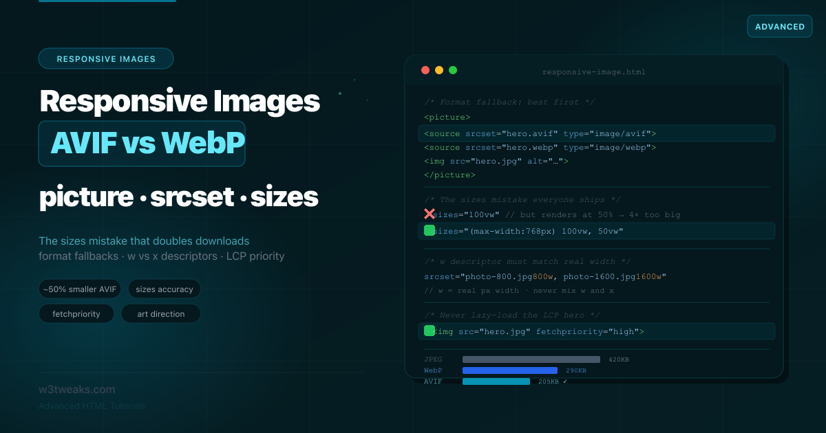
The sizes Accuracy Problem — The Mistake Everyone Ships
This is the single most common responsive-images bug, and it produces zero errors while wasting enormous bandwidth.
sizes tells the browser how wide the image will render before any image has loaded or any CSS has applied. If you get it wrong, the browser picks the wrong file.
<!-- ❌ The 100vw lie: image actually renders at 50% in a two-column layout -->
<img srcset="photo-400.jpg 400w, photo-800.jpg 800w, photo-1600.jpg 1600w"
     sizes="100vw"
     src="photo-800.jpg" alt="Photo">
If your sizes attribute says 100vw but the image is actually displayed at 50% of the viewport inside a two-column layout, the browser will fetch a file twice as large as needed.
On a 1440px desktop, sizes="100vw" makes the browser think it needs a ~1440px image (and at 2× DPR, ~2880px → it grabs your largest file). But the image only renders at 720px. You shipped a 1600px image to fill a 720px slot. The user downloaded roughly 4× the bytes they needed.
<!-- ✅ sizes matches the real rendered width -->
<img srcset="photo-400.jpg 400w, photo-800.jpg 800w, photo-1600.jpg 1600w"
     sizes="(max-width: 768px) 100vw, 50vw"
     src="photo-800.jpg" alt="Photo">
How to get sizes right: Open DevTools, select the image, and read its rendered width at each breakpoint. Translate those widths into the sizes media conditions.
A more complete real-world sizes:
sizes="(max-width: 480px) 100vw,
       (max-width: 768px) 90vw,
       (max-width: 1200px) 50vw,
       600px"
Read it as: “Below 480px the image fills the viewport; up to 768px it’s 90% of the viewport; up to 1200px it’s half the viewport; above that it’s a fixed 600px.”
The w Descriptor Must Match the File’s Natural Width
A subtle trap: the w descriptor describes the image’s actual pixel width, not a label you choose.
<!-- ❌ Lying: this file is really only 400px wide, not 600px -->
<img srcset="small-photo.jpg 600w" sizes="300px" src="small-photo.jpg" alt="">
If you claim 600w but the file is physically 400px wide, the browser trusts your 600w claim. On a 2× display in a 300px container it requests a 600px image, gets your 400px file, and stretches it to display at 600px — visibly soft and squished. The w descriptor should always match the image’s true natural width.
Putting It Together — picture + srcset + sizes
For a responsive image that needs both format fallbacks and resolution switching, combine them. Each <source> gets its own srcset and sizes:
<picture>
  <!-- AVIF, all sizes -->
  <source
    type="image/avif"
    srcset="hero-400.avif 400w, hero-800.avif 800w,
            hero-1200.avif 1200w, hero-1600.avif 1600w"
    sizes="(max-width: 768px) 100vw, 50vw">

  <!-- WebP, all sizes -->
  <source
    type="image/webp"
    srcset="hero-400.webp 400w, hero-800.webp 800w,
            hero-1200.webp 1200w, hero-1600.webp 1600w"
    sizes="(max-width: 768px) 100vw, 50vw">

  <!-- JPEG fallback, all sizes -->
  <img
    src="hero-800.jpg"
    srcset="hero-400.jpg 400w, hero-800.jpg 800w,
            hero-1200.jpg 1200w, hero-1600.jpg 1600w"
    sizes="(max-width: 768px) 100vw, 50vw"
    alt="Mountain landscape at sunrise"
    width="1200" height="800"
    loading="lazy">
</picture>
The browser first picks the format (AVIF if supported), then within that format’s srcset picks the best resolution for the viewport and DPR.
fetchpriority=“high” for the LCP Image
Your Largest Contentful Paint (LCP) image — usually the hero — is the single most important image for perceived load speed. Add fetchpriority="high" to the LCP image and document Web Vitals wins of ~20-30%.
Rule 1: Never lazy-load the LCP image
<!-- ❌ Lazy-loading the hero delays your LCP — the worst common mistake -->
<img src="hero.jpg" loading="lazy" alt="Hero">

<!-- ✅ The hero loads eagerly (default) and gets high priority -->
<img src="hero.jpg" fetchpriority="high" alt="Hero">
loading="lazy" is for below-the-fold images. The hero is above the fold — lazy-loading it tells the browser to wait, directly hurting your LCP score.
Rule 2: Give the hero fetchpriority="high"
<picture>
  <source type="image/avif" srcset="hero-800.avif 800w, hero-1600.avif 1600w"
          sizes="100vw">
  <source type="image/webp" srcset="hero-800.webp 800w, hero-1600.webp 1600w"
          sizes="100vw">
  <img src="hero-1600.jpg"
       srcset="hero-800.jpg 800w, hero-1600.jpg 1600w"
       sizes="100vw"
       alt="Hero"
       width="1600" height="900"
       fetchpriority="high"
       decoding="async">
</picture>
Rule 3: The decoding="async" Companion Most Guides Skip
decoding="async" lets the browser decode the image off the main thread. The catch is browser defaults differ:
| Browser | Default decoding |
|---|---|
| Chromium (Chrome, Edge, Brave) | sync |
| Firefox | async |
| Safari | sync |
For the LCP image, explicitly setting decoding="async" + fetchpriority="high" is the modern combo. Async decode means the image doesn’t block the main thread while it processes, but high priority means it still gets the network bandwidth it needs. This pairing is what fixes the WordPress LCP regression hundreds of plugins hit when they applied decoding="async" without fetchpriority.
Rule 4: Preload the LCP Image with imagesrcset
imagesrcset preload lets the browser start the right candidate’s download during HTML parsing, before the <img> is even discovered:
<head>
  <link rel="preload" as="image"
        imagesrcset="hero-800.avif 800w, hero-1600.avif 1600w"
        imagesizes="100vw"
        type="image/avif"
        fetchpriority="high">
</head>
Use it only for the one LCP image — preloading everything defeats the purpose.
Image CDN Auto-Format Negotiation
A modern alternative to writing <picture> markup: image CDNs read the browser’s Accept header and serve AVIF, WebP, or JPEG automatically. No tag changes needed — just point your <img src> at the CDN URL.
| CDN | AVIF? | Accept-header auto | URL param |
|---|---|---|---|
| Cloudinary | ✅ | ✅ default since 2023 | f_auto |
| ImageKit | ✅ | ✅ default | f-auto |
| Cloudflare Images | ✅ | ✅ default | format=auto |
| Cloudflare Polish | ✅ | ⚠ Deprecated for new zones March 2026 | n/a |
| Vercel Image Optimization | ✅ | ✅ default | <Image> component |
| Next.js Image | ✅ | ✅ via the built-in optimizer | <Image> component |
| Imgproxy (self-hosted) | ✅ | Configurable | URL signing |
<!-- One src — server picks format based on browser's Accept header -->
<img src="https://cdn.example.com/hero.jpg?f_auto&w=800" alt="Hero" width="800" height="450">
Caching gotcha: If you front the CDN with another CDN or proxy, the cache MUST honor Vary: Accept — otherwise Chrome’s AVIF gets cached and served back to Safari (which doesn’t support it well historically) or vice versa.
CSS image-set() — The Background-Image Equivalent
The CSS image-set() function is the background-image equivalent of <picture>, with type() for format negotiation. Baseline since September 2023.
.hero {
  background-image: image-set(
    url("hero.avif") type("image/avif"),
    url("hero.webp") type("image/webp"),
    url("hero.jpg")
  );
  background-size: cover;
}

/* Or with DPR descriptors */
.icon {
  background-image: image-set(
    url("icon.png") 1x,
    url("icon-2x.png") 2x,
    url("icon-3x.png") 3x
  );
}
<img> vs CSS background — when to use which:
Use <img> (HTML) when | Use CSS background when |
|---|---|
| Content image (informational) | Purely decorative |
| LCP candidate | Won’t be LCP |
| Should appear in image search SEO | Should not be indexed |
| Needs alt text | No alt needed |
| Aspect-ratio matters for layout | Container ratio matters more than image |
Content images belong in HTML for SEO and accessibility. CSS backgrounds are for decoration only.
Placeholder Strategies for Perceived Performance
While the real image loads, show something. Four techniques:
| Technique | Bytes | Quality | Needs JS | Aspect ratio |
|---|---|---|---|---|
| LQIP (Low-Quality Image Placeholder) | 1-3 KB | Pixelated tiny image | ❌ Pure CSS | From image |
| BlurHash | ~20-30 bytes | Smooth blur, no detail | ✅ Canvas decode | Not encoded |
| ThumbHash | ~25-50 bytes | Better detail than BlurHash, alpha | ✅ Canvas decode | ✅ Encoded |
| Dominant color | ~7 bytes | Solid color block | ❌ Just background-color | Container-based |
ThumbHash wins for most use cases — more detail per byte than BlurHash, encodes aspect ratio, supports alpha for transparent images. Both BlurHash and ThumbHash render a placeholder via Canvas API in 1-2ms.
<!-- Pure CSS LQIP — tiny encoded thumbnail blurred via CSS -->
<div class="hero-wrap">
  <img class="lqip" src="hero-20x11.jpg" alt="" aria-hidden="true">
  <img class="hero" src="hero-1600.jpg"
       srcset="hero-800.jpg 800w, hero-1600.jpg 1600w"
       sizes="100vw" alt="Hero"
       width="1600" height="900"
       fetchpriority="high"
       decoding="async">
</div>
.hero-wrap { position: relative; }
.lqip {
position: absolute; inset: 0;
width: 100%; height: 100%;
filter: blur(20px);
transform: scale(1.1); /* hide edge blur */
z-index: 0;
}
.hero { position: relative; z-index: 1; }Resolution Switching vs Art Direction — The Decision Rule
This is the distinction that confuses most developers. Both use responsive image markup, but they solve different problems.
Resolution switching — same image, different sizes (srcset alone)
Use srcset + sizes on a plain <img> when you’re serving the same image at different resolutions. The crop and composition stay identical; only the pixel dimensions change.
<img srcset="photo-400.jpg 400w, photo-800.jpg 800w, photo-1600.jpg 1600w"
     sizes="(max-width: 768px) 100vw, 50vw"
     src="photo-800.jpg" alt="Team photo">
Art direction — different crops at different viewports (<picture media>)
Use <picture> with media attributes when you want a different crop or composition at different viewports:
<picture>
  <source media="(max-width: 768px)" srcset="hero-square.jpg">
  <source media="(min-width: 769px)" srcset="hero-wide.jpg">
  <img src="hero-wide.jpg" alt="Hero" width="1600" height="900">
</picture>
The rule:
- Same image, just resize →
srcset+sizes(let the browser choose) - Different crop/composition per viewport →
<picture>withmedia(you choose explicitly)
Generating the Images — The Sharp / libvips Toolchain
You can’t ship 4 widths × 3 formats by hand. The canonical Node.js tool is Sharp (a binding to libvips) — it powers Next.js, Astro, Eleventy, and most static-site generators:
// generate-images.mjs — Sharp generates 4 widths × 3 formats
import sharp from 'sharp';

const widths = [400, 800, 1200, 1600];
const sources = ['hero.jpg'];

for (const src of sources) {
  const base = src.replace(/\.[^.]+$/, '');
  for (const w of widths) {
    const pipeline = sharp(src).resize({ width: w });
    await pipeline.clone().avif({ quality: 60 }).toFile(`${base}-${w}.avif`);
    await pipeline.clone().webp({ quality: 75 }).toFile(`${base}-${w}.webp`);
    await pipeline.clone().jpeg({ quality: 80, mozjpeg: true }).toFile(`${base}-${w}.jpg`);
  }
}
For visual quality comparison, Squoosh.app is the browser-based A/B tool — drag in an image and compare AVIF/WebP/JPEG quality side-by-side with file-size readouts.
Save-Data and Client Hints: older guides recommend Accept-CH: DPR, Width, Viewport-Width. Those Sec-CH-DPR/Width hints were specified but never shipped widely — don’t build new pipelines on them. Save-Data: on (from users with the “Data Saver” mode) still works and is useful for serving lower-quality variants.
object-fit — Controlling How the Image Fills Its Box
Once your responsive image lands in a sized container, object-fit controls how it fills that box. This is CSS, not HTML, but it’s the natural companion to responsive images:
img {
  width: 100%;
  height: 300px;
  object-fit: cover;
  object-position: center;
}
object-fit value | Behavior |
|---|---|
cover | Fills the box, crops overflow, preserves aspect ratio (most common for photos) |
contain | Fits entirely inside the box, may letterbox, preserves aspect ratio |
fill | Stretches to fill, distorts aspect ratio (avoid for photos) |
none | Original size, crops if larger than box |
scale-down | Smaller of none or contain |
Responsive Image Best Practices
The complete checklist for production:
- AVIF first, WebP fallback, JPEG last resort — generate all three at build time
- Add JXL to your picture for Safari 17+ if you serve any JPEG-heavy content (lossless transcoding is a free 20% reduction)
- Width and height attributes on every
<img>— paired with CSSheight: autoandaspect-ratiofor zero CLS fetchpriority="high"+decoding="async"on the LCP imageloading="lazy"on every below-the-fold image (NEVER the LCP)sizesmatches the real rendered width — measure in DevTools, don’t guesswdescriptor matches the file’s natural pixel width — never roundalt=""(empty, no space) for decorative images, descriptive alt otherwise- Use
<picture>only when needed — image CDN auto-format does the same job with a single<img>for many sites image-set()for CSS backgrounds, not for content images
Key Takeaways
- AVIF vs WebP: AVIF wins compression by 20-30%; WebP wins decode speed and encode time. Generate both at build time.
- JPEG XL current status: Safari 17+ default-on, Chrome 145 behind flag, Firefox 152 behind pref. Add to
<picture>for Safari benefits today. <picture>handles format — the browser uses the first<source>whosetypeit supports, so order them best-to-worst (JXL → AVIF → WebP → JPEG)- The
<img>inside<picture>is mandatory and carries everything —alt,width,height,loading,class, and CSS all target the<img>, not the wrapper.<picture>has noalt. alt=""(empty, no space) for decorative images, descriptive alt otherwise. Missing alt makes screen readers read the filename.srcset+sizeshandle resolution switching — the browser readssizesto learn the rendered width, multiplies by DPR, picks the smallest sufficientsrcsetcandidate- The #1 bug is a wrong
sizesvalue —sizes="100vw"on an image rendering at 50% downloads a file up to 4× too large; measure the real width in DevTools - Use
wdescriptors withsizesfor images that resize across viewports; usexdescriptors (nosizes) for fixed-size images needing only DPR switching; never mix - The
wdescriptor must equal the file’s true natural pixel width — lying about it makes the browser stretch and soften the image - Never lazy-load the LCP image — give it
fetchpriority="high"+decoding="async"and optionally preload withimagesrcset/imagesizes - Image CDNs read
Acceptheader — Cloudinaryf_auto, ImageKitf-auto, Cloudflare Images, Vercel/Next.js Image all auto-pick AVIF/WebP/JPEG. Skip<picture>for many sites - CSS
image-set()withtype()is the background-image equivalent of<picture>— Baseline since Sept 2023 - ThumbHash beats BlurHash for placeholders — more detail per byte, encodes aspect ratio, supports alpha
- Generate images with Sharp (Node + libvips) —
pipeline.avif(),.webp(),.jpeg()chained — same source, 4 widths × 3 formats in seconds - Resolution switching (
srcset) vs art direction (<picture media>) — same image different sizes vs different crops per viewport
FAQ
Is AVIF better than WebP ?
For most photographic content, yes — AVIF files are typically 20-30% smaller than WebP at equivalent visual quality, roughly 50% smaller than JPEG versus WebP’s 25-35%, and AVIF supports HDR and wide color gamut which WebP does not. The tradeoff is slower encoding. The best practice is to serve both: AVIF first in a <picture> element, WebP as the fallback, and JPEG as the universal last resort. This way capable browsers get the smallest file and older browsers still work.
What is the difference between srcset and the picture element?
srcset on an <img> offers the browser a set of image sizes and lets it choose based on viewport and device pixel ratio — this is resolution switching. The <picture> element gives the developer explicit control over which image loads, used for two things: format fallbacks (AVIF → WebP → JPEG via type) and art direction (different crops via media). Use srcset for resolution switching and <picture> for format fallbacks and art direction. For many sites, an image CDN with Accept-header negotiation removes the need for <picture> entirely.
Why is my responsive image downloading a file that’s too large?
Almost always a wrong sizes value. The sizes attribute tells the browser how wide the image will render, and the browser picks the srcset candidate based on it — before any CSS applies. If sizes says 100vw but your image actually renders at 50% of the viewport in a multi-column layout, the browser fetches a file up to twice as wide (4× the bytes at 2× DPR). Inspect the image’s real rendered width in DevTools at each breakpoint and write sizes to match.
What is the w descriptor in srcset?
The w descriptor (e.g. photo-800.jpg 800w) tells the browser the image’s actual width in pixels. The browser combines this with the sizes attribute and the device pixel ratio to choose the best candidate. The w value must match the file’s true natural width — if you claim 800w for a file that’s really 400px wide, the browser will request it for an 800px slot and stretch it, producing a blurry result. When using w descriptors, the sizes attribute is required.
Should I lazy-load my hero image?
No. loading="lazy" defers loading until the image is near the viewport, which is correct for below-the-fold images but harmful for your hero. The hero is usually your Largest Contentful Paint element — lazy-loading it directly delays LCP and hurts Core Web Vitals. Load the hero eagerly (the default) and add fetchpriority="high" + decoding="async" to prioritize it. Reserve loading="lazy" for images below the fold.
Should I use decoding=“async” on my LCP image?
Yes — paired with fetchpriority="high". Chromium and Safari default decoding to sync, which blocks the main thread while the image decodes. Setting decoding="async" lets the decode happen off-thread. The trap: setting decoding="async" WITHOUT fetchpriority="high" can hurt LCP because Chromium uses sync decode as a priority signal. The combo of both is the modern recipe. Firefox already defaults to async.
BlurHash vs ThumbHash for placeholders — which one?
ThumbHash wins for most use cases. It encodes more detail per byte than BlurHash (~25-50 bytes vs ~20-30), encodes the aspect ratio (BlurHash doesn’t), and supports an alpha channel for transparent images. Both decode in 1-2ms via Canvas API and produce a smooth blurred placeholder. Use ThumbHash unless you’re stuck with an existing BlurHash pipeline. For zero-JS placeholders, a pure-CSS LQIP (a tiny 20×11 image blurred with filter: blur(20px)) is the simplest option.
When should I use object-fit cover vs contain?
Use object-fit: cover when you want the image to completely fill its container with no empty space, cropping any overflow — ideal for photo grids, cards, and hero backgrounds where uniform sizing matters. Use object-fit: contain when the entire image must be visible without cropping, accepting possible letterboxing — ideal for logos, product shots on white backgrounds, or anything where cropping would lose important content. Both preserve aspect ratio; fill does not and will distort the image.