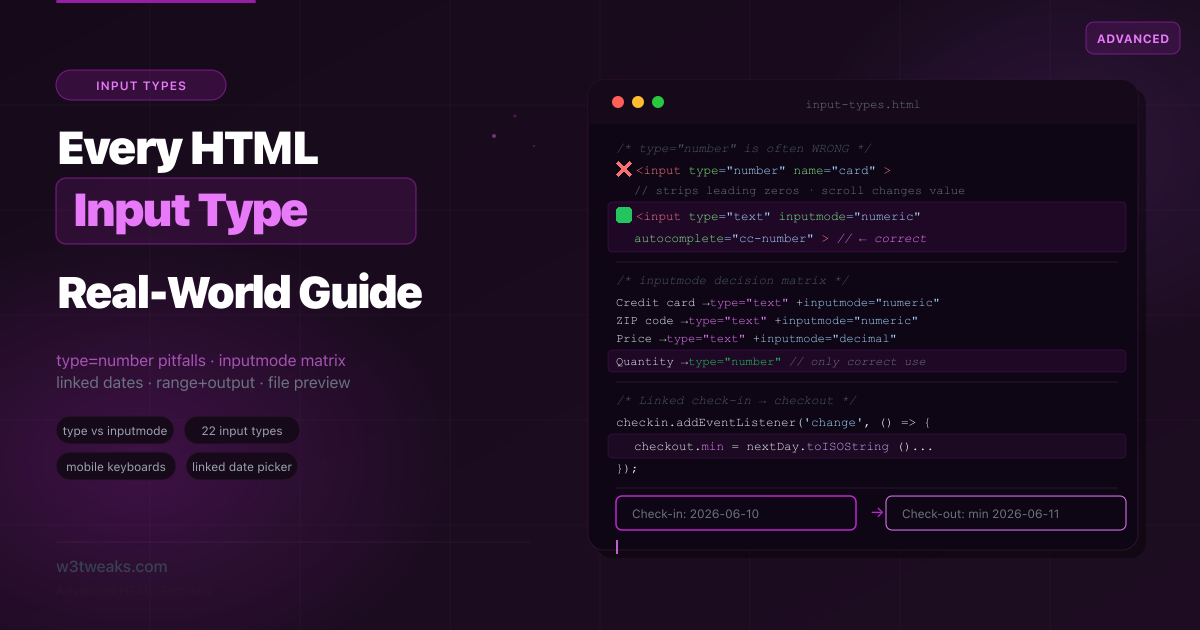
There are 22 HTML input types. Most tutorials list all 22 with a code snippet each. What they don’t tell you is that type="number" is the wrong choice for credit card numbers, ZIP codes, one-time passwords, and any other data that “consists of numbers but isn’t a number” — the spec’s own language. They don’t show you inputmode, which gives you the mobile keyboard of your choice without any of type="number"’s UX quirks. They don’t cover enterkeyhint, which controls the soft-keyboard Return key. And they don’t show you the <output> element — the semantic HTML partner for <input type="range"> that almost nobody has heard of.
This guide goes beyond the reference list. Every input type gets its real-world use case, its mobile keyboard behavior, its gotchas, and its correct implementation pattern. Related tutorials: HTML5 Form Validation · Accessible Forms · HTML datalist
Live Demo
Five interactive sections: the input decision helper, text-family inputs with keyboard previews, numeric and range inputs, date and time pickers with linked check-in/out, and file/color/special inputs.
The type="number" Problem Nobody Explains
This is the most common HTML forms mistake . Developers reach for type="number" whenever they need numeric data. The spec says otherwise:
“The type=number state is not appropriate for input that happens to only consist of numbers but isn’t strictly speaking a number.” — WHATWG HTML Living Standard
What type="number" actually does wrong
<!-- ❌ type="number" for a credit card — 4 problems -->
<input type="number" name="card" placeholder="Card number">- Scroll wheel changes the value — hovering and scrolling accidentally increments or decrements the number
- input type number leading zeros are silently stripped —
value="007"renders as7, breaking ZIP codes, OTPs, and formatted IDs - Shows browser spinners — ugly increment/decrement arrows on a card number field
badInputvalidity state — partial values like1.2.3triggervalidity.badInput = true, complicating validation
The fix: type="text" + inputmode
<!-- ✅ Correct: text semantics + numeric keyboard -->
<input type="text" inputmode="numeric" name="card"
       pattern="[0-9 ]{13,19}"
       autocomplete="cc-number"
       placeholder="1234 5678 9012 3456">

<!-- ✅ ZIP code: keeps leading zeros, no spinners -->
<input type="text" inputmode="numeric" name="zip"
       pattern="[0-9]{5}" autocomplete="postal-code"
       placeholder="12345">

<!-- ✅ OTP: same -->
<input type="text" inputmode="numeric" name="otp"
       pattern="[0-9]{6}" autocomplete="one-time-code"
       placeholder="000000" maxlength="6">
When type="number" IS correct
<!-- ✅ Actual quantities — increment/decrement makes sense -->
<input type="number" name="qty" min="1" max="99" step="1" value="1">
<input type="number" name="age" min="0" max="150">
<input type="number" name="price" min="0" step="0.01">
Use type="number" only when: the value is a pure mathematical quantity where incrementing/decrementing is meaningful, leading zeros are irrelevant, and decimal steps make sense.
The inputmode Attribute — Mobile Keyboards Without the Baggage
inputmode tells the mobile browser which virtual keyboard to show, completely independently of the semantic type. It’s supported in all browsers since 2020 and is one of the most underused attributes in HTML.
inputmode="none"     <!-- No keyboard (custom keyboard via JS) -->
inputmode="text"     <!-- Standard text keyboard (default) -->
inputmode="decimal"  <!-- Numeric with decimal point and minus key -->
inputmode="numeric"  <!-- Digits 0-9 only (no decimal, no minus) -->
inputmode="tel"      <!-- Phone keypad (0-9, *, #) -->
inputmode="search"   <!-- Search-optimized (submit key labeled "Search") -->
inputmode="email"    <!-- Email-optimized (@ and .com keys) -->
inputmode="url"      <!-- URL-optimized (/ and .com keys) -->
inputmode numeric vs decimal — which one when?
Choosing between inputmode numeric vs decimal: numeric hides the period and minus keys (use for credit cards, ZIPs, OTPs, integers). decimal keeps the period and minus (use for prices, decimals, signed numbers, GPS coordinates).
The complete decision matrix
| Data you’re collecting | Best type | Best inputmode | Why |
|---|---|---|---|
| Quantity (items, people) | number | — | Spinner makes sense |
| Price / decimal | text | decimal | Keeps formatting, decimal keyboard |
| Credit card number | text | numeric | No spinners, no leading-zero loss |
| ZIP / postal code | text | numeric | Preserves leading zeros |
| OTP / PIN | text | numeric | Short numeric code |
| Phone number | tel | — | Native phone keyboard |
| Email address | email | — | Native email keyboard |
| URL / website | url | — | Native URL keyboard |
| Search query | search | — | Search-optimized keyboard |
| Free text | text | text | Standard keyboard |
| Currency formatted | text | decimal | ”£1,234.56” needs text type |
HTML Input enterkeyhint Values — All 7
enterkeyhint is the sister attribute to inputmode: it controls the label on the soft-keyboard Return key so the action becomes obvious. Supported in all major browsers since 2021.
| Value | Return key label | Use for |
|---|---|---|
enter | Default ↵ | Insert newline (default for multi-line) |
done | Done | Last field of a form / OTP / form not yet submittable |
go | Go | URL bar, single-field submit-on-Enter |
next | Next | Move to next field in multi-step / multi-field |
previous | Previous | Move to previous field |
search | Search | Search inputs (implicit with type="search") |
send | Send | Chat message inputs, comment composers |
<!-- OTP: last digit submits, Return should say "Done" -->
<input type="text" inputmode="numeric" autocomplete="one-time-code"
       enterkeyhint="done" maxlength="6">

<!-- Chat composer: Return sends the message -->
<input type="text" enterkeyhint="send" placeholder="Type a message…">

<!-- Multi-step form: Return moves to next field -->
<input type="text" enterkeyhint="next" autocomplete="given-name">
<input type="text" enterkeyhint="next" autocomplete="family-name">
<input type="email" enterkeyhint="done" autocomplete="email">
A small detail that makes a huge UX difference on mobile — Return labeled “Send” vs ”↵” makes the action self-evident.
Text-Family Inputs
type="text" — the baseline
<input type="text" name="name" autocomplete="name"
       minlength="2" maxlength="80" placeholder="Full name">
type="password"
<input type="password" name="current-pw"
       autocomplete="current-password" minlength="8">

<input type="password" name="new-pw"
       autocomplete="new-password" minlength="8">
autocomplete="new-password" is the signal password managers use to offer to generate a strong password. Never use autocomplete="off" for password fields — it disables password managers entirely.
type="email"
<input type="email" name="email" autocomplete="email"
       placeholder="you@example.com" required>

<!-- Multiple emails -->
<input type="email" name="cc-emails" multiple
       placeholder="alice@ex.com, bob@ex.com">
Validation checks: presence of @, at least one character before, at least one character and a dot after. Does NOT verify the domain exists — that’s always server-side.
type="url"
<input type="url" name="website" autocomplete="url"
       placeholder="https://example.com">
Validation requires a valid scheme (http://, https://, etc.). example.com without a scheme fails. Always use placeholder to show the expected format.
type="tel" with input type tel pattern validation
<input type="tel" name="phone" autocomplete="tel"
       pattern="[0-9]{3}-[0-9]{3}-[0-9]{4}"
       placeholder="555-867-5309"
       enterkeyhint="next"
       title="Format: 555-867-5309">
input type tel pattern validation is advisory only — type=tel itself enforces nothing (phone numbers vary too widely internationally). Always pair with pattern for format enforcement.
type="search" — more than cosmetic
type="search" is widely treated as a cosmetic variant of type="text". It has real behavioral differences:
<label for="site-search" class="sr-only">Search tutorials</label>
<input type="search" id="site-search" name="q"
       autocomplete="off"
       enterkeyhint="search"
       placeholder="Search…"
       aria-label="Search tutorials">
What type="search" does differently:
- Adds a clear (×) button natively in Chrome, Edge, and Safari when the field has content
- On mobile, the submit/return key is labeled “Search”
- Adds
role="searchbox"to the accessibility tree automatically - macOS/iOS may integrate with Spotlight search heuristics
input[type="search"]::-webkit-search-cancel-button {
  -webkit-appearance: none;
}
Suppress autocomplete: spellcheck, autocorrect, autocapitalize
Three attributes that suppress “helpful” mobile behaviors that get in the way for codes, usernames, and IDs:
| Attribute | Purpose | Set to OFF for |
|---|---|---|
spellcheck="false" | Disables red squiggly | Usernames, codes, IBANs, postcodes |
autocorrect="off" | iOS auto-correct | Usernames, codes, technical fields |
autocapitalize="off" | iOS first-letter caps | Usernames, lowercase tokens, emails |
autocomplete="off" | Browser autofill | Genuine security need only |
<!-- Username: don't capitalize, correct, or spellcheck -->
<input type="text" name="username" autocomplete="username"
       spellcheck="false" autocorrect="off" autocapitalize="off"
       inputmode="text">

<!-- Bitcoin address: definitely don't autocorrect -->
<input type="text" name="btc-address"
       spellcheck="false" autocorrect="off" autocapitalize="off"
       inputmode="text">
spellcheck="false" is the only one of these in the HTML spec; autocorrect and autocapitalize are Apple-originated but supported in Chrome too.
The pattern Regex Cookbook
Copy-paste patterns for the most common formatted fields. Every row pairs the regex with its inputmode and autocomplete companions:
| Field | pattern | inputmode | autocomplete |
|---|---|---|---|
| Credit card | [0-9\s]{13,19} | numeric | cc-number |
| CVV / CSC | [0-9]{3,4} | numeric | cc-csc |
| MM/YY card expiry | (0[1-9]|1[0-2])\/[0-9]{2} | numeric | cc-exp |
| US phone | [0-9]{3}-[0-9]{3}-[0-9]{4} | tel | tel-national |
| US ZIP | \d{5}(-\d{4})? | numeric | postal-code |
| UK postcode | [A-Z]{1,2}\d[A-Z\d]?\s*\d[A-Z]{2} | text | postal-code |
| IBAN | [A-Z]{2}\d{2}[A-Z0-9]{1,30} | text | off |
| Hex color | #[0-9A-Fa-f]{6} | text | off |
| OTP 6-digit | [0-9]{6} | numeric | one-time-code |
| Username (lowercase) | [a-z0-9_]{3,20} | text | username |
The pattern attribute only runs validation; you still need title to tell users what the format means (browsers show the title text in the validation tooltip).
autocomplete=“one-time-code” + WebOTP API for iOS SMS
iOS 14+ auto-fills SMS verification codes when the input has autocomplete="one-time-code" AND the SMS follows Apple’s domain-bound format:
Your code is 123456

@example.com #123456
The bottom line tells iOS the code belongs to example.com. The QuickType bar above the keyboard suggests the code instantly.
<!-- iOS auto-fill from SMS -->
<input type="text" inputmode="numeric"
       autocomplete="one-time-code"
       enterkeyhint="done"
       maxlength="6" pattern="[0-9]{6}">
For Chrome Android (and as an iOS programmatic fallback), use the WebOTP API to read the code without copy-paste:
// Chrome 84+ on Android — read code from SMS programmatically
if ('OTPCredential' in window) {
  const ac = new AbortController();
  navigator.credentials.get({
    otp: { transport: ['sms'] },
    signal: ac.signal,
  }).then(otp => {
    document.getElementById('otp').value = otp.code;
    ac.abort();
  });
}
The SMS must end with @example.com #123456 for both iOS auto-fill and Chrome WebOTP to recognize the binding.
Numeric Inputs and the input range output element
type="number" — when it’s right
<input type="number" id="qty" name="quantity"
       min="1" max="99" step="1" value="1">

<input type="number" name="rating"
       min="1" max="5" step="0.5" value="3">

<input type="number" name="price"
       min="0" max="9999.99" step="0.01">
valueAsNumber — typed numeric access
Reading .value returns a string. Reading .valueAsNumber returns a real number — no parseFloat needed:
const qty = document.getElementById('qty');
const total = qty.valueAsNumber * 19.99; // ✅ number * number
// vs
const total = qty.value * 19.99; // ⚠️ string coerced — works but error-prone
Setting valueAsNumber = NaN clears the field; setting it to any number formats it appropriately.
type="range" with <output> — the semantic live-value pattern
Wiring an input range output element with oninput gives you live value display without JS state — <output> has implicit role="status" so screen readers announce changes as a polite live region:
<label for="volume">Volume</label>
<div class="range-wrap">
  <input type="range" id="volume" name="volume"
         min="0" max="100" step="1" value="50"
         oninput="this.nextElementSibling.value = this.value">
  <output for="volume">50</output>
</div>
// Or with a named reference:
const range = document.getElementById('volume');
const output = document.querySelector('output[for="volume"]');
range.addEventListener('input', () => {
output.value = range.value;
});Using <span> instead of <output> loses both the semantic connection (for attribute) and the live-region announcement.
input event vs change event
| Event | Fires when | Best for |
|---|---|---|
input | Every value mutation (every keystroke, slider tick, color pick) | Live previews, character counters, range output sync |
change | Value is “committed” (blur for text, picker close for date, end of drag for range in some browsers) | Saving to server, triggering validation, linked date math |
blur | Field loses focus | Validation timing for accessibility |
range.addEventListener('input',  e => preview.style.opacity = e.target.value);  // every tick
range.addEventListener('change', e => saveToServer(e.target.value));            // on release
Styling type="range" cross-browser
input[type="range"] {
  -webkit-appearance: none;
  appearance: none;
  width: 100%;
  height: 6px;
  border-radius: 3px;
  background: #e5e7eb;
}

input[type="range"]::-webkit-slider-thumb {
  -webkit-appearance: none;
  width: 20px; height: 20px;
  border-radius: 50%;
  background: #8b5cf6;
  border: 2px solid #fff;
  box-shadow: 0 1px 4px rgba(0,0,0,.2);
}

input[type="range"]::-moz-range-thumb {
  width: 20px; height: 20px;
  border-radius: 50%;
  background: #8b5cf6;
  border: 2px solid #fff;
}
Date and Time Inputs (with datetime-local timezone offset)
type="date" — the cross-browser reality
<input type="date" name="birthday"
       min="1900-01-01" max="2026-12-31">
Value format is always YYYY-MM-DD regardless of the browser’s display format. The displayed format follows the user’s locale.
valueAsDate and the datetime-local gotcha
// Get a real Date object instead of parsing the string
const birthday = document.getElementById('birthday');
const date = birthday.valueAsDate; // Date object at midnight UTC

// Setting today as default value
birthday.valueAsDate = new Date();
Critical: valueAsDate returns null on <input type="datetime-local"> — MDN’s own documentation calls this out. For datetime-local, parse .value manually or use valueAsNumber (which returns a timestamp).
Linked date inputs — the check-in / checkout pattern
This is the most-searched date input question and the worst-documented pattern. Use UTC-safe math — new Date('YYYY-MM-DD') parses as UTC midnight, so naive setDate(getDate() + 1) advances the LOCAL day, which in negative-offset timezones (Americas) puts you back at the original date:
<div class="date-range">
  <div class="field">
    <label for="checkin">Check-in</label>
    <input type="date" id="checkin"  name="checkin">
  </div>
  <div class="field">
    <label for="checkout">Check-out</label>
    <input type="date" id="checkout" name="checkout" disabled>
  </div>
</div>
const checkin = document.getElementById('checkin');
const checkout = document.getElementById('checkout');
// Set today as min for checkin
const today = new Date().toISOString().split('T')[0];
checkin.min = today;
checkin.addEventListener('change', () => {
if (!checkin.value) {
checkout.value = '';
checkout.disabled = true;
return;
}
// UTC-safe next-day math — split the YYYY-MM-DD string and use Date.UTC
// so the +1 happens in UTC space, not the user's local timezone
const [y, m, d] = checkin.value.split('-').map(Number);
const next = new Date(Date.UTC(y, m - 1, d + 1));
checkout.min = next.toISOString().split('T')[0];
checkout.disabled = false;
if (checkout.value && checkout.value <= checkin.value) {
checkout.value = '';
}
checkout.focus();
});type="time"
<input type="time" name="appt-time"
       min="09:00" max="17:00" step="1800">
Step in seconds: 1800 = 30 minutes. Value is always HH:MM or HH:MM:SS in 24-hour format.
type="datetime-local" — the timezone trap
<input type="datetime-local" name="event-start"
       min="2026-06-01T09:00"
       max="2026-12-31T23:59">
The datetime-local timezone offset is not stored — the control is a wall-clock string only. The value is whatever the user types in their local time, with no timezone conversion. Capture the timezone separately:
const tz = Intl.DateTimeFormat().resolvedOptions().timeZone; // e.g. "America/New_York"

// Construct the full datetime + timezone to store/send
function getFullDatetime(localValue, timezone) {
  return { datetime: localValue + ':00', timezone };
}
type="month" and type="week"
<input type="month" name="billing-month"
       min="2026-01" max="2026-12"
       autocomplete="cc-exp">

<input type="week" name="sprint-week">
Browser support caveat: type="month" and type="week" are not supported in Safari (macOS/iOS) today — they fall back to type="text". Always pair with a polyfill, two <select> fallback for month, or server-side validation.
Selection Inputs
type="checkbox"
<label>
  <input type="checkbox" name="terms" required>
  I accept the <a href="/terms">Terms of Service</a>
</label>

<!-- Indeterminate state — set via JS only -->
<input type="checkbox" id="select-all">
<script>
  document.getElementById('select-all').indeterminate = true;
</script>
The indeterminate state is CSS-selectable with :indeterminate — useful for “select all” controls when only some children are selected.
type="radio"
<fieldset>
  <legend>Payment method</legend>
  <label><input type="radio" name="payment" value="card"   checked> Credit card</label>
  <label><input type="radio" name="payment" value="paypal">         PayPal</label>
  <label><input type="radio" name="payment" value="crypto">         Crypto</label>
</fieldset>
Always use <fieldset> + <legend> for radio groups — see the Accessible Forms tutorial.
File and Media Inputs
type="file" with image preview
<label for="avatar">Profile photo</label>
<input type="file" id="avatar" name="avatar"
       accept="image/png,image/jpeg,image/webp"
       aria-describedby="avatar-hint">
<span id="avatar-hint" class="hint">PNG, JPG, or WebP. Max 2MB.</span>
<div id="avatar-preview"></div>
const fileInput = document.getElementById('avatar');
const preview = document.getElementById('avatar-preview');
fileInput.addEventListener('change', () => {
const file = fileInput.files[0];
if (!file) return;
// ✅ Instant preview with URL.createObjectURL — one line
const url = URL.createObjectURL(file);
preview.innerHTML = `<img src="${url}" alt="Preview" style="max-width:200px;border-radius:8px">`;
// Revoke when no longer needed (prevents memory leak)
preview.querySelector('img').onload = () => URL.revokeObjectURL(url);
});Mobile camera, multiple files, folder uploads
Three lesser-known file-input attributes that unlock big UX wins:
<!-- Open the rear camera directly on mobile -->
<input type="file" accept="image/*" capture="environment">

<!-- Front camera (selfie) -->
<input type="file" accept="image/*" capture="user">

<!-- Multiple file selection — handles arrays in change handler -->
<input type="file" accept="image/*" multiple>

<!-- Whole-folder upload (Chrome/Edge) -->
<input type="file" webkitdirectory directory>
Rendering an input type file preview multiple images: loop e.target.files and URL.createObjectURL each.
input.addEventListener('change', (e) => {
  const files = Array.from(e.target.files);
  files.forEach(file => {
    const url = URL.createObjectURL(file);
    const img = document.createElement('img');
    img.src = url;
    img.onload = () => URL.revokeObjectURL(url);
    preview.appendChild(img);
  });
});
Drag-and-drop file uploads
The dropzone needs dragover (with preventDefault so the browser doesn’t navigate to the file) and drop:
<div id="dropzone" tabindex="0">
  <input type="file" id="dz-file" accept="image/*" multiple>
  <p>Drop files here or click to choose</p>
</div>
const dropzone = document.getElementById('dropzone');
const fileInput = document.getElementById('dz-file');
dropzone.addEventListener('dragover', (e) => {
e.preventDefault();
dropzone.classList.add('over');
});
dropzone.addEventListener('dragleave', () => dropzone.classList.remove('over'));
dropzone.addEventListener('drop', (e) => {
e.preventDefault();
dropzone.classList.remove('over');
fileInput.files = e.dataTransfer.files; // populate the input
fileInput.dispatchEvent(new Event('change')); // trigger your existing handler
});Assigning e.dataTransfer.files to fileInput.files requires a DataTransfer — modern browsers accept it directly; in older browsers you need to construct one.
Custom file button — the accessible label trick
The native file button is impossible to style cross-browser. The accessible pattern: visually hide the <input> and style its <label>:
<input type="file" id="custom-file" class="visually-hidden">
<label for="custom-file" class="file-button">
  <span class="icon" aria-hidden="true">📁</span>
  Choose file
</label>
<span id="file-name" aria-live="polite"></span>
.visually-hidden {
position: absolute;
width: 1px; height: 1px;
padding: 0; margin: -1px;
overflow: hidden;
clip: rect(0 0 0 0);
}
.file-button {
display: inline-flex;
align-items: center;
gap: 8px;
padding: 10px 16px;
background: #8b5cf6;
color: #fff;
border-radius: 8px;
cursor: pointer;
}
/* Focus ring on the label when the (hidden) input has focus */
.visually-hidden:focus + .file-button {
outline: 3px solid #8b5cf6;
outline-offset: 2px;
}document.getElementById('custom-file').addEventListener('change', (e) => {
const name = e.target.files[0]?.name || 'No file chosen';
document.getElementById('file-name').textContent = name;
});The clicker target IS the label — same accessibility tree node, same keyboard activation, but full visual control.
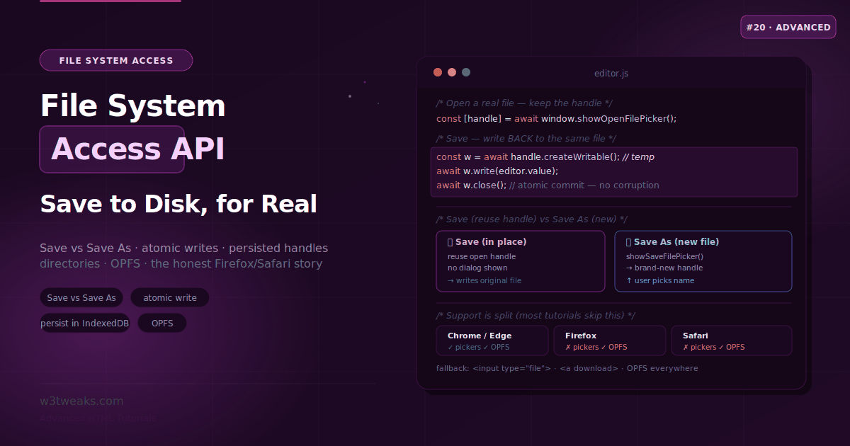
showOpenFilePicker() — the modern alternative
The File System Access API gives you a programmatic file picker that can also write back:
async function pickAndSave() {
  if ('showOpenFilePicker' in window) {
    const [handle] = await window.showOpenFilePicker({
      types: [{
        description: 'Images',
        accept: { 'image/*': ['.png', '.jpg', '.jpeg', '.webp'] },
      }],
    });
    const file = await handle.getFile();
    // …handle the file
  } else {
    // Fallback to <input type="file">
    document.getElementById('fallback-file').click();
  }
}
Currently supported in Chrome 86+, Edge 86+ (not Firefox/Safari) — always feature-detect and fall back to <input type="file">.
Converting input type color hex to rgb
type="color" always returns a lowercase 6-character hex string (#rrggbb). Converting input type color hex to rgb: slice the #rrggbb string in pairs and parseInt(_, 16):
<label for="brand-color">Brand color</label>
<input type="color" id="brand-color" name="brand-color" value="#8b5cf6">
const colorInput = document.getElementById('brand-color');
colorInput.addEventListener('input', () => {
const hex = colorInput.value; // "#8b5cf6"
const r = parseInt(hex.slice(1, 3), 16);
const g = parseInt(hex.slice(3, 5), 16);
const b = parseInt(hex.slice(5, 7), 16);
document.documentElement.style.setProperty('--brand', hex);
});No alpha transparency — the color picker is RGB only.
<input list="…"> + <datalist> Native Autocomplete
<input list> paired with <datalist> gives a native autocomplete dropdown with zero JavaScript:
<label for="country">Country</label>
<input type="text" id="country" name="country" list="country-list"
       autocomplete="country-name">

<datalist id="country-list">
  <option value="United States">
  <option value="United Kingdom">
  <option value="Canada">
  <option value="Australia">
</datalist>
Browser-native dropdown that filters as you type, full keyboard navigation, accessible by default in most environments.
Screen reader caveat: today, NVDA + Firefox don’t reliably announce datalist options — VoiceOver + Safari and JAWS + Chrome work well. If your form is mission-critical and your audience includes NVDA users, fall back to a custom ARIA Combobox pattern. See the HTML datalist tutorial for the full pattern.
Action Inputs
type="submit", type="reset", type="button"
<!-- Always prefer <button> over <input type="submit"> — allows HTML content -->
<button type="submit">Submit <span aria-hidden="true">→</span></button>
<button type="reset">Clear form</button>
<button type="button" onclick="doSomething()">Custom action</button>
Hidden and Special Inputs
type="hidden"
<input type="hidden" name="csrf_token" value="abc123xyz">
<input type="hidden" name="user_id" value="42">
type="hidden" is NOT a security mechanism — users can edit hidden values via DevTools.
type="reset" — almost never use it
Users frequently click Reset by accident, losing all their form data. Avoid unless you genuinely need a full reset.
Complete Mobile Keyboard Reference
The definitive type + inputmode + enterkeyhint + autocomplete guide for every common field:
<!-- Full name -->
<input type="text" autocomplete="name" enterkeyhint="next">

<!-- Email -->
<input type="email" autocomplete="email" enterkeyhint="next">

<!-- Phone -->
<input type="tel" autocomplete="tel" enterkeyhint="next">

<!-- Quantity (whole numbers) -->
<input type="number" min="1" max="999" step="1">

<!-- Price / monetary value -->
<input type="text" inputmode="decimal" autocomplete="transaction-amount"
       pattern="[0-9]+(\.[0-9]{1,2})?">

<!-- Credit card number -->
<input type="text" inputmode="numeric" autocomplete="cc-number"
       pattern="[0-9 ]{13,19}" maxlength="19" enterkeyhint="next">

<!-- Credit card expiry -->
<input type="month" autocomplete="cc-exp">

<!-- CVV -->
<input type="text" inputmode="numeric" autocomplete="cc-csc"
       pattern="[0-9]{3,4}" maxlength="4" enterkeyhint="done">

<!-- ZIP / postal code -->
<input type="text" inputmode="numeric" autocomplete="postal-code"
       pattern="[0-9]{5}" enterkeyhint="next">

<!-- OTP / verification code -->
<input type="text" inputmode="numeric" autocomplete="one-time-code"
       pattern="[0-9]{6}" maxlength="6" enterkeyhint="done">

<!-- Password (new) -->
<input type="password" autocomplete="new-password">

<!-- Search -->
<input type="search" autocomplete="off" enterkeyhint="search">

<!-- Chat message composer -->
<input type="text" enterkeyhint="send" placeholder="Type a message…">

<!-- Username (no autocorrect / autocapitalize) -->
<input type="text" autocomplete="username" inputmode="text"
       spellcheck="false" autocorrect="off" autocapitalize="off"
       enterkeyhint="next">
Browser Support Summary
| Type | Chrome | Firefox | Safari | Edge | Notes |
|---|---|---|---|---|---|
| text, password, email, url, tel, search | All | All | All | All | Universal |
| number | All | All | All | All | See caveats |
| range | All | All | All | All | Styling varies |
| date | All | All | All | All | Display format varies by locale |
| time | All | All | All | All | |
| datetime-local | All | All | All | All | No timezone |
| month | All | All | ❌ | All | Falls back to text in Safari |
| week | All | All | ❌ | All | Falls back to text in Safari |
| color | All | All | Partial | All | No alpha; Safari limited |
| file | All | All | All | All | |
| checkbox, radio, hidden, submit, reset, button | All | All | All | All | Universal |
enterkeyhint | All | All (102+) | All (16+) | All | Safe today |
| WebOTP API | 84+ | ❌ | ❌ | All | Android only |
showOpenFilePicker | 86+ | ❌ | ❌ | 86+ | Chromium only |
Key Takeaways
type="number"is wrong for credit card numbers, ZIP codes, OTPs, and any data where leading zeros matter or the data isn’t a math quantity — usetype="text"+inputmode="numeric"insteadinputmodenumeric vs decimal: numeric hides the period (cards/ZIPs); decimal keeps it (prices/decimals)enterkeyhintcontrols the soft-keyboard Return key label —sendfor chats,donefor last fields,nextfor multi-stepautocomplete="one-time-code"+ iOS SMS@example.com #123456format auto-fills the QuickType bar; WebOTP API is the Android equivalent- The pattern regex cookbook covers credit card, phone, postcode, IBAN, hex color, OTP — pair each with the right
inputmode+autocomplete type="search"is not just cosmetic — native clear button, “Search” Return label,role="searchbox"- Use
<output for="range-id">to display the live value of atype="range"input — implicitrole="status" valueAsNumber/valueAsDategive typed access withoutparseFloat/new Date— butvalueAsDateisnullfor datetime-localinputevent fires on every keystroke;changeevent fires when the value is committedtype="datetime-local"has no timezone information — capture the user’s timezone separately viaIntl.DateTimeFormat().resolvedOptions().timeZonetype="month"andtype="week"fall back totype="text"in Safari- Linked date pickers need UTC-safe date math (
Date.UTC()from split string) — naivesetDate(getDate()+1)produces same-day results in Americas timezones - Use
URL.createObjectURL(file)for instant image previews — one line, no FileReader capture="environment"opens the rear camera on mobile;multiple+dataTransfer.filesenable drag-drop- Custom file button: visually hide the
<input>, style the<label>— full visual control + accessibility intact showOpenFilePicker()is the modern Chromium-only alternative; feature-detect with fallback<input list>+<datalist>gives native autocomplete with zero JS — but NVDA+Firefox don’t announce optionsspellcheck/autocorrect/autocapitalizesuppress unwanted mobile “helpfulness” for usernames, codes, IBANs
FAQ
What is the difference between type number and type text with inputmode numeric?
type="number" triggers numeric validation, strips leading zeros, shows spinner controls, and changes the value on scroll — behavior you often don’t want for credit cards, ZIP codes, or OTPs. type="text" inputmode="numeric" gives the numeric keyboard on mobile without any of those side effects. The value stays as a string, leading zeros are preserved, and you control validation via the pattern attribute.
What’s the difference between inputmode numeric vs decimal?
inputmode="numeric" shows a digits-only keypad (0–9), with no period and no minus key — perfect for credit cards, ZIP codes, OTPs, and PINs. inputmode="decimal" shows the same digits plus a period and minus key, which is what you want for prices, weights, percentages, and any signed or fractional number. Don’t mix them up: an inputmode=“numeric” on a price field traps users when they try to type the decimal point.
Which HTML input type should I use for a phone number?
Use type="tel". It triggers the phone keypad on mobile (numeric keys plus * and #), doesn’t validate format (phone numbers vary internationally), and works with autocomplete="tel" for autofill. Pair it with a pattern attribute for the specific format your app requires and a title describing the expected format.
How do I set an HTML date input default value to today?
Two clean options. Pure-HTML: set the value attribute server-side to today’s YYYY-MM-DD. Client-side: document.getElementById('mydate').valueAsDate = new Date(). Setting valueAsDate works in every browser for type="date" but returns null on type="datetime-local" — for datetime-local, build the string manually: new Date().toISOString().slice(0,16).
How do I link a check-in date input to a checkout date input?
Listen for the change event on the check-in input. Use UTC-safe date math: split the YYYY-MM-DD string, then use new Date(Date.UTC(y, m-1, d+1)) to advance to the next day. Naive new Date(checkin.value); next.setDate(next.getDate()+1) produces wrong results in negative-offset timezones (Americas) — the value lands back on the same UTC date. Set checkout.min to the next-day string, enable the field, clear the value if it’s now invalid.
How do I show a live value for a range input?
Use the <output> element: <output for="range-id">initial-value</output>. Update it with output.value = range.value in an input event listener. <output> has implicit role="status" so screen readers announce changes as a polite live region. It’s semantically connected to the input via the for attribute, unlike a <span> which is just a visual display.
How do I create an image preview before file upload?
Use URL.createObjectURL(file) in the change event: const url = URL.createObjectURL(fileInput.files[0]). Set it as the src of an <img> element. Call URL.revokeObjectURL(url) after the image loads to release the memory. This is faster and simpler than FileReader.readAsDataURL() and doesn’t block the main thread.
How do I capture a photo from the rear camera with input type=file?
Use capture="environment": <input type="file" accept="image/*" capture="environment">. iOS Safari and Android Chrome open the rear camera app directly. Use capture="user" for the front (selfie) camera. The user can still cancel the camera and pick from the photo library — capture is a hint, not a forced mode. Falls back to a normal file picker on desktop.
What happens to type month and type week in Safari?
Both fall back to type="text" in Safari on macOS and iOS today. The user sees a plain text input with no picker UI. Always pair these inputs with a placeholder showing the expected format and server-side validation. For month, consider using two separate <select> elements for month and year as a universally supported fallback, or a JavaScript date picker library.