Forms are where accessibility failures concentrate. According to WebAIM’s Million report, over 50% of WCAG errors appear in forms — missing labels, insufficient error identification, inaccessible field groupings. Every tutorial covers the basics: <label> with for, fieldset with legend, aria-describedby for hints.
But they stop before the hard parts. Nobody explains that <legend> text is repeated before every radio button label — and why that becomes unusable when your legend is 12 words long. Nobody shows aria-describedby referencing two IDs at once, which is how real form UX handles the hint-plus-error state. Nobody covers aria-errormessage, the newer attribute that specifically links error text to a field when aria-invalid="true" is set. Almost nobody shows all five steps of the accessible submit-error pattern together in one working implementation. And almost no article covers the WCAG 2.2 criteria that now apply specifically to forms — Redundant Entry, Accessible Authentication, and Target Size.
This guide covers all of it. Related tutorials: HTML5 Form Validation · ARIA Roles Practical Guide · Focus Management
Live Demo
Five interactive examples: labeling patterns, fieldset legend verbosity, the 5-step error pattern with error summary, aria-invalid and aria-errormessage, and advanced patterns (password toggle, character counter, autocomplete).
Before / After — Inaccessible vs Accessible Form
❌ Before — common mistakes in one form
<!-- Every issue here is a WCAG failure -->
<form>
  <!-- No label association -->
  <input type="text" placeholder="Enter your name">

  <!-- Placeholder as label — disappears on focus -->
  <input type="email" placeholder="Email address *">

  <!-- Radio group with no fieldset — no group context for SR -->
  <p>Contact preference:</p>
  <input type="radio" name="contact" id="r1"> <label for="r1">Phone</label>
  <input type="radio" name="contact" id="r2"> <label for="r2">Email</label>

  <!-- Error shown only with color — fails non-color requirement -->
  <input type="tel" style="border-color: red">
  <span style="color: red">Invalid format</span>

  <button>Submit</button>
</form>
WCAG failures: 1.1.1, 1.3.1, 1.3.5, 2.4.3, 3.3.1, 3.3.2.
✅ After — accessible form
<form novalidate>
  <div class="field">
    <label for="name">Full name <span aria-hidden="true">*</span></label>
    <input type="text" id="name" name="name"
           required autocomplete="name"
           aria-required="true"
           aria-describedby="name-hint name-error">
    <span id="name-hint" class="hint">First and last name</span>
    <span id="name-error" class="error" hidden aria-live="polite"></span>
  </div>

  <fieldset>
    <legend>Contact preference</legend>
    <label><input type="radio" name="contact" value="phone"> Phone</label>
    <label><input type="radio" name="contact" value="email"> Email</label>
  </fieldset>

  <div class="field">
    <label for="phone">Phone number</label>
    <input type="tel" id="phone" name="phone"
           autocomplete="tel"
           aria-describedby="phone-hint phone-error">
    <span id="phone-hint" class="hint">Format: 555-867-5309</span>
    <span id="phone-error" class="error" hidden></span>
  </div>

  <button type="submit">Submit</button>
</form>
Step 1 — Accessible Form Labels: 3 Methods
Every interactive form control must have an accessible name — the text announced by screen readers when the control receives focus. There are three methods, with a clear priority order. Accessible form labels start with the rule every screen reader expects: every input needs a programmatic name.
Method 1: <label> with for/id (preferred)
<label for="email">Email address</label>
<input type="email" id="email" name="email" autocomplete="email">
Expands the click target, works with every screen reader, clearly visible to all users.
Method 2: aria-label (for controls without visible labels)
<!-- ✅ Use when no visible label text exists — icon buttons, search bars -->
<button aria-label="Close dialog">✕</button>
<input type="search" aria-label="Search tutorials" placeholder="Search…">
Method 3: aria-labelledby (for controls labeled by other visible text)
<h2 id="billing-heading">Billing address</h2>
<div role="group" aria-labelledby="billing-heading">
  <label for="street">Street</label>
  <input type="text" id="street" name="billing-street" autocomplete="billing street-address">
</div>

<!-- Multiple references — the label AND a heading -->
<h3 id="card-h">Card number</h3>
<input type="text" id="card" aria-labelledby="card-h card-label">
<label id="card-label" for="card">16 digits, no spaces</label>
The accessible name calculation order
When multiple methods apply, the browser uses this priority:
aria-labelledby— always wins (references visible text)aria-label— invisible string on the element<label for="…">— explicit association- Element content (for
<button>,<select option>) titleattribute — fallback, avoid relying on it
Label in Name (WCAG 2.5.3) — and Why aria-label Breaks Voice Control
Label in Name (WCAG 2.5.3, Level A) requires the visible label text to appear inside the accessible name. The most common violation: a button shows the word “Submit” but aria-label="Send form". A voice-control user saying “Click Submit” gets nothing — the speech engine looks up the accessible name, which is “Send form”, and can’t match “Submit”.
<!-- ❌ Fails WCAG 2.5.3 + breaks Dragon NaturallySpeaking + macOS Voice Control -->
<button aria-label="Send form">Submit</button>

<!-- ✅ Visible text matches OR is contained in the accessible name -->
<button aria-label="Submit registration form">Submit</button>

<!-- ✅ Cleanest: no aria-label at all, just the visible button text -->
<button>Submit</button>
The rule: if you must use aria-label on something with visible text, start the accessible name with the visible text exactly. This is the only way voice control, screen reader speech, and visual scanning all agree on what to call the control.
Anti-pattern: Floating labels and placeholder-as-label
Two designer-favorite patterns that wreck accessibility:
<!-- ❌ Placeholder as label — disappears on focus, low contrast,
     screen readers may or may not announce it, voice control can't target it -->
<input type="email" placeholder="Email address">

<!-- ❌ Floating label — visually moves on focus but if the implementation
     uses CSS only (no real <label>), screen readers see nothing -->
<div class="float-label-input">
  <input type="email">
  <span>Email address</span> <!-- styled to float — NOT a real label -->
</div>

<!-- ✅ Real label, always visible -->
<label for="email">Email address</label>
<input type="email" id="email" autocomplete="email">
If you must ship floating labels, use a real <label for> behind the float effect. The visible animation is decoration; the semantic label is what assistive tech needs.
Step 2 — Required Fields: aria-required vs required
The distinction matters and is widely misunderstood:
required (HTML) | aria-required="true" | |
|---|---|---|
| Triggers browser validation | ✅ Yes | ❌ No |
| Announces “required” to screen readers | ✅ Yes (implicitly) | ✅ Yes |
Works with novalidate forms | N/A | ✅ Yes |
| Use case | Native validation | Custom validation flows |
<!-- ✅ Use HTML required for native validation -->
<input type="email" id="email" required autocomplete="email">

<!-- ✅ Use aria-required when you handle validation yourself (novalidate forms) -->
<form novalidate>
  <input type="email" id="email" aria-required="true" autocomplete="email">
</form>
Marking required fields visually
The asterisk convention is universally understood, but must be implemented accessibly:
<!-- ✅ Correct: asterisk hidden from SR (required attribute already signals it) -->
<label for="name">
  Full name
  <span aria-hidden="true">*</span>
</label>
<input type="text" id="name" required autocomplete="name">

<!-- ✅ Also add a note explaining the convention -->
<p><span aria-hidden="true">*</span> Required fields</p>
Step 3 — aria-describedby Example with Multiple IDs
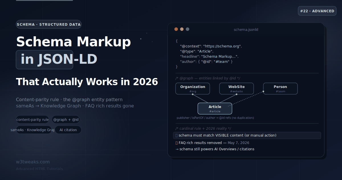
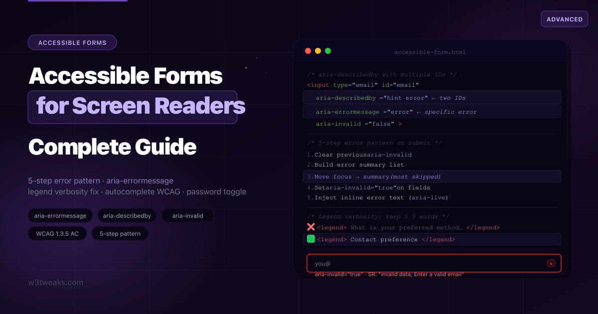
aria-describedby accepts a space-separated list of IDs. Every referenced element’s text is concatenated and announced after the label when the control receives focus.
Here’s a working aria-describedby example wiring one input to a hint and an error at the same time — the key to handling the hint + error state in one attribute:
<div class="field">
  <label for="password">Password <span aria-hidden="true">*</span></label>
  <input type="password" id="password" name="password"
         required
         autocomplete="new-password"
         aria-describedby="pw-hint pw-error"
         aria-invalid="false">

  <!-- Hint: always visible -->
  <span id="pw-hint" class="hint">
    8+ characters, one uppercase letter, one number.
  </span>

  <!-- Error: only shown when invalid, content injected by JS -->
  <span id="pw-error" class="error-msg" aria-live="polite"></span>
</div>
What the screen reader announces on focus:
- When valid: “Password, required. 8+ characters, one uppercase letter, one number.”
- When invalid: “Password, invalid data, required. 8+ characters, one uppercase letter, one number. Password must be at least 8 characters.”
function showError(input, errorEl, message) {
  input.setAttribute('aria-invalid', 'true');
  errorEl.textContent = message;  // Live region announces automatically
}

function clearError(input, errorEl) {
  input.setAttribute('aria-invalid', 'false');
  errorEl.textContent = '';
}
Step 4 — Fieldset Legend Screen Reader: The Verbosity Problem
How a fieldset legend screen reader announcement works: the legend is read once per control, prefixed to each label within the group.
<fieldset>
  <legend>What is your preferred method of contact?</legend>
  <label><input type="radio" name="contact" value="phone"> Phone</label>
  <label><input type="radio" name="contact" value="email"> Email</label>
  <label><input type="radio" name="contact" value="post"> Post</label>
</fieldset>
What NVDA announces navigating this group:
“What is your preferred method of contact? Phone, radio button, 1 of 3” “What is your preferred method of contact? Email, radio button, 2 of 3” “What is your preferred method of contact? Post, radio button, 3 of 3”
The full legend is repeated every time. For a group of 10 checkboxes with a 12-word legend, screen reader users hear 120 words of repeated context.
The fix: keep legends to 3–5 words maximum:
<!-- ✅ Short legend — minimal repetition -->
<fieldset>
  <legend>Contact preference</legend>
  <label><input type="radio" name="contact" value="phone"> Phone</label>
  <label><input type="radio" name="contact" value="email"> Email</label>
</fieldset>

<!-- ✅ When you need longer explanation: put it in aria-describedby on fieldset -->
<fieldset aria-describedby="contact-desc">
  <legend>Contact preference</legend>
  <p id="contact-desc">We'll use this to send you order updates and receipts.</p>
  <label><input type="radio" name="contact" value="phone"> Phone</label>
  <label><input type="radio" name="contact" value="email"> Email</label>
</fieldset>
role="group" as a fieldset alternative
When CSS or framework constraints make <fieldset> impractical, use role="group" with aria-labelledby:
<div role="group" aria-labelledby="contact-group-label">
  <span id="contact-group-label" class="group-label">Contact preference</span>
  <label><input type="radio" name="contact" value="phone"> Phone</label>
  <label><input type="radio" name="contact" value="email"> Email</label>
</div>
Step 5 — WCAG Form Errors: The 5-Step Pattern
WCAG form errors fall under success criteria 3.3.1 (Error Identification), 3.3.3 (Error Suggestion), and 3.3.4 (Error Prevention). This is the complete pattern most tutorials only half-implement.
<!-- Step 0: Set up structures (on page load) -->
<div id="error-summary" role="alert" tabindex="-1" hidden>
  <h2>Please fix the following errors:</h2>
  <ul id="error-list"></ul>
</div>

<form id="myForm" novalidate>
  <div class="field" id="field-name">
    <label for="name">Full name <span aria-hidden="true">*</span></label>
    <input type="text" id="name" name="name"
           required autocomplete="name"
           aria-describedby="name-hint name-error">
    <span id="name-hint" class="hint">First and last name</span>
    <span id="name-error" class="error-msg" aria-live="polite"></span>
  </div>

  <div class="field" id="field-email">
    <label for="email">Email <span aria-hidden="true">*</span></label>
    <input type="email" id="email" name="email"
           required autocomplete="email"
           aria-describedby="email-hint email-error">
    <span id="email-hint" class="hint">We'll send your receipt here</span>
    <span id="email-error" class="error-msg" aria-live="polite"></span>
  </div>

  <button type="submit">Submit</button>
</form>
The accessible form validation JavaScript below runs on blur, sets aria-invalid, and moves focus to the summary on submit:
const form    = document.getElementById('myForm');
const summary = document.getElementById('error-summary');
const list    = document.getElementById('error-list');

form.addEventListener('submit', (e) => {
  e.preventDefault();
  const errors = validateForm();
  if (errors.length > 0) handleErrors(errors);
  else submitForm();
});

function handleErrors(errors) {
  // Step 1: Clear previous state
  document.querySelectorAll('[aria-invalid="true"]').forEach(el => {
    el.setAttribute('aria-invalid', 'false');
  });
  document.querySelectorAll('.error-msg').forEach(el => el.textContent = '');

  // Step 2: Build error summary
  list.innerHTML = errors.map(err => `
    <li><a href="#${err.id}">${err.label}: ${err.msg}</a></li>
  `).join('');
  summary.hidden = false;

  // Step 3: Focus the error summary
  requestAnimationFrame(() => {
    summary.focus();
    summary.scrollIntoView({ behavior: 'smooth', block: 'start' });
  });

  // Steps 4 + 5: Mark each invalid field + inject inline error text
  errors.forEach(err => {
    const input    = document.getElementById(err.id);
    const errorEl  = document.getElementById(`${err.id}-error`);
    input.setAttribute('aria-invalid', 'true');
    errorEl.textContent = err.msg;
  });
}
The 5 steps as a checklist:
☐ Step 1: Clear all previous aria-invalid and error text on new submit attempt
☐ Step 2: Build an error summary listing all failed fields with descriptive links
☐ Step 3: Move focus to the summary (role="alert" + tabindex="-1" + .focus())
☐ Step 4: Set aria-invalid="true" on each failed input
☐ Step 5: Inject specific error text into the linked aria-describedby span
aria-invalid accessibility — When to Flip the Flag
Used correctly, aria-invalid accessibility means flipping the flag after the user has interacted — never on first paint. Adrian Roselli’s research shows that marking required fields invalid before any interaction is what causes the “form announces 15 errors before I’ve typed a single character” complaint.
The 3-state lifecycle:
// State 1: Pristine — page just loaded, user hasn't touched the field
// aria-invalid="false" (or omit entirely)

// State 2: Touched — user has visited and left the field
input.addEventListener('blur', () => {
  const isValid = validate(input.value);
  // Only NOW is it safe to set aria-invalid based on the current value
  input.setAttribute('aria-invalid', isValid ? 'false' : 'true');
});

// State 3: Submitted — user has tried to submit the form
form.addEventListener('submit', (e) => {
  // All fields are "submitted" — validate and flip aria-invalid for any that fail
});
The rule: never set aria-invalid="true" until the user has either (1) blurred the field for the first time, or (2) attempted submit. On input events, clear invalid state (the user is correcting it) — never set it (you’d announce errors mid-typing).
Forced-colors mode and WCAG 1.4.11 Non-text Contrast
Error states often rely on a red border + red text. Two problems:
- WCAG 1.4.11 requires the border to have 3:1 contrast against adjacent colors — many “subtle” reds fail this against light surrounds.
- Windows High Contrast (forced-colors mode) replaces your colors with system tokens. The red border disappears entirely, leaving no visible indicator.
/* ✅ Visible error state in normal mode AND forced-colors mode */
input[aria-invalid="true"] {
  border-color: #dc2626;
  box-shadow: 0 0 0 3px rgba(220, 38, 38, 0.1);
}

@media (forced-colors: active) {
  /* CanvasText is the system "high-contrast text" color — always visible */
  input[aria-invalid="true"] {
    outline: 2px solid CanvasText;
    outline-offset: 2px;
  }
}
Also: keep the error visible without color alone (an icon, the aria-invalid attribute, or the inline error text) — fails WCAG 1.4.1 (Use of Color) otherwise.
role=“status” for Success — the Happy Path
Most error-pattern tutorials forget the success case. Without role="status", “Account created!” is silent for screen reader users.
<!-- Add to the page, hidden initially -->
<div id="form-status" role="status" aria-live="polite" class="sr-only"></div>
function submitForm() {
// ... actual submission ...
const status = document.getElementById('form-status');
// Clearing then setting is the cross-SR trick for re-announcing
status.textContent = '';
requestAnimationFrame(() => {
status.textContent = 'Account created successfully. Redirecting to dashboard…';
});
}Why role="status" and not role="alert"? alert is for urgent/interruptive messages (errors). status is for non-urgent confirmations (success). Both are live regions, but they map to different SR announcement priorities. Use polite not assertive for the same reason.
Step 6 — aria-errormessage vs aria-describedby
aria-errormessage is the semantically correct attribute for error messages. It was added in ARIA 1.1 and provides a more specific relationship than aria-describedby:
aria-describedby | aria-errormessage | |
|---|---|---|
| Announced when | Always (on focus) | Only when aria-invalid="true" |
| Purpose | General description, hints | Error messages specifically |
| Multiple IDs | ✅ Yes | ❌ One ID only |
| Browser support | Universal | Chrome 67+, Firefox 116+, Safari 16.4+ |
| Current SR support | Reliable everywhere | Still uneven (NVDA + VO improving, JAWS partial) |
<!-- Using aria-errormessage (the semantically correct choice for errors) -->
<div class="field">
  <label for="username">Username</label>
  <input type="text" id="username" name="username"
         aria-describedby="username-hint"
         aria-errormessage="username-error"
         aria-invalid="false">
  <span id="username-hint" class="hint">3–20 characters, letters and numbers only.</span>
  <span id="username-error" class="error-msg" hidden></span>
</div>
Practical recommendation: Use both aria-describedby (for hints, always announced) and aria-errormessage (for errors, only when invalid). For the widest screen reader support, also use aria-live="polite" on the error element as a fallback. The belt-and-suspenders pattern:
<input type="email" id="email"
       aria-describedby="email-hint"
       aria-errormessage="email-error"
       aria-invalid="false">
<span id="email-hint">We'll send your receipt here.</span>
<span id="email-error" aria-live="polite" hidden></span>
Step 7 — Autofill + Soft-Keyboard Hints (WCAG 1.3.5 AA)
Hitting autocomplete WCAG AA (1.3.5) means using the spec’s exact token list — not invented values like autocomplete="user". But modern accessible forms ship four MORE attributes that affect cognitive and motor accessibility on mobile:
| Attribute | Purpose | Example | Accessibility impact |
|---|---|---|---|
autocomplete | Browser/password-manager autofill | autocomplete="email" | WCAG 1.3.5 AA, cognitive support, motor support |
inputmode | Soft keyboard layout (mobile) | inputmode="numeric" | Cognitive/motor — right keyboard appears |
enterkeyhint | Soft keyboard Return-key label | enterkeyhint="send" | Sets the action label (send/search/done/go/next/previous/enter) |
autocapitalize | Whether to auto-capitalize first letter | autocapitalize="words" | Reduces typing burden for cognitive disabilities |
spellcheck | Whether to spell-check field | spellcheck="false" | Critical to OFF for usernames, codes, addresses (false-positive squiggles are noise) |
<!-- Phone — numeric keyboard with "next" return key -->
<input type="tel" name="phone"
       autocomplete="tel"
       inputmode="tel"
       enterkeyhint="next">

<!-- 6-digit OTP — numeric keyboard, iOS auto-fills from SMS -->
<input type="text" name="otp"
       autocomplete="one-time-code"
       inputmode="numeric"
       pattern="[0-9]{6}"
       maxlength="6"
       enterkeyhint="done">

<!-- Search — search keyboard with "search" return key -->
<input type="search" name="q"
       autocomplete="off"
       enterkeyhint="search"
       autocapitalize="off"
       spellcheck="false">
The full autocomplete token reference (personal info, address, payment, credentials):
<!-- Name -->
<input autocomplete="name">
<input autocomplete="given-name">
<input autocomplete="family-name">
<input autocomplete="nickname">

<!-- Contact -->
<input autocomplete="email">
<input autocomplete="tel">
<input autocomplete="url">

<!-- Address -->
<input autocomplete="street-address">
<input autocomplete="address-level2"> <!-- city -->
<input autocomplete="address-level1"> <!-- state -->
<input autocomplete="postal-code">
<select autocomplete="country">…</select>

<!-- Billing / shipping prefixes -->
<input autocomplete="billing street-address">
<input autocomplete="shipping street-address">

<!-- Payment -->
<input autocomplete="cc-number">
<input autocomplete="cc-name">
<input autocomplete="cc-exp">
<input autocomplete="cc-csc">

<!-- Credentials -->
<input autocomplete="username">
<input autocomplete="current-password">
<input autocomplete="new-password">
<input autocomplete="one-time-code">
Use autocomplete="off" only when there’s a genuine security reason (bank account numbers, one-time codes after they’ve been used). Using autocomplete="off" on name or email fields to “keep things clean” is a WCAG failure.
WCAG 2.2 Form Criteria
WCAG 2.2 (the current AA bar) adds three success criteria that directly affect forms:
| SC | Name | Rule | Form pattern that satisfies it |
|---|---|---|---|
| 3.3.7 | Redundant Entry (A) | Don’t ask users to re-enter info already provided in the same flow | Pre-fill checkout shipping address from billing; preserve form data across step navigation |
| 3.3.8 | Accessible Authentication (AA) | Auth must not depend on a cognitive function test (CAPTCHA, memory, transcription) UNLESS an alternative exists | Use autocomplete="current-password" so password managers work; offer passkeys; offer email-link alternatives to CAPTCHA |
| 3.3.9 | Accessible Authentication Enhanced (AAA) | Same as 3.3.8 but no exceptions even for object recognition CAPTCHAs | Passkeys, magic links, biometric only |
| 2.5.8 | Target Size Minimum (AA) | Interactive controls must be at least 24×24 CSS pixels (or have 24px-wide spacing around) | padding: 8px 16px on a 14px-text button gets you to ~36px height — comfortable |
The pragmatic checklist:
- All required-information fields have a correct
autocompletetoken (3.3.8 + 1.3.5) - Submit/checkbox/radio targets are ≥24×24 CSS px (2.5.8)
- Multi-step forms preserve entered data on back-navigation (3.3.7)
- No CAPTCHA without an accessible alternative (3.3.8)
When NOT to Build a Custom Select
The #1 form component developers break. The browser’s <select> element is fully accessible out of the box — keyboard navigation, screen reader announcements, mobile native pickers, voice control all just work. A custom select reimplementing the ARIA Combobox pattern needs 400+ lines and rarely matches native behavior.
Decision tree:
Do you need to filter/search options as the user types?
├─ NO → Use native <select>. Stop here.
└─ YES → Do you need to allow free-text entry alongside suggestions?
    ├─ NO → Use <input list="..."> + <datalist>. ~10 lines, accessible by default.
    └─ YES → Use the WAI-ARIA Combobox pattern. Plan for 400+ lines.
The <datalist> shortcut
For a search-with-suggestions field, the most accessible solution is built into HTML:
<label for="country">Country</label>
<input type="text" id="country" name="country"
       list="country-options"
       autocomplete="country-name">
<datalist id="country-options">
  <option value="United States">
  <option value="United Kingdom">
  <option value="Canada">
  <option value="Australia">
  <!-- … -->
</datalist>
What you get for free: keyboard navigation, type-ahead filtering, screen reader announcement, mobile native UI, voice control compatibility. What you give up: full styling control of the dropdown (browser-styled).
Use a custom combobox ONLY when:
- You need to render rich content inside options (images, badges, multi-line)
- You need tags/multi-select behavior
- The dropdown must scroll-anchor differently than browser default
Even then, reach for a tested library (Radix, React Aria, Headless UI) rather than rolling your own — the ARIA Combobox pattern has 27 keyboard interactions to get right.
Advanced Patterns
Accessible Password Toggle
Build an accessible password toggle with aria-pressed on a real <button> — never a styled <span>. The wrong pattern is everywhere — a button that changes the input type without updating its own label.
<div class="field password-field">
  <label for="password">Password</label>
  <div class="input-group">
    <input type="password" id="password" name="password"
           autocomplete="current-password"
           aria-describedby="pw-strength">
    <button type="button"
            id="toggle-pw"
            aria-label="Show password"
            aria-controls="password"
            aria-pressed="false">
      <span aria-hidden="true">👁</span>
    </button>
  </div>
  <span id="pw-strength" aria-live="polite"></span>
</div>
const pwInput = document.getElementById('password');
const toggleBtn = document.getElementById('toggle-pw');
toggleBtn.addEventListener('click', () => {
const isHidden = pwInput.type === 'password';
pwInput.type = isHidden ? 'text' : 'password';
toggleBtn.setAttribute('aria-label', isHidden ? 'Hide password' : 'Show password');
toggleBtn.setAttribute('aria-pressed', isHidden ? 'true' : 'false');
pwInput.focus(); // Keep focus on input, not button
});Three required steps: (1) switch input.type, (2) update aria-label AND aria-pressed, (3) keep focus on the input.
Character Counter with aria-live
<div class="field">
  <label for="bio">Bio <span class="char-limit">(max 280 characters)</span></label>
  <textarea id="bio" name="bio" maxlength="280" rows="4"></textarea>
  <div class="char-count">
    <span id="char-display" aria-hidden="true">280 characters remaining</span>
    <span id="char-announce" aria-live="polite" class="sr-only"></span>
  </div>
</div>
let debouncer;
textarea.addEventListener('input', () => {
const remaining = 280 - textarea.value.length;
const label = `${remaining} character${remaining !== 1 ? 's' : ''} remaining`;
display.textContent = label; // Visual: every keystroke
clearTimeout(debouncer);
debouncer = setTimeout(() => {
announce.textContent = '';
requestAnimationFrame(() => { announce.textContent = label; });
}, 800); // SR: debounced 800ms
});Multi-step Form Accessibility
function goToStep(n) {
  updateStepUI(n);
  requestAnimationFrame(() => {
    const heading = document.getElementById('step-heading');
    heading.textContent = steps[n - 1];
    heading.focus(); // tabindex="-1" on the heading
  });
  // Announce step change
  const announcer = document.getElementById('step-announcer');
  announcer.textContent = '';
  requestAnimationFrame(() => {
    announcer.textContent = `Step ${n} of ${steps.length}: ${steps[n - 1]}`;
  });
}
The trio: visible progress indicator, focus the step heading on navigation, announce step changes via aria-live.
Accessible Forms Audit Checklist
Labeling
☐ Every input has a programmatically associated label
☐ No input uses placeholder as its only label
☐ Required asterisk uses aria-hidden="true"
☐ aria-label (if used) includes the visible text (WCAG 2.5.3)

Grouping
☐ Radio button groups inside fieldset + legend
☐ Legend text ≤ 5 words (avoid SR verbosity)
☐ Long descriptions go in aria-describedby on the fieldset, not in legend

Hints and descriptions
☐ aria-describedby references BOTH hint and error IDs

Error handling
☐ Error summary on submit failure with focus moved to it
☐ aria-invalid="true" set ONLY after blur or submit (not on page load)
☐ Inline error text via aria-describedby/aria-errormessage
☐ role="status" used for success messages
☐ Errors visible in forced-colors mode

Autofill + soft keyboards
☐ All personal data fields have correct autocomplete token
☐ inputmode set for mobile-friendly keyboards
☐ enterkeyhint set for action context
☐ autocomplete="one-time-code" on OTP fields

WCAG 2.2
☐ Touch targets ≥ 24×24 CSS pixels (2.5.8)
☐ No CAPTCHA without an accessible alternative (3.3.8)
☐ Multi-step forms preserve data on back-navigation (3.3.7)

Advanced
☐ Password toggle updates aria-label AND aria-pressed; focus stays on input
☐ Character counters use debounced aria-live="polite"
☐ Multi-step forms focus the step heading on navigation
☐ Custom select considered only when <datalist> won't work
Key Takeaways
- Every form control needs a programmatically associated label — placeholder alone fails WCAG
- HTML
requiredtriggers native browser validation AND setsaria-requiredimplicitly; use HTMLrequiredfor native flows,aria-requiredonly for custom validation aria-describedbyaccepts multiple space-separated IDs — reference both hint and error simultaneously<legend>text is repeated before every option — keep legends to 5 words or less- The 5-step error pattern: clear → summary → focus → aria-invalid → inline error
- aria-invalid lifecycle: pristine → touched → submitted — never set “true” before user interaction
- WCAG 2.5.3 Label in Name — aria-label must contain the visible text or voice control breaks
role="status"for success messages — most articles forget the happy path- Forced-colors mode: error borders disappear unless you add a
forced-colors: activerule - autocomplete + inputmode + enterkeyhint + autocapitalize are the modern mobile-accessible quartet
- WCAG 2.2 form rules: 3.3.7 Redundant Entry, 3.3.8 Accessible Authentication, 2.5.8 Target Size (24×24 CSS px)
- Don’t build a custom select when
<datalist>will do — keyboard, SR, mobile, voice control all just work - Accessible password toggle: update
aria-labelANDaria-pressed, keep focus on the input - Multi-step forms must focus the step heading and announce step changes via
aria-live
FAQ
How do I associate an error message with a form field for screen readers?
Use aria-describedby pointing to the error element’s ID: <input aria-describedby="email-error">. The error element can start empty and have text injected when invalid. Also set aria-invalid="true" on the input when the error is active — but only after the user has blurred the field or attempted submit, never on page load. For the most semantically correct approach, also use aria-errormessage="email-error" which is only announced when aria-invalid="true".
aria-required vs required — which should I use?
Prefer HTML required for native validation flows — it triggers browser validation AND implicitly sets aria-required. Add aria-required="true" only when you’re using novalidate on the form and handling validation entirely in JavaScript. The two are not mutually exclusive: using both together is harmless and redundantly explicit.
What is the difference between aria-invalid and aria-required?
aria-invalid="true" communicates the current value has failed validation — only set after user interaction (blur or submit). aria-required="true" communicates the field must be filled before the form can be submitted — set on page load. HTML’s required attribute does both — communicates requirement and triggers native validation.
Should I use fieldset and legend for every form group?
Use <fieldset> + <legend> whenever radio buttons or checkboxes form a group that needs group context to be understood. Always for radio groups, always for checkbox groups where individual labels aren’t self-explanatory. Keep legend text to 5 words maximum — screen readers repeat it before every option in the group.
Why does my aria-label break voice control?
WCAG 2.5.3 (Label in Name) requires the visible label text to appear inside the accessible name. If a button shows “Submit” but aria-label="Send form", a voice-control user saying “Click Submit” gets no match — Dragon NaturallySpeaking and macOS Voice Control look up the accessible name, find “Send form”, and can’t match the spoken “Submit”. The fix: start your aria-label with the visible text exactly, or omit aria-label and let the visible text be the name.
aria-errormessage vs aria-describedby — what’s the current support status?
Both work. aria-describedby is still the more reliably announced of the two across all screen reader / browser combinations — Adrian Roselli’s testing confirms NVDA and VoiceOver have improved but JAWS support is still partial for aria-errormessage. The safe pattern: use aria-describedby for hints AND errors, then layer aria-errormessage and aria-live="polite" on the error element as future-proofing. Once browser-and-SR matrix catches up, dropping aria-describedby from the error element is a one-line change.
What autocomplete values are required by WCAG?
WCAG 1.3.5 (Identify Input Purpose, Level AA) requires appropriate autocomplete tokens on all fields collecting personal information. Key values: name, given-name, family-name, email, tel, username, current-password, new-password, one-time-code, street-address, address-level1, address-level2, postal-code, country, cc-number, cc-name, cc-exp, cc-csc. Use autocomplete="off" only for genuine security reasons.
How should a screen reader user know when a form has errors?
The accessible pattern: (1) prevent submission, (2) build an error summary listing all failed fields with descriptive links, (3) move focus to the summary container (role="alert" + tabindex="-1" + .focus()), (4) set aria-invalid="true" on each failed input, (5) inject specific error text into the aria-describedby-linked element. The summary ensures the SR immediately announces all errors; the inline errors give specific guidance when the user navigates to each field.