One in seven people worldwide have a disability. A significant portion of those users — plus power users, developers, and anyone who prefers hands on their keyboard — navigate the web entirely without a mouse. If your interactive elements can’t be reached or activated by keyboard, those users are completely locked out.
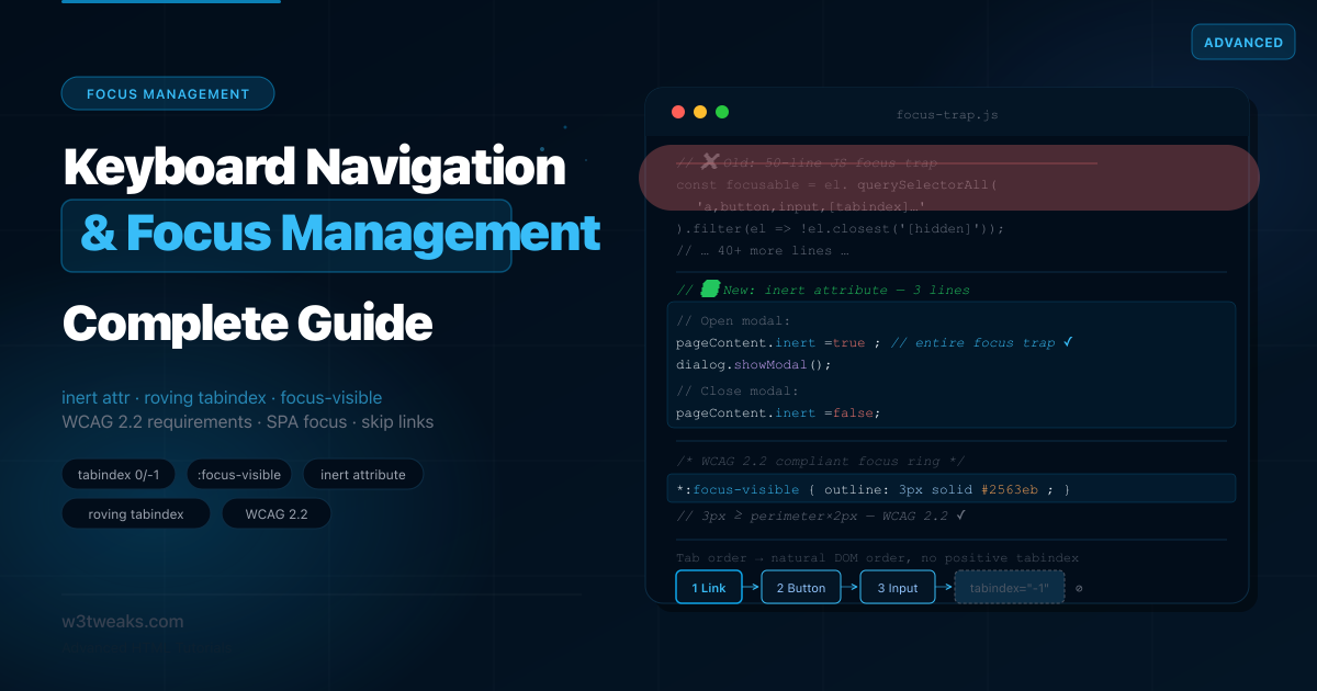
The patterns for correct keyboard focus management have changed significantly in the last two years. The HTML inert attribute (baseline in all browsers since April 2023) replaces the old 50-line JavaScript focus-trap. WCAG 2.2 (September 2023) introduced new focus indicator requirements with specific numeric minimums that most tutorials haven’t caught up with. Chrome fixed its skip-link bug in 2023, but the correct pattern requires a tabindex="-1" on the target that most tutorials still don’t include. And as of 2025, element.focus({ focusVisible: true }) lets you force the focus ring programmatically — solving a long-standing UX bug.
This guide starts from first principles and builds to the patterns you’ll actually ship: tabindex 0 vs -1, a complete focus trap using inert (and when you still need aria-hidden), the roving tabindex with full arrow-key handling — and when to use aria-activedescendant instead, focus management across SPA route changes, the CSS visibility trap (which elements block focus and which don’t), enterkeyhint for better mobile keyboards, and WCAG 2.2 focus indicator requirements with the math.
Related tutorials: ARIA Roles Practical Guide · HTML <dialog> Element Complete Guide · Semantic HTML Guide
Live Demo
Five interactive demos: tabindex visual explorer, :focus-visible vs :focus side-by-side, working skip links + the CSS visibility trap matrix, focus trap with the inert attribute, and the roving tabindex pattern with arrow-key navigation.
Before / After — Old Focus Trap vs inert
The focus trap for modals is the most written-about focus management pattern. Most implementations look like this:
❌ Before — manual JS focus trap (still common)
// The 2018 approach: query all focusable elements, manually trap Tab
function trapFocus(element) {
  const focusableSelectors = [
    'a[href]', 'button:not([disabled])', 'input:not([disabled])',
    'select:not([disabled])', 'textarea:not([disabled])',
    '[tabindex]:not([tabindex="-1"])', 'details > summary'
  ].join(', ');

  const focusable = [...element.querySelectorAll(focusableSelectors)]
    .filter(el => !el.closest('[hidden]'));

  const firstFocusable = focusable[0];
  const lastFocusable  = focusable[focusable.length - 1];

  element.addEventListener('keydown', function trap(e) {
    if (e.key !== 'Tab') return;
    if (e.shiftKey) {
      if (document.activeElement === firstFocusable) {
        e.preventDefault();
        lastFocusable.focus();
      }
    } else {
      if (document.activeElement === lastFocusable) {
        e.preventDefault();
        firstFocusable.focus();
      }
    }
  });
}
// Plus: save previous focus, restore on close, handle dynamic content,
// handle nested modals, handle aria-hidden on background...
Problems: 50+ lines, breaks when content is dynamic, needs updating whenever focusable selectors change, doesn’t handle shadow DOM, doesn’t handle <details>, misses elements inside scrollable containers.
✅ After — inert attribute (2023+)
<!-- When modal opens: add inert to everything except the modal -->
<body>
  <header inert>…</header>      <!-- not focusable, not SR-reachable -->
  <main inert>…</main>          <!-- not focusable, not SR-reachable -->
  <footer inert>…</footer>      <!-- not focusable, not SR-reachable -->

  <dialog id="modal">           <!-- focus stays here automatically -->
    <h2>Confirm delete</h2>
    <button autofocus>Cancel</button>
    <button>Delete</button>
  </dialog>
</body>
function openModal(modal, trigger) {
modal._trigger = trigger; // Save trigger for focus restoration
// Inert everything except the modal — that's the entire focus trap
document.querySelectorAll('body > *:not(dialog)').forEach(el => {
el.inert = true;
});
modal.showModal(); // <dialog> handles focus + Escape + aria-modal
}
function closeModal(modal) {
document.querySelectorAll('body > *:not(dialog)').forEach(el => {
el.inert = false;
});
modal.close();
modal._trigger?.focus({ preventScroll: true });
}5 lines of logic. inert handles focus, pointer events, scroll, and screen reader access simultaneously.
Step 1 — tabindex: The Three Values You Need to Know
The tabindex attribute controls two things: whether an element is in the keyboard tab order, and whether JavaScript can move focus to it programmatically.
tabindex 0 vs -1 — the only two values you should ever ship
<!-- tabindex="0": adds to tab order at its natural DOM position -->
<div role="button" tabindex="0" onclick="doSomething()"
     onkeydown="if(e.key==='Enter'||e.key===' ')doSomething()">
  Custom button
</div>

<!-- tabindex="-1": focusable by JS, NOT in tab order -->
<!-- Use for: modals (focus on open), skip link targets, error messages -->
<div id="main-content" tabindex="-1">
  <!-- focus() can target this, but Tab won't reach it -->
</div>

<!-- tabindex="1+" — NEVER use this -->
<!-- Positive values create a custom tab order that breaks navigation -->
<input tabindex="3"> <!-- jumps ahead of natural DOM order -->
<input tabindex="1"> <!-- focused first, before everything else -->
Elements that are natively focusable (tabindex not needed)
These receive Tab focus by default — don’t add tabindex="0" to them, as that’s redundant:
<a href="/page">Link</a>              <!-- ✅ naturally focusable -->
<button>Button</button>               <!-- ✅ naturally focusable -->
<input type="text">                   <!-- ✅ naturally focusable -->
<select>…</select>                    <!-- ✅ naturally focusable -->
<textarea>…</textarea>                <!-- ✅ naturally focusable -->
<details><summary>…</summary></details><!-- ✅ summary is focusable -->
When to use each value
| Value | Tab order | JS .focus() | When to use |
|---|---|---|---|
tabindex="0" | ✅ In natural DOM position | ✅ Yes | Custom interactive elements (role="button", sliders, custom controls) |
tabindex="-1" | ❌ Not reachable by Tab | ✅ Yes | Focus targets (modal container, skip targets, error summaries) |
tabindex="1+" | ⚠ Yes (jumps queue) | ✅ Yes | Never. Breaks natural focus flow. |
The DOM order = tab order rule
Tab order follows DOM source order, not visual order. When CSS grid, flexbox order, or position: absolute reorders elements visually, the tab order stays at the DOM position:
/* ❌ Visual order and tab order are now mismatched */
.card-grid {
  display: flex;
  flex-direction: row-reverse; /* visually: C B A, tab order: A B C */
}
Match DOM order to visual order, or use grid-template-areas to control visual placement without reordering the DOM.
Step 2 — :focus, :focus-visible, and :focus-within
The difference between :focus and :focus-visible
:focus activates whenever an element gains focus — by keyboard, mouse click, or JavaScript. It always shows the focus ring, even when mouse users click a button.
:focus-visible activates only when the browser determines the user needs to see where focus is — which in practice means keyboard navigation and programmatic focus, but not mouse clicks on buttons.
/* ❌ Old pattern: outline removed entirely — breaks keyboard nav */
button:focus { outline: none; } /* ← accessibility failure */

/* ❌ Also wrong: outline on :focus shows ring on mouse clicks too */
button:focus { outline: 2px solid blue; } /* obtrusive for mouse users */

/* ✅ Correct: :focus-visible respects browser heuristics */
button:focus-visible {
  outline: 2px solid #2563eb;
  outline-offset: 2px;
}

/* ✅ Explicit removal of :focus ring only in modern browsers */
button:focus:not(:focus-visible) {
  outline: none;
}
Browser support: :focus-visible is baseline across all browsers since March 2022. Use it by default. For older browser fallback:
*:focus {
  outline: 2px solid #2563eb;
  outline-offset: 2px;
}

@supports selector(:focus-visible) {
  *:focus:not(:focus-visible) {
    outline: none;
  }
  *:focus-visible {
    outline: 2px solid #2563eb;
    outline-offset: 2px;
  }
}
:focus-within — style the parent when any child is focused
:focus-within applies to a parent element when any of its descendants currently has focus:
.form-group:focus-within {
  background: #eff6ff;
  border-color: #2563eb;
}

.form-group:focus-within label {
  color: #2563eb;
  font-weight: 500;
}

.nav-dropdown:focus-within {
  display: block; /* Keep dropdown open while navigating items */
}

.search-bar:focus-within {
  box-shadow: 0 0 0 3px rgba(37, 99, 235, 0.15);
}
:user-valid and :user-invalid — focus’s siblings
CSS Level 4 introduced two user-intent pseudo-classes that pair naturally with :focus-visible. Where :focus-visible says “show the ring only when the user actually needs it,” :user-valid and :user-invalid say “show validation state only after the user has interacted with the field.” Both gate styling on user intent — not on raw state:
/* ❌ Old: :invalid shows red on page load — before the user typed anything */
input:invalid { border-color: red; }

/* ✅ Better: :user-invalid only after the user has interacted */
input:user-invalid {
  border-color: #dc2626;
  background: #fef2f2;
}

input:user-valid {
  border-color: #16a34a;
}

/* Combine both: only show ring + validation when user-driven */
input:user-invalid:focus-visible {
  outline: 3px solid #dc2626;
  outline-offset: 2px;
}
Browser support: Chrome 119+, Firefox 88+, Safari 16.5+. Now in all three engines.
WCAG 2.2 Focus Appearance Requirements
WCAG 2.2 (September 2023) introduced two new success criteria that define the minimum size and contrast for focus indicators.
WCAG 2.2 2.4.11 Focus Appearance (Minimum) — Level AA
The focus indicator must have an area of at least the perimeter of the component × 2 CSS pixels.
Minimum focus indicator area = perimeter of component × 2px

Example: A 100px × 40px button
  Perimeter = (100 + 40) × 2 = 280px
  Minimum area = 280 × 2 = 560 sq px

  A 2px outline around the button = 280 × 2 = 560 sq px ← just meets it
  A 1px outline = only 280 sq px ← fails
WCAG 2.2 2.4.13 Focus Appearance (Enhanced) — Level AAA
The focus indicator must have a contrast ratio of at least 3:1 between focused and unfocused states.
/* ✅ Meets WCAG 2.2 AA: 3px outline + 2px offset = visible focus area */
:focus-visible {
  outline: 3px solid #2563eb;   /* 3px > 2px minimum — safely passes */
  outline-offset: 2px;          /* offset expands the visible area */
  border-radius: 4px;
}

/* ✅ Alternative: high contrast against any background */
:focus-visible {
  outline: 3px solid currentColor;
  outline-offset: 3px;
}

/* ❌ Fails WCAG 2.2: area too small + low contrast */
:focus-visible {
  outline: 1px solid #ccc;
}
The practical rule: Use outline: 3px solid at minimum, with at least outline-offset: 2px. Use a color with 3:1 contrast against both the component’s background and its un-focused state.
Step 3 — Skip Links That Actually Work in Chrome
Skip links let keyboard users jump past the navigation directly to main content. They’re required for WCAG 2.4.1. The common implementation has a bug in all Chrome versions before Chrome 112 (2023):
Skip link not working in Chrome? The fix
<!-- ❌ Broken: Chrome scrolls to #main but doesn't move keyboard focus -->
<a href="#main" class="skip-link">Skip to main content</a>

<main id="main">   <!-- Chrome bug: focus stays on skip link -->
  …
</main>
After clicking the skip link, sighted keyboard users see the page scroll, but Tab focus doesn’t move to #main. The next Tab press goes to the first link after the skip link, not the first link in <main>.
<!-- ✅ Correct: tabindex="-1" allows programmatic focus on non-interactive elements -->
<a href="#main-content" class="skip-link">Skip to main content</a>

<main id="main-content" tabindex="-1">
  <!-- tabindex="-1" lets the browser receive .focus() on non-interactive elements -->
  …
</main>
The tabindex="-1" on <main> is the fix. Without it, clicking href="#main-content" scrolls to the element but doesn’t actually move keyboard focus there in older Chrome. With it, focus reliably lands on <main> and Tab from there navigates its children.
Styling skip links
Skip links should be visually hidden until focused — never display: none (which removes them from tab order):
.skip-link {
  position: absolute;
  top: -100%;           /* off-screen */
  left: 0;
  z-index: 9999;
  background: #1e40af;
  color: #fff;
  padding: 12px 20px;
  font-size: 14px;
  font-weight: 600;
  text-decoration: none;
  border-radius: 0 0 8px 0;
  transition: top 0.2s ease;
}

.skip-link:focus {
  top: 0;
  outline: 3px solid #fff;
  outline-offset: 2px;
}
Multiple skip links
Complex pages may need multiple targets:
<a href="#main-content" class="skip-link">Skip to content</a>
<a href="#site-search"  class="skip-link">Skip to search</a>
<a href="#site-nav"     class="skip-link">Skip to navigation</a>
Step 4 — How to Trap Focus in a Modal With inert
The inert attribute
inert makes an element and all its descendants completely unreachable — by keyboard, mouse, touch, or screen reader. It’s the definitive solution for focus containment.
const dialog  = document.getElementById('settings-dialog');
const mainEl  = document.getElementById('main-content');
const openBtn = document.getElementById('open-settings');

document.getElementById('open-settings').addEventListener('click', () => {
  mainEl.inert = true;  // Trap focus inside the dialog
  dialog.showModal();   // <dialog> handles: top layer, focus, Escape, aria-modal
});

document.getElementById('close-settings').addEventListener('click', () => {
  mainEl.inert = false;
  dialog.close();
  openBtn.focus({ preventScroll: true });
});
What inert does:
- Removes all descendants from tab order
- Prevents mouse / touch click events
- Hides from screen reader accessibility tree
- Prevents page search (
Ctrl+F) from finding content - Works recursively on all descendants
Browser support: Chrome 102+, Firefox 112+, Safari 15.5+. Baseline available since April 2023.
aria-hidden vs inert — When Do You Need Both?
This is the most-confused modal topic. Short answer: when you’re using inert, you do NOT need aria-hidden on the same element. inert is a superset — it already removes content from the accessibility tree, blocks all input, and disables descendants. Adding aria-hidden="true" to an inert element is redundant.
<!-- ❌ Redundant — inert already hides from screen readers -->
<header inert aria-hidden="true">…</header>

<!-- ✅ Just inert is enough -->
<header inert>…</header>
When you might still use aria-hidden:
- On decorative content (icons, dividers) that should be hidden from SR but remain interactive —
inertwould also block clicks - On a fully visible element where you want screen readers to skip the visible label but keep the element clickable
The key distinction:
| Attribute | Removes from a11y tree | Blocks focus | Blocks pointer | Blocks descendants |
|---|---|---|---|---|
inert | ✅ | ✅ | ✅ | ✅ (recursive) |
aria-hidden="true" | ✅ | ❌ | ❌ | ✅ (descendants in a11y tree only) |
hidden attribute | ✅ | ✅ | ✅ | ✅ |
display: none (CSS) | ✅ | ✅ | ✅ | ✅ |
Use inert for focus traps. Use aria-hidden only for decorative content that should remain interactive.
inert attribute not working? Common gotchas
If your inert attribute isn’t blocking focus or input, check these in order:
- Browser support — Safari 15.5+ only. If you support older browsers, polyfill it.
<dialog>withshowModal()escapes ancestor inertness. This is intentional — modals must be interactive. If you setinerton<body>and open a<dialog>inside it viashowModal(), the dialog stays interactive. This is what enables nested modals.- Not all property accesses sync.
element.inert = trueworks in modern browsers.element.setAttribute('inert', '')also works.element.setAttribute('inert', 'true')works but the value doesn’t matter —inertis a boolean attribute.
Nested Modals — When Modal Opens Another Modal
This is the spec quirk that surprises every team that hits it. When you open a confirmation dialog from inside a settings modal, you’d expect the settings modal to become inert. But by default, <dialog> opened with showModal() escapes ancestor inertness — both modals stay interactive simultaneously.
// ❌ Both modals are interactive at the same time
function openConfirm() {
  const settingsModal = document.getElementById('settings');
  const confirmModal  = document.getElementById('confirm');
  // settingsModal is NOT auto-inerted when confirm opens
  confirmModal.showModal();
}

// ✅ Explicitly inert the parent modal when opening a child
function openConfirm() {
  const settingsModal = document.getElementById('settings');
  const confirmModal  = document.getElementById('confirm');

  settingsModal.inert = true;  // explicitly trap focus in the new child
  confirmModal.showModal();
}

function closeConfirm() {
  const settingsModal = document.getElementById('settings');
  const confirmModal  = document.getElementById('confirm');

  confirmModal.close();
  settingsModal.inert = false;  // restore parent modal interactivity
  settingsModal.querySelector('[autofocus]')?.focus({ preventScroll: true });
}
The browser handles the visual stacking (the new modal appears in the top layer above the old one), but you have to handle the focus trap explicitly. This is the one non-obvious spec rule about inert.
Focus trap without <dialog>: using inert on a custom panel
let lastFocus;

function openPanel() {
  lastFocus = document.activeElement;
  document.getElementById('page-content').inert = true;

  const panel = document.getElementById('settings-panel');
  panel.hidden = false;

  requestAnimationFrame(() => {
    document.getElementById('first-focusable').focus();
  });
}

function closePanel() {
  document.getElementById('page-content').inert = false;
  document.getElementById('settings-panel').hidden = true;
  lastFocus?.focus({ preventScroll: true });
}

document.addEventListener('keydown', (e) => {
  if (e.key === 'Escape') closePanel();
});
Step 5 — The Roving tabindex Pattern
For composite widgets (toolbars, tab panels, menubars, grids), the rule is: Tab moves between widgets; arrow keys move within a widget. Only one element in the widget is in the tab order at any time — the currently active one.
This is the roving tabindex pattern: the active item has tabindex="0", all others have tabindex="-1". When the user presses an arrow key, you update which item has tabindex="0".
<div role="toolbar" aria-label="Text formatting" id="toolbar">
  <button tabindex="0"  aria-pressed="false">Bold</button>
  <button tabindex="-1" aria-pressed="false">Italic</button>
  <button tabindex="-1" aria-pressed="false">Underline</button>
  <button tabindex="-1" aria-pressed="false">Strike</button>
</div>
const toolbar = document.getElementById('toolbar');
const buttons = [...toolbar.querySelectorAll('button')];
toolbar.addEventListener('keydown', (e) => {
const current = document.activeElement;
const idx = buttons.indexOf(current);
let target;
switch (e.key) {
case 'ArrowRight':
case 'ArrowDown':
e.preventDefault();
target = buttons[(idx + 1) % buttons.length]; // wrap
break;
case 'ArrowLeft':
case 'ArrowUp':
e.preventDefault();
target = buttons[(idx - 1 + buttons.length) % buttons.length];
break;
case 'Home':
e.preventDefault(); target = buttons[0]; break;
case 'End':
e.preventDefault(); target = buttons[buttons.length - 1]; break;
default:
return;
}
if (!target) return;
current.setAttribute('tabindex', '-1');
target.setAttribute('tabindex', '0');
target.focus();
});The keyboard contract for toolbar/menubar widgets
| Key | Action |
|---|---|
Tab | Enter/exit the widget; moves to next widget |
Arrow Right/Down | Move to next item (wrap at end) |
Arrow Left/Up | Move to previous item (wrap at start) |
Home | Move to first item |
End | Move to last item |
Enter / Space | Activate the focused item |
Escape | If popup/menu, close and return focus to trigger |
When NOT to Use Roving Tabindex: aria-activedescendant
Roving tabindex moves real DOM focus around. For most composite widgets that’s fine — but for comboboxes, listboxes, and grids with thousands of cells, moving focus through every option creates a lot of noise for screen readers and can fight with virtual scrolling.
The WAI-ARIA APG presents aria-activedescendant as the paired pattern. Real focus stays on the container; you announce the “active” descendant via an attribute:
<!-- Combobox/listbox: focus stays on input; activedescendant moves -->
<input type="text" role="combobox" aria-controls="suggestions"
       aria-activedescendant="opt-3" id="search-input">

<ul id="suggestions" role="listbox">
  <li id="opt-1" role="option">React</li>
  <li id="opt-2" role="option">Vue</li>
  <li id="opt-3" role="option" class="active">Svelte</li>  <!-- "activedescendant" -->
  <li id="opt-4" role="option">SolidJS</li>
</ul>
// Arrow key updates aria-activedescendant — focus stays on the input
input.addEventListener('keydown', (e) => {
if (e.key !== 'ArrowDown' && e.key !== 'ArrowUp') return;
e.preventDefault();
const items = [...listbox.querySelectorAll('[role="option"]')];
const currentId = input.getAttribute('aria-activedescendant');
const idx = items.findIndex(el => el.id === currentId);
const next = items[e.key === 'ArrowDown'
? (idx + 1) % items.length
: (idx - 1 + items.length) % items.length];
input.setAttribute('aria-activedescendant', next.id);
next.scrollIntoView({ block: 'nearest' });
});Which to choose:
- Roving tabindex — toolbars, menubars, tab lists, small grids. Focus moves with arrow keys; visually shows where you are via
:focus-visible. aria-activedescendant— comboboxes, listboxes, autocomplete suggestions, large data grids. Focus stays put; “active” is announced by SR without moving the visible focus ring.
VoiceOver caveat (Sarah Higley):
aria-activedescendanthistorically had inconsistent support in VoiceOver/Safari. Test thoroughly on real assistive tech before shipping. For most app UIs the support is solid, but listbox-style components are still where the most bug reports happen.
Step 6 — The CSS Visibility Trap
This is the most common source of hidden keyboard bugs. Some CSS that visually hides an element still leaves it in the tab order, meaning keyboard users Tab into invisible content.
<button class="hidden-button">You can't see me, but Tab finds me!</button>| CSS method | Visually hidden | Still focusable by Tab | Notes |
|---|---|---|---|
display: none | ✅ Yes | ❌ No | Fully removed from layout and tab order |
visibility: hidden | ✅ Yes | ❌ No | Removed from tab order (but space preserved) |
opacity: 0 | ✅ Yes | ✅ YES | ⚠ Still in tab order — keyboard trap |
clip-path: inset(100%) | ✅ Yes | ✅ YES | ⚠ Still in tab order |
transform: translateX(-9999px) | ✅ Yes | ✅ YES | ⚠ Still in tab order |
width: 0; height: 0; overflow: hidden | ✅ Yes | ✅ YES | ⚠ Still in tab order |
hidden attribute | ✅ Yes | ❌ No | Equivalent to display: none |
inert attribute | ✅ Focus removed | ❌ No | Blocks Tab, mouse, and SR |
The sr-only pattern (visually hidden but SR-accessible, not focusable):
.sr-only {
  position: absolute;
  width: 1px;
  height: 1px;
  padding: 0;
  margin: -1px;
  overflow: hidden;
  clip: rect(0, 0, 0, 0);
  white-space: nowrap;
  border: 0;
}
The visually-hidden-but-focusable pattern (skip links):
.skip-link {
  position: absolute;
  top: -100%;
  left: 0;
  /* Still in tab order — becomes visible when focused */
}
.skip-link:focus {
  top: 0;
}
Step 7 — Programmatic Focus: requestAnimationFrame, preventScroll, focusVisible, autofocus
Why .focus() sometimes doesn’t work
Calling .focus() on a just-inserted or just-revealed element can fail if the element isn’t in the DOM render tree yet. The fix is to wait one animation frame:
// ❌ Sometimes fails: element may not be painted yet
modal.hidden = false;
modal.querySelector('button').focus();

// ✅ Correct: wait for the browser to paint before focusing
modal.hidden = false;
requestAnimationFrame(() => {
  modal.querySelector('button').focus();
});

// ✅ Also correct: use setTimeout(0) as a fallback
modal.hidden = false;
setTimeout(() => {
  modal.querySelector('button').focus();
}, 0);
.focus({ preventScroll: true })
By default, .focus() scrolls the focused element into view. To focus without scrolling — useful for focus restoration after closing a modal:
triggerButton.focus({ preventScroll: true });
errorSummary.focus({ preventScroll: false }); // explicit scroll to error
.focus({ focusVisible: true }) — Force the Ring on Programmatic Focus
A long-standing browser inconsistency: when you call .focus() programmatically (after a route change, after closing a modal), some browsers show the focus ring and some don’t — even though the user is clearly navigating by keyboard. As of 2025, the spec added a focusVisible option to force the ring:
// Newer browsers: explicitly request the focus-visible state
heading.focus({ focusVisible: true });

// Combine with preventScroll for restore-without-scroll
errorEl.focus({ focusVisible: true, preventScroll: true });
Browser support: Firefox shipped it in 2024. Chromium added it behind a flag in late 2025, on track for unflagged enablement . Safari follows the spec but check the current support matrix at MDN before relying on it for production. For now, treat it as progressive enhancement — the call doesn’t throw on unsupporting browsers, it just ignores the option.
The autofocus attribute
autofocus moves focus to the element when the page loads or when a <dialog> opens:
<form>
  <input type="search" autofocus placeholder="Search…">
</form>

<dialog>
  <h2>Confirm delete?</h2>
  <button autofocus>Cancel</button>  <!-- focus Cancel, not Delete -->
  <button class="danger">Delete</button>
</dialog>
Hazards of autofocus:
- On page load, it moves the screen reader’s reading position — users who have started reading lose their place
- Inside modals opened programmatically (not on page load),
autofocusworks correctly and is recommended - Never
autofocusa field that triggers screen reader announcements on focus
Focus Flow on Mobile: enterkeyhint + inputmode
A keyboard isn’t always a physical keyboard. On mobile, the virtual keyboard is what users see — and enterkeyhint lets you relabel the Enter key to match the next step in your form. Combined with inputmode (which controls which keyboard layout appears) and autocomplete (which enables browser autofill), these three attributes turn an awkward mobile form into a thumb-friendly one.
<!-- Multi-step form: Enter advances to the next field -->
<form>
  <input type="email" name="email" inputmode="email"
         autocomplete="email" enterkeyhint="next" required>

  <input type="tel" name="phone" inputmode="tel"
         autocomplete="tel" enterkeyhint="next" required>

  <input type="text" name="otp" inputmode="numeric" maxlength="6"
         autocomplete="one-time-code" enterkeyhint="done" required>

  <button type="submit">Verify</button>
</form>
enterkeyhint values
| Value | Enter key label | Use for |
|---|---|---|
enter | Enter / ↵ (default) | Form submit, generic Enter |
done | Done | Final field in a form |
go | Go | URL bar, navigation field |
next | Next | Multi-step form — advance to next field |
previous | Previous | Multi-step form — return to previous field |
search | Search | Search input |
send | Send | Chat input, send message |
The trio for production-quality forms
<!-- Search bar: virtual keyboard shows a "Search" button -->
<input type="search" inputmode="search" enterkeyhint="search"
       autocomplete="off" autofocus>

<!-- Chat input: send arrow instead of return key -->
<input type="text" inputmode="text" enterkeyhint="send"
       autocomplete="off" aria-label="Type a message">

<!-- Numeric PIN: number pad instead of full keyboard, with "Done" button -->
<input type="text" inputmode="numeric" enterkeyhint="done"
       maxlength="4" pattern="\d{4}" autocomplete="off">
Browser support: enterkeyhint — Chrome 77+, Safari 13.4+, Firefox 94+. inputmode — all modern browsers since 2020. Both Baseline.
Why not use
type="email"/type="tel"alone? Those attributes also affect server-side validation and submission.inputmodeonly controls the virtual keyboard. Use both:<input type="text" inputmode="numeric">for a 4-digit OTP that shouldn’t be validated as atype="number".
Step 8 — SPA Route-Change Focus Management (React, Vue, Svelte)
Single-page application navigation is one of the biggest accessibility problems on the modern web. When a user “navigates” to a new route in a React/Vue/Svelte app, the DOM changes but the browser doesn’t handle focus — it stays wherever it was, often in the middle of the previous page’s content.
The correct pattern: focus the page <h1> on route change
// React Router example (useFocusOnRouteChange hook)
import { useEffect } from 'react';
import { useLocation } from 'react-router-dom';

export function useFocusOnRouteChange() {
  const location = useLocation();

  useEffect(() => {
    requestAnimationFrame(() => {
      const h1 = document.querySelector('main h1');
      if (h1) {
        h1.setAttribute('tabindex', '-1');
        h1.focus({ preventScroll: false, focusVisible: true });
      }
    });
  }, [location.pathname]);
}<main>
<h1 tabindex="-1">About us</h1>
<p>Content…</p>
</main>/* Don't show a focus ring on headings that receive programmatic focus */
h1:focus,
h1:focus-visible {
outline: none;
}Announcing route changes to screen readers
Focusing the <h1> makes the SR read the new page title. Additionally, a visually-hidden live region can announce the navigation:
<div id="route-announcer" aria-live="polite" aria-atomic="true"
     class="sr-only"></div>
function announceRouteChange(pageTitle) {
const announcer = document.getElementById('route-announcer');
announcer.textContent = '';
requestAnimationFrame(() => {
announcer.textContent = `Navigated to: ${pageTitle}`;
});
}Complete Working Example — Accessible Modal with inert
<!DOCTYPE html>
<html lang="en">
<head>
  <meta charset="UTF-8">
  <title>Accessible Modal — inert Focus Trap</title>
  <style>
    .skip-link {
      position: absolute; top: -100%; left: 0; z-index: 9999;
      background: #1e40af; color: #fff; padding: 12px 20px;
      font-weight: 600; text-decoration: none; border-radius: 0 0 8px 0;
      transition: top .15s;
    }
    .skip-link:focus { top: 0; }

    :focus-visible {
      outline: 3px solid #2563eb;
      outline-offset: 2px;
      border-radius: 4px;
    }

    dialog {
      border: none; border-radius: 12px; padding: 0;
      max-width: min(480px, 90vw); width: 100%;
    }
    dialog::backdrop {
      background: rgba(0,0,0,.5);
      backdrop-filter: blur(3px);
    }
    [inert] { opacity: 0.4; pointer-events: none; }
  </style>
</head>
<body>

  <a href="#main" class="skip-link">Skip to main content</a>

  <div id="page-content">
    <header>
      <nav aria-label="Primary">
        <a href="/">Home</a>
        <a href="/about">About</a>
      </nav>
    </header>

    <main id="main" tabindex="-1">
      <h1>My Application</h1>
      <button id="delete-btn">Delete account</button>
    </main>
  </div>

  <dialog id="confirm-dialog" aria-labelledby="dialog-title">
    <div class="dialog-header">
      <h2 id="dialog-title">Delete account?</h2>
    </div>
    <div class="dialog-body">
      <p>This will permanently delete your account.</p>
    </div>
    <div class="dialog-footer">
      <button class="btn btn-ghost" id="cancel-btn" autofocus>Cancel</button>
      <button class="btn btn-danger" id="confirm-delete">Delete</button>
    </div>
  </dialog>

  <script>
    const dialog      = document.getElementById('confirm-dialog');
    const pageContent = document.getElementById('page-content');
    let   trigger;

    function openModal(triggerEl) {
      trigger = triggerEl;
      pageContent.inert = true;
      dialog.showModal();
    }

    function closeModal() {
      pageContent.inert = false;
      dialog.close();
      trigger?.focus({ preventScroll: true });
    }

    document.getElementById('delete-btn').addEventListener('click', function() {
      openModal(this);
    });

    document.getElementById('cancel-btn').addEventListener('click', closeModal);

    document.getElementById('confirm-delete').addEventListener('click', () => {
      closeModal();
      alert('Account deleted (demo)');
    });

    dialog.addEventListener('click', (e) => {
      if (e.target === dialog) closeModal();
    });

    dialog.addEventListener('cancel', (e) => {
      e.preventDefault();
      closeModal();
    });
  </script>
</body>
</html>
Shadow DOM Focus + delegatesFocus
If you build web components, focus inside the shadow DOM has its own rules. By default, shadow DOM creates a separate focus scope — the host element is focusable, and focus moves into shadow children separately.
The delegatesFocus: true option on attachShadow() makes the shadow root delegate focus to the first focusable element inside it:
class MyInput extends HTMLElement {
  constructor() {
    super();
    this.attachShadow({
      mode: 'open',
      delegatesFocus: true  // ← focus on host delegates to first focusable child
    });
    this.shadowRoot.innerHTML = `
      <label><slot></slot></label>
      <input type="text">
    `;
  }
}
customElements.define('my-input', MyInput);<my-input>Email</my-input>
<!-- Tab to <my-input>, focus lands on the inner <input> automatically -->Gotcha: Do NOT set
tabindex="0"on a host withdelegatesFocus: true. The host already participates in tab order naturally — addingtabindex="0"creates a double tab stop where focus lands on the host first and then on the inner element on the next Tab press.
Testing Keyboard Accessibility: The 5-Minute Smoke Test
Run this before every release. Unplug your mouse. Navigate only with keys:
1. Tab through the page
   ☐ Every interactive element receives visible focus in logical order
   ☐ No element is skipped or unreachable
   ☐ No keyboard trap (you can always Tab away)

2. Skip link
   ☐ First Tab shows a skip link
   ☐ Activating it moves focus to main content (not just scrolls)

3. Buttons and links
   ☐ Enter activates links and buttons
   ☐ Space activates buttons (not links)

4. Modal dialogs
   ☐ Focus moves into the modal when it opens
   ☐ Tab stays within the modal (can't reach background)
   ☐ Escape closes the modal
   ☐ Focus returns to the trigger when modal closes

5. Dropdowns and menus
   ☐ Arrow keys navigate within the menu
   ☐ Tab moves out of the menu entirely
   ☐ Escape closes the dropdown

6. Focus indicator
   ☐ Visible on every element (3px+ outline, meets WCAG 2.2)
   ☐ Never invisible or removed without replacement
Key Takeaways
tabindex="0"adds an element to the tab order at its natural DOM position;tabindex="-1"makes it programmatically focusable but not reachable by Tab; positive values always break navigation- Never use
tabindexwith a positive value — it creates a custom tab order that confuses keyboard users - Use
:focus-visibleinstead of:focusfor custom focus ring styles :focus-withinapplies to a parent when any descendant is focused — pairs naturally with the user-intent pseudo-classes:user-valid/:user-invalid- WCAG 2.2 focus appearance: 3px outline + 2px offset with 3:1 contrast meets 2.4.11 AA safely
- The
inertattribute replaces 50-line JavaScript focus traps with one attribute aria-hiddenvsinert:inertis a superset — when usinginert,aria-hiddenis redundant- Nested modals:
<dialog>opened withshowModal()escapes ancestor inertness — explicitly setinert = trueon the parent modal when opening a child - Skip links need
tabindex="-1"on their target (<main>) to correctly move keyboard focus in Chrome - Roving tabindex for toolbars/menubars;
aria-activedescendantfor comboboxes/listboxes/large grids opacity: 0,clip-path, andtransform: translateX(-9999px)leave elements in the tab order — usedisplay: none,visibility: hidden, thehiddenattribute, orinert- Call
.focus()insiderequestAnimationFrame()for just-revealed elements element.focus({ focusVisible: true })(2025) forces the focus ring on programmatic focus — progressive enhancement- Mobile keyboards: combine
type+inputmode+enterkeyhint+autocompletefor production-quality forms - SPA route changes don’t move focus automatically — focus the
<h1>of the new page inrequestAnimationFrame() - Shadow DOM:
delegatesFocus: trueonattachShadow()makes the host delegate to the first focusable child — don’t addtabindex="0"to the host as well
FAQ
What is the difference between tabindex 0 and tabindex -1?
tabindex="0" adds an element to the keyboard tab order at its natural position in the DOM — Tab will reach it. tabindex="-1" makes an element programmatically focusable via JavaScript’s .focus() method, but Tab will never reach it. Use tabindex="0" for custom interactive elements. Use tabindex="-1" for focus targets that should only receive focus via script — modal containers, skip link targets, error summaries, and route change headings.
What is the difference between focus and focus-visible in CSS?
:focus applies whenever an element has focus, regardless of how it got there — keyboard Tab, mouse click, or JavaScript. :focus-visible applies only when the browser determines the user needs to see where focus is — keyboard navigation and programmatic focus, but not mouse clicks on buttons. Use :focus-visible for custom focus ring styles; it respects the browser’s heuristics about when focus indication is helpful.
What is the HTML inert attribute and how does it work for focus traps?
The inert attribute makes an element and all its descendants completely unreachable — no keyboard focus, no mouse or touch events, no screen reader access. Setting element.inert = true on everything outside a modal creates a native focus trap without any JavaScript event listeners or focusable element queries. Browser support: Chrome 102+, Firefox 112+, Safari 15.5+ (baseline April 2023).
aria-hidden vs inert — which do I use on background content when a modal is open?
Use inert. It is a superset — it removes content from the accessibility tree AND blocks focus AND blocks pointer events AND disables all descendants. aria-hidden="true" only removes from the accessibility tree but leaves the content focusable and clickable, so a keyboard user can Tab into “hidden” content. Adding both inert and aria-hidden="true" to the same element is redundant. Use aria-hidden only on decorative content (icons, dividers) that should be hidden from screen readers but stay interactive for mouse users.
Why does my skip link not work in Chrome?
Chrome had a bug where activating a skip link (<a href="#main">) would scroll to the target element but not move keyboard focus there. The fix is adding tabindex="-1" to the target element: <main id="main" tabindex="-1">. Without tabindex="-1", non-interactive elements like <main>, <div>, and <h1> cannot receive programmatic focus from a link’s hash navigation in older Chrome versions.
Why is focus-visible not working in my CSS?
The most common cause is selector order. If you wrote button:focus { outline: none } first and button:focus-visible { outline: 3px solid blue } second, that order is correct. But if you wrote :focus-visible first and :focus { outline: none } second, the :focus rule overrides because both selectors match keyboard focus and the later rule wins (or the more specific one). Always remove the outline only from :focus:not(:focus-visible) so the :focus-visible ring still shows up.
Why is my inert attribute not working?
Three common reasons. (1) Browser support: Safari 15.5+ only. Test on the actual browser, not just devtools. (2) <dialog> with showModal() escapes ancestor inertness: this is intentional — modals must stay interactive. If you inert the <body> and open a <dialog> inside it, the dialog stays interactive. (3) Setting via attribute string: element.setAttribute('inert', '') works; element.inert = true works; but setting inert="false" does NOT remove inert because inert is a boolean attribute — any presence of the attribute means active. Use removeAttribute('inert') or element.inert = false.
What is the roving tabindex pattern?
Roving tabindex is the keyboard navigation pattern for composite widgets like toolbars, tab lists, and grids. Only one item in the widget has tabindex="0" (the active one); all others have tabindex="-1". Tab moves between widgets; arrow keys move within the widget. When the user presses an arrow key, you update which element has tabindex="0" and call .focus() on it. For comboboxes, listboxes, and large grids, use aria-activedescendant instead — focus stays on the container while the “active” descendant is announced via the attribute.
Does opacity 0 remove an element from the tab order?
No. opacity: 0 hides an element visually but leaves it in the keyboard tab order and accessible to screen readers. The same is true for clip-path: inset(100%) and transform: translateX(-9999px). To remove an element from tab order, use display: none, visibility: hidden, the hidden attribute, or inert. The visibility: hidden approach preserves the element’s layout space but removes it from the tab order, which opacity: 0 does not.
How do I handle a modal opening another modal?
By default, <dialog> opened with showModal() escapes ancestor inertness — both modals stay interactive simultaneously. To trap focus in the new child modal: explicitly set inert = true on the parent modal before calling showModal() on the child, then set inert = false on the parent when the child closes. The browser handles the visual stacking (top layer), but you handle the focus trap explicitly.