TL;DR
One line of HTML. Decides whether phones render your page at real device width — the whole responsive story working correctly — or at a fake ~980px desktop canvas, scaled down. Get it wrong and Google’s mobile-first indexing tanks your rankings, users can’t read anything, and your Core Web Vitals get destroyed by layout shifts.
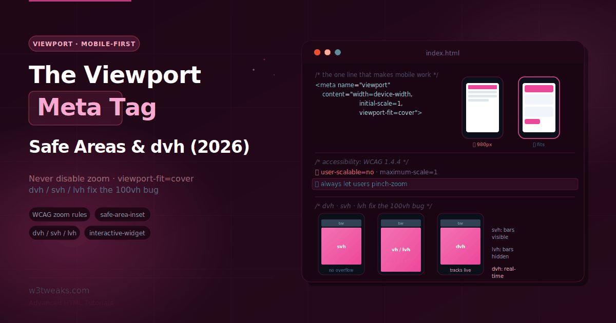
<meta name="viewport" content="width=device-width, initial-scale=1">That’s it. That’s the canonical default. Never add user-scalable=no or maximum-scale=1 — they fail WCAG 1.4.4, block low-vision users from zooming, AND modern iOS Safari ignores them anyway so you get the accessibility violation without any of the intended effect.
Watch out for four things: the classic 100vh bug on mobile (fix: svh/lvh/dvh units), notch content clipping (fix: viewport-fit=cover + env(safe-area-inset-*)), the on-screen keyboard overlaying inputs (fix: interactive-widget=resizes-content, or the visualViewport API for Safari), and — the one nobody mentions — dvh does NOT shrink when the keyboard opens, so a 100dvh chat shell still hides its input.
→ Try it in the live demo — with-vs-without comparison, accessible tag builder with live WCAG verdict, notch/safe-area visualizer, dvh vs svh vs lvh in a fake phone with a toggleable address bar, and a live visualViewport readout.
Ok so this is one of those tags that everybody knows about but almost nobody actually understands past width=device-width, initial-scale=1. Which is a shame because there’s genuinely a lot going on in this single line of HTML.
Get it right and your responsive CSS works exactly as you designed it. Get it wrong — or leave it out — and mobile browsers fall back to a ~980px desktop canvas assumption and scale the whole page down to fit. Your media queries measure the wrong width. Your carefully-crafted min-width breakpoints never fire. Users see a zoomed-out desktop layout they have to pinch and drag around to read a single sentence. And Google’s mobile-first indexing? It flags you as not mobile-friendly, which in 2026 basically means you don’t rank on mobile at all. Which is like 60-70% of your potential traffic gone.
I’ve inherited two projects in the last three years that shipped without a proper viewport tag. Both times the mobile bounce rate was over 80% and nobody could figure out why until I opened Chrome DevTools with mobile emulation on. Anyway.
“Just add width=device-width” is where most tutorials stop. Which is fine for a starter tutorial. Not fine for anyone actually shipping a real site to real devices with real users. Because the same tag also controls whether users can pinch-zoom (an accessibility requirement you can literally fail an audit on), whether your content flows under the iPhone notch or leaves ugly black bars, and how everything behaves when the on-screen keyboard slides up mid-form-fill. And the tag has a close CSS partner — the newer dvh/svh/lvh units — that finally fixes the notorious 100vh mobile bug the tag alone never could.
This guide covers the whole thing. Properties, accessibility rules, notches, keyboard behavior, dynamic viewport units, Core Web Vitals impact, framework integration (Next.js/Nuxt/Astro/SvelteKit/Remix), how to actually test viewport behavior in Playwright/Cypress/BrowserStack, and the modern edge cases — foldables, iPad multitasking, PWA interactions.
Related tutorials: Web App Manifest & PWA · Resource Hints · Meta Tags for SEO & Social
Live Demo
Five interactive sections: the with-vs-without-viewport comparison, an accessible tag builder, a notch/safe-area visualizer, a dvh/svh/lvh demo of the 100vh bug, and a live visualViewport readout.
What the Viewport Tag Does
Sits in your <head> and tells mobile browsers how to size and scale the page:
<meta name="viewport" content="width=device-width, initial-scale=1.0">That’s the canonical default. For the vast majority of responsive sites it’s all you need. Two things it says:
width=device-width— make the layout viewport as wide as the device’s screen (its “ideal” width in CSS pixels), not the default ~980px desktop canvas.initial-scale=1.0— load at 100% zoom, no initial scaling.
Without this tag, mobile browsers render at ~980px and scale down to fit. Which means your responsive CSS never triggers. Your media queries measure the wrong width. Users get a zoomed-out desktop layout. Which is why the tag is non-negotiable for any responsive site — and why Google’s mobile-first indexing effectively requires it.
The Three Viewports
To understand what the properties actually control, you need the mental model most tutorials skip: on mobile there isn’t one viewport. There are three.
| Viewport | What it is | What uses it |
|---|---|---|
| Layout viewport | The area CSS lays the page out against | CSS percentages, position: fixed, media queries |
| Visual viewport | The part currently visible on screen | What the user sees after pinch-zoom or with the keyboard up |
| Ideal viewport | The device’s natural width in CSS pixels | What width=device-width sets the layout viewport to |
When you pinch-zoom, the visual viewport shrinks (you see less of the page) but the layout viewport stays the same (the page doesn’t reflow). width=device-width sets the layout viewport equal to the ideal viewport. Which is what makes a responsive layout actually behave.
Keep these three straight and every property below makes sense. Confuse them and nothing makes sense. This was the mental model that finally clicked for me after years of just copy-pasting the tag from Stack Overflow.
The Scaling Properties — And The Accessibility Rules
Beyond width and initial-scale, the tag accepts scaling controls. This is where you can actively harm your site, so I’m going to treat these as rules and not options:
<!-- ❌ NEVER ship any of these — they fail WCAG 1.4.4 (Resize Text) -->
<meta name="viewport" content="width=device-width, initial-scale=1, user-scalable=no">
<meta name="viewport" content="width=device-width, initial-scale=1, maximum-scale=1">user-scalable=no— disables pinch-zoom entirely. Single most accessibility-hostile viewport setting there is. Locks out users with low vision who need to zoom to read your content. Never use it. Never.maximum-scale— caps how far users can zoom in. Any value below2fails accessibility.maximum-scale=1is as bad asuser-scalable=no. Don’t set it below 5, if at all.minimum-scale— caps how far users can zoom out. Rarely needed.
These block zoom, which WCAG 1.4.4 (Resize Text) requires up to at least 200%. Deque axe, Stark, WAVE, and Lighthouse all flag it. Your legal team will not thank you if it ships to production and gets picked up in an accessibility audit.
Here’s the funny part though: modern iOS Safari now ignores user-scalable=no and maximum-scale specifically so users can always zoom. So if you set them you get the accessibility failure AND the setting doesn’t even work. It’s like the worst possible outcome. Just… don’t.
Rule is simple. Let users zoom. width=device-width, initial-scale=1 with none of the scale-locking properties is the accessible default. Done.
viewport-fit=cover and Safe Areas — Handling the Notch
Modern phones have notches. Punch-holes. Rounded corners. Home indicators that intrude on the rectangular screen. By default (viewport-fit=auto) the browser keeps your content inside a “safe” rectangle — which can leave visible bars around the edges. Kinda ugly, especially for hero sections and full-bleed marketing pages.
To draw edge-to-edge — under the notch, under the status bar — you opt in with viewport-fit=cover:
<meta name="viewport" content="width=device-width, initial-scale=1, viewport-fit=cover">But now your content can slide under the notch and the home indicator. Which means anything interactive there — a header nav button, a bottom tab bar — is unreachable or clipped. You pad it back out of harm’s way with the CSS env() safe-area-inset variables:
.top-header {
  position: fixed;
  top: 0; left: 0; right: 0;
  padding-top: env(safe-area-inset-top);     /* clear the notch/status bar */
}

.bottom-nav {
  position: fixed;
  bottom: 0; left: 0; right: 0;
  padding-bottom: env(safe-area-inset-bottom); /* clear the home indicator */
}

.content {
  padding-left: env(safe-area-inset-left);    /* clear rounded corners in landscape */
  padding-right: env(safe-area-inset-right);
}
Four env(safe-area-inset-*) values — top, right, bottom, left. Each reports how much padding that edge needs. The genuinely elegant part: if you’re NOT using viewport-fit=cover, all four insets resolve to 0. So adding them is completely risk-free — they only kick in when you’ve gone edge-to-edge. You basically never need to guard these with a media query or a feature check.
cover + env() pairing is the correct, complete way to handle notched devices. Using one without the other is the common half-solution I see all the time in code review. Either the header is hidden under the notch (has cover but no env), or the page has ugly black bars around the edges (has env padding written defensively but no cover so it’s all zeros anyway). Both. Always both.
interactive-widget — Keyboard Behavior
Newer viewport property. Controls how the on-screen keyboard affects the viewport when an input is focused:
<meta name="viewport" content="width=device-width, initial-scale=1, interactive-widget=resizes-content">Three options:
resizes-visual(the default) — keyboard shrinks only the visual viewport. Layout viewport anddvhunits are unchanged. Keyboard overlays your content.resizes-content— keyboard shrinks the layout viewport. Your layout reflows into the space above the keyboard anddvhreflects the reduced height. This is what you actually want for chat apps.overlays-content— keyboard overlays without resizing anything. Rarely correct.
For a chat interface, a full-height form, anything where the layout should reflow above the keyboard — resizes-content is what you want. Sort of. Because Safari doesn’t support it (as of this writing). Chrome 108+ does. Firefox does. For cross-browser keyboard handling you fall back to the visualViewport API (below). Which is annoying. Real annoying if you’re building a mobile-first chat app.
Dynamic Viewport Units — Fixing the 100vh Bug
Ok here’s the classic mobile bug the viewport tag alone can’t fix. And the CSS units that finally do.
You set a hero section to height: 100vh expecting it to fill the screen. On desktop it’s perfect. On mobile, the bottom gets cut off — or leaves a weird gap — because mobile browsers have a dynamic address bar that expands and collapses as you scroll. 100vh is measured against the largest viewport (bars hidden). So when the address bar IS visible, your 100vh element is taller than the visible area, and the bottom part of it disappears under the bar.
I’ve debugged this so many times over the years. Every time somebody asks “why is my hero getting cut off on mobile” it’s this.
CSS finally solved it with three new viewport states, each with its own units:
| Unit | Measures against | Behavior | Use for |
|---|---|---|---|
svh | Small viewport (bars visible) | Stable; never overflows | Hero sections that must not clip on load |
lvh | Large viewport (bars hidden) | Stable; equals legacy 100vh | Deliberate overflow under the address bar |
dvh | Dynamic (current state) | Tracks in real time as bars show/hide | Layouts that must always fill the exact visible area |
.hero {
  height: 100vh;   /* fallback for old browsers — declare it FIRST */
  height: 100svh;  /* modern: never overflows on mobile */
}
Whole family exists — svw/lvw/dvw for widths, plus the logical vi/vb variants for vertical and RTL writing modes. Two practical rules from actually shipping this:
- Always declare a
vhfallback line first, then thesvh/dvhline. Cascade picks the supported one. All three reached Baseline (widely available) in June 2025, but a small slice of traffic (older Samsung Internet, some ancient WebViews) still needs the fallback and it costs literally nothing to include. dvhchanges value during scroll because it tracks the address bar in real time. Which means animating a height to100dvhcan cause visible jank as the bar collapses mid-animation. Usesvh/lvh(both stable) inside animations. Savedvhfor static layouts.
The keyboard caveat almost nobody mentions
dvh does NOT shrink when the on-screen keyboard appears. With the default interactive-widget=resizes-visual, the keyboard only affects the visual viewport, and dvh tracks the layout viewport. So a 100dvh chat shell will sit UNDER the keyboard, hiding its own input field. Which is like the exact bug the whole thing was supposed to fix.
Single most common surprise when building keyboard-heavy mobile layouts. Reading visualViewport.height in JS is the fix. Next section covers that.
The visualViewport API
When you need to react to pinch-zoom or the on-screen keyboard in JavaScript — the things CSS units genuinely can’t capture — the visualViewport API is the cross-browser answer:
const vv = window.visualViewport;

vv.addEventListener('resize', () => {
  // Fires when the keyboard opens/closes or the user pinch-zooms
  console.log('Visible height:', vv.height);
  console.log('Zoom scale:', vv.scale);

  // e.g. keep an input bar pinned above the keyboard
  inputBar.style.bottom = (window.innerHeight - vv.height - vv.offsetTop) + 'px';
});
visualViewport exposes the visual viewport’s width, height, scale, and offset. Fires resize and scroll events. Reliable across browsers — including Safari where interactive-widget=resizes-content isn’t a thing. This is the API pretty much every chat app you use (Slack, Discord, WhatsApp Web, Teams) is using under the hood to pin input bars above the keyboard.
Also useful for detecting pinch-zoom (vv.scale > 1) if you want to adjust something UI-wise when the user has zoomed in. Sentry Session Replay and LogRocket both surface visualViewport data in their session recordings, which is a lifesaver when you’re triaging a mobile bug and need to know if the user had zoomed in when it happened.
Core Web Vitals Impact
This is the part that gets skipped by like every viewport tutorial I’ve read, so — briefly, because it matters more than most people realize.
CLS (Cumulative Layout Shift): the biggest single mobile CLS offender in most sites I’ve audited is height: 100vh on hero sections. The address bar collapses on first scroll, 100vh re-measures to a bigger value, everything below the hero shifts down. Google Search Console reports it as CLS ≥ 0.1 on mobile, and now the page fails Core Web Vitals. Fix: 100svh (stable, never shifts) or set an explicit pixel height. Won’t ever CLS on address-bar collapse.
LCP (Largest Contentful Paint): if your hero image is set to height: 100vh and the initial paint measures against the wrong viewport, the image gets sized wrong, browser may need to reflow, LCP is delayed. 100svh or an aspect-ratio-based sizing avoids this entirely.
INP (Interaction to Next Paint): less directly related, but the on-screen keyboard opening triggers a resize event which can flash a bunch of layout work if you have interactive-widget=resizes-content set. Debounce it. Or use content-visibility on chunks below the fold.
Google PageSpeed Insights explicitly checks for the viewport tag as part of its mobile-friendliness audit. Missing or malformed tag → automatic mobile-friendliness fail → mobile search rankings drop. It’s not subtle. Datadog RUM, Sentry Performance, New Relic Browser — they all surface CLS by page, so you can spot the 100vh bug across your whole site by sorting by CLS descending. If you’re already paying for any of those, that’s the fastest way to find every place this bug is hiding in your codebase.
Framework Integration
Every modern framework has its own way of handling the viewport tag. Which is annoying because you can’t just paste the meta tag into a static HTML template anymore. Here’s the actual syntax for each:
Next.js 14+ — export a viewport object from your root layout (this replaced the old approach of dumping meta tags in <head>):
// app/layout.tsx
export const viewport: Viewport = {
  width: 'device-width',
  initialScale: 1,
  viewportFit: 'cover',
  interactiveWidget: 'resizes-content',
  themeColor: '#0f172a',
};
Nuxt 3+ — use useHead in your layout or plugin:
useHead({
  meta: [{ name: 'viewport', content: 'width=device-width, initial-scale=1, viewport-fit=cover' }]
});
SvelteKit — <svelte:head> in your root layout:
<svelte:head>
  <meta name="viewport" content="width=device-width, initial-scale=1, viewport-fit=cover" />
</svelte:head>
Astro — put it in your <Layout> component’s <head>. Regular HTML, nothing fancy:
<head>
  <meta name="viewport" content="width=device-width, initial-scale=1, viewport-fit=cover" />
</head>
Remix / React Router 7 — export a meta function:
export const meta: MetaFunction = () => [
  { name: 'viewport', content: 'width=device-width, initial-scale=1, viewport-fit=cover' }
];
For deployment on Vercel, Netlify, Cloudflare Pages, AWS Amplify, GitHub Pages — none of them do anything special with the viewport tag, it passes through as-is. The framework does all the work of injecting it into the built HTML. Which is good.
Testing Viewport Behavior
Nothing catches viewport bugs like actually testing on a device. But since nobody has 47 phones sitting on their desk, here’s the actual pipeline that works:
Chrome DevTools device toolbar — F12, Ctrl+Shift+M (or Cmd+Shift+M on Mac), pick a device from the dropdown. Fast, free, covers 90% of what you need. Rotate the device with the icon in the top right to check landscape. Simulates safe-area insets on iPhone models with the notch.
Playwright — playwright.config.ts with device presets:
projects: [
  { name: 'iPhone 15 Pro', use: devices['iPhone 15 Pro'] },
  { name: 'Pixel 8', use: devices['Pixel 8'] },
  { name: 'iPad Pro 11', use: devices['iPad Pro 11'] }
]
Playwright emulates the viewport and user agent. Doesn’t emulate the actual browser engine (still Chromium under the hood for iPhone tests), but it catches the vast majority of viewport-related layout bugs and it runs in CI. Which is what actually matters.
Cypress — cy.viewport('iphone-15-pro-max') or cy.viewport(390, 844) for pixel-precise. Same story: viewport emulation, not engine emulation.
BrowserStack, LambdaTest, Sauce Labs — real device grids. Actual iPhone 15 running actual Safari, actual Pixel 8 running actual Chrome. Expensive but you need this for anything customer-facing that must work exactly right. Percy and Chromatic layer on top of these for visual regression snapshots — a viewport-tag change that breaks the notch layout will show up as a diff in the PR before it ever ships.
Lighthouse — mobile audit specifically checks for the viewport tag as part of the mobile-friendliness score. Run it in CI (Lighthouse CI) and fail the build if the mobile-friendliness score drops. Cheap safety net.
Foldables, iPad Multitasking, and Modern Weirdness
Foldable phones (Samsung Galaxy Fold, Google Pixel Fold, Surface Duo) and iPad multitasking modes (Split View, Slide Over, Stage Manager) throw a bunch of weird viewport behaviors at you that a single meta tag can’t fully solve.
For foldables — when the phone unfolds, the viewport width doubles mid-session. Your responsive CSS needs to actually respond to this (which is why min-width media queries matter — they’ll re-evaluate on the resize). The Fold has a viewport-segments CSS feature in development that lets you know about the hinge, though browser support is still Chrome-only and behind a flag.
For iPad Split View / Slide Over — the browser reports the actual window width, not the full device width. So width=device-width gives you 507px if the browser is in half-screen, not 1024px. Which is correct behavior but occasionally surprises devs who assume device-width means “the whole iPad width”.
For Stage Manager on iPad (iPadOS 16+) — the window is genuinely resizable and floating. dvh tracks correctly. interactive-widget=resizes-content matters more here than on iPhone because the on-screen keyboard is a bigger chunk of a floating window.
Test these paths on BrowserStack or LambdaTest if you have users on foldables (Samsung’s share is non-trivial in Korea, Japan, and some EU markets — worth checking Google Analytics or Datadog RUM for device breakdown before deciding if it’s worth engineering effort).
The Mobile-First Mindset
Viewport tag makes responsive CSS possible. Mobile-first is how you actually write it. Instead of designing for desktop and squeezing down, you start with the smallest screen and layer complexity upward with min-width media queries:
/* Base styles = mobile (no media query) */
.grid { display: grid; grid-template-columns: 1fr; gap: 1rem; }

/* Enhance upward for larger screens */
@media (min-width: 768px)  { .grid { grid-template-columns: 1fr 1fr; } }
@media (min-width: 1200px) { .grid { grid-template-columns: repeat(3, 1fr); } }
Mobile-first pairs naturally with the viewport tag because both assume the phone is the baseline, not an afterthought. Which matches how most of your traffic actually arrives (60-70% mobile for most tier-1 markets — US, UK, Canada, Australia, Germany all sit somewhere in that range depending on vertical). And how Google indexes your site (mobile-first). Same for Shopify, BigCommerce, WooCommerce mobile checkout flows — Shopify’s own analytics consistently show mobile revenue is now the majority for basically every merchant category outside B2B.
Start simple. Add breakpoints only where the layout genuinely needs them. Keep images and tables fluid (max-width: 100% on images, overflow-x: auto on wide tables) so nothing forces horizontal scroll. That’s it. That’s the whole mobile-first playbook.
Analytics-wise — Google Analytics 4, Hotjar session recordings, FullStory replays all show a mobile-vs-desktop split by default. If your mobile bounce rate is much higher than desktop, first thing to check is whether the viewport tag is even present and correct. It’s my go-to first debug step and it’s caught the issue more times than I can count.
Key Takeaways
- The viewport meta tag (
width=device-width, initial-scale=1) makes mobile browsers use the device’s real width instead of a ~980px desktop canvas — without it, responsive CSS and media queries never work correctly, and Google mobile-first indexing tanks your rankings - Three viewports on mobile: layout viewport (what CSS uses), visual viewport (what’s on screen after pinch-zoom or with the keyboard up), ideal viewport (
device-width).width=device-widthsets layout = ideal - Never ship
user-scalable=no,maximum-scale=1, or anymaximum-scalebelow 2 — they block pinch-zoom, fail WCAG 1.4.4, get flagged by Deque axe / Stark / WAVE / Lighthouse, and iOS Safari ignores them anyway - Use
viewport-fit=coverfor edge-to-edge under notches, pad content back withenv(safe-area-inset-*). Insets resolve to 0 withoutcover, so adding the padding is risk-free - The newer
interactive-widgetproperty controls keyboard behavior;resizes-contentreflows the layout above the keyboard (Chrome/Firefox), but Safari doesn’t support it, sovisualViewportAPI for cross-browser dvh/svh/lvhfix the100vhmobile bug:svhnever overflows (heroes),lvhequals legacy100vh,dvhtracks in real time. Declarevhfallback firstdvhdoes NOT shrink when the on-screen keyboard appears — a100dvhchat shell hides its own input. ReadvisualViewport.heightin JS to fixvisualViewportAPI exposes visible width/height/scale/offset, fires resize/scroll — the API pretty much every chat app is using to pin inputs above the keyboard- Framework integration: Next.js 14+
viewportexport, NuxtuseHead, SvelteKit<svelte:head>, Astro layout<head>, Remixmetafunction - Test with Chrome DevTools device toolbar for daily work, Playwright/Cypress in CI for regressions, BrowserStack/LambdaTest/Sauce Labs for real-device coverage, Percy/Chromatic for visual regression, Lighthouse CI for the mobile-friendliness score
- Core Web Vitals impact:
100vhis the biggest single CLS offender on mobile — fix with100svh. Datadog RUM / Sentry / New Relic can sort by CLS to find every occurrence in your codebase - Foldables and iPad multitasking add edge cases: viewport width changes mid-session,
interactive-widgetmatters more on Stage Manager, check BrowserStack for device coverage if your Google Analytics shows non-trivial foldable share - Mobile-first (
min-widthmedia queries) pairs naturally with the tag — matches 60-70% of tier-1 traffic being mobile, matches Google mobile-first indexing, matches how Shopify/BigCommerce/WooCommerce mobile checkout revenue is now the majority for most merchants
FAQ
What does the viewport meta tag do?
The viewport meta tag tells mobile browsers how to size and scale your page. The standard width=device-width, initial-scale=1 makes the layout viewport match the device’s actual screen width and loads at 100% zoom, so your responsive CSS and media queries measure the real device width. Without it, mobile browsers assume a roughly 980-pixel desktop canvas and scale the whole page down to fit, so your site appears as a tiny zoomed-out desktop layout, your media queries never trigger correctly, and users must pinch and drag to read. It’s required for any responsive site and effectively required by Google’s mobile-first indexing.
Why should I never use user-scalable=no?
Because it disables pinch-zoom entirely, which locks out users with low vision who rely on zooming to read — a direct failure of WCAG 1.4.4 (Resize Text), which requires content to be resizable up to at least 200%. Same applies to maximum-scale=1 or any maximum-scale below 2. Deque axe, Stark, WAVE, and Lighthouse all flag it. And beyond the accessibility failure, modern iOS Safari now deliberately ignores user-scalable=no and maximum-scale so users can always zoom, which means setting them gives you the accessibility violation without even achieving the intended effect. The accessible default is simply width=device-width, initial-scale=1 with no scale-locking properties — always let users zoom.
How do I handle the iPhone notch and safe areas?
Add viewport-fit=cover to your viewport meta tag so your content can draw edge-to-edge, under the notch and status bar. Then use the CSS env() safe-area-inset variables to pad interactive content back out of the intruding areas: padding-top: env(safe-area-inset-top) clears the notch, padding-bottom: env(safe-area-inset-bottom) clears the home indicator, and the left/right insets clear rounded corners in landscape. A useful safety property: when you’re not using viewport-fit=cover, all four insets resolve to 0, so adding these env() rules never breaks a non-notched layout. Using cover without the env() padding (or vice versa) is the common incomplete solution.
What is the difference between dvh, svh, and lvh?
They’re viewport-height units that account for mobile browser chrome (the address bar and toolbars). svh (small viewport height) measures against the screen with the bars visible, so 100svh never overflows on load — ideal for hero sections. lvh (large viewport height) measures against the screen with the bars hidden, so 100lvh equals the legacy 100vh behavior. dvh (dynamic viewport height) tracks the current state in real time, resizing as the address bar shows and hides. Use svh for content that must not clip, lvh for deliberate full-bleed, and dvh when the layout must always fill the exact visible area — but note dvh changes during scroll, so avoid it in height animations to prevent jank.
How do I fix the 100vh problem on mobile?
The 100vh problem happens because mobile browsers measure vh against the largest viewport (with the address bar hidden), so a height: 100vh element is taller than the visible area when the bars are showing, cutting off the bottom. The fix is the newer viewport units: use 100svh for a hero that must never overflow, or 100dvh for a layout that should always match the exact visible height. Always declare a vh fallback line first for older browsers, then the modern unit: height: 100vh; height: 100svh;. These units reached Baseline in June 2025. One caveat: dvh does not shrink when the on-screen keyboard opens, so for keyboard-heavy layouts also read visualViewport.height in JavaScript.
Does the viewport meta tag affect SEO?
Yes, indirectly but importantly. Google uses mobile-first indexing, meaning it primarily crawls and ranks the mobile version of your site, and a correct viewport meta tag is part of what makes a page mobile-friendly. Without it, your page renders as a zoomed-out desktop layout on phones, fails mobile usability, and can lose mobile rankings — which suppresses the majority of your potential traffic since most visits are mobile (60-70% for typical tier-1 markets like US/UK/Canada/Australia/Germany). The tag itself isn’t a direct ranking boost, but its absence is a mobile-friendliness failure that hurts rankings. Pair it with responsive mobile-first CSS and stable layouts (no shifting when the address bar collapses) for the best mobile search performance.
How do I set the viewport meta tag in Next.js, Nuxt, or SvelteKit?
Every framework has its own syntax. Next.js 14+ exports a viewport object from your root layout — export const viewport: Viewport = { width: 'device-width', initialScale: 1, viewportFit: 'cover' }. Nuxt 3+ uses useHead({ meta: [{ name: 'viewport', content: '...' }] }) in a plugin or layout. SvelteKit uses <svelte:head><meta name="viewport" content="..." /></svelte:head> in the root layout. Astro just puts the meta tag directly in the <head> of your Layout component. Remix and React Router 7 export a meta function returning an array with the viewport entry. All of them build to the same static HTML in the end — the tag ends up in the <head> of the rendered page — the framework syntax is just where you define it.
Does the viewport meta tag affect Core Web Vitals?
Yes, especially CLS (Cumulative Layout Shift). The biggest single mobile CLS offender is height: 100vh on hero sections, because the address bar collapses on first scroll, 100vh re-measures to a larger value, and everything below shifts down. Google Search Console flags it as CLS ≥ 0.1 on mobile and the page fails Core Web Vitals. Fix: use 100svh (stable) or an explicit pixel height, or aspect-ratio for images. 100vh also affects LCP indirectly if your hero image is sized against the wrong viewport. Google PageSpeed Insights explicitly checks the viewport tag as part of mobile-friendliness — a missing or malformed tag is an automatic fail, and Datadog RUM, Sentry Performance, and New Relic Browser can sort by CLS by page to find every occurrence in your codebase.