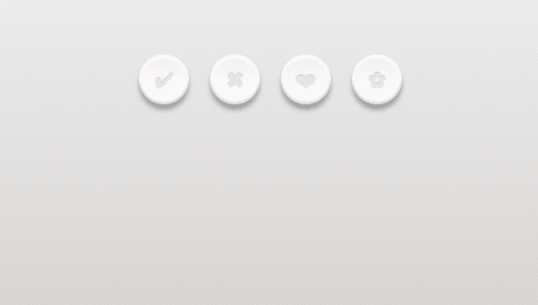
Rounded CSS buttons with mouseover effect and click effect. Buttons are developed using css and html. Demo and download available.
Author Pali Madra
Hits
Created FEBRUARY 07, 2014
License Open
Compatible browsers Chrome, Firefox, Safari
HTML Snippet
`<div class="buttonHolder"> <a href="#" class="button tick"></a> <a href="#" class="button cross"></a> <a href="#" class="button heart"></a> <a href="#" class="button flower"></a> </div>`CSS Code
`html, body{ min-height:100%; } body{ background-image: -webkit-linear-gradient(top, #edecec, #cecbc9); background-image: linear-gradient(top, #edecec, #cecbc9); } .buttonHolder{ margin:80px auto; width:400px; } .button{ background-image: -webkit-linear-gradient(top, #f4f1ee, #fff); background-image: linear-gradient(top, #f4f1ee, #fff); border-radius: 50%; box-shadow: 0px 8px 10px 0px rgba(0, 0, 0, .3), inset 0px 4px 1px 1px white, inset 0px -3px 1px 1px rgba(204,198,197,.5); float:left; height: 70px; margin: 0 30px 30px 0; position: relative; width: 70px; -webkit-transition: all .1s linear; transition: all .1s linear; } .button:after{ color:#e9e6e4; content: ""; display: block; font-size: 30px; height: 30px; text-decoration: none; text-shadow: 0px -1px 1px #bdb5b4, 1px 1px 1px white; position: absolute; width: 30px; } .heart:after{ content: "â�¤"; left: 21px; top: 21px; } .flower:after{ content: "â¿"; left: 23px; top: 19px; } .tick:after{ content: "â"; left:23px; top:20px; } .cross:after{ content: "â"; left: 24px; top: 19px; } .button:hover{ background-image: -webkit-linear-gradient(top, #fff, #f4f1ee); background-image: linear-gradient(top, #fff, #f4f1ee); color:#0088cc; } .heart:hover:after{ color:#f94e66; text-shadow:0px 0px 6px #f94e66; } .flower:hover:after{ color:#f99e4e; text-shadow:0px 0px 6px #f99e4e; } .tick:hover:after{ color:#83d244; text-shadow:0px 0px 6px #83d244; } .cross:hover:after{ color:#eb2f2f; text-shadow:0px 0px 6px #eb2f2f; } .button:active{ background-image: -webkit-linear-gradient(top, #efedec, #f7f4f4); background-image: linear-gradient(top, #efedec, #f7f4f4); box-shadow: 0 3px 5px 0 rgba(0,0,0,.4), inset 0px -3px 1px 1px rgba(204,198,197,.5); } .button:active:after{ color:#dbd2d2; text-shadow: 0px -1px 1px #bdb5b4, 0px 1px 1px white; }`Preview