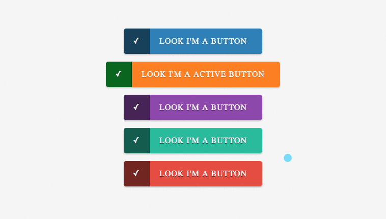
A series of simple CSS buttons. They are easy to customize and use. Can easily be integrated with Font-Awesome or other icons library to bring it out more. Developed using CSS and HTML. Demo and download available.
Author Sazzad
Created AUGUST 12,2013
License Open
Compatible browsers Chrome, Firefox, Safari
HTML Snippet
`<div class="container"> <a href="#" class="button"><span>âܓ</span>Look I'm a button</a> <a href="#" class="button orange active"><span>âܓ</span>Look I'm a Active Button</a> <a href="#" class="button purple"><span>âܓ</span>Look I'm a button</a> <a href="#" class="button turquoise"><span>âܓ</span>Look I'm a button</a> <a href="#" class="button red"><span>âܓ</span>Look I'm a button</a> </div> <div class="copyright"> Created by <a href="http://www.fwpolice.com">The Fireworks Police</a> </div>`CSS Code
`body { text-align: center; padding: 40px; background: #F5F5F5; } .container { width: 500px; text-align: center; margin: auto;} .copyright { margin-top: 50px; font-size: 12px; text-transform: uppercase; } .copyright a { text-decoration: none; padding: 5px;background: #c0392b; color: #FFFFFF; } .copyright a:hover { background: transparent; color: #c0392b; } .button { display: inline-block; height: 50px; line-height: 50px; padding-right: 30px; padding-left: 70px; position: relative; background-color:rgb(41,127,184); color:rgb(255,255,255); text-decoration: none; text-transform: uppercase; letter-spacing: 1px; margin-bottom: 15px; border-radius: 5px; -moz-border-radius: 5px; -webkit-border-radius: 5px; text-shadow:0px 1px 0px rgba(0,0,0,0.5); -ms-filter:"progid:DXImageTransform.Microsoft.dropshadow(OffX=0,OffY=1,Color=#ff123852,Positive=true)";zoom:1; filter:progid:DXImageTransform.Microsoft.dropshadow(OffX=0,OffY=1,Color=#ff123852,Positive=true); -moz-box-shadow:0px 2px 2px rgba(0,0,0,0.2); -webkit-box-shadow:0px 2px 2px rgba(0,0,0,0.2); box-shadow:0px 2px 2px rgba(0,0,0,0.2); -ms-filter:"progid:DXImageTransform.Microsoft.dropshadow(OffX=0,OffY=2,Color=#33000000,Positive=true)"; filter:progid:DXImageTransform.Microsoft.dropshadow(OffX=0,OffY=2,Color=#33000000,Positive=true); } .button span { position: absolute; left: 0; width: 50px; background-color:rgba(0,0,0,0.5); -webkit-border-top-left-radius: 5px; -webkit-border-bottom-left-radius: 5px; -moz-border-radius-topleft: 5px; -moz-border-radius-bottomleft: 5px; border-top-left-radius: 5px; border-bottom-left-radius: 5px; border-right: 1px solid rgba(0,0,0,0.15); } .button:hover span, .button.active span { background-color:rgb(0,102,26); border-right: 1px solid rgba(0,0,0,0.3); } .button:active { margin-top: 2px; margin-bottom: 13px; -moz-box-shadow:0px 1px 0px rgba(255,255,255,0.5); -webkit-box-shadow:0px 1px 0px rgba(255,255,255,0.5); box-shadow:0px 1px 0px rgba(255,255,255,0.5); -ms-filter:"progid:DXImageTransform.Microsoft.dropshadow(OffX=0,OffY=1,Color=#ccffffff,Positive=true)"; filter:progid:DXImageTransform.Microsoft.dropshadow(OffX=0,OffY=1,Color=#ccffffff,Positive=true); } .button.orange { background: #FF7F00; } .button.purple { background: #8e44ad; } .button.turquoise { background: #1abc9c; } .button.red { background: #e74c3c; }`Preview