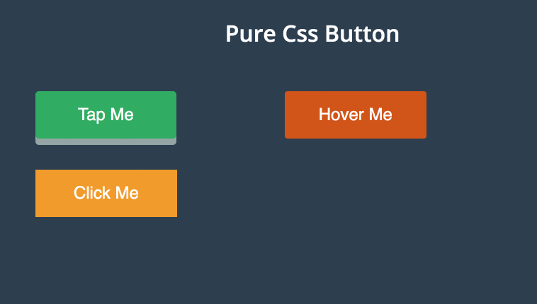
Three Pure CSS Button effects like tap, hover and click effects developed using CSS and HTML. Demo and Download available.
Author Mohammad Abdul Mohaiman
Created APRIL 20, 2016
License Open
Compatible browsers Chrome, Firefox, Safari
HTML Snippet
`<h1>Pure Css Button</h1>
<div class="main">
<div class="sub-main">
<button class="button-one">Tap Me</button>
</div>
<div class="sub-main">
<button class="button-two"><span>Hover Me</span></button>
</div>
<div class="sub-main">
<button class="button-three">Click Me</button>
</div>
<p>More Buttons will be reached...
<br> bulit with ♥ by <a href="https://about.me/mohaiman" tagget="_blank">Mohaiman..
</p>
</div>`CSS Code
`@import url(https://fonts.googleapis.com/css?family=Open+Sans:400,400italic,600,600italic,700italic);
* {
    margin: 0px;
    padding: 0px
}

body {
    background: #2c3e50;
    font-family: 'Open Sans', sans-serif;
}

h1,
button {
    color: #fff;
    text-align: center;
    padding: 20px;
}

p {
    color: #fff;
    text-align: center;
    padding-top: 500px;
    font-size: 10px;
}

a {
    text-decoration: none;
    color: #fff;
}

a:hover {
    color: #2ecc71;
}

.main {
    width: 100%;
}

.sub-main {
    width: 30%;
    margin: 22px;
    float: left;
}

.button-one,
.button-two,
.button-three {
    text-align: center;
    cursor: pointer;
    font-size: 24px;
    margin: 0 0 0 100px;
}

    transition-duration: 0.4s;
    text-decoration: none;
    overflow: hidden;
}

.button-three:hover {
    background: #fff;
    box-shadow: 0px 2px 10px 5px #97B1BF;
    color: #000;
}

.button-three:after {
    content: "";
    background: #f1c40f;
    display: block;
    position: absolute;
    padding-top: 300%;
    padding-left: 350%;
    margin-left: -20px !important;
    margin-top: -120%;
    opacity: 0;
    transition: all 0.8s
}

.button-three:active:after {
    padding: 0;
    margin: 0;
    opacity: 1;
    transition: 0s
}`
Preview