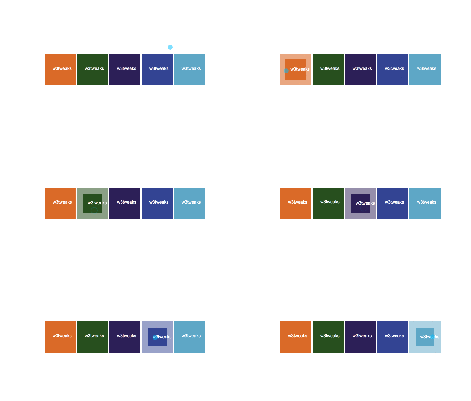
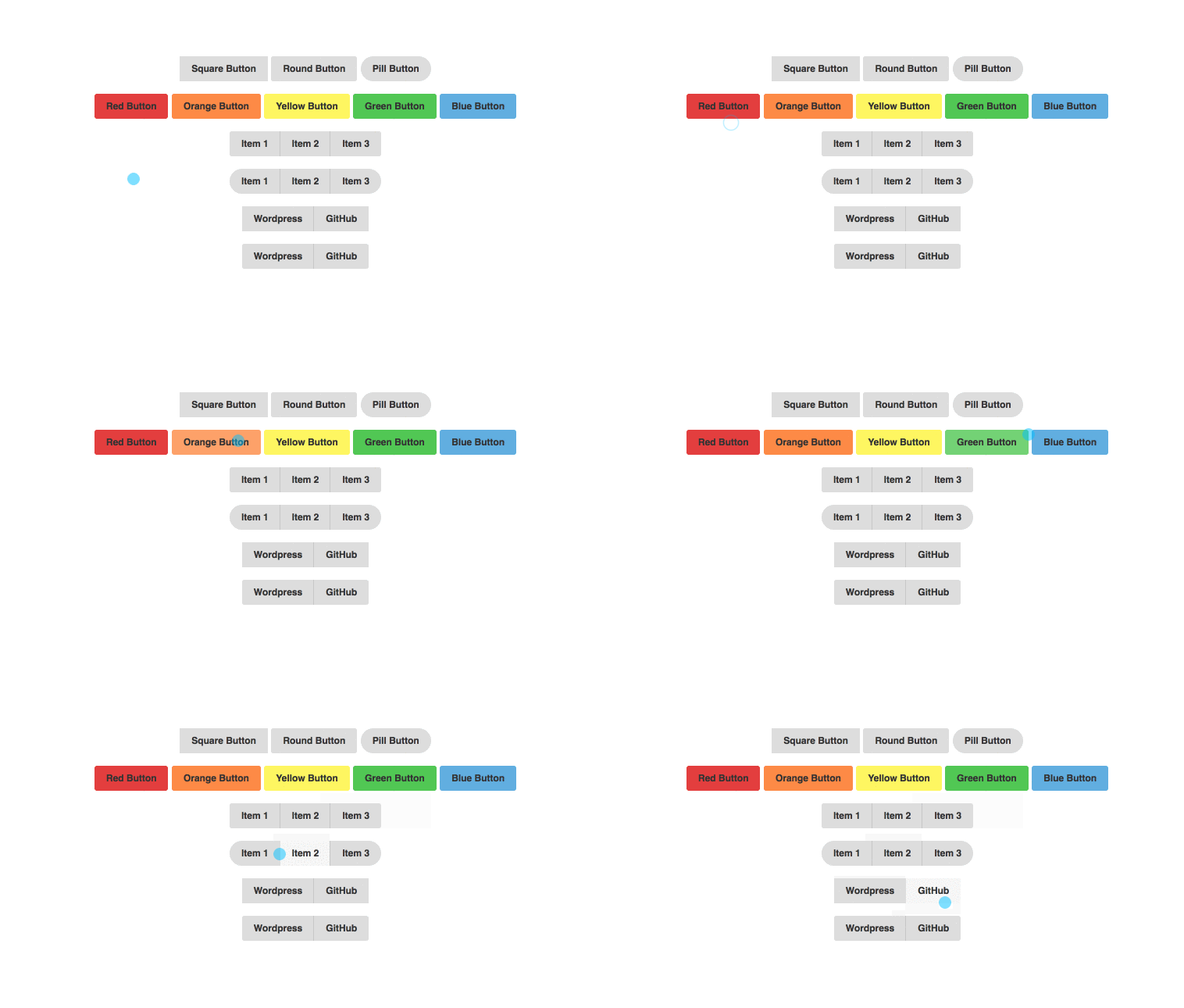
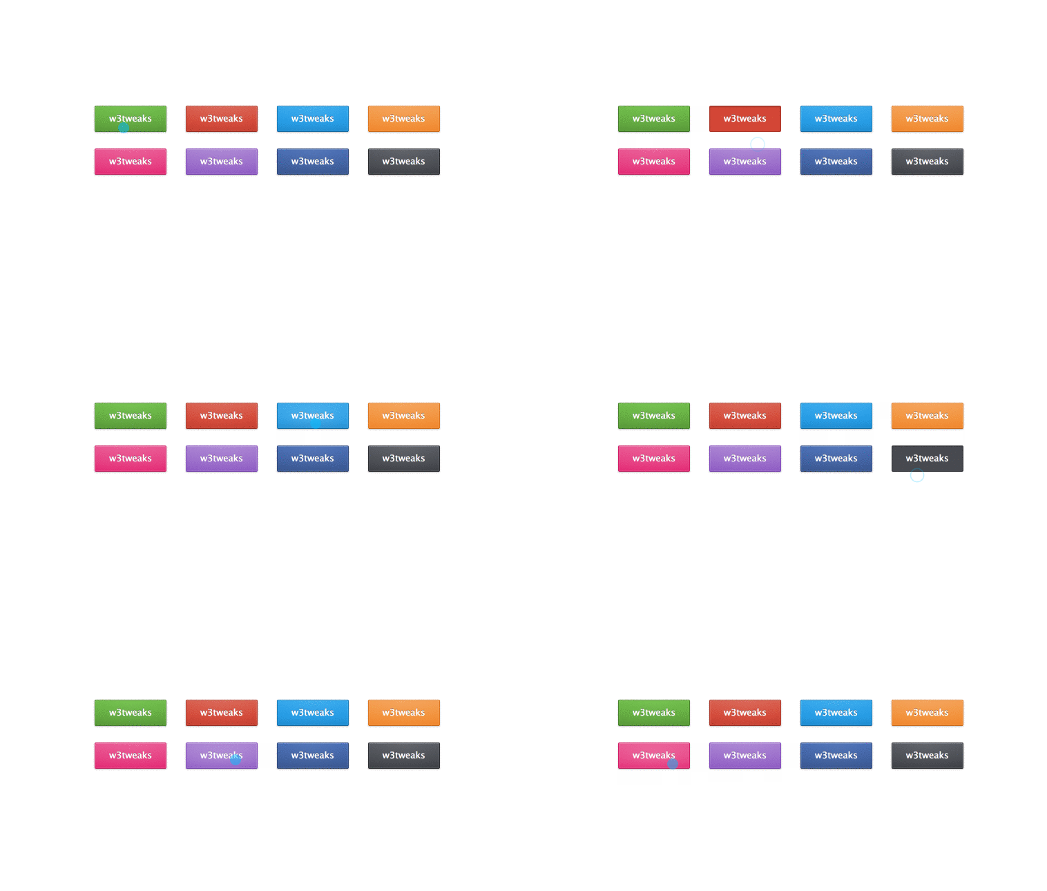
Collection of free, hand-picked CSS Buttons. It will be updated with two new buttons on July 20, 2023.
Welcome to our eye-catching collection of free CSS button samples! Each of the examples presented here has been skillfully created using HTML and CSS, giving you many ideas for your web design projects.
These CSS buttons will grab your attention, whether you’re a front-end developer, a web designer, or just someone who is curious about them. Our collection includes a variety of themes ideal for various online apps, from elegant, minimalistic layouts to colorful, dynamic ones.
CSS button hover effect
Author
- Julia
Made with
- HTML / CSS
Created on
- FEBRUARY 14, 2017
Updated on
- SEPTEMBER 25, 2017
About the Code
tags: button, hover, simple, design, material
Useful Links: More info | Live Demo
Dependency: –
CSS Button Hover
Author
- Imran Pardes
Made with
- HTML / CSS
Created on
- July 8, 2018
Updated on
- OCTOBER 26, 2018
About the Code
Pure CSS button. (Tags: CSS, button, animation, SVG, hover)
Useful Links: More info | Live Demo
Dependency: –
Pure CSS loading animation for buttons
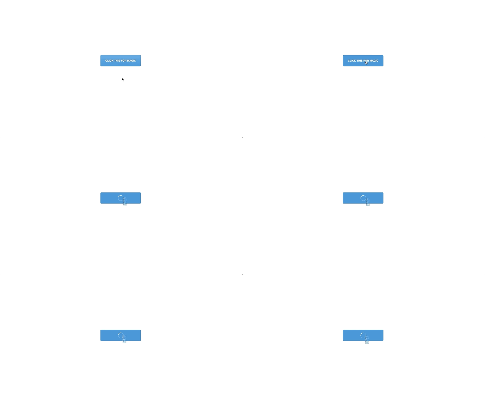
A simple test with pure CSS loading animation for buttons (uses jQuery to toggle class).
Shifting Material Button Modal
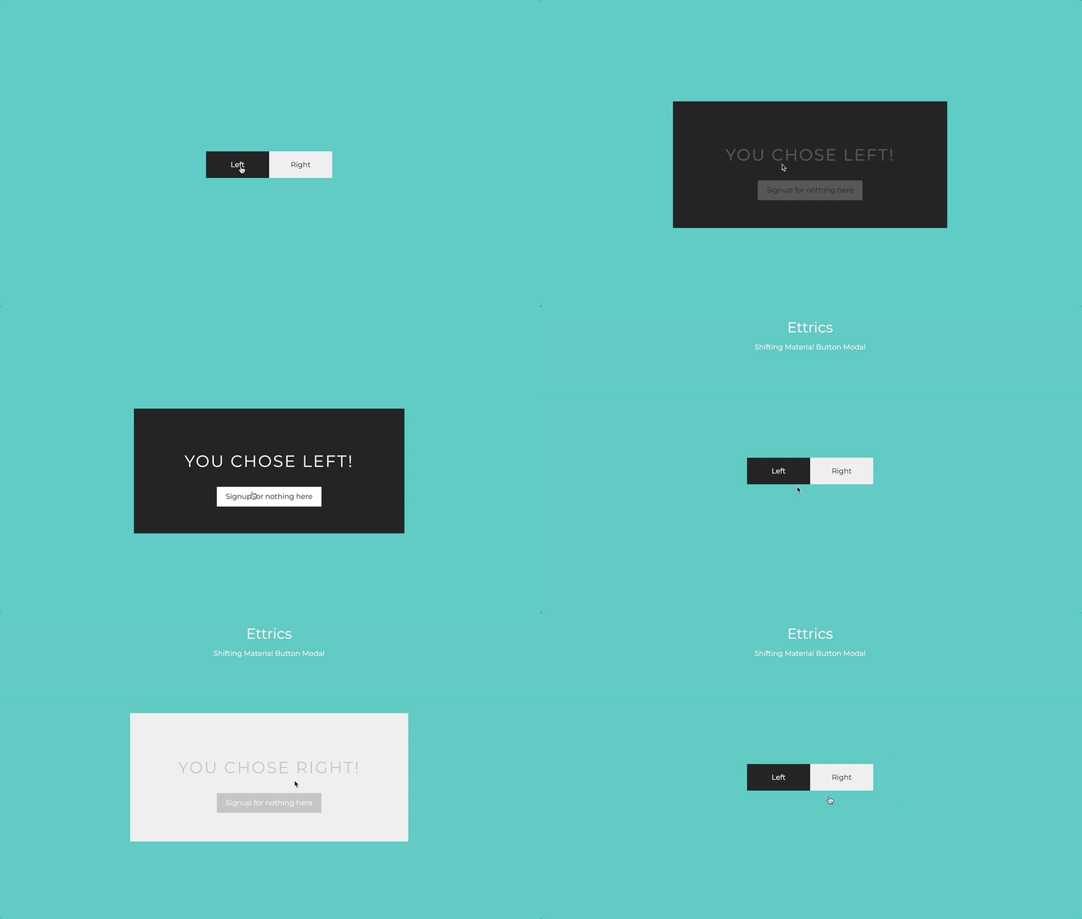
Two call-to-action buttons that give context to your modals in a Material Design fashion.
Button with Built-in Loading Indicator -JS and SCSS

Button with Built-in Loading Indicator
Elior Tabeka
AUGUST 15, 2016
HTML, CSS and JavaScript
Simple CSS buttons for Disabled Buttons
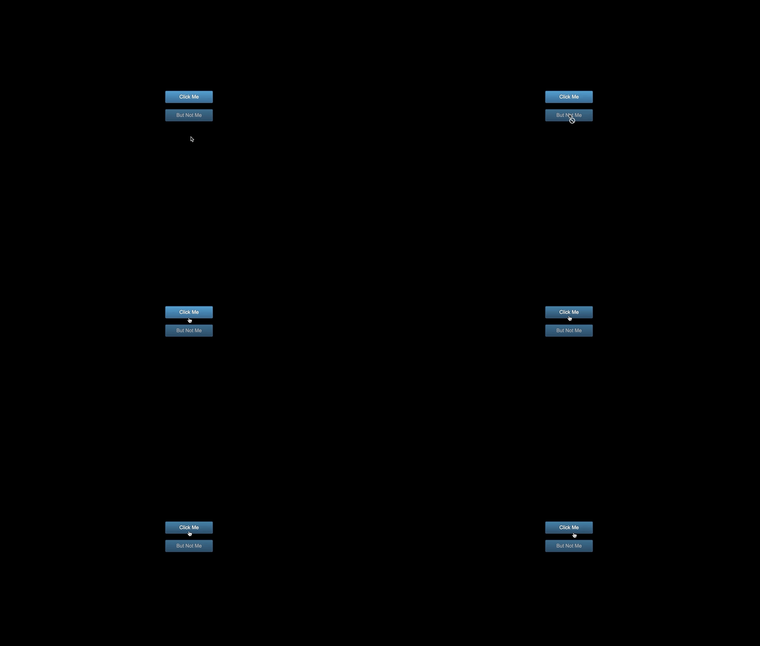
For browsers that support CSS3, there’s a simple cursor available to help users understand certain elements that may be disabled due to page logic. So, if you have a button that becomes enabled only after a certain page action is taken (like filling out a form), you can use cursor: not-allowed to reinforce the state using the mouse pointer.
Submit button loader after submit
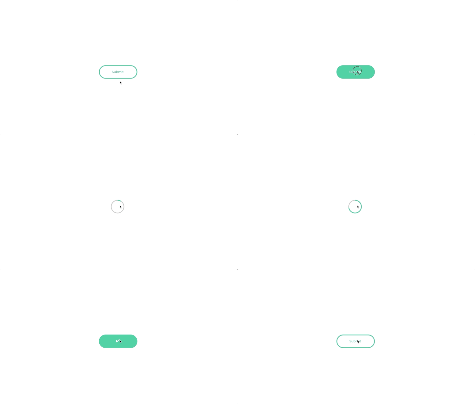
Submit button with loader after submit. No CSS Keyframes, all one JS timeline + SVG.
Button animation practice
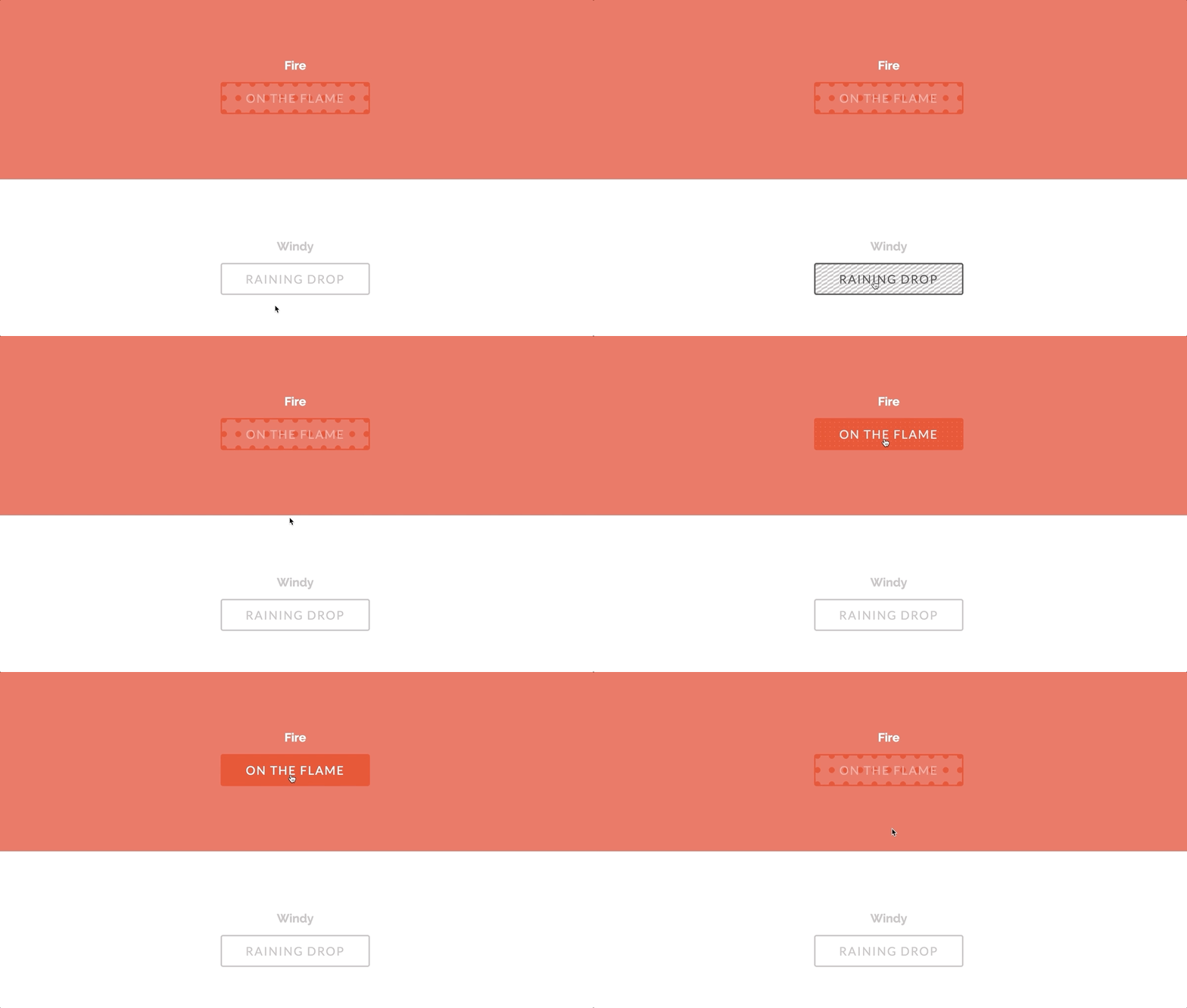
Button animation practice
SVG Button hover effect with snap.svg

Simple button hover effect by replacing the text in a button with an svg element which mimics the button in order to create an effect which can not (easily?) be done with css.
Gradient Button with translate
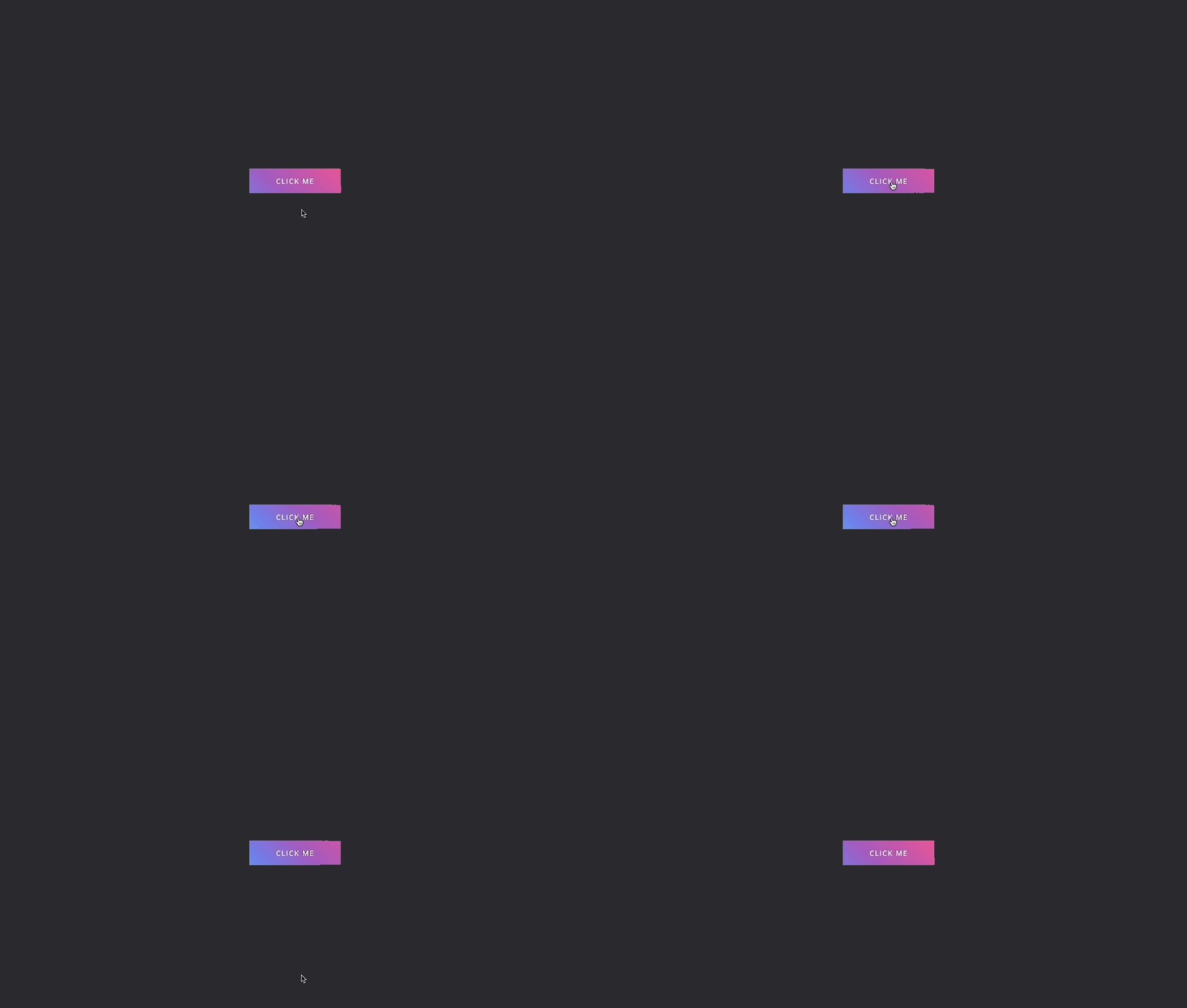
Gradient button with translate on hover
3D Paper button effects
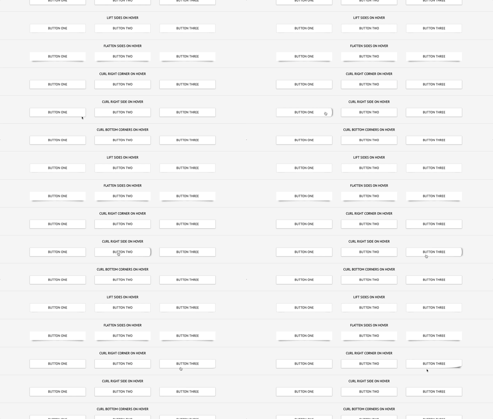
Try out and illustrate some of the subtle button effects you can create just using box-shadow and borders on pseudo–elements. Tested in latest Chrome and Firefox, but no reason it shouldn’t work in all latest browsers.
Button Hover States
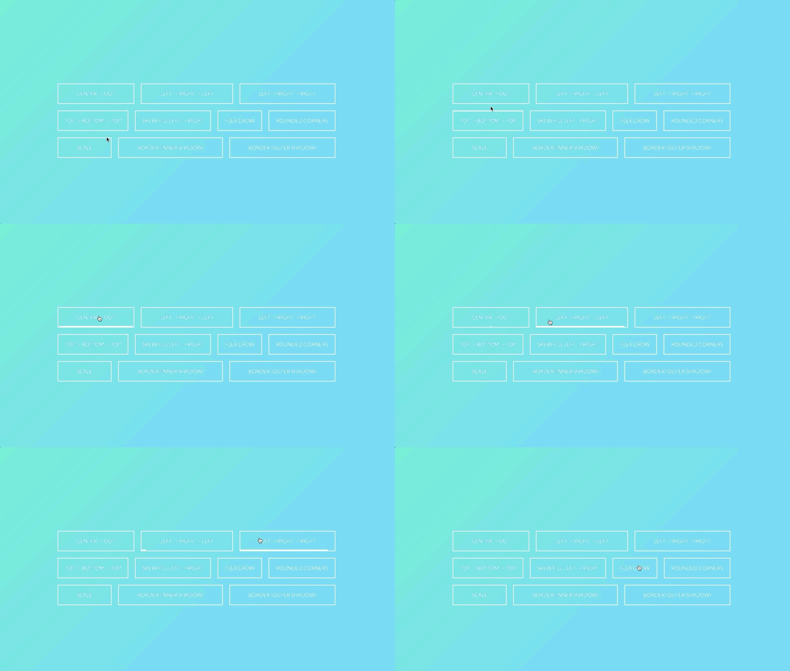
Snazzy CSS hover states for a button.
Button Hover Effects
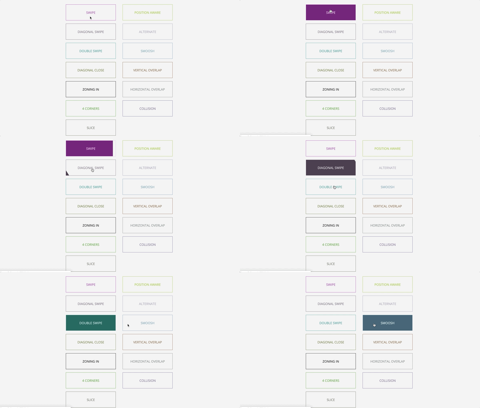
Some button hover effects using psuedo elements and borders.
Kyle Brumm
NOVEMBER 23, 2014
HTML, CSS and JavaScript
Pulsing Button
Pulsing button using css3 keyframe animation.
Twitter Button Concept using only CSS

Nice twitter button with door open like concept
Some simple buttons
Just some simple buttons
Ottis Kelleghan
JUNE 15, 2013
HTML, CSS and JavaScript
Button using :after and box-shadow
Hover Buttons which look good, feel good and work good. This requires only CSS. Pure CSS button fun, no strings attached – Just Hover and appreciate!
Purely CSS Button
Amazing and powerful the CSS Check-Box Hack is. No JS in this button!
The radio button highlight Underground
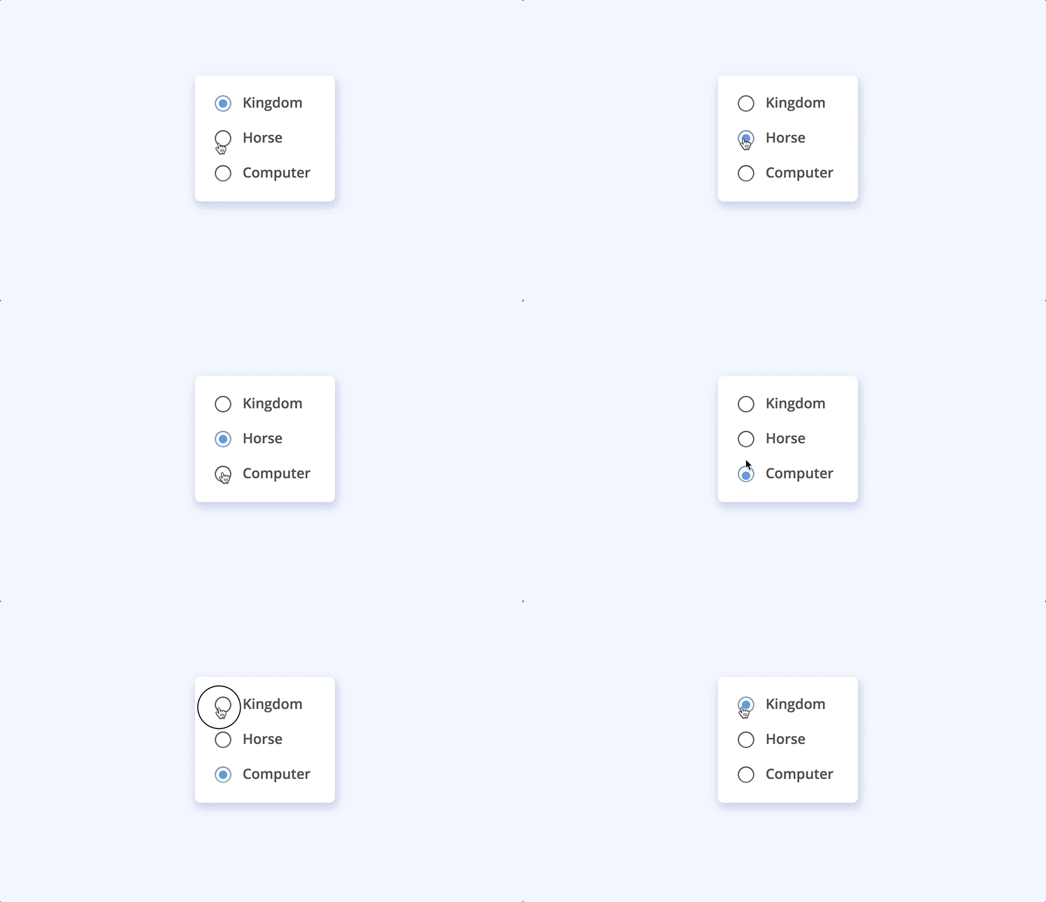
The radio button highlight travels underground
3D Retro Buttons
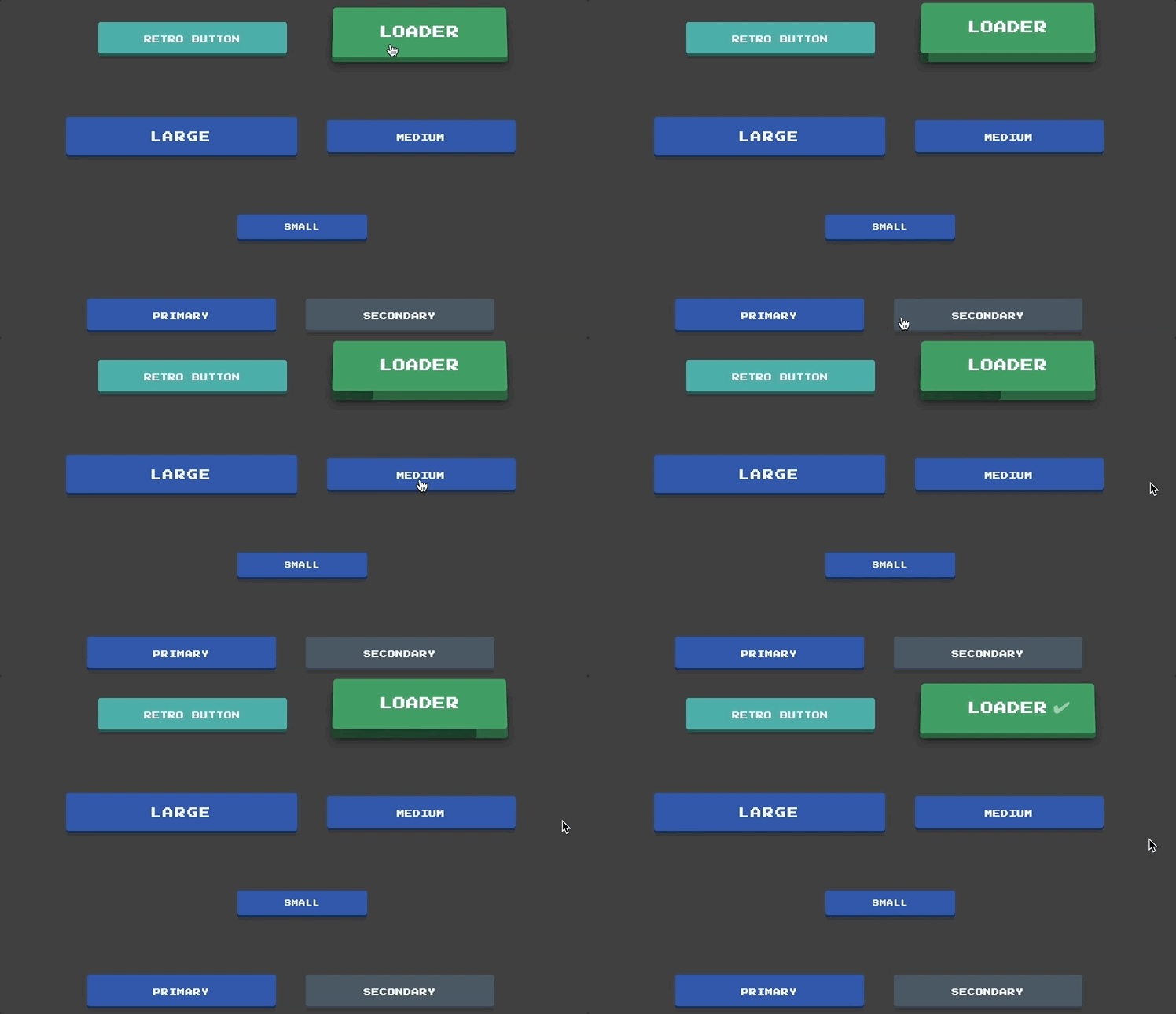
3D push buttons with a retro style and font. The first button is a push button that pushes to the center and tilts left or right based on the cursor’s location while hovering. It is styled similar to an old-school game console button. These buttons have been configured with a sm, md, lg size classes along with bootstrap-esque classes such as primary, secondary, danger, warning, success and info. Second button is a loader button with it’s own progress bar when pushed. It only pushes in the center, but then opens upwards to show a progress bar on it’s front side. It will either show a checkmark or X when finished based on success of action.
Mike @ Titan Global Tech
AUGUST 06, 2018
HTML, CSS and JavaScript
Animated CSS Button
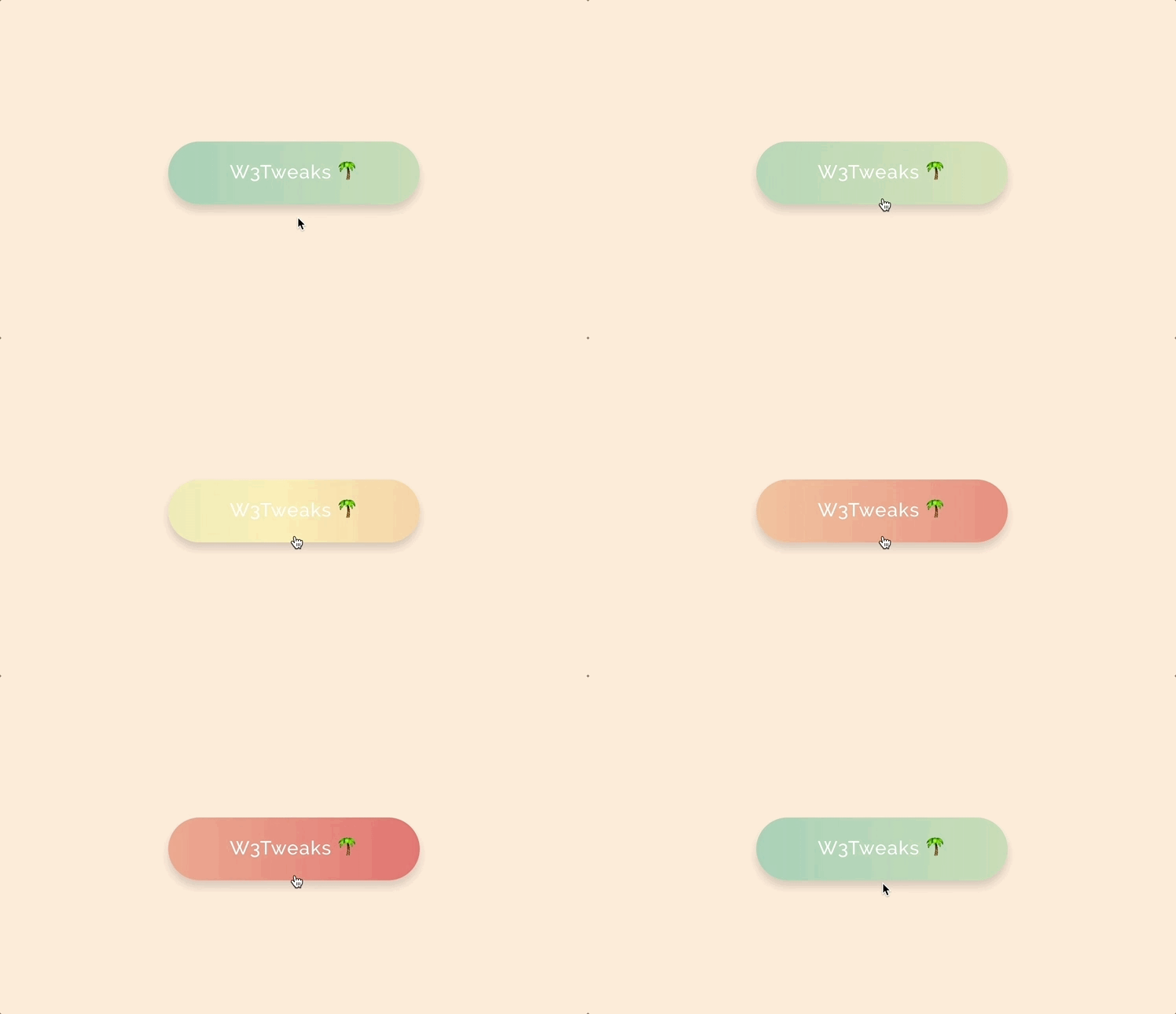
First take on newest CodePen challenge. Animated button in Sass
Custom Checkbox and radio button Checklists

Custom Checklists Step-by-Step Guide. Have demo for both radio and checkbox custom tutorial and demo
Brandon McConnell
APRIL 25, 2018
HTML, CSS and JavaScript
Progress Button Microinteractions

Made an example button for uploading with microinteraction.
Takane Ichinose
JANUARY 08, 2019
HTML, CSS and JavaScript
Slidey radios
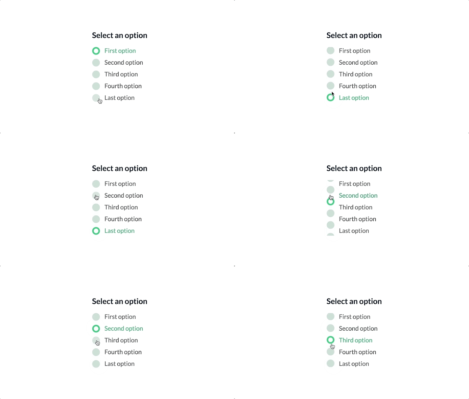
A less-weird-but-still-weird remix of ‘Swappy radios’
Transitional Buttons using only CSS

Using of transitions in button hover effects.
Angularjs Material floating button directive

Customizable, semantic Material design floating action menu with buttons, implemented as an Angularjs directive. Also available in vanilla html.
CSS3 Rounded Buttons

CSS3 Rounded Buttons developed using css and html
Burak Kaya
DECEMBER 10, 2012
HTML, CSS and JavaScript
CSS3 3d flip button

CSS3 button w/ 3d transform using no JS, no imgs, and No icon-fonts
3D Parallax Buttons
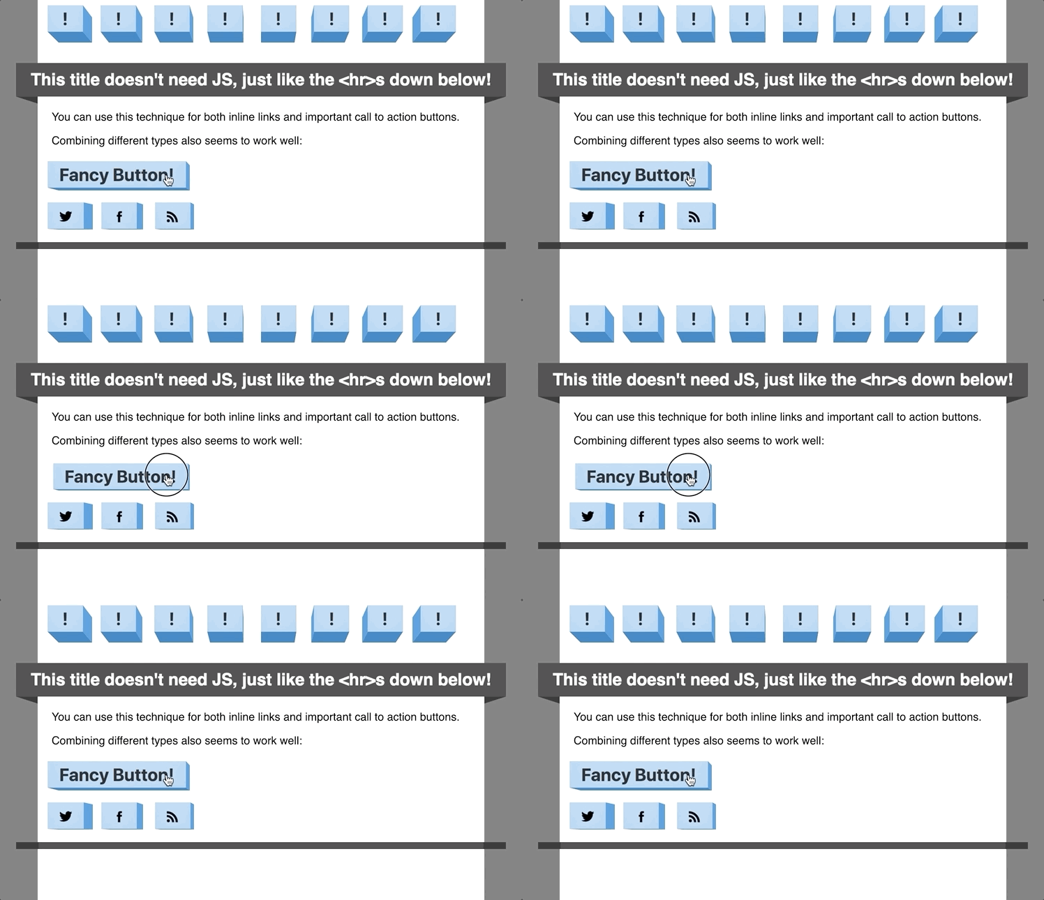
3D pushable buttons with a real perspective and a parallax-like effect when scrolling. Made with CSS 3D transforms.
Alexander Futekov
MAY 08, 2013
HTML, CSS and JavaScript
Topcoat Button Bar
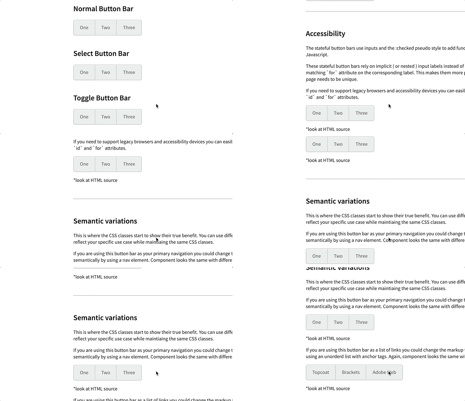
Default style for Topcoat Button Bar. Requirements are portable and accessible markup with flexible and performant css. No javascript required
Hand-Drawn Border Buttons
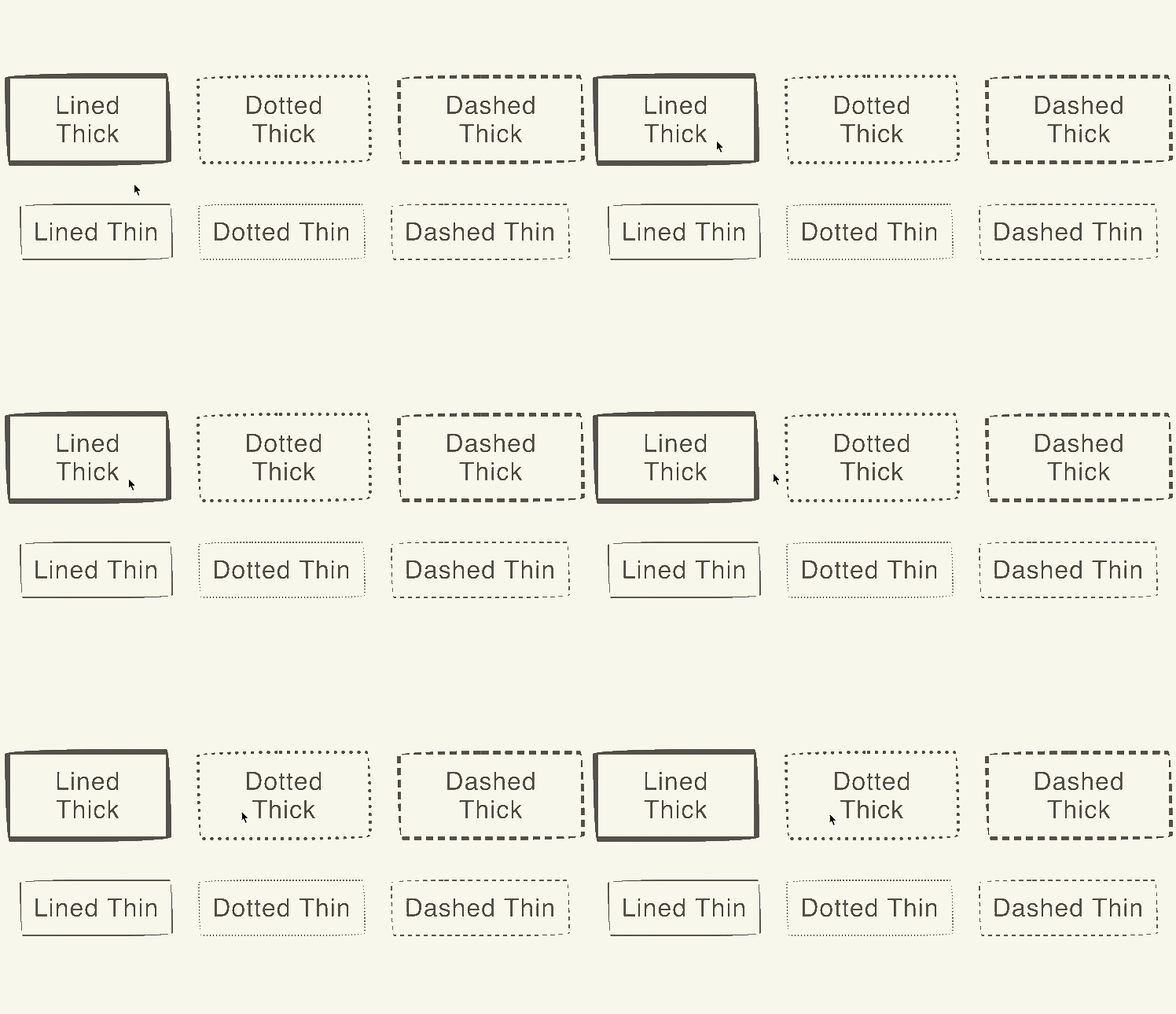
“Hand-Drawn” border effect on buttons w/CSS border-radius. FYI: There is a bug when rendering the dotted / dashed borders in FF. Rendering solid borders in FF is fine.
Colorful CSS Buttons
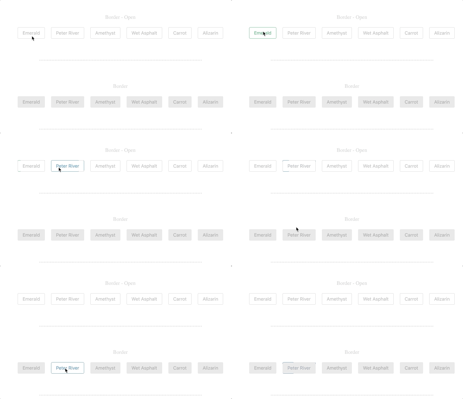
A collection of various types of CSS buttons in various colors.
Button bubble effect

A hover effect using the gooey tricks.
CSS-only Custom Radio Buttons

Based on the webdesign tuts+ article (link below) but instead of using images I used only css.
Flyaway Send Button
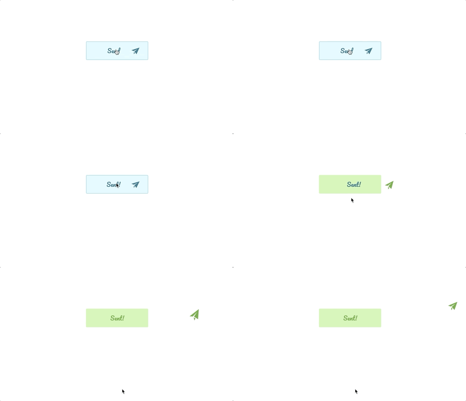
A basic CSS animation that makes a paper airplane fly out of this “Send” button when clicked.
Adrian Del Balso
JUNE 18, 2014
HTML, CSS and JavaScript
Bubbly Button with click effect
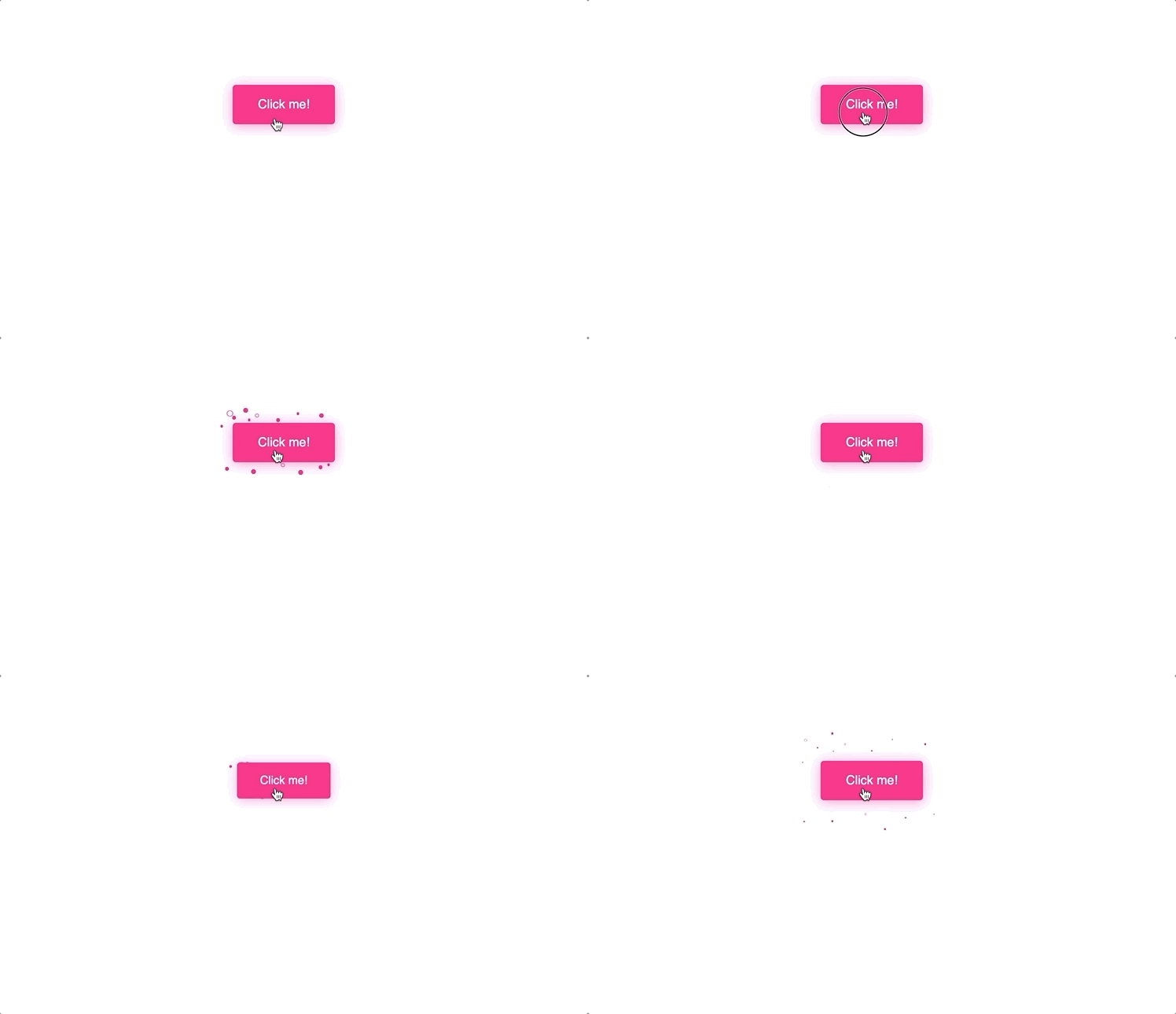
Made the bubbles using “radial-gradient” for background-image. I believe this property is so cool that you can draw many things without adding extra divs or pseudo elements (::before and ::after)
3D flip button
Prototype for 3D flip button.
Sign-post arrow buttons
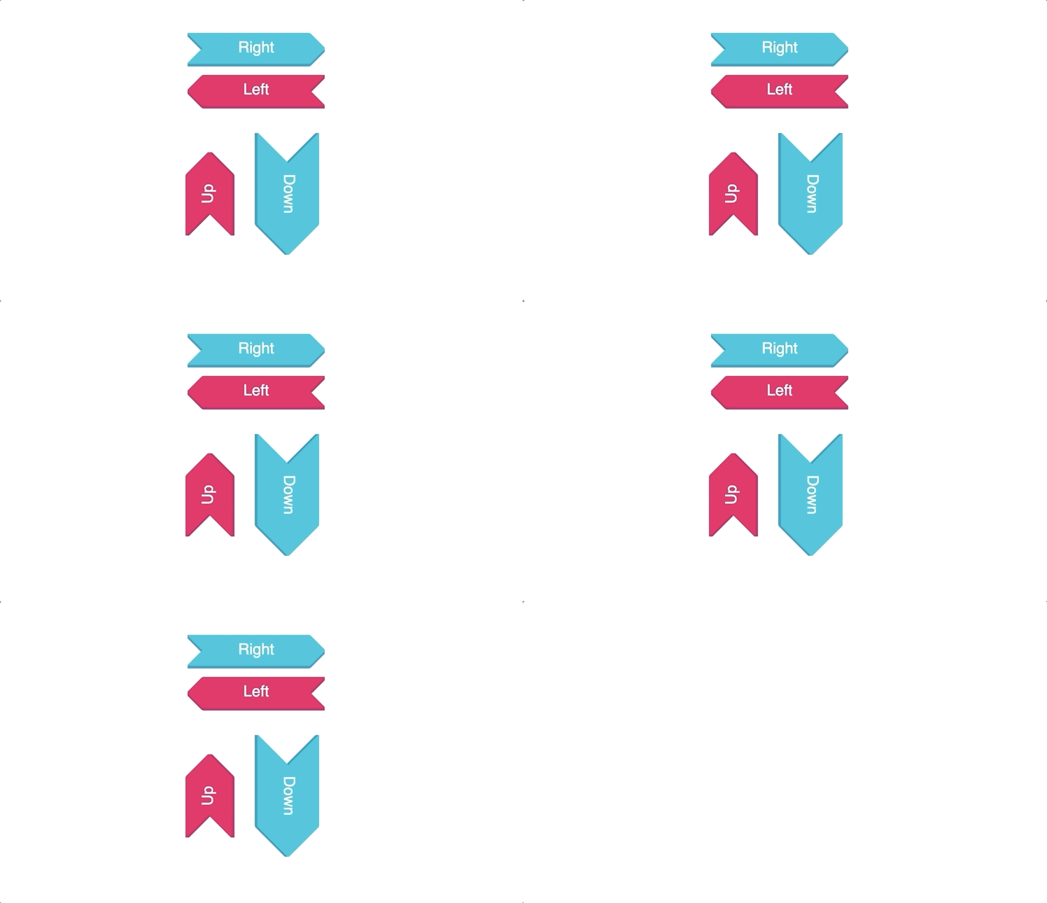
Sass mixin for creating arrow buttons. Uses transform: skew on pseudo-elements. CSS arrow buttons
Button hover effects with box-shadow
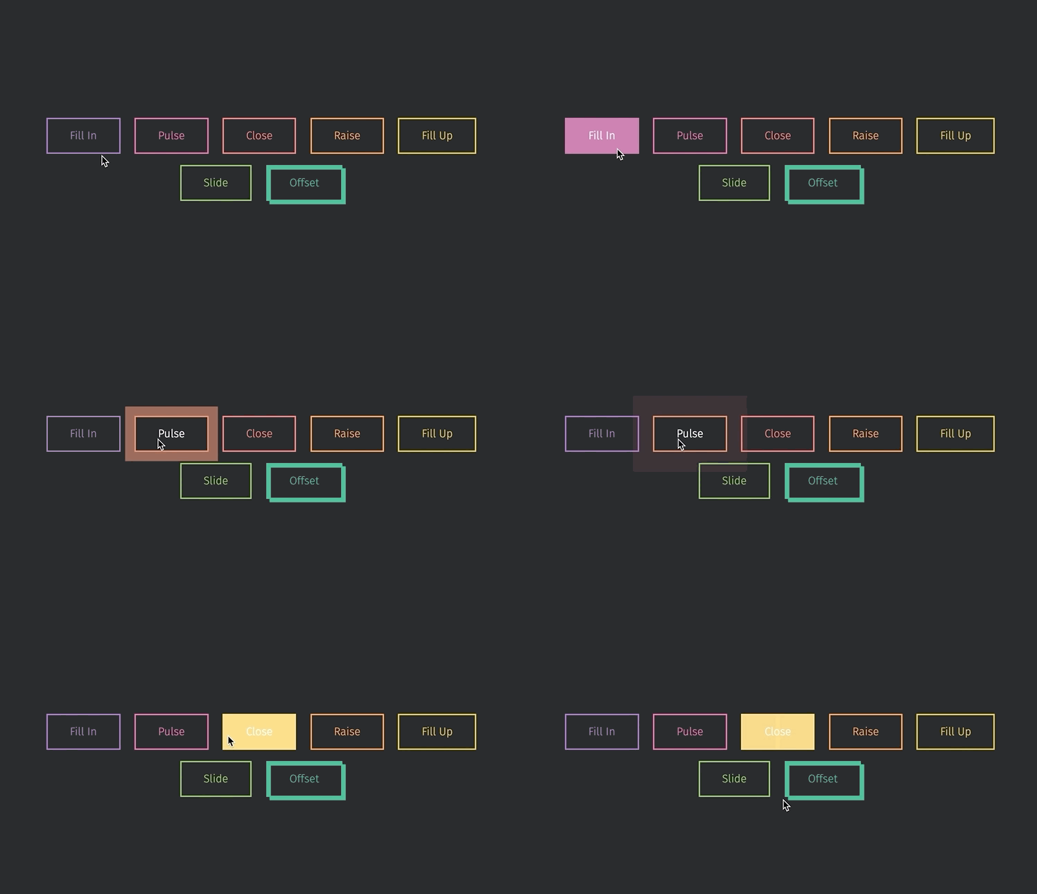
Making some basic animations with box-shadows. No extra elements or even pseudo elements required.
Organic Button
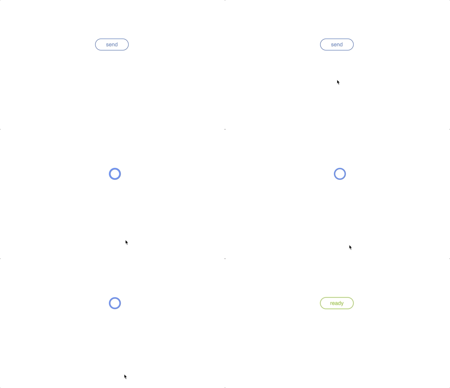
Elastic button, has pounding hearth for loading animation, will burst into ready state once done.
Rik Schennink
MARCH 12, 2014
HTML, CSS and JavaScript
CSS3 Button Hover Effects with FontAwesome
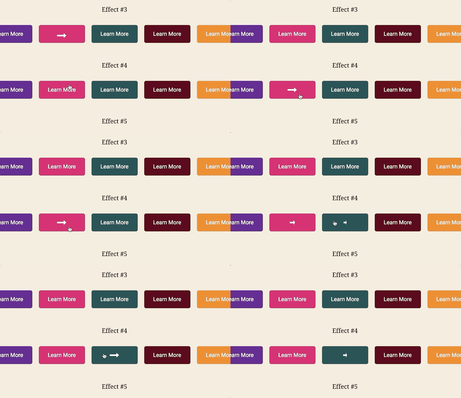
Pure CSS3 Button Hover Effects
Activate Button animation
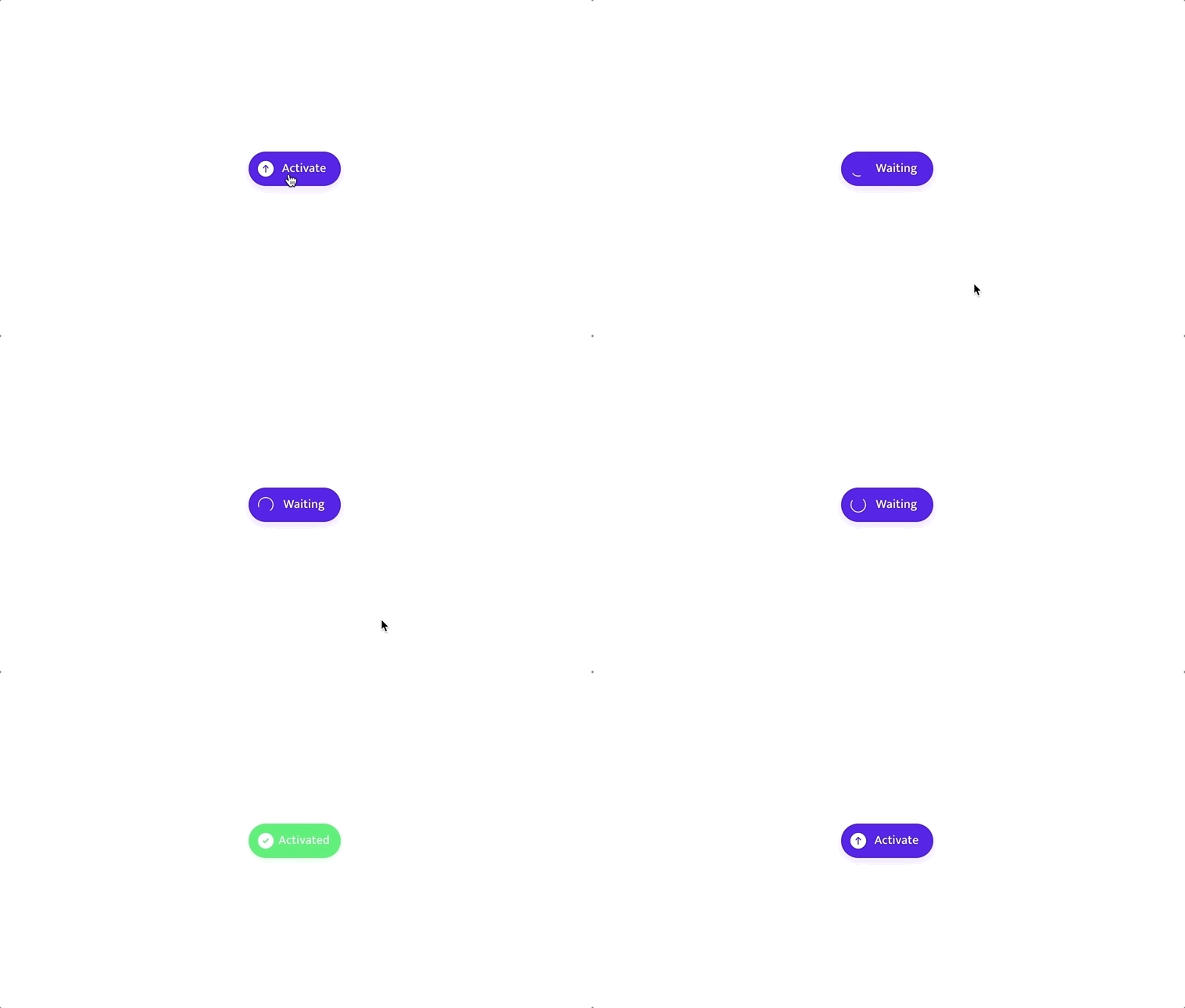
Cool Activate and Waiting Button animation using HTML, CSS and JavaScript.
Aaron Iker
DECEMBER 17, 2018
HTML, CSS and JavaScript
Creative Buttons using just CSS
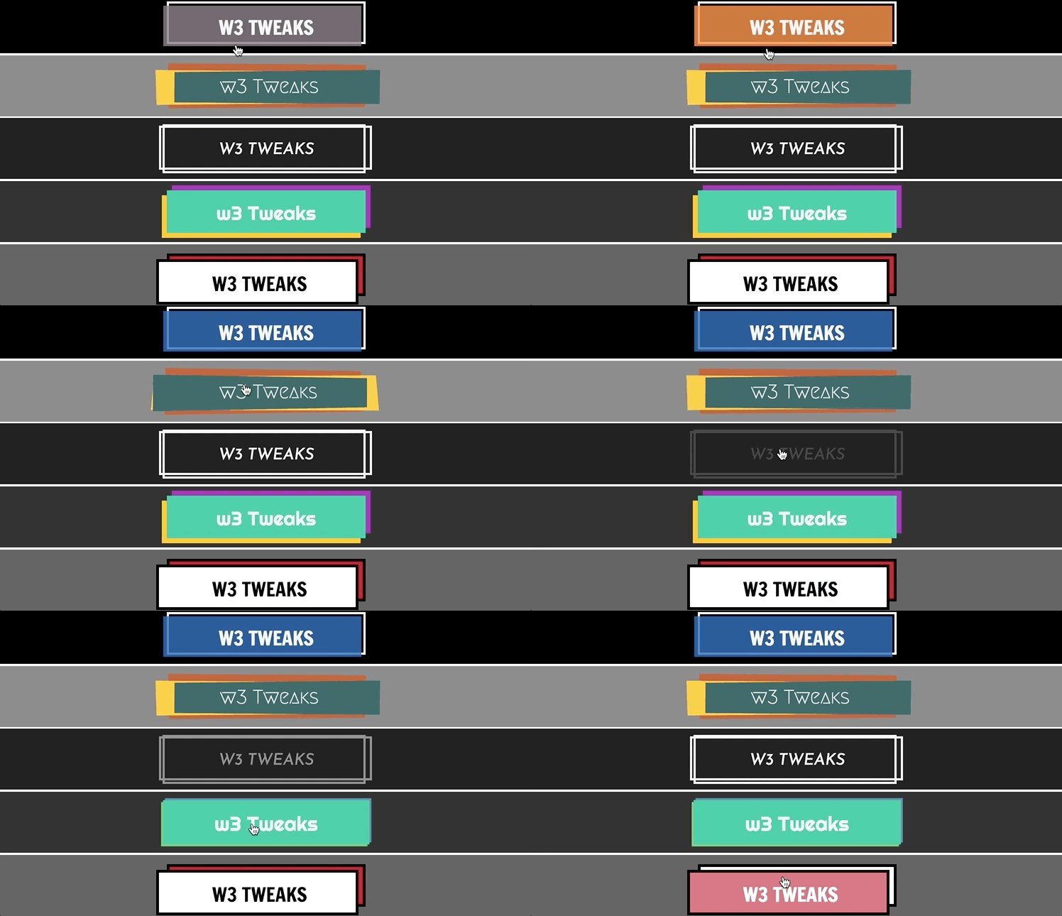
Creative Buttons using just CSS. Can be converted to SCSS for flexibility
CSS button with different transition effects
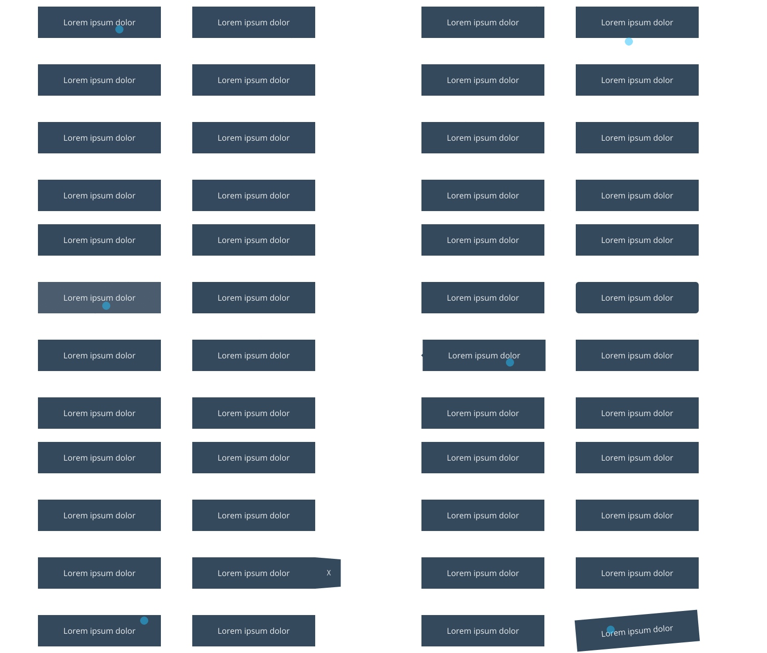
CSS Button with different on hover transition effects developed using css and html.
Button Hover Effects
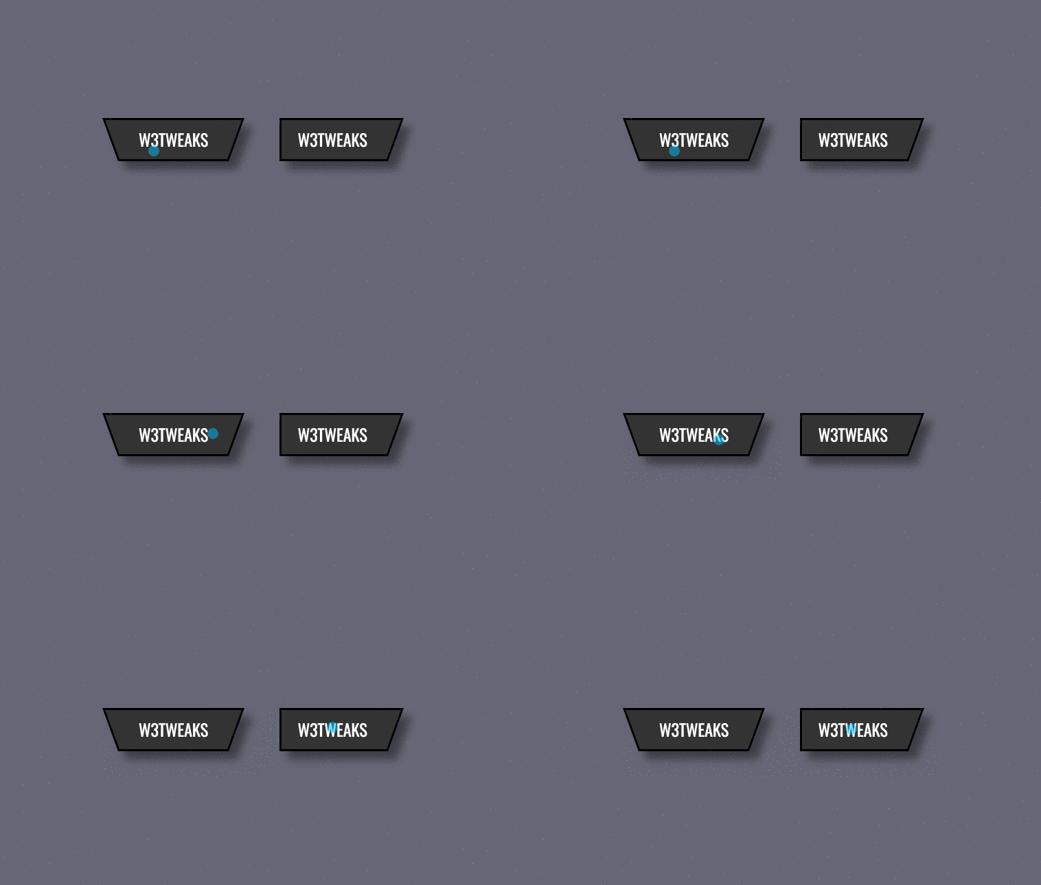
CSS Button with 20 diffrent hover animation effects developed using css and html.
CSS Button with Angled Sides
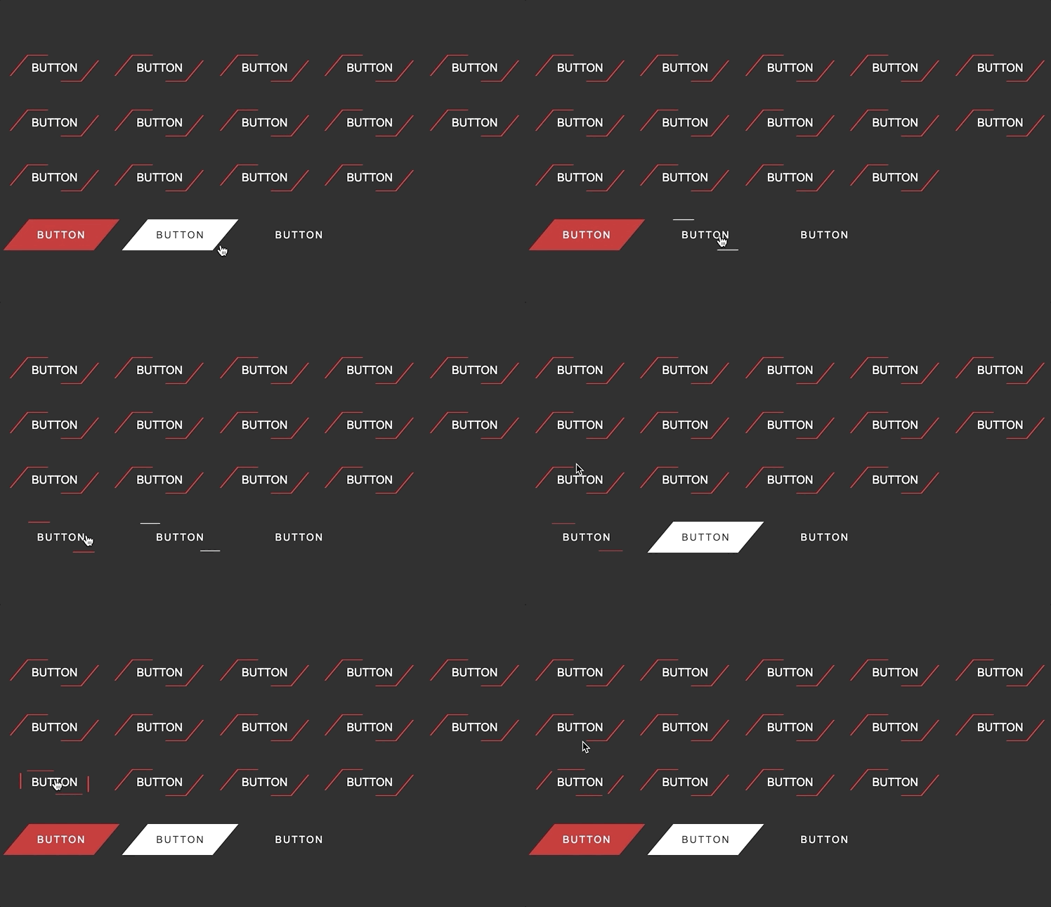
CSS Button with Angled Sides developed using only css and html.
CSS Buttons with animations

CSS Buttons with different animations reactions
Six Pure CSS Button Hover Animations
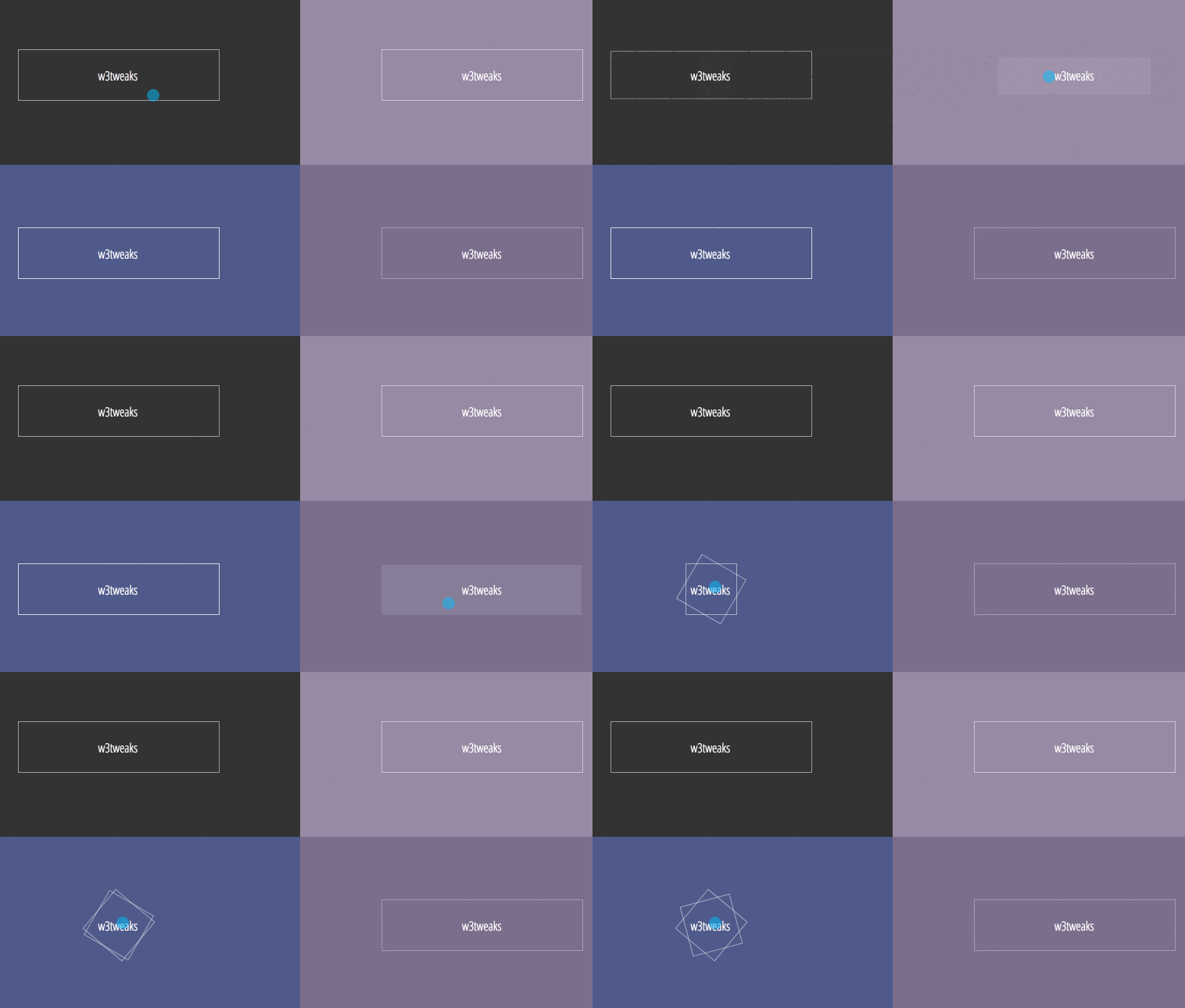
Six Pure CSS Button Hover Animations
Very creative CSS Buttons | Depth Effect
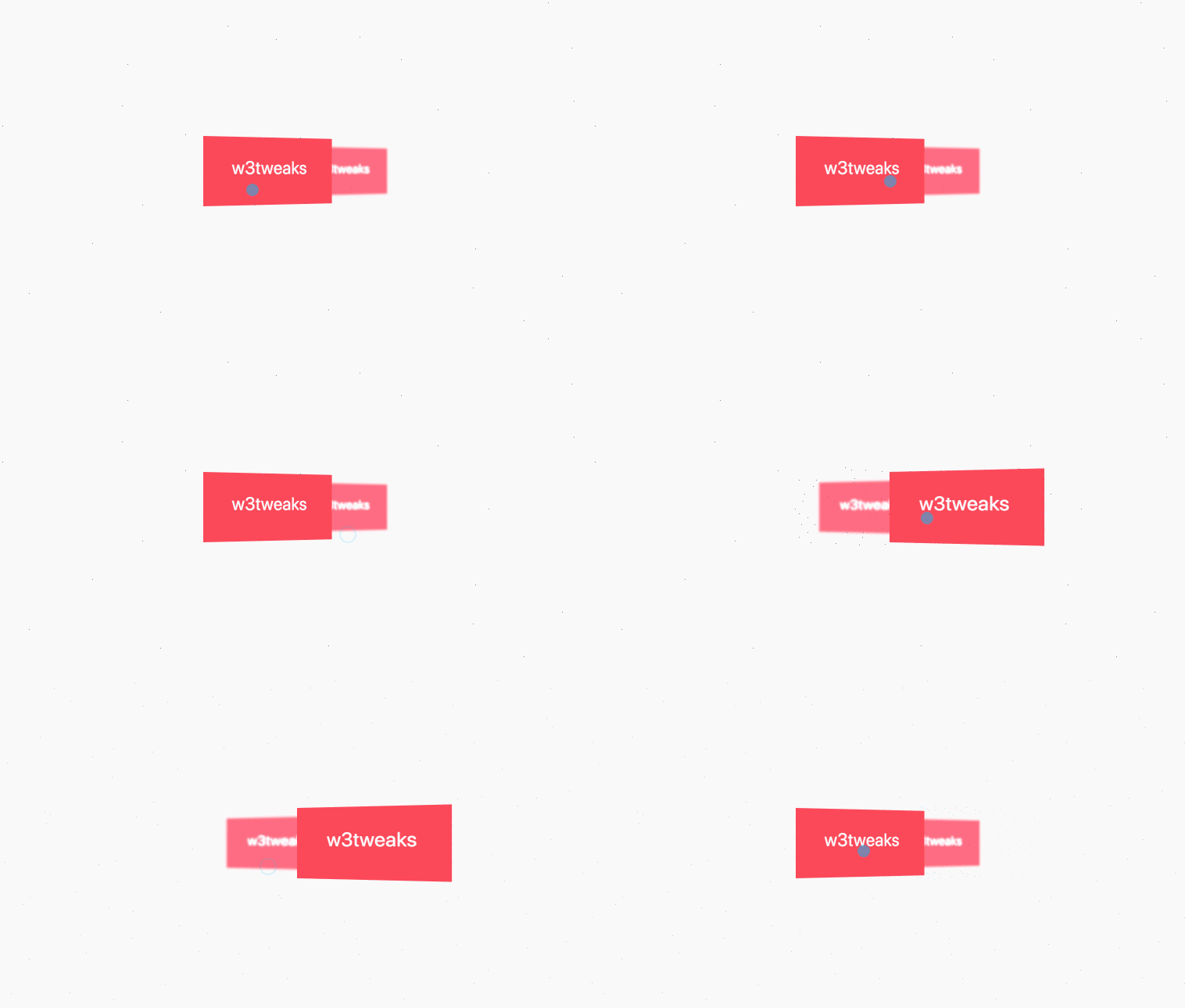
Very creative CSS Buttons | Depth Effect. Developed using css, html and javascript
Praveen Bisht
NOVEMBER 28, 2017
HTML, CSS and JavaScript
Next & Prev CSS buttons
Next & Prev CSS buttons.CSS buttons for next and previous button for sliders, or whatever.
Simple CSS Button Hover Effect
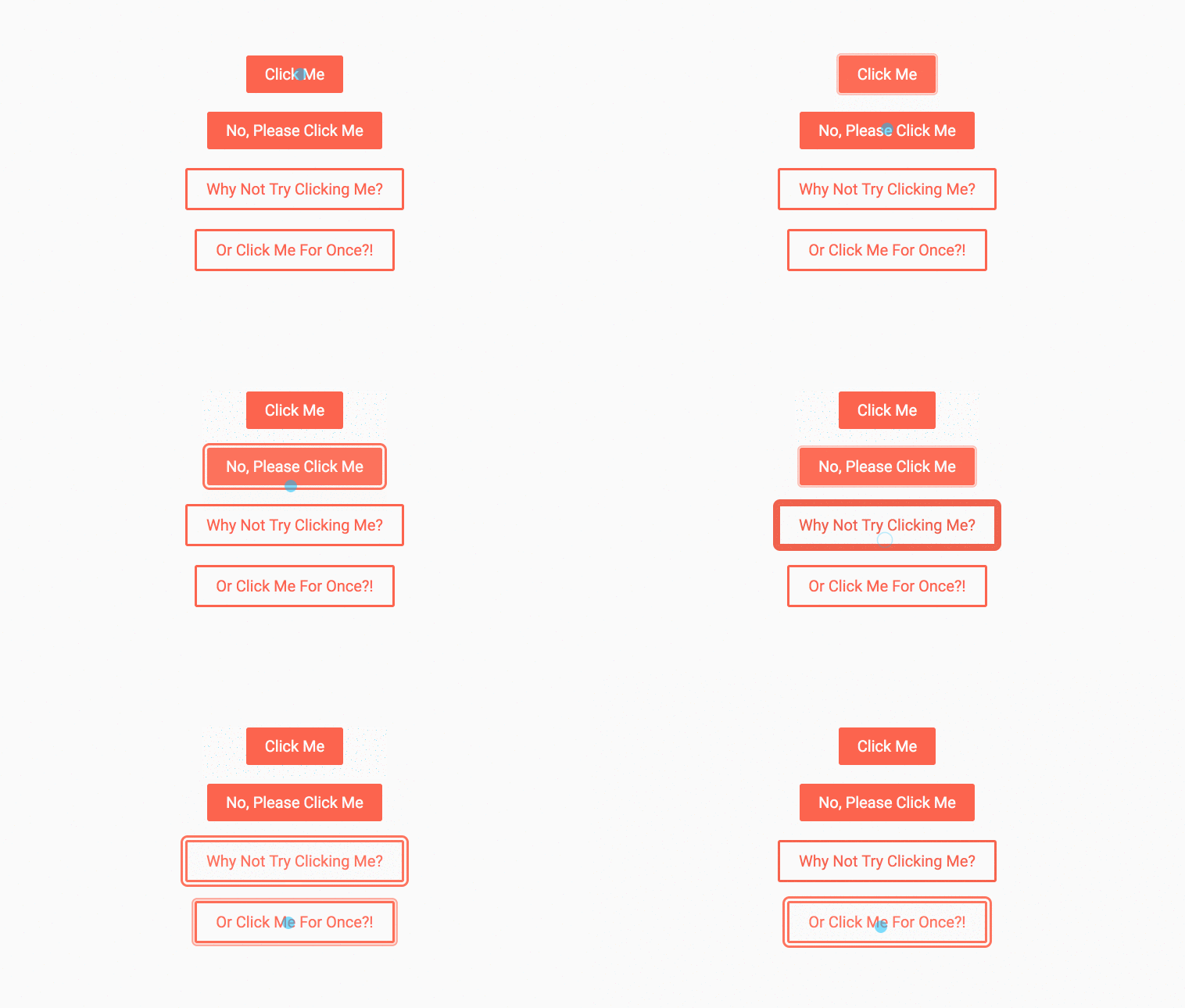
Simple CSS Button Hover Effect. Simple, but good looking :hover and :active transition for buttons and links styled as buttons.
Andréas Lundgren
JUNE 01, 2016
HTML, CSS and JavaScript
CSS button transitions
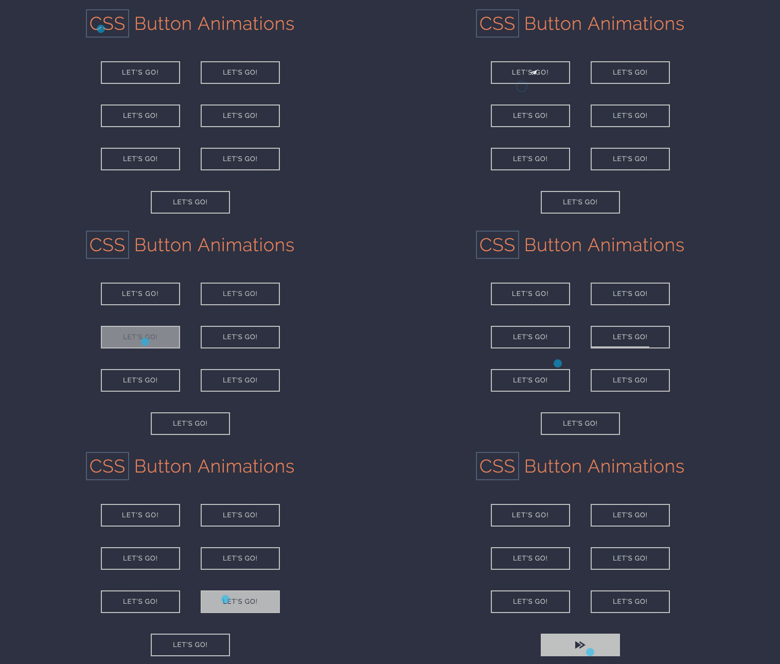
CSS Button Animations styles.Playing around with some CSS button transitions. Possible repo for future use. Learning experience for me dealing with browser compatibility.
Free Bootstrap CSS Buttons
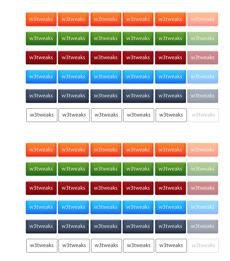
Bootstrap-free CSS Buttons.A pure CSS button style that you can put on anchor tags, buttons, inputs, & labels. Demo and download available.
Enlarge button effect on hover

Button zoom effect on hover. CSS Button enlarge effect using only css and html. Demo and download available.
