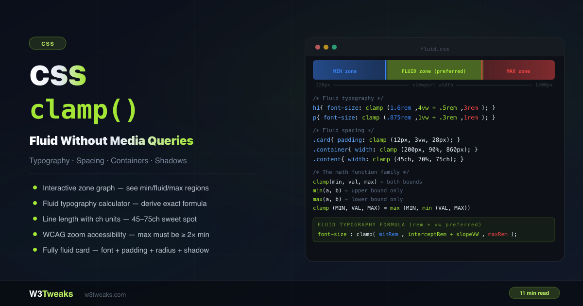
The use of CSS is now required for developing websites. Hover effects are one of CSS’s most intriguing and inventive features. Your website can be made more engaging and enjoyable to use by adding depth and interactivity using hover effects.
In this article, we’ll look at how to use CSS to make beautiful hover effects. Demo codes will be provided for each lesson to aid in your comprehension of the ideas. Let’s get going.
Understanding Hover Effects in CSS
CSS hover effects are attributes that alter an element’s style when a user moves their cursor over it. Changes to the background color, text color, border, box-shadow, and other elements are just a few examples of these attributes. By enhancing the user experience and making your website more dynamic and visually appealing, hover effects can give users a more engaged and engaging experience.
Creating Simple Hover Effects
Simple hover effects are straightforward to design and can include background and text color changes, border additions, and box shadows. Let’s look at a few instances:
Changing Background Color on Hover
Using the CSS property “background-color,” you can alter the background color of an element when it has hovered over. Here is an illustration of some code:
HTML:
`<button>Hover Me!</button>`CSS:
`button:hover {
  background-color: #ff0000;
}`
Demo:
When the user moves their cursor over the button in this illustration, its background color will change to red (#ff0000).
Changing Text Color on Hover
Using the CSS property “color,” you may alter the text color of an element when it has hovered over. Here is an illustration of some code:
HTML:
`<a href="#">Hover Me!</a>`CSS:
`a:hover {
  color: #0000ff;
}`
Demo:
When the user moves their cursor over the link in this example, the text color of the link will change to blue (#0000ff).
Adding Border on Hover
Using the CSS property “border,” you may give an element a border when it has hovered over. Here is an illustration of some code:
HTML:
`<div class="box">Hover Me!</div>`CSS:
`.box:hover {
  border: 2px solid #000000;
}`
Demo:
In this example, when the user moves their cursor over the box, a 2 px solid black border will show up around it.
Adding Box Shadow on Hover
Use the CSS property “box-shadow” to add a box shadow to an element when it has hovered over. Here is an illustration of some code:
HTML:
`<div class="box">Hover Me!</div>`CSS:
`.box:hover {
  box-shadow: 2px 2px 5px #888888;
}`
Demo:
When the user hovers their cursor over the box in this example, a box shadow will appear around it with the following properties: 2px horizontal offset, 2px vertical offset, 5px blur radius, and the color #888888.
Creating Hover Effects on Images
Images can also use hover effects to generate interactive and captivating effects. Let’s look at a few instances:
Adding Image Overlay on Hover
CSS and HTML can be used to add an image overlay when the user hovers. Here is an example of some code:
HTML:
`<div class="image">
  <img src="image.jpg">
  <div class="overlay"></div>
</div>`
CSS:
`.image {
  position: relative;
  display: inline-block;
}

.overlay {
  position: absolute;
  top: 0;
  left: 0;
  width: 100%;
  height: 100%;
  background-color: rgba(0, 0, 0, 0.5);
  opacity: 0;
  transition: opacity 0.5s;
}

.image:hover .overlay {
  opacity: 1;
}`
Demo:
In this case, when the user moves their cursor over the image with their mouse, an image overlay with a black backdrop that is semi-transparent will emerge on top of the image.
Creating Zoom Effect on Image
When a user hovers their mouse over an image, the zoom effect on images is a common hover effect that enables them to zoom in on the image. You can scale an element using CSS’s transform property to get this effect.
The following code demonstrates how to apply a zoom effect to an image:
HTML:
`<div class="image-zoom">
  <img src="your-image-url.jpg" alt="your image description">
</div>`
CSS:
`.image-zoom {
  overflow: hidden;
  display: inline-block;
}

.image-zoom img {
  transition: transform .3s ease-in-out;
}

.image-zoom:hover img {
  transform: scale(1.1);
}`
Demo:
In this illustration, an image element was placed inside a container div with the class image-zoom. To conceal any portion of the picture that extends beyond the container, we set the overflow property of the container to hidden. Additionally, we changed the display property of the container to inline-block so that it just occupies the necessary amount of space.
To make the zoom effect more fluid, we added a transition property to the img element’s CSS. The transition property is set to transform.3s ease-in-out, which indicates that it will alter subtly over a 0.3-second period using an ease-in-out timing function.
When the user hovers over an image, it will be scaled up by 10% thanks to the transform property being set to scale(1.1) in the CSS for the image-zoom:hover img selector.
Adding Caption on Image Hover
A wonderful approach to give context or more information about an image is by adding captions to it. When hovering, captions can be added using CSS.
The HTML code for including a picture with a caption is as follows:
`<div class="image-caption">
  <img src="image.jpg" alt="Image">
  <div class="caption">Caption Text</div>
</div>`
To display the caption while the cursor hovers, we can use the:hover selector in CSS.
`.image-caption {
  position: relative;
}

.caption {
  position: absolute;
  bottom: 0;
  left: 0;
  width: 100%;
  background-color: rgba(0, 0, 0, 0.5);
  color: #fff;
  padding: 10px;
  text-align: center;
  opacity: 0;
  transition: opacity 0.5s ease;
}

.image-caption:hover .caption {
  opacity: 1;
}`
Demo:
To place the .caption absolutely relative to its parent element, we first set the position property of the .image-caption to a relative in the CSS code above. We then use the bottom and left attributes to position the .caption at the bottom left of the .image-caption container after setting its position to absolute. In order to ensure that the caption fills the complete width of the container, we also set the width to 100%.
Using RGBA, we next changed the caption’s background color to a semi-transparent black (0, 0, 0, 0.5). Using the text-align command, we center the text, add some padding, and set the text’s color to white.
In order to add a seamless transition when the caption appears on hover, we set the opacity of the .caption to 0 and use the transition property. Using the :hover selector, we set the .caption’s opacity to 1 when the user hovers over the .image-caption.
Creating Hover Effects on Text
Text components can also have hover effects applied to them to make them more interactive and interesting.
Underlining Text on Hover
Text can be highlighted when the user hovers over it as a simple hover effect. The CSS text-decoration property can be used to do this.
`a:hover {
  text-decoration: underline;
}`
Demo:
The underline effect is applied to links on hover in the aforementioned example using the a:hover selector.
Changing Text Size on Hover
The ability to adjust the size of text on hover is another hover effect. The CSS font-size property can be used for this.
`h1:hover {
  font-size: 36px;
}`
Demo:
In the aforementioned example, the heading element’s font size is increased to 36px on hover using the h1:hover selector.
Adding Background on Text Hover
Using the background-color attribute, you can also give hovering text a background color.
`p:hover {
  background-color: #eee;
}`
Demo:
The paragraph element in the aforementioned example has a light grey background color added to it on hover thanks to the p:hover selector.
Changing Font Style on Hover
Finally, you can use the font-style attribute to alter the font style of text that is displayed on hover.
`em:hover {
  font-style: italic;
}`
In the last example, we used the em:hover selection to make italic the default font type for emphasized text when the user hovers over it.
Creating Advanced Hover Effects
Your website can be made to be more interactive and interesting by using CSS hover effects. Create complex CSS hover effects to give your design a sense of depth and dimension if you want to take hover effects to the next level. The four advanced CSS hover effects of parallax, 3D, perspective, and scroll will be covered in this section.
Creating Parallax Effect on Hover
Web designers frequently utilize the parallax effect to give websites a sense of depth and movement. This effect is produced by moving several webpage elements at various rates to provide a 3D effect. Here’s an illustration of how to make a hovering parallax effect:
HTML:
`<div class="parallax">
  <div class="parallax-image"></div>
  <div class="parallax-text">
    <h2>Parallax Effect</h2>
    <p>Hover over me to see the effect!</p>
  </div>
</div>`
CSS:
`.parallax {
  height: 500px;
  position: relative;
  overflow: hidden;
}
.parallax-image {
  background-image: url('image.jpg');
  background-size: cover;
  background-position: center;
  position: absolute;
  top: 0;
  left: 0;
  width: 100%;
  height: 100%;
  transition: transform 0.4s ease-out;
}
.parallax-text {
  position: absolute;
  top: 50%;
  left: 50%;
  transform: translate(-50%, -50%);
  text-align: center;
  color: #fff;
  z-index: 1;
  opacity: 0;
  transition: opacity 0.4s ease-out;
}
.parallax:hover .parallax-image {
  transform: scale(1.1);
}
.parallax:hover .parallax-text {
  opacity: 1;
}`
Demo:
Creating 3D Effect on Hover
The 3D effect is another intriguing hover effect. It can give your consumers an engaging experience and lend depth and realism to your pieces.
Use the perspective property, the transform property, along with the rotateX or rotateY function to produce a 3D effect.
Here is an illustration of an image with a 3D effect:
HTML:
`<div class="image-3d">
  <img src="image.jpg" alt="Image">
</div>`
CSS:
`.image-3d {
  position: relative;
  perspective: 1000px;
}

.image-3d img {
  position: absolute;
  top: 0;
  left: 0;
  width: 100%;
  height: 100%;
  transition: transform 0.5s;
}

.image-3d:hover img {
  transform: rotateY(30deg);
}`
Demo:
In order to create a 3D space in this example, we set the perspective property on the container. The picture is then made to fill the container by setting the position property on it to absolute and the width and height to 100%. Finally, we use the rotateY method to apply a transform attribute to the picture, rotating it 30 degrees on the Y-axis when it has hovered.
Creating Perspective Effect on Hover
Adding a perspective effect while an element is hovering is another approach to give it depth. It can create a sense of space between your parts and make them stand out.
You must combine the translateZ function with the perspective and transform properties to get a perspective effect.
Here is an illustration of how perspective can be used in the text:
HTML:
`<h2 class="perspective">Perspective Text</h2>`CSS:
`.perspective {
  position: relative;
  transition: transform 0.5s;
  transform: perspective(1800px) rotateY(45deg);
}

.perspective:hover {
  transform: translateZ(50px);
}`
Demo:
In order to create a 3D environment, we set the perspective attribute on the text in this example. Then, when the user hovers over the text, we apply a transform property to the text using the translateZ method to move it 50 pixels in their direction along the Z-axis.
Creating Scroll Effect on Hover
The scroll effect is a special approach to give your elements interactivity. It can make interacting with your website enjoyable and interesting for your users.
You must combine the transition property with the ease-out function and the transition property with the translateY function to get a scrolling effect.
Here is an illustration of a text with a scroll effect:
HTML:
`<h2 class="scroll">Scroll Text</h2>`CSS:
`.scroll {
  position: relative;
  transition: transform 0.5s;
}

.scroll:hover {
  transform: translateY(-50%);
  transition-timing-function: ease-out;
}`
Demo:
In this example, we use the translateY method to apply a transform property to the text, which causes it to shift 50% upward when hovered. To make the animation fluid and realistic, we also combine the ease-out function with the transition-timing-function property.
Using Transition and Transform Properties
We can use CSS transitions and transforms to build more sophisticated and intricate hover effects. We may add fluid and dynamic animations to our elements on hover by using these properties.
Understanding Transition and Transform Properties
Using CSS transitions, we may gradually change an element’s style to provide a smooth animation effect. The transition property controls the timing and duration of a transition effect on an element.
On the other hand, CSS transformations let us change an element’s position, size, and shape. To produce various effects, we can use the transform property in conjunction with its functions, such as translate, rotate, and scale.
Applying Transition Property on Hover
Any CSS property can have a transition effect applied to it. For instance, we can use the CSS code below to apply a transition effect to a button’s background-color attribute when it is hovered over:
`button {
  background-color: #eee;
  transition: background-color 0.5s ease;
}

button:hover {
  background-color: #888;
}`
Demo:
When we hover over the button in the example above, the background-color property will gradually change from #333 to #555 over the course of 0.5 seconds.
Combining Transition and Transform Properties
To create more complex CSS hover effects, we may also combine the attributes of transformation and transition. For instance, we can use the CSS code below to add a zoom effect to a picture when it is hovered over:
`img {
  transition: transform 0.5s ease;
}

img:hover {
  transform: scale(1.2);
}`
Demo:
In the aforementioned illustration, the image will enlarge on hover to 1.2 times its original size.
We can design countless CSS hover effects utilizing transitions and transforms, making browsing our websites more dynamic and interesting for visitors.
Best Practices for Creating Hover Effects
A few best practices should be kept in mind while developing CSS hover effects to make sure they look and work as intended.
Keeping it Simple and Consistent
Keeping hover effects straightforward and dependable is among the most crucial considerations. Users may become confused or distracted by complex or inconsistent CSS hover effects, which can potentially negatively affect the speed of your website.
To give your website a unified and professional appearance, stick with a few straightforward hover effects that you can use consistently throughout.
Using the Right Colors and Fonts
How consumers perceive your CSS hover effects can be greatly influenced by the colors and typefaces you select. Make sure to pick easy-to-read colors and fonts that go with the overall design of your website.
Avoid using very vivid or challenging-to-read fonts or colors because these can overwhelm or distract readers.
Testing on Different Devices and Browsers
Your hover effects should be tested on many platforms and browsers to make sure they function properly and look decent.
Test your CSS hover effects on PCs, tablets, mobile devices, and several web browsers, including Chrome, Firefox, and Safari.
Optimizing for Performance
Finally, it’s critical to performance-optimize your CSS hover effects. This calls for employing effective selectors, keeping your CSS as minimal as feasible, and reducing the number of hover effects you employ on your page.
You can design professional-looking hover effects that improve user experience on your website without losing performance by adhering to these best practices.
FAQs:
Q: What do CSS hover effects do?
A: Hover effects are CSS attributes that modify an element’s style when a user moves their cursor over it.
Q: How significant are CSS hover effects?
A: Hover effects can enhance the user experience and make your website stand out by making it more interactive and engaging.
Q: On my website, how do I make CSS hover effects?
A: By utilizing CSS features like background color, text color, border, box-shadow, image overlay, and more, you can create hover effects.
Conclusion
Your website can advance to the next level if you master CSS hover effects. You may develop spectacular hover effects that will captivate your audience and improve their experience on your site by comprehending the principles and using the demo scripts. Keep it straightforward, be consistent, and utilize the appropriate colors.
 Mastering CSS Hover Effects