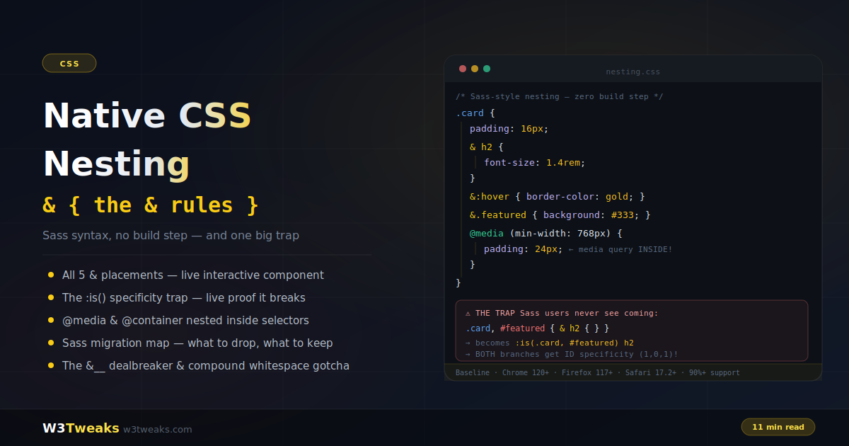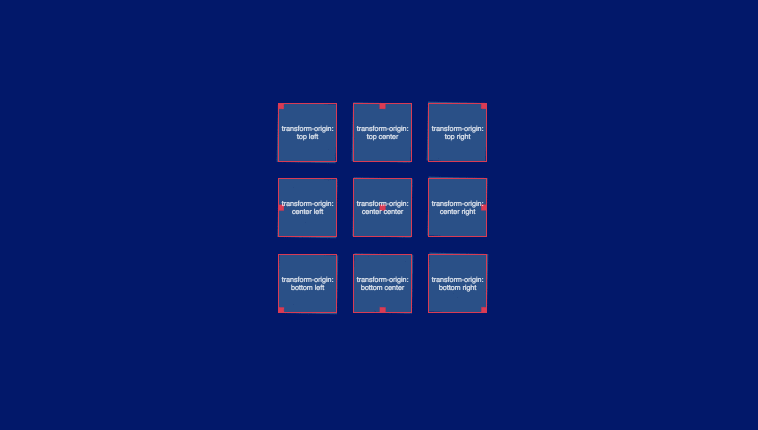
This demo will show all sides origin rotation of element using css Transform Origin illustration. Demo and download options available.
Author Shaw
Created SEPTEMBER 12, 2018
License Open
Compatible browsers Chrome, Firefox, Safari
This demo use all the direction of origin rotation using CSS transform-origin illustration. Find the code snippet below.
HTML Snippet
`<div class="origin" style="transform-origin: top left"></div> <div class="origin" style="transform-origin: top center"></div> <div class="origin" style="transform-origin: top right"></div> <div class="origin" style="transform-origin: center left"></div> <div class="origin" style="transform-origin: center center"></div> <div class="origin" style="transform-origin: center right"></div> <div class="origin" style="transform-origin: bottom left"></div> <div class="origin" style="transform-origin: bottom center"></div> <div class="origin" style="transform-origin: bottom right"></div>`SCSS Code
`.origin { width: 1em; height: 1em; font-size: 11vmin; position: relative; background: rgba(0,0,0,.4); animation: spin 6s cubic-bezier(.8, 0, .2, 1) infinite; @keyframes spin { 50% { transform: rotate(180deg); } 100% { transform: rotate(360deg); } } &:before, &:after { content: ''; display: block; width: 100%; height: 100%; position: absolute; top: 0; left: 0; border: solid 1px red; transform-origin: inherit; // visibility: hidden; } &:before { animation: inherit; animation-direction: reverse; font-size: .12em; content: attr(style); display: flex; text-align: center; word-break: keep-all; align-items: center; z-index: 2; } &:after { background: red; transform: scale(0.1); } } html, body { background: #00136c; } .origin { background: #3b2c85; background: rgba(133, 207, 203, 0.3); } .origin:before { border: solid 1px #db3951; color: rgba(255, 255, 255, 0.8); z-index: 5; } .origin:after { background: #db3951; } *, *::before, *::after { box-sizing: border-box; } html { display: grid; justify-items: center; align-items: center; height: 100%; overflow: hidden; } body { display: grid; grid-template: repeat(3, auto)/repeat(3, auto); grid-gap: 1em; } `Preview