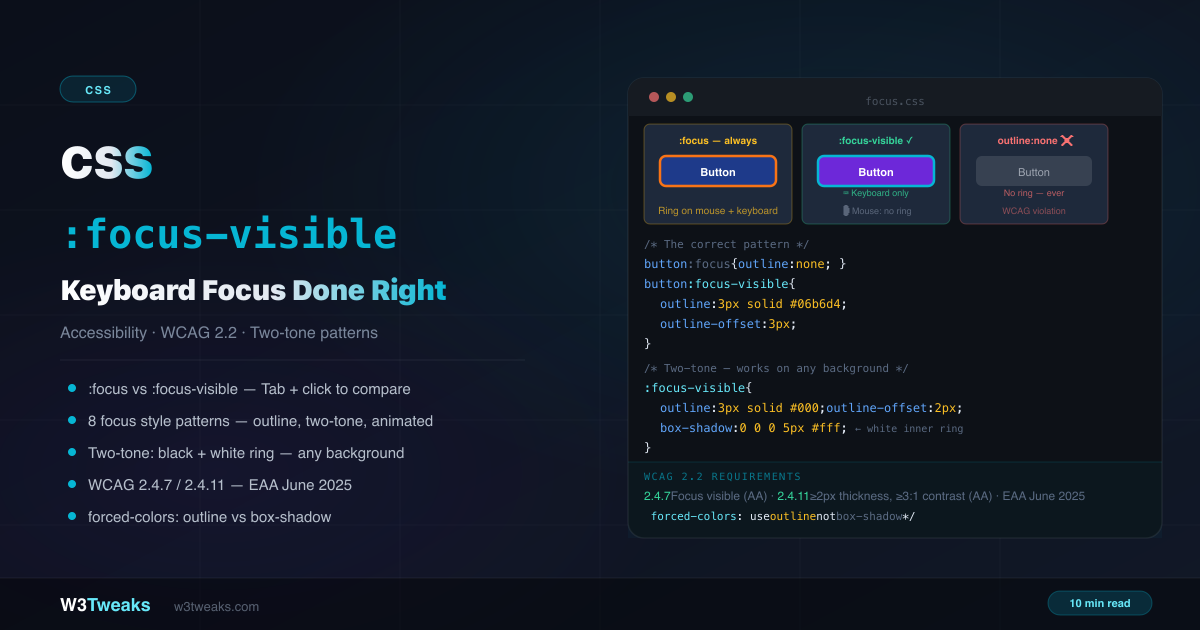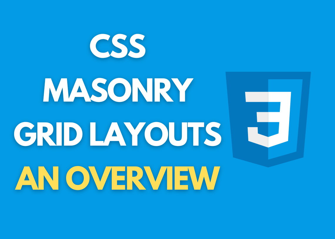
CSS masonry grid layouts are a popular way for web designers and developers to make websites that look good and are fun to use.
We will give an overview of CSS Masonry Grid Layouts in this article, explaining what they are, how they operate, and how to use them in your web design projects.
What is a Masonry Grid Layout?
A Masonry Grid Layout is a type of CSS grid system that doesn’t have fixed column widths and lets content be arranged in a way that changes based on the device being used. In contrast to traditional grid layouts, Masonry Grids use variable column widths to arrange content in a free-form, ad hoc way. This makes for a layout that is cohesive and looks good.
How Do a CSS Masonry Grid Layouts Work?
Masonry Grids produce a dynamic, adaptable layout that changes depending on the size of the shown material by using CSS3 columns. Instead of having fixed column widths, content is organized in a succession of columns, with each column’s width depending on how much content it includes. This enables a smooth, aesthetically pleasing layout that is ideal for showcasing images, text, and other kinds of material.
Implementing Masonry Grid Layouts
Masonry Grid Layouts are simple to use and implement in your web design projects. In addition to well-known choices like Masonry.js, Isotope, and Packery, there are numerous CSS libraries and frameworks that offer pre-built Masonry Grid Layouts.
Instead, you can use CSS3 columns and other sophisticated CSS techniques to make your own Masonry Grid Layout. To make sure that your layout is suitable for various screen sizes and devices, it’s important to employ responsive design concepts.
Code Snippets
The following code snippets demonstrate how to make a simple Masonry Grid Layout with CSS3 columns:
HTML
`<div class="masonry-grid">
   <div class="masonry-item">
       <img src="image-1.jpg">
   </div>
   <div class="masonry-item">
       <img src="image-2.jpg">
   </div>
   <div class="masonry-item">
       <img src="image-3.jpg">
   </div>
   ...
</div>`
CSS
`.masonry-grid {
    column-count: 3;
    column-gap: 20px;
}

.masonry-item {
    break-inside: avoid;
    margin-bottom: 20px;
}`
Demo
FAQs
What are the benefits of using a Masonry Grid Layout?
Masonry Grid Layouts are aesthetically pleasing, adaptable, and responsive, which makes them ideal for showcasing dynamic content like images, text, and video.
Do I need to be an advanced CSS developer to implement a Masonry Grid Layout?
No, even if you are not an experienced CSS developer, it is simple to design a Masonry Grid Layout because to the many pre-built tools and frameworks that are accessible.
Conclusion
Using masonry grid layouts, a popular design trend, you can make websites that look good and have a lot of movement. Using CSS3 columns and other advanced CSS techniques, you can make layouts that can be changed to fit different screen sizes and devices. Masonry grids are an effective tool for web designers and developers, whether you’re utilizing a ready-made library or making your own layout.