CSS
23 min
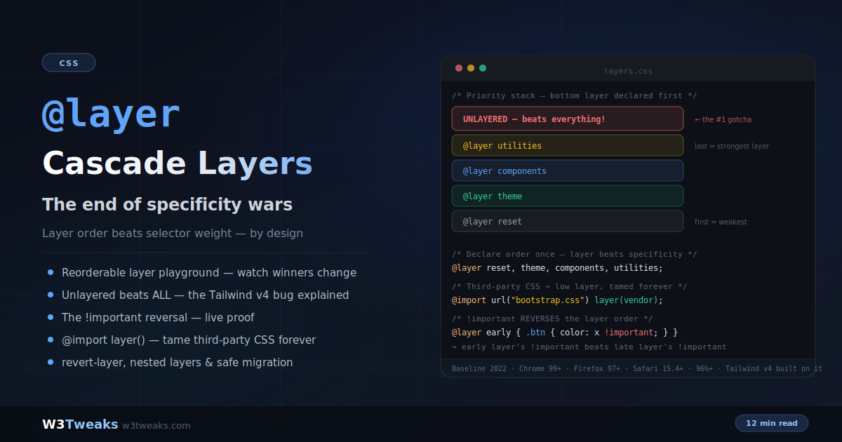
CSS @layer: Cascade Layers That End the Specificity Wars
Cascade layers let you declare which groups of styles win — independent of selector specificity. A one-line @layer declaration replaces years of specificity hacks and !important escalation. This guide covers the full system: layer ordering, why unlayered styles beat every layer (the Tailwind v4 upgrade bug), the mind-bending !important reversal, taming third-party CSS with @import layer(), nested layers, revert-layer, Shadow DOM's independent layer graph, design system layer contracts for Radix/shadcn/MUI/Chakra, the empty-layer reservation pattern for code-split apps, and the migration path that can't break anything.
CSS
22 min
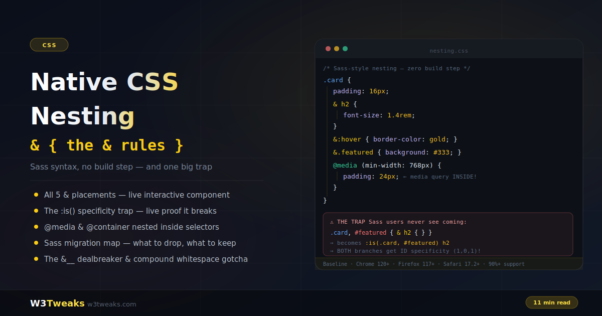
Native CSS Nesting: Sass Syntax With No Build Step (And One Big Trap)
Native CSS nesting brings Sass-style nested rules to the browser with zero build step — and it's Baseline in every evergreen browser. But it isn't a Sass clone: the parent selector gets wrapped in :is(), which silently changes specificity in ways that break Sass habits; &__ concatenation doesn't exist; and bare compound selectors gain an unwanted space. This guide covers every & placement, nesting at-rules inside components, the honest Sass migration map, plus @scope pairing, Tailwind v4 native output, @starting-style composition, the .vue/.svelte/.astro scoped-CSS interaction, and the & + & flow-content pattern.
CSS
22 min
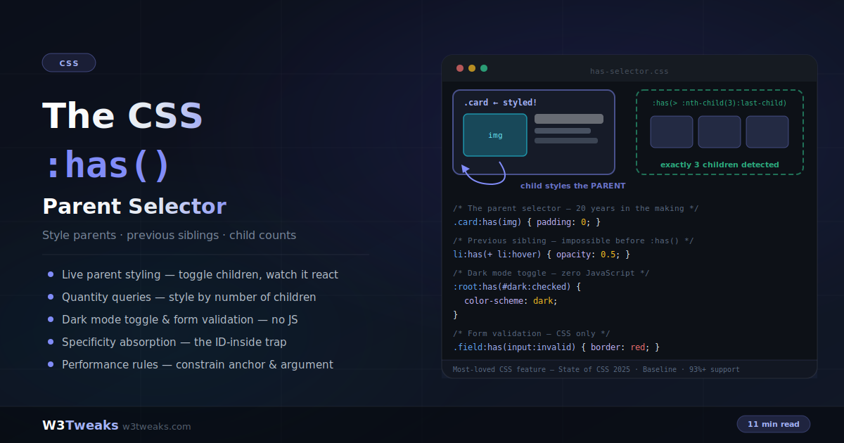
CSS :has() Selector: The Parent Selector, Explained With Live Demos
For twenty years, a parent selector was the most requested CSS feature — and :has() finally delivered it. Style a card because it contains an image, select the element before a hovered one, restyle a grid by how many children it holds, build form validation and dark mode toggles with zero JavaScript. This guide covers every pattern plus the specificity trap, the no-nesting rule, the two-negatives (`:not(:has())` vs `:has(:not())`) confusion, CSS-only tabs, `<details>` accordions, state-machine buttons, the shadow-DOM scope boundary, and the performance constraints that matter.
CSS
20 min
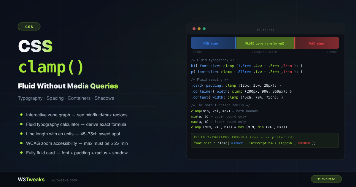
CSS clamp(): Fluid Typography, Spacing & Layouts in One Line
CSS clamp() sets a value that scales fluidly between a minimum and maximum — no media queries, no JavaScript. font-size: clamp(1rem, 4vw, 2rem) is smaller than 1rem on tiny screens, scales with the viewport, and never exceeds 2rem on wide ones. This guide covers the math family (min/max/clamp), the rem+vw preferred formula, a fluid typography calculator, ch units for line length, WCAG zoom requirements, container query units for component-fluid sizing, dynamic viewport units (dvw) for iOS, the var() myth, and a complete fluid card component.
CSS
20 min
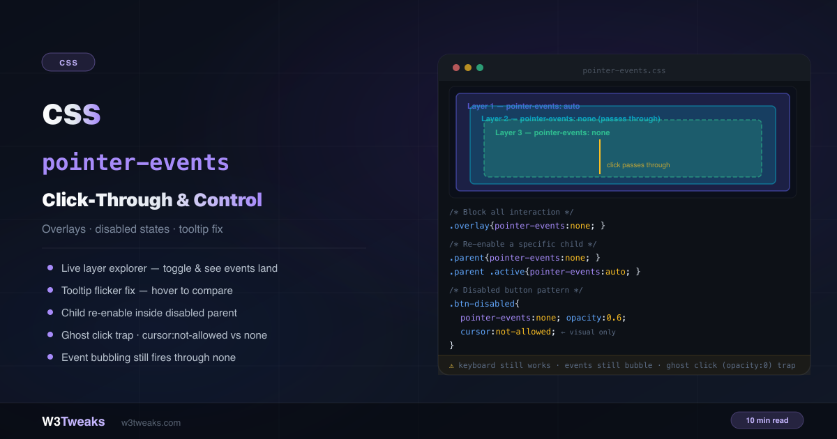
CSS pointer-events: inert, Click-Through, disabled & SVG
pointer-events is a one-line CSS property that controls whether an element can be the target of mouse, touch, and pen interactions. Most guides stop at click-through overlays. This guide adds the inert attribute alternative for disabled subtrees, the disabled-attribute-vs-pointer-events table for native form controls, transition-behavior: allow-discrete for fade-in menus, dialog ::backdrop click-to-close, SVG bounding-box hit areas, map/canvas HUD click-through, the JS Pointer Events API disambiguation, and the senior-dev debugging anti-pattern.
CSS
23 min
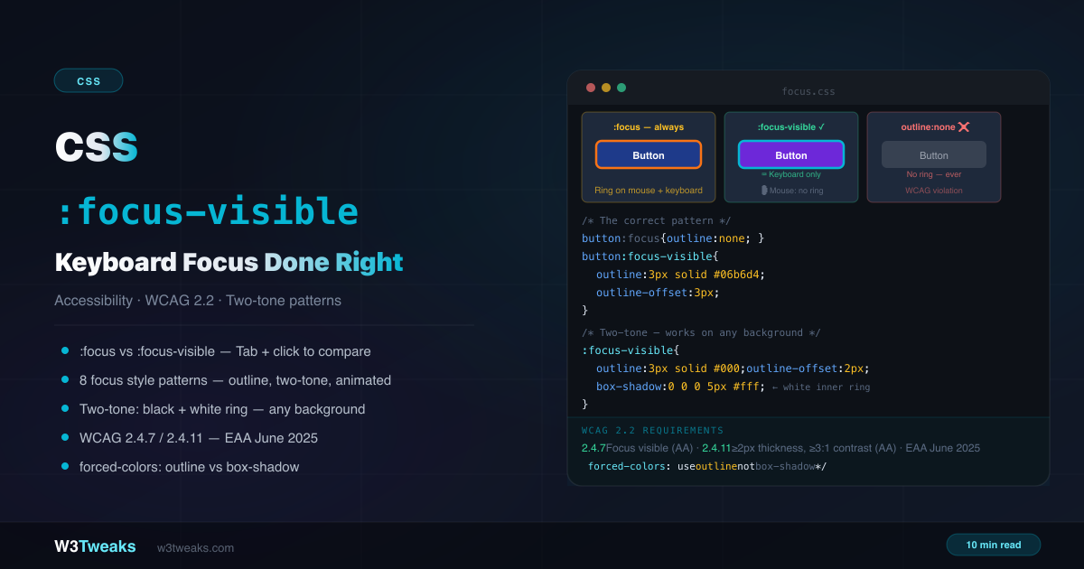
CSS :focus-visible: Keyboard Focus, WCAG & inert
Removing outline:none without a replacement is one of the most common accessibility failures on the web. CSS :focus-visible shows a focus ring for keyboard users and hides it for mouse clicks — but most tutorials stop there. This guide adds the sticky-header scroll-padding-top trap, modern inert and <dialog> focus management, the :has(:focus-visible) modern keyboard-only parent highlight, accent-color for native form focus, why tap on mobile doesn't show a focus ring, cross-browser heuristic differences, and the WICG polyfill for legacy browsers.
CSS
17 min
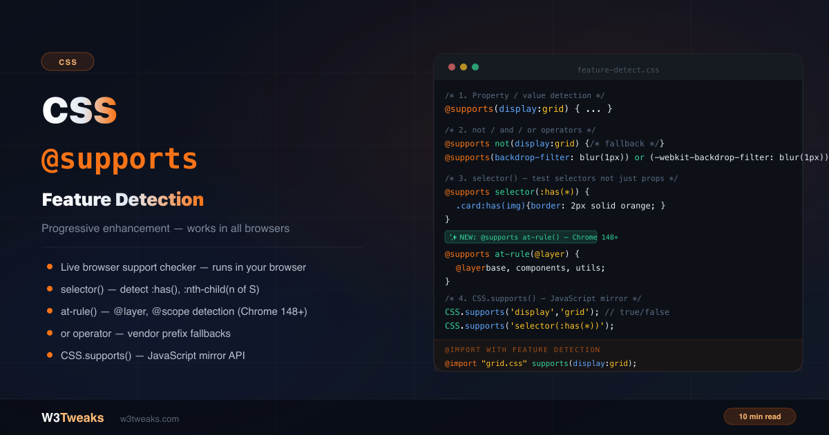
CSS @supports: Feature Detection & Progressive Enhancement
CSS @supports is pure CSS feature detection — no JavaScript, no Modernizr. The modern Modernizr alternative is built into CSS itself. This guide covers @supports examples, the not/and/or operators, the selector() function (with the empty :has() gotcha), at-rule() for detecting @layer and @scope, Tailwind's supports-[] arbitrary variant, OKLCH and View Transitions detection, @supports inside @container for component-scoped gating, the double-negation parser quirk, and the CSS.supports() JavaScript API.
CSS
19 min
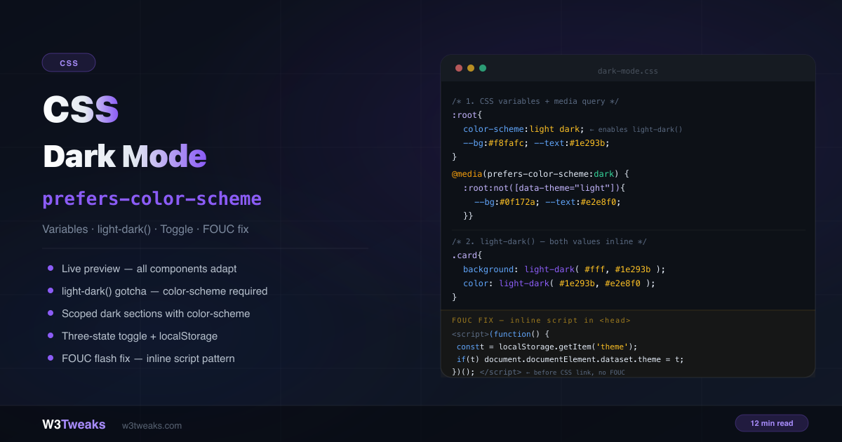
CSS Dark Mode: prefers-color-scheme, light-dark, OKLCH
The complete CSS dark mode guide — prefers-color-scheme media query, the new light-dark() function with the color-scheme gotcha, OKLCH tokens with color-mix() for perceptual lightness scaling, Material 3 surface elevation, View Transitions API for the toggle animation, the SSR/SSG FOUC fix matrix (Next.js cookie pattern), Windows High Contrast Mode survival with forced-colors, meta theme-color for mobile chrome, Tailwind v4 @custom-variant dark, and cross-tab sync.
CSS
19 min
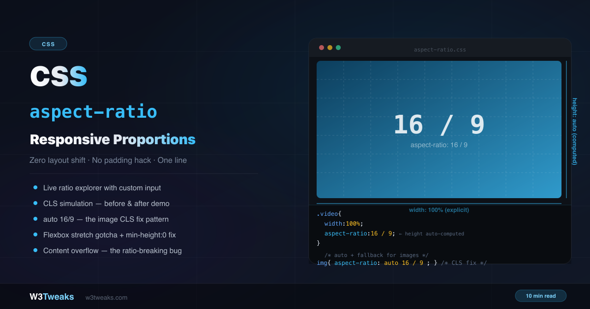
CSS aspect-ratio Property: Complete Guide With Live Visualiser
CSS aspect-ratio is one line where the old padding-bottom hack needed five. It reserves space proportionally, eliminates layout shift, and works natively in every browser since 2021. This guide covers every value, the auto fallback for images, the gotchas with flexbox and content overflow, CSS custom-property patterns, Tailwind/Bootstrap equivalents, the @media (aspect-ratio) vs property disambiguation, view-transition interpolation, social-card cropping with object-position, and a complete common-ratios reference.
CSS
21 min
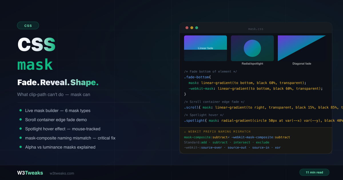
CSS mask: Fade, Reveal & Shape Elements (Complete Guide)
CSS mask uses another image or gradient as a stencil for element visibility. Unlike clip-path's hard edges, mask creates soft fades, partial transparency, and graduated reveals. This guide covers the alpha vs luminance reality (not just black=visible), gradient masks, SVG icon recoloring with currentColor, scroll container edge fades, spotlight hover, wipe reveals, scroll-driven animation-timeline reveals, mask-composite + mask-border, and the -webkit-mask-composite naming mismatch that silently breaks Safari.
CSS
21 min
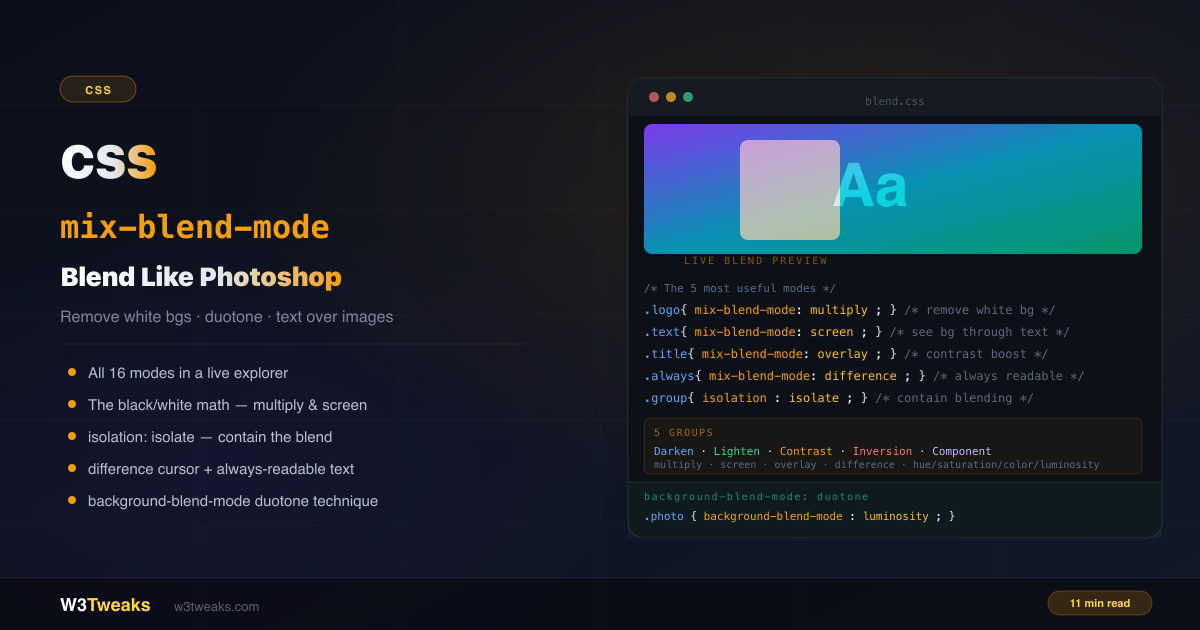
CSS mix-blend-mode: Blend Text, Images & Colors Like Photoshop
mix-blend-mode lets an element's pixels react to whatever is behind them — the same algorithms Photoshop uses. Remove white backgrounds from logos. Make text always readable (with the WCAG caveat nobody mentions). Build duotone photos in pure CSS or with Spotify-style SVG feColorMatrix. Plus the interaction matrix when mix-blend-mode silently stops working with opacity/filter/transform, plus-lighter/plus-darker (CSS Blending Level 2), animation behavior, glitch/chromatic-aberration patterns, and forced-colors fallbacks.
CSS
21 min
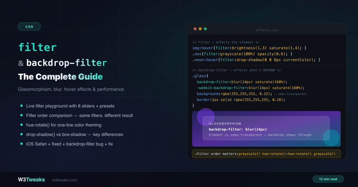
CSS filter & backdrop-filter: The Complete Visual Guide
CSS filter applies effects to an element — blur, grayscale, brightness, contrast, drop-shadow. CSS backdrop-filter applies those same effects to whatever is behind the element. This complete guide covers both properties, the filter-order gotcha, drop-shadow vs box-shadow, glassmorphism patterns (including Apple's Liquid Glass + dialog::backdrop modals), filter: url() for SVG-referenced effects like duotone and gooey blobs, prefers-reduced-transparency, @supports fallbacks, forced-colors mode, the iOS Safari fixed-position bug, and performance tiers.