
Guide
19 min
How to Add .env to .gitignore: The Complete Security Guide
Most 'add .env to gitignore' tutorials stop at one line in a .gitignore file. This guide covers what they miss: the standard multi-line .env* block used by Next.js / Vite / Create React App, what to actually do when a secret was already pushed (rotate FIRST), git filter-repo for rewriting history (git filter-branch is deprecated), GitHub Push Protection, gitleaks + TruffleHog pre-commit scanners, encrypted-env alternatives like dotenvx and Doppler, and why --skip-worktree beats --assume-unchanged for config files.

Guide
14 min
GitHub Copilot vs Claude vs ChatGPT: Which Writes Better CSS?
We gave the same 6 frontend tasks to GitHub Copilot, Claude, and ChatGPT and scored every output honestly. Spoiler: each tool has a clear strength — knowing which to reach for first saves real time.
Guide
14 min
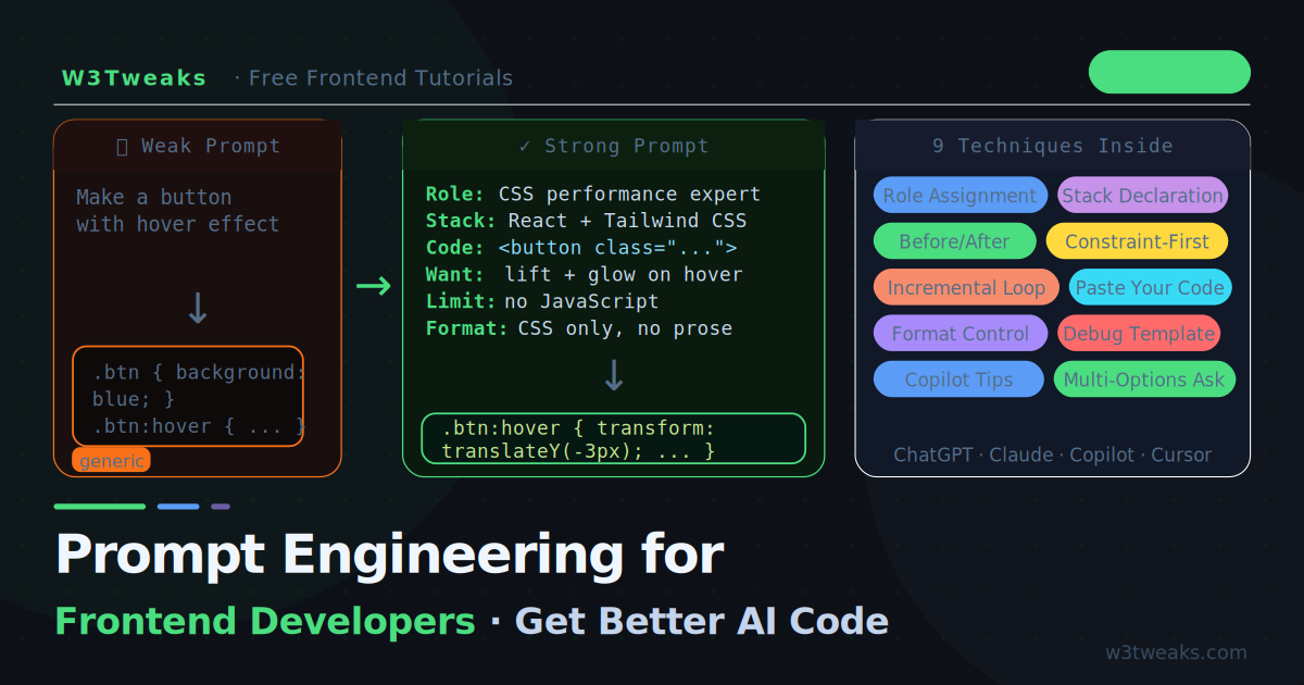
Prompt Engineering for Frontend Developers
Vague prompts get vague code. This guide shows frontend developers exactly how to write prompts that produce clean, working CSS and JavaScript — with real before-and-after examples for ChatGPT, Claude, and GitHub Copilot.

Guide
2 min
How to Center iFrame Video in HTML?
Discover the simplest methods to center iFrame videos in HTML. Follow our concise guide for a seamless web design experience and optimal video display.
Guide
5 min
How to write a function in JavaScript?
Guide
4 min
Does Internet Explorer 10 Support HTML5?
Explore if IE10 supports HTML5 features. Dive into compatibility, updates, and best practices for web development on IE10.
Guide
2 min
How to Read a CSV File in JavaScript
Guide
2 min
What Does $ Mean in Javascript?
Guide
3 min
How to Check if an Object Is Empty in Javascript
Guide
2 min
How to Comment Out Multiple Lines in JavaScript

Guide
1 min
How to Convert String to Date in Javascript in dd-mmm-yyyy Format
Guide
2 min
How to Disable Javascript in Tor