CSS
16 min
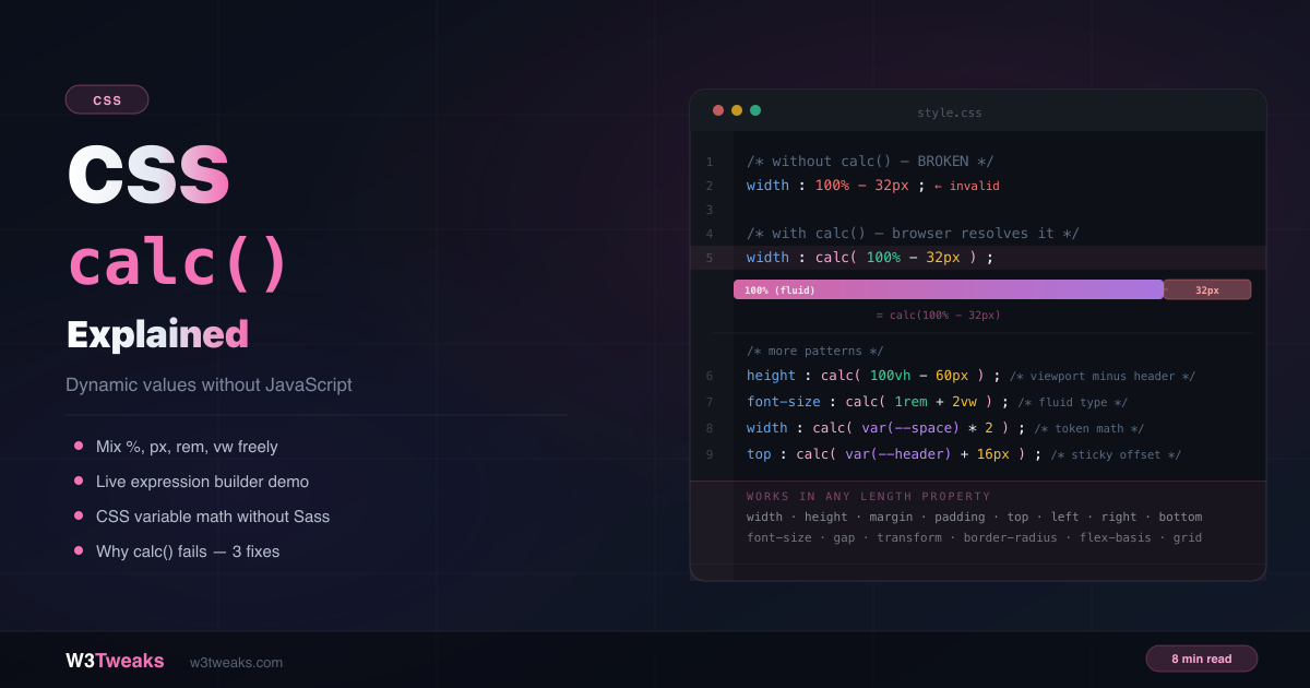
CSS calc() Explained: Dynamic Values Without JS
You can't write width: 100% - 32px in plain CSS — the browser doesn't know what 100% minus 32 pixels equals until layout time. calc() defers that calculation to the browser, solving it at render time when both values are known. No JavaScript needed.
CSS
11 min
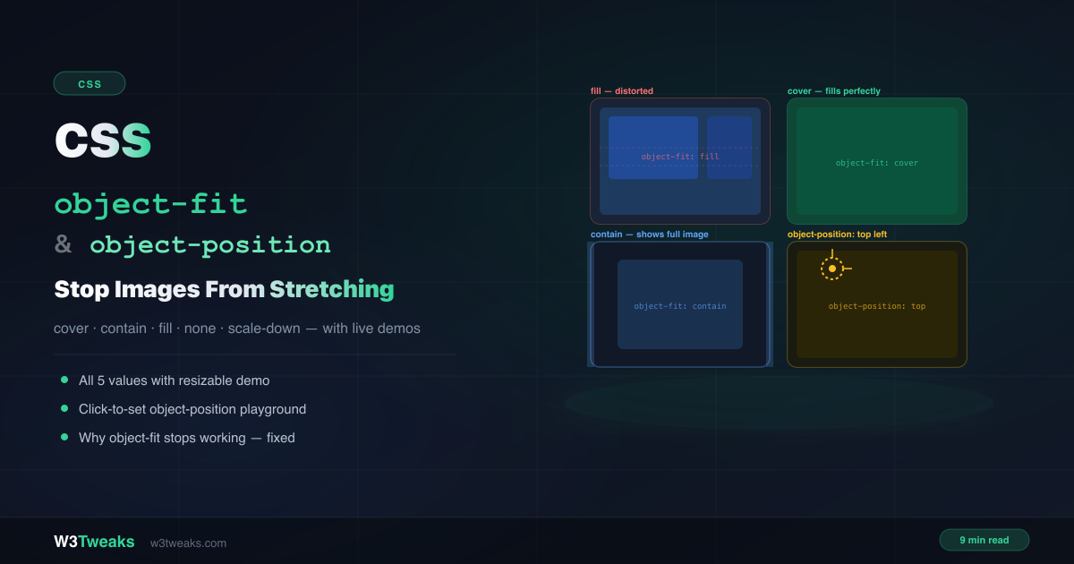
CSS object-fit & object-position: Stop Stretching
You have a card grid where every thumbnail should be the same height. You set width:100% and height:200px on the images — and they all stretch and distort. The fix is two words: object-fit: cover. This guide covers all 5 values, the focal-point trick with object-position, and why object-fit sometimes silently does nothing.
CSS
14 min
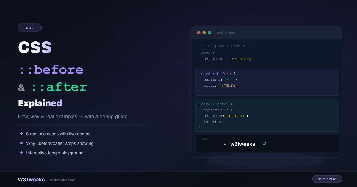
CSS ::before and ::after Pseudo-Elements Explained
Decorative arrows, tooltips, notification badges, quote marks, and animated underlines — without adding a single extra span or div to your HTML. This guide explains how ::before and ::after work, 8 real use cases, and the 5 reasons they silently stop showing.
CSS
12 min
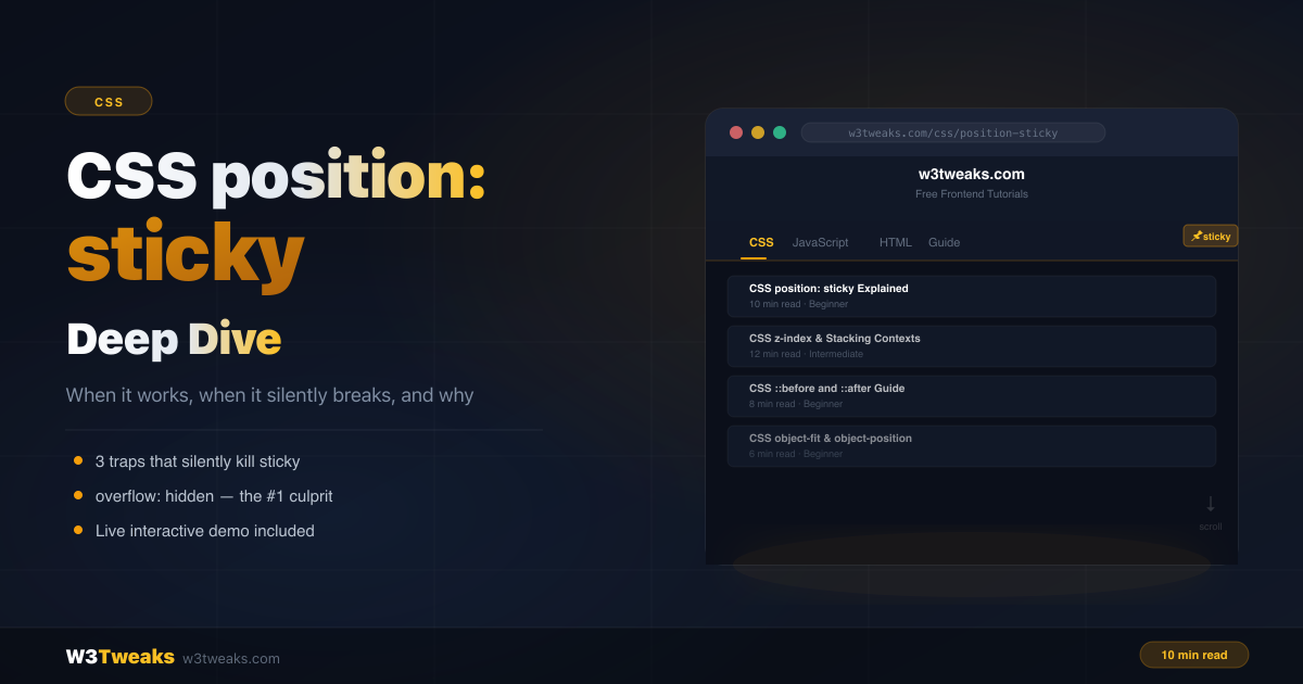
CSS position: sticky — How It Really Works
You add position: sticky; top: 0 to a header and nothing happens. No error — it just silently refuses to stick. This guide explains how sticky really works, the three traps that break it, and the patterns for headers, sidebars, and table headers.
CSS
10 min
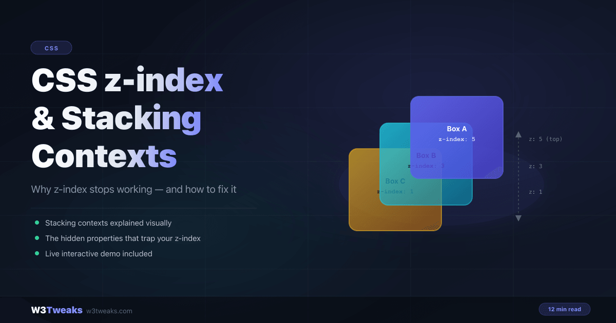
CSS z-index & Stacking Contexts Explained
You set z-index: 9999 on a tooltip. It still hides behind a modal. Until you understand stacking contexts, you're just guessing. This guide explains exactly how z-index works, what traps it, and how to fix every layering bug you'll ever face.
CSS
12 min
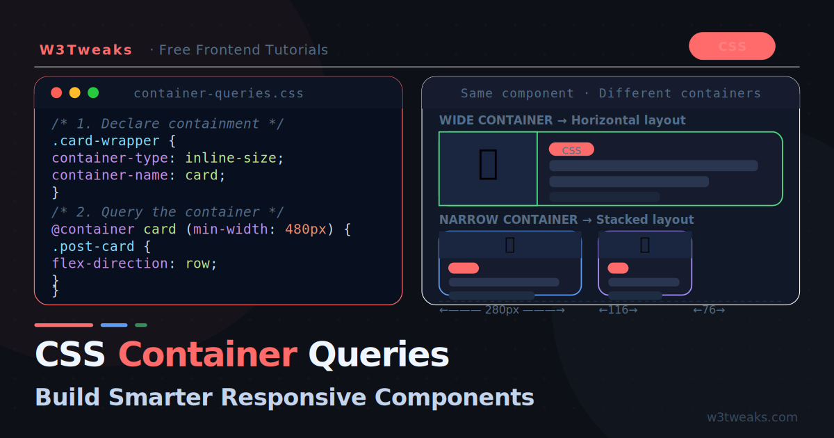
CSS Container Queries: Components That Respond to Their Parent
Media queries respond to the viewport. Container queries respond to the parent element. This single difference unlocks truly reusable components that adapt to wherever they are placed — sidebars, grids, modals, anywhere.
CSS
11 min
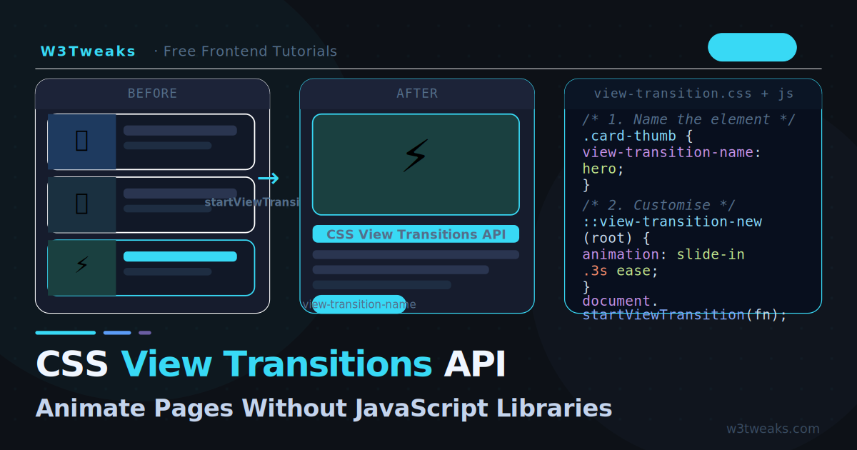
CSS View Transitions API: Animate Pages Without Libraries
The View Transitions API lets you animate between any two DOM states with a single JavaScript call and pure CSS. No animation library needed — the browser handles the cross-fade, morphing, and timing automatically.
CSS
13 min
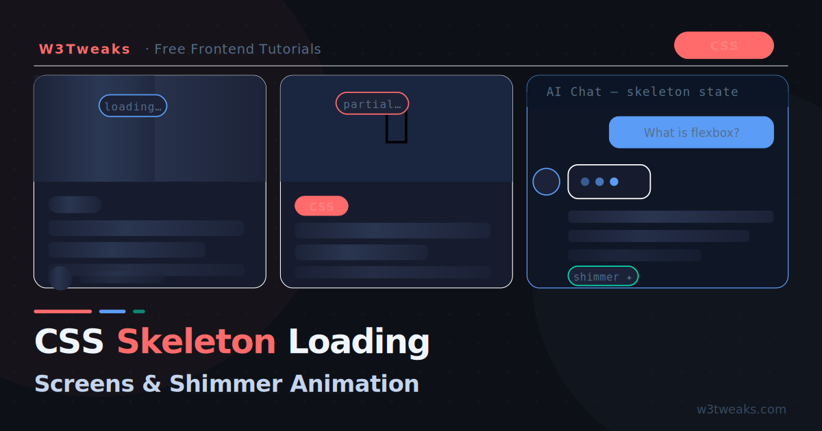
CSS Skeleton Loading Screens with Shimmer Animation
Skeleton screens replace blank white flashes and spinning loaders with intelligent content placeholders. Here is how to build them with pure CSS — including shimmer animation, dark mode, and AI chat loading states.
CSS
25 min
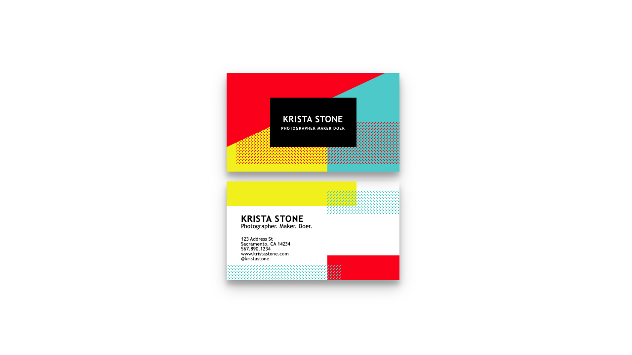
131 CSS Cards Collections: Free Code + Demos
Explore 131 CSS cards designs for 2023. From creation tips to code demos, W3Tweaks provides top inspirations and neat layouts for web enthusiasts.
CSS
12 min
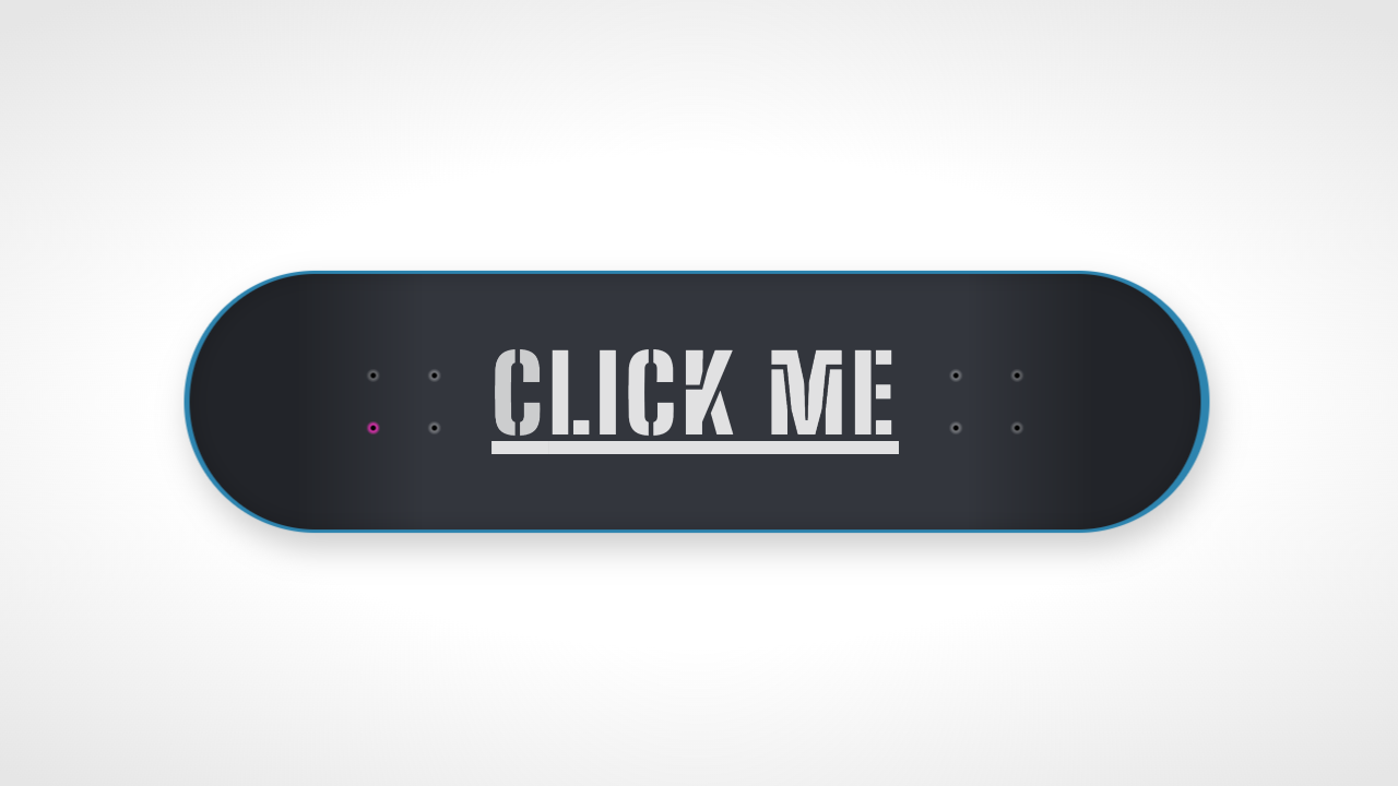
59 Free CSS Buttons
listed the hand-picked awesome css buttons developed using only css and html. tutorials well played with colors, gradients or shapes.
CSS
4 min
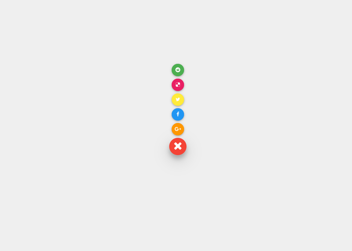
15 Free CSS Floating Action Buttons
Looking for free CSS floating action buttons? Check out our collection of 13 high-quality designs that will add a touch of interactivity to your website.
CSS
2 min
CSS Masonry Grid Layouts: An Overview
Learn about CSS Masonry Grid Layouts and how to use them. We will give an overview of the Grid Layouts in this article, explaining what they are...