CSS
12 min
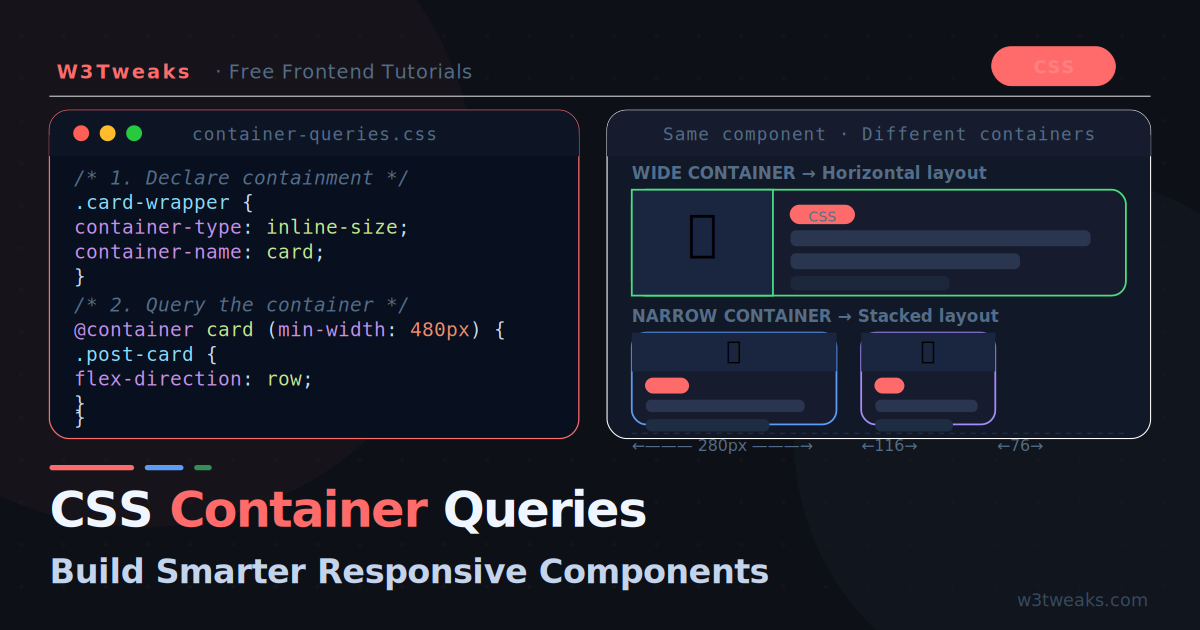
CSS Container Queries: Components That Respond to Their Parent
Media queries respond to the viewport. Container queries respond to the parent element. This single difference unlocks truly reusable components that adapt to wherever they are placed — sidebars, grids, modals, anywhere.
CSS
11 min
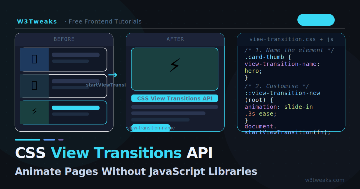
CSS View Transitions API: Animate Pages Without Libraries
The View Transitions API lets you animate between any two DOM states with a single JavaScript call and pure CSS. No animation library needed — the browser handles the cross-fade, morphing, and timing automatically.
CSS
13 min
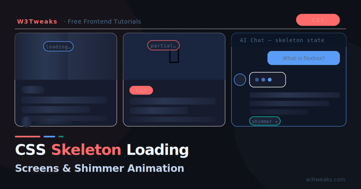
CSS Skeleton Loading Screens with Shimmer Animation
Skeleton screens replace blank white flashes and spinning loaders with intelligent content placeholders. Here is how to build them with pure CSS — including shimmer animation, dark mode, and AI chat loading states.
CSS
25 min
131 CSS Cards Collections: Free Code + Demos
Explore 131 CSS cards designs for 2023. From creation tips to code demos, W3Tweaks provides top inspirations and neat layouts for web enthusiasts.
CSS
12 min
59 Free CSS Buttons
listed the hand-picked awesome css buttons developed using only css and html. tutorials well played with colors, gradients or shapes.
CSS
4 min
15 Free CSS Floating Action Buttons
Looking for free CSS floating action buttons? Check out our collection of 13 high-quality designs that will add a touch of interactivity to your website.
CSS
2 min
CSS Masonry Grid Layouts: An Overview
Learn about CSS Masonry Grid Layouts and how to use them. We will give an overview of the Grid Layouts in this article, explaining what they are...
CSS
13 min
Mastering CSS Hover Effects With Demo
Learn how to create stunning hover effects with CSS. This article provides step-by-step guidance on mastering CSS hover effects.
CSS
4 min
CSS Transition: The Basics Explained
CSS
4 min
10 Free CSS Toast/Notification
Free CSS toast/notification collections. A website's or app's user experience can be improved by adding toast notifications because they deliver feedback and
CSS
2 min
CSS Positioning: A Beginner's Guide to Mastering the Position Property
CSS
10 min
25 Free CSS Search Bars with Expanding Functionalities