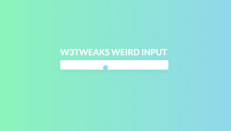
Weird input animation is really awesome with fun and useful for visually impaired users too. Developed using css, html and javascript. demo and download avilable.
Author Jack Pack
Created SEPTEMBER 19, 2018
License Open
Compatible browsers Chrome, Firefox, Safari
HTML Snippet
`<main class="container">
<h1>Weird Input</h1>
  <div class="nice-input">
    <input type="text" id="test" v-model="message" />
    <label for="test">
      <span class="nice-input__animate" v-for="m in message2">{{m}}</span>
    </label>
    </div>
  </main> `
CSS Code
`body {
  background: #84fab0;
  background-image: linear-gradient(120deg, #84fab0 0%, #8fd3f4 100%);
  font-family: 'Lato', sans-serif;
  font-size: 14px;
  overflow:hidden;
}

.red {
  background-image: linear-gradient(to right, #f78ca0 0%, #f9748f 19%, #fd868c 60%, #fe9a8b 100%);
}

.container {
  position:absolute;
  left:50%;
  top:50%;
  transform: translate(-50%,-50%);
  margin-top:-30px;
  text-align:center;
}

h1 {
  color: #fff;
  text-transform: uppercase;
  margin-bottom: 10px;
}

.nice-input {
  position: absolute;
}

.nice-input input {
  border:none;
  border-radius:4px;
  padding:7px 10px;
  font-family: 'Lato', sans-serif;
  font-size:14px;
  box-shadow: rgba(0,0,0,.05) 0 5px 20px;
  letter-spacing:0;
  width:165px;
  color: transparent;
  font-weight:900;
}

.nice-input input:focus {
  outline:none;
  box-shadow: rgba(0,0,0,.1) 0 5px 20px;
}

.nice-input label {
  position: absolute;
  top: 6px;
  left: 10px;
  letter-spacing:0;
  font-size:0;
}

.nice-input span {
  font-family: 'Lato', sans-serif;
  font-size:14px;
  font-weight:900;
}

.nice-input__animate {
  animation: print .2s 1 ease-in-out;
}

.shake {
  animation: shake .2s 1 ease-in-out;
}

@keyframes print {
  from{
  position:absolute;
  transform: scale(50);

  }
  99% {
  position:absolute;
  }
  to {
  position:relative;
  }
}

@keyframes shake {
  from,
  to {
  }
  50% {
    transform:scale(0.97);
  }
}`
JavaScript Snippet
`var app = new Vue({
  el: '.container',
  data: {
    message: ''
  },
  watch: {
    message: {
      handler: function(after,before){
        if (after.length > before.length) {
         setTimeout(function(){
            document.querySelector('.nice-input').classList.add('shake');
           setTimeout(function(){
            document.querySelector('.nice-input').classList.remove('shake');
           },300);
          },200);
        }
      }
    }
  },
  computed: {
    message2: function(){
      return this.message.split('');
    }
  }
});`
Preview