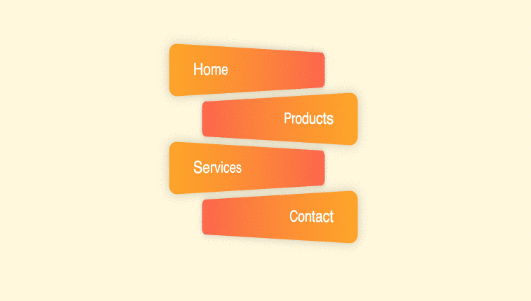
Perspective button hover effect using CSS and HTML only. This can be used for menus or buttons animation hover effects. Demo and Download options available.
Author Comehope
Created SEPTEMBER 28, 2018
License Open
Compatible browsers Chrome, Firefox, Safari
HTML Snippet
`<ul> <li>home</li> <li>products</li> <li>services</li> <li>contact</li> </ul>`CSS Code
`body { margin: 0; height: 100vh; display: flex; align-items: center; justify-content: center; background: cornsilk; } ul { padding: 0; list-style-type: none; } ul li { box-sizing: border-box; width: 15em; height: 3em; font-size: 20px; border-radius: 0.5em; margin: 0.5em; box-shadow: 0 0 1em rgba(0,0,0,0.2); color: white; font-family: sans-serif; text-transform: capitalize; line-height: 3em; transition: 0.3s; cursor: pointer; } ul li:nth-child(odd) { background: linear-gradient(to right, orange, tomato); text-align: left; padding-left: 10%; transform: perspective(500px) rotateY(45deg); } ul li:nth-child(even) { background: linear-gradient(to left, orange, tomato); text-align: right; padding-right: 10%; transform: perspective(500px) rotateY(-45deg); } ul li:nth-child(odd):hover { transform: perspective(200px) rotateY(45deg); padding-left: 5%; } ul li:nth-child(even):hover { transform: perspective(200px) rotateY(-45deg); padding-right: 5%; }`Preview