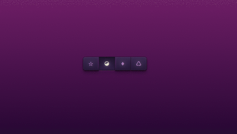
These buttons only use unicode symbols. You could also use text or icon fonts. Developed using css and html. Demo and download available.
Author Sascha Michael Trinkaus
Created DECEMBER 25, 2012
License Open
Compatible browsers Chrome, Firefox, Safari
HTML Snippet
`<div class='buttons'> <a href='#' title='Title 1'> ☆ </a> <a class='active' href='#' title='Title 2'> ☯ </a> <a href='#' title='Title 3'> ♦ </a> <a href='#' title='Title 4'> ♺ </a> </div>`CSS Code
`html { display: table; width: 100%; height: 100%; } body { display: table-cell; text-align: center; vertical-align: middle; width: 100%; height: 100%; } .buttons { white-space: nowrap; min-height: 33px; position: relative; width: 205px; margin: 0 auto; } .buttons a { animation: bounceInDown 900ms 200ms ease-in-out both; width: 50px; height: 33px; position: absolute; top: 0; text-decoration: none; padding-top: 9px; outline-width: 0px; z-index: 990; color: #a675b3; text-align: center; line-height: 26px; display: block; } .buttons a:not(.active) { box-shadow: inset 0 1px 1px rgba(111, 55, 125, 0.8), inset 0 -1px 0px rgba(63, 59, 113, 0.2), 0 9px 16px 0 rgba(0, 0, 0, 0.3), 0 4px 3px 0 rgba(0, 0, 0, 0.3), 0 0 0 1px #150a1e; background-image: linear-gradient(#3b2751, #271739); text-shadow: 0 0 21px rgba(223, 206, 228, 0.5), 0 -1px 0 #311d47; } .buttons a:not(.active):hover, .buttons a:not(.active):focus { transition: color 200ms linear, text-shadow 500ms linear; color: #caadd2; text-shadow: 0 0 21px rgba(223, 206, 228, 0.5), 0 0 10px rgba(223, 206, 228, 0.4), 0 0 2px #2a153c; } .buttons a:not(.active):active { color: #e4e3ce !important } .buttons a.active, .buttons a:active { box-shadow: 0 9px 16px 0 rgba(0, 0, 0, 0.1), 0 0 0 1px #170c22, 0 2px 1px 0 rgba(121, 65, 135, 0.5), inset 0 0 4px 3px rgba(15, 8, 22, 0.2); background-image: linear-gradient(#1f132e, #311d47); text-shadow: 0 0 21px rgba(223, 206, 228, 0.5), 0 0 10px rgba(223, 206, 228, 0.4), 0 0 2px #2a153c; color: #e4e3ce; } .buttons a.active:before, .buttons a:active:before { position: absolute; display: block; content: ""; width: 1px; height: 36px; top: 1px; left: -2px; background-image: linear-gradient(rgba(91, 35, 105, 0), #5b2369 41%, #5b2369 59%, rgba(91, 35, 105, 0)); box-shadow: -2px 0 6px 0 #5b2369; } .buttons a.active:after, .buttons a:active:after { position: absolute; display: block; content: ""; width: 1px; height: 36px; top: 1px; right: -2px; background-image: linear-gradient(rgba(91, 35, 105, 0), #5b2369 41%, #5b2369 59%, rgba(91, 35, 105, 0)); box-shadow: 2px 0 6px 0 #5b2369; } .buttons a.active { z-index: 1000 } .buttons a:active { z-index: 999 } .buttons a:last-of-type { border-radius: 0 7px 7px 0; } .buttons a:first-of-type { border-radius: 7px 0 0 7px; left: 0; } .buttons a:nth-of-type(2) { left: 51px } .buttons a:nth-of-type(3) { left: 102px } .buttons a:nth-of-type(4) { left: 153px } .buttons a:nth-of-type(5) { left: 204px } .buttons a:nth-of-type(6) { left: 255px } .buttons a:nth-of-type(7) { left: 306px } .buttons a:nth-of-type(8) { left: 357px } .buttons a i:before { margin-left: 2px; font-size: 22px; } .buttons a i.icon-bar-chart:before { font-size: 20px; margin-top: 0px; } .buttons a i.icon-sync:before { font-size: 20px; margin-left: 3px; margin-top: 1px; } .buttons a i.icon-download:before { font-size: 19px; margin-top: 1px; margin-left: 4px; } p { position: absolute; bottom: 50px; left: 13px; right: 50px; color: #a99bad; font-family: Helvetica, sans-serif; font-size: 10px; margin-top: 250px; margin-left: 50px; } p > a { color: white; font-weight: bold; } body, html { padding: 0; height: 100%; overflow: hidden; background-image: linear-gradient(#862077, #140027); }`Preview