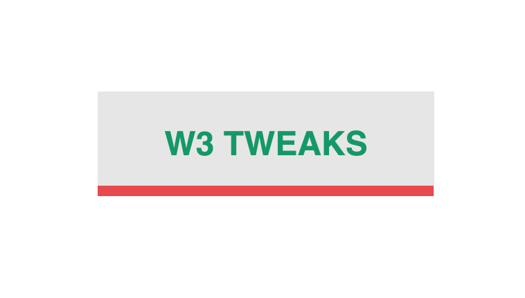
CSS Hover effect on Box links with animation developed using CSS, HTML. Demo and Download available.
Author Tigran Sargsyan
Created SEPTEMBER 15, 2018
License Open
Compatible browsers Chrome, Firefox, Safari
HTML Snippet
`<a href="" class="card"><span class="card-text">W3 Tweaks!</span></a> `CSS code
`body { display: flex; flex-direction: column; align-items: center; justify-content: space-between; min-height: 100vh; margin: 0; font-family: Helvetica, Arial, sans-serif; } a { color: hsl(210, 100%, 50%); } .card { font-weight: bold; display: inline-block; margin: 30px; padding: 1em 2em; position: relative; background: hsl(0, 0%, 90%); font-size: 3rem; text-decoration: none; text-transform: uppercase; } .card::before { content: ""; position: absolute; top: 0; left: 0; right: 0; bottom: 0; background: hsl(0, 80%, 60%); transform: scale(1, 0.1); transform-origin: bottom left; animation: link-hover-out .25s; } .card:hover::before { animation: link-hover .5s ease-in forwards; } .card-text { position: relative; color: hsl(160, 100%, 30%); transition: .25s; } .card:hover .card-text { transition-delay: .4s; color: hsl(0, 0%, 90%); } @keyframes link-hover { 25% { transform: scale(0.05, 0.1); } 50% { transform: scale(0.05, 1); } 65% { transform: scale(0.1, 1); } 100% { transform: scale(1, 1); } } @keyframes link-hover-out { from { transform: scale(1, 1); } }`Preview